|
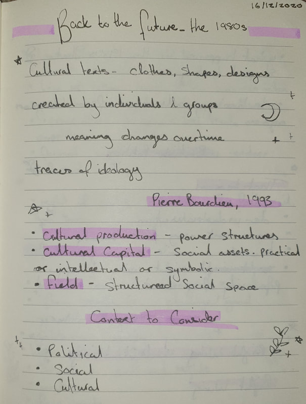
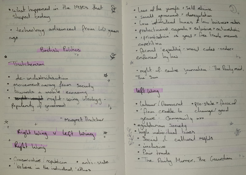
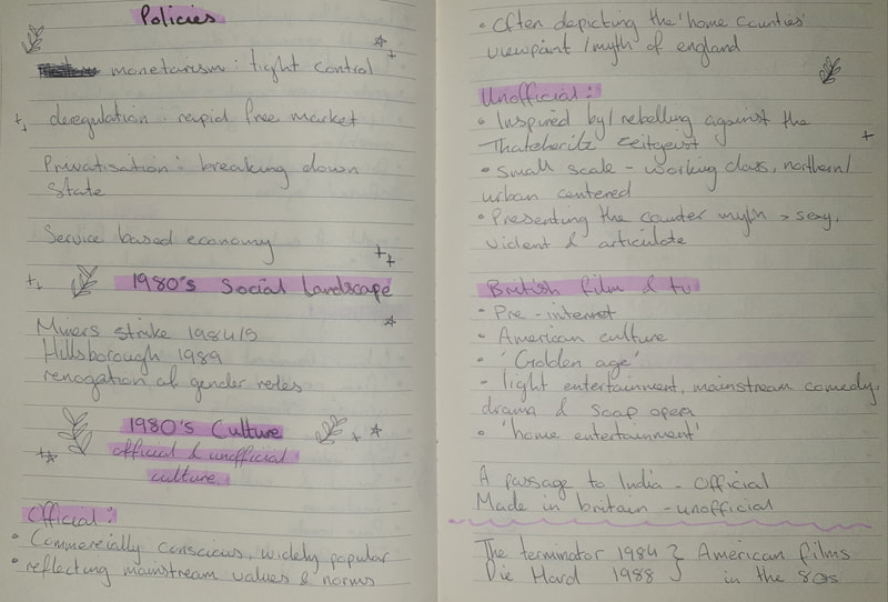
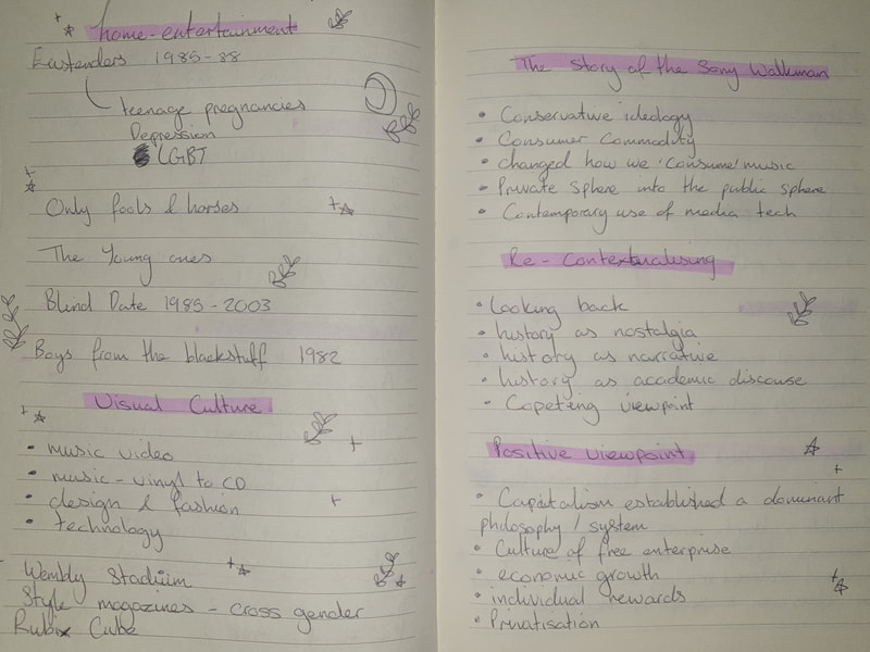
Blog Task 12: A visual mood board of 1980’s culture - showing examples of ‘official’ and ‘unofficial’ culture. 1980'sThe 1980’s focused towards social, political, economic and cultural aspects which was influenced throughout the political scenes, movies and films, music, technology, etc… During the session we learned about Margret Thatcher and ‘Thatcherism’ which played an important role in society at the time. To Take on the task I have 1 collage each for ‘Unofficial’ and ‘Official’ culture during the 1890’s.
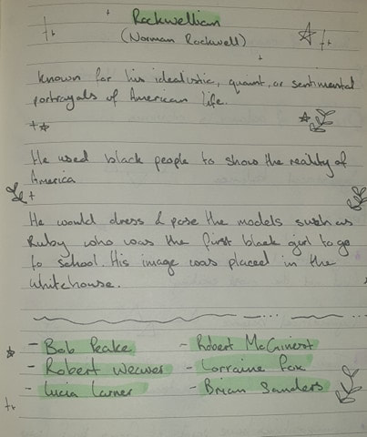
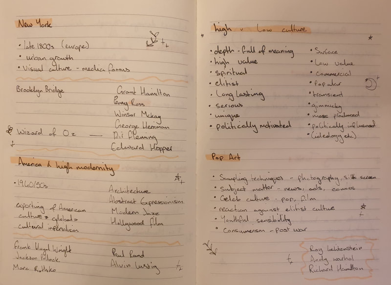
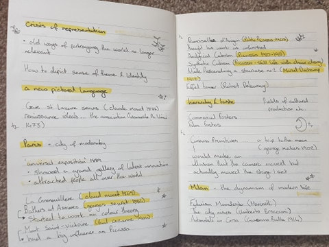
session notes
0 Comments
Task 10: Choose one of the artists listed below...
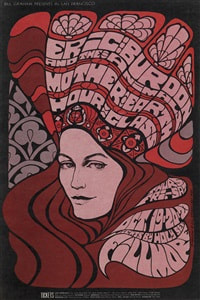
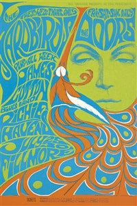
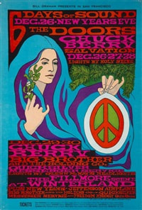
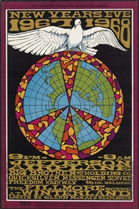
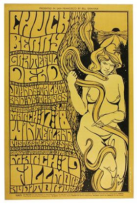
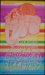
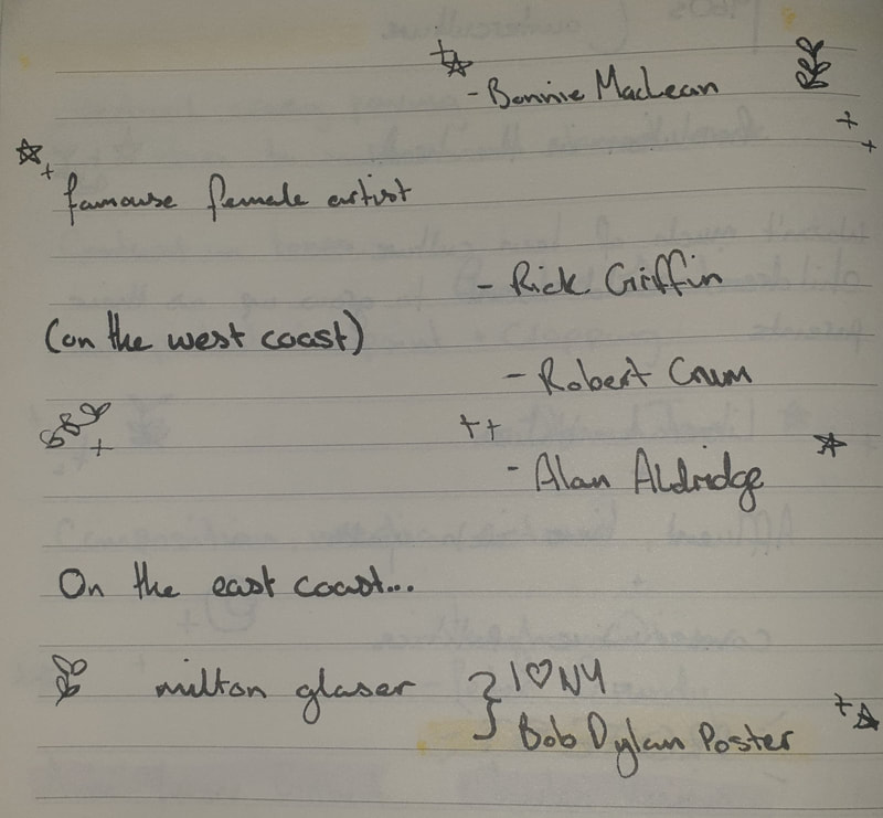
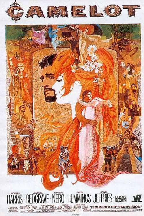
Collate and post a collection of representative work (i.e. work that is that artist is reknowned for) on your blog. Identify and research your chosen artists’ own artistic influences (for example, Victor Moscoso cites Joseph Albers). Find examples of their work to post alongside those of your chosen artist, highlighting through brief annotation, where that influence can be recognised (if at all). Please make sure all images are credited to the artist and image source. Bonnie MacLean |
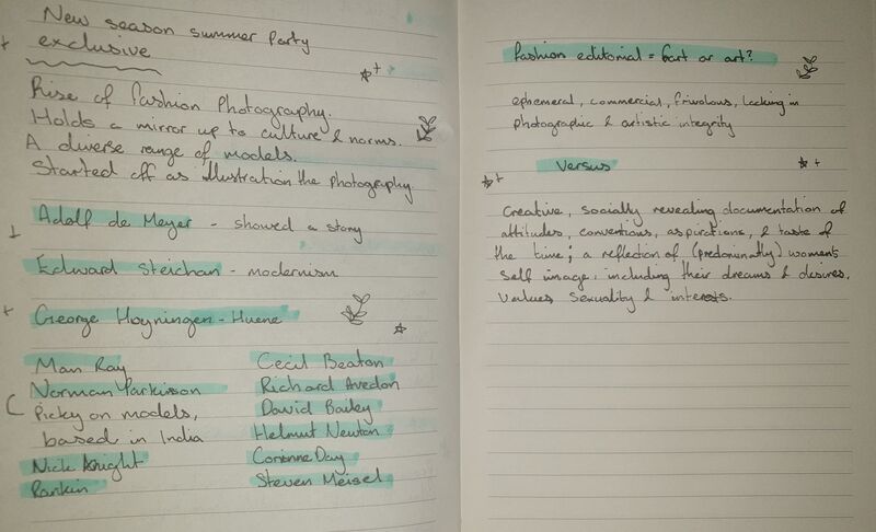
session notes
Blog task 8:
(These tasks have changed to be online)
- Please bring along a magazine of your choice to the session that contains fashion editorial e.g. Dazed & Confused, Elle, Sunday Times "Style", Daily Mail "You", Sunday Telegraph "Stella", Esquire, GQ, Wallpaper, Vogue, Oh Comely... etc. They do not have to be the current issue.
- Scan and critique two fashion "stories" from a publication (or 2) of your choice. Discuss the narrative intention, the audience, location, photographic techniques, tone and mood, composition, typographic elements, model choice etc.
- Display your choice and comments in your blog.
- Watch "How to Become a Creative Director with Alexa Cheung"
(These tasks have changed to be online)
Vogue korea
I have chosen Vogue’s issue on sisterhood which they have chosen to spotlight on ITZY, a rookie kpop girl group who have a lot to say in their work and interviews. The targeted audience for this article would be towards females who are working alongside others and have formed a tight knit bond with another as well as those who are fans of the girl group.
The whole concept of ITZY is ‘ITZ DIFFERENT’ which is shown within their debut song ‘DALLA DALLA’ this sticks to the sisterhood bond they have with another as although they just met, some of them trained together and worked hard to be a part of this new era for kpop where they just don’t care for trivial things such as wanting a man or being told they can’t do what men (or boy groups) can usually do but rather they stick with one another, help each other perform and do their best to challenge these sexist remarks.
Within their choices of clothing you can see their personalities and how they have a similar sense of colour but not too much to ‘look the same’ as one another. The first single shots of photographs show a lot of red, black and pinks to keep the images bold to make them stand out. The next set of photographs show them in two groups.
the first being Lia and Yuna, the outfits for these show the difference in their personalities although it is only a 3-year age gap, the colours for their outfits also contrast well with them as the teal like outfit suits Yuna’s blonde hair, with Lia, she wears a lot of red which suits the single shot she did before but the style changes to a more casual setting.
The second shot of photos include Chaeryoung, Ryujin and Yeji, the outfits for this set seem a bit more mature but also contrast through the different uses of colours, Chaeryoung has a simplistic black dress with a white collar but matches this with a red belt and heels, Ryujin is the most colourful for this especially as her pink hair also matches well with the outfits, with Yeji’s outfit it is more formal with the beige colour and crotched style almost as though she is in a school setting.
The last full group photo shows their personalities within their choice of pose, Ryujin who stands off alone but looks slightly back to her sisters, Chaeryoung who is at the back but also at centre, Lia hugging onto Yeji which shows how she feels towards her sisters and how she can rely on them to Yuna who stand closer, a bit curious. The outfits here contrast to the single shot of the red outfits they primarily use black for this set.
The location for the photographs is professionally done inside but with the added object of the table makes it feel as though they are home. With the apple, I am still unsure why it has been added but it also does give a different vibe to the photographs altogether.
Vogue India
I have chosen Vogue India and their focus on winter velvet kurtas as the season nears and these styles caught my attention from their colour and style as none of these look as though they are just repetitive designs. The overall audience would be targeted towards South Asian, primarily the Punjab region, women usually wear kurti (longer version of kurta in size) these over some jeans for an Indo-American styled look but they can also be a matched set whereas men would wear kurtas with their pajamas for a classic look.
This article focuses towards the velvet material for the upcoming winter season with some new and fresh designs. I love the way the velvet fabric makes these all look cozy and comfortable to wear (and owning some velvet pajams they definitely will keep you warm and cosy during the winter). Not to say these are only winter looks but as the weather changes these can be used for any cold days but don’t want to be wearing so many layers of clothing.
The colours used ranges from bright to darks to show a variety of these fabrics, personally I think the bright colours stand out more as they are vibrant whereas with the darker colours look more formal. The patterns also range in different styles as no Indian outfit ever looks the same within the sequence giving more variety than just the colours.
The location of these photographs ranges from indoors and outdoors, this helps visualise how these outfits would look within each setting from a homely environment to the outdoors which shows you the difference between night and day. The photographs are all full body shots to show off the whole design without getting rid of any details.
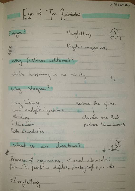
SESSION NOTES
Blog task 7:
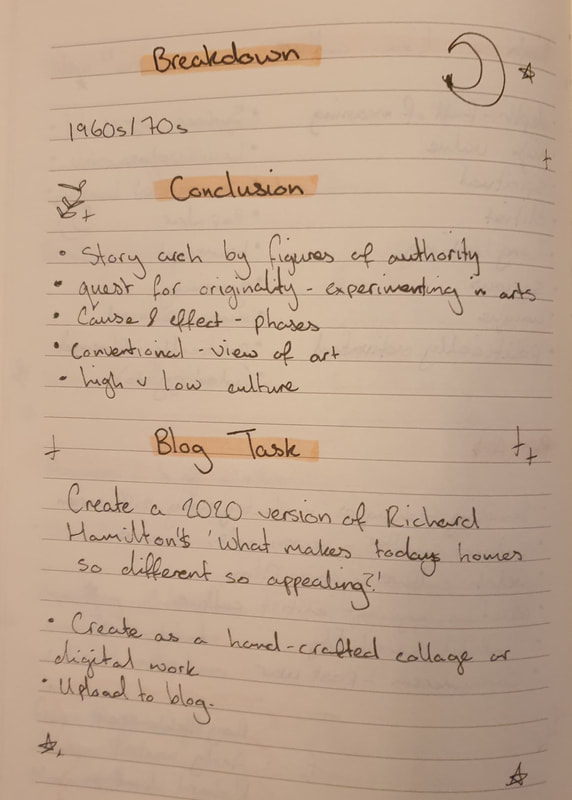
- Create a 2020 version of Richard Hamilton's 'What makes todays homes so different so appealing?’.
Richard hamilton
(1922–2011)
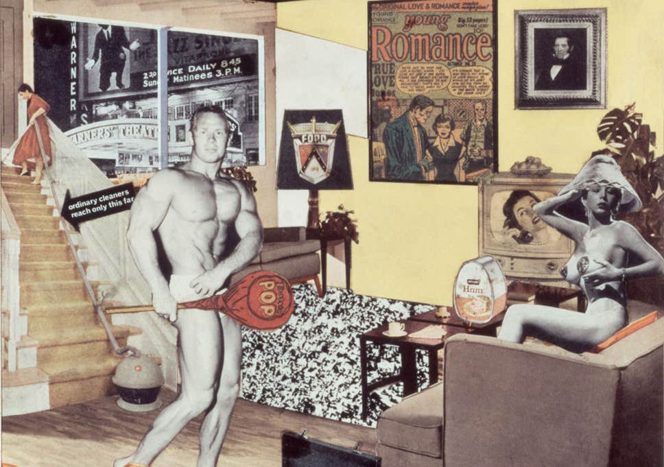 Richard Hamilton's 'What makes todays homes so different so appealing?’
 Richard Hamilton, born February 24th, 1922, London. He was a well know English artist who was famous for his pop art. He primarily worked with collages with pieces such as Fashion Plate (1969). He once reflected. “Art is made through the sensibilities of an artist, and the kind of ambitions and intelligence, curiosity and inner direction that role requires”.
At the age of 16 he entered the Royal Academy but was later expelled for not following the school’s regulations. Richard Hamilton worked as an apprentice at an electrical components firm, this was when he started to begin his art classes at Saint Martin’s School of Art during the evenings. Richard Hamilton had completed his first major college work in 1956 ‘just what is it that makes today’s homes so different’.
Richard Hamilton, who was offered to teach his old alma mater, mentored numbers of students in the late 1950s alongside Peter Blake and David Hockney. During the mid-1960s Richard Hamilton became interested in the work of Marcel Duchamp. Through some mutual friends Richard Hamilton was introduced to Paul McCartney and helped in the produced cover art for The Beatles’ White Album (1968).
The following decades Richard Hamilton focused on producing prints and focusing on new technologies such as computer software. Richard Hamilton’s works are held in The Museum of Modern Art in New York, the Tate Gallery in London, the Los Angeles County Museum of Art, and the National Gallery of Australia in Canberra, among others.
Richard Hamilton died September 13, 2011, Oxfordshire, United Kingdom.
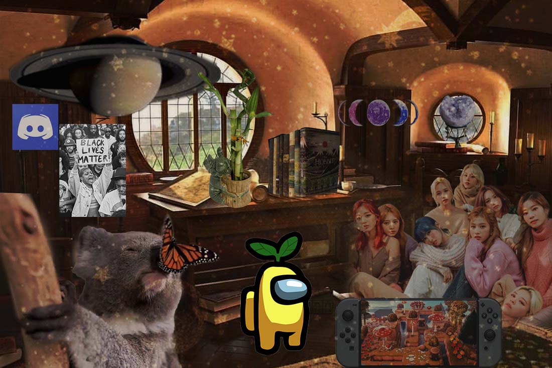
I wasn't all too sure how to make this fit the task but I based it off of how my 2020 would look inside a house
(or should I say inside a Hobbit hole...)
(or should I say inside a Hobbit hole...)
SESSION NOTES
Blog task 6:
- Take one of the artists or designers mentioned in the presentation and research their life and visual output. Collate a minimum of 10 pieces of their work and write a short biography (300-500 words).
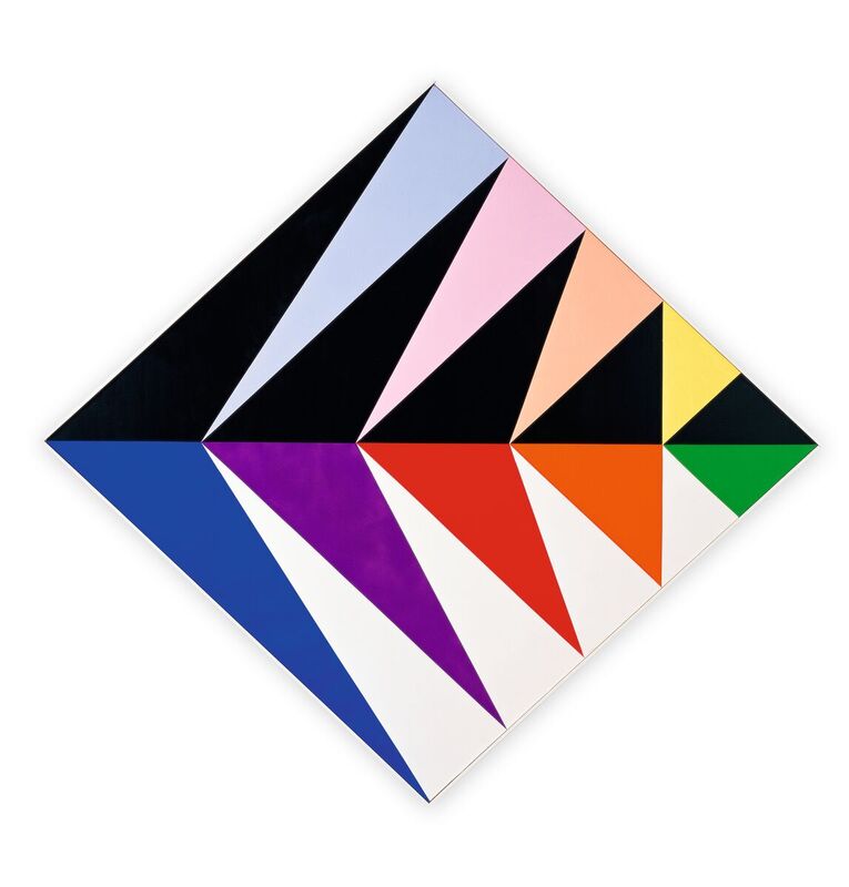
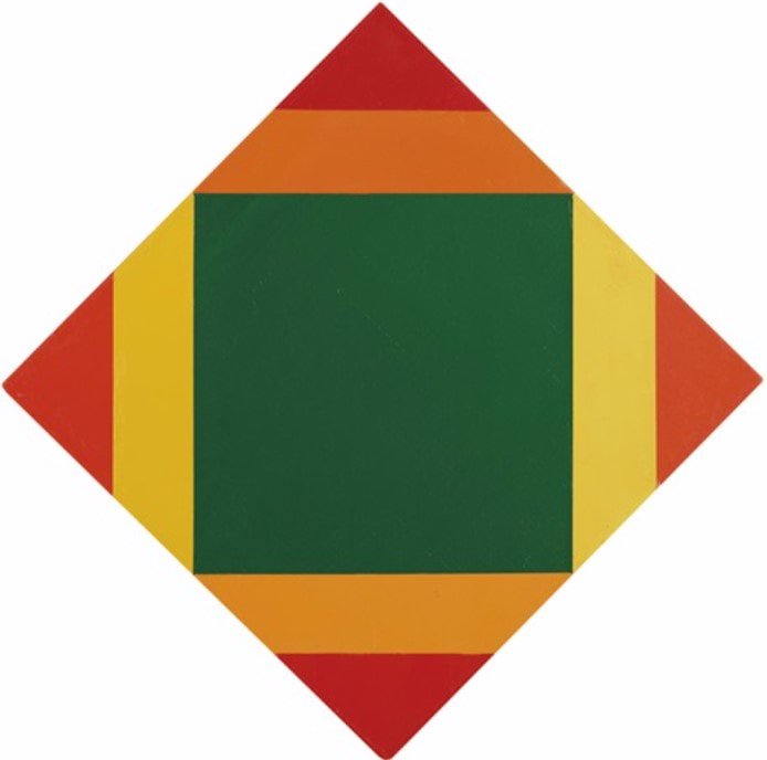
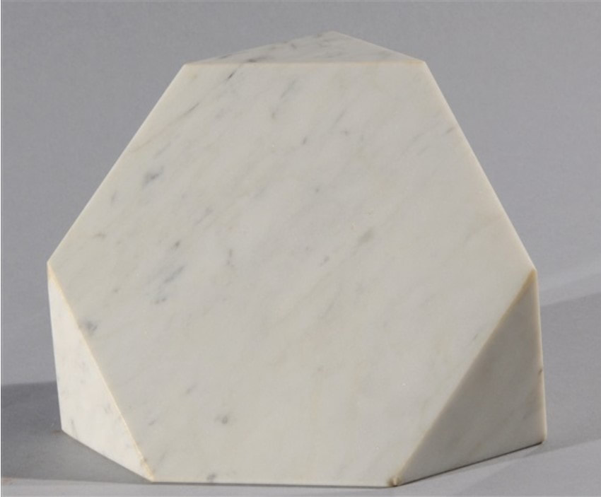
Max Bill
(1908–1994)
Max Bill was born on the 22nd December, Winterthur, Switzerland 1908. He was a leader for the Concreate Art Movement in 1924. He later on applied in 1924 to study at the Art and Crafts Academy in Zurich but after seeing artwork by Le Corbusier his interest had shifted towards architecture which led him to become a student at the Bauhause in Dessau. This is where he would learn under notable artists – Joseph Albers, Wassily Kandinsky, and Paul Klee. From 1927-1929 Max Bill had become an apprentice as a silversmith. In 1929 he moved to Zurich to peruse his career as an architect, graphic artists, sculptor, industrial designer and painter, He was still very active during this time. His artwork has been inspired by the ideas of Theo Van Doesburg and the concepts of concreate art as he applied geometry and mathematics into his work.
During 1936 he started to be more active in public relations. From 1944 he was more active in graphic designs and founded the journal Abstrakt Konkret. In the 1950s the Max Bill started to write monographs, catalogues and journal entries that would explore all the theories that came to mind about Abstract Constructivism.
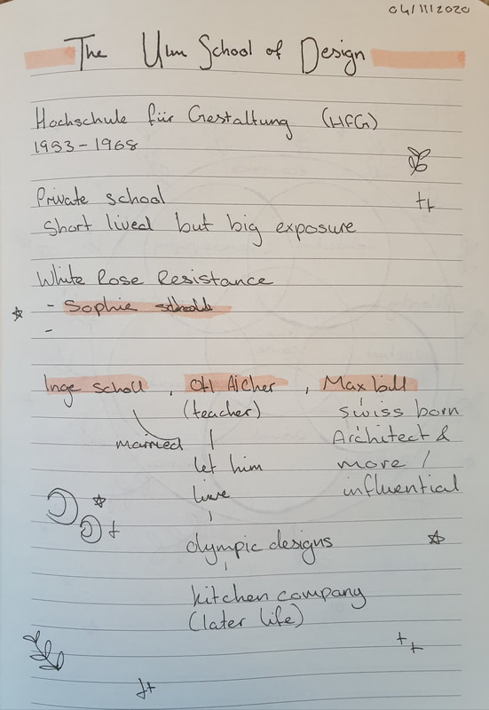
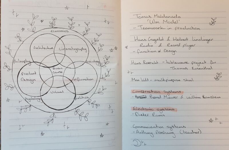
Max Bill, in 1931 became the co-founder and director for the Ulm School of Arts and Crafts (Ulm Hochschule für Gestaltung (College of Design)) along with Otl Aicher and activist Inge Scholl. This lasted until 1956. Max Bill then became the head of architecture and industrial design from 1967 and 1974. He also taught environmental design Hochschule für Bildende Künste (College of Fine Arts) in Hamburg.
In 1941 he joined Allianz (Union of Modern Swiss Artists) he founded a publishing company under the same name and became a member of Abstraction-Création artist association, CIAM (Congrès Internationaux d’Architecture Moderne), Academy for the Arts, Berlin. Bauhaus Archival Association of Berlin, I.C.P. (Institut Für Progressive Kultur), U.A.M. (Union des Artistes Modernes). And many more associations and councils of Swiss and German workers.
Bill Max was awarded the Grand Prix in Italy and Brazil during his career. In 1968 he achieved the Award for Art in Zurich as well as two honorary degrees.
Max Bill died at the age of 86 on December 9, 1994, during a visit to Berlin.
SESSION NOTES
Blog task 5:
- Take one of the artists or designers mentioned in the presentation and research their life and visual output.
- Collate a minimum of 10 pieces of their work and write a short biography (300-500 words).
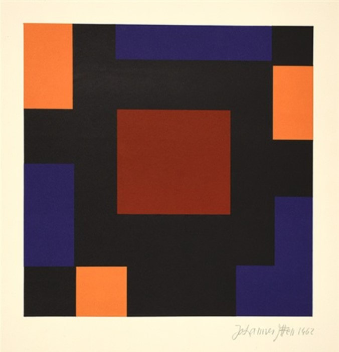
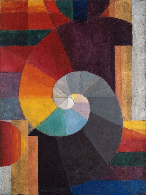
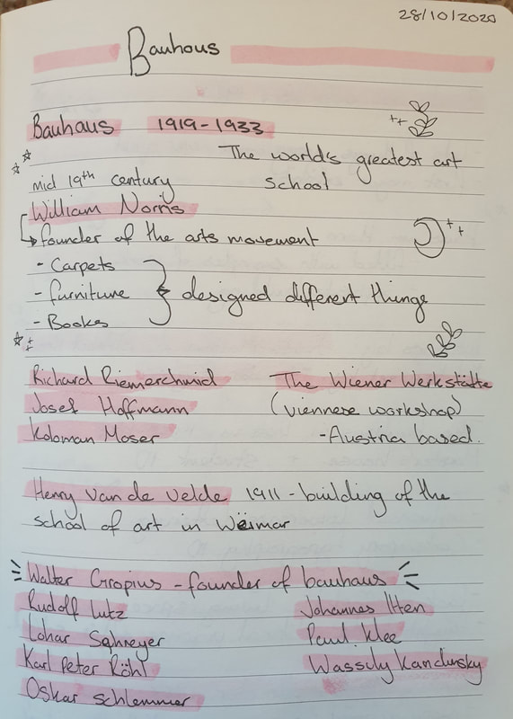
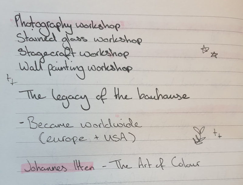
JOHANNES ITTEN
(1888 -1957)
Johannes Itten was born at Südern-Lindern, Switzerland on November 11th 1888. He was the son of a teacher that had influenced him to study as a primary school teacher in Bern dueing 1908-1909. After the brief study course, he had gone onto studying mathematics and science, he trained at Geneva École des Beaux-Arts in Genf where he studies under his instructor Adolf Hölzel in 1913. This is where he got his diploma to start teaching secondary schools. Dueing this time of study he had began to learn more about the concepts of psychoanalysis which started his research to learn more about colour and painting theory.
During his time of teaching he would start to encourage his students to be individuals and let them make mistakes without making them feel as though they would need to fix them. He took many trips abroad to different countries which helped him to discover his love for artwork and working out colour theory. This was a new beginning for Itten as it would uncover that he was much happier as a painter. After his studying with Adolf Hölzel was the year he moved to Vienna in 1916 as he was greatly inspired by the music that surrounded him during his time. Johannes Itten had managed to create a circle of friends who later would introduce him to Walter Gropius. Gropius would then invited Johannes Itten to teach at the Bauhause in 1919 making it the first invatations that was extended to anyone.
From 1919 to 1923 he taught in Weimar he developed a universal doctrine in design which he taught as a preliminary course at the Bauhause. During the course he taught the students on the concept of colour, compositions and materials.
Johannes Itten had a great devotion towards a cult which began his dismissal from the Bauhause. After his dismissal he started up a school for painting, photography, architecture and printmaking in Berlin, 1926 where he continued to teach about colour and its principles. In 1932 he began to start teaching at the Krefeld School of Textile Design till 1938 in which he later moved to the Netherlands and became a director of the Museum of Arts and Crafts in Zurich (1938). In the years that followed he devoted all his time to teach and worked extremely hard to achieve this. JohannesItten later retired in 1955 so he would be able to devote himself intensively towards his paintings and other work.
He later wrote two books “Art and Colour” (1961) and “My Preliminary Course at Bauhause” on form and design. Darmstadt Polytechnic, in 1965 awarded an honorary decorate to Johannes Itten. He received “Netherlands Sikkens Art Prize” In 1966, he later represented Switzerland at the 33rd Venice Biennale.
Joahness Itten died 25th March 1967, Zurich.
SESSION NOTES
Constructivism
Blog task 4:
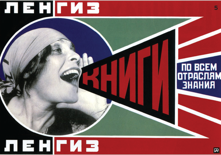
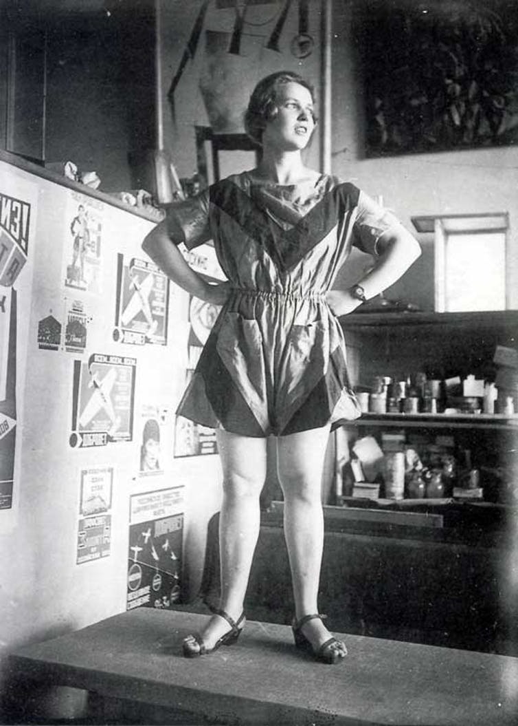
- Text analysis - compare two constructivist posters/ paintings of your choice.
- Exploring key formal attributes: Materials, composition, use of text and image, use of photography and illustration, line, colour, readership and audience.
The constructivism movement was founded by Vladimir Tatlin and Alexander Rodchenko and began to bloom around the early 20th century. This was mainly a group of young artists that wanted to show a more revolutionary purpose to their art as they adapted avant-garde forms of cubism and futurism. This movement was more so for the beliefs rather than the artists' personal expression
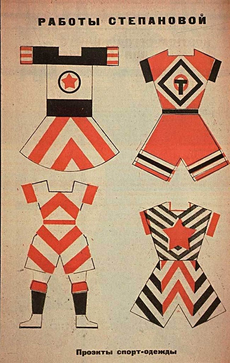
The first poster, 'Sportswear' designed by Varvava Stepanova is a unisex sports wear. This links in with the use of orange as the primary colour she uses as, although colours do not have gender roles, they have been classed to be specific with blues and pinks especially during these time periods. The initial geometric clothing could not be made from materials but was only to be shown as a display. The composition of this image is direct and focuses the eye directly to the model, what makes her stand out is the superhero esc type pose she is making as she is looking off to the side and is in a firm stance. The geometric compositions where not explored through material but rather became a model for more new industrial designs. The use of photography has been done in greyscale where the lighting is hitting her face making the outfit appear more visible. The text image is easy to read and placed carefully at the top in centre as the font also matches the way she uses the geometric lines. The audience is for everyone as these suits come in different styles and would most likely be chosen by preference.
Whereas the second poster, 'books in all fields of knowledge' designed by Alexander Rodchenko is an advertisement meant to encourage reading for everyone. The use of colours is much more bold compared to the 'Sportswear' design as this uses a lot of black and reds with a small amount of blues, this makes it pop out as these colours compliment each other nicely. The composition is laid out towards the left as the image text is shouting out at us towards the right. The use of photography was, much like the 'Sportswear' has also been done in greyscale, this diverts the attention from the woman and more on towards the text. The audience for this poster design is for those who are wanting to read no matter who you are.
Overall both these posters have slight similarities within the small amount of colours as well as the black and white photos and how the messages for booth of these are mainly diverted to everyone no matter who you are.
SESSION NOTES
ART NOUVEAU - THE MAJOR DIFFERENCES
Blog task 3:
Document, describe and explain the major differences of ‘Art Nouveau’ as it was interpreted by artists and designers in Glasgow, Vienna, Madrid and Nancy.
Document, describe and explain the major differences of ‘Art Nouveau’ as it was interpreted by artists and designers in Glasgow, Vienna, Madrid and Nancy.
Glasgow, Scotland
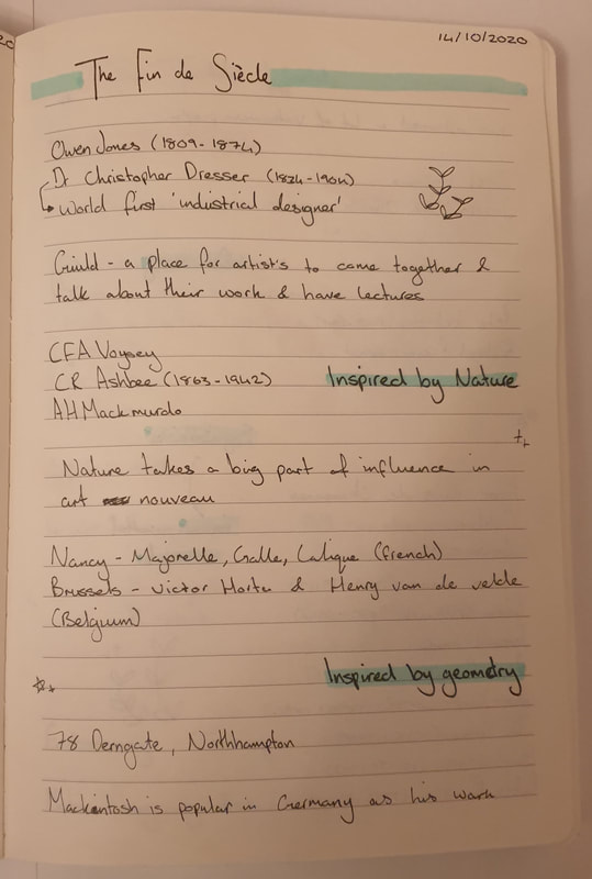
Art Nouveau is a style that was introduced between 1890 and 1910 that spread over Europe and the United States. The movement was influenced by either Nature or Geometry and is widespread from jewellery, architecture and interior design as this was how they wanted to create a new sense of style that broke free of the style of the 19th century. Art nouveau was heavily influenced by expressive lines as well as Japanese prints (ukiyo-e). There were many prominent artists though the one who stood out was the Scottish architect and designer Charles Rennie Mackintosh who specialised in geometric lines which had influenced Austrian Sezessionstil; the Belgian architects Henry van de Velde and Victor Horta who later on influenced French architect Hector Guimard, the Spanish architect Antonio Gaudi who was the most original as he went beyond what others did.
Art Nouveau in Glasgow had influenced the Arts and Crafts Movement that consisted of a group of four designers: Charles Rennie Mackintosh, Margaret and Frances Macdonald and Herbert MacNair. The group had been known as Glasgow boys/girls who were highly interested in the architecture of the city even prior to not knowing much of the culture and traditions of Glasgow. Those who wanted to finance the artist’s work where usually local entrepreneurs. This led to the commission of Mackintosh who ended up designing The Hill House.
The Glasgow style was well known for their stained glass, ceramics, textiles and illustration as well as the exterior and interior building designs, Glasgow's architecture uses strong lines that are bold and use black outline but contain subtle colours such as how the red's look desaturated making them appear more darker than they should.
Vienna, Austria
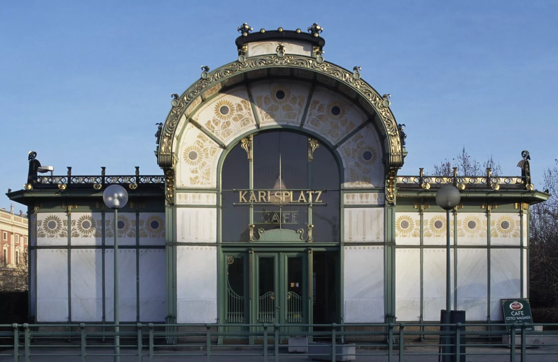
The Vienna secession in 1897 was the beginning for modern art in Australia – a nation that was highly attached to their traditions. This was the beginning for artists and designers to embrace new genres and fields in which they worked with. This heavily helped contemporary artists a first dedicated venue to showcase their works. Josef Maria Auchentaller had designed a poster which can be found in the secession building – this poster resembled how art can all be linked to one another as art influenced many places.
The Vienna style is more decorative as it uses gold and vibrant colours making it appear modern and rich compared to the Glasgow style. The style has more details where each part of the architecture the details can be seen individually, the colours also compliment the use of gold as it the Majolika Haus shows pinks which later contrast next to the golden architecture.
The shapes have been structured to be more stable and practical but also focuses on the inspiration from nature and geometry giving the buildings their own unique style that is eye catching and makes you want to know more about the thought process on the designs.
Madrid, Spain
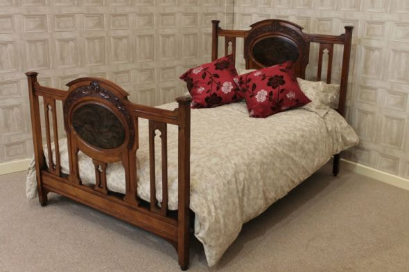
The Spanish Society of Authors and Publishers is well known to be one of the few buildings in Madrid that is styled by art nouveau. The palace was built by Javier Gonzalez Longoria – the building is noted to be impressive due to the ornamental externa appearance. The treatment of the building was made from artificial stone that had smooth vegetable and organic forms which was used with decorative pieces that covered them. Inside the building there is a main staircase which has striking features as it was inspired by the French art nouveau architecture just as much as the rest of the décor inside the building. Overall, the building was very much in line with the style of art nouveau.
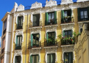
The style for Madrid's buildings has a bigger amount of colour pallet with the glass stains, the overall colour pallet is lighter compared to Nancy but much more brighter compared to Glasgow. The colour that stands out a lot is yellow within the glass stain and the building making them noticeable and quite interesting to look at. The style has the appearance of being symmetrical with the architecture and furniture alongside the exterior design. Like Vienna the buildings have decorative balconies although they appear darker within the appearance.
The style for Madrid's buildings has a bigger amount of colour pallet with the glass stains, the overall colour pallet is lighter compared to Nancy but much more brighter compared to Glasgow. The colour that stands out a lot is yellow within the glass stain and the building making them noticeable and quite interesting to look at. The style has the appearance of being symmetrical with the architecture and furniture alongside the exterior design. Like Vienna the buildings have decorative balconies although they appear darker within the appearance.
Nancy, France
Nancy in 1900 became famous for its art nouveau movement – this was founded by a group of outstanding artists known as the Ecole de Nancy who were very influential within the arts and industrial production. Emile Gallé, an artist who would end up breaking barriers of fine art. Gallé would go onto working with ceramics, furniture, bookbinding, sculpture and much more hands on work – this led to Gallé working on architectures of houses, banks and shops which was a huge success.
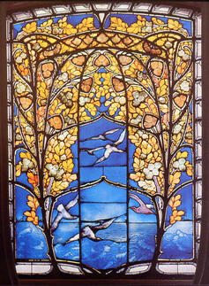
The style and colour pallet are neutral which include yellows and blues. The designs are detailed yet have a soft touch, all the pieces within the "Nancy School" have soft natural lines that make the architecture stand out weather it is the building. exterior design, stained glass or the furniture. The overall shapes put these styles together. The style focuses on a lot of floral designs and use little to none blacks or whites for the outlines.
There seems to be more of a mixture of colours than having them separated which you can see with the stained glass
as it shows more depth creating a gradient to the details. The stained glass and door show tree branches which suit the Art Nouveau style.
SESSION NOTES
HOW JAPANESE ART INFLUENCED THE NINETEENTH & TWENTIETH CENTURY ARTISTS
Blog task 2:
- Take two differing pieces of art or design from the late nineteenth or early twentieth century and explain how the Art of Japan influenced their form, function or manufacture.
- Contrast this with examples that show no influence from Japan.
Claude Monet’s ‘Water Lilies’ series has been heavily influenced by Japanese art; this can be seen with ukiyo-e as it is referenced within how Monet is deeply invested in nature (which has also played a huge role in Japanese culture) as he would plant his water lilies before he would paint, this is due to how he would rather paint his own creations. He knew how to fuse Japanese motifs within his own palette which would later develop into his own style. The reason Monet works this way is for others to enjoy the scenery he creates, which he has succeeded in as the Chichu Art Museum has put up a garden that consists of his artwork to create a more surreal essence to his artwork.
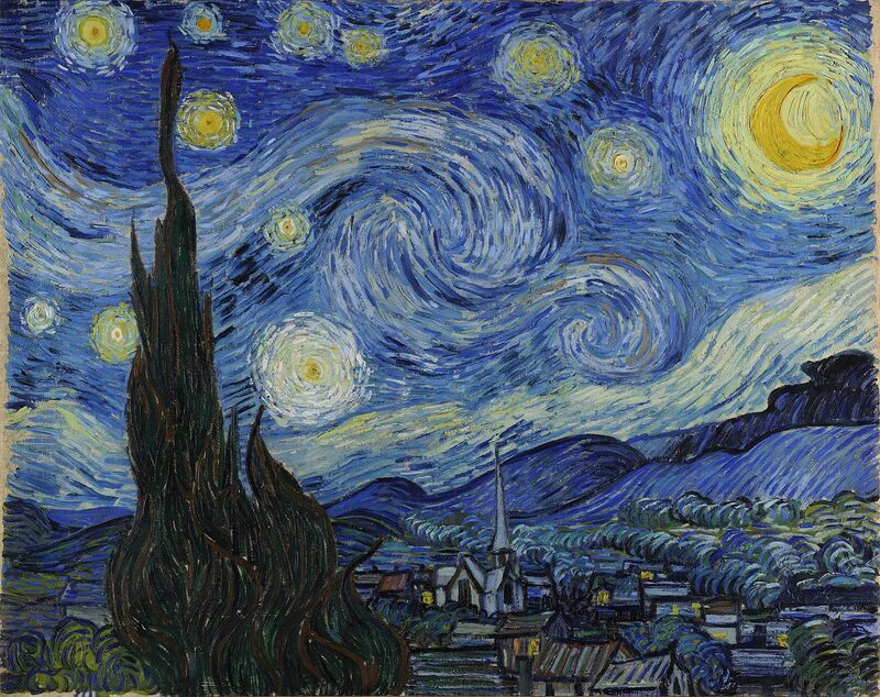
Van Gogh’s ‘Starry Night’ has been influenced by Japanese woodcuts; you can see this in the form of the way the night sky flows as it has also been inspired by The Great Wave off Kanagawa. Gogh has admired the way these Japanese woodcuts all the way down to their bold designs and the intense colours they give. The reason for his work is due to his attacks when he was in the asylum and not being able to control himself, from last weeks lesson I learnt that colours have different meanings, in this case he uses a lot of blues which he uses to expresses his emotions and how isolated he felt and to show that through the window in which he had been left in.
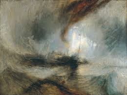
J M W Turner’s ‘Snowstorm, Steamboat off a Harbour’s Mouth’ seems much more complex within the brush strokes compared to how flat the strokes are within Japanese art that gives them a manga style, Turner’s brush strokes show the opposite. Turner’s style feels a bit more intense within the colours he uses such as greys where he really shows off a storm-like effect creating the mood a bit darker.
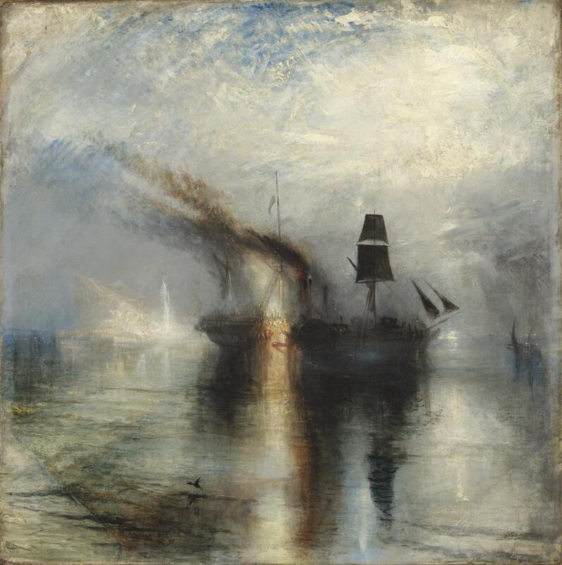
Turner’s ‘Peace, Burial at Sea’ also shows the same mood within the darker colours as there is a lot of smudged blacks- this really stands out as Japanese art the colours are all solid and neat. The style of the painting shows sorrow and loss of people which you wouldn’t see as bold within Japanese prints. The overall images of these two paintings have a completely different influence from Monet & Gogh as the paintings show no influence from Japanese prints.
SESSION NOTES
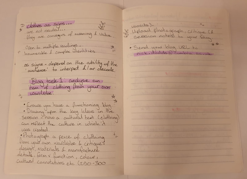
WHAT DOES MY CLOTHING SAY ABOUT ME?
Blog task 1:
- Ensure you have a functioning blog.
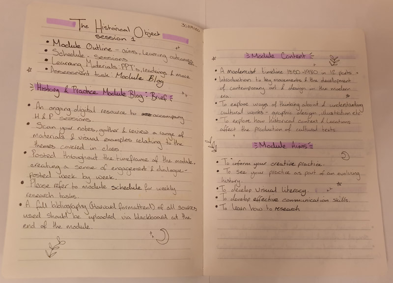
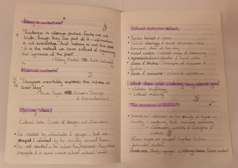
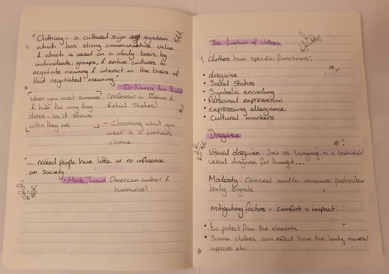
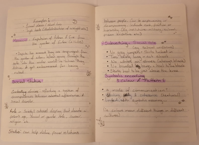
- Drawing upon the key ideas in the session – how a cultural text (i.e. a piece of clothing) can reflect the culture in which it was created.
- Photograph a piece of clothing from your own wardrobe and critique: design, materials and manufacture details, form v function, colour, cultural connotations etc (250 – 300 words). Upload photograph, critique (& any session notes) to your blog.

Before our session I would not have thought too much about what my clothing really says, but after going through the lecture I am prepared to talk more about my clothing. For this task I have decided to pick out an Indian saree.
The culture of the saree is a cultural piece of clothing that is worn by South Asian communities. South Asian women across the regions would wear different styles of sarees depending on their culture and religion. This stands out as how diverse India is, we are all linked by the styles of sarees. The way to style this suit is the have the chunni (scarf) to be worn around the neck. The saree is the most suitable attire to be worn by South Asian women. The saree can have various styles across all subcontinents (such as a Bengali style which would look different compared to the suit I have)
The function of a saree is for it to be a more fashionable look for formal events as the designs and patterns also help give the suits more definition and character to the piece. As I have a one-piece saree, they come with a bottom pairing making it more flexible to walk around than most traditional 9-yard sarees would making it more practical to wear outside as well as inside. I like wearing these one-pieced sarees as they feel more comfortable as well as enjoying the flowing movement the bottom ends of the suit give out
When it comes to the materials there are many variety’s to chose from. The fabrics used for my suit consist of cotton, a material that is most comfortable to wear and keep you cool in hot weather. There is also a mesh like layer over the cotton which brings out the design more – the texture of mesh seems really captivating. I have always been fascinated in the different styles that sarees come in and have wanted to try out the other different designs they come in although would not have many reasons to wear one as I used to.
Nonetheless it also comes down to the different colour variations you can get which makes them more appealing to the individual – personally I did not choose the colours of my suits as my grandpa had gotten me it during his trip to India and I was not at all that fussy on colour. My suit heavily consists of cyan which to me symbolizes being restful and calming. But there is also magenta which symbolizes peace, harmony and emotional balance (but also having violet (compassion) and red (passion) tendencies.
Personally, for me I do believe these colours best suit me although I like to wear a wide range of colours it all depends on personality and what colours we associate ourselves with. This suit is more towards standing out which I do not prefer but for events it feels more natural. I want to look and feel a lot more confident in these suits before I would be able to move onto more traditional two-piece suits where the chunni drapes around the shoulder to waist. To me this suit represents my culture and heritage which, I think, needs to be more appreciated for.
Session Notes
Author
Manisha Kaur Samra
Archives
December 2020
November 2020
October 2020
September 2020





















































 RSS Feed