Analogue Activity

|

|
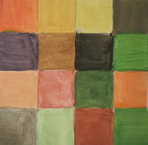
The colour wheel was a bit hard to do as some of my paints didn't seem to mix well into the colours i wanted especially for the purples, for the gradient I found the greyscale one easier to identify where some parts where light and dark but i messed up a bit when adding onto the orange colour for the darker areas in which I re did and stuck on top of the mess I seemed to have made, I have learnt that i should be a bit more patient with paints especially with white's.
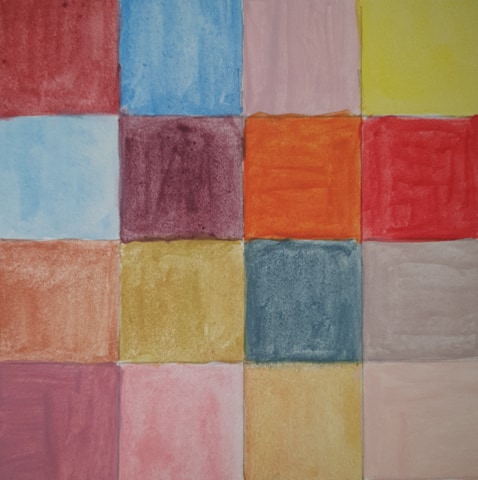
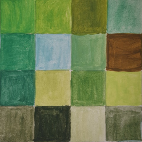
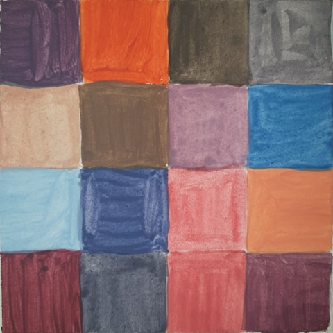
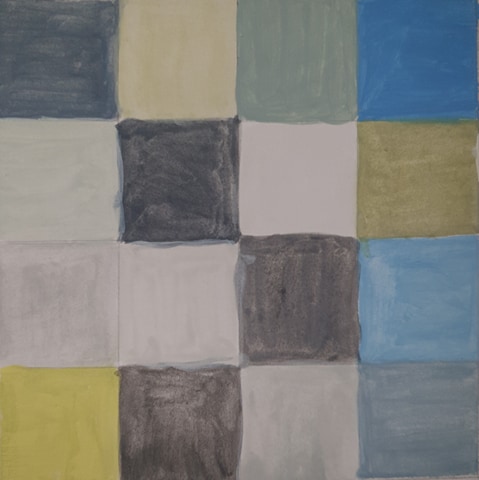
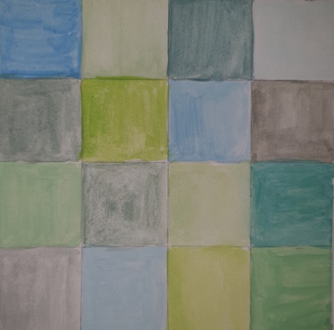
The gridded squares where fun to go through and to see what colours I could think of when hearing the words.
The gridded squares where fun to go through and to see what colours I could think of when hearing the words.
Composition Warm-up
|
|
|
|
|
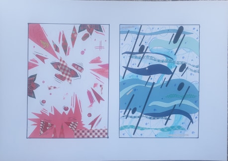
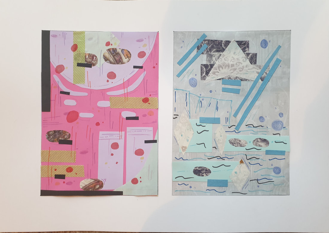
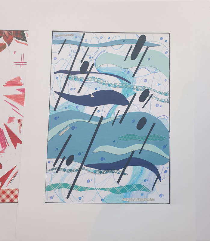
I had a lot of fun trying to come up with composition ideas with cut up paper and magazines, my favourite one is Storm at Sea as it was fun to work with the paper and how i was going to convey the shapes to match waves. I used a gardening and card making magazine for most of my patterned paper and used a bit of pencil colours and markers to add a bit more to the imaged if needed.
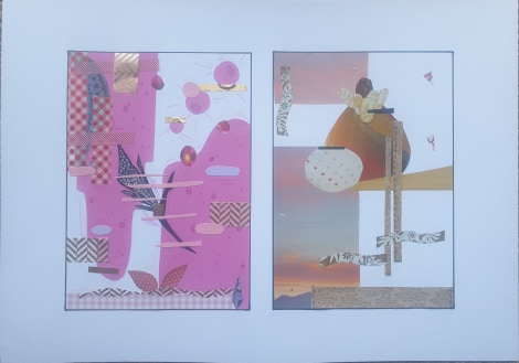
Overall I had a lot of fun trying to come up with ideas for each word and how I thought they would visualise and what the compositions would be placed like.
Overall I had a lot of fun trying to come up with ideas for each word and how I thought they would visualise and what the compositions would be placed like.
Designing with type:
Finals
|
|
|
I had a hard time to choose which design to pick as finals as I didn't just go for my last developments ideas but would rather go back and take an image that wasn't fully finished as the simplicity of some just looked better in my opinion.
Developments
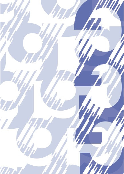
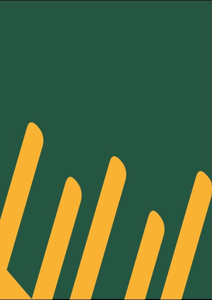
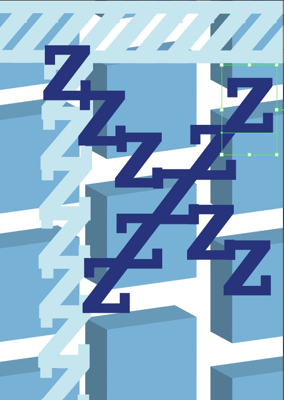
Scale
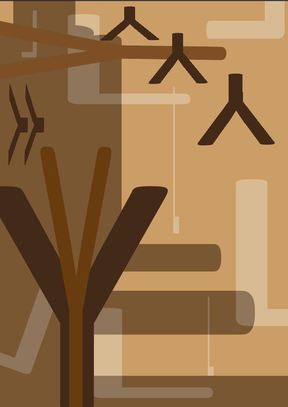
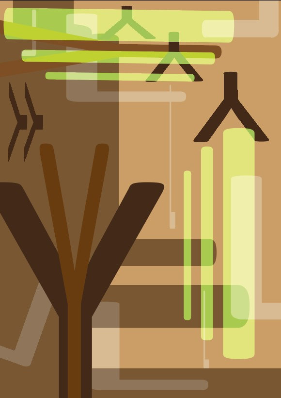
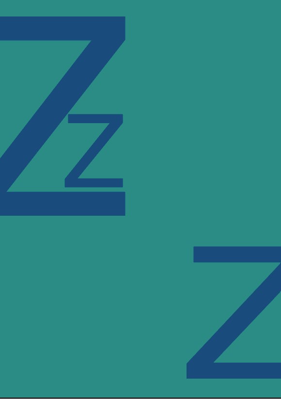
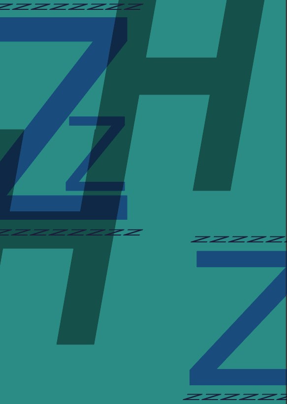
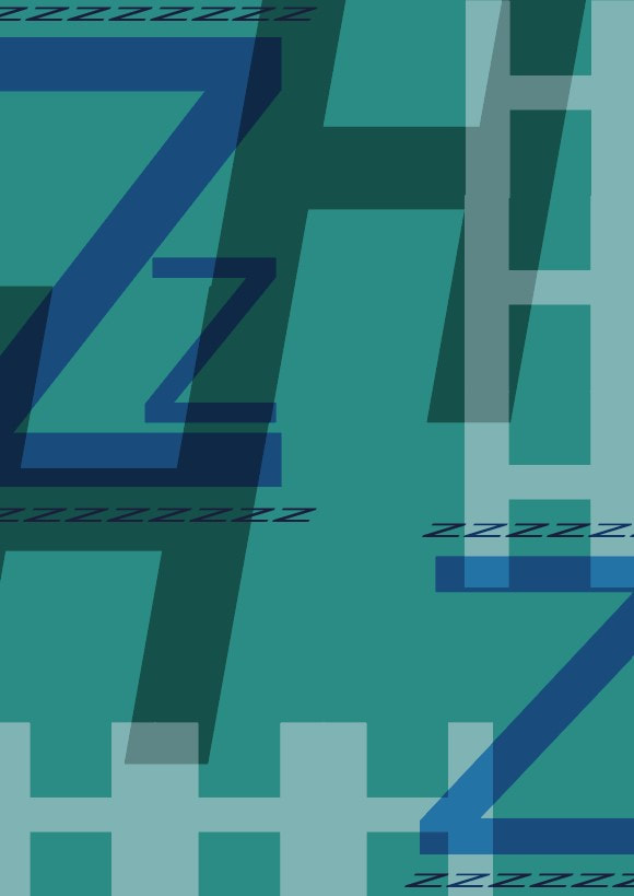
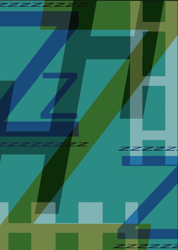
I didn't realise I had already made a first scale design as it was hidden in my folders but with my second try i showed a bit more with the different sizes and lengths
I didn't realise I had already made a first scale design as it was hidden in my folders but with my second try i showed a bit more with the different sizes and lengths
|

|
|
|
|
|
|
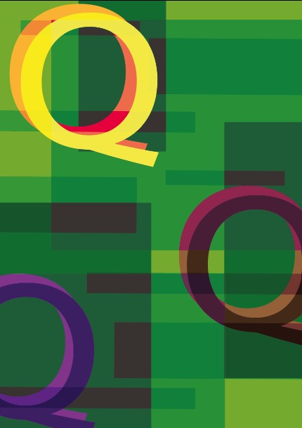
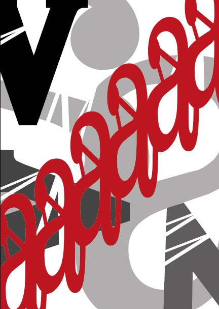
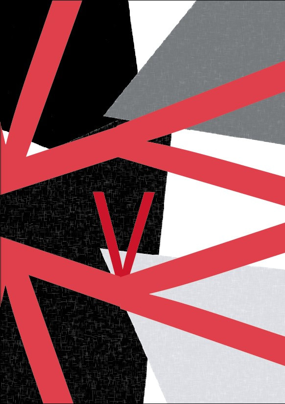
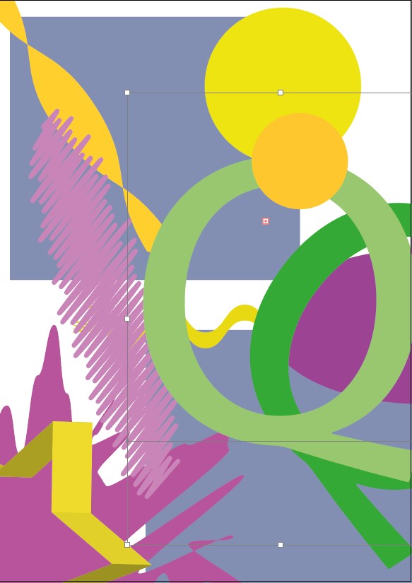
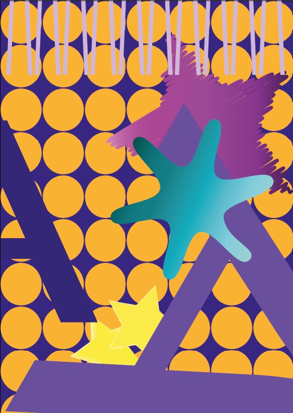
Playful
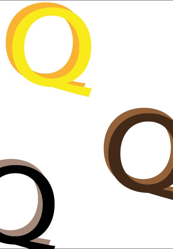
For this one I knew the colours would be bright and just overall all over lapping, I had a lot of fun with this one - the black Q seemed a bit unplayful to say so I switched it with a darker purple
For this one I knew the colours would be bright and just overall all over lapping, I had a lot of fun with this one - the black Q seemed a bit unplayful to say so I switched it with a darker purple
|

|

|

|
|
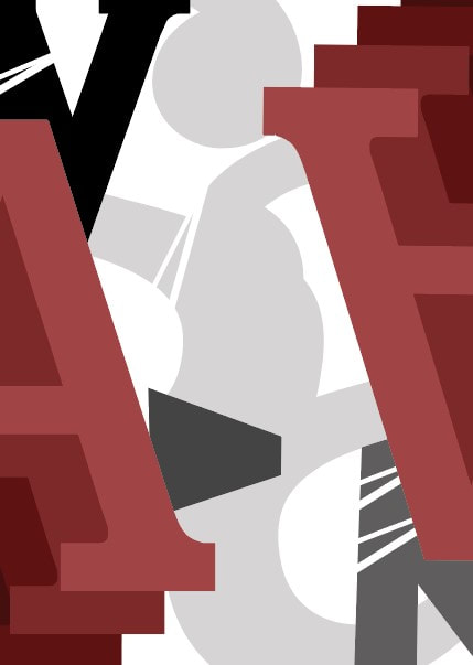
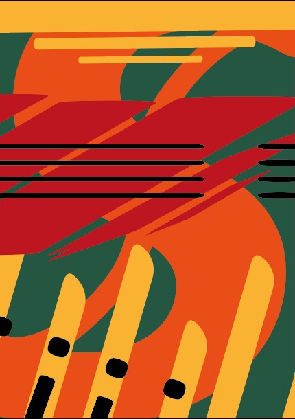
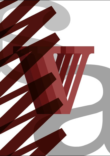
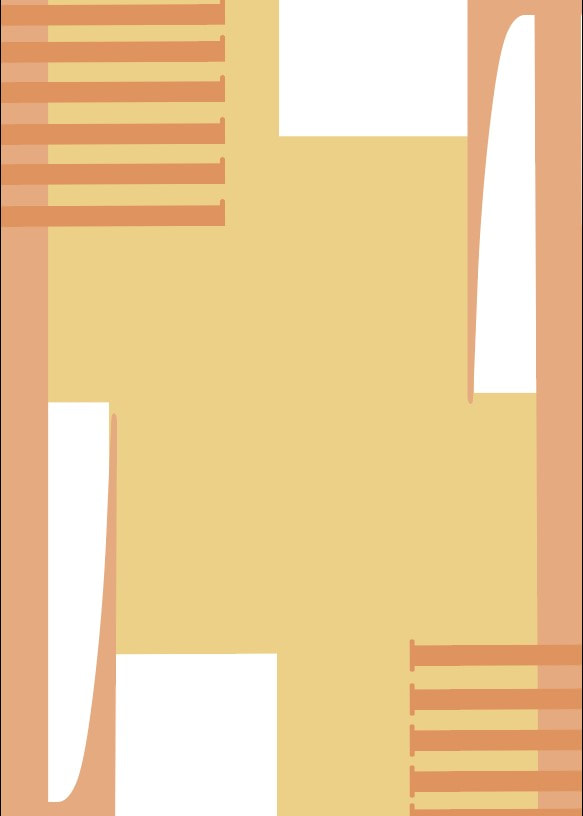
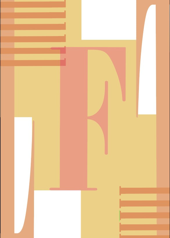
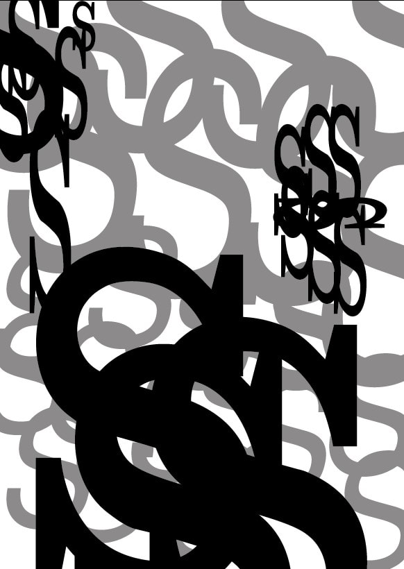
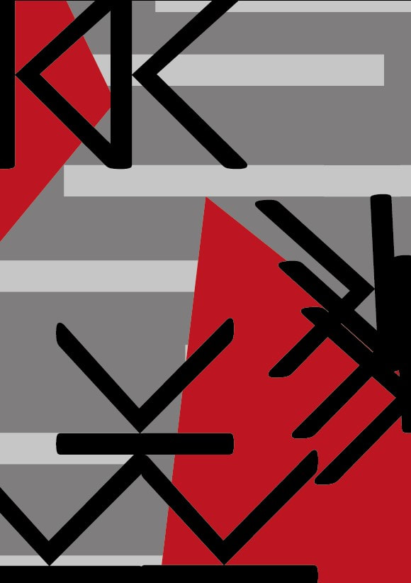
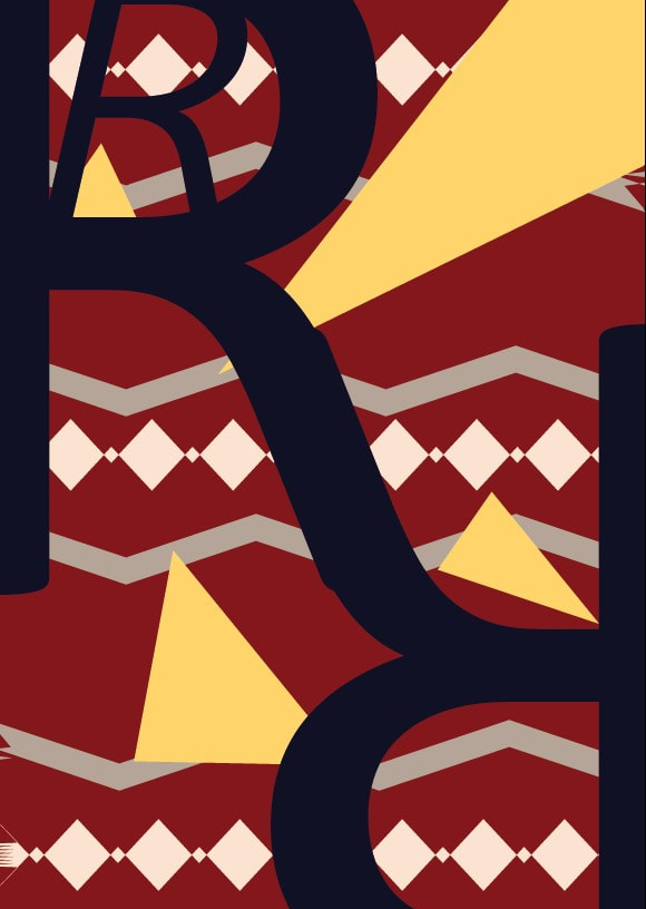
Power
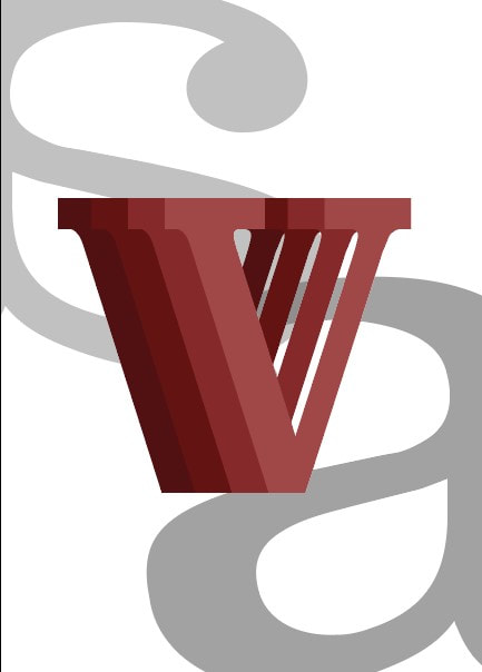
This one was a bit tricky, I thought to use greyscale with red being the primary focus
This one was a bit tricky, I thought to use greyscale with red being the primary focus

|
|
|
|
|
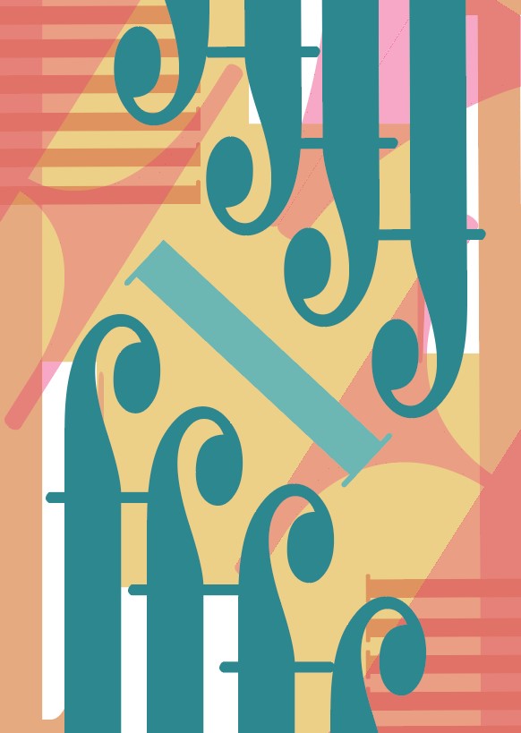
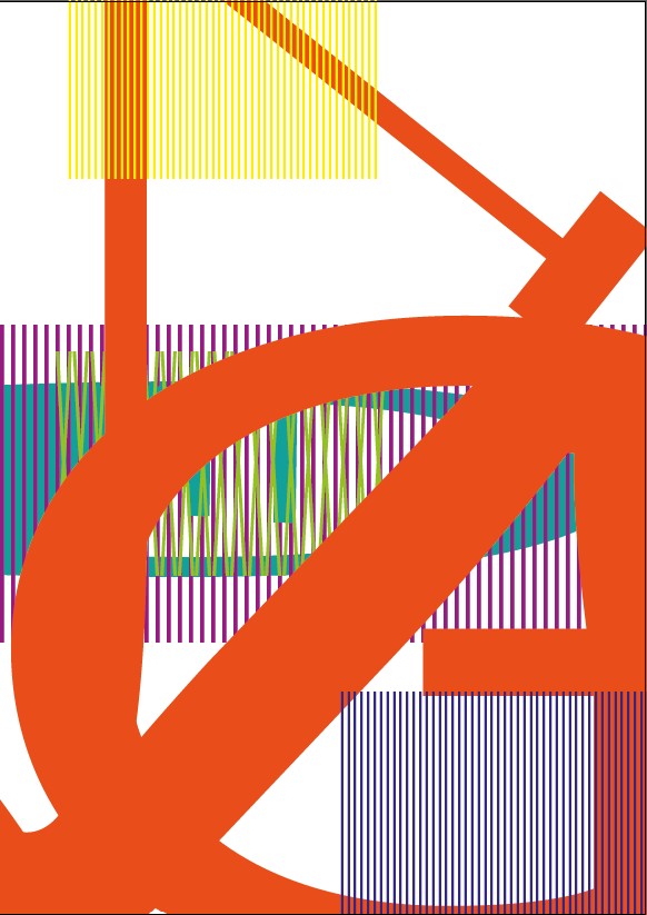
Pattern
With this one I felt the last design was too much so I chose a previous design to keep it more simple
With this one I felt the last design was too much so I chose a previous design to keep it more simple

|
|
|
|

|
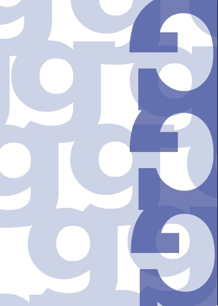
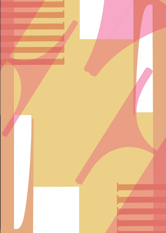
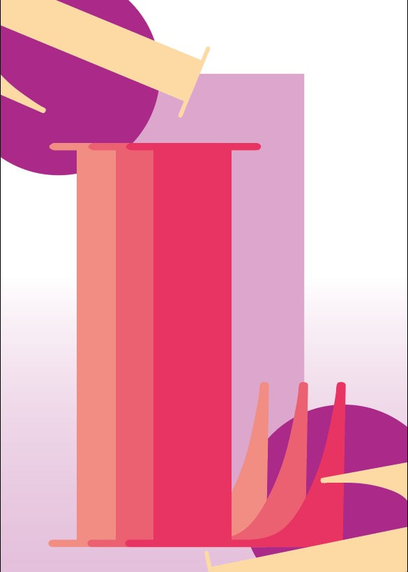
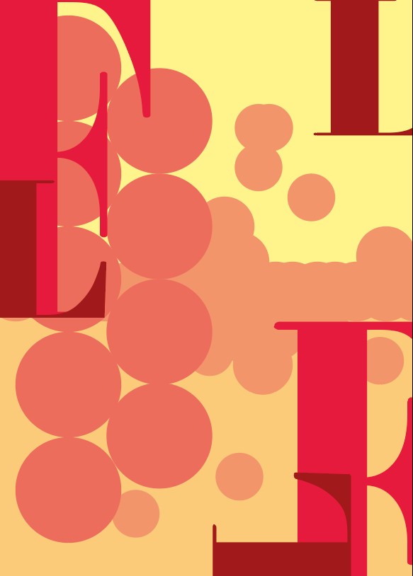
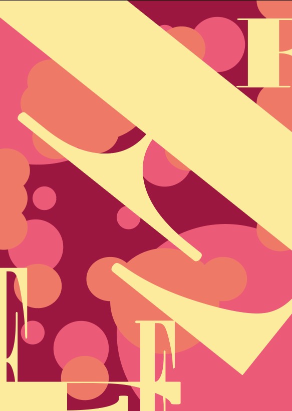
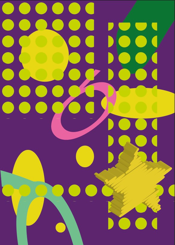
Feminine
I enjoyed working with the colours for this as the pastels just make the images brighten up, I thought about the design feeling like a magazine to stick with the feminine side while using blue to make the front stand out
I enjoyed working with the colours for this as the pastels just make the images brighten up, I thought about the design feeling like a magazine to stick with the feminine side while using blue to make the front stand out

|
|
|
|
|
|
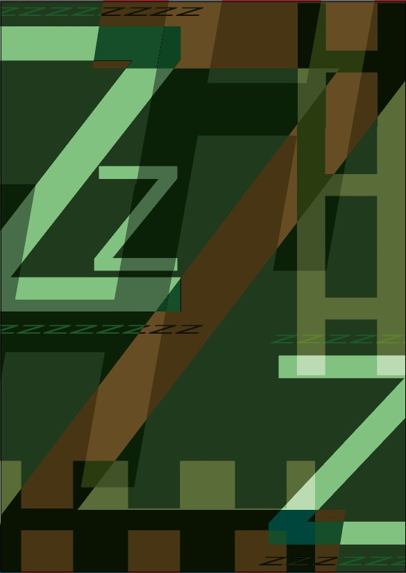
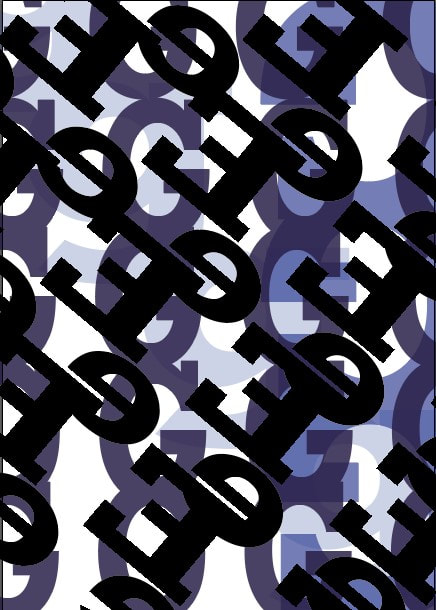
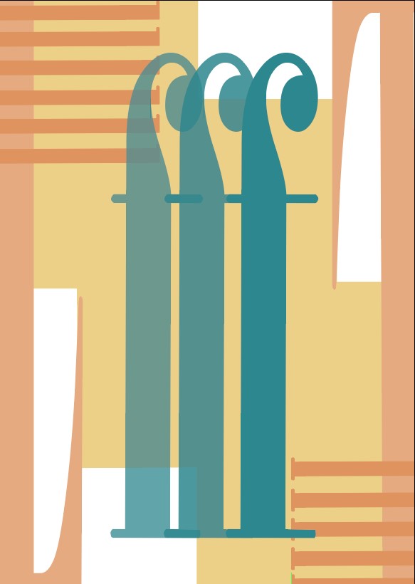
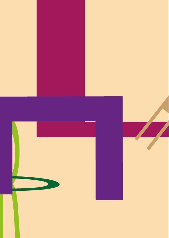
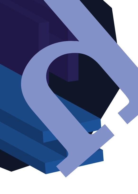
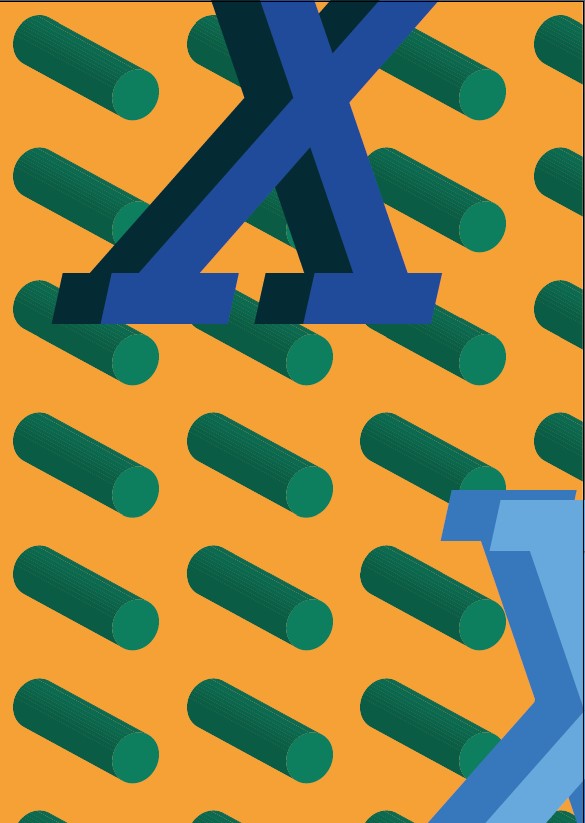
Masculine
I wasn't too sure on how to go with this one either, the colours that stuck to me where blue and greens si i experimented with a lot of overlapping
I wasn't too sure on how to go with this one either, the colours that stuck to me where blue and greens si i experimented with a lot of overlapping
|
|
|
|
|
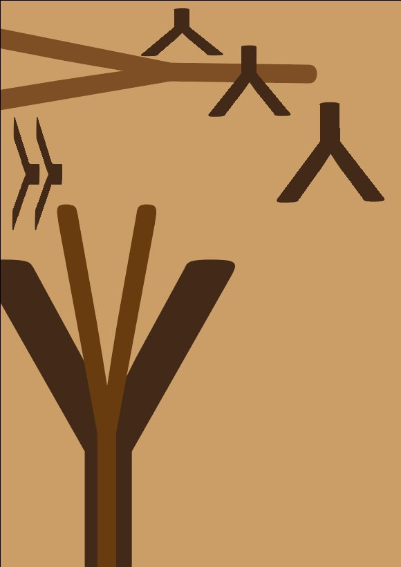
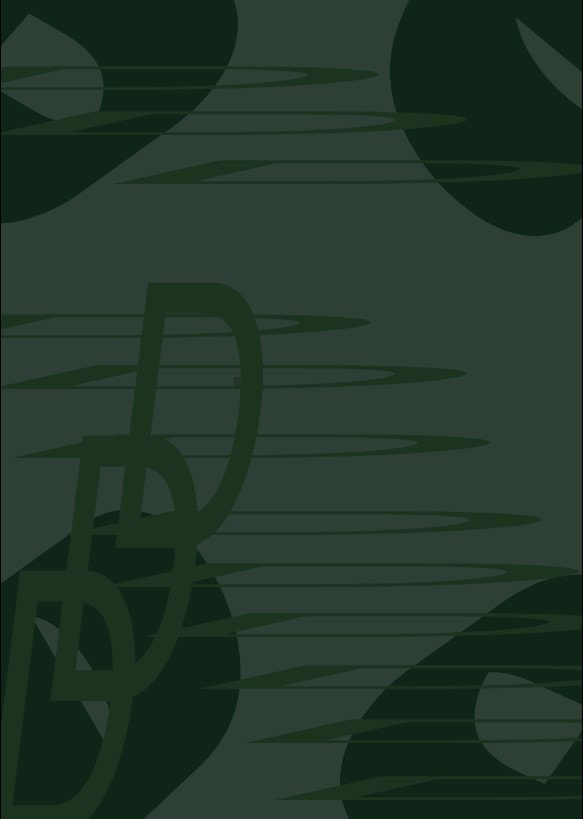
- Scale - Calibri
- Playful - Myriad Pro
- Power - Clarendon
- Pattern - Rockwell
- Feminine - Bodoni
- Masculine - Helvetica
Tests
Scale
Power
Feminine
|
Scale
Power
Feminine
|
Scale
Power
Feminine
|
Playful
Pattern
Masculine
|
Playful
Pattern
Masculine
|
Playful

Pattern
Masculine
|
I decided to try and test some ideas for each word as I was unsure what the brief fully wanted - this is why I ended up making some shapes which I realised we where only to use typeface later on but this still helped me figure out the colour theme and layout.
Overall I had a lot of fun just experimenting and coming up with my own ideas for each word especially as it was all done on adobe illustrator making it easier to move things around and change the colour. I have also learnt that the type of font can also convey a message of what the words associate with.