|
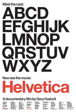
Helvetica was created in 1957 ,Switzerland created by Max Alfons Miedinger. The font was named after the Latin word for 'Switzerland' in 1960. The original name for Helvetica was Neue Haas Grotesk and was a sans serif font that had a linear, simple and elegant design, he didn't want frills and was aiming for it to be extremely legible
|
Movie Notes
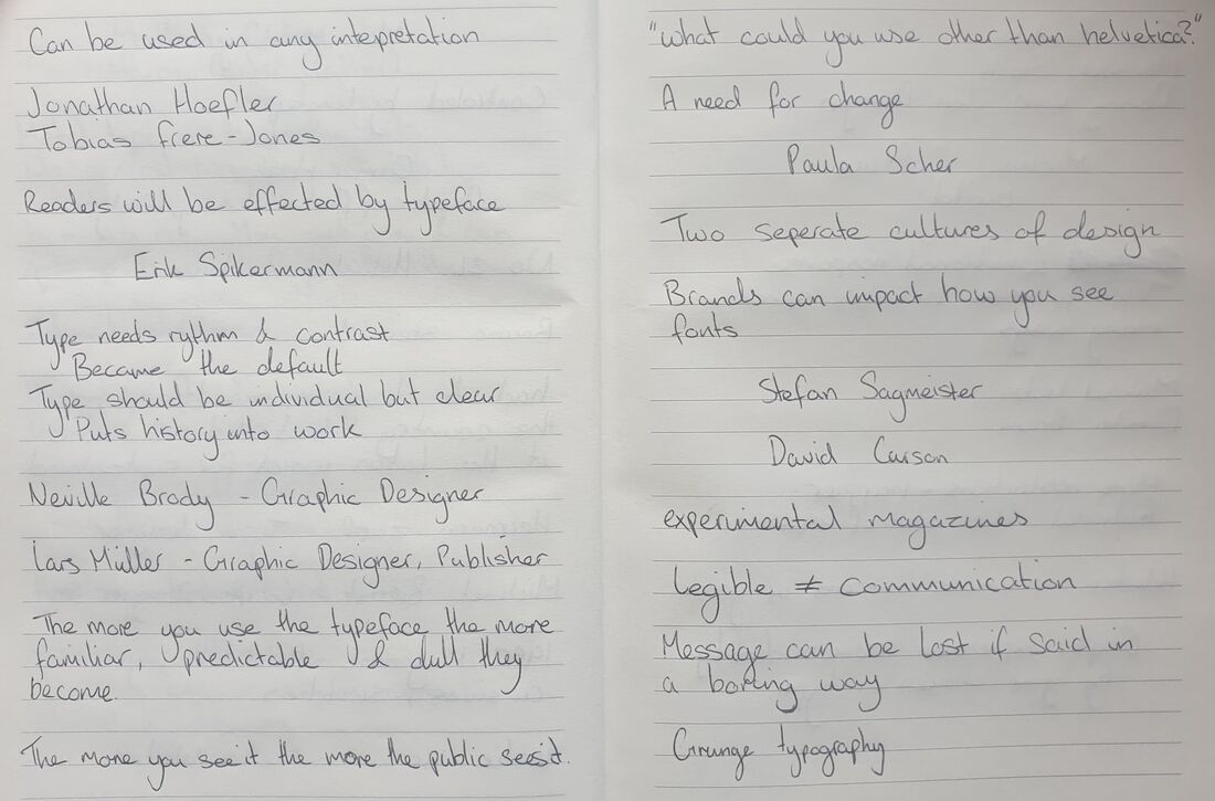
As I was watching the film I took notes on what I had found useful, there was definitely some parts I didn't think really contributed to the film and just found that it was just dragging it along. As I was watching I was expecting everyone to basically have the same type of views and just 'like' the font but everyone had something different to say especially on why they did like it.
My personal opinion on the typeface isn't really like or hate, I feel I would definitely use it if in the correct circumstance but not if it doesn't fit the overall mood. I do however prefer a serif font and this could be why sans serif comes off a bit 'boring' to me, I would just rather have something be slightly detailed in it's own way as most type faces that include a sans serif just visually appeal to me and show more of a story behind them than a serif typeface does.
My personal opinion on the typeface isn't really like or hate, I feel I would definitely use it if in the correct circumstance but not if it doesn't fit the overall mood. I do however prefer a serif font and this could be why sans serif comes off a bit 'boring' to me, I would just rather have something be slightly detailed in it's own way as most type faces that include a sans serif just visually appeal to me and show more of a story behind them than a serif typeface does.