Research
To start off I chose Peter Pan as have already seem the animated Disney film as well as it being a fairy-tale (which is why I primarily chose it) and most Disney fairy tales originates from Brothers Grimm folklore's which takes a more twisted path than what Disney shows. I have also seen the Peter Pan movie but I have not seen the play, due to this, I tried my best to find as much information as plays change depending on scripts so I relied on theories of Peter Pan and how I could make it seem more magical.
|
Following these links there are multiple reasons that show off the true Peter Pan and how he isn't all that nice... (and it is said Peter Pan is audience towards adult's and not children). |
I found this video where Jen Campbell analyse' a lot of fairy tales so naturally I decided to take a look at what she had to say about Peter Pan as I worked on my thumbnail visuals as this helped me get into the project rather than trying to come up with ideas in silence.
|
|
|
|
I did also watch through the recommended videos as well as to use the links more productively than to skip past the help provided.
Thumbnails
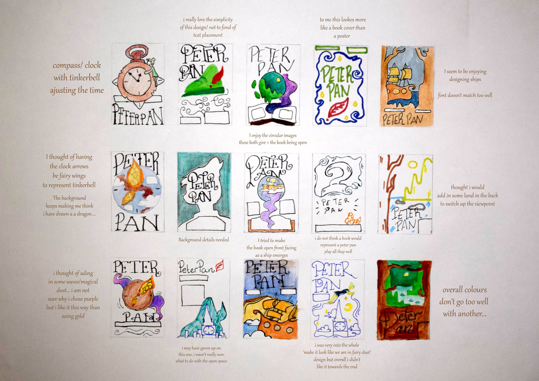
For my thumbnails it was pretty hard to try and come up with 40 different ideas without it coming off too repetitive for some but I am glad I managed to get them all filled as some of my later designs caught my attention. I used a range of materials from watercolour (including pencils and metallic), gouache, fine liner, felt pens / markers and coloured pencils.
As I was informed on my feedback that my visuals showed more white than colour I went back and did quick watercolour swashes to them and I can see the difference it really creates
As I was informed on my feedback that my visuals showed more white than colour I went back and did quick watercolour swashes to them and I can see the difference it really creates
Development
For my development I chose 3 designs that truly caught my attention most, I then moved onto different development ideas to them with 3 designs for each. This overall did make it harder to choose from but I am still happy with all the ideas I could come up with. On the first image I added in some text on what I thought for each piece and what it was. I also enjoyed trying to figure out the typography for the title as I liked the fancier fonts a bit more as to keep the theme of the book to be targeted at adults.
I made the same mistake with my development so choosing carefully what colours suited I also had to make sure to somehow avoid the Ink titles smudging from the water
I made the same mistake with my development so choosing carefully what colours suited I also had to make sure to somehow avoid the Ink titles smudging from the water
Three Client Visuals
As I couldn't scan A3 paper I did my best to photograph it well and adjust the colours on photoshop to make it appear more bright and vibrant. For the final designs I didn't think I would manage to paint the gouache paints over the text as It did manage to smudge a little but the Pencil colours managed to work well - the boxes are to show where I would add in the information such as dates and locations.
Materials:
Thought process:
Materials:
- Gouache + fountain pen (text + swirls).
- Water colour + water colour pencil + fountain pen (text).
- Pencil colours.
Thought process:
- I wanted a simple design to start off with but also make it obvious It was about peter pan so I took the hat idea and changed a bit of the layout, the lined area below is where venue and dates would be going into.
- My second design was more of a storybook poster where the book opened as captain hook's ship appears out. I wasn't sure on how to make the title and venue box fit well but I am happy with this design.
- This one may perhaps be my favourite out of all. I decided to make the clock arrows into fairy wings to represent Tinkerbelle but when I remembered the character 'Tiger Lily' I decided to look up some of the flowers and add them in the centre of the clock as magical waves go around from one side of the text to another with the venue/date box just below.
Overall I have learned from this project to quickly just draw out any ideas I may have and not to focus too much on doing each thumbnail in detail before I choose a final design option as this allows me and any other client to see what I thought of and if the design is chosen then I can later on work in more focus towards them. This is definitely a quicker and productive use of time than trying to write down my ideas as sometimes I tend to forget what the ideas looked like if i have left it for too long.
Site powered by Weebly. Managed by 34SP.com


