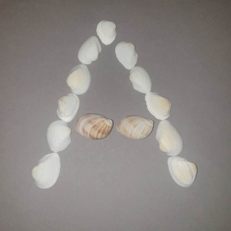
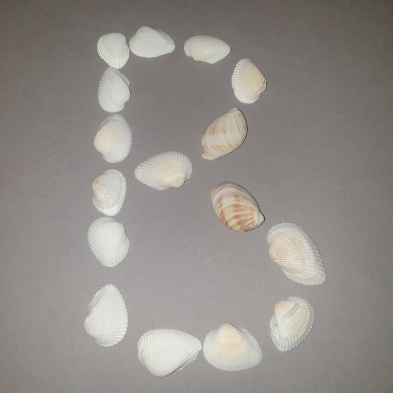
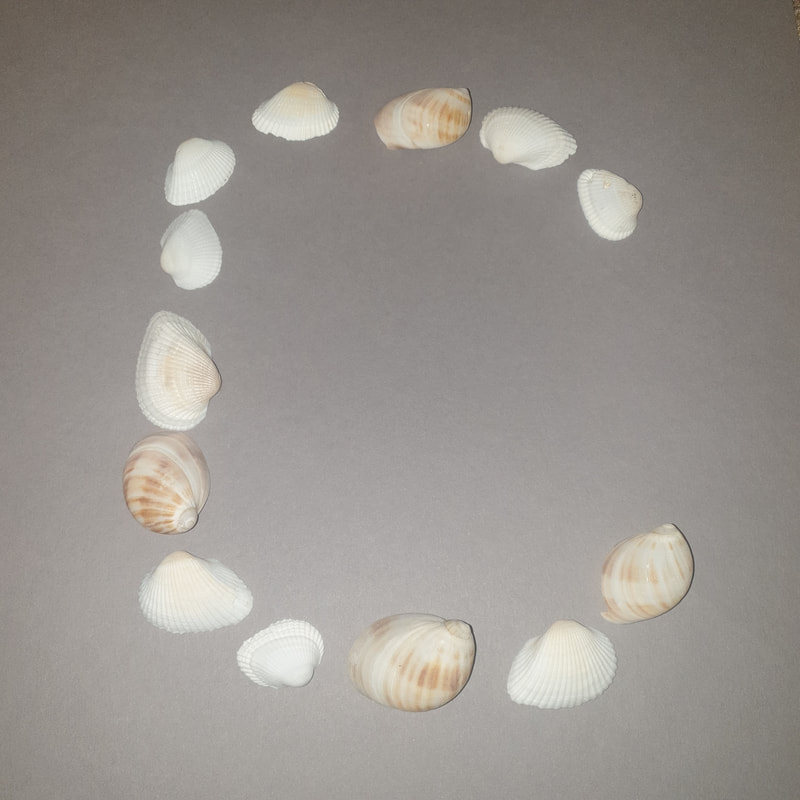
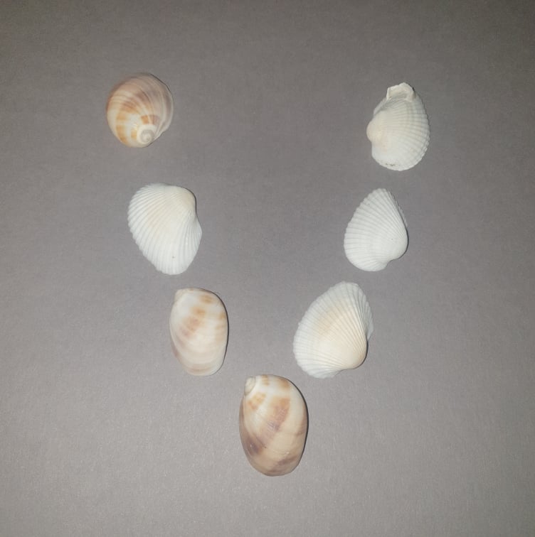
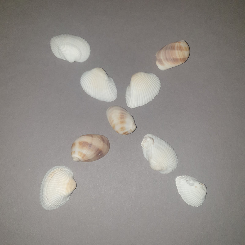
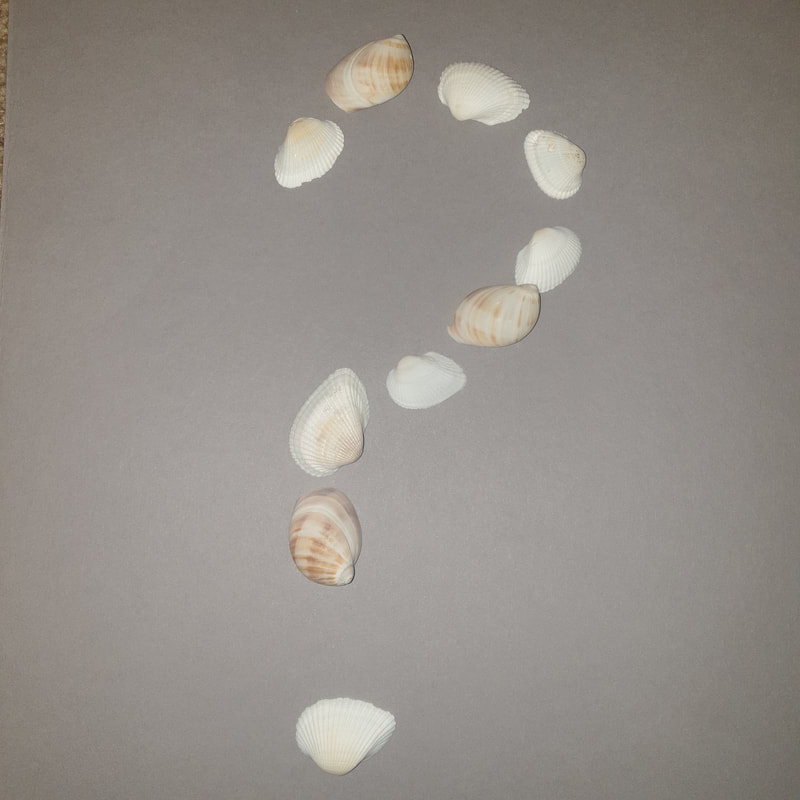
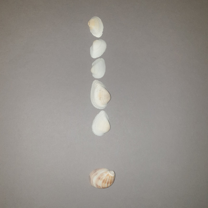
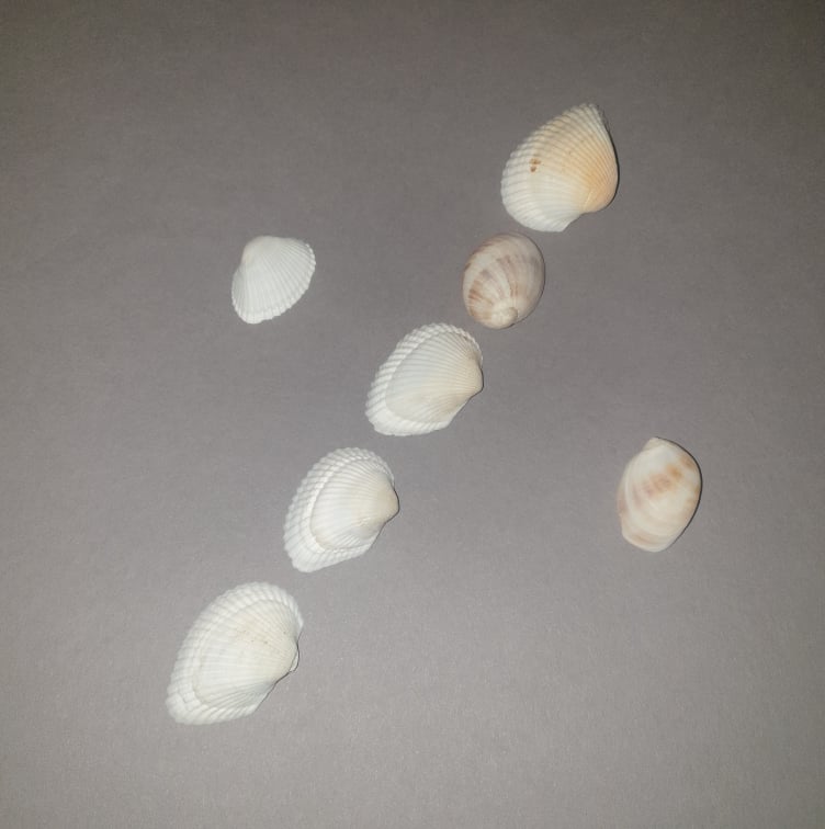
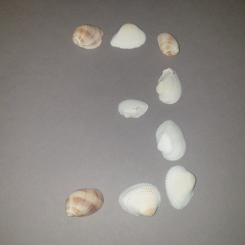
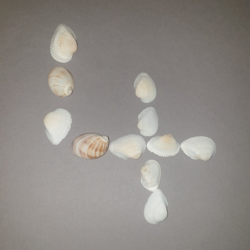
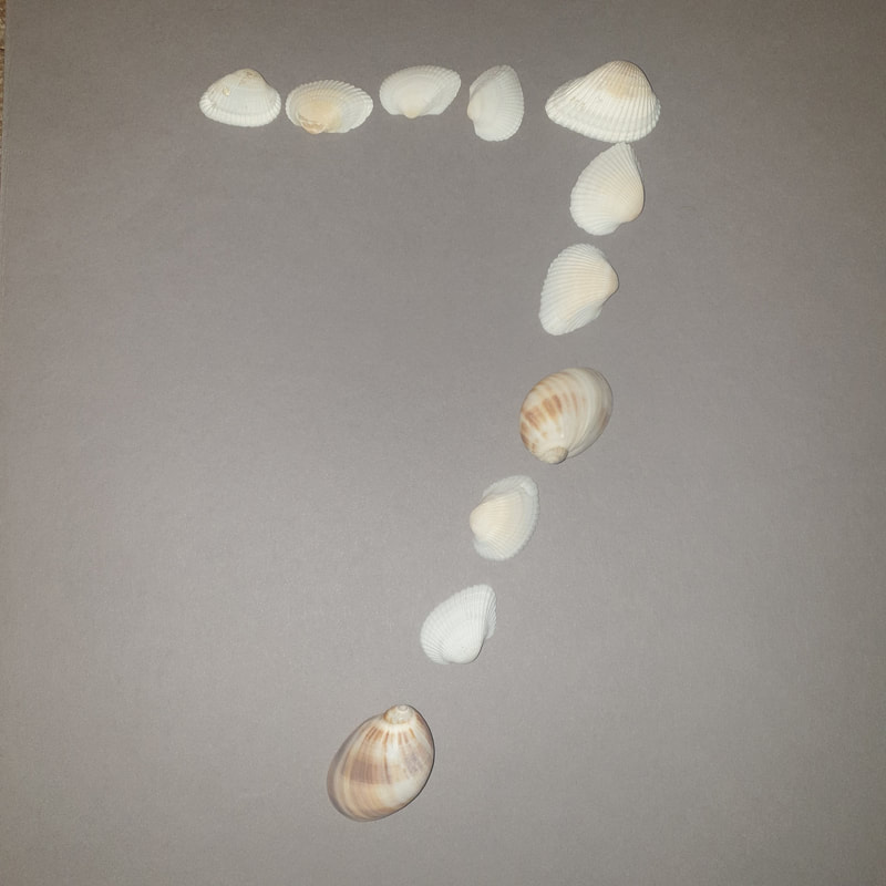
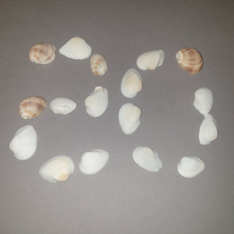
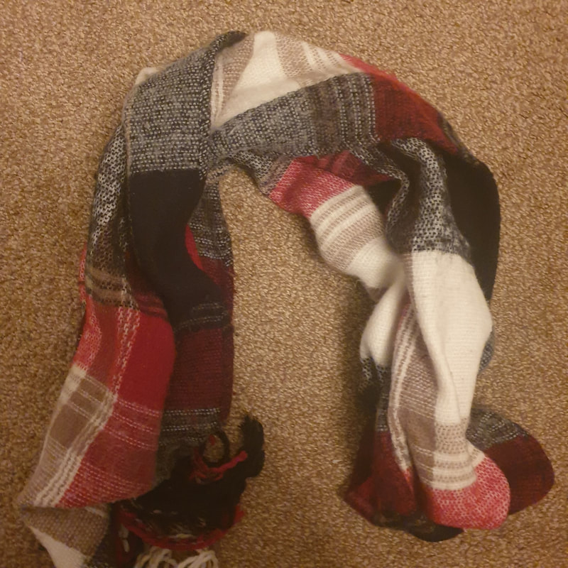
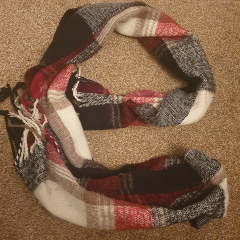
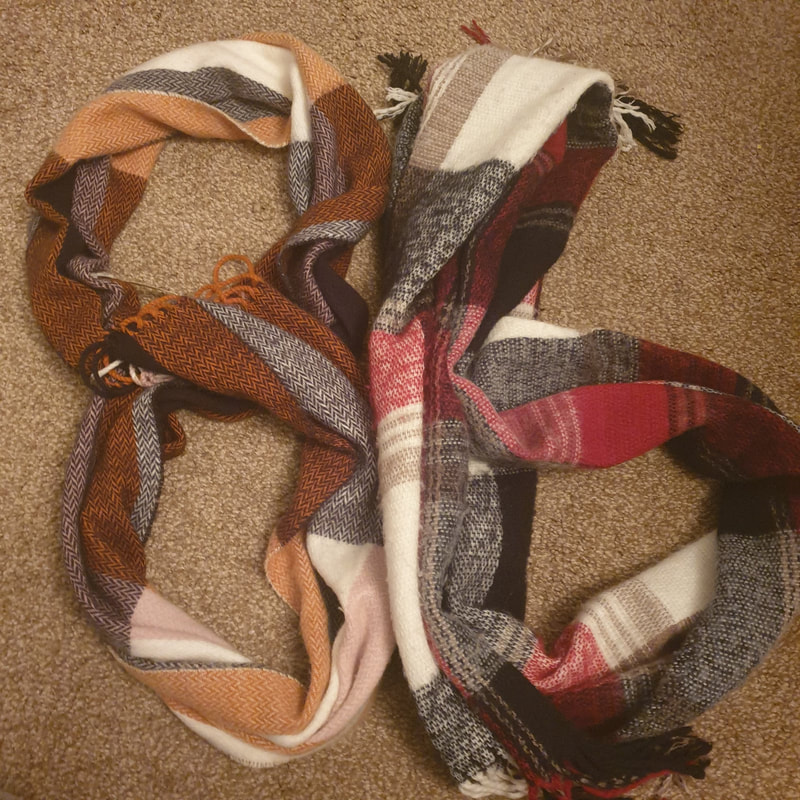
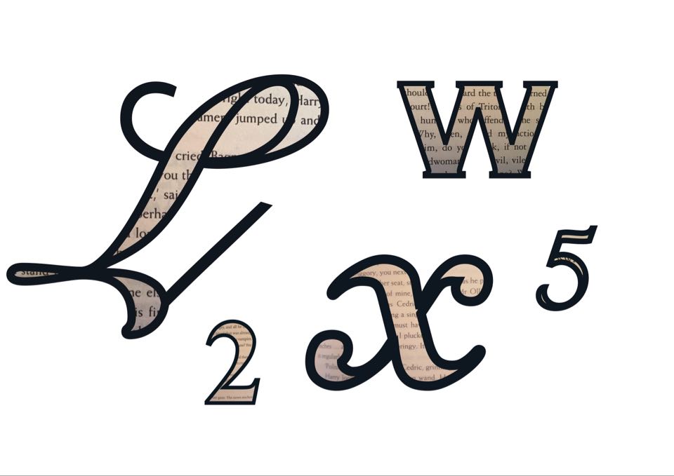
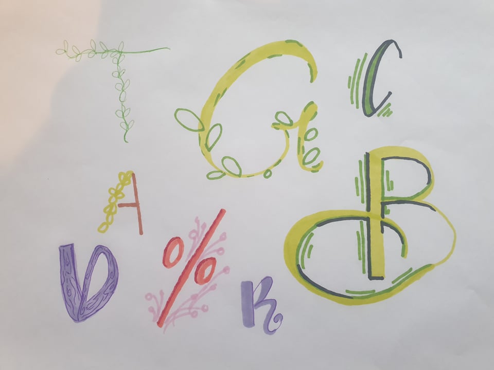
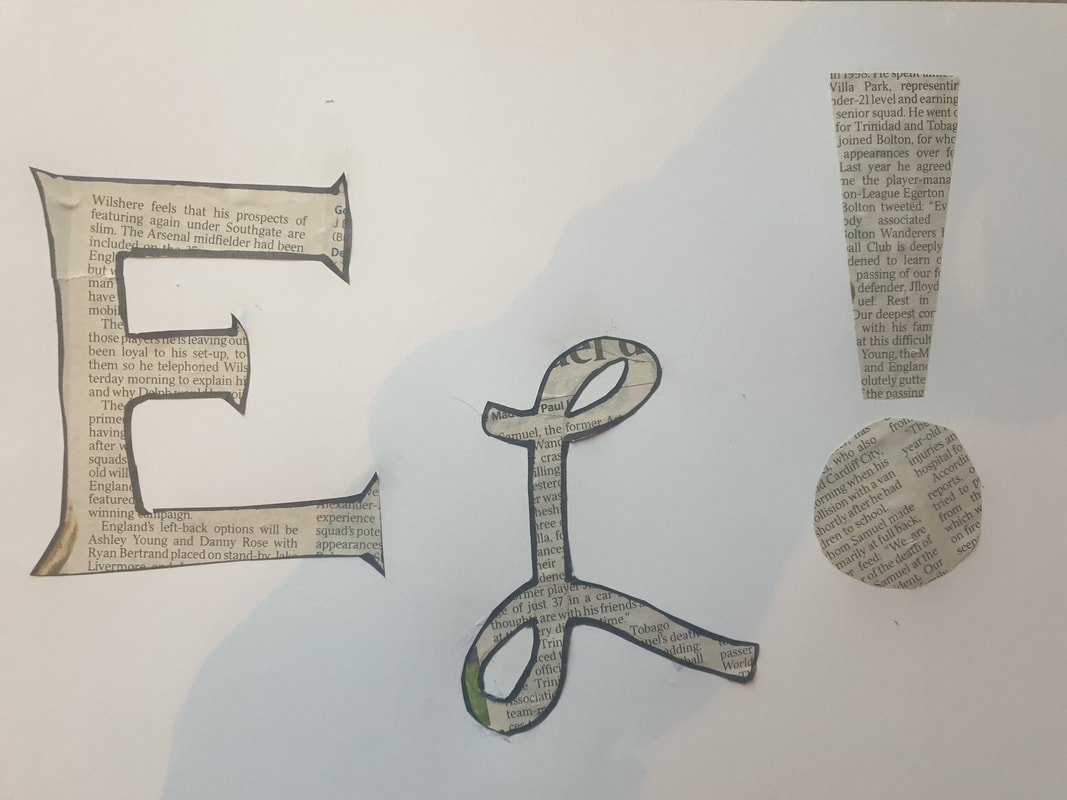
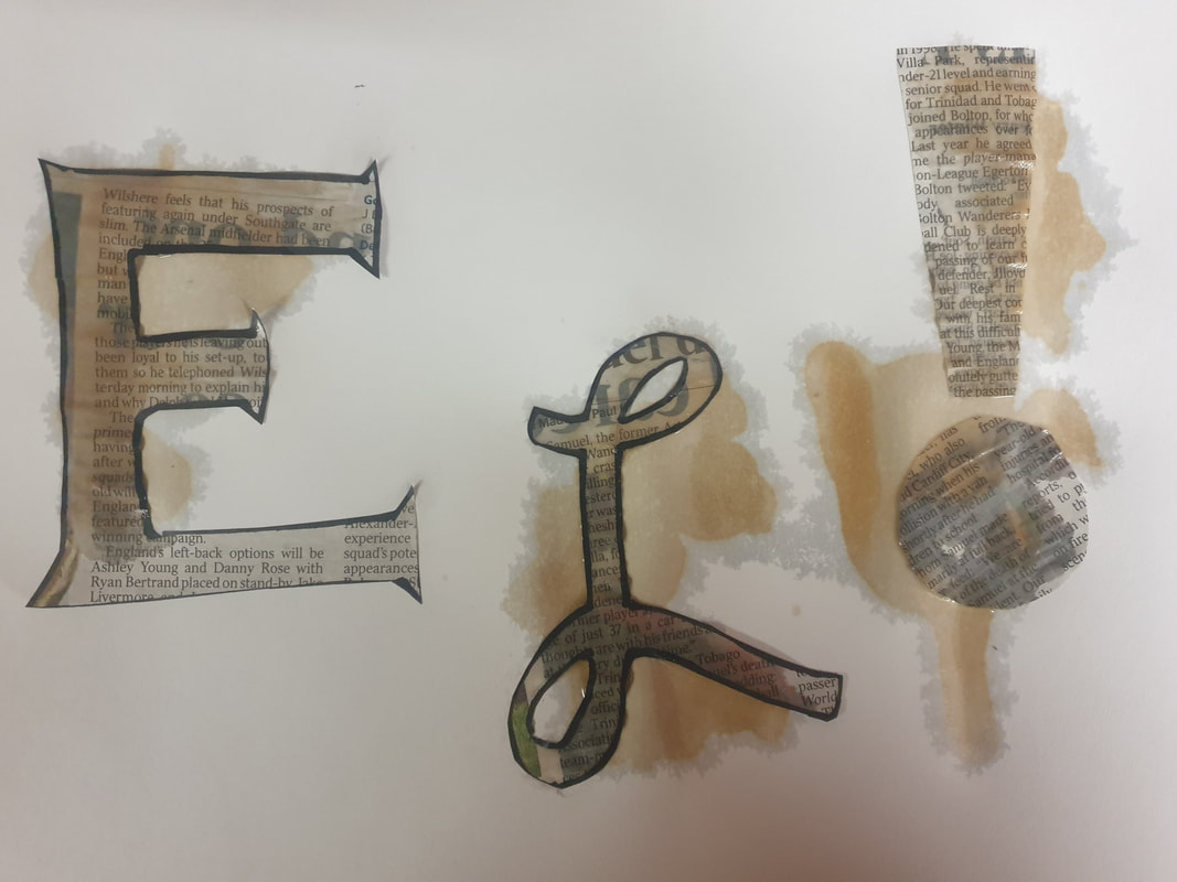
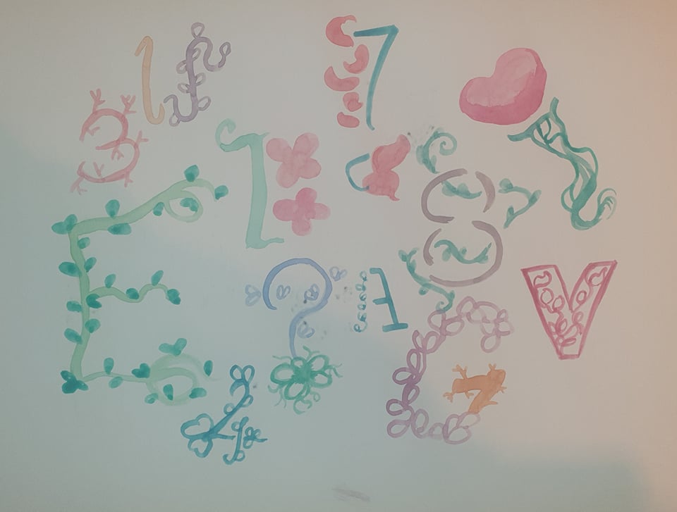
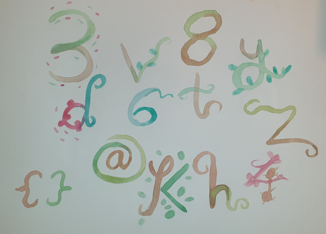
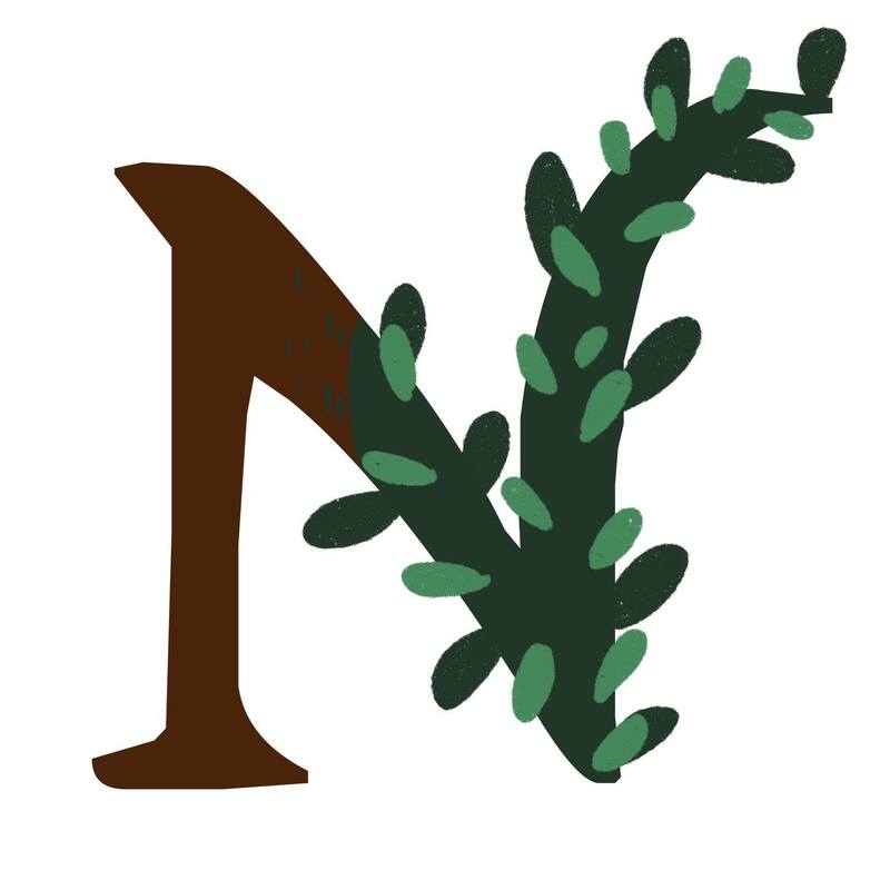
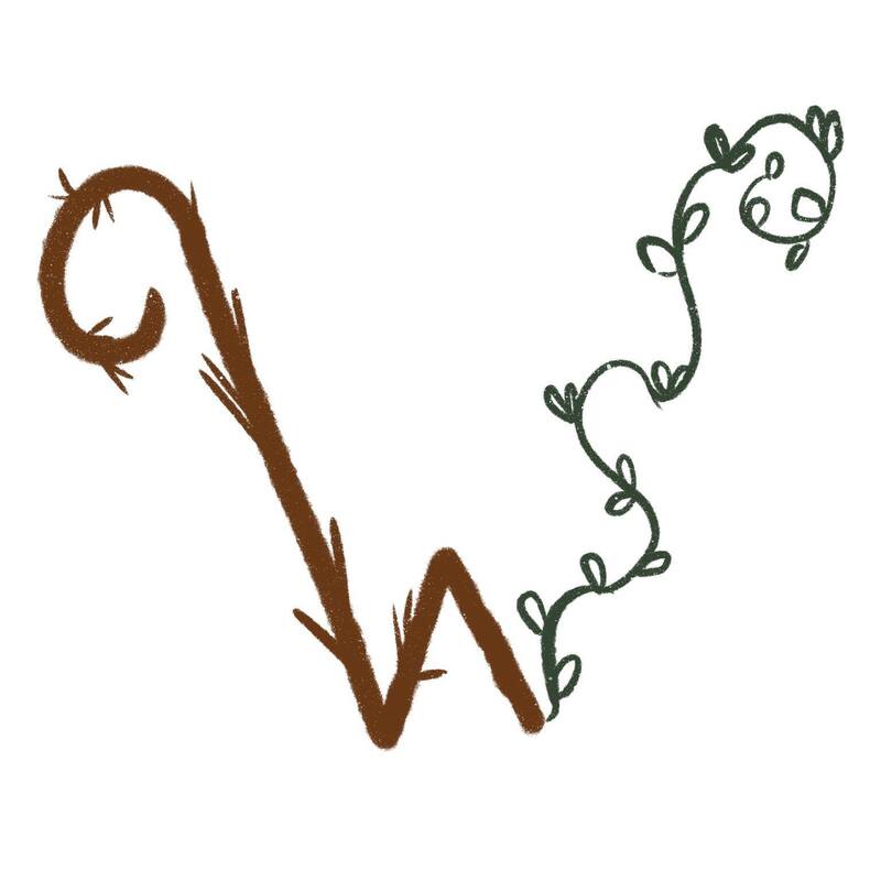
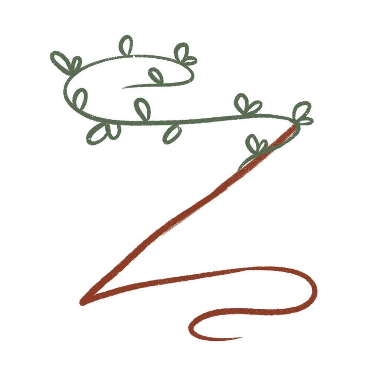
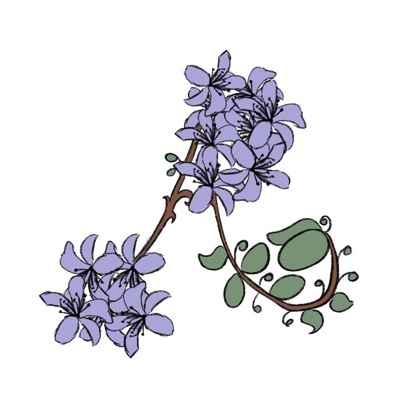
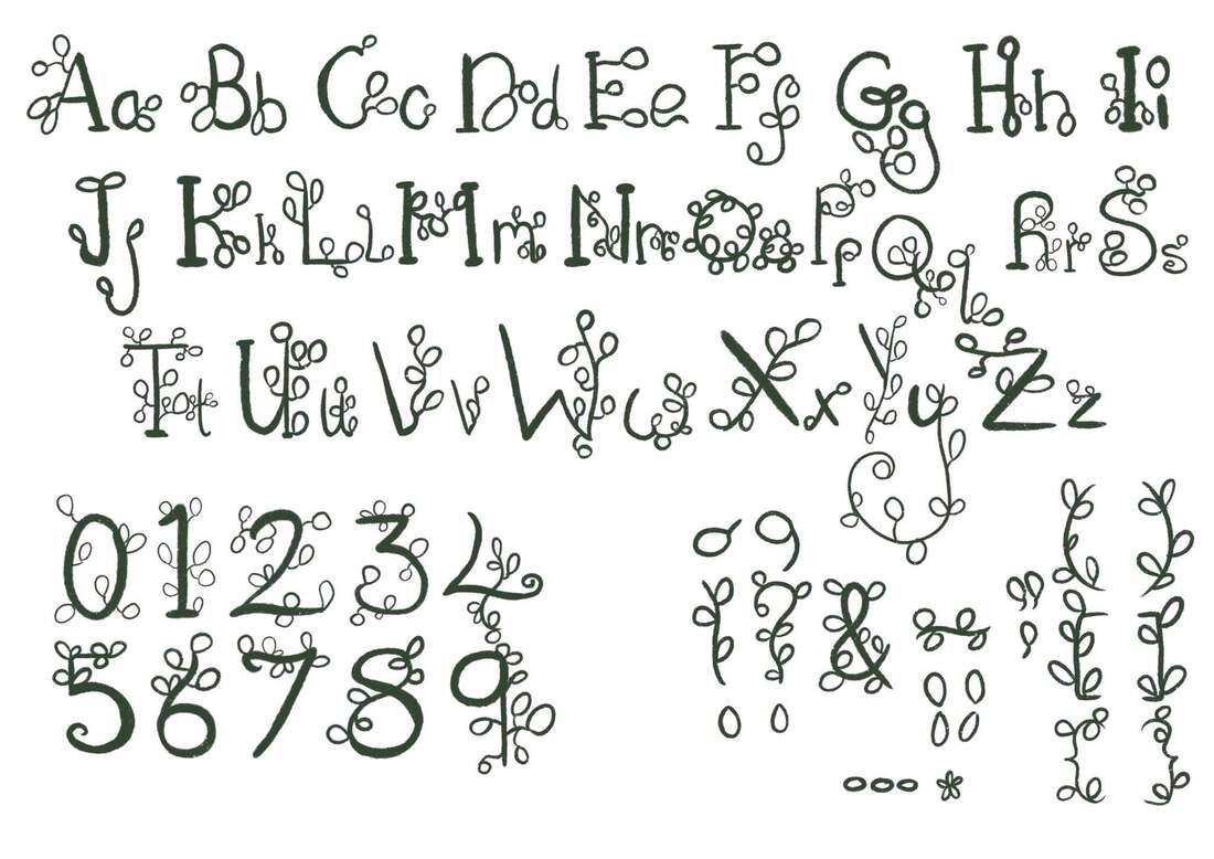
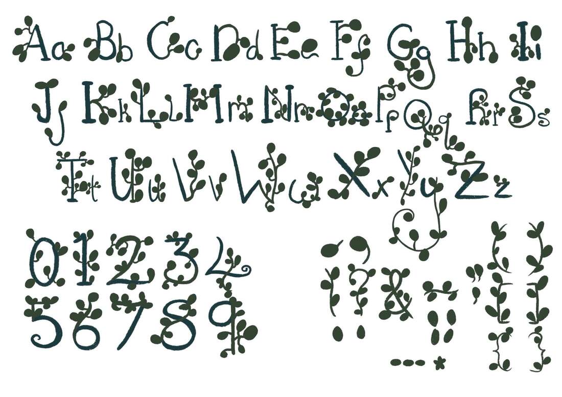
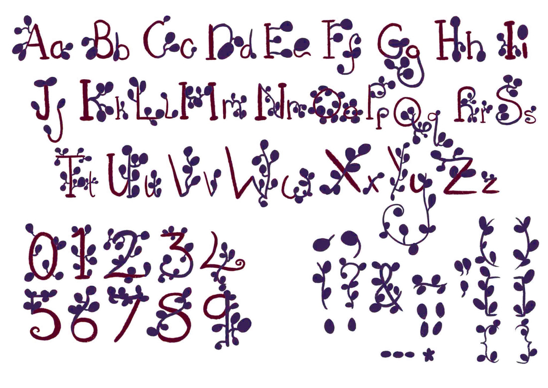
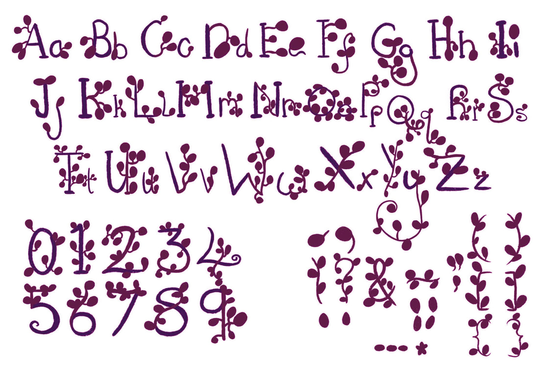
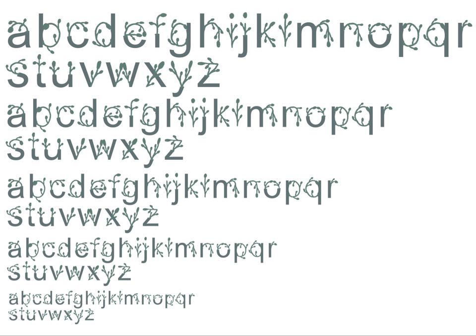
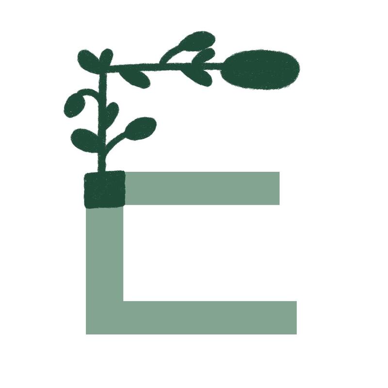
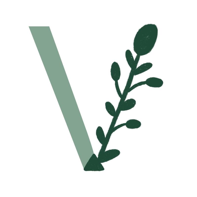
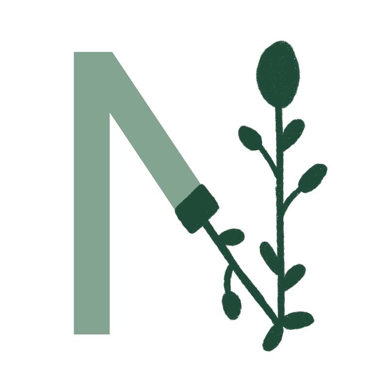
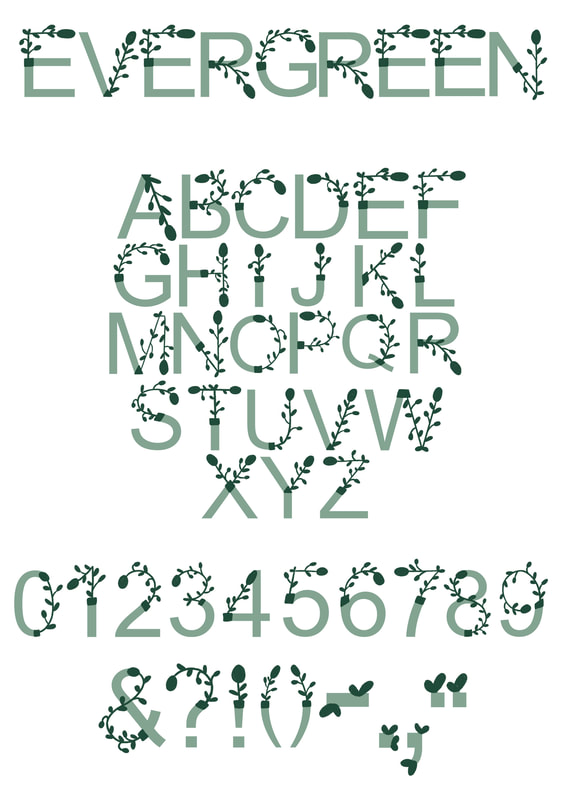
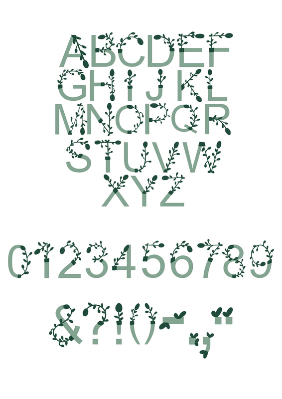
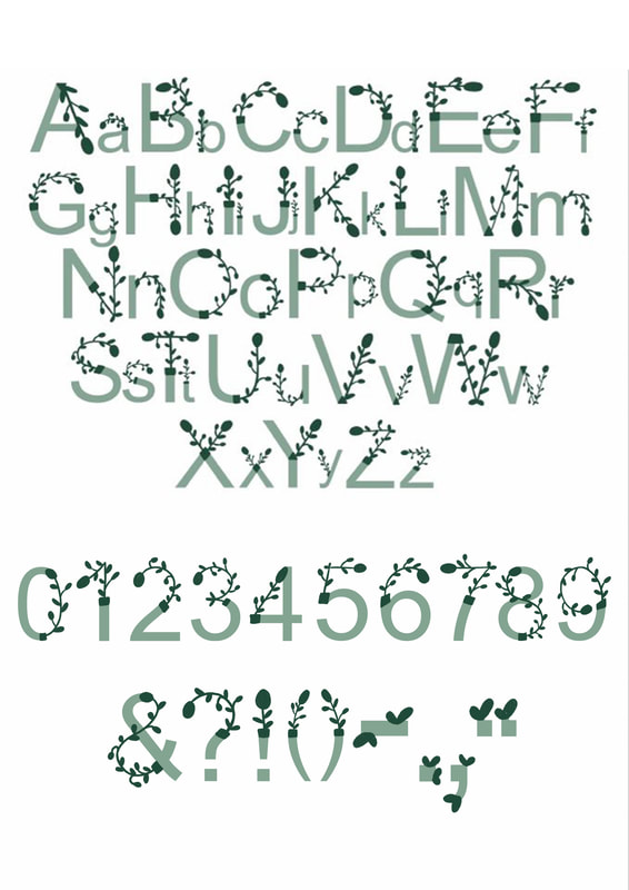
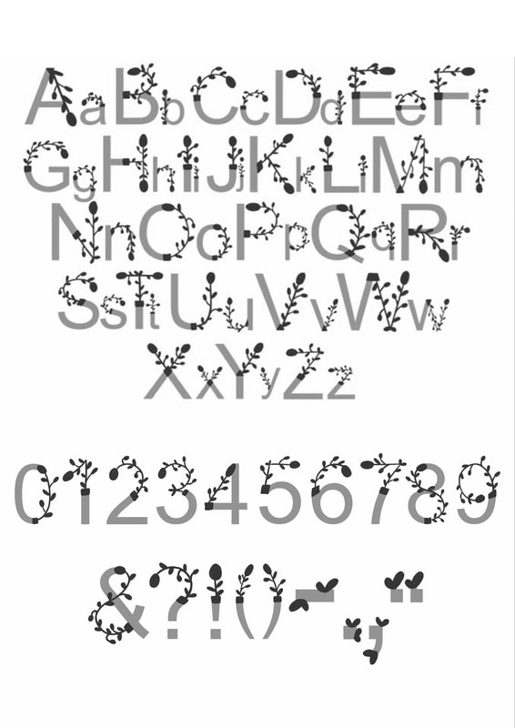
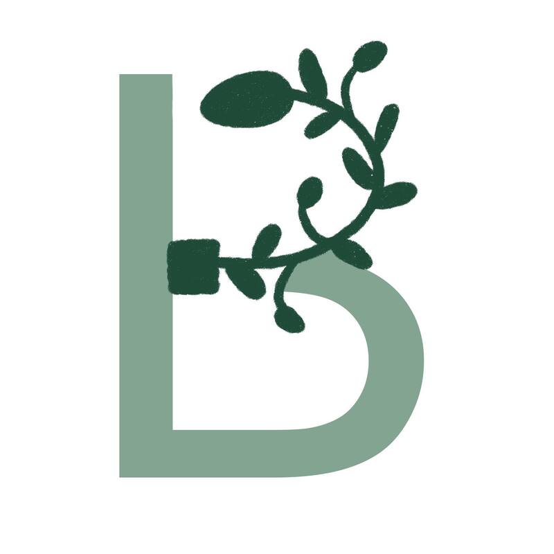
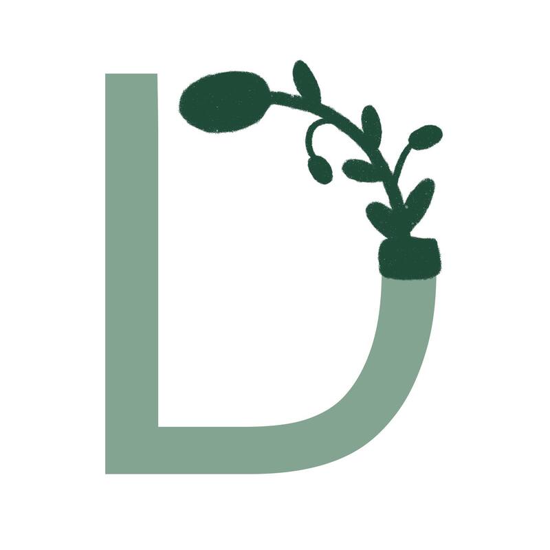
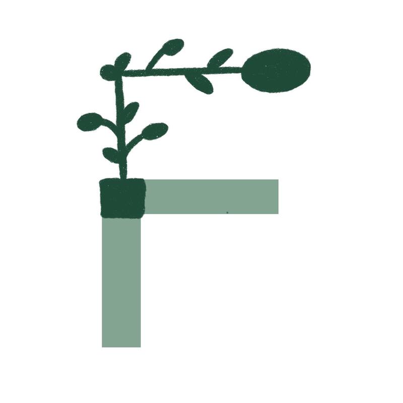
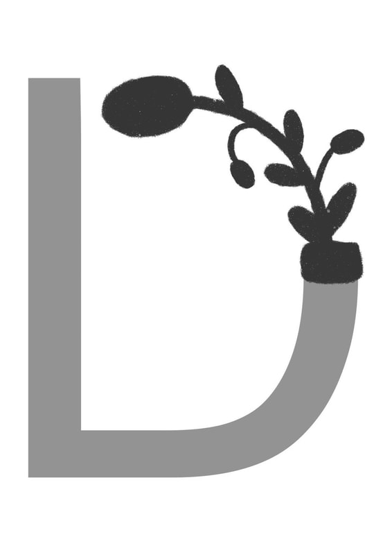
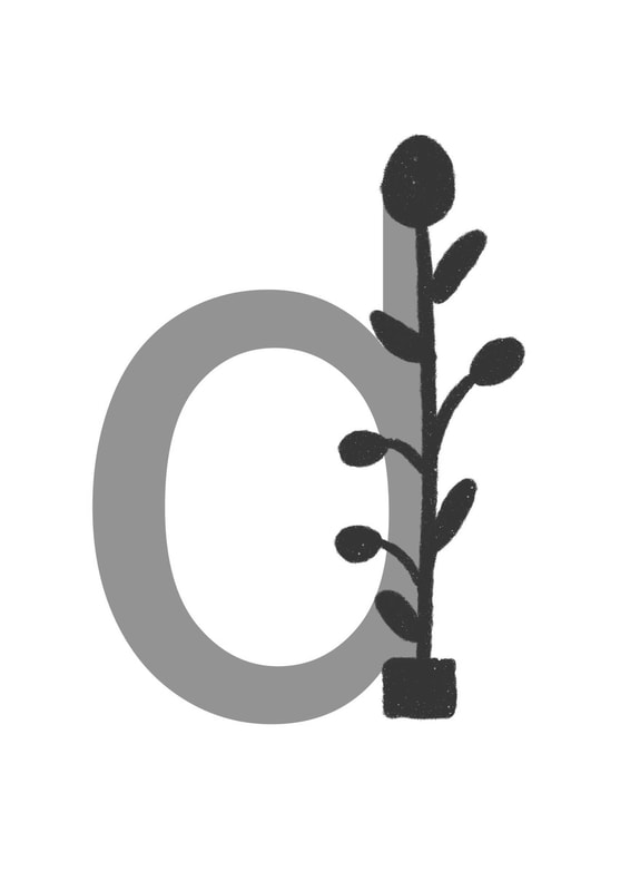
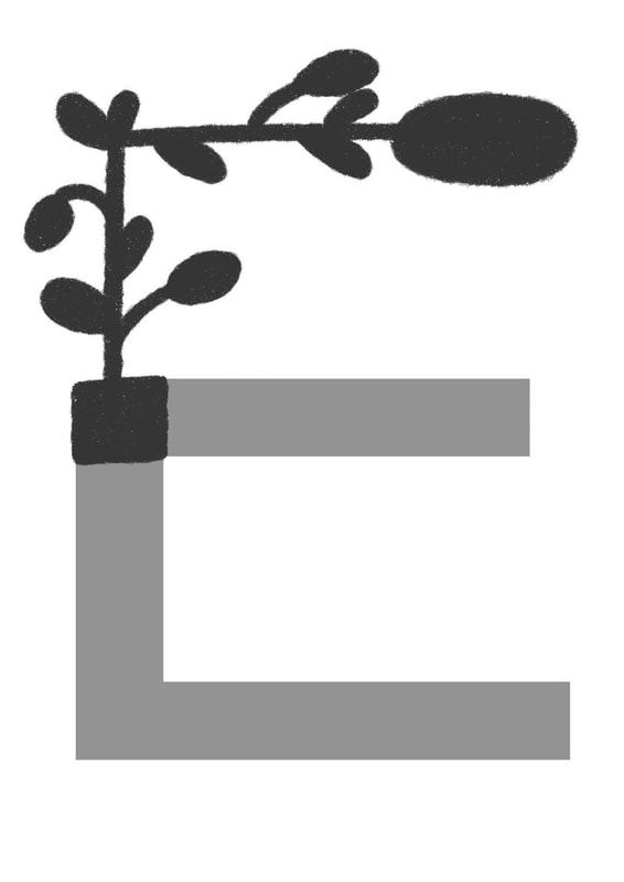
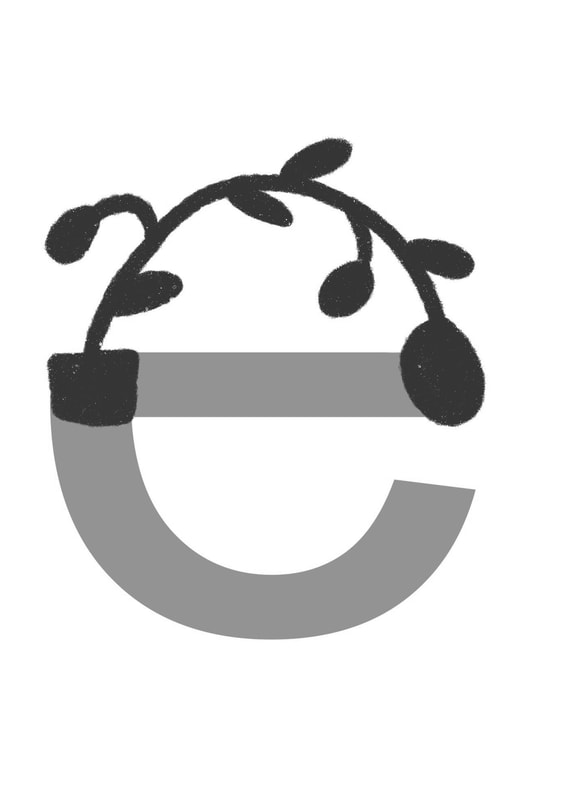
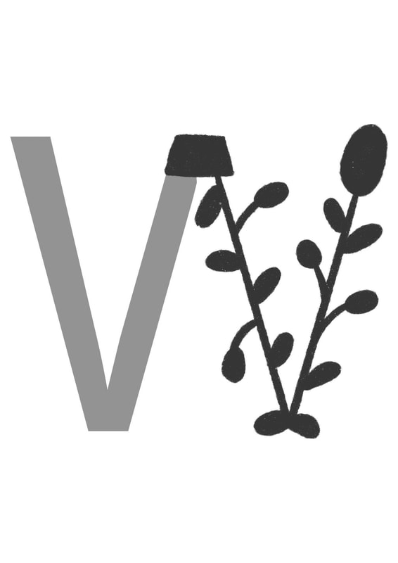
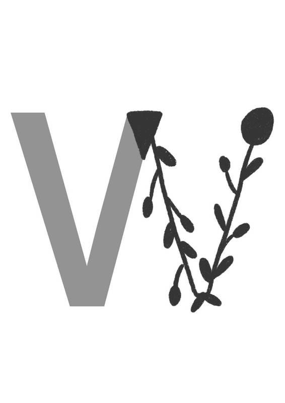
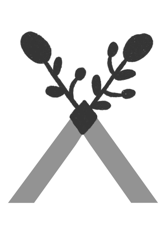
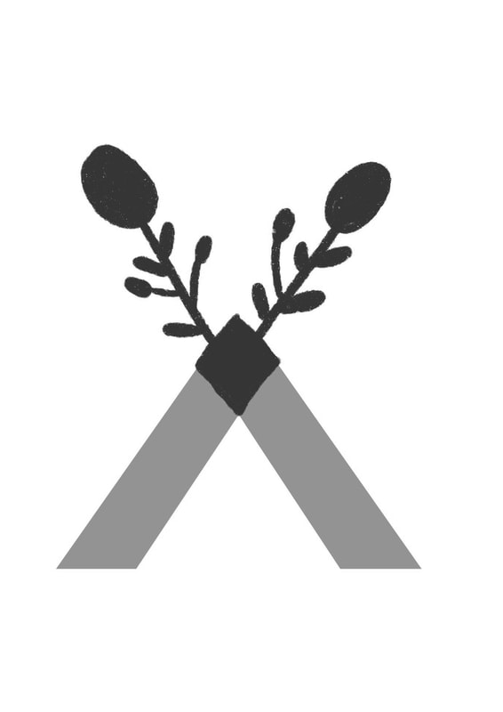
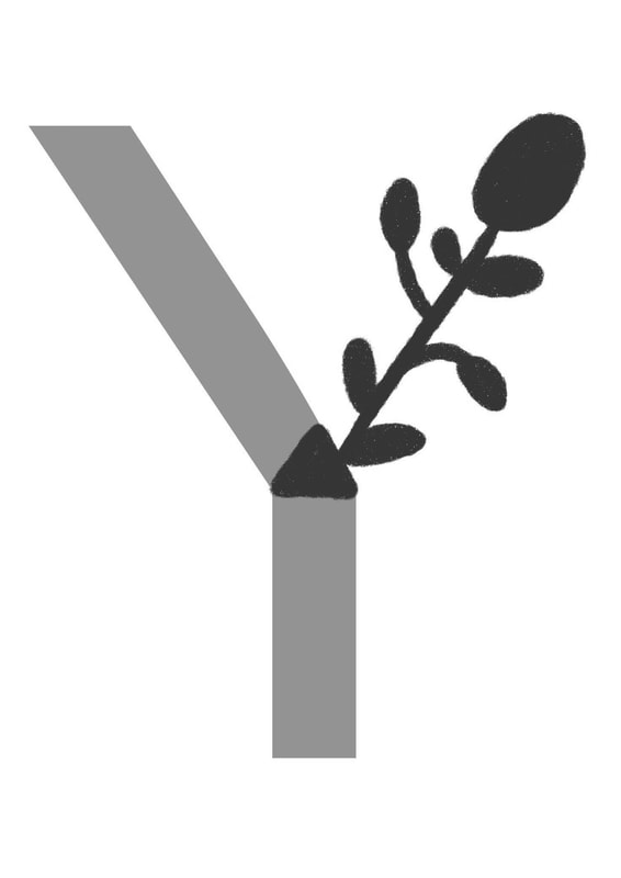
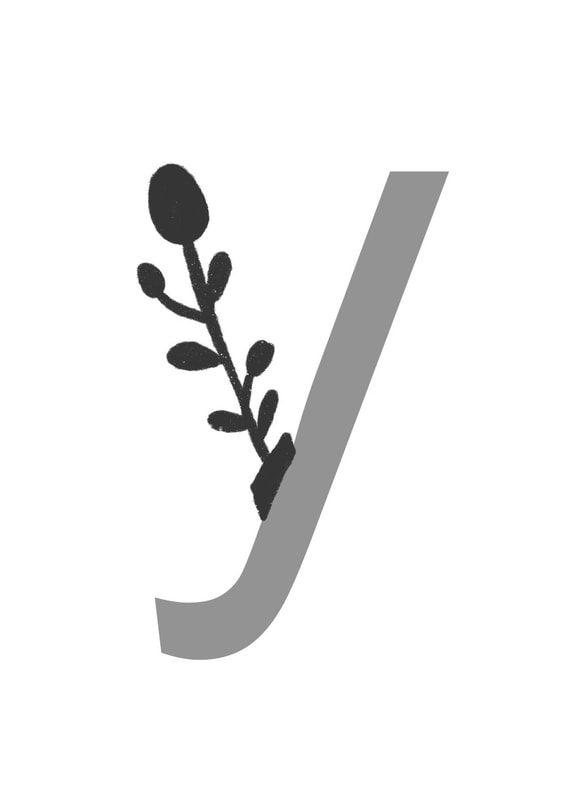
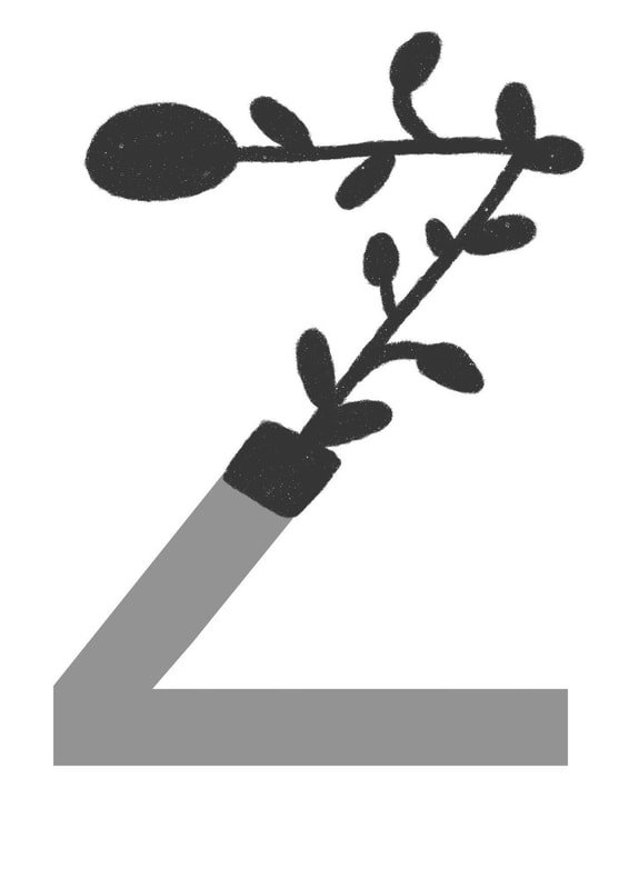
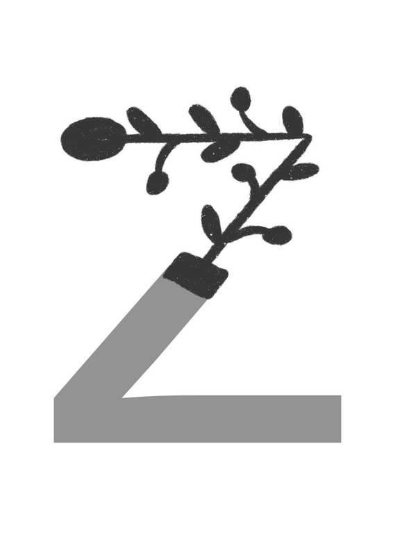
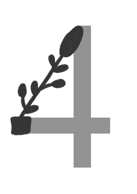
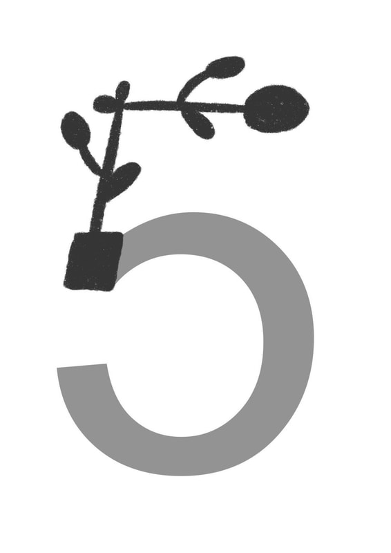
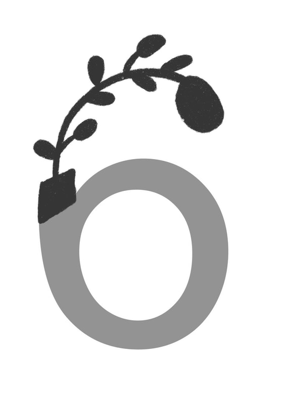
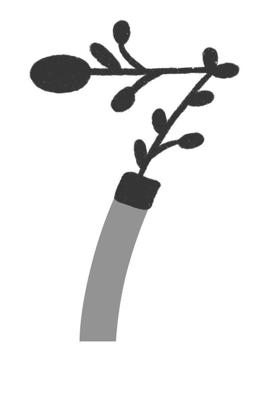
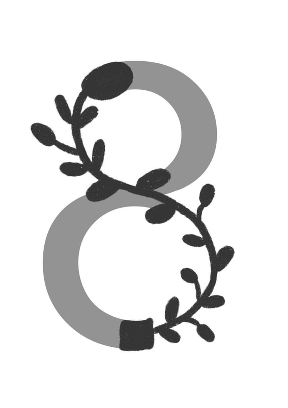
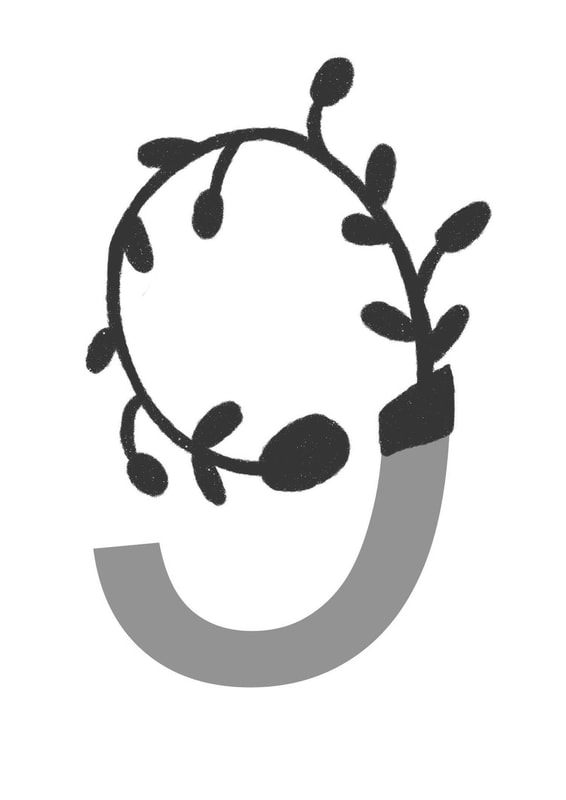
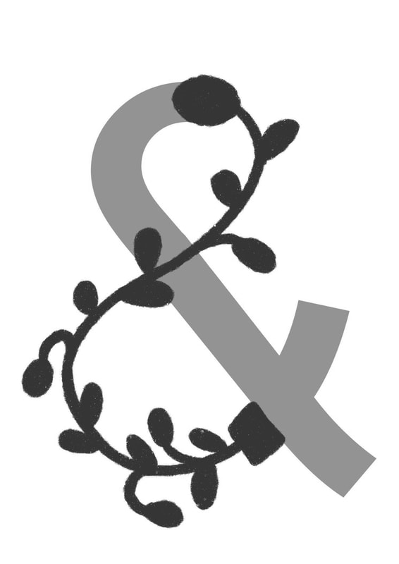
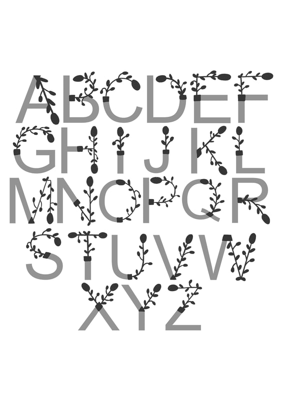
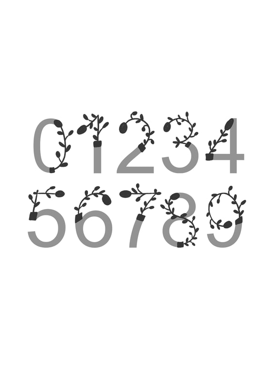
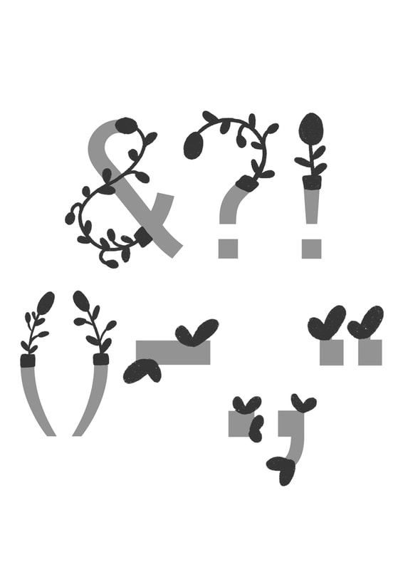
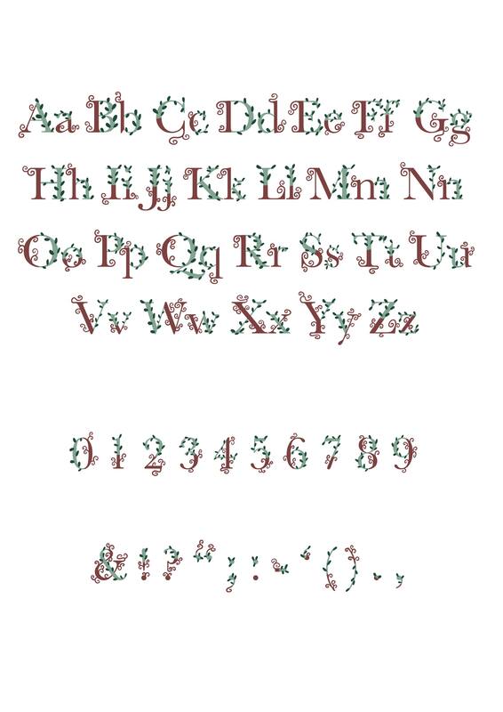
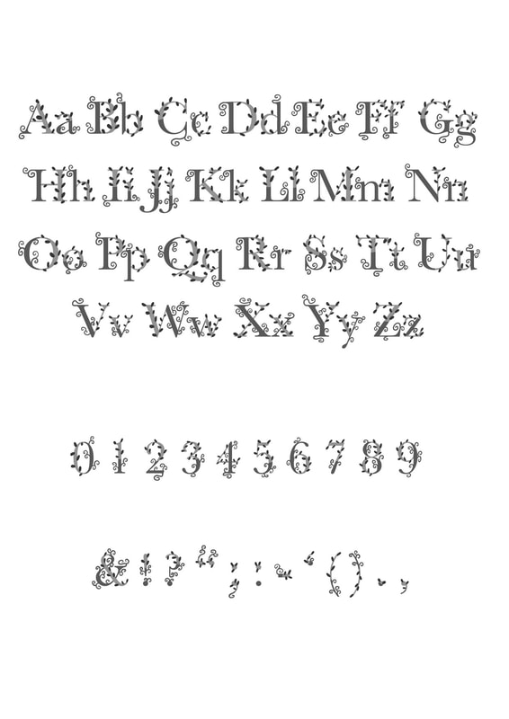
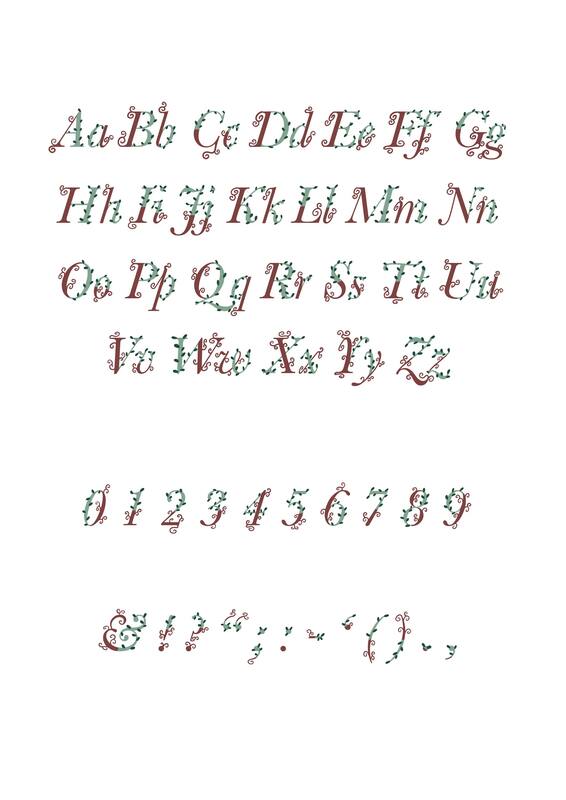
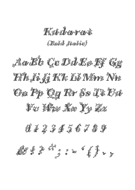
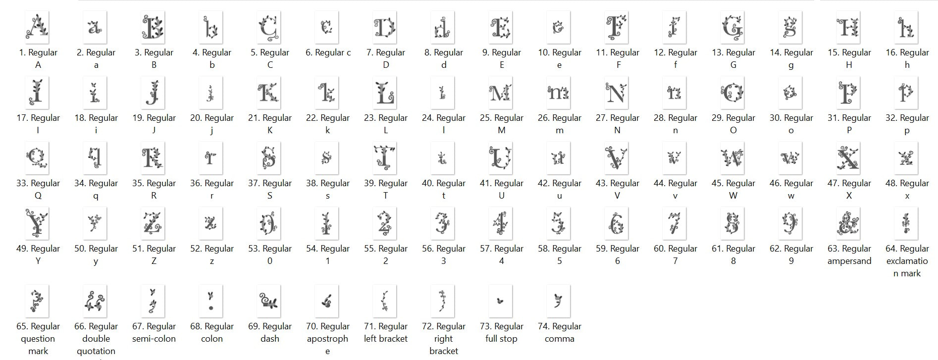
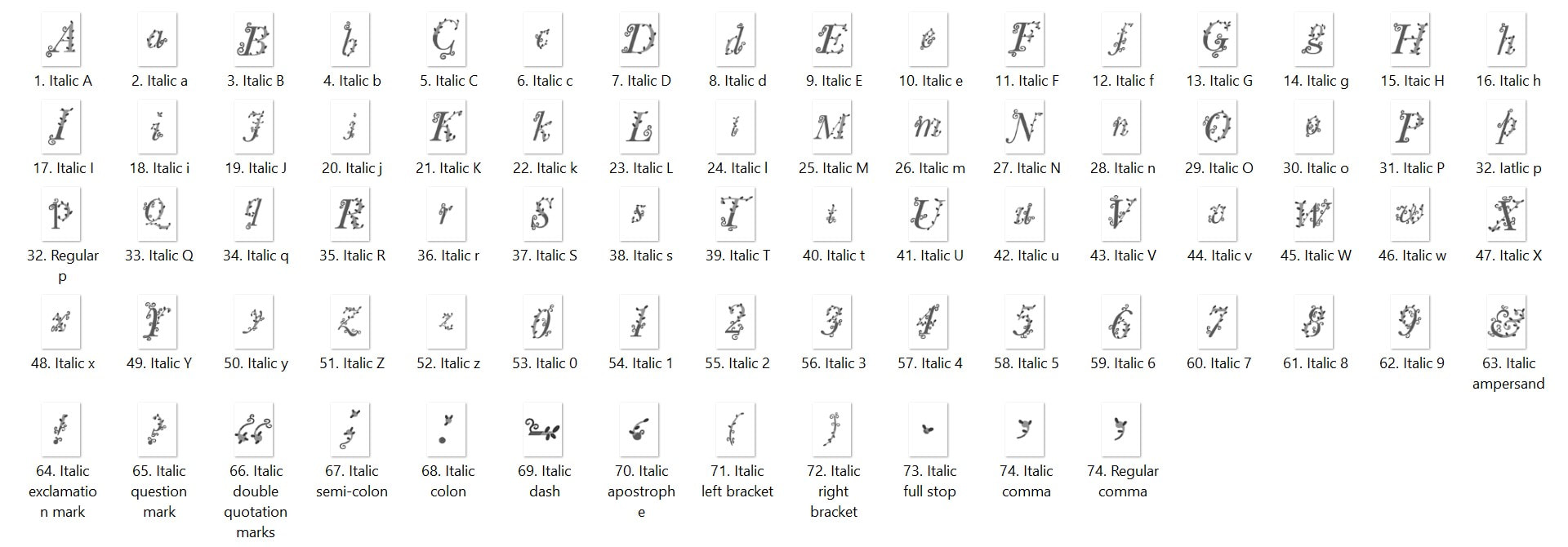
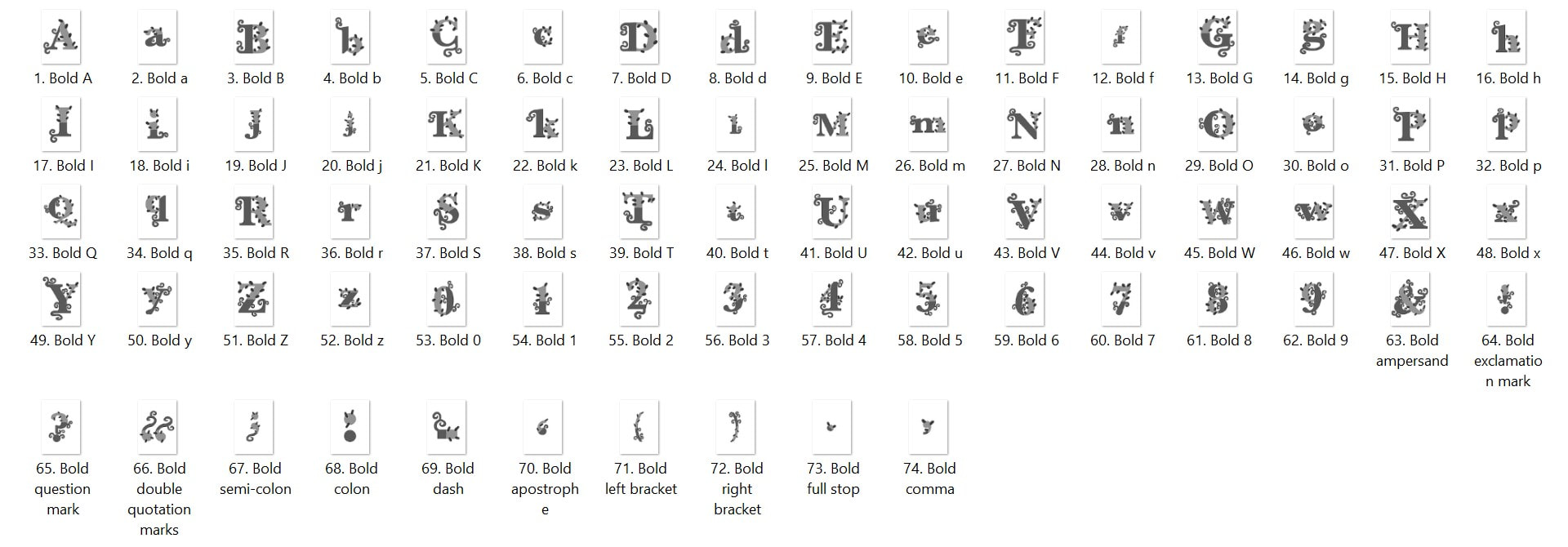
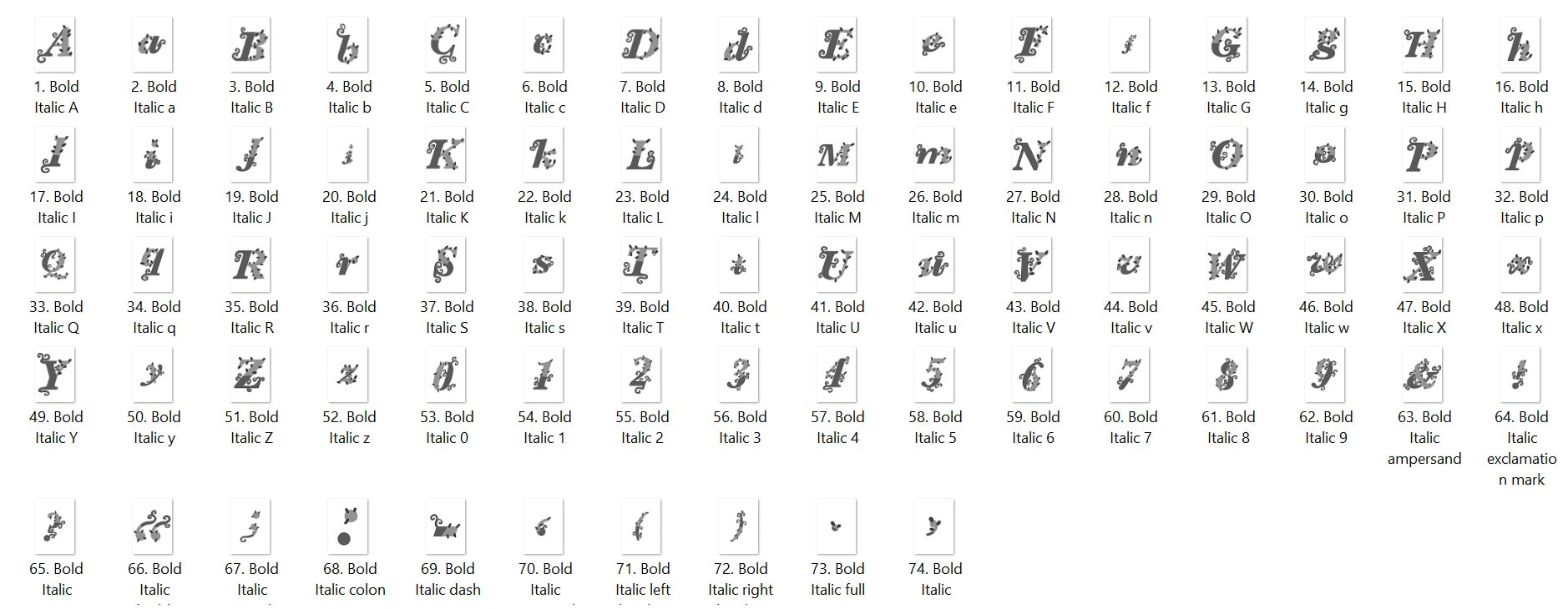
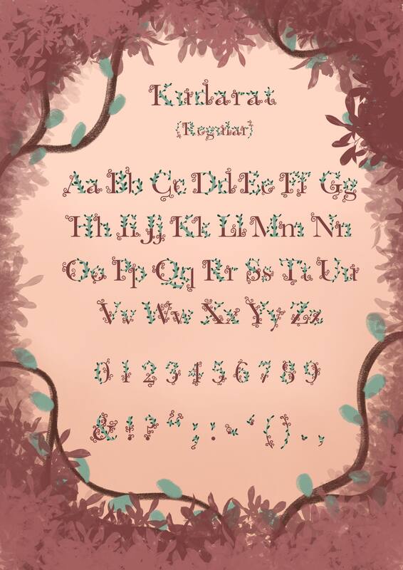
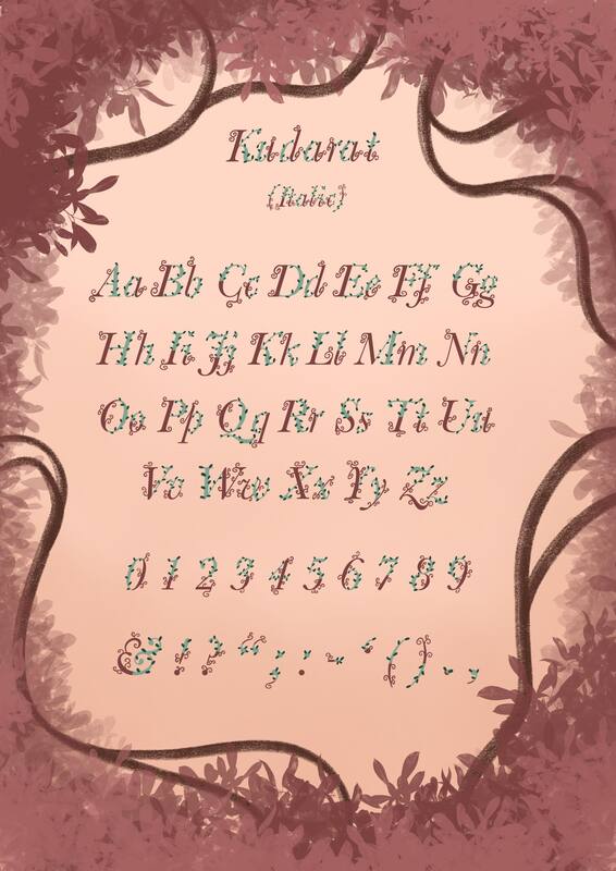
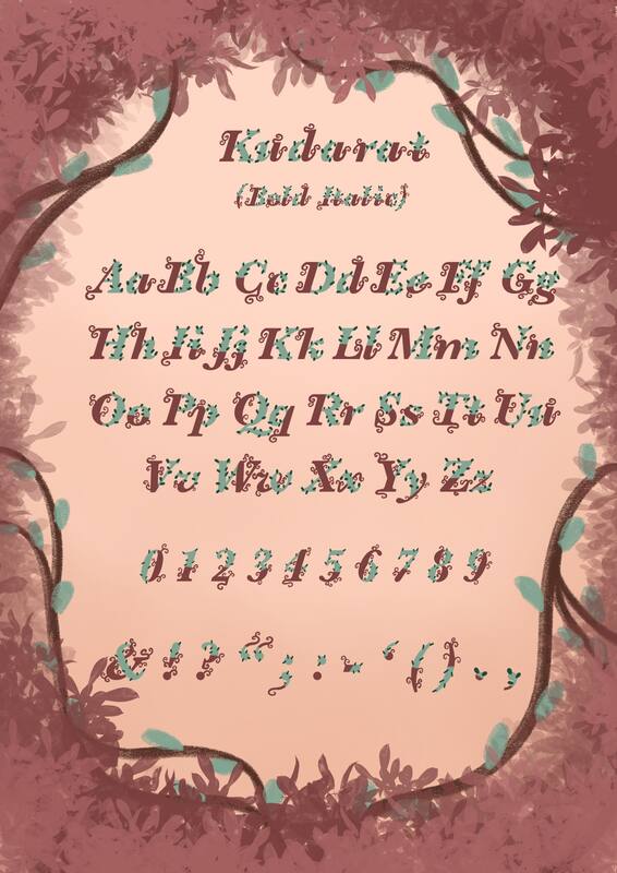
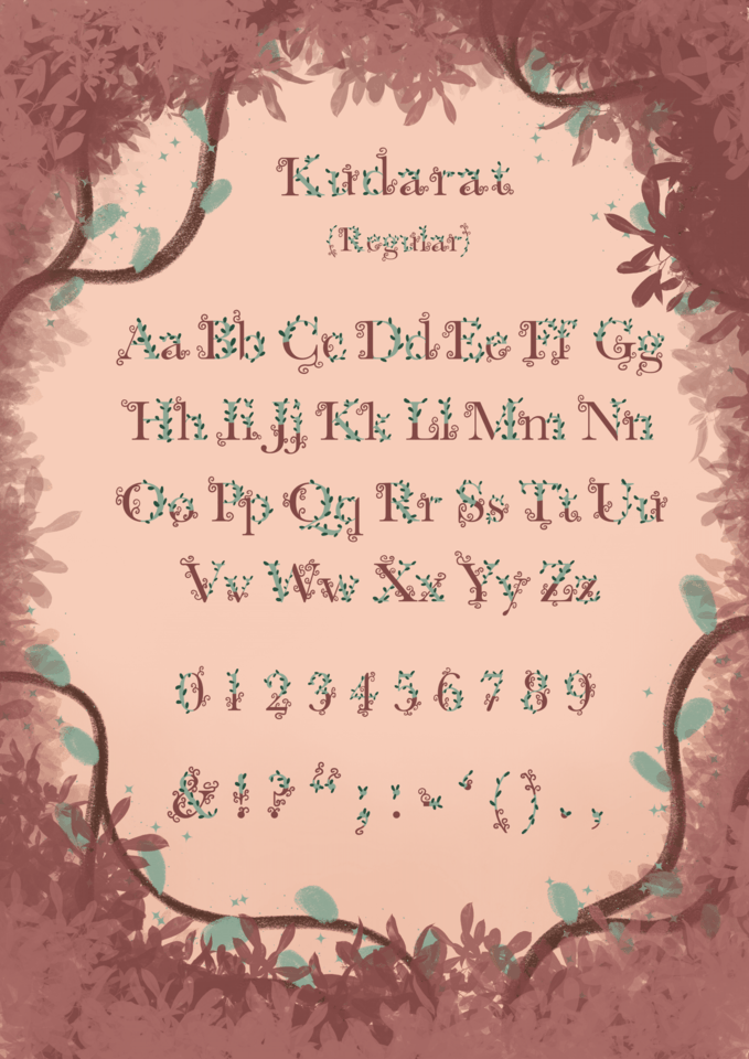
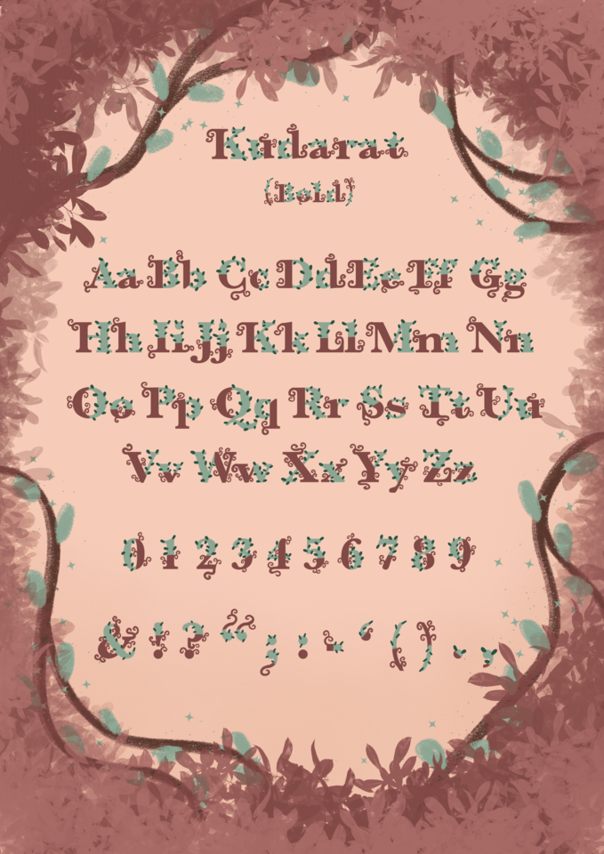
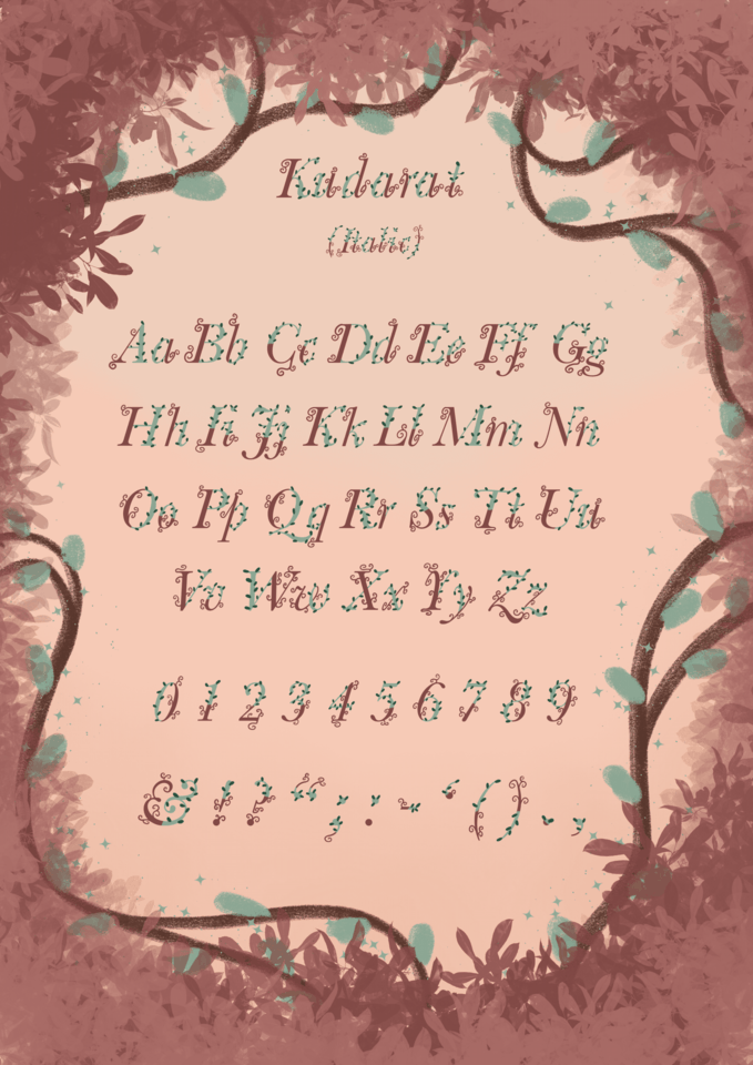
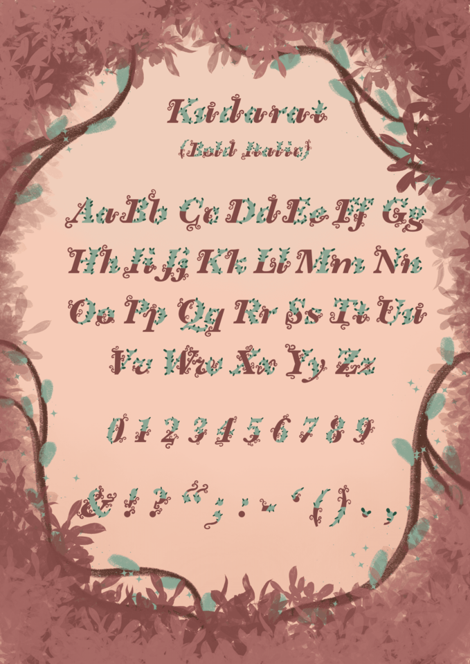
MANISHA SAMRA
  • Home
  • Univerisity
    • Year 1 >
      • Workshop
      • History & Practice
      • Introducing Visual Communication >
        • Telling Stories
        • Nursery Rhyme
        • Old School
        • Master Forger
        • Perspective
        • The Tree
        • Thumbnail Visuals
        • Colour Theory
      • Muli-Dimensional Illustration >
        • end of year submission
      • Visual Problem Solving >
        • Type Selfie + Quiz
        • DIY Alphabet
        • Ampersands
        • Handlettering
        • 2 Become 1
        • Helvetica
        • Type Talk
    • Year 2 >
      • the critical illustrator
      • ILLUSTRATOR'S TOOLKIT
    • Year 3 >
      • ARTD6000
      • Advanced Illustration Projects
      • FMP
      • Twitch Assests
  • Submission Page
  • About
  • Instagram

DIY Alphabet


Artist Research
Lauren Hom
Sabeena Karnik
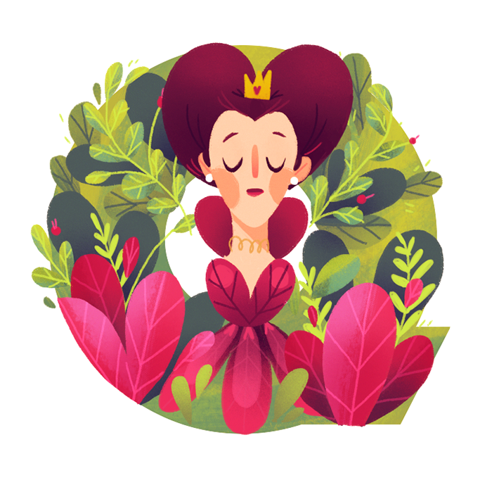
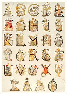
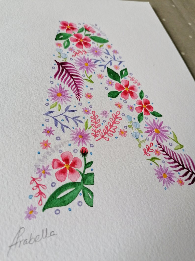
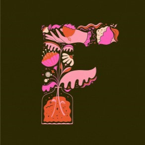
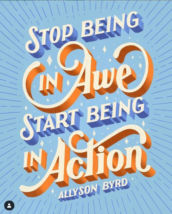
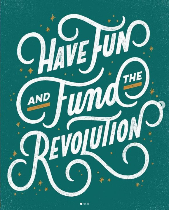
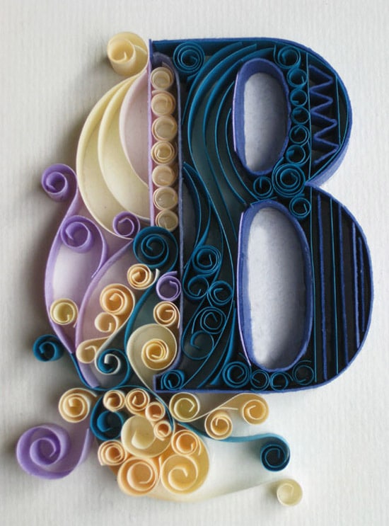
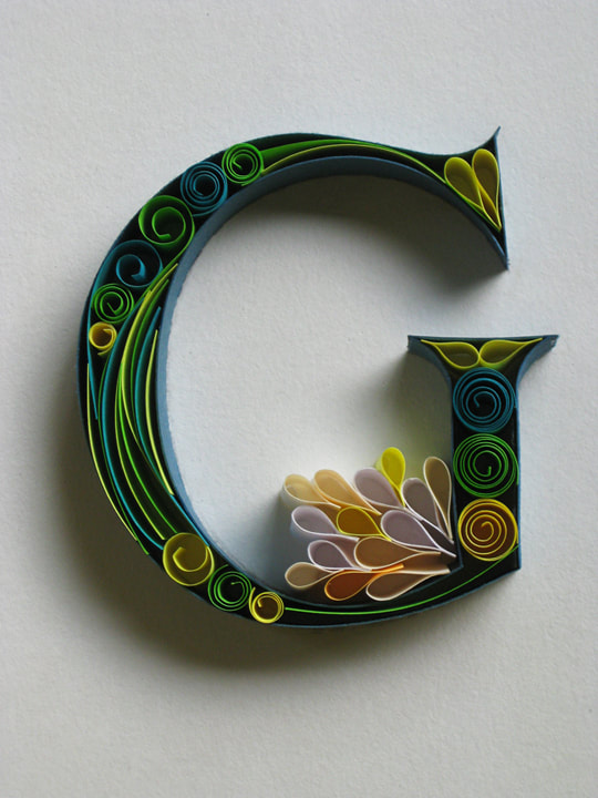
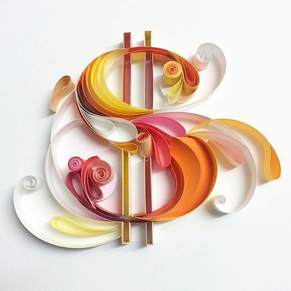
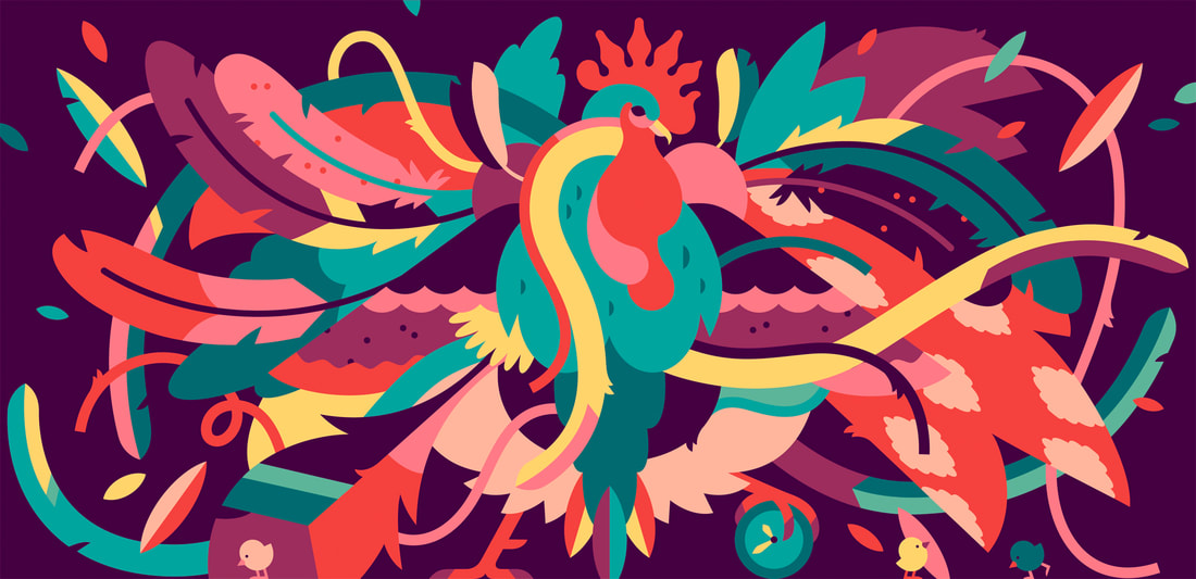
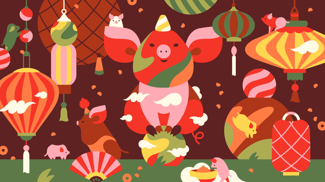
I really enjoy the bright vibrant colours Lauren uses in her lettering, Although not specific to just one alphabet I think her designs look really nice.
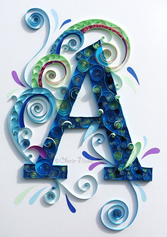
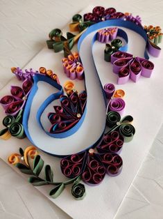
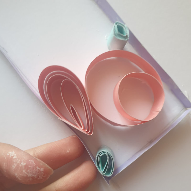
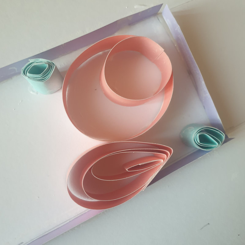
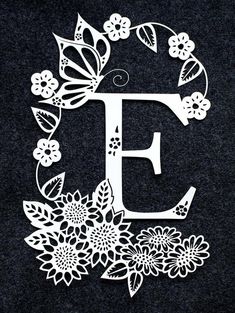
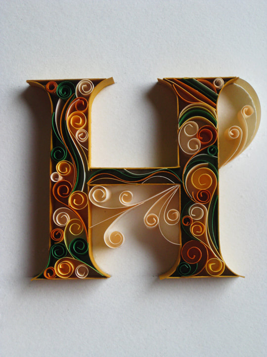
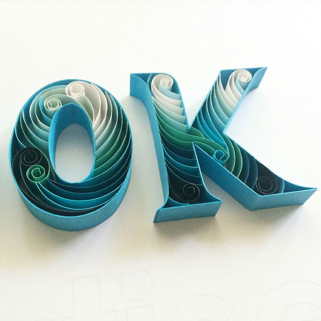
Sabeena works with 3D cards which is something I do not see myself working with as I would not have a variety of colours to work with as well as not feeling confident with my lettering and card shaping skills to be able to create these fun designs. 
Verity Morrish
Janine Rewell
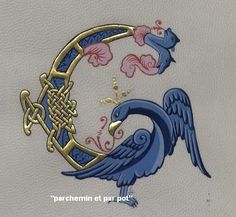
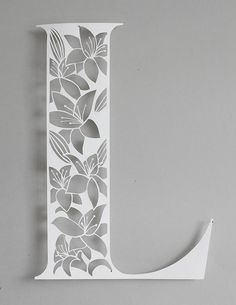
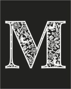
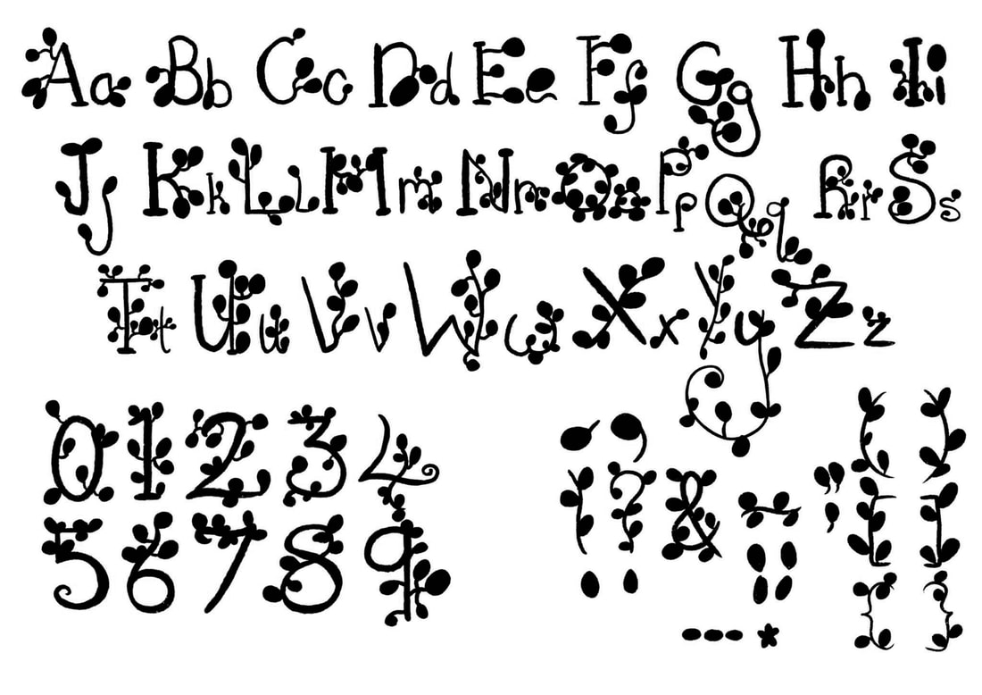
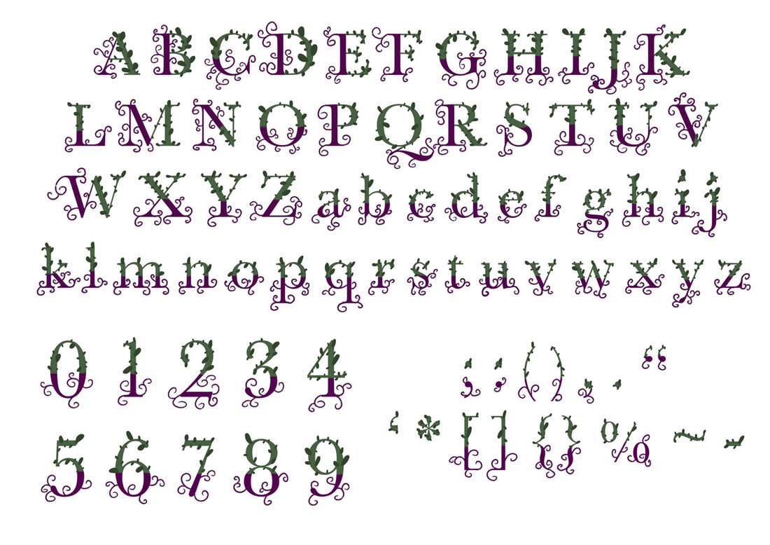
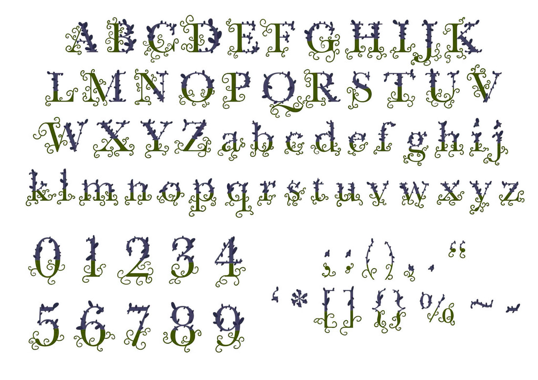
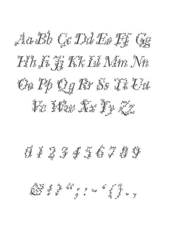
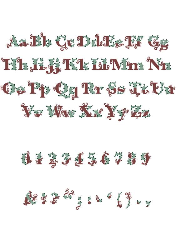
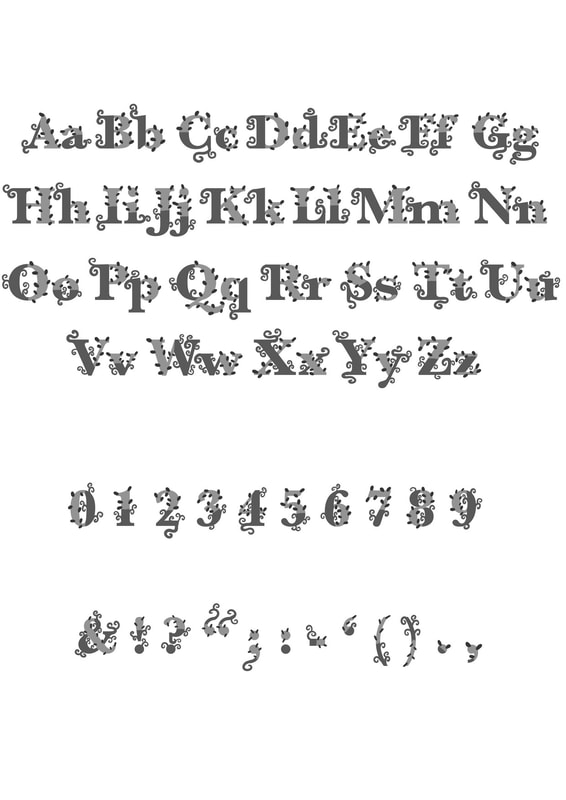
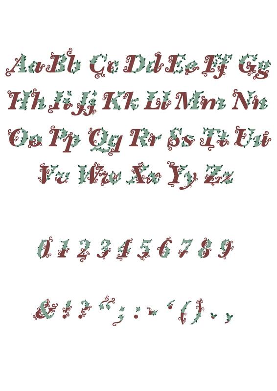
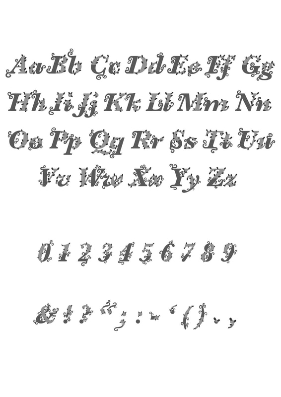
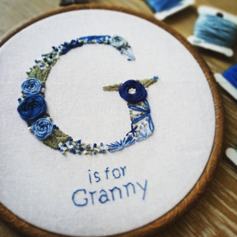
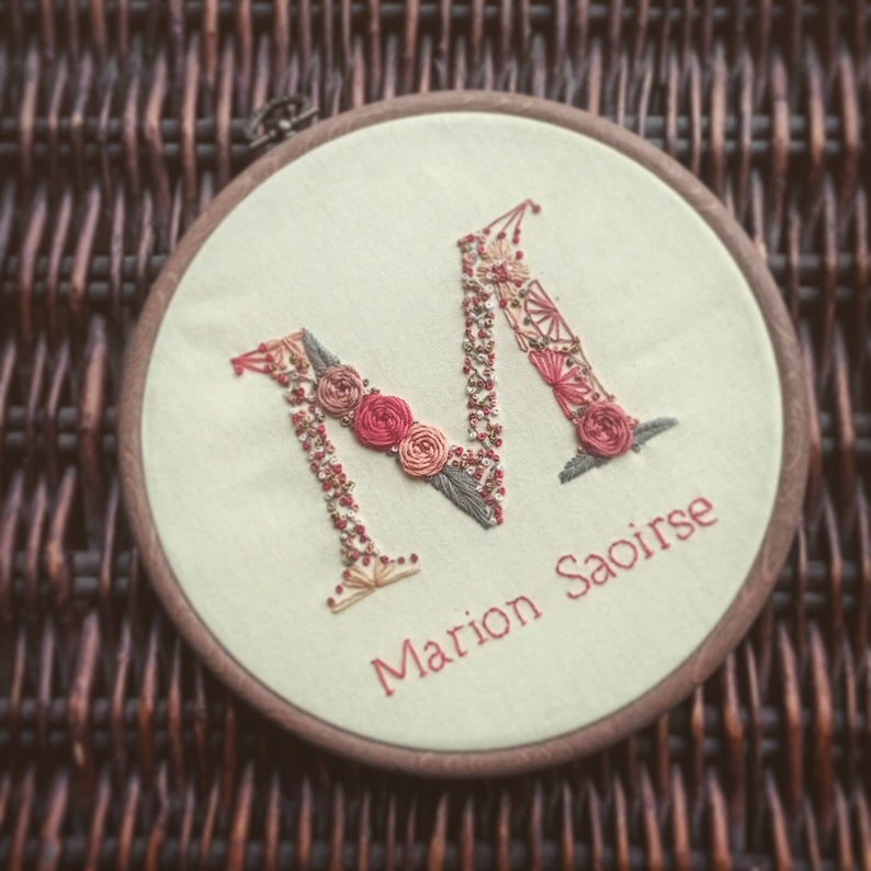
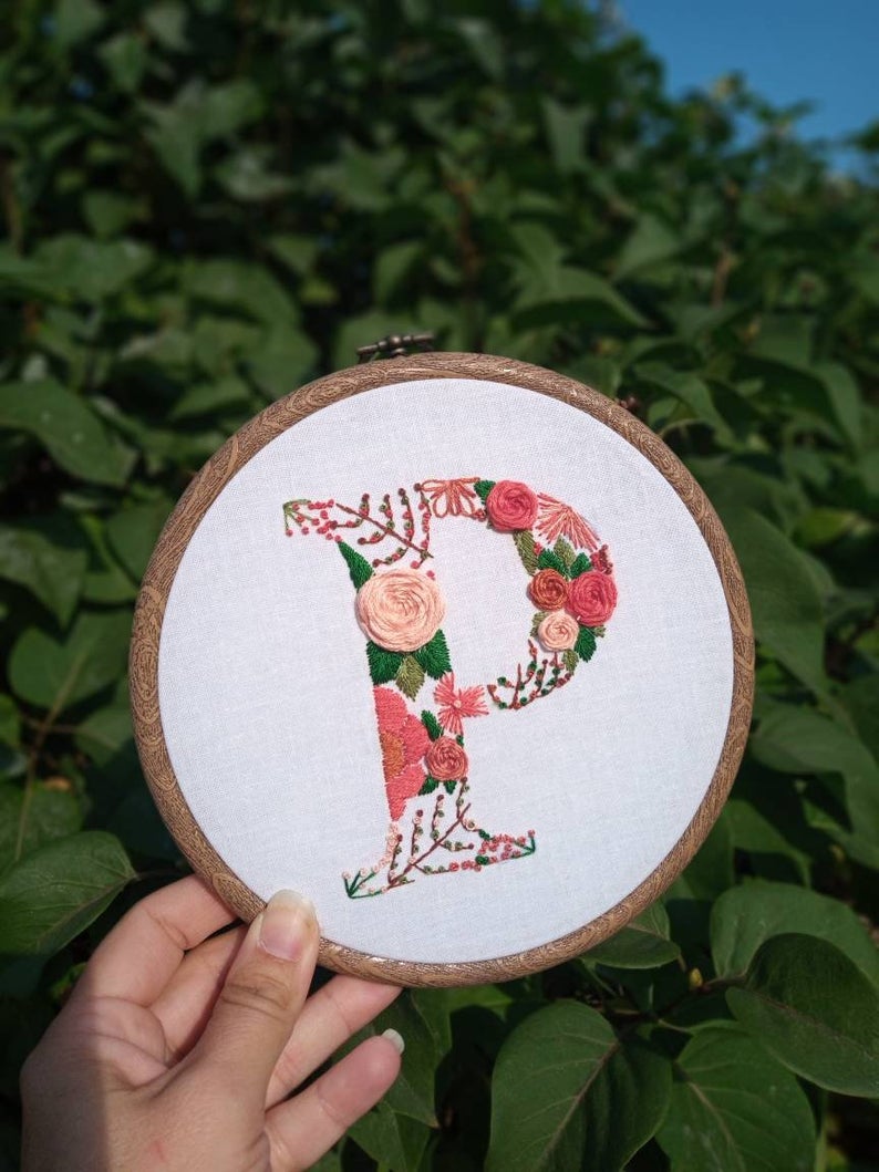
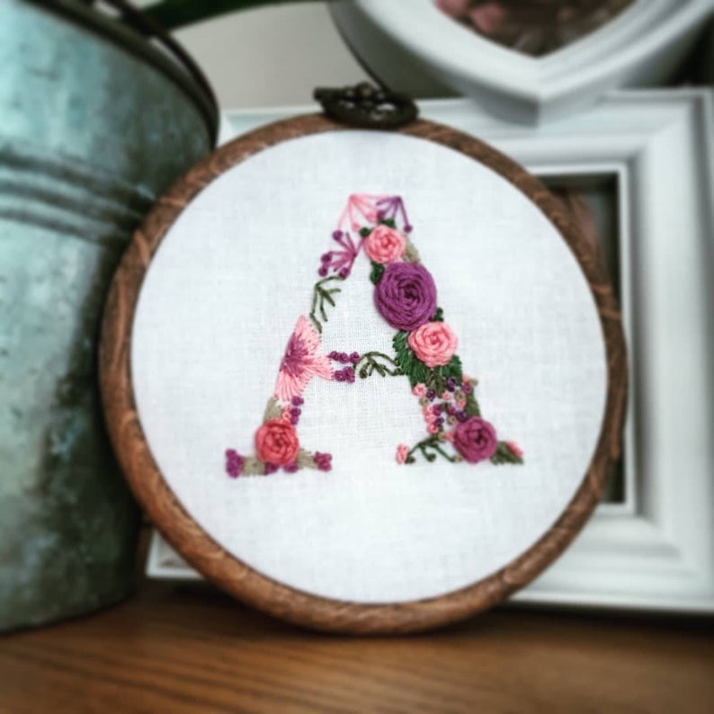
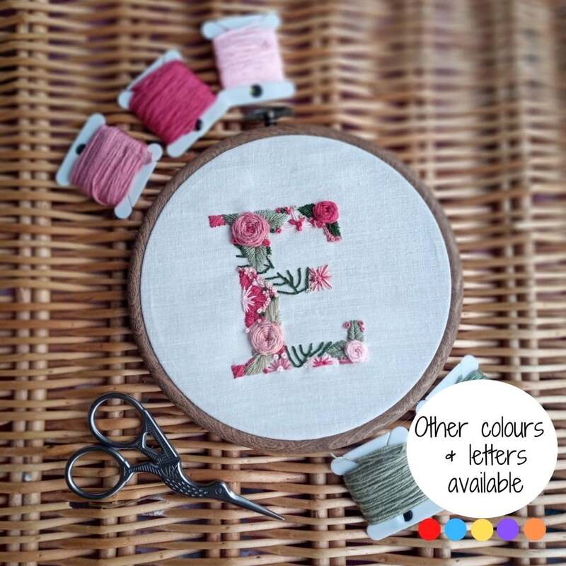
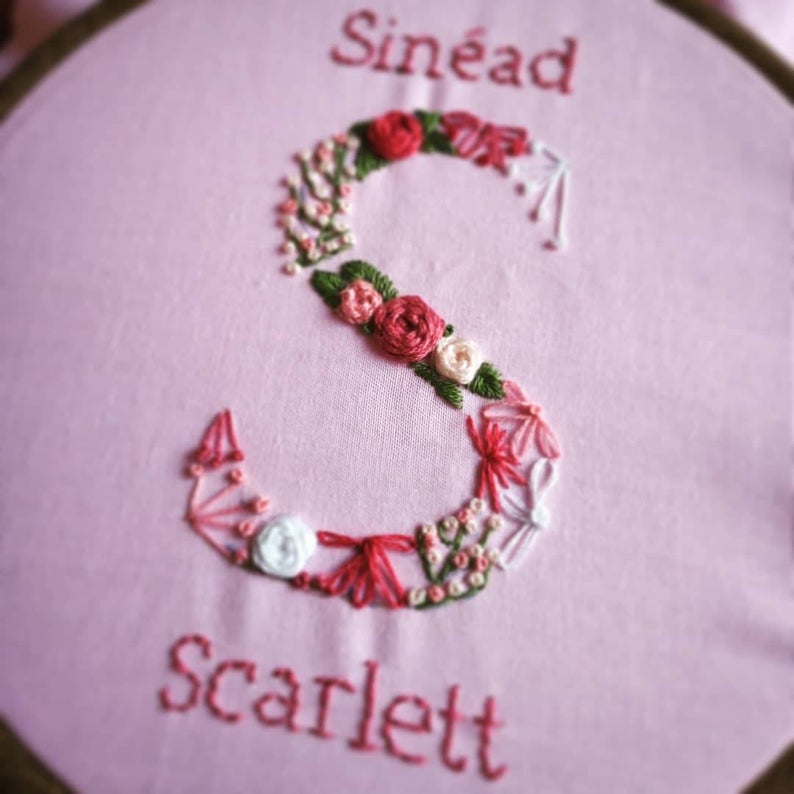
I like the embroidery designs these letters create. I however do not think I would be abl to achieve this due to the resources. 
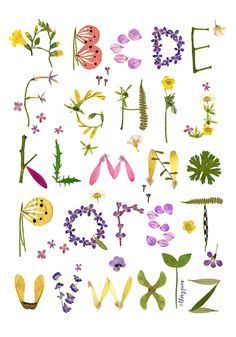
It was hard finding a lot of letterings but I like the way Janine doesn't use outlines when working digital. The designs look colourful and fun.
Rafael Mayani
Michelle Malréchauffé
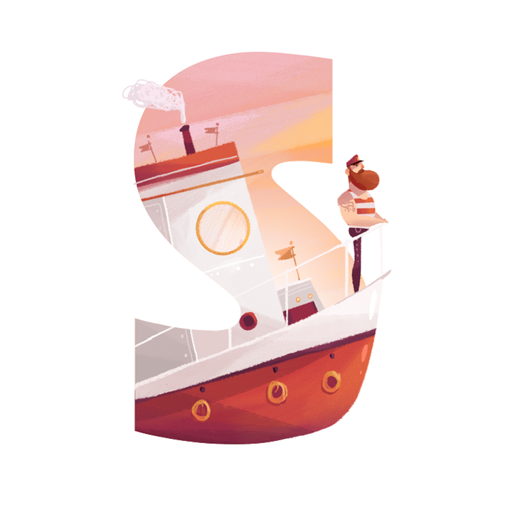
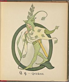
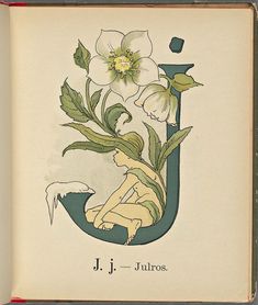
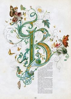
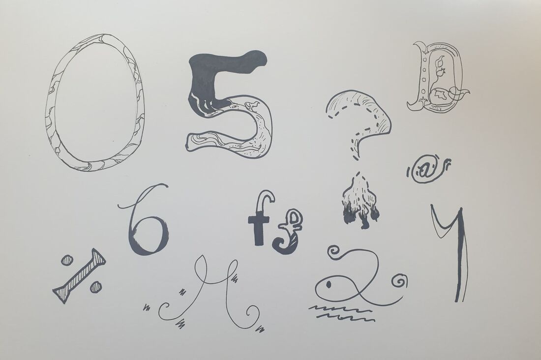
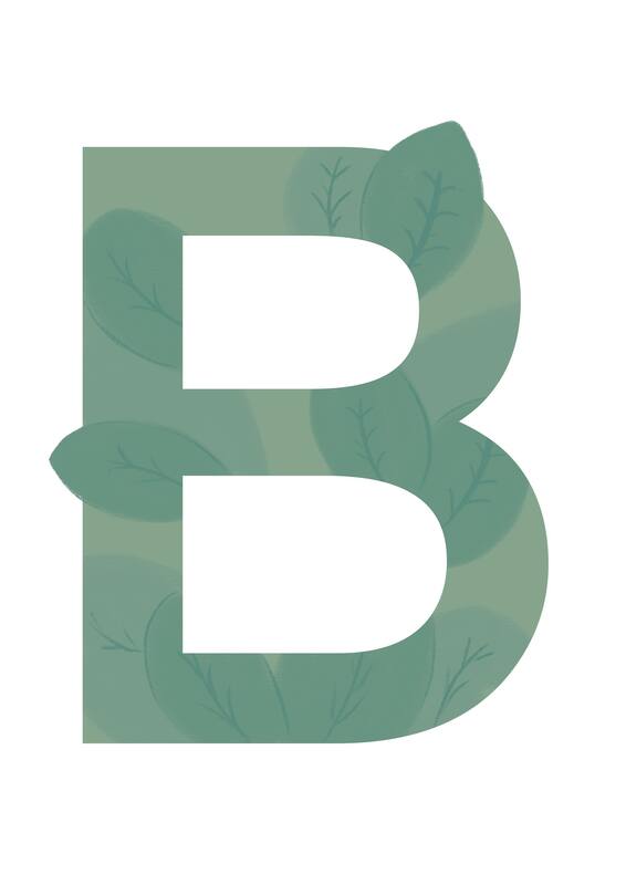
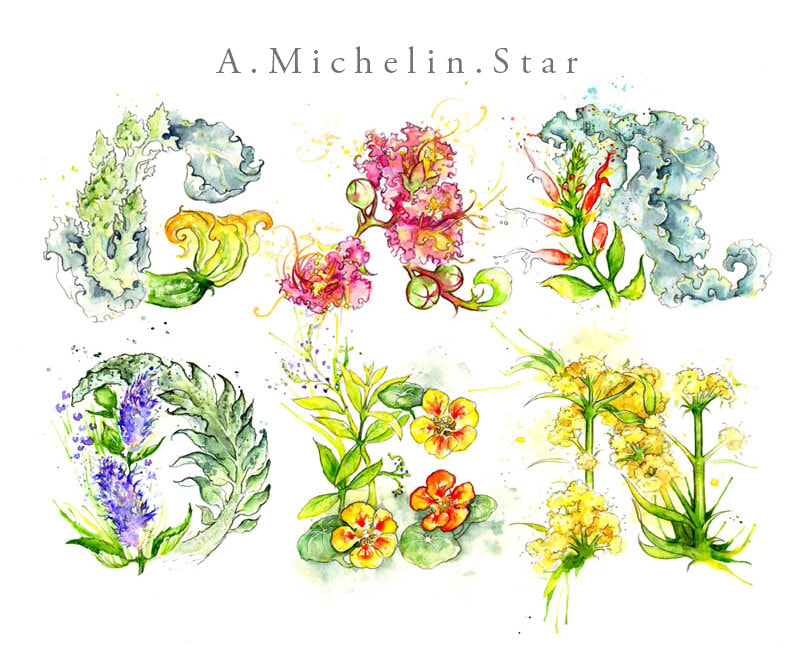
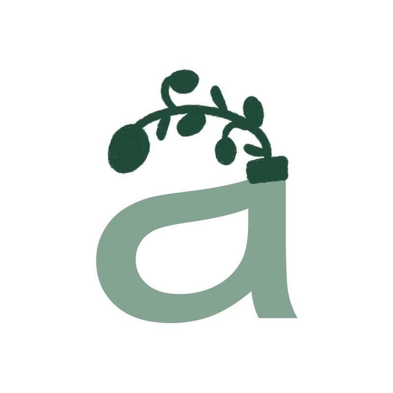
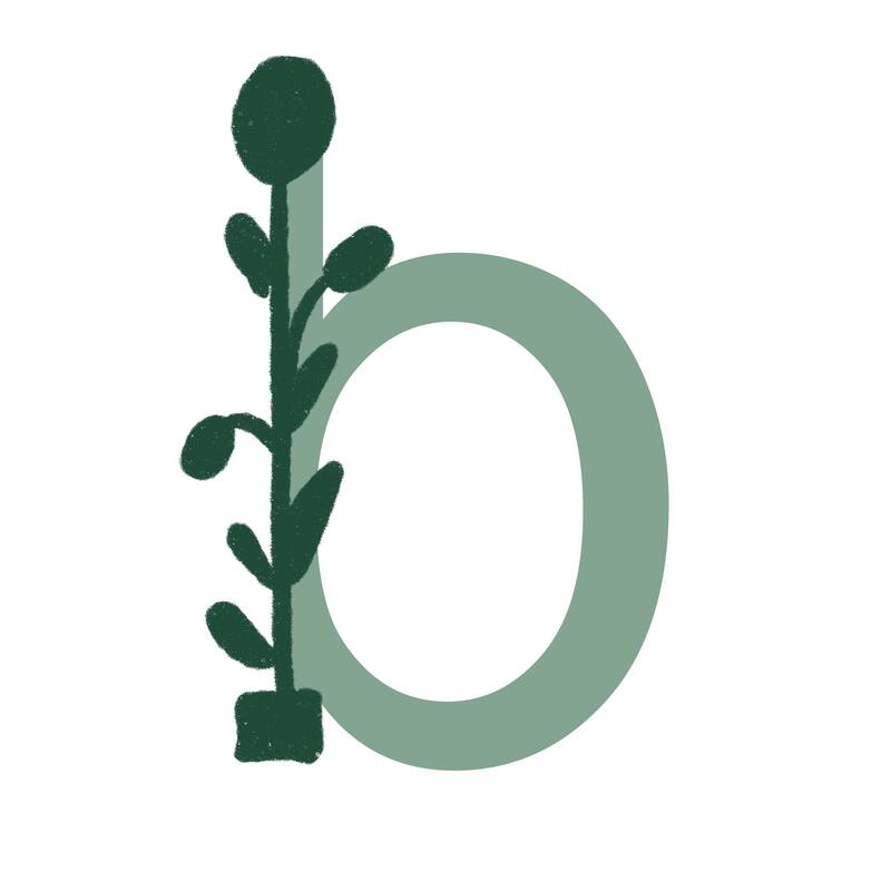
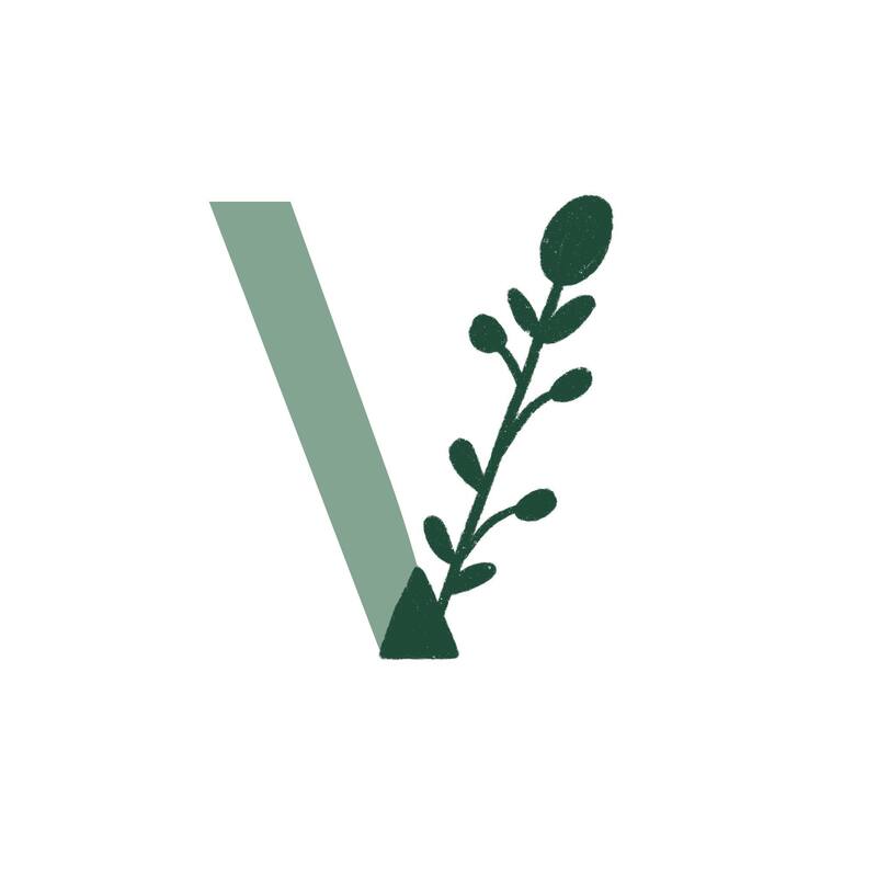
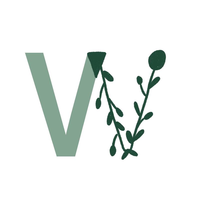
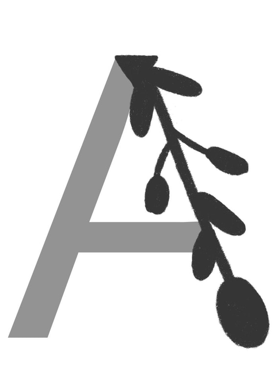
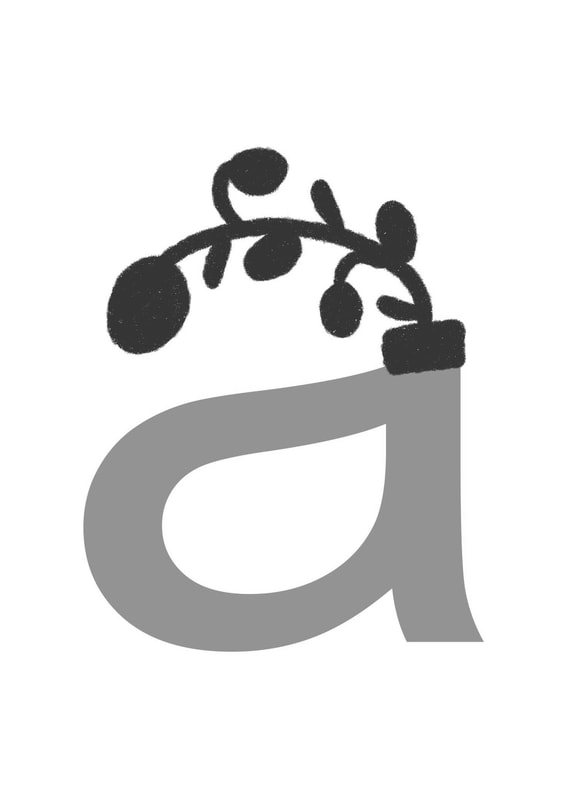
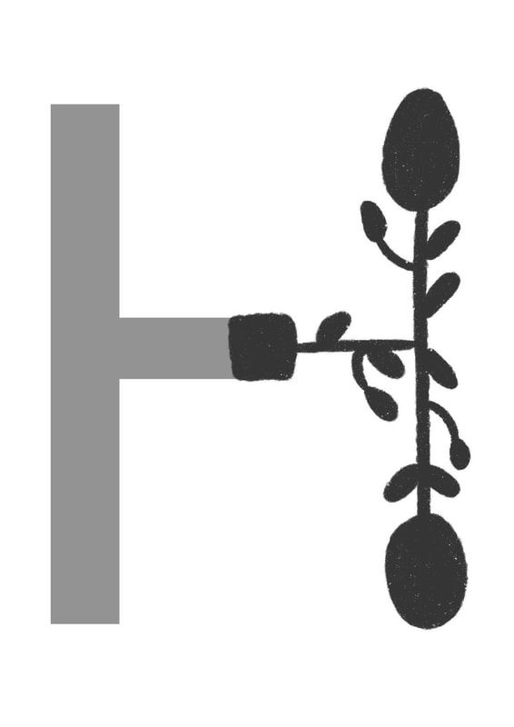
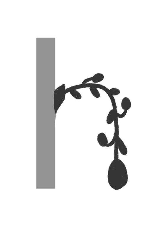
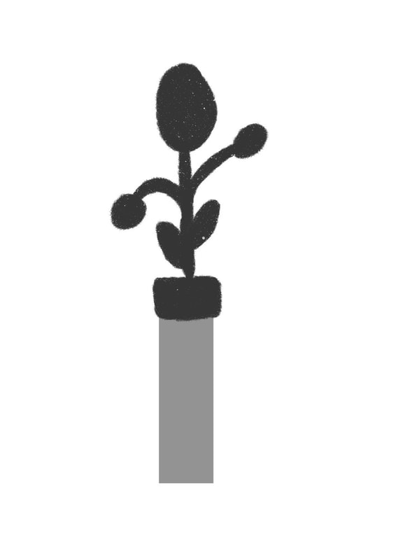
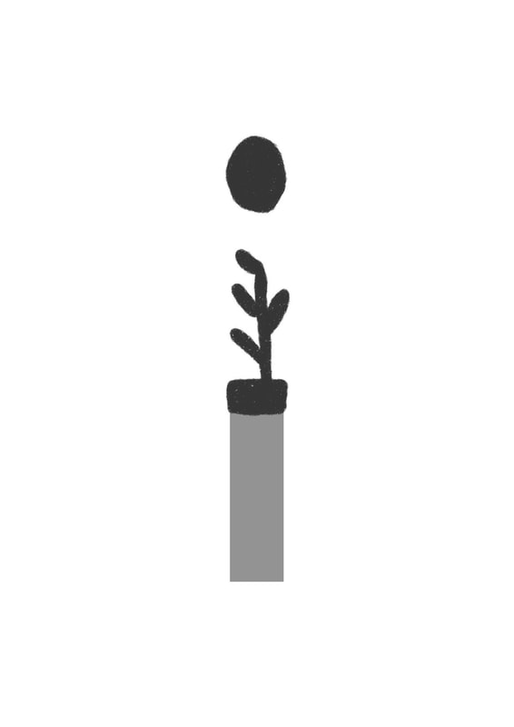
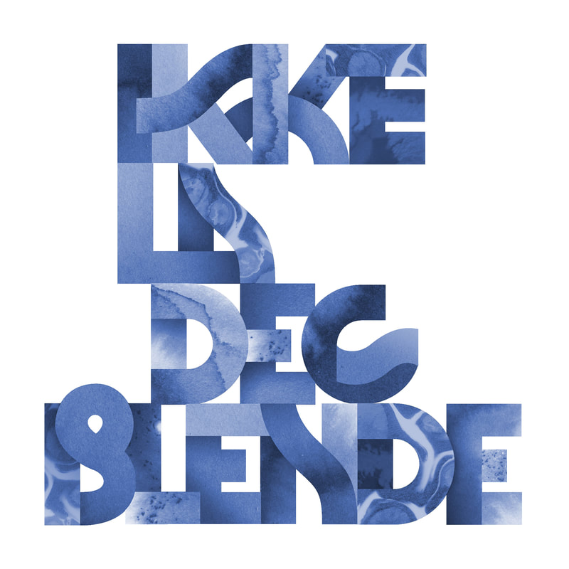
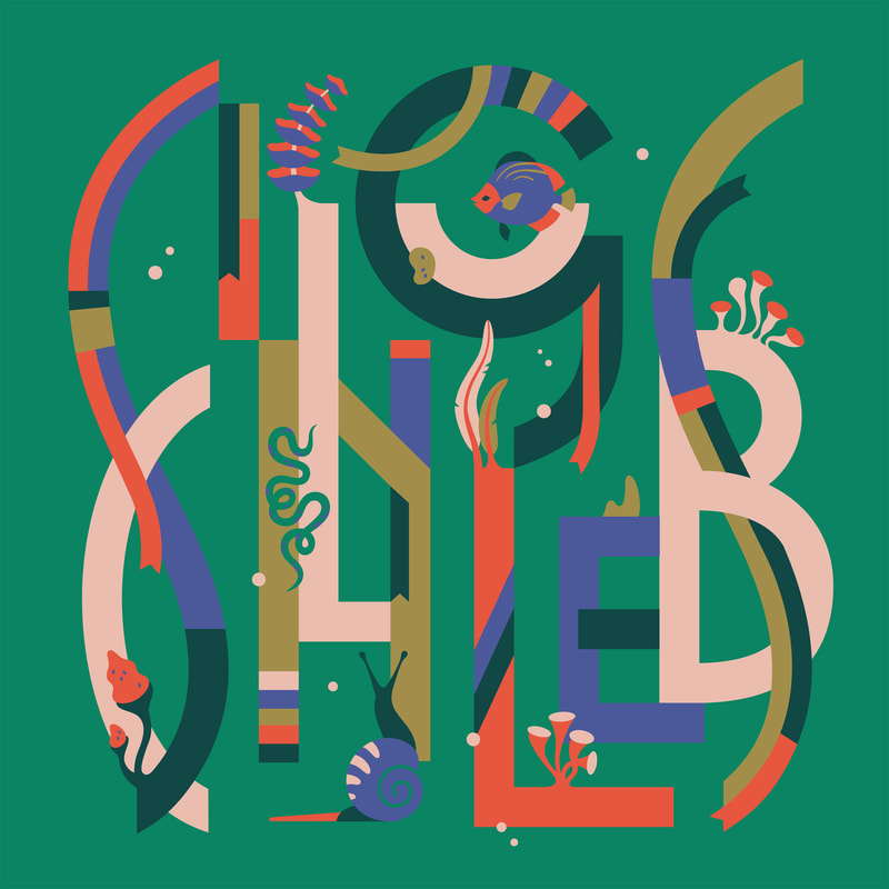
Rafael's designs are based more on what the beginning of each letter stands for rather than having any particular theme. 
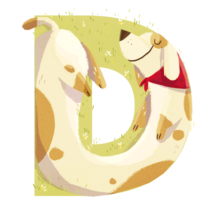
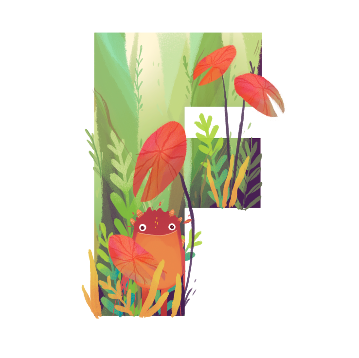
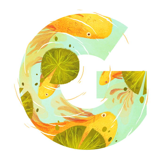
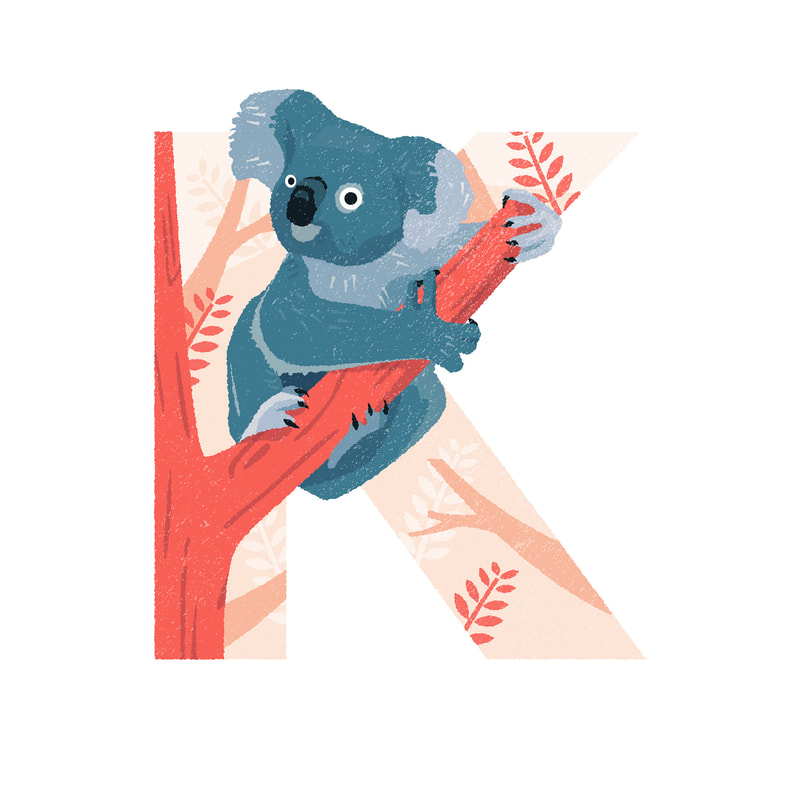
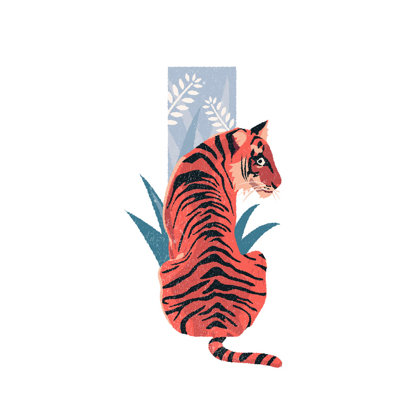
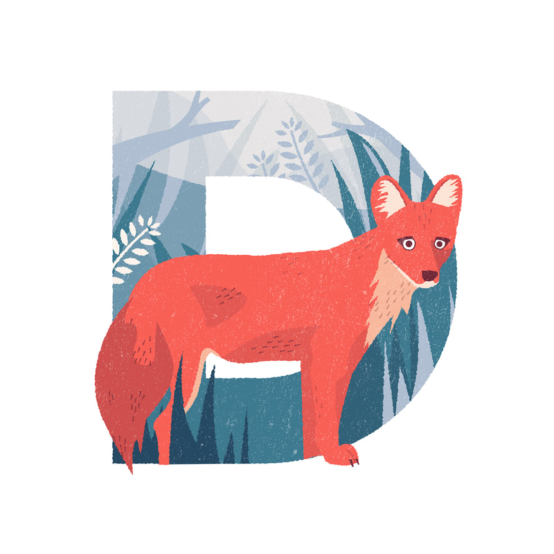
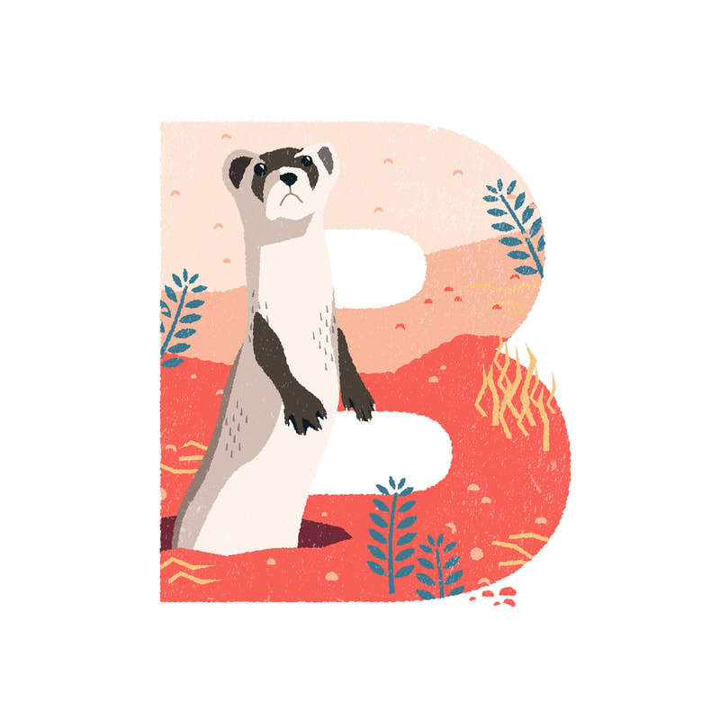
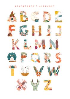
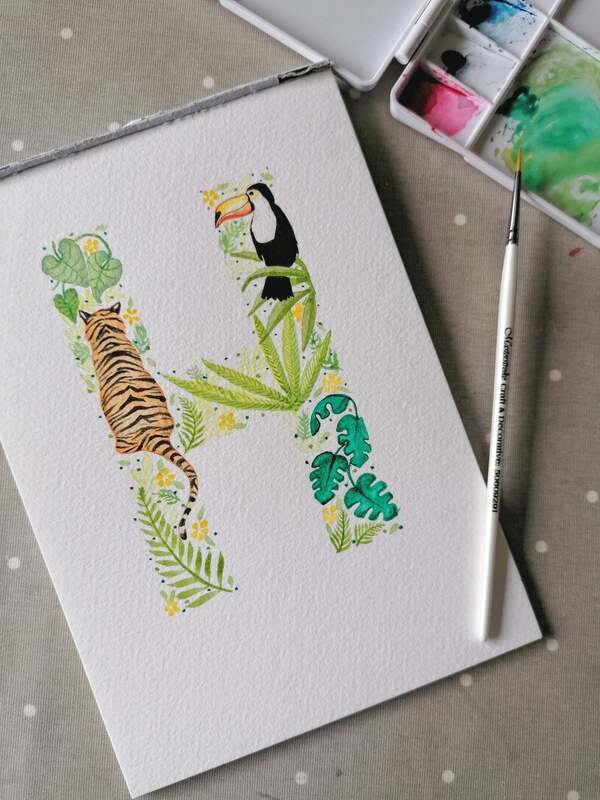
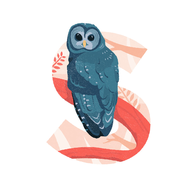
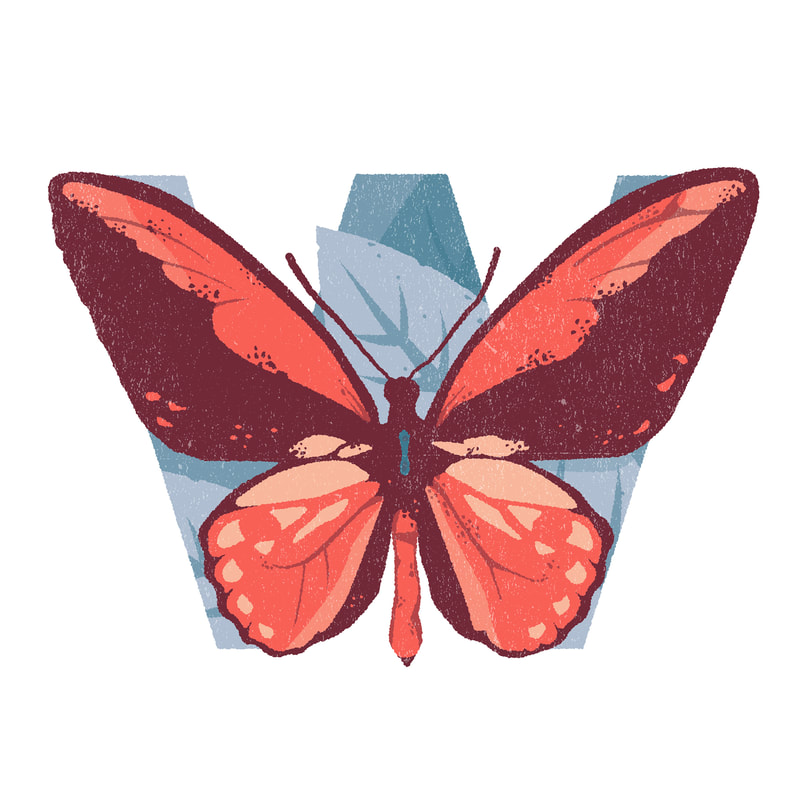
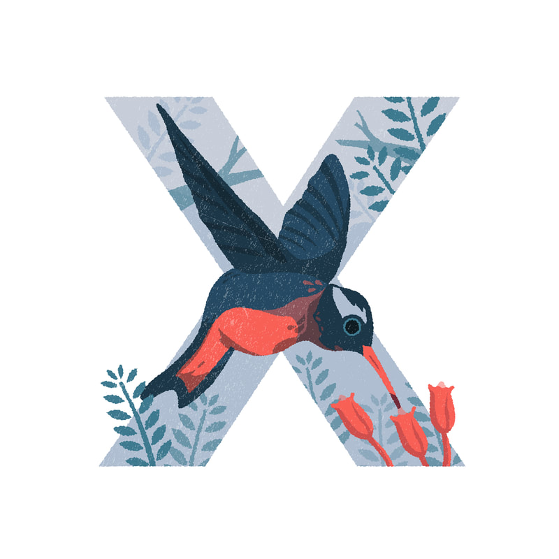
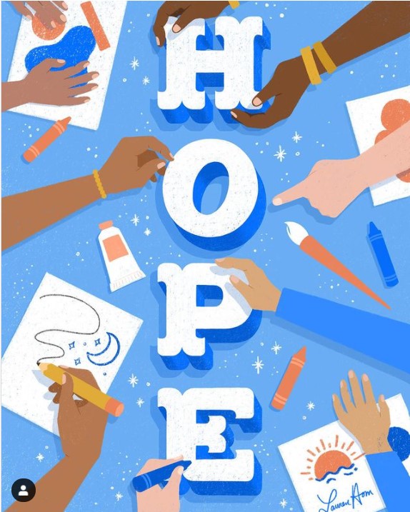
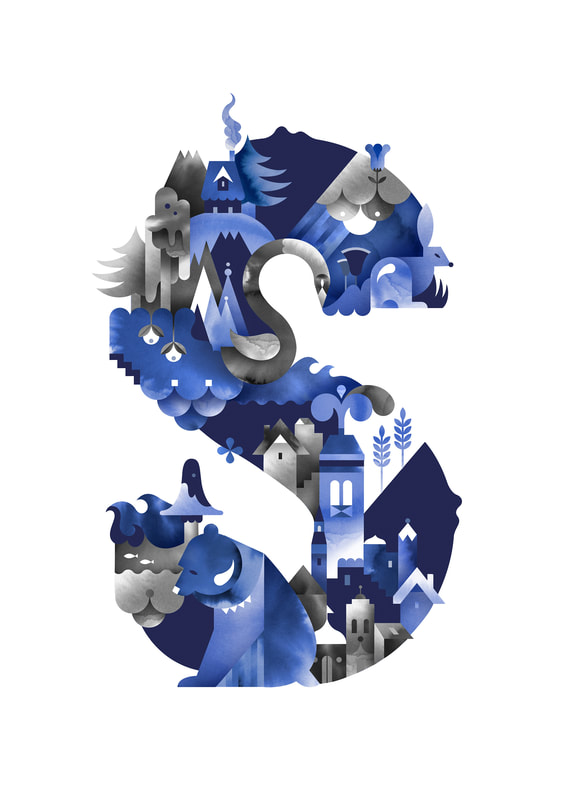
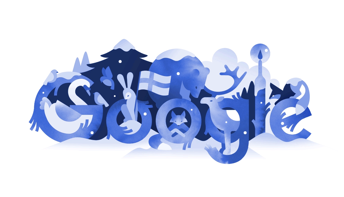
Michelle's work really captured me from the illustration to the idea behind it all. The reason for these letters are to show the animals which are endangered based on the beginning of the name.
Picture
Picture
Picture

Experimenting


Objects & Food
Shells:
​I found using the shells to be the easiest as the shapes flow decently where you would like them. I am not certain that I will continue to use these but I may try and develop into them at some point.
A
B
C
V
X
?
!
%
3
4
7
20
Crystals:
Using the crystals was fun as they came in different shapes and sizes so I played around with mixing them around. Now from the lack of crystals I do own, I feel this would perhaps become a bit boring later on.
Z
/
=
6
Jewellery:
​I liked the designs of my jewellery but I found this more of a challenge. I am not certain on if I will move forward with these as coming up with the alphabet ideas with them was pretty hard. However I do think drawing them out would make it feel more flexible.
H
i
P
Q
÷
Plushies:
I had to use my floor as I needed a wider space to play around with the plush. This experiment was a bit tricky so I do not intend to use plushies again, I think I prefer a smaller area to work with.
q
o
%
7
Fairy lights:
At first I thought this would be easy as they would bend better but it was pretty difficult to create an alphabet with it especially as it wasn't too long.
o
p
^
8
Scarf:
Using a scarf seemed a bit difficult but I like the flow it creates. I will most likely not use any type of clothing unless I develop with different types of fabrics to make the designs look more different.
Biscuits:
After my tutorial I remembered being asked to experiment with biscuits and other tea related foods, I enjoyed this (and not only for the biscuits), I think the little crumbs being left adds a bit more to the lettering. 
Object Designs
Book Pages:

I took some photos from my books and decided to go over it digitally, I like this idea but I think it is missing something.
Picture
Plants:
Picture
I like the idea of creating an alphabet garden, I may work on this a bit more If I choose to continue with this.
Tea & Newspaper:

I cut up some sports newspaper but I found this a bit challenging - I later thought about using tea to create my alphabet and also splattered it to create a different effect
Picture
Pinecone's & other miscellaneous objects:

I thought this would be a bit fun but I honestly struggled a bit trying to get the shapes down
Material Tets
Meni Chatzipanagiotou
Ink

I feel inking is something I rarely use so I want to give it a try, however iI feel like It does lack in colour so I would need to be precise on where I ink and perhaps use hatch markings as a way to show the depth. 
Ink Testing
Picture
Picture
During my testing I had fun just working with black ink but later on went and used colours. I prefer the black & white tests more and may develop into it further. I tried to incorporate the theme of the artists with the creepy looking trees but then move onto making potion bottles which was a hard task as I couldn't think of many other ways to make the letters into a bottle shape.
Prim and Dotty
Watercolour

Watercolour is something I am using a lot but using it for a specific theme would be fun such as the J and how it uses farming as it's theme. I also like how there isn't a specific outline but gives the illusion that there is one.
Watercolour Testing
Picture
Picture
during my tutorial I took what Zoe had said about using the leaves/ vines as the tails of the letters as well as taking little bits of flowers and other imagery to create certain parts of the letters. I enjoy using watercolour and I like the way the brown and greens mix up. 
Paper Quilling

Now I don't really see myself doing quilling or finding it easy but that is exactly why I am going to try and test what Letter I can design from this.
Quilling Test
This was honestly so hard to make and I mostly ended up giving up and just leaving it as the paper wouldn't stick on properly. I don't think I will be using paper for my lettering unless it stays flat. 
Paper Cutting

I feel like this would take me a long time as well as trying not to break the paper when it comes to any thin areas, but I like the animal designs that can be made with it and will try out if this would work with my lettering.
Paper Cutting Test
This was pretty fun to make but overall I don't think i will be working with card at all for this as it's a bit tricky to work with for certain areas as well as not having a variety of colours to add depth into 
Digital Lettering

When it comes to digital letters I couldn't seem to come across a lot of ones that only focus on the alphabet so I am using my artist research to dive into this more as I do enjoy her designs. 
Digital Test
Picture
Picture
Using my research I focused mainly on backgrounds for this test, I like working digitally with this project and I may continue to work with this medium.
Media Mix Up
Picture
Watercolour + Digital
Picture
Watercolour + Gouche
Picture
Gouache + Digital
I had fun mixing around with the mediums but overall I think I will most likely be using digital for my final creations. 

Development


Theme Ideas
Plants/Wood
Agapanthus
Bellflower
Calla Lily
This is far by my favourite theme and I enjoyed created the 'K' letter and will definitely be proceeding with this - although I think for the plants they will be different looking to give a larger variety to them and make each one stand out without looking overall similar. I decided when working with the flowers I would try and name them based on the beginning of the flower name and which flower stands out the most, however I may try and add in different types of flowers of the same name just to add in some variety other than the twigs and leaves. Not too sure how I would correspond the flower names to the numbers and punctuation but I may just be a bit more free with those designs.
Tea & Biscuits
My first attempt was making this digitally but I feel as though it was much harder to figure out how I wanted these to look like.
I went back to using real biscuits and added some crackers in too - this was much easier than drawing out the biscuits itself although also a bit tricky when it comes to certain letters, I also spilled some tea into the plate.
Jillian Goeler
Amy Holliday
Picture
during the Hand letting session we were given some artists to help us with the task and I really loved Jullian and Amy's work that I wanted to add them for my DIY alphabet. I especially like Amy's and how much nature she uses which fits my theme idea and I hope to develop more into this.
Further Development
Picture
Out of these developments I prefer the first one but I need to continue to develop into it and make sure the letters aren't so hard to read. I will also be using a sans serif to give it a modern look.
Picture
Picture
Picture
I took my first development idea and used the Arial font to help with how I wanted my pieces to look and they look much more clearer this way. I also tried to see how they would look in different sizes. I have also been testing out whether or not I want my letters to be capitals or not and I think I prefer them to be capital.
Picture
Picture
Picture
Picture
Picture
Picture
Picture
Picture
Picture
Picture
Picture
Picture
Picture
Picture
Picture
Picture
Picture
Picture
Picture

F i n a l


During the last feedback I changed some things to change my final piece, this being the overall theme and using a serif font (Baskerville), I was also shown other blogs and what we could do to improve such as making them bold or italic and even decorating the final sheets.

I was asked if I re did my work what exactly would I change but in all honestly I ended up changing everything after the session, I just didn't feel confident in the work I had made and re doing it, especially in a serif font, I prefer this new final I have made. Other than my first attempt at doing my final I really like this and how you can tell more clearly I used more than one colour. I think to make it more meaningful I will be naming it Kudarat which translates to nature in my mother tongue, Punjabi.
Picture
Original
With my work I have done it using Baskerville as a template, I wasn't exactly sure on how to make regular font's turn into italic, bold or bold italic so I re-created all 4 of them separately which you can tell by some letters and punctuation as they seem to change especially the Italic Ampersand. I however did try my best to make them look pretty similar as well. 
Picture
Picture
Regular
Picture
Picture
Italic
Picture
Picture
Bold
Picture
Picture
Bold Italic
Sharpened
My saved files ended up loosing some of it's quality especially when enlarging the text so I went onto photoshop to sharpen it up slightly, some of the designs in colour do look a bit different to the original but the change isn't completely massive.
Picture
Picture
Picture
Picture
Picture
Picture
Picture
Picture
Separated Characters
Mock Up Designs
For my design I went with warm tones with hints of green, just adding a bit more to the nature theme
Picture
Picture
Picture
Picture
Animated Gif
I proceeded to take my designs and animate the leaves to make them look as though they are blowing with some star fragments shimmering around
Picture
Picture
Picture
Picture
Site powered by Weebly. Managed by 34SP.com
  • Home
  • Univerisity
    • Year 1 >
      • Workshop
      • History & Practice
      • Introducing Visual Communication >
        • Telling Stories
        • Nursery Rhyme
        • Old School
        • Master Forger
        • Perspective
        • The Tree
        • Thumbnail Visuals
        • Colour Theory
      • Muli-Dimensional Illustration >
        • end of year submission
      • Visual Problem Solving >
        • Type Selfie + Quiz
        • DIY Alphabet
        • Ampersands
        • Handlettering
        • 2 Become 1
        • Helvetica
        • Type Talk
    • Year 2 >
      • the critical illustrator
      • ILLUSTRATOR'S TOOLKIT
    • Year 3 >
      • ARTD6000
      • Advanced Illustration Projects
      • FMP
      • Twitch Assests
  • Submission Page
  • About
  • Instagram