MANISHA SAMRA
  • Home
  • Univerisity
    • Year 1 >
      • Workshop
      • History & Practice
      • Introducing Visual Communication >
        • Telling Stories
        • Nursery Rhyme
        • Old School
        • Master Forger
        • Perspective
        • The Tree
        • Thumbnail Visuals
        • Colour Theory
      • Muli-Dimensional Illustration >
        • end of year submission
      • Visual Problem Solving >
        • Type Selfie + Quiz
        • DIY Alphabet
        • Ampersands
        • Handlettering
        • 2 Become 1
        • Helvetica
        • Type Talk
    • Year 2 >
      • the critical illustrator
      • ILLUSTRATOR'S TOOLKIT
    • Year 3 >
      • ARTD6000
      • Advanced Illustration Projects
      • FMP
      • Twitch Assests
  • Submission Page
  • About
  • Instagram

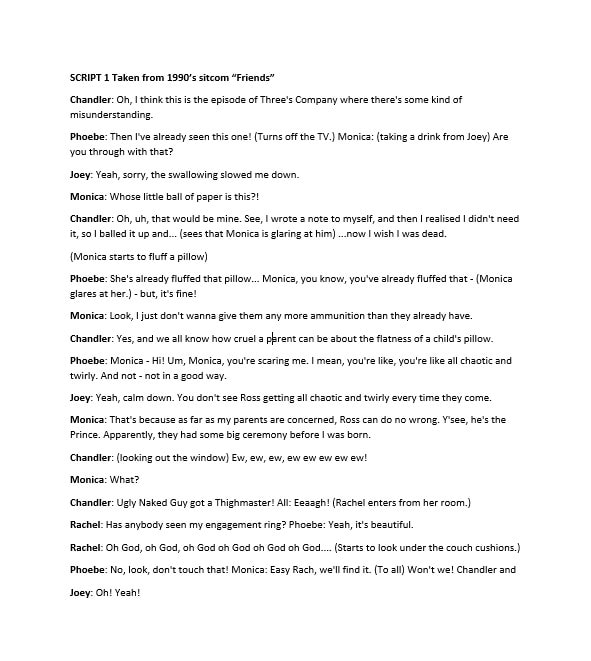
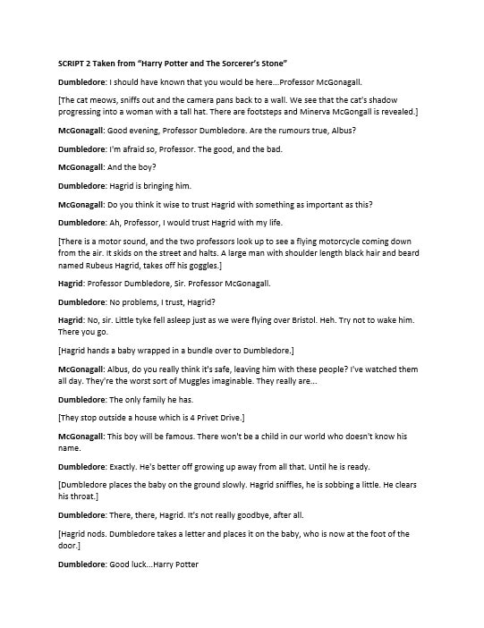
harry potter and the philosopher's stone

Picture
Picture
Brief & Script

We were given our next brief on Thursday to pick out of 4 scripts and I decided to choose Harry Potter as I love the wizarding world a lot and thought I would definitely enjoy this one much more, friends was also a close choice as I enjoy watching it as background noise. With Harry Potter I am hoping to change the title to the British version, It is a small detail which I am hoping will be allowed to change.
Session Notes & Type Play
Artist Research
Robert Massin
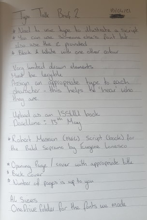
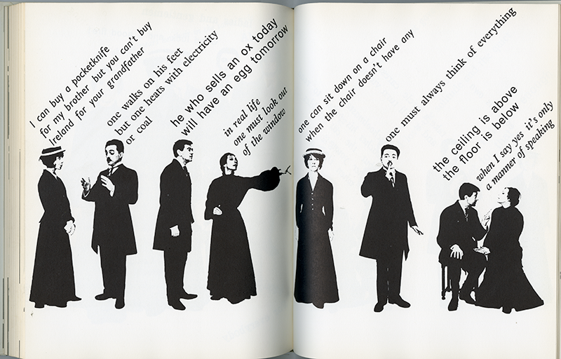
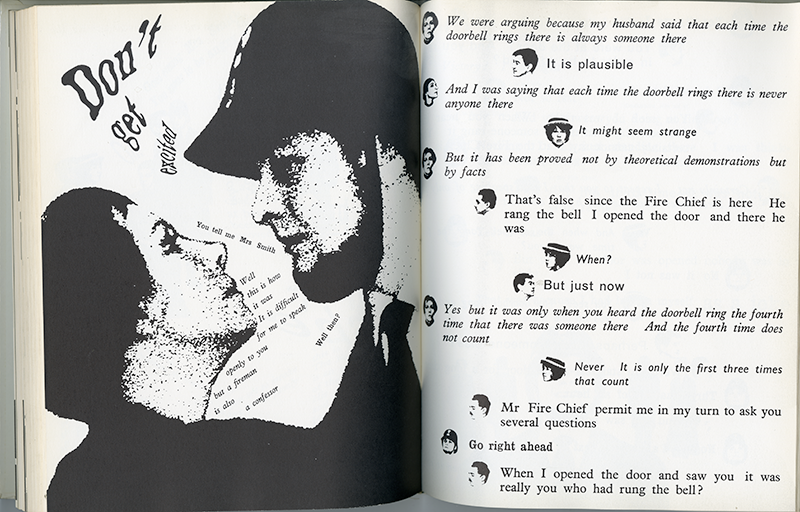
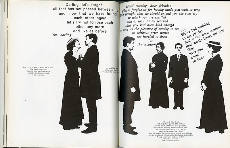
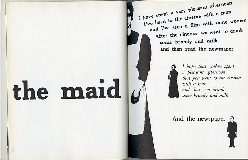
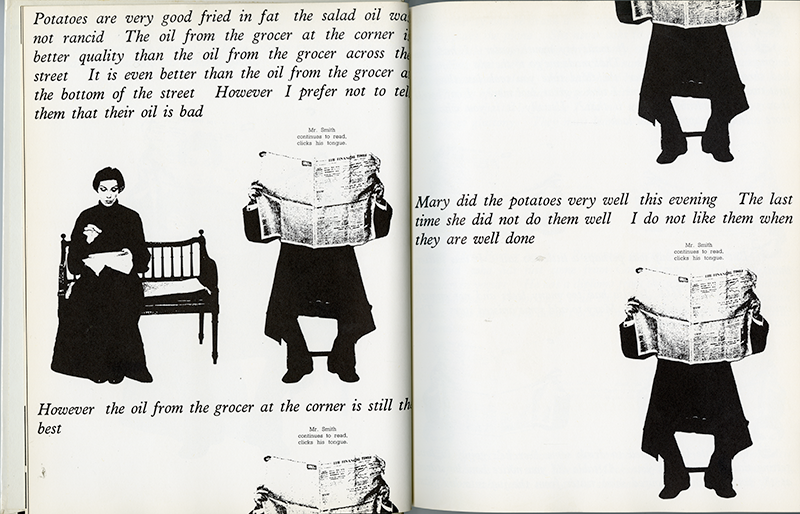
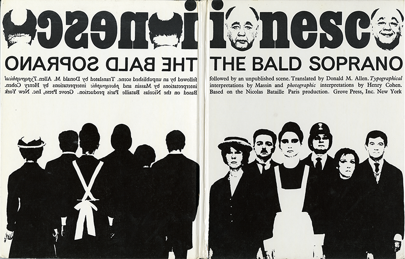
We were shown the work of Robert Massin during our session and this helped me figure out slightly what the brief could be like especially when working with black and white. 
Lisa Perrin
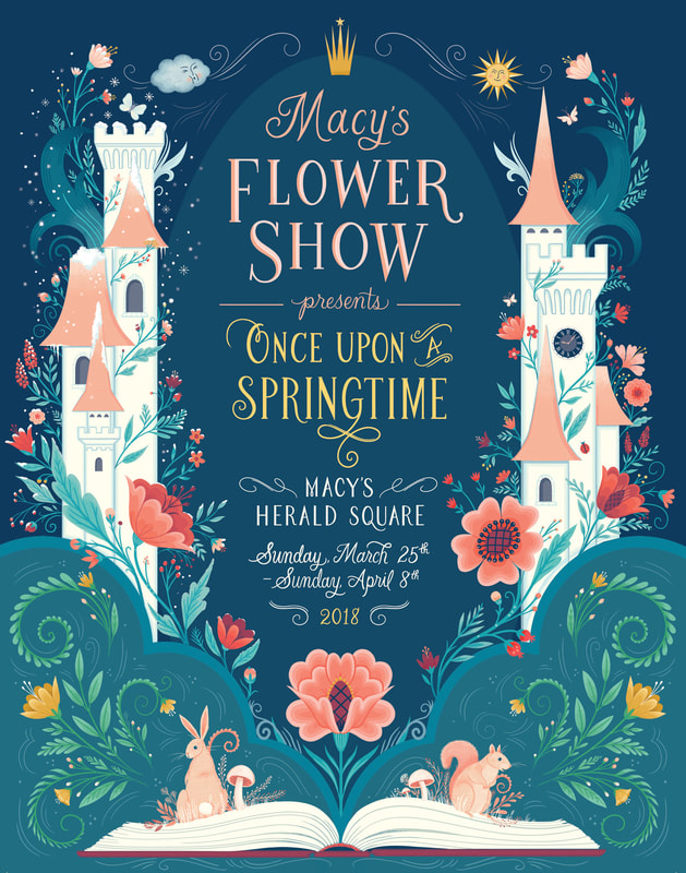
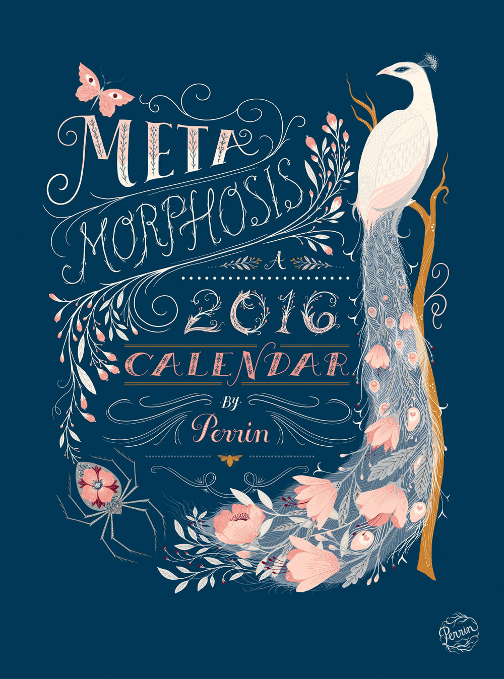
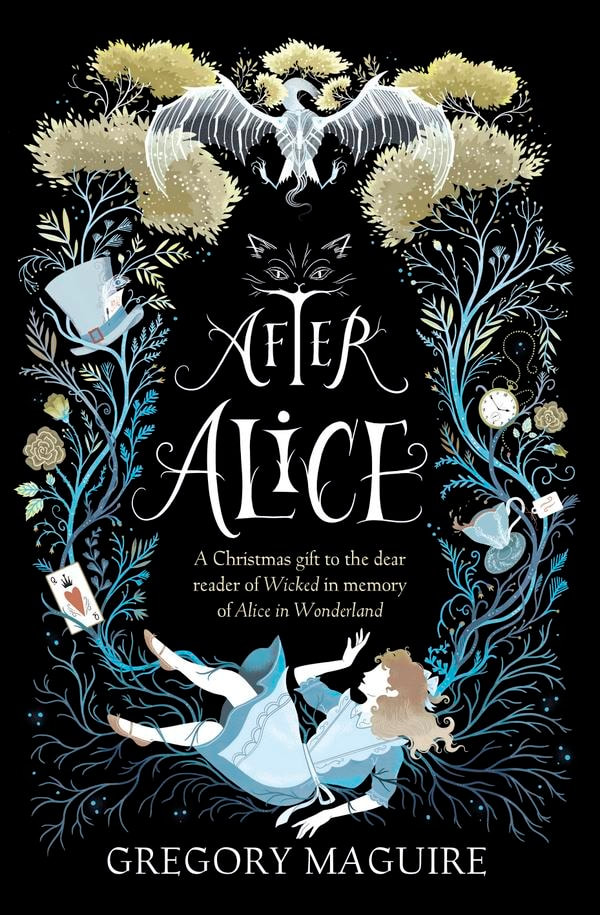
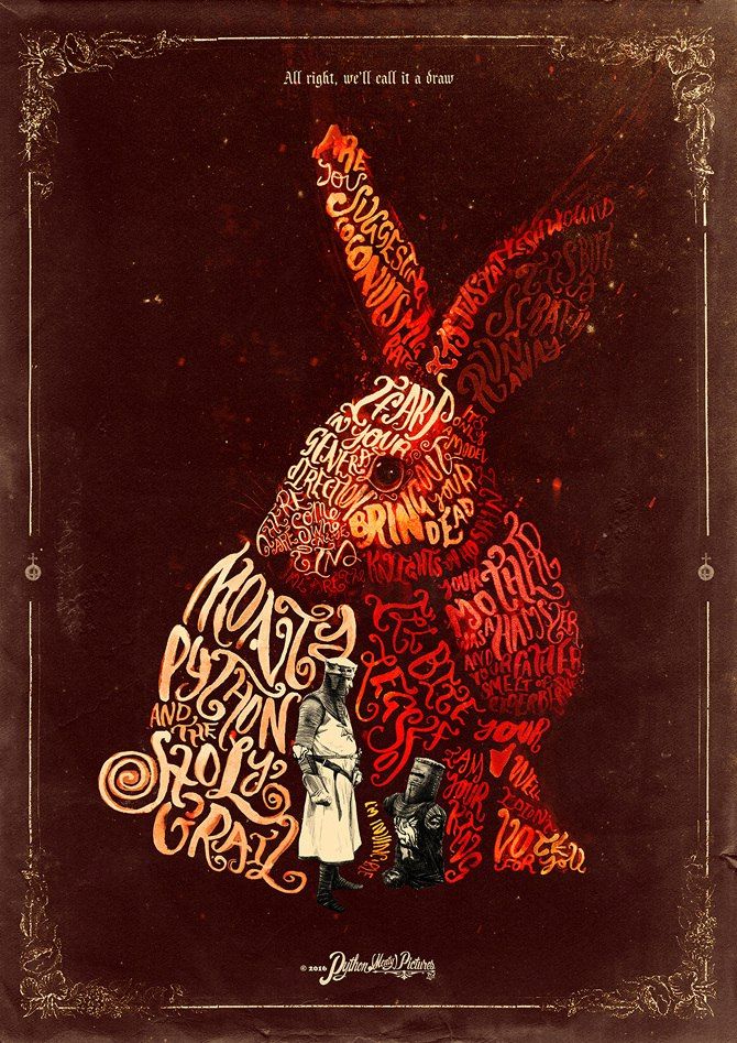
I was looking at book covers as another inspiration but most of these are illustrated more than type but as we're allowed a small amount of illustration this could work out. As we're only allowed certain colours I feel like a simple illustration with colour would look nice or have a specific text have colour within it.
Peter Strain
Asja Boros
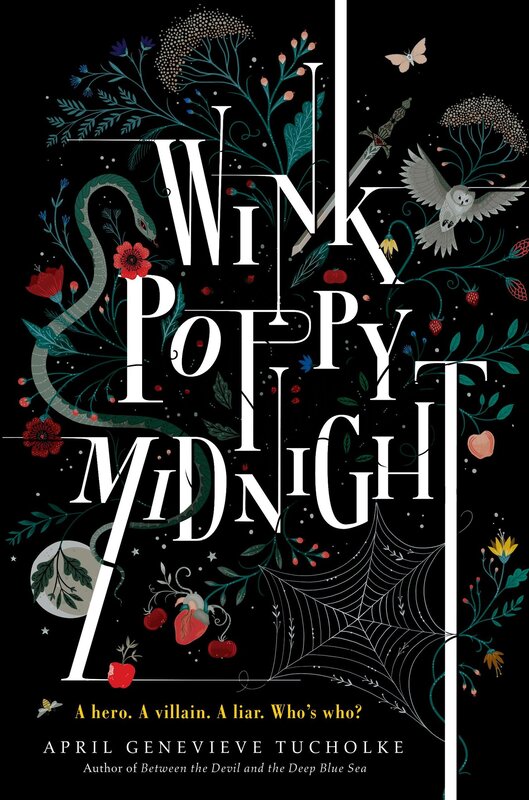
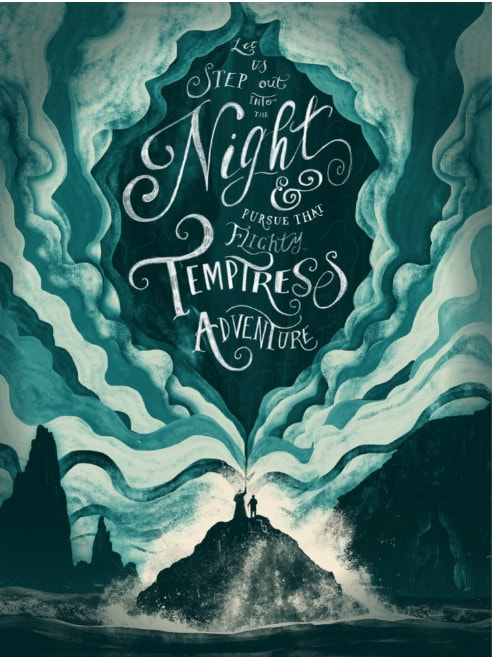
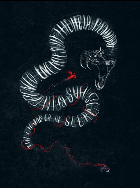
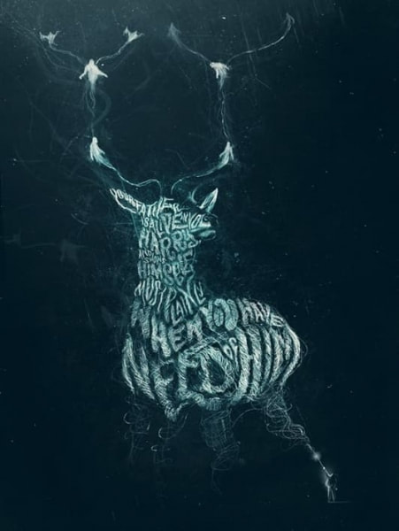
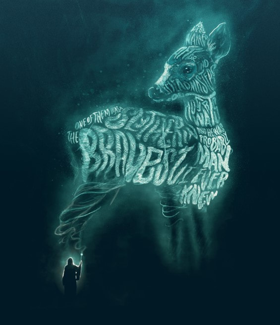
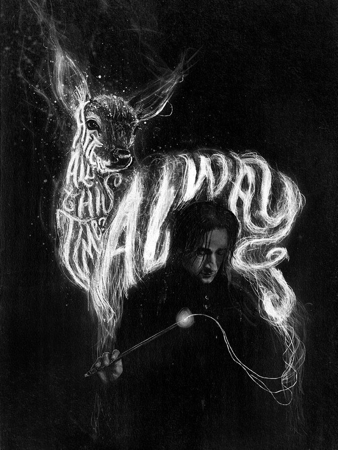
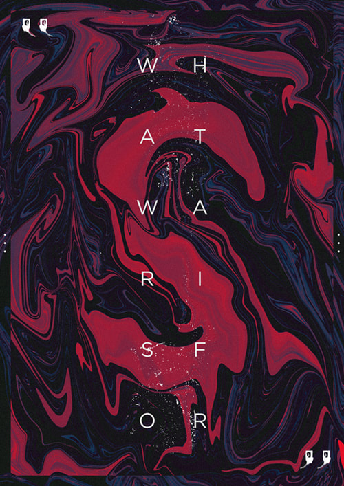
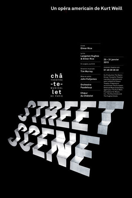
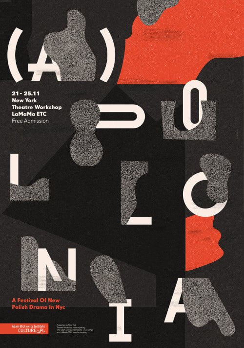
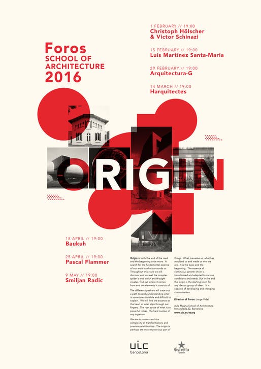
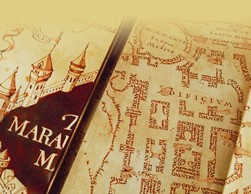
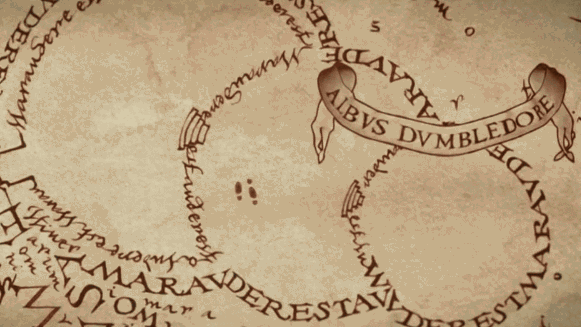
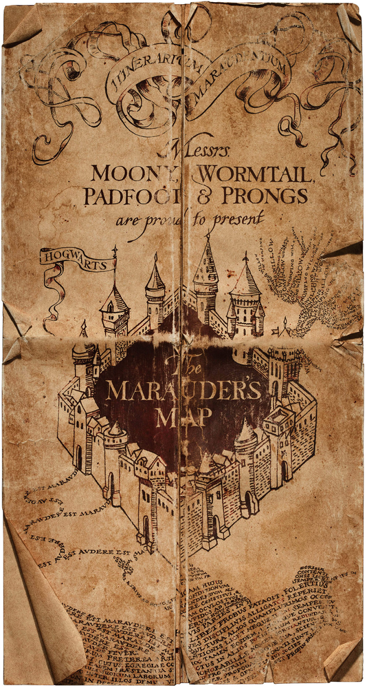
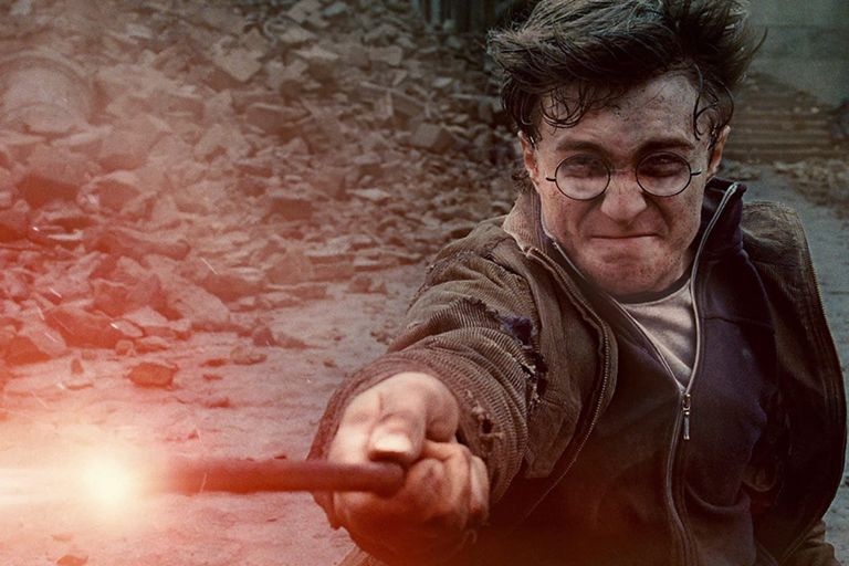
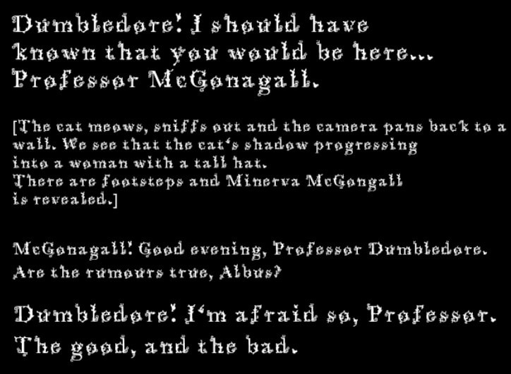
Peter Strain was the first person in mind who I thought of when it came to typography and harry potter but I had forgotten his name unfortunately but Harry's Patronus was still stuck in my head, I later noticed he had more work that relates to the wizarding world. Harry Potter Type Art
I really like the colours used for these designs and the darker background, I feel fore my designs I may go with a black background with white text and few illustrations.
Layout Research
The Marauders Map
My first Idea was to use the marauder's map as it's mainly just footsteps with writing on the walls of the rooms which is pretty simple and would fit having not much illustration within it. I also like the coffee stained paper effect as well as the names being in a fancy ribbon. I may take this Idea further and use these as the cover and back cover for the script as the map only opens up with a tap of a wand and by reciting  "I solemnly swear that I am up to no good." and closes off similarly with "Mischief managed." which would be a cool idea to add. The Marauders map was created by Remus Lupin (Moony), Peter Pettigrew (Wormtail) Sirius Black (Padfoot) and James Potter (Prongs) in 1974 while they attended Hogwarts.
Deathly Hallows: The Tale of the Three Brothers
Picture
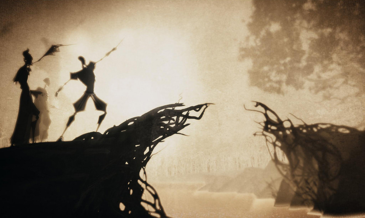
Deathly Hallows Animation

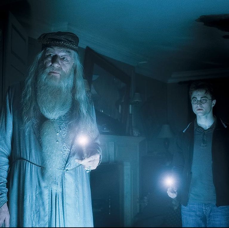
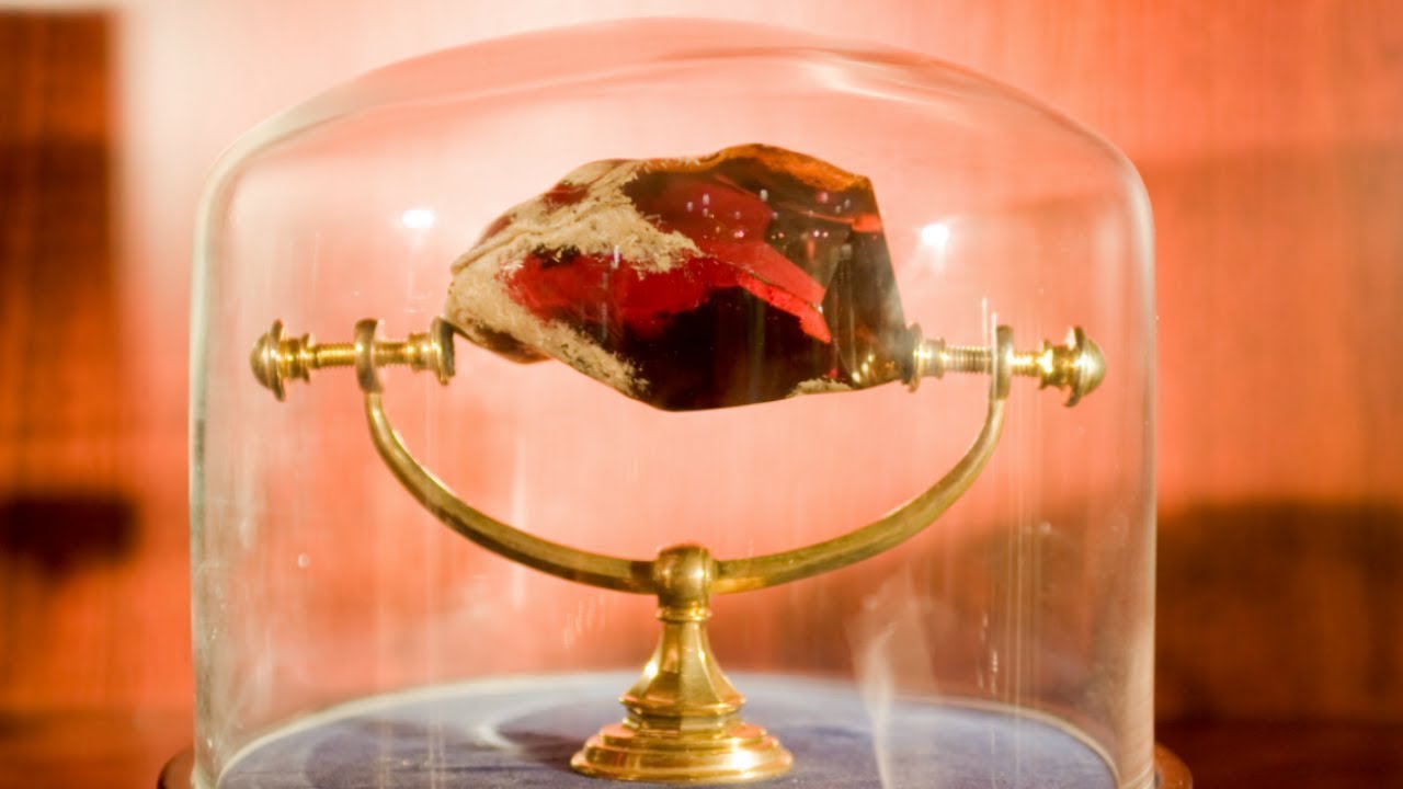
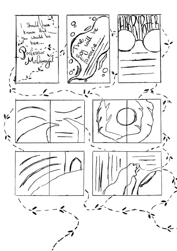
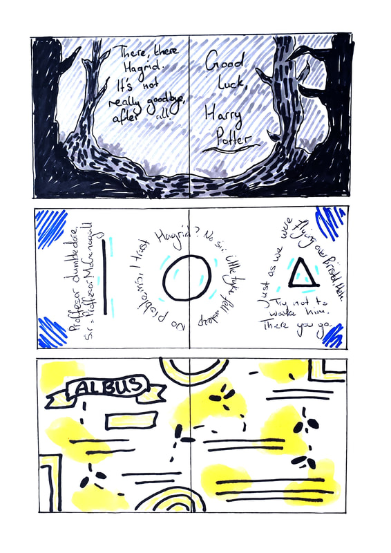
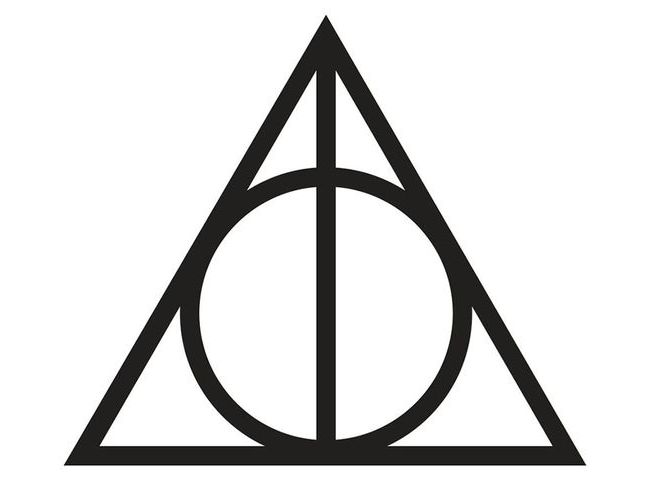
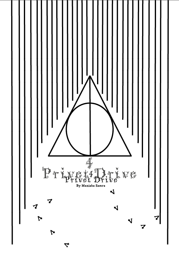
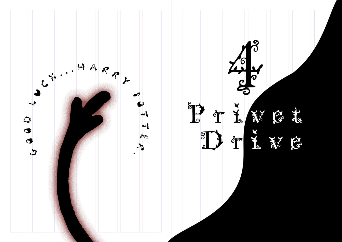
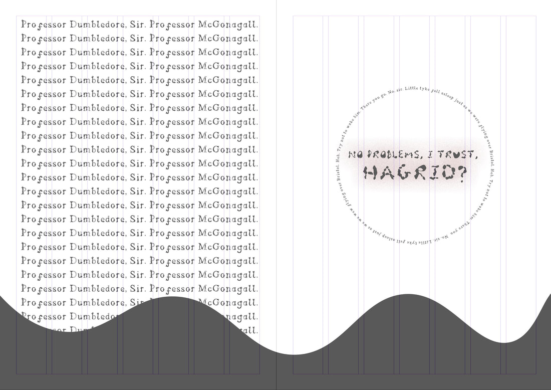
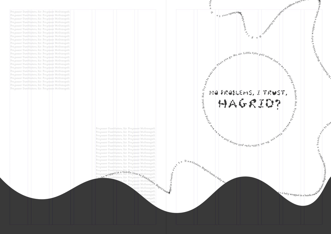
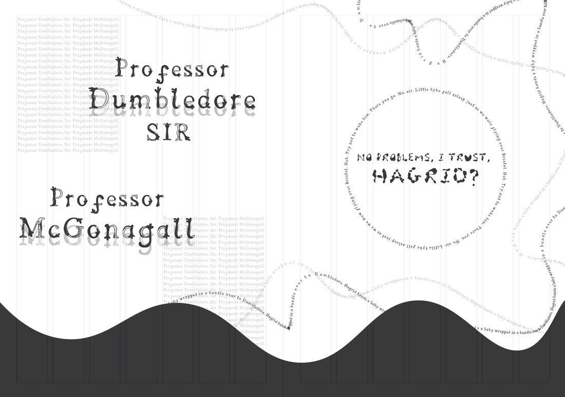
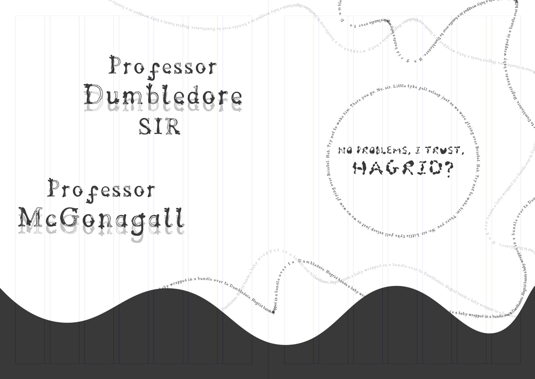
​The Deathly Hallows relate to Dumbledore as he is referred to "death himself" throughout the story and this makes sense as we all know he dies and greets Harry as an old friend during a scene in the deathly hallows. The Peverell brothers represent each hallow, the line which represents the elder wand, the circle which represents the resurrection stone and lastly the triangle which represents the invisibility cloak that gets passed down from James Potter to Harry (Beedle and the Bard). The Potters also being a distance relative of the Peveralls.

Gryffindor
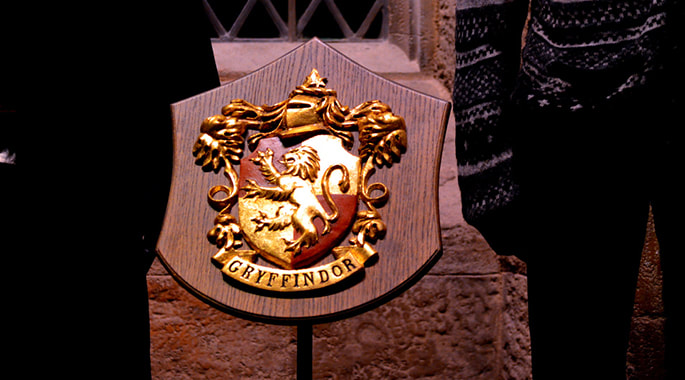
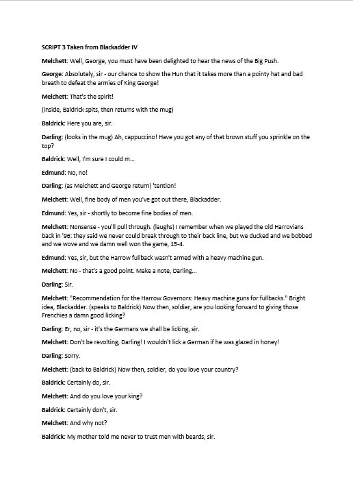
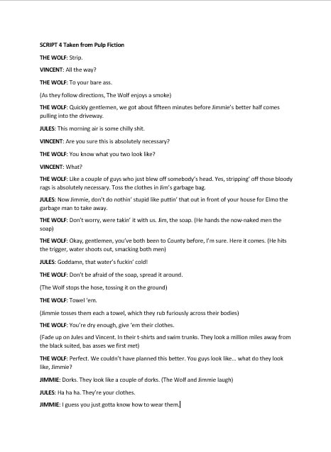
‘You might belong in Gryffindor,
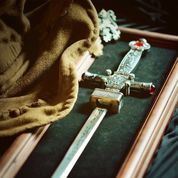
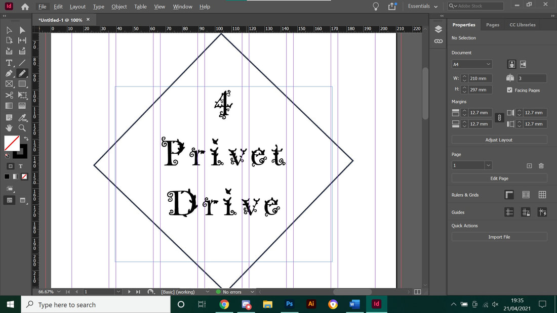
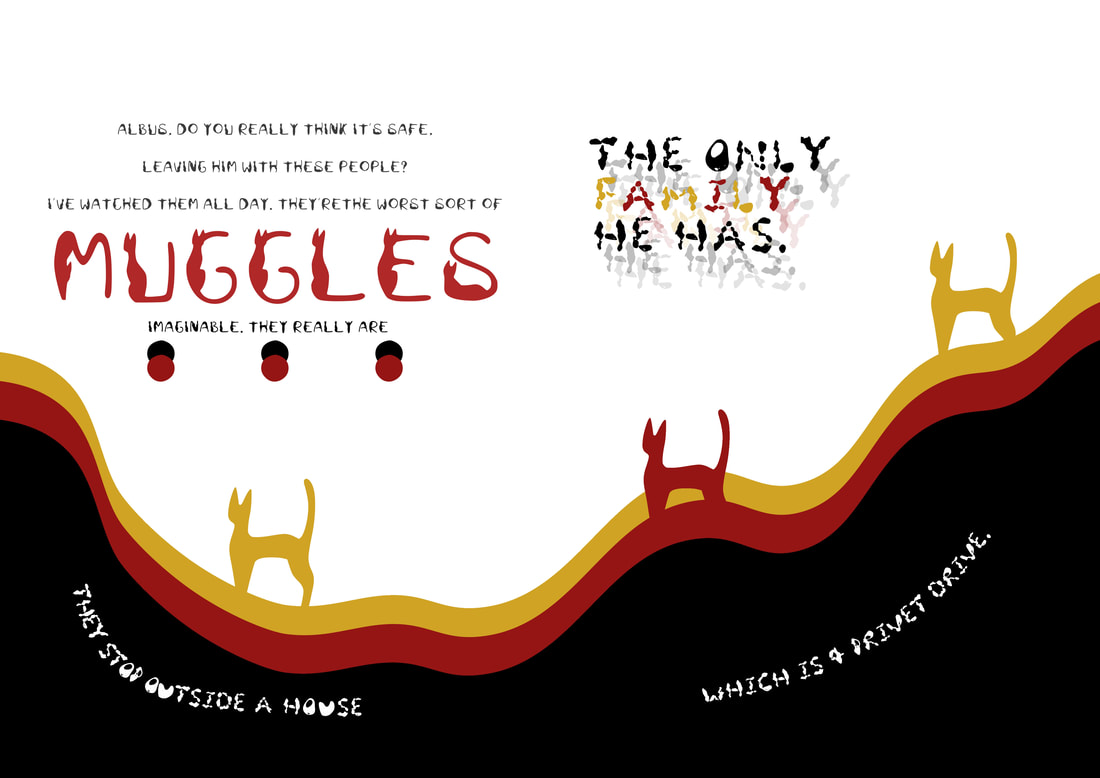
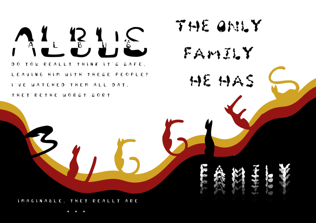
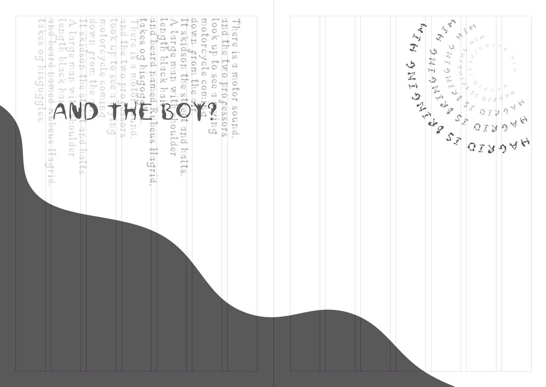
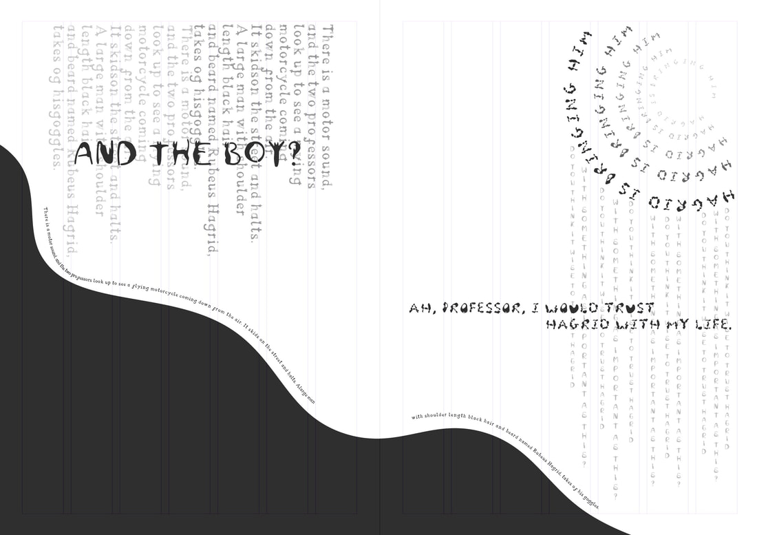
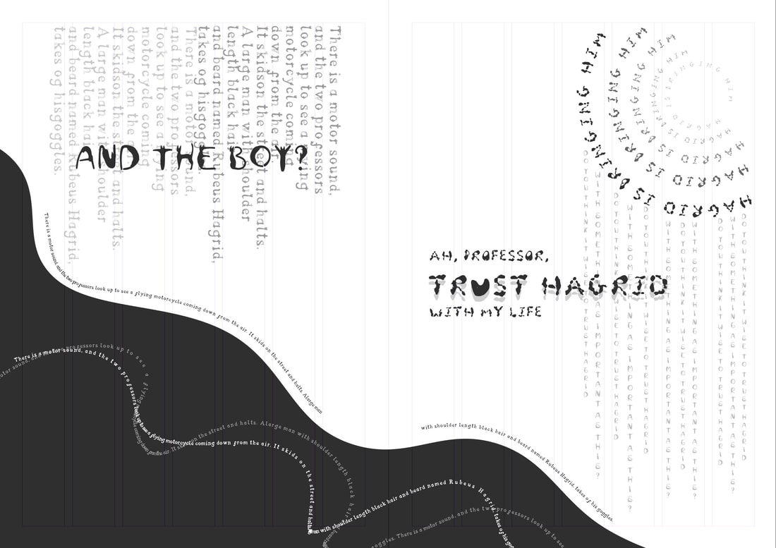
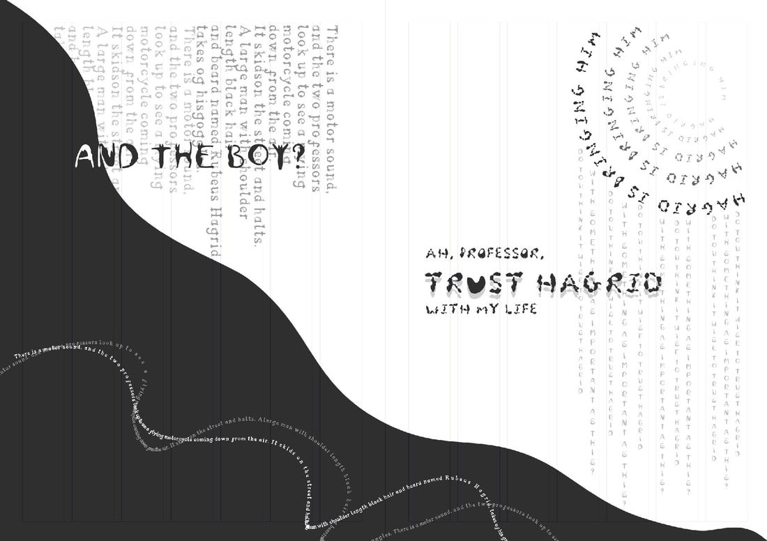
Where dwell the brave at heart,
Their daring, nerve and chivalry
Set Gryffindors apart.’
Harry Potter and the Philosopher’s Stone
I thought it would be best fit to look into Gryffindor related items and aesthetics as each character that is included in the script all belong to the house of Godric Gryffindor. This also ties into the correlation that Harry did grow up in Godrics hollow for a year or so before his parents where murdered by Voldemort. 
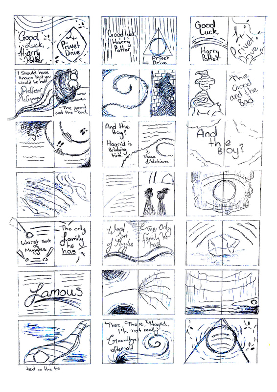
Charms & Spells
The main thing about Hogwarts is clearly the spells and charms they cast - especially a Patronus charm which I really like the image for, and since the images are mainly black and white I feel like a black background for a simple animal illustration could work well or just a gust of 'wind'. A Patronus charm takes a while to fully form as it's based on your happiest memory and each Patronus is different, Harry's is a stag, just like his fathers. We don't hear what Dumbledore, McGonagall and Hagrids would be but McGonagall's would most likely be a cat as it's her Animagus form (although your Patronus does not dictate which animal you transfigure into). I would like to believe Dumbledore's would be a Phoenix due to his pet 'Fawks' which would be fun to work with, a Phoenix made out of type?
Philosopher's Stone
Now for the title of the script, the Philosopher's stone, created by Nicholas Flamel and was also a close friends with Albus Dumbledore. We haven't been introduced to him through the movie or book but he has been mentioned a few times - the first time we finally get to see him on screen is during way before the rise of Voldemort and Harry Potter but rather the war of Gallert Grindlwald as Newt and his friends come to see him in Fantastic Beasts. The stone was also briefly shown to showcase the reference. Adding onto the Gryffindor colours I feel like my script will have pops of reds and golds - the stone itself could be a cool idea to have as one of the pages too.
Your browser does not support viewing this document. Click here to download the document.
Initial Ideas

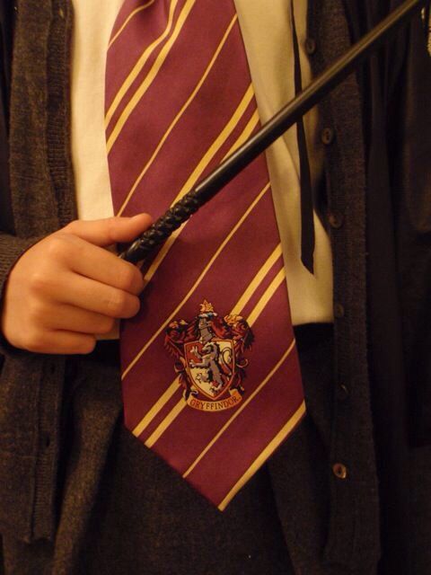
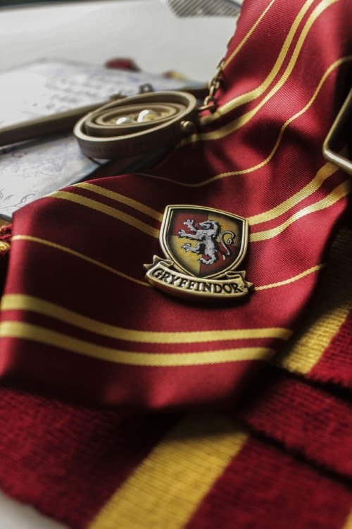
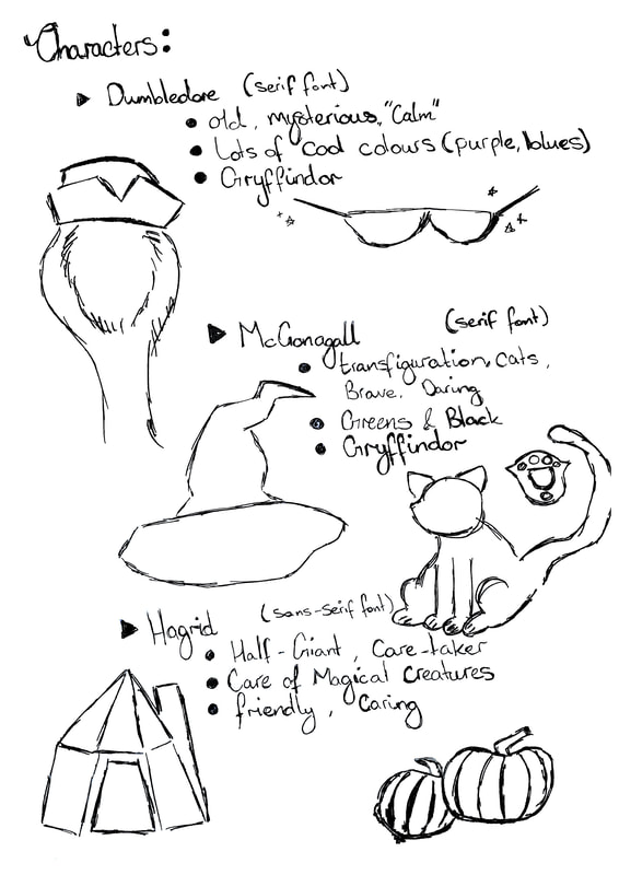
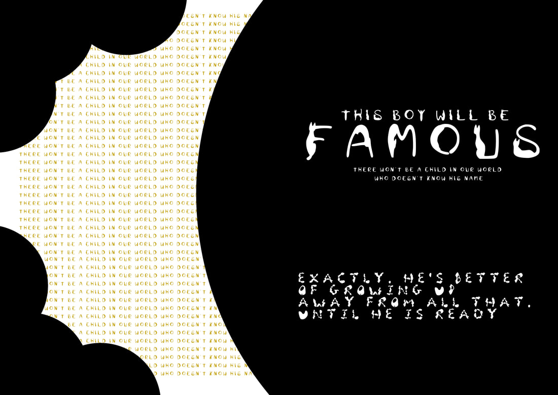
During Monday's break I decided to come up with some ideas off the spot and decided to add in some details from the wizarding world, I laid out some Ideas for the characters and their personalities, and since they're all Gryffindor I feel the best colour would be to use Red and Gold for my limited colours. I then went onto word to mess around with the script and the page layout so I knew which script would go with each page. From my ideas of the characters I will move onto research more about them that would fit the 20% illustration.
Thumbnails
Picture
For my first set of thumbnails I wanted to try out how I was going to use a singular colour into my work. I used some cool and warm colours with markers and then decided to try out ball point pens - I think i will have very limited colour but will use it mainly for parts of the script to really emphasise on the words.

For my fully draw Thumbnails I decided to go ahead in photoshop and make the quality look more sharp (I used a pencil for all the sketches but some turn out looking blue as well as my ballpoint pen which slowly desaturated as I'm not actually that great with using photoshop.) 
Picture
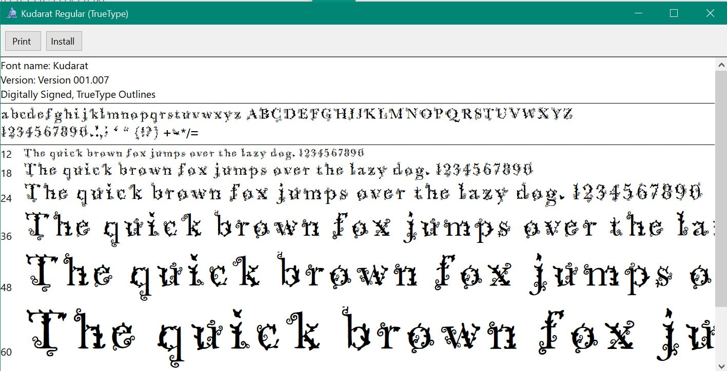
Making the font was very time consuming and also made my fingers hurt from so much clicking and trying to make my alphabet have a transparent background so they would fit properly. I also struggled with the 'g' as It went from too small to too large but I managed to get it at a decent height that wouldn't end up cropping it.
I followed the YouTube video above as well as the "How to create your first font" site. The outcome came out much more black than greyscale and I wasn't really expecting that but I don't hate how it looks - Although now I need to figure out which character I want to give my font or if I will use it for the stage directions instead.  

Picture
Picture
Grids

I remember from the first time we used InDesign to upload to ISSUU we where told to have the bleed be at 3mm so I've kept it the same for this but with 7 grids. I'm not too sure if we need to change the margin size and have left it at the default setting. I find it pretty difficult to try and work with InDesign when it comes to text and how I want it so I think I'll be using Photoshop or Procreate and then transferring the document over but also making sure to use the grid layout on photoshop and use the rulers as a guide for where I am supposed to stay within.
Typeface Testing

I went into photoshop and messed around by installing some fonts from DaFont. I used pictures from the movie to find out what the character's handwriting is like and for the most part Dumbledore and McGonagall would have a more calligraphy style to their writing whereas Hagrid would have messy writing which could also influence my script to have messy pages. I am not sure which character I will give my own typeface too or what to do with the stage directions but I think I'm leaning towards giving my type to Dumbledore. I will not be settling onto this Idea until I have done more tests and played around with more type. 
Picture
Picture
Picture
DIY Alphabet Choices

I didn't realise we had to pick DIY Alphabets for each character - I have now been going through most peoples OneDrive folders to see who I think would match each typeface the best. I find this a bit tricky as everyone has so many different ideas and themes that may not relate to the characters as much. I will most likely change my mind on some of these and may change who has which typeface.
Picture
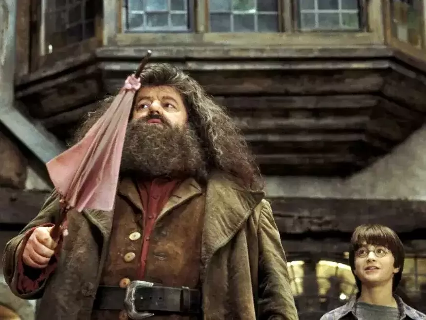
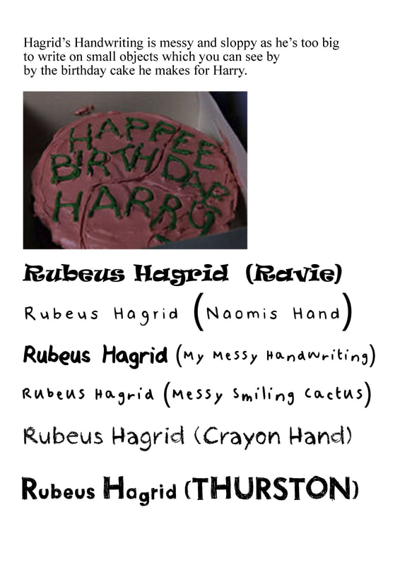
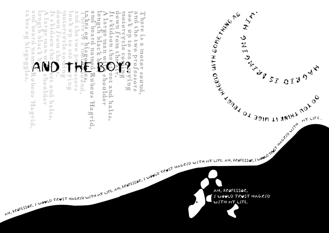
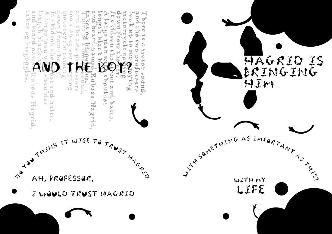
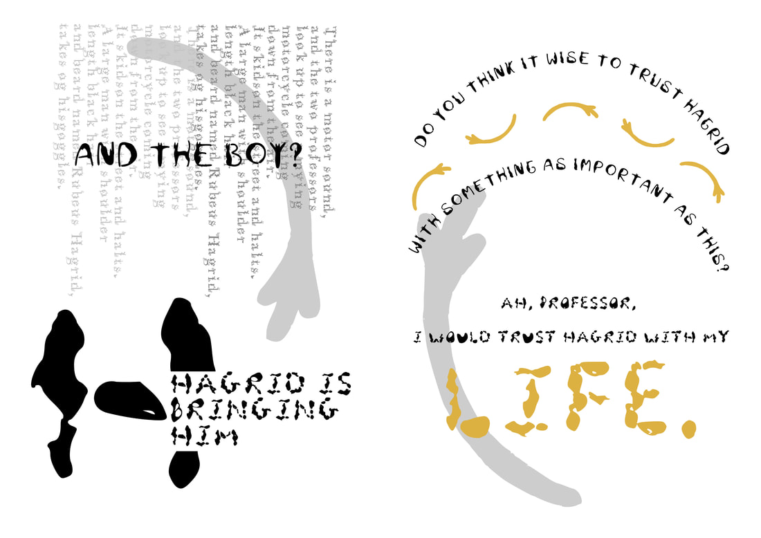
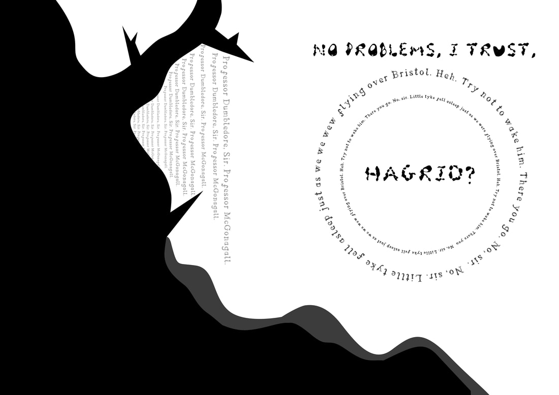
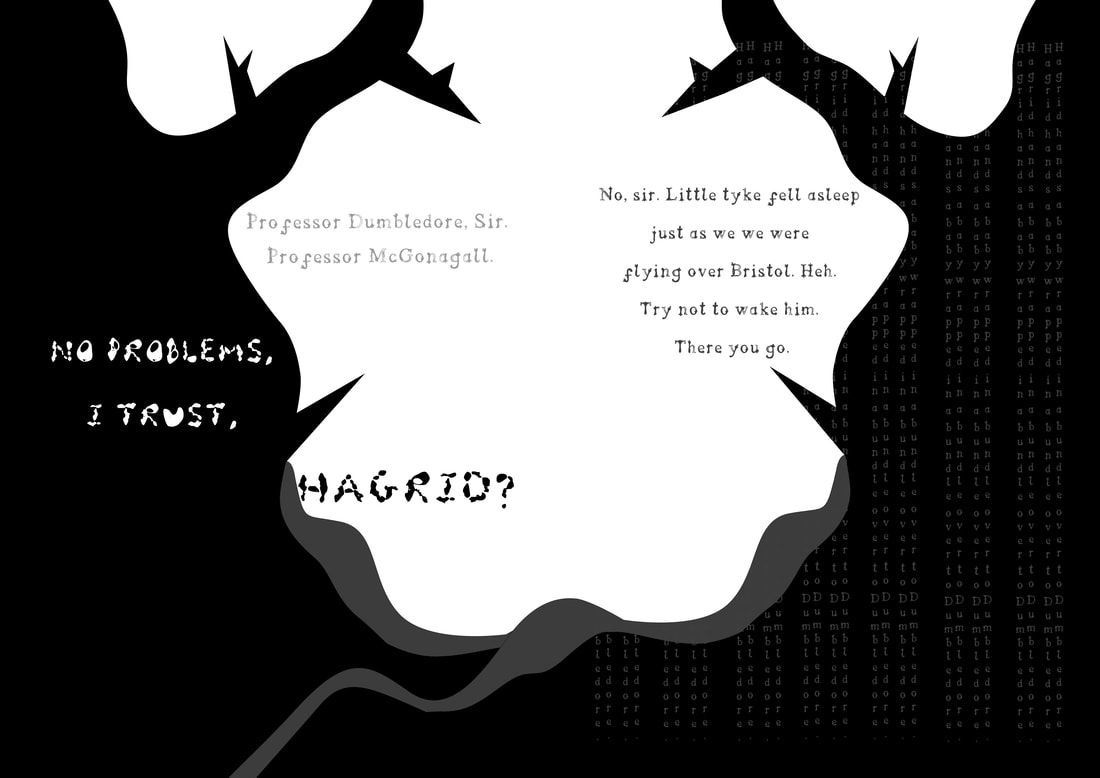
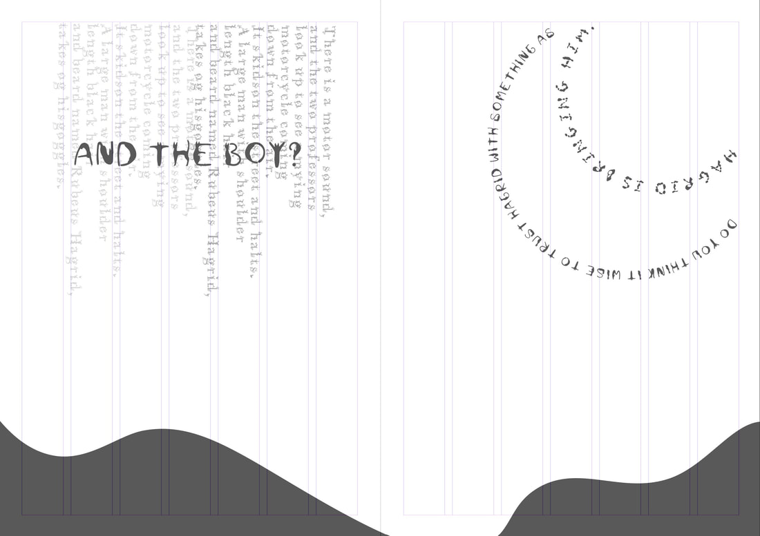
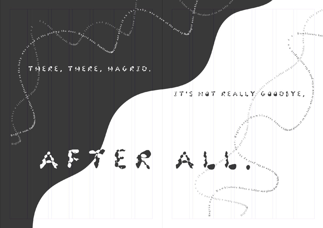
Rubeus Hargrid Is a Half Giant who is friendly and lovable - for his character his handwriting can be messy but as he's a nature and animal fellow I decided to either go for Ayeisha's Blackbird Alphabet or Clare's Nature alphabet. Played by Robbie Coltrane.
Picture
Picture
Picture
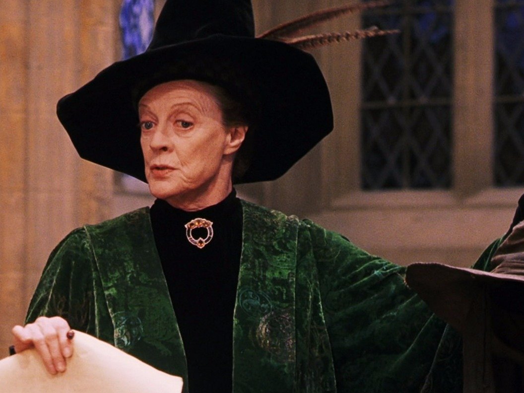
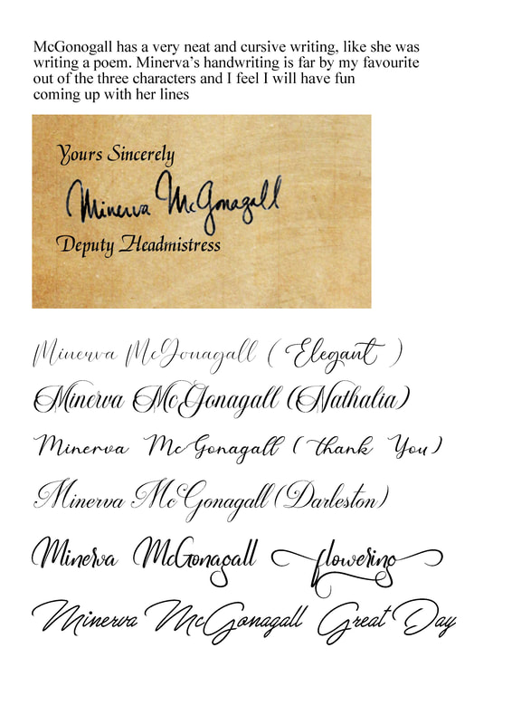
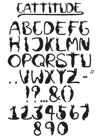
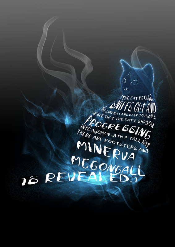
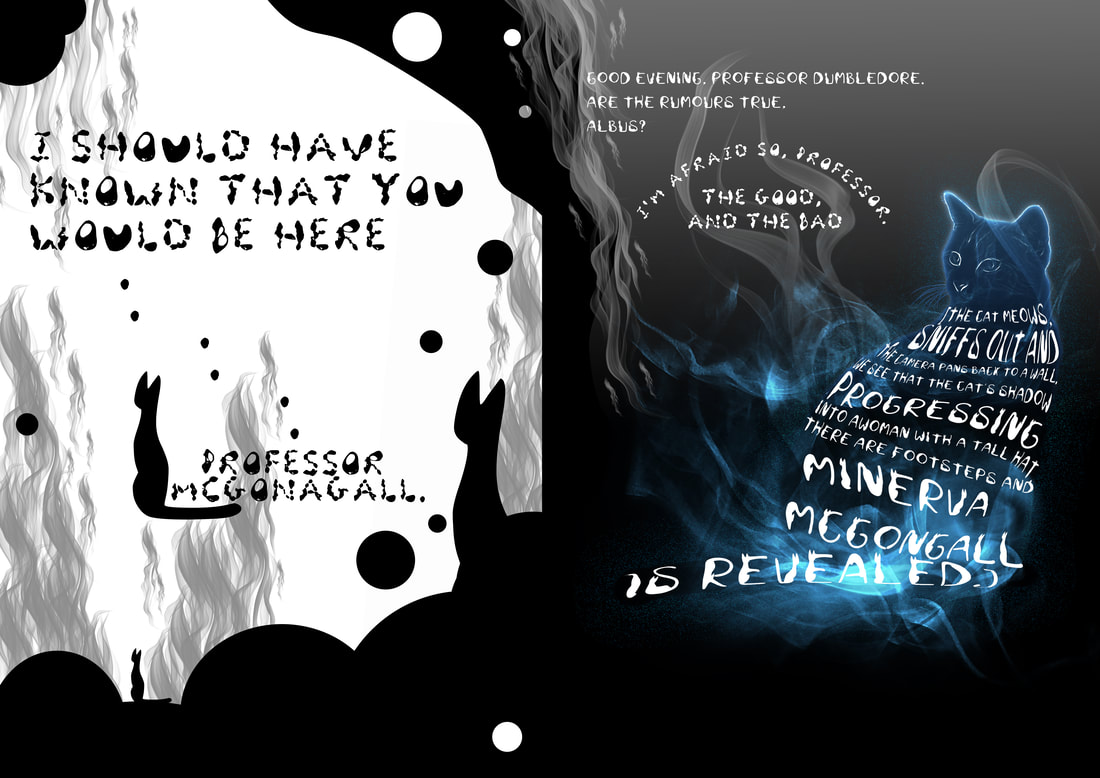
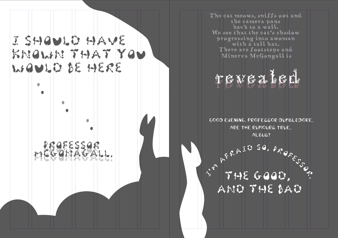
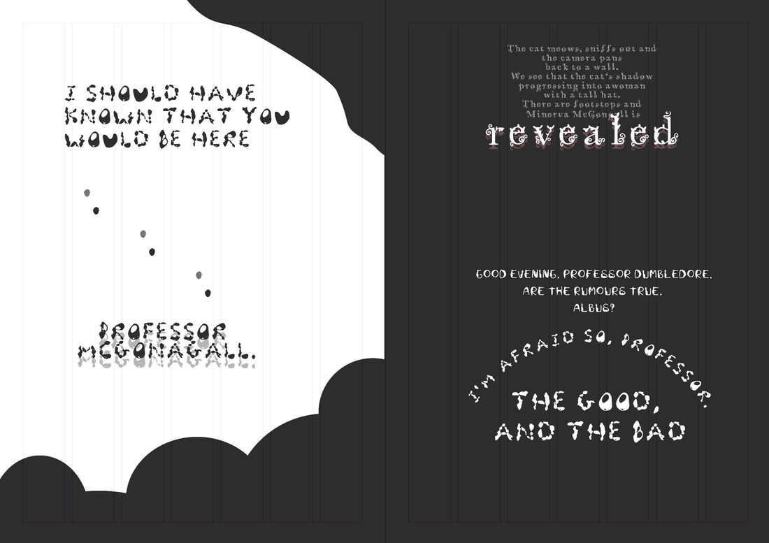
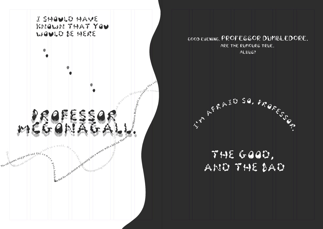
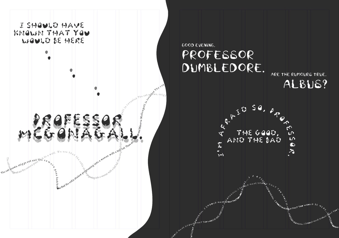
Minerva McGonagall is the headmistress of Hogwarts and the head of Gryffindor house. she is strict but also has a soft spot for her Gryffindor's as if they were her own 'cubs'. I chose my own typeface for her (I may be biased) as I feel a more elegant looking type suits her but I also thought about Amy's as hers is based on cats. Played by Maggie Smith. 
Picture
Picture
Picture
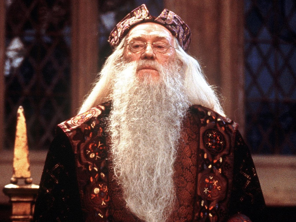
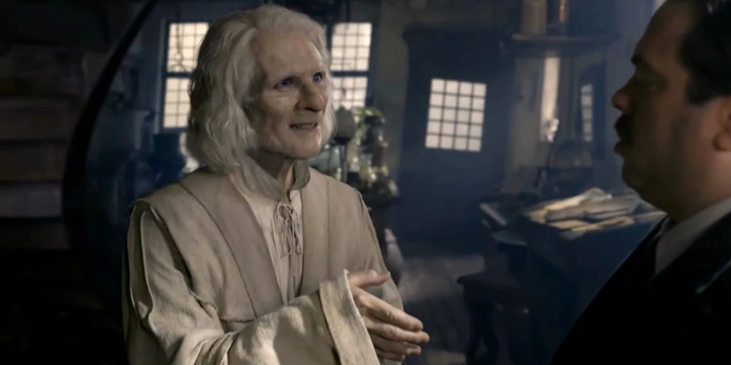
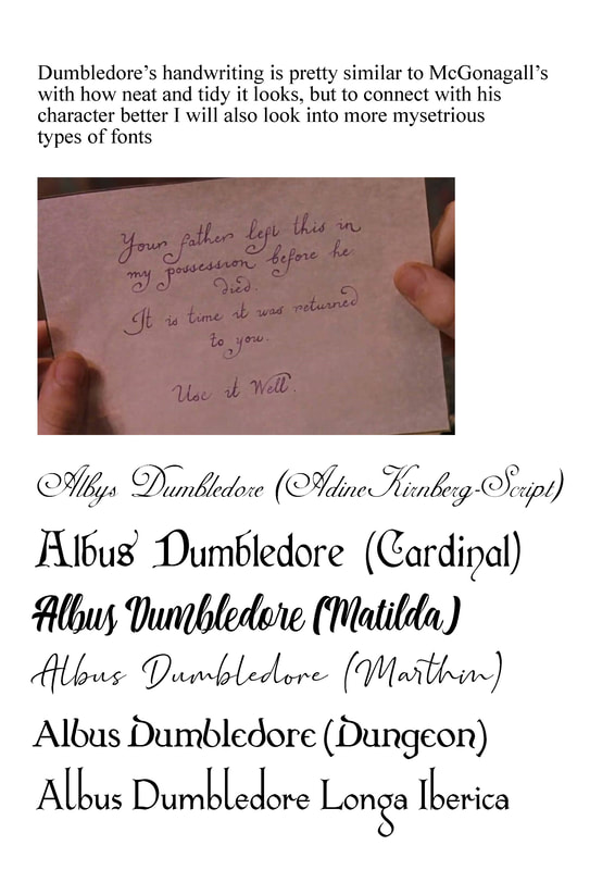
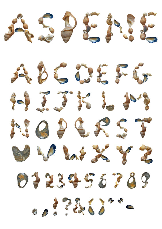
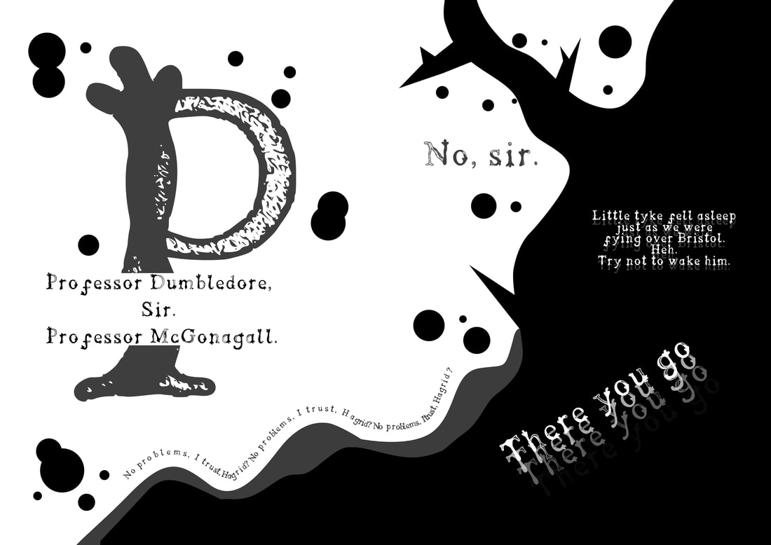
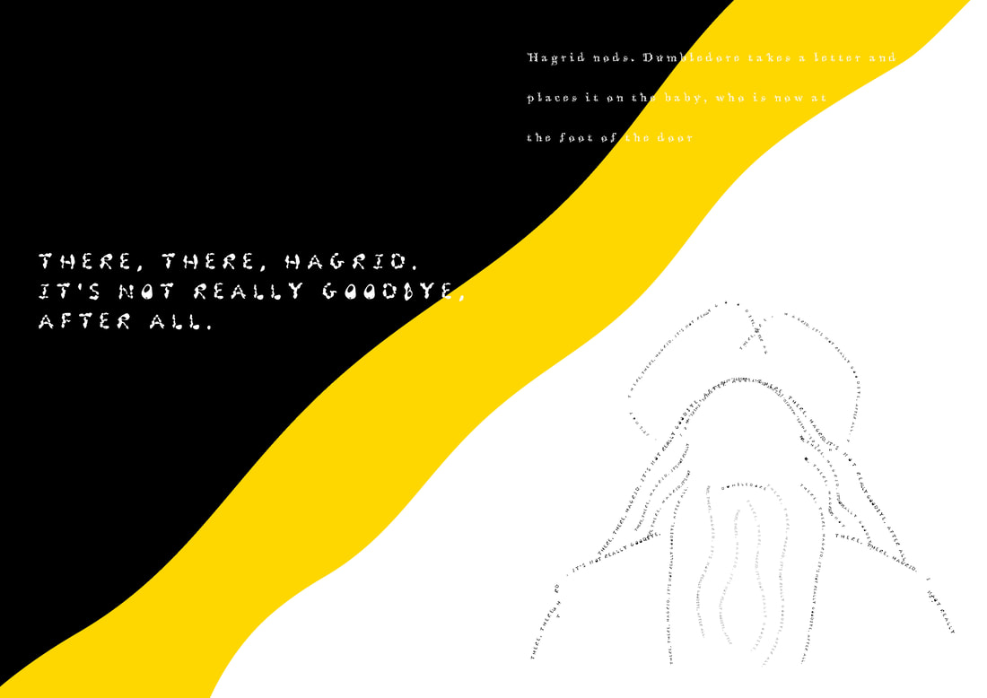
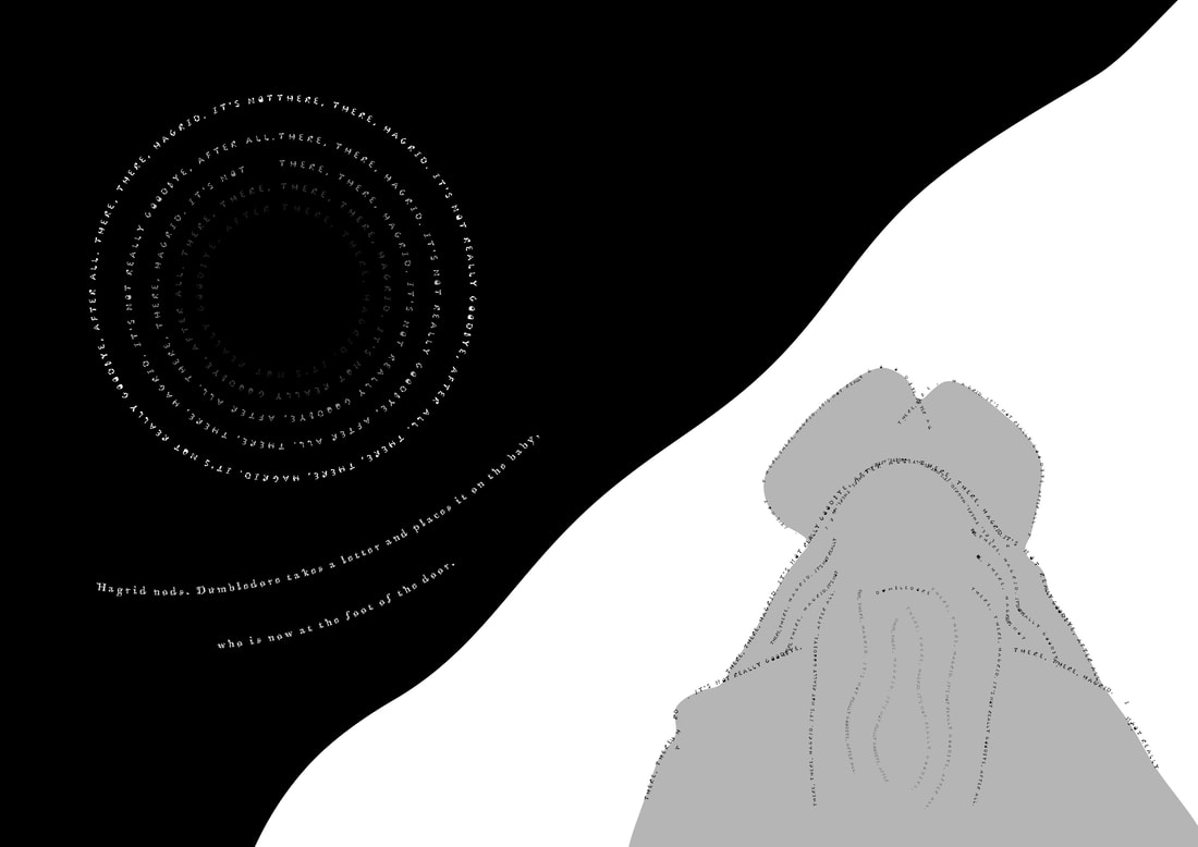
Albus Dumbledore is the headmaster of Hogwarts, once the transfiguration professor. He comes off as an old soul, someone you don't really know but feel like you do. I chose Jessica's shell typeface for Dumbledore as I feel he would be the type of person to collect things and place them around in his office. Played by Richard Harris (for the first 2 movies).
Picture
Testing DIY Alphabets

I downloaded some of the fonts that were available and played around with some of the script and made some imagery out of most, I feel once I began this I may need to change my script and how many word per page.
Picture
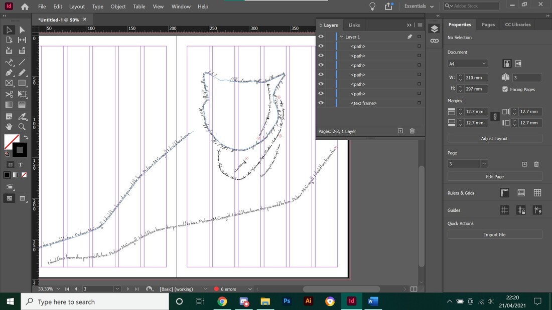
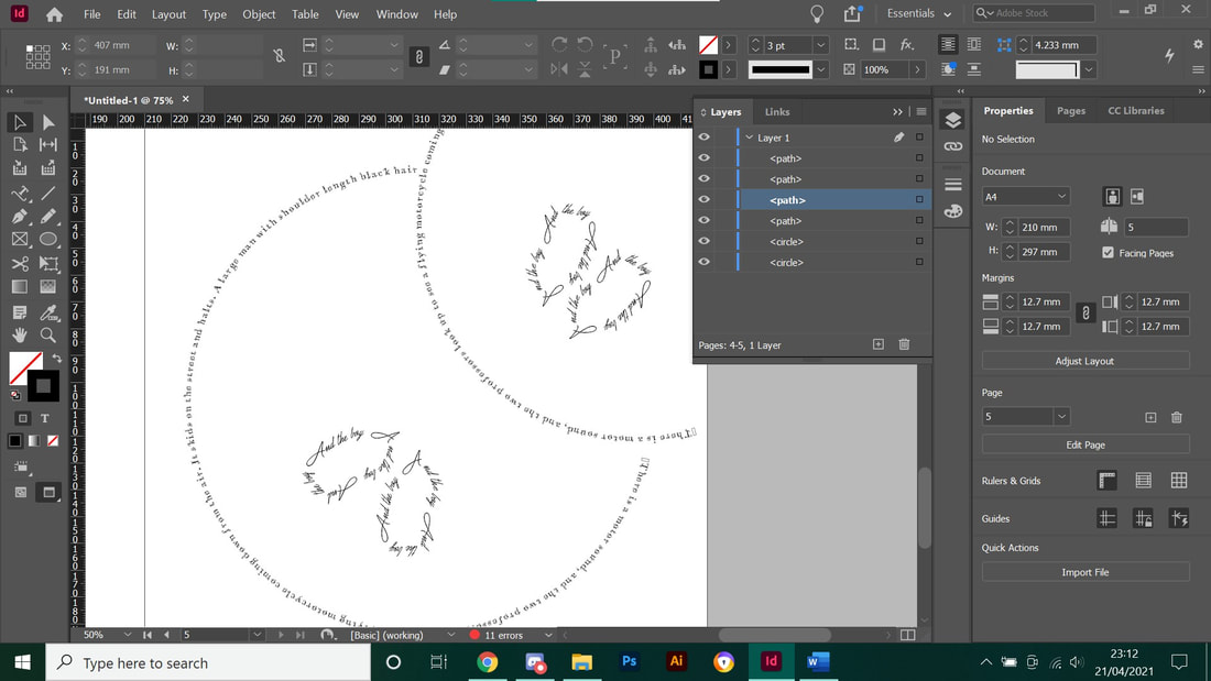
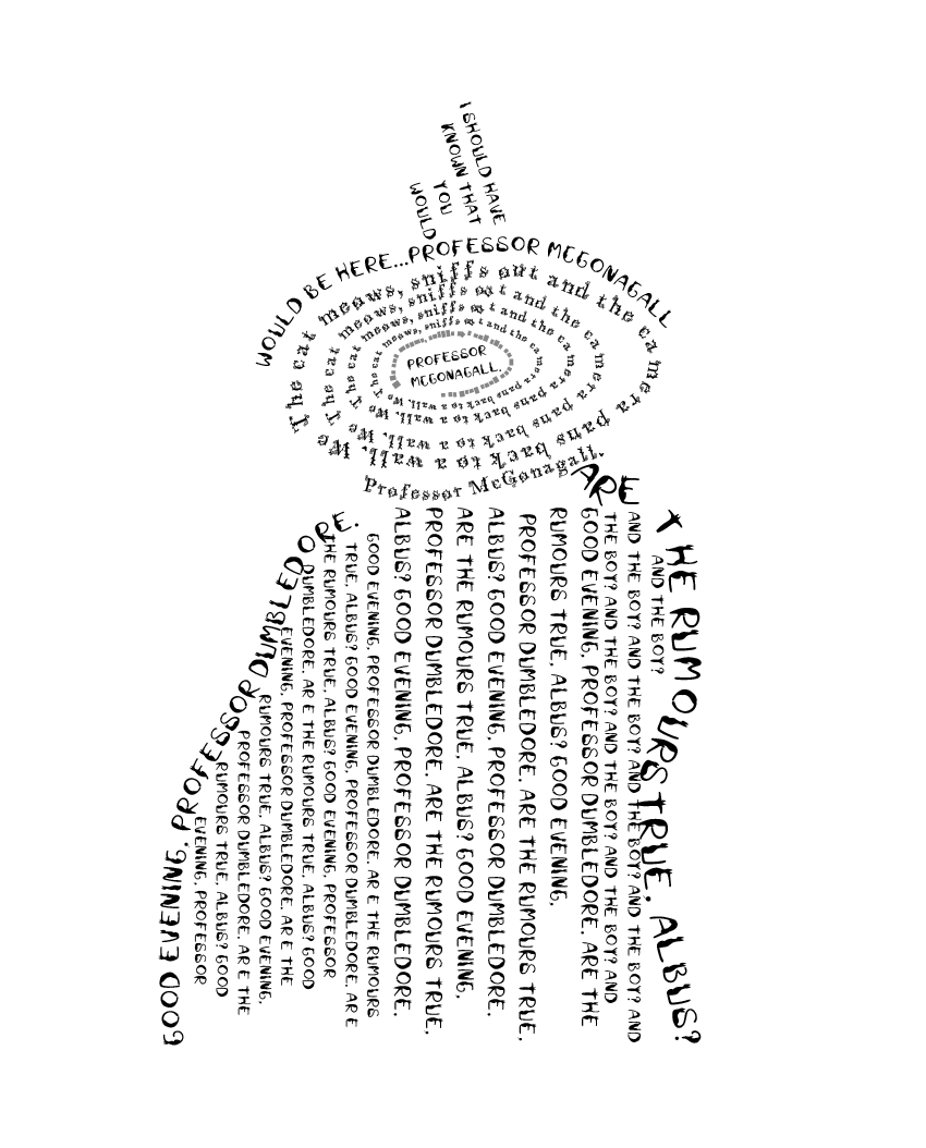
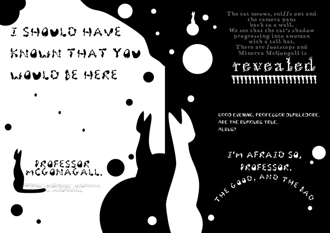
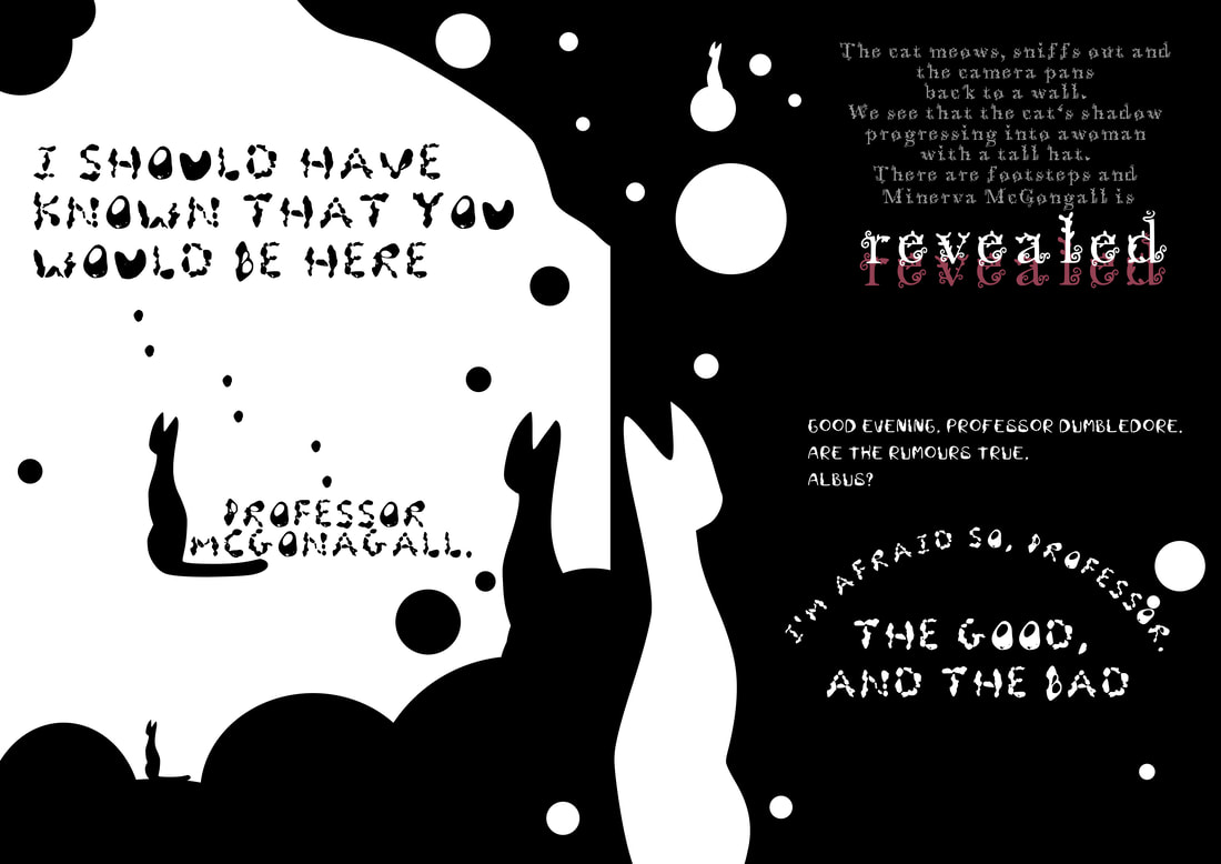
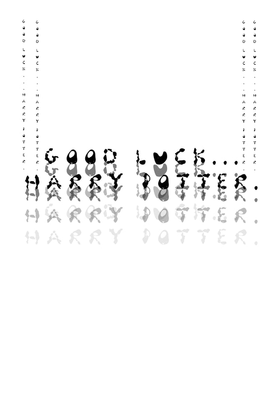
McGonagall Word Test

With the style of Peter Strain I wanted to test the DIY alphabets as best as possible, It's slightly different as I am not used to InDesign and couldn't manage to figure out how to warp the text so i used the pen tool and used the text option that lets you align onto the lines. I quite like this style but i'm not exactly sure on how to make it look better so I will move onto Photoshop instead. 
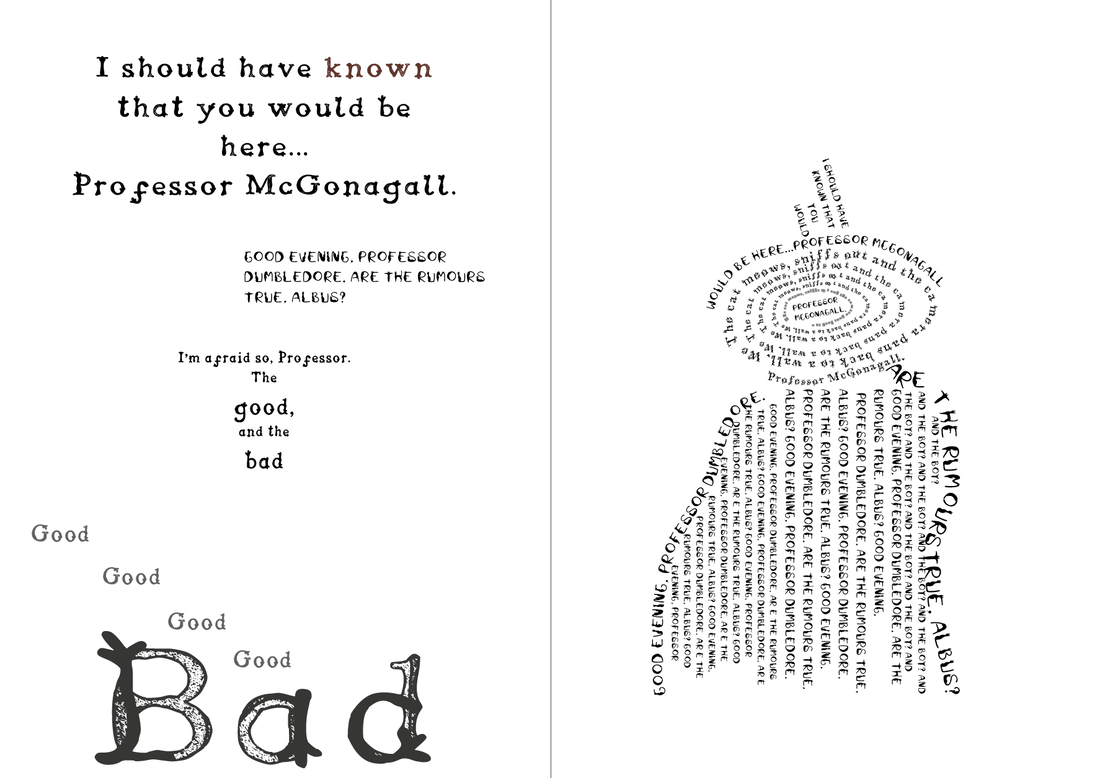
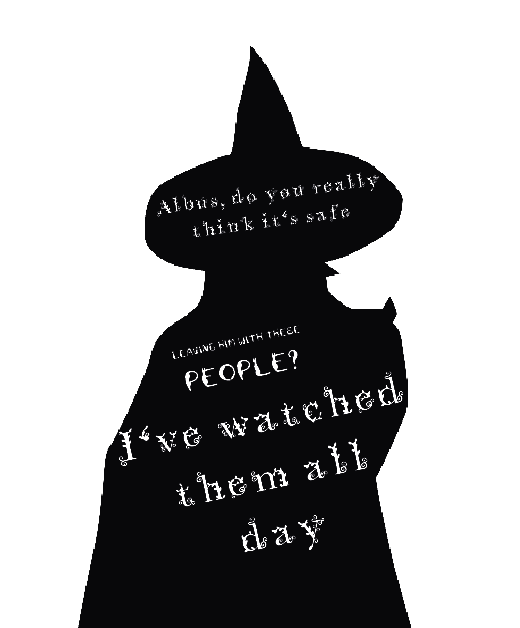
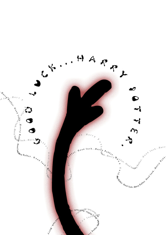
Picture
Vector Shadow

With the shadow of McGonagall it came out a bit pixalated when i was using the pen tool to try and fill it in. I will need to figure out how to make a smoother shadow if I use this in my work. 
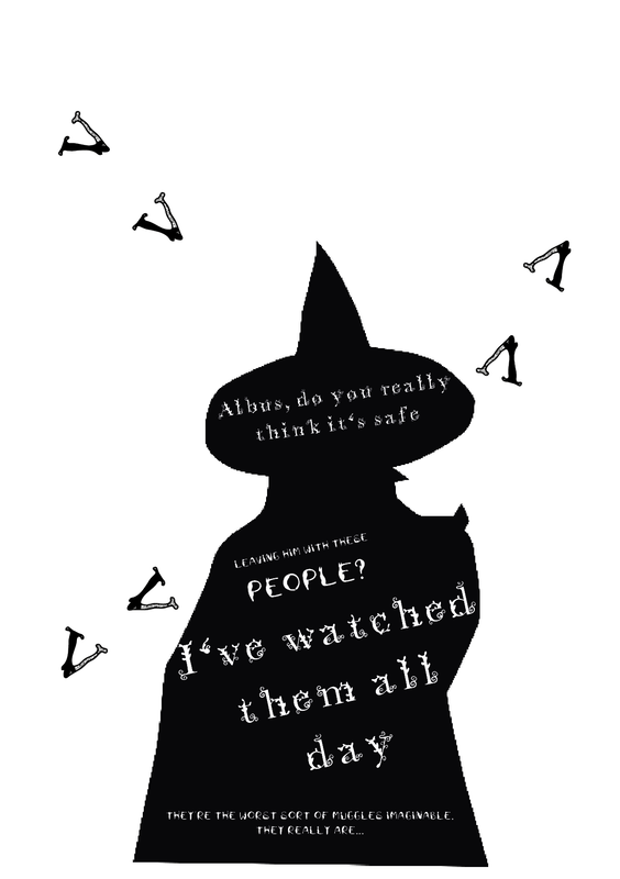
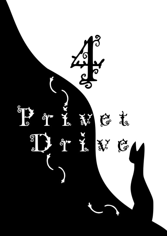
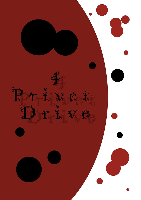
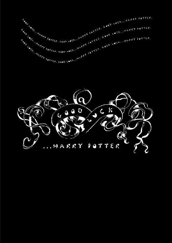
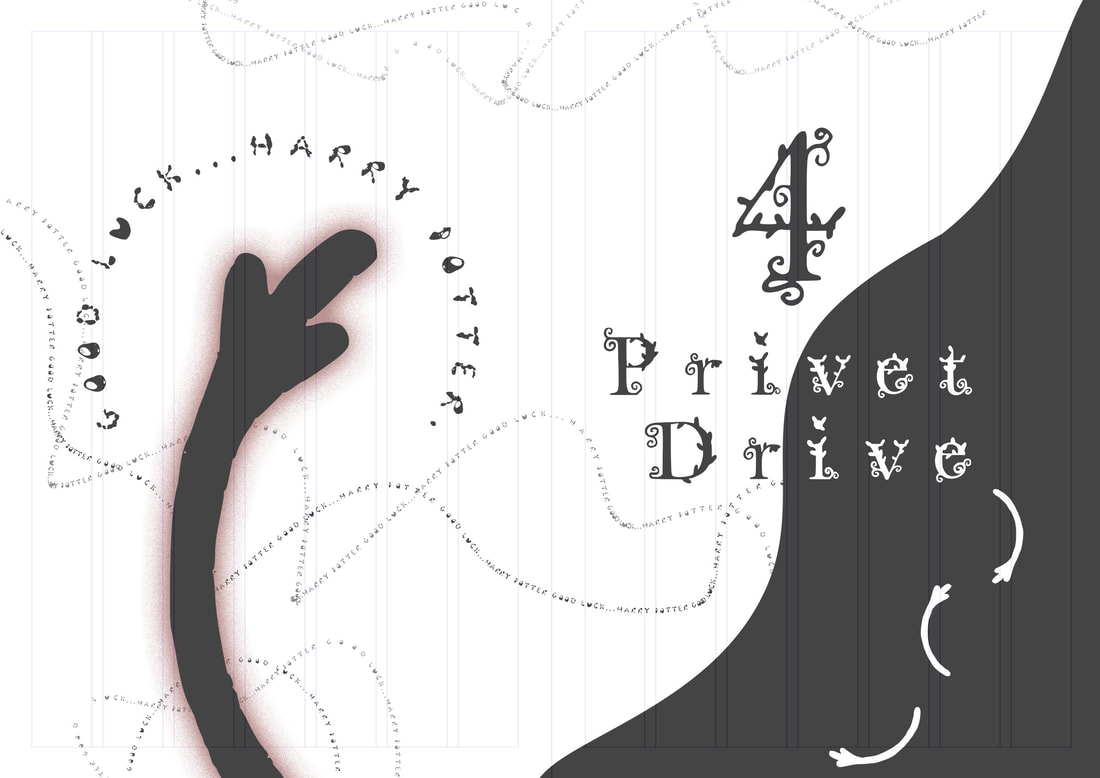
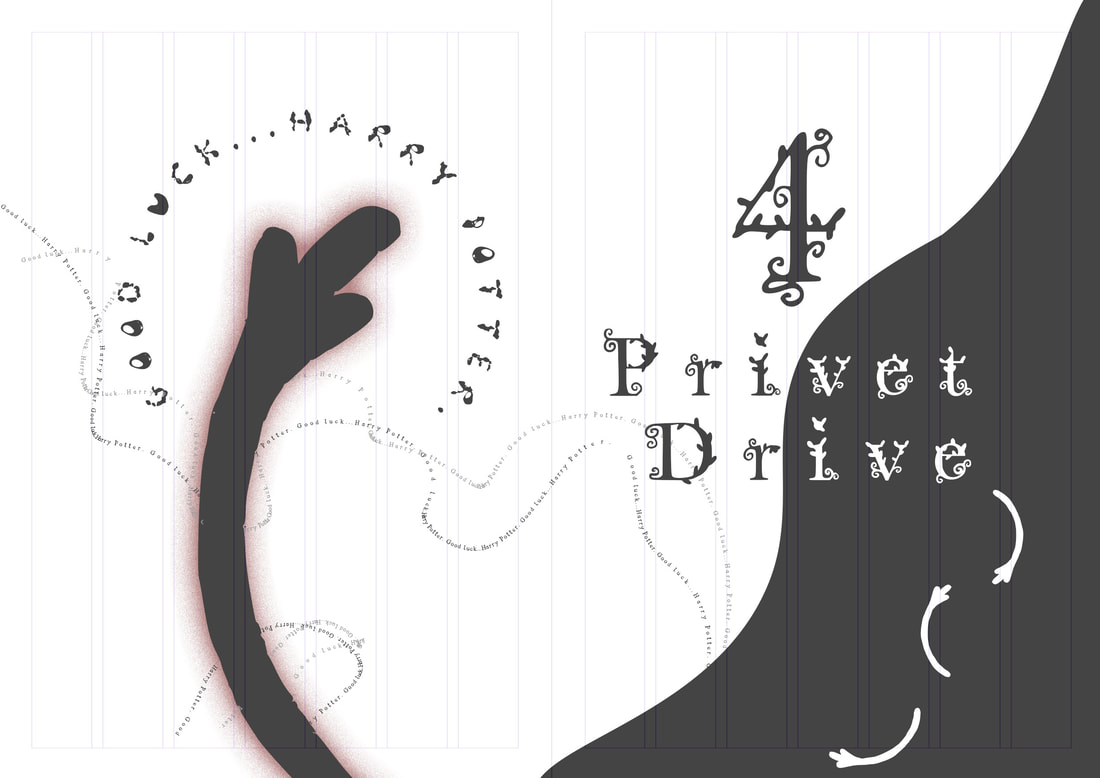
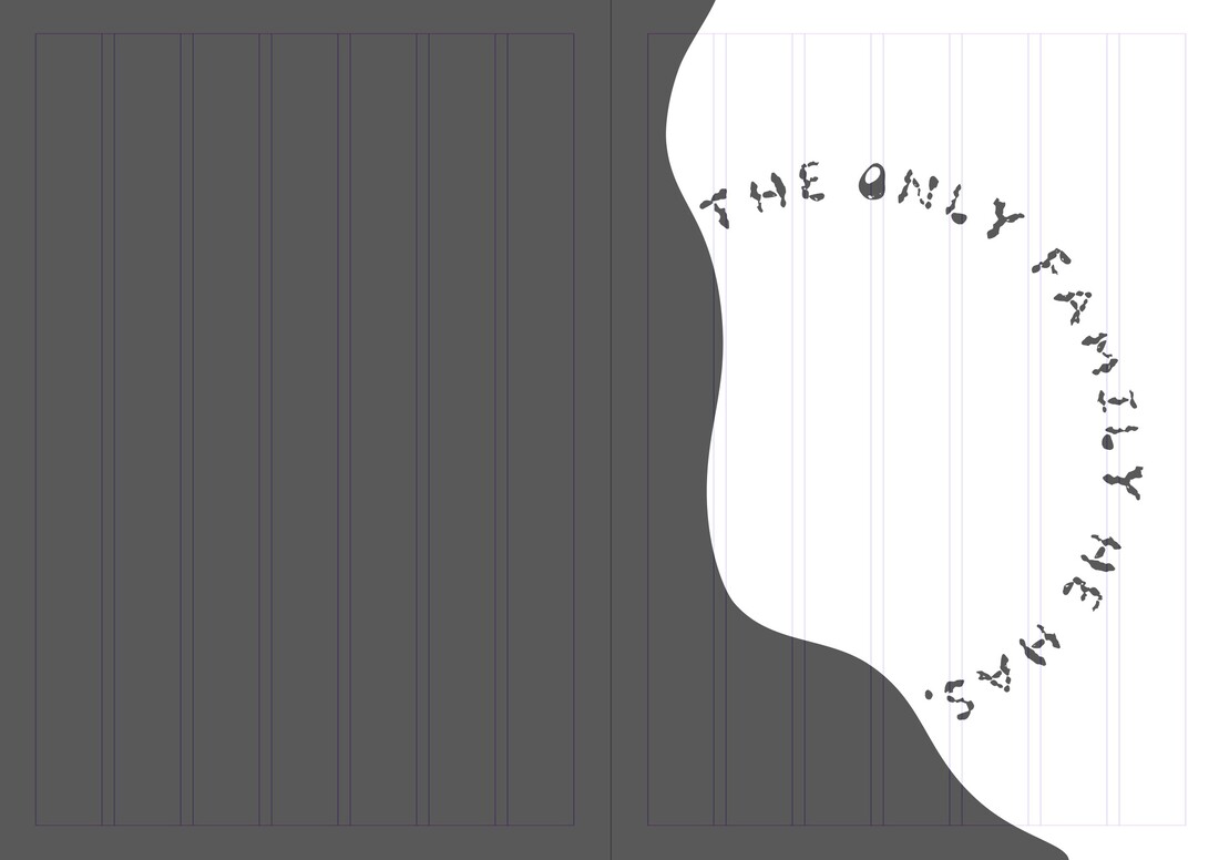
Picture
Picture
Front Cover Test

With my front cover I tested out the deathly hallows but I think to make this work more is to have more little feet scattered about.
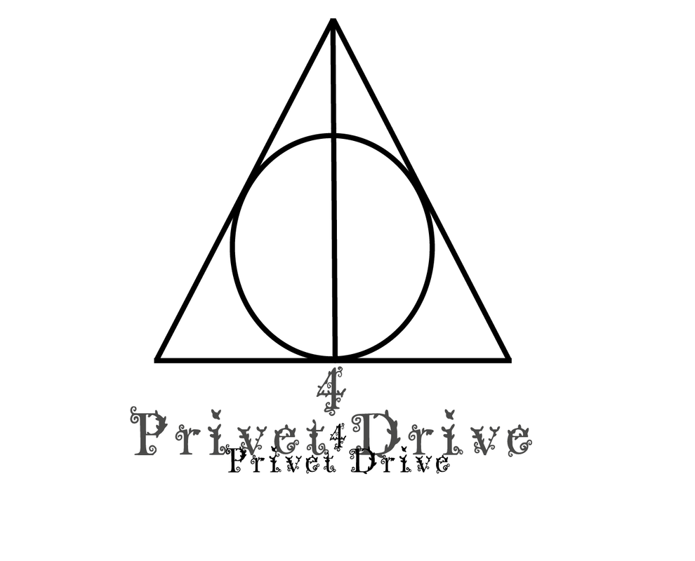
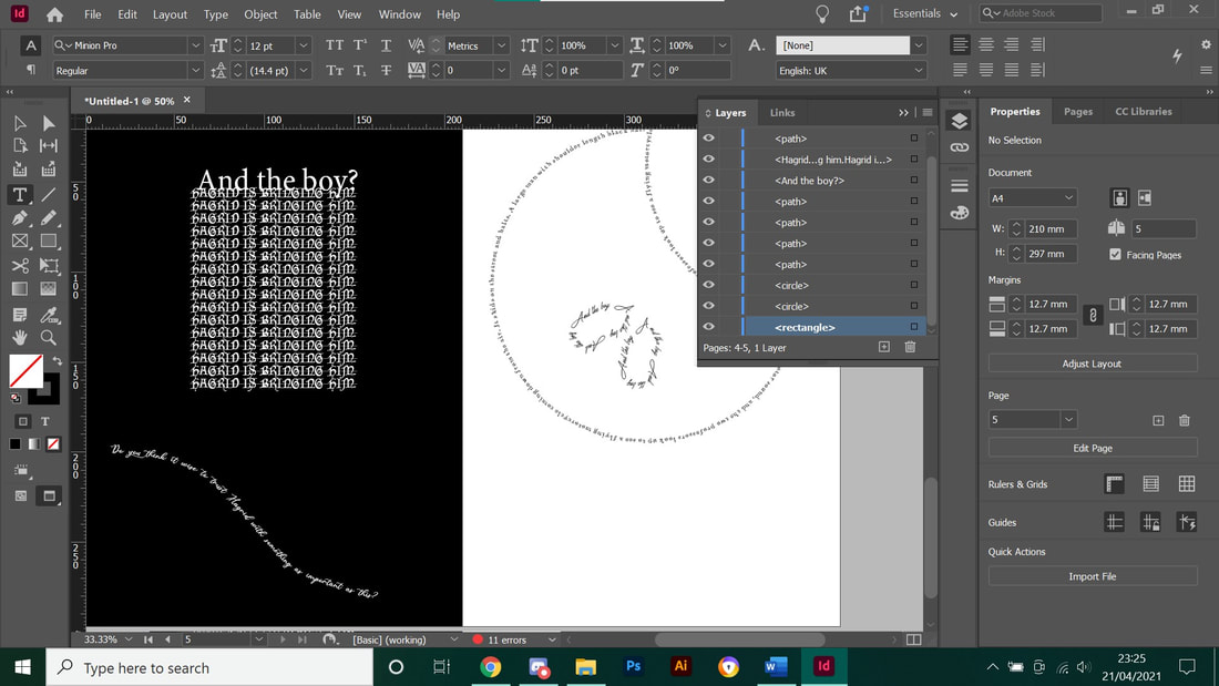
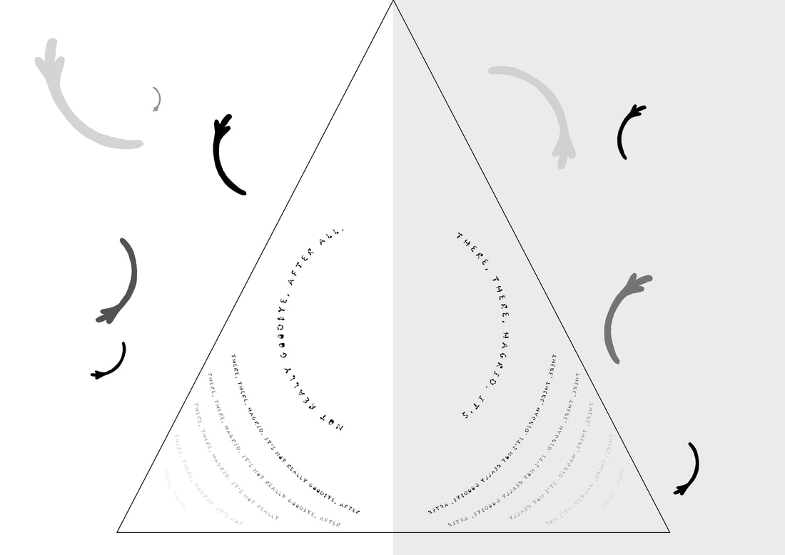
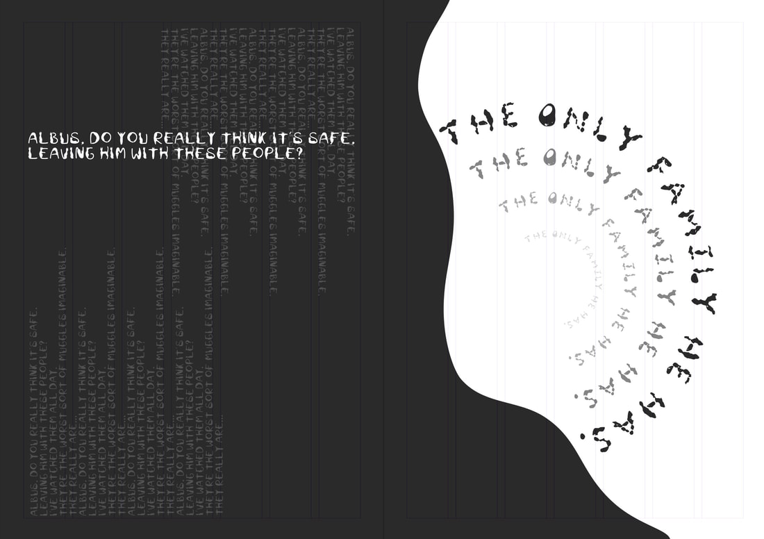
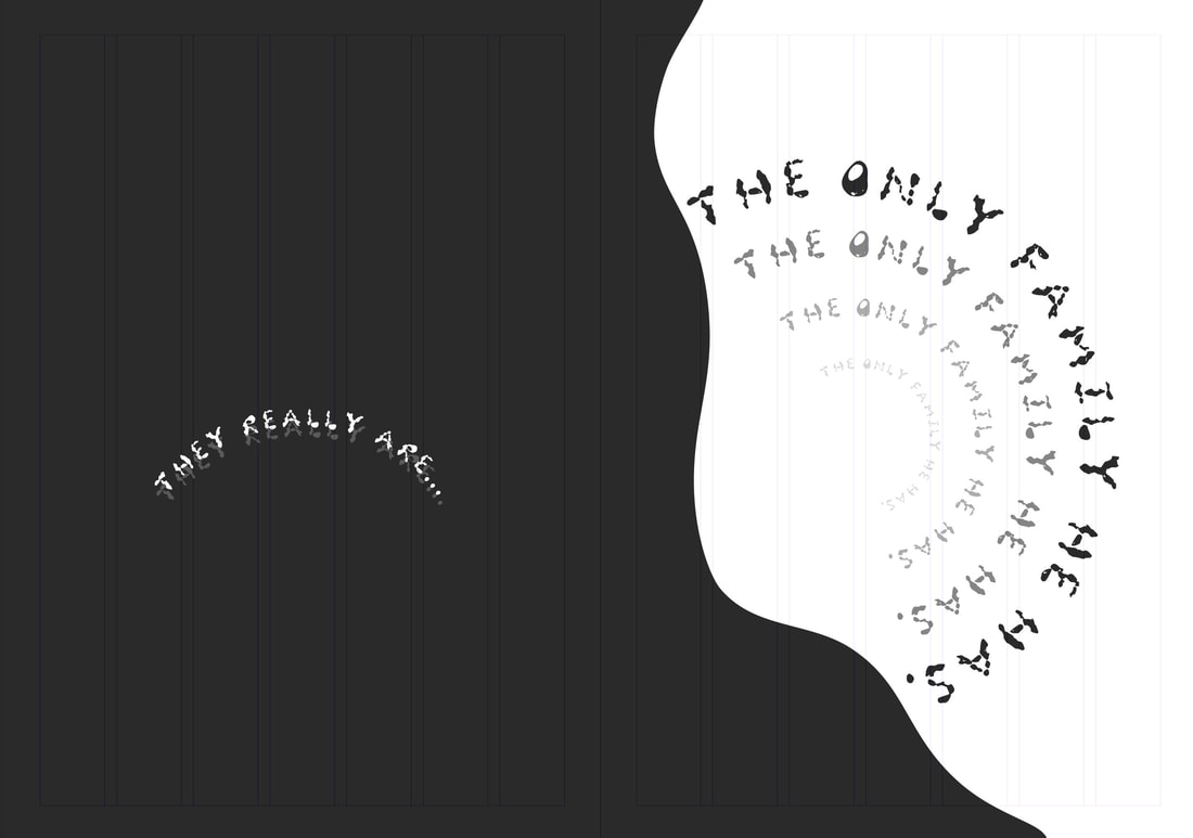
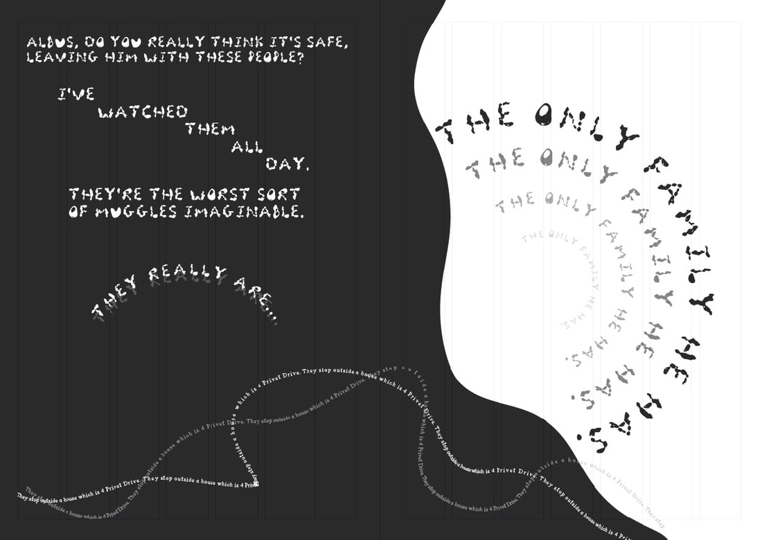
Picture
Picture
Warping

I went into Illustrator to figure out how to warp and exported it over to InDesign, these pages look quite minimal but I like the warp effects as It makes it ass a bit more to the design than if it would just straight.
Picture
Magazine Style

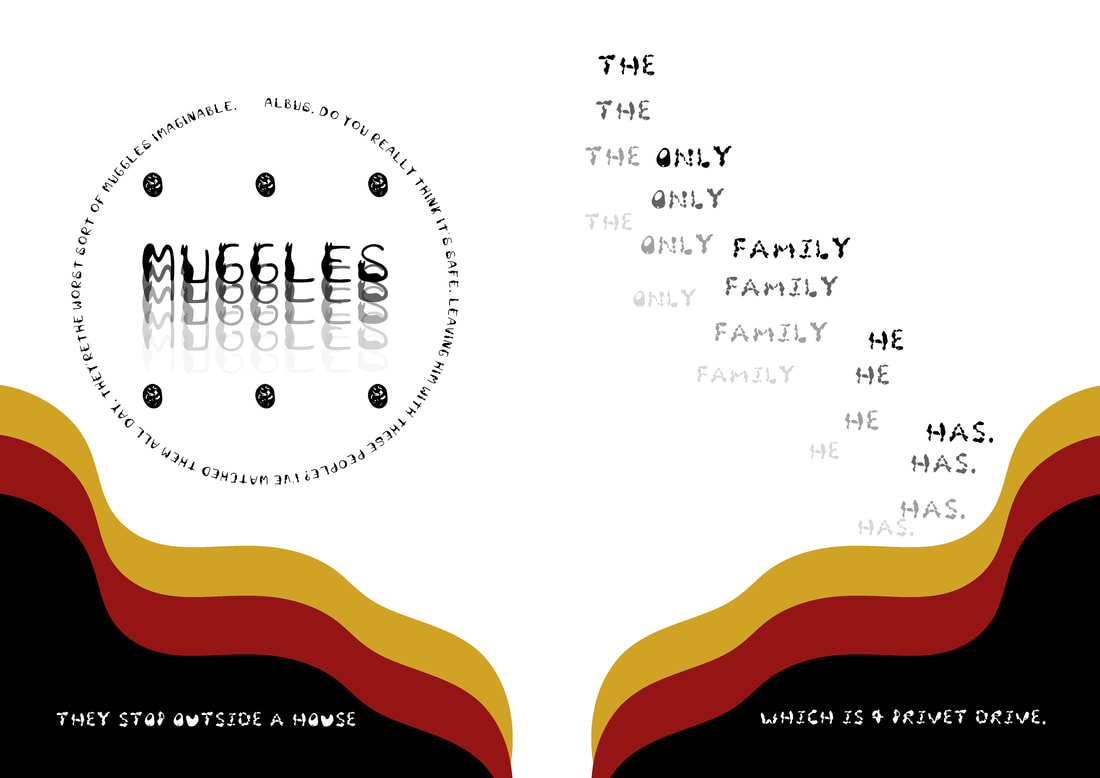
Using the images I got for research I liked how the work looked with the capital letters where the writing was inside and around it, I fee i will most likely use this style for some pages for my final.
Picture
Picture
Amy's Typeface
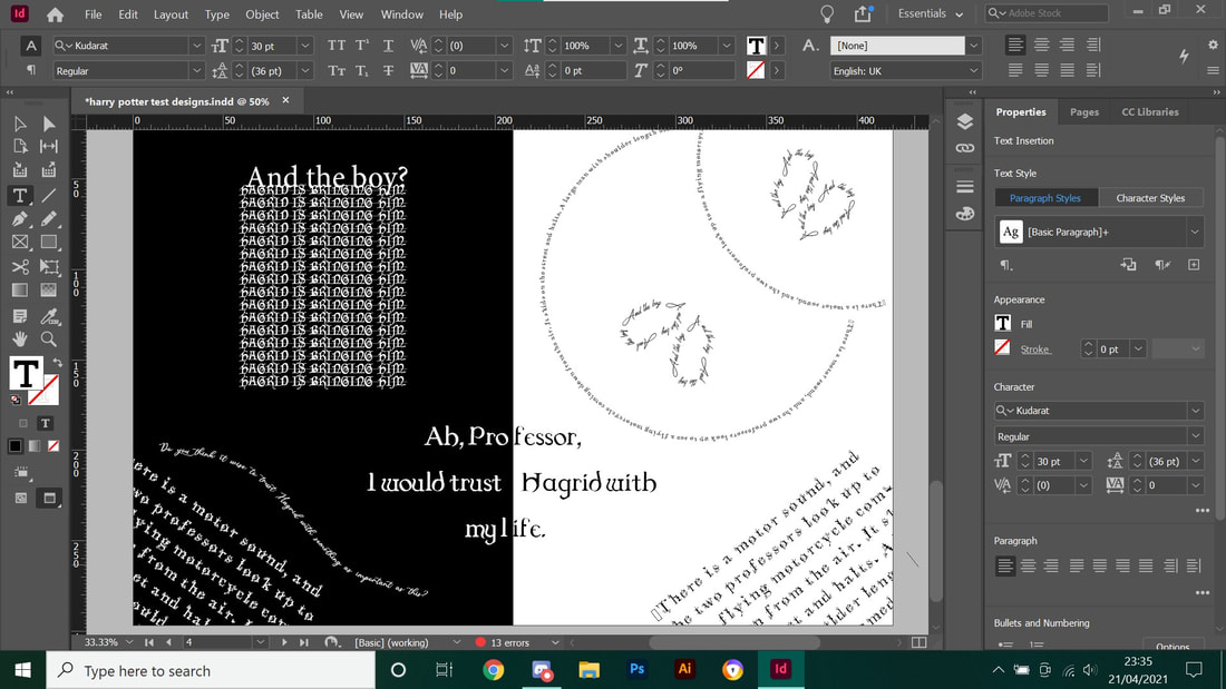
With McGonagall I felt like the cat theme Amy had going on really captured her catty like attitude and just overall works better.  I may however use my font for stage directions instead.  I tested out on Procreate how I could achieve the Peter Strain type with scripts of McGonagall and Dumbledore and emphasized more on McGonagall to see how this would look. 
Picture
Ayeisha's Typeface
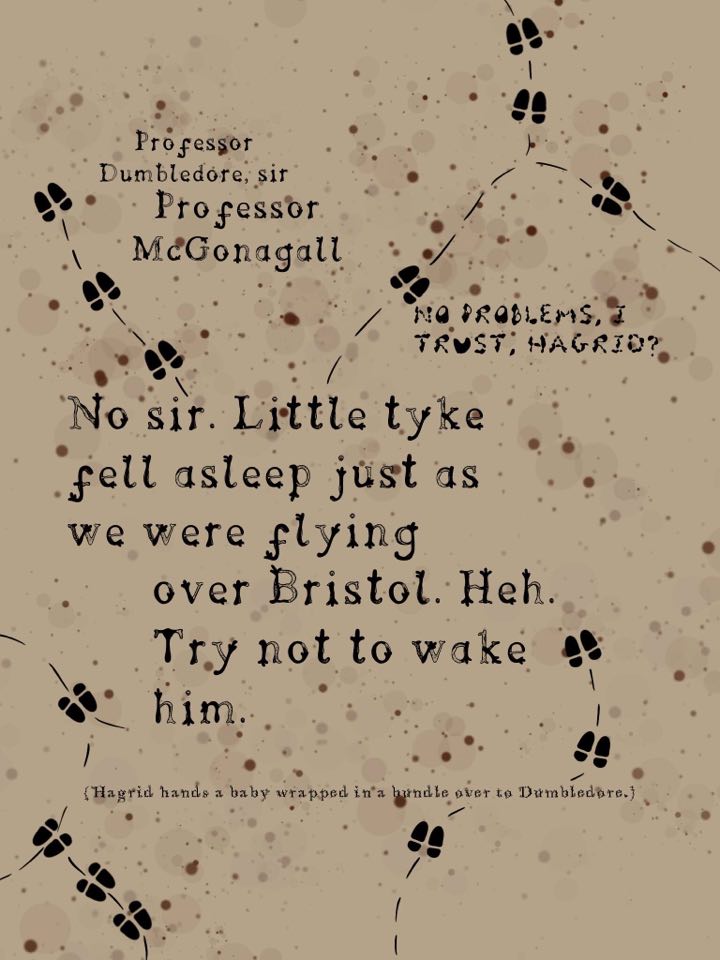
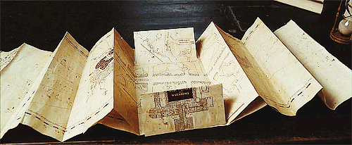
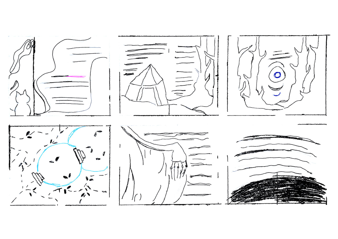
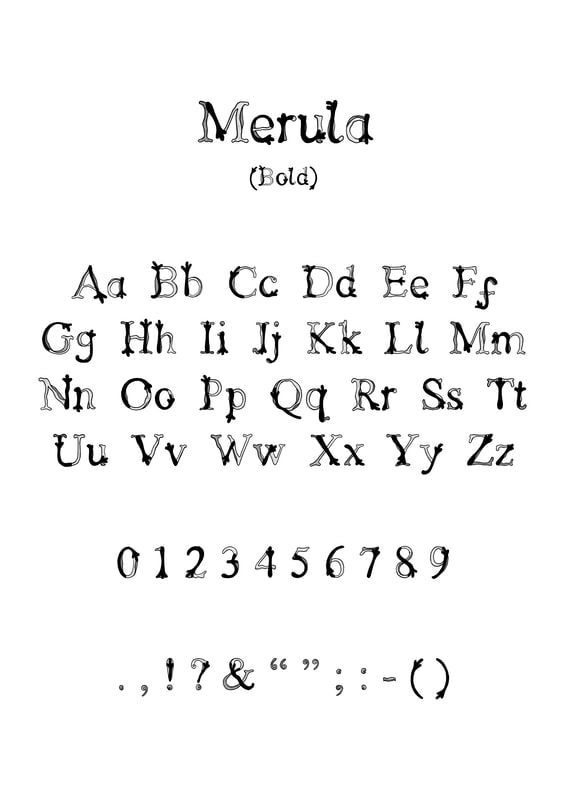
For Hagrid I have decided to go for Ayeisha's font based off blackbirds as this suits his characters the most and during the testing I also tried to turn the 'v' into their own little feet. I have linked her DIY alphabet blog below. With this I was testing out the marauders map footprints but I think I am using too much colour for this one.
Picture
Jess's Typeface
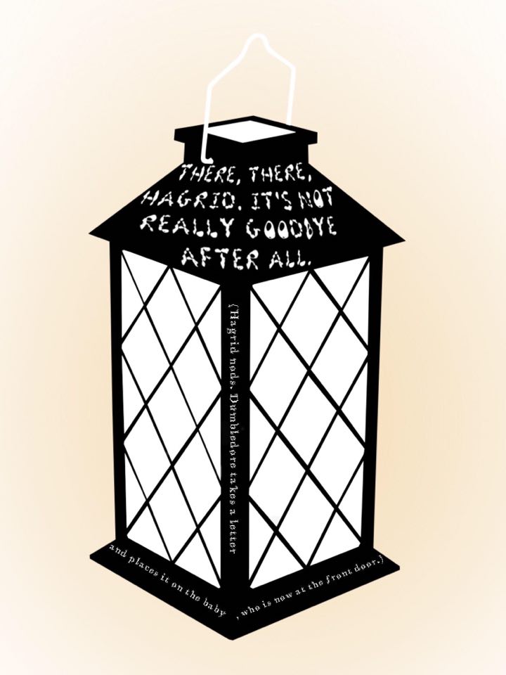
For Dumbledore I am keeping with Jess's typeface as his works best for him. If I do not like my overall designs with this typeface for him I may choose a type of my own choosing. With this design we first see Dumbledore taking all the street lights away so I thought a simple lanterns design would be cool. The text doesn't appear that clear so I will mostly go for the Peter Strain style more. 
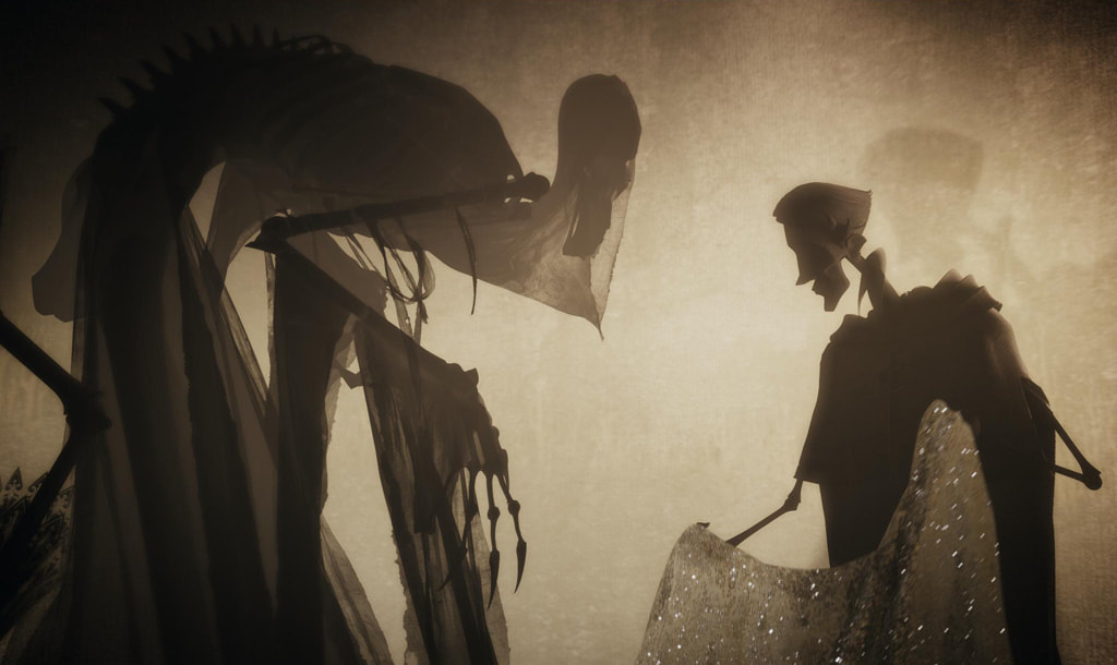
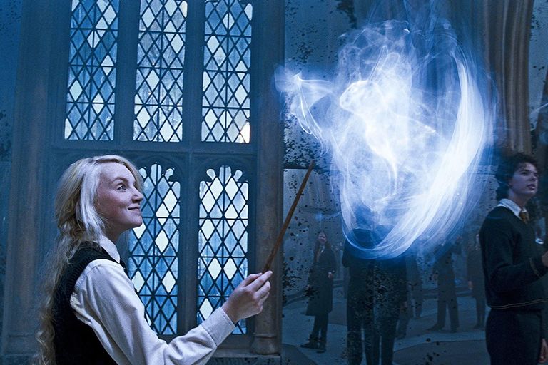
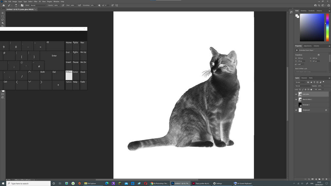
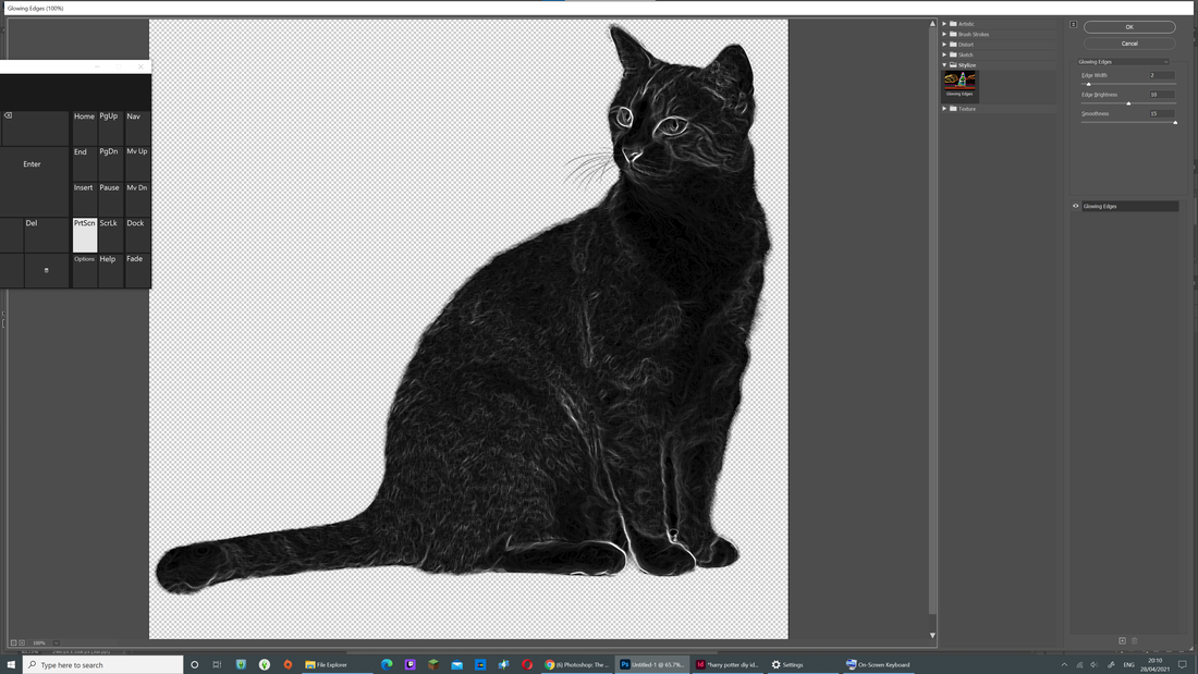
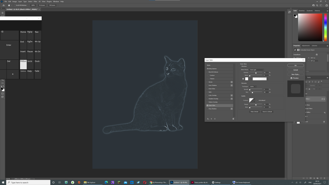
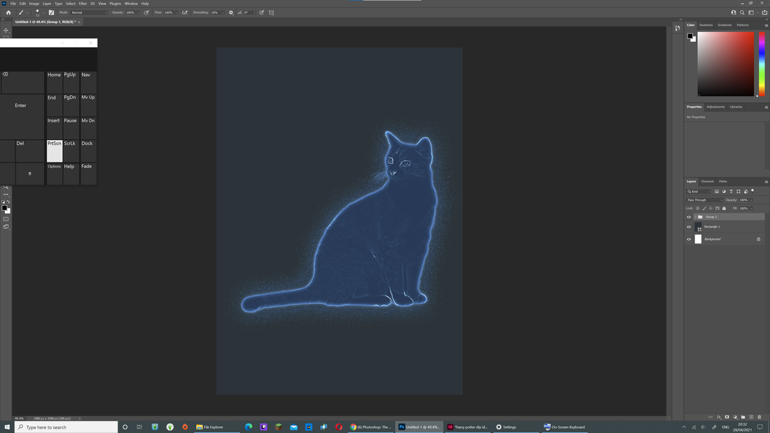
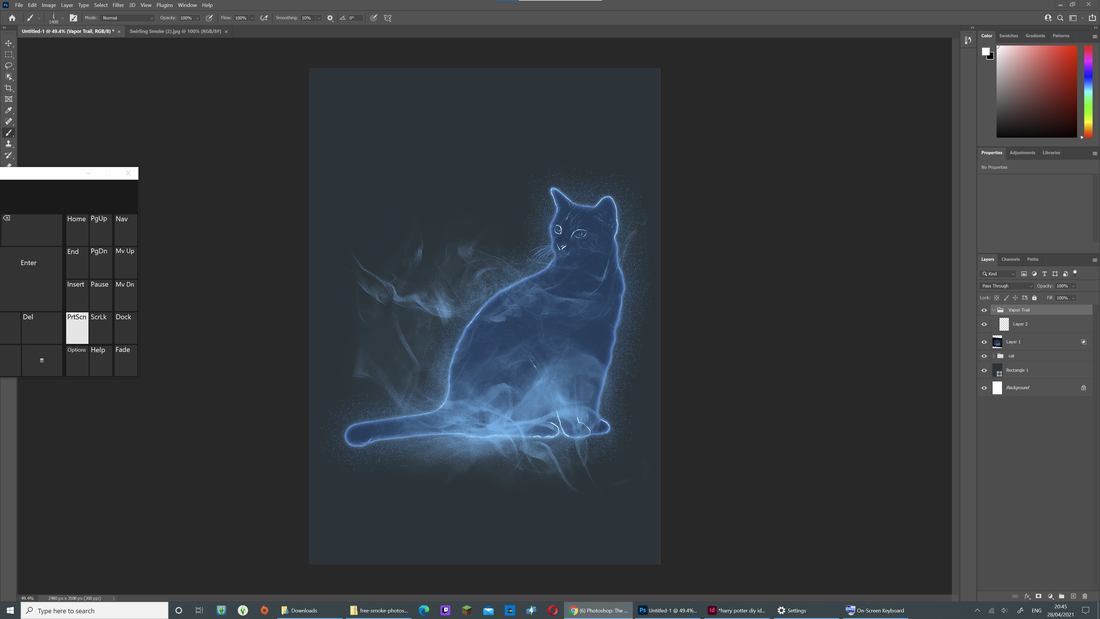
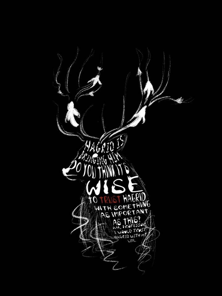
Picture
Patronus Test

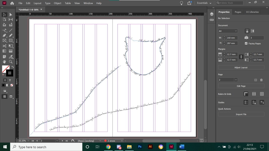
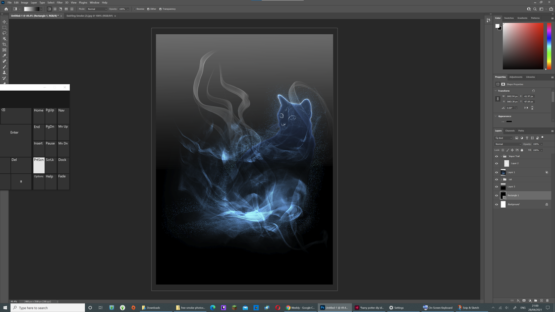
At first I was using Procreate to make my images but the quality came out bad for them and as I was looking on youtube how to make an animal out of text  I came across on the perfect video for making the patronus. The Illustration of it is still simple and not overly detailed which i like. I then added text and warped it into place. I had to give the background a gradient as the face of the cat was disappearing too much. After adding in the text I'm not that big a fan of it but I feel if i change the blue colours to white it may work better as long as it doesn't blend into the text.
Overall this process was fun and quick to do and I will most likely continue to do this for certain pages.
Huge Heteronyms!
The Brief

Choose two sets of heteronyms and produce a typographic solution for each set that clearly explains the two different meanings of the one word as a single, integrated composition in a vertical A4 format. You should initially work by hand in your sketchbook on small-scale ‘thumbnails’ and then moving to the computer only when you have a good range of ideas to explore.

Limitations/Things to Consider

You are only allowed to use digital type to communicate meaning. NO pictorial imagery. There are no restrictions placed on colour and how it is used. Try to limit the range of faces you use (the simpler the better) and really think about composition. Use faces/fonts intelligently, experiment with different ones and select the most appropriate. Make sure you save digital files as you go along so we can see how your ideas developed. You are not allowed to digitally alter the proportion of any face/font (stretching/squashing). This is a type crime and you will be punished! 

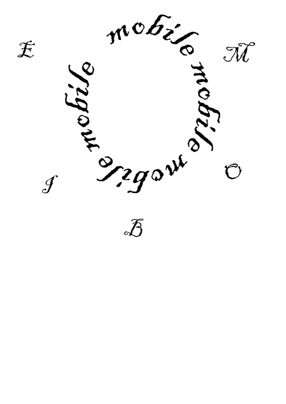
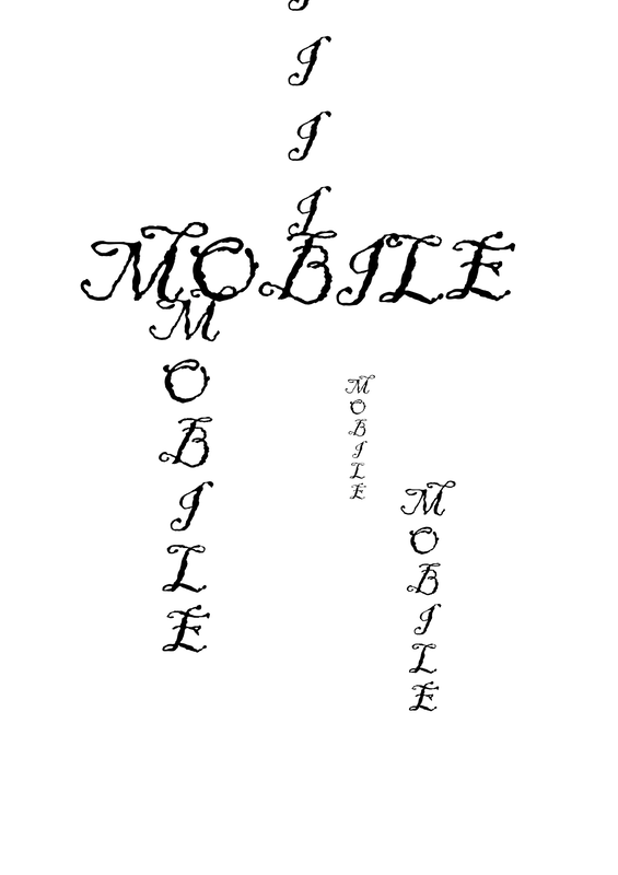
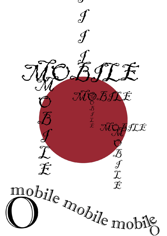
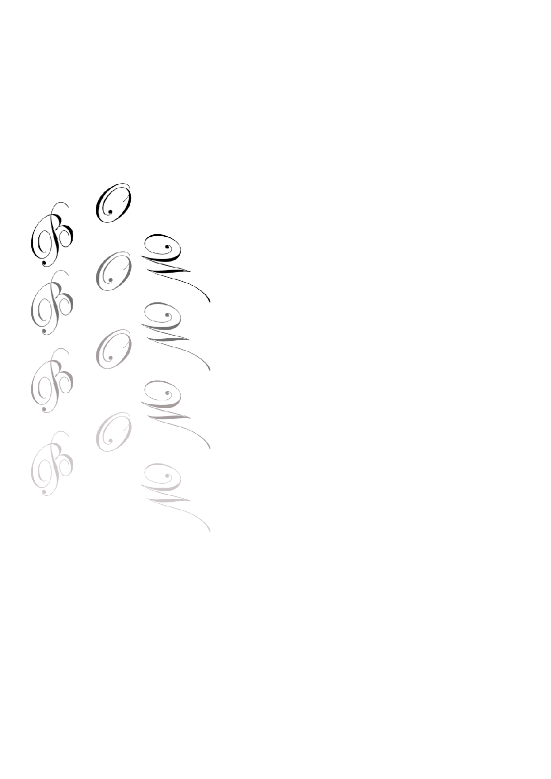
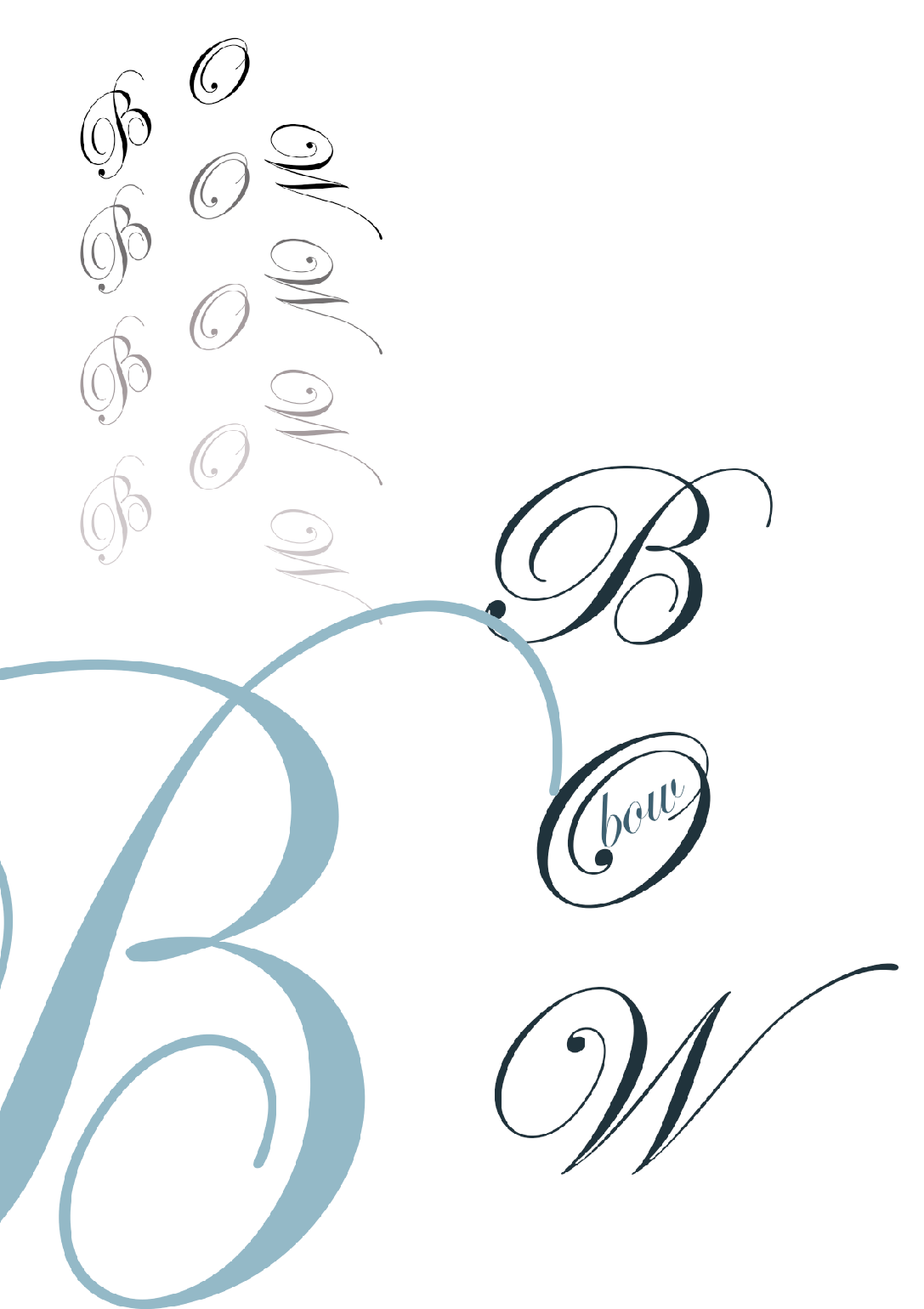
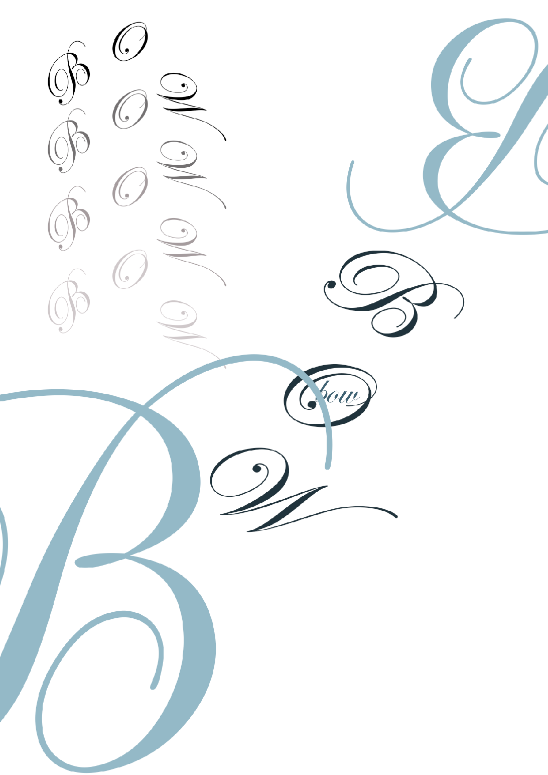
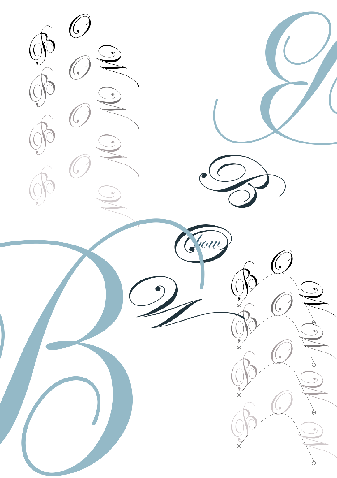
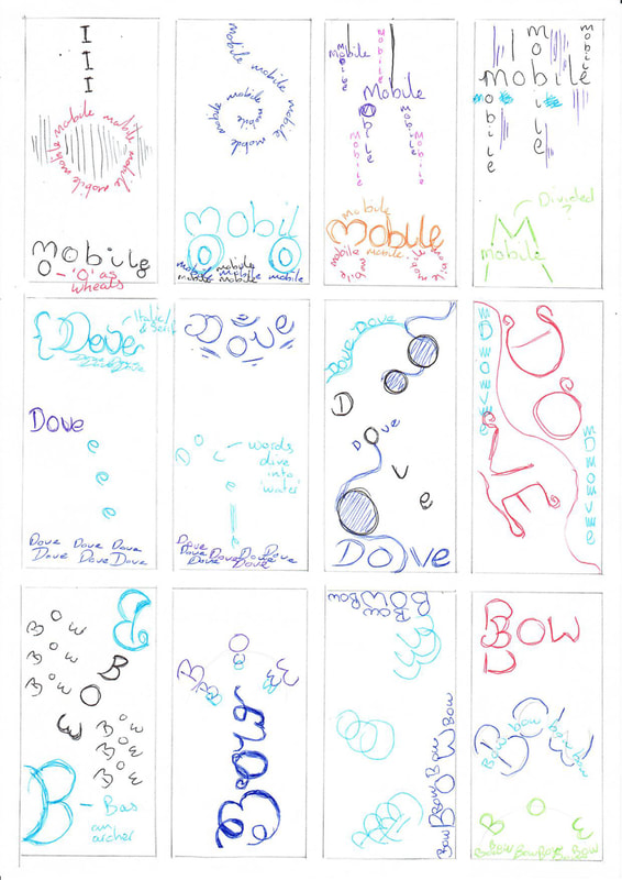
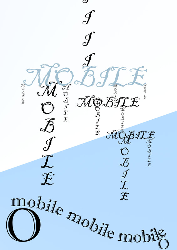
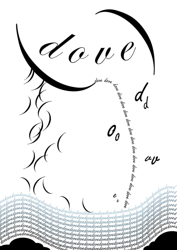
Before I began I tested out 3 words for my thumbnails and then chose the final 2 words. My first batch was too illustrative so i re did them with more colours. I feel mobile is still too illustrative but for the second meaning I am not at all sure how to make type work with this.

Bow – to bend; Bow – the front of a ship; Bow – implement to shoot an arrow
Dove – a bird; Dove – jumped off
Mobile – wind blown sculpture; Mobile – moveable
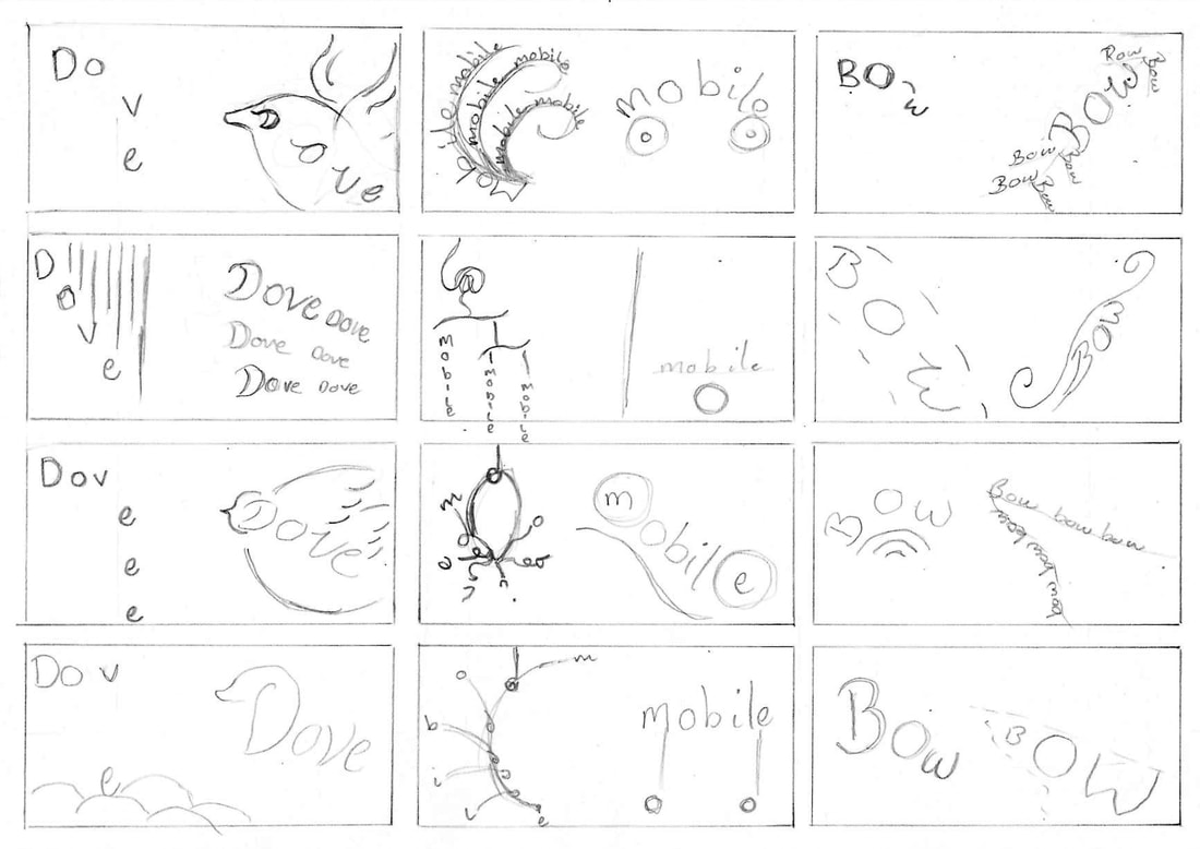
Picture
Picture
Picture
Mobile

I really liked my idea for the first word of mobile and wanted to continue with it but when it came to movable I wasn't at all sure what that meant so I thought to make the O look like wheels which would indiciate they word can move.
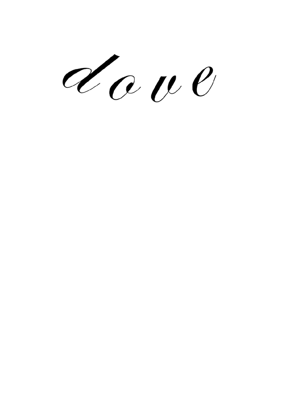
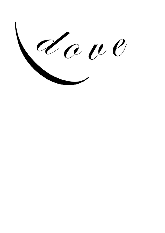
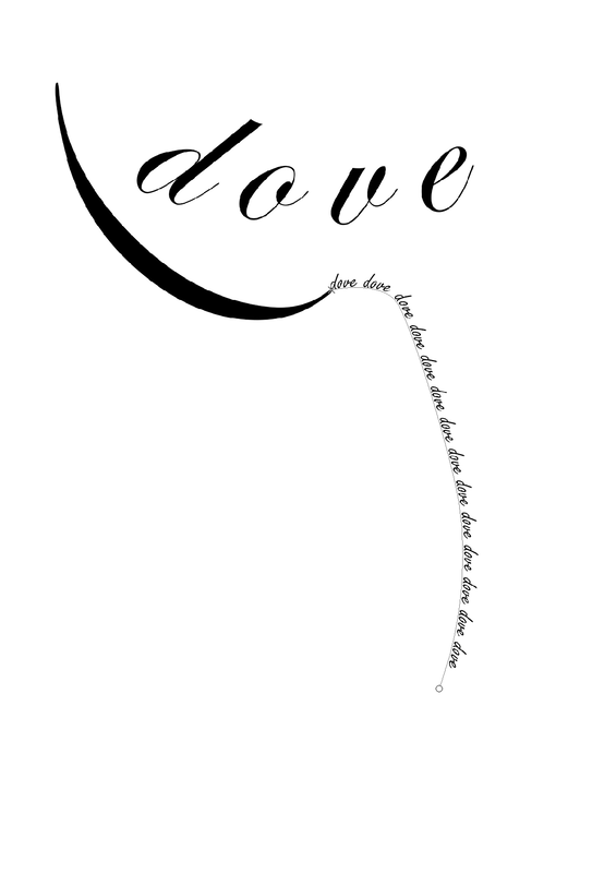
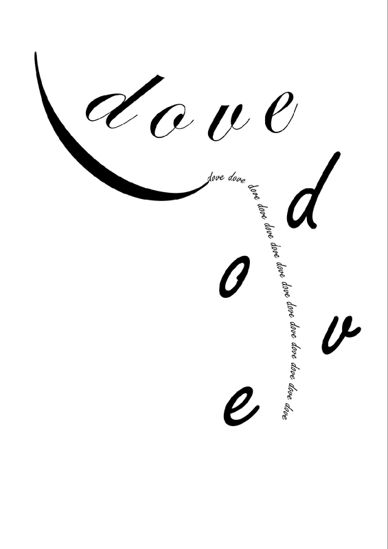
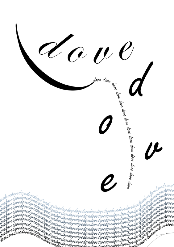
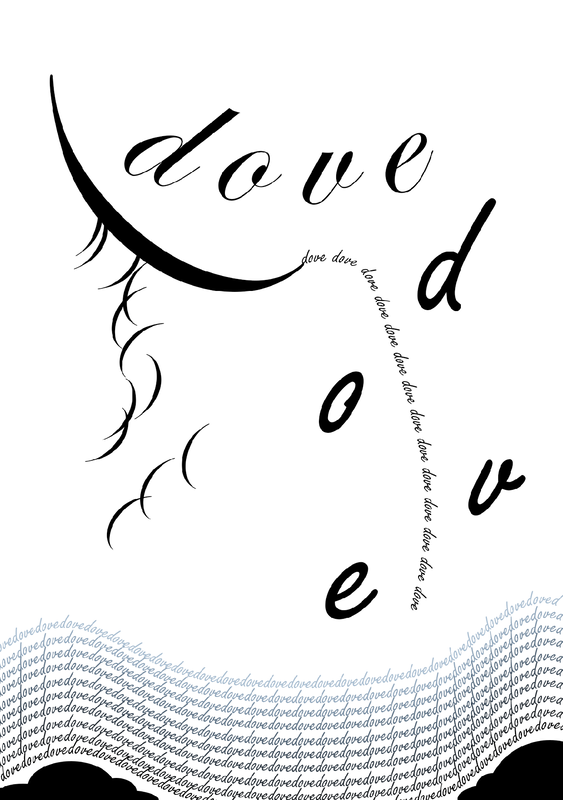
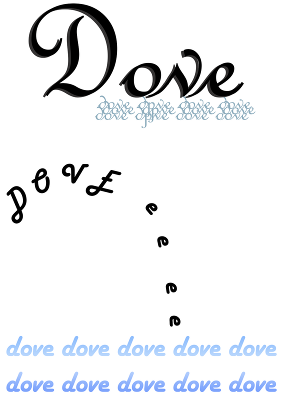
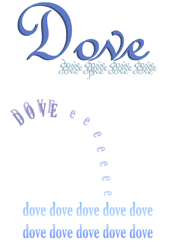
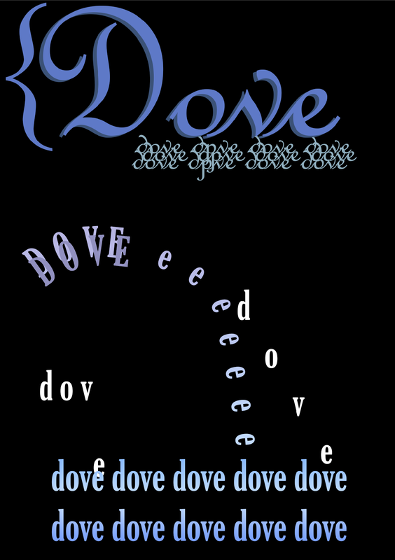
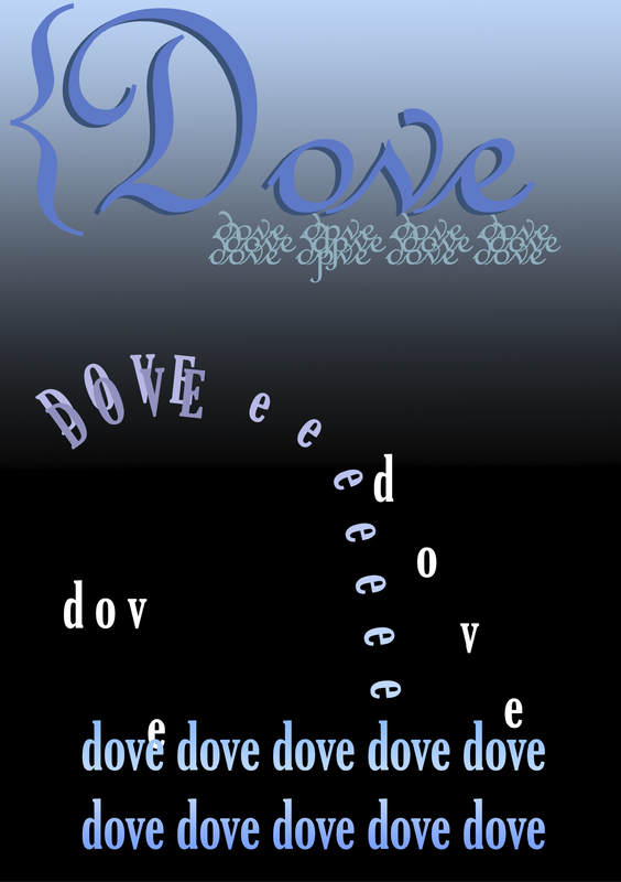
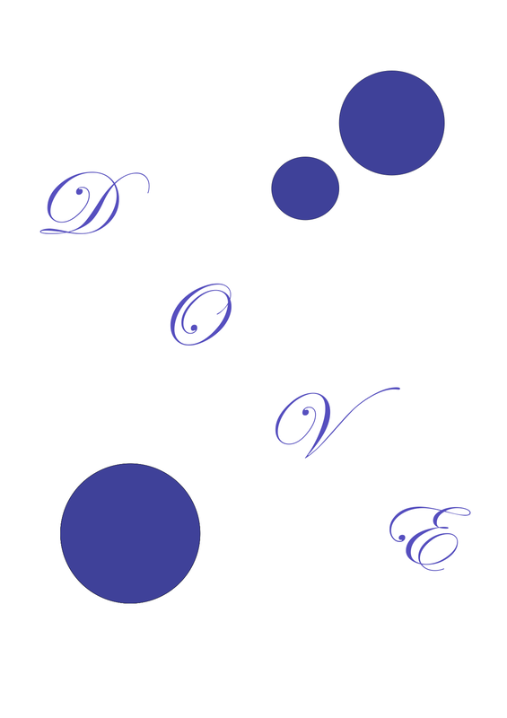
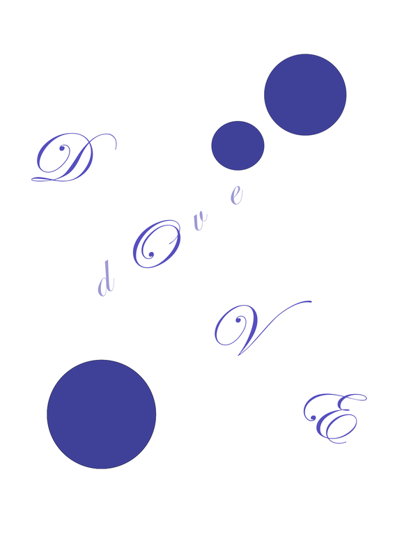
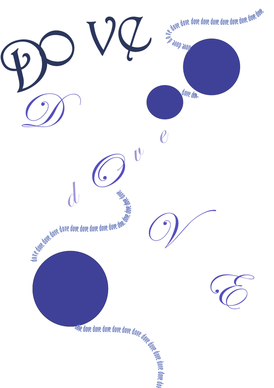
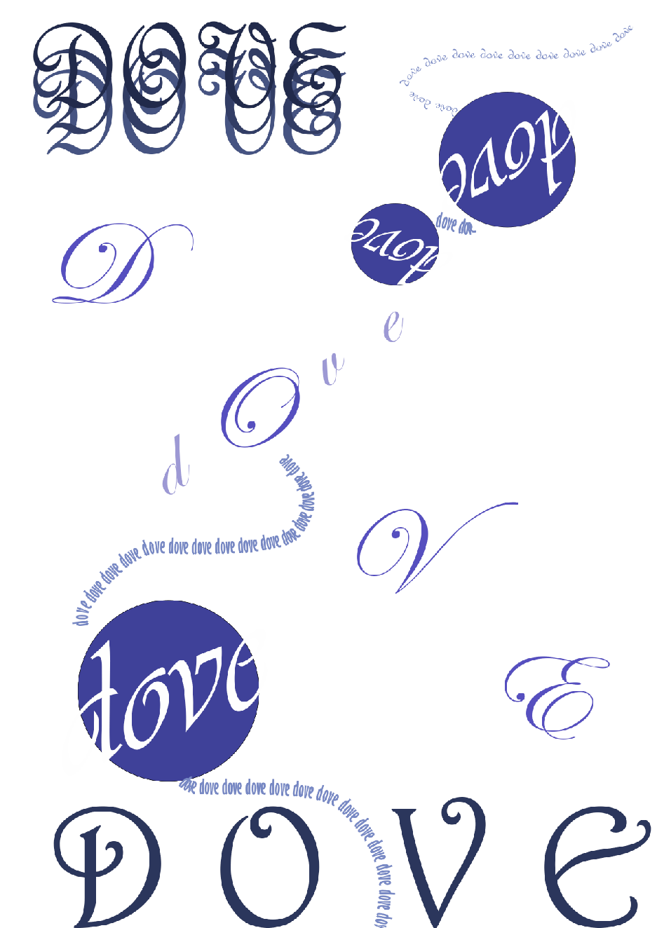
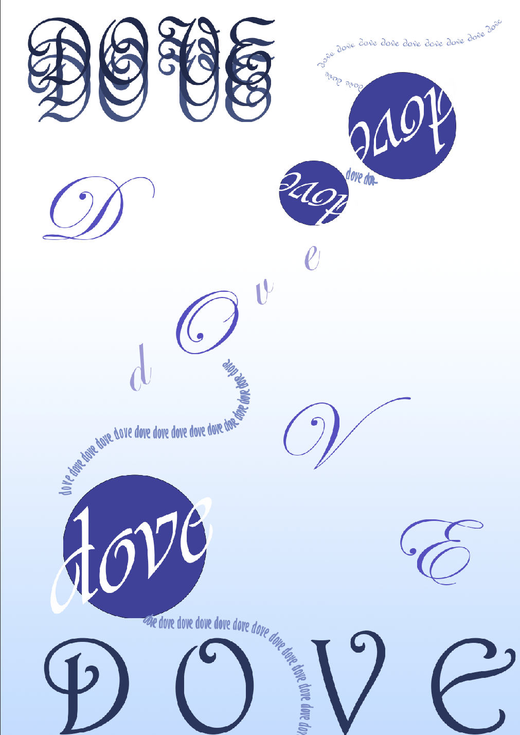
Dove

I am not sure if I like what I made for this one as I couldn't really picture my thumbnails as what I really wanted to make. I did use punctuation and italic fonts for the bird dove and for the diving 'dove' I made a stream with words falling down.

Picture
Photoshop Tests

These are the experiments I have done of my thumbnails but didn't end up liking for my final 2 designs. I feel some of the words I picked have been hard mainly due to not really understanding the words properly or knowing much English on it's own. It has also been hard to not just draw out the words with the type and what compositions I want them in.


Development

Moving on from thumbnails and alphabet test, I needed to try figure out how to make my ideas come out on Photoshop and have messed with the pages 3 times to get different styles and compositions to see what I can do for my final and which ones I prefer/ or could potentially mix up. I have made sure to stay within the guidelines while working on Photoshop but with I feel it will be pretty easy to manipulate into the right place if needed to. I find it a bit difficult to create my thumbnails digitally so some ideas have been changed and played around with. 

Page 1 (front cover)
With my front cover I feel like my thumbnails are too complicated for this so I wanted to take a style from one of the pages and add it as the start, I am really liking the second design the most but I will need to play around with it more until I find the design I really want.

Page 2-3
For my first batch of page developments I started with page 1 and 3, these have gone a bit away from my initial thumbnails but they are less illustration than type, i did however use Amy's typeface for 'i' and 'L' for the cat designs
I think I like the 2nd design the most and may choose it as part of my final.

Pages 4-5
My seconds two pages was a bit tricky to think of how to make my thumbnails come to digital. I like the splattered dots I made from my first two pages so I thought maybe to keep that going with some pages or perhaps have each page have something small used with text. With the last test I decided to use Merula to add in feet affects and used gold but I may change the gold feet to red.

Page 6-7
With my third double page spread I wanted to use my tree thumbnail but I realise having the text in a circular center would not work out well. I am unsure which one i like the best but I will play around with the final composition and see what can go well. I do like having to add random bits of circles as it fills up space a lot better but I also like the first design.

Page 8-9
with this page I wasn't sure how what to really do so I experimented with a bit more Gryffindor colours together. I made sure the muggle type fit well inside the grids but most of my shapes will most likely be affected which I hope won't be too big a deal as it is not the text that would bend inbetween. I really like my second idea the most out of these. I forgot the one colour limit so I will change it to either just red or gold for the final.

Page 10-11
​My first test I tried out a different colour just to see the affect it could give so I chose blue and it makes the page look peaceful compared to using a bold colour of red. I like the layout of the second one the most as the vibrant colour does stand out more plus having the text change colour looks pleasing to me.

Page 12-13
I tried out some gold colours but I think the one colour I will end up using will be Red as to me it just looks better with black and doesn't look more like Hufflepuff colours. I have also been having problems with Photoshop when it comes to adding text on the path tool making this style a bit hard for me to do. I feel these pages are a bit weaker due to having less lines so I will need to copy and paste the same lines and mess around more. For my last design I did something a bit more different and tried to play around with getting a circular text in the middle, I have made sure it doesn't go out the grid so if i do go with this idea I am hoping it will work.

Page 14 (back cover)
I kept my back cover simple but I did get a bit lazy doing the second one as I was rushing most of the covers, all the text fits within the guidelines and for the first image I used the ribbon on the marauders map to use as the back page... this however could also work as a front cover too.

re designing final ideas

​After my feedback I took a note to make sure my finals are less illustrative and change certain things, I also need to make sure to stick to a certain style throughout to make sure these look similar for each page. The only words that will be getting cut off are the stage directions which won't play a massive part of my script but rather just some extra detail.

Page 1 & 14

For now I am doing the front and back cover together so i can see how they would look together, I will later separate them on InDesign. For my back page I tried to recreate what I made but I prefer my development work more so I have left it in but made my text flow to the next page. This idea had less things going on which I prefer more - I have also gotten rid of the cat but kept the footprints. The only colour I have used is Red for the back cover as to not overly use it but also give a nice finish to the scirpt.

Page 2-3

I moved onto creating the next pages and have gotten rid of the circles and cats to make it look similar to my covers and make sure the style fits throughout. It is still similar to my original idea witch i like. 

Page 4-5

I chose my first development test and worked a bit into it to match the style, I am not sure if these look similar or not as it's a bit hard to tell what styles look like when it comes to typography - I decided for the 5th page to keep the dropping affect I had one the 4th page while also not filling up so much room.

Page 6-7

For this design I had to think what exactly would fit it best and suit the overall style. I am unsure if I want to keep the background text for page 6 to have more space in some pages.

Page 8-9

With both these pages I struggled to think about how to do the layout as my original ideas weren't following the same style I had going on but I think I have managed to get this sorted out.

Page 10-11

For these two pages I had to go off my developments to make sure the style matched, I am really pleased with this one as I haven't added so much to the page which is something I am trying to do less of.
Page 12-13

The very last page did have visual elements but I decided against it all together as I feel the footsteps I used for the covers was just enough imagery that I needed. I ado not think I will keep the small round footprint for the final.

ISSUU Test

I uploaded my finals to ISSUU to check if I needed to fix anything and the main thing I need to go back into is the stage directions as they end up being cut off as I may have made them a bit further off from what i expected it to cut from. I had almost forgot to change the font for my title to one that I have been using already as it wouldn't make sense to use my own typeface when the other pages won't be showing them at all. I also had some issues with some images coming out low quality which I will need to fix, other that that, it all looks good and I am excited to present it fully published!

final

ISSUU - HARRY POTTER
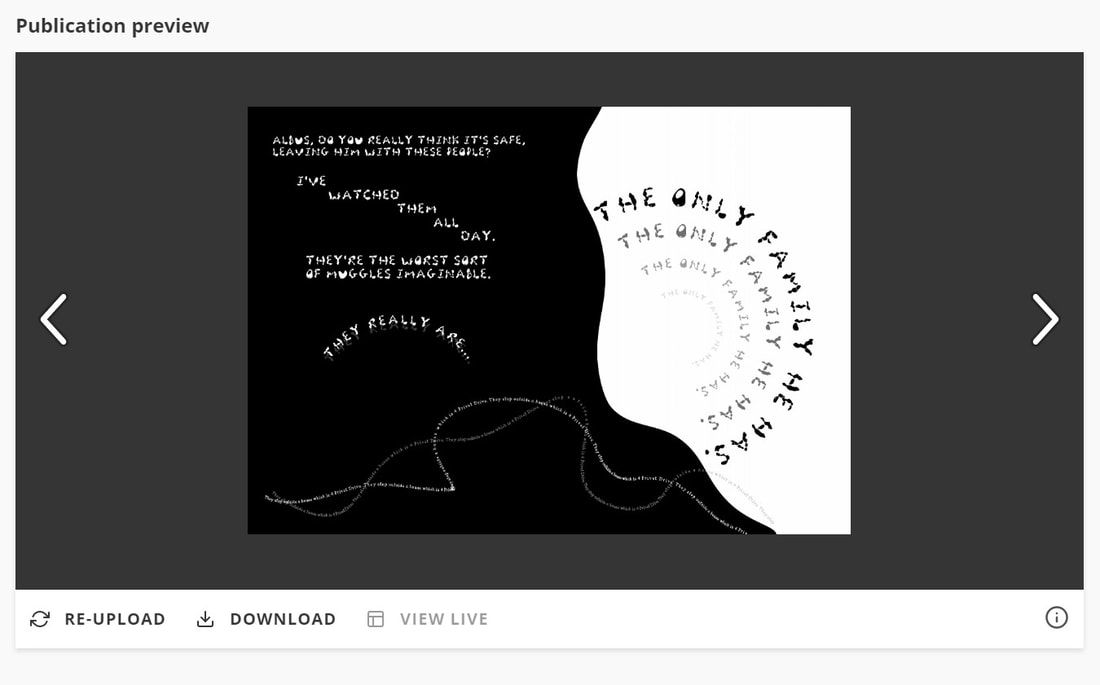
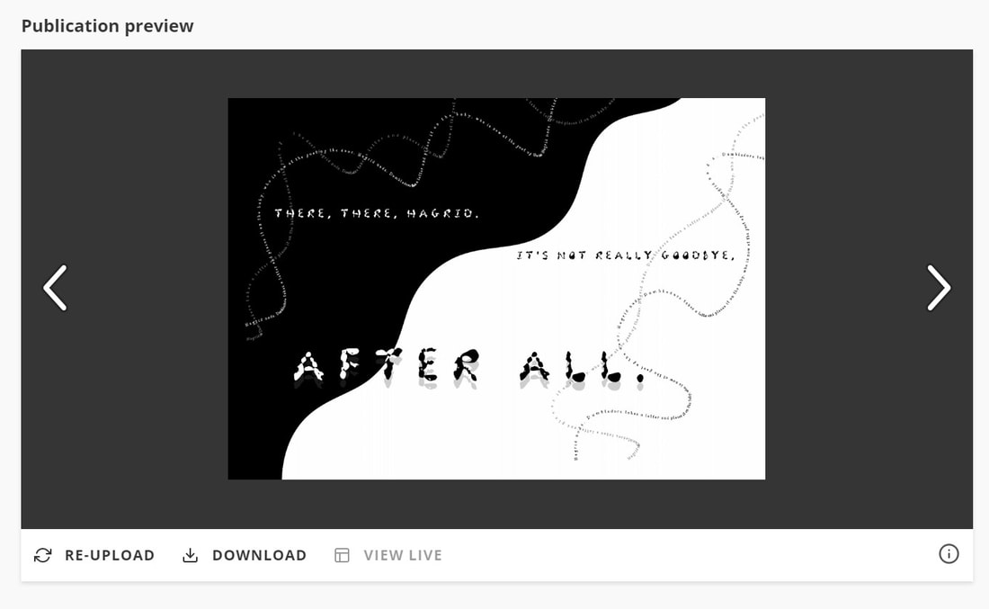
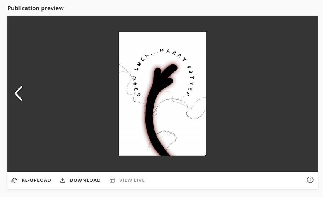
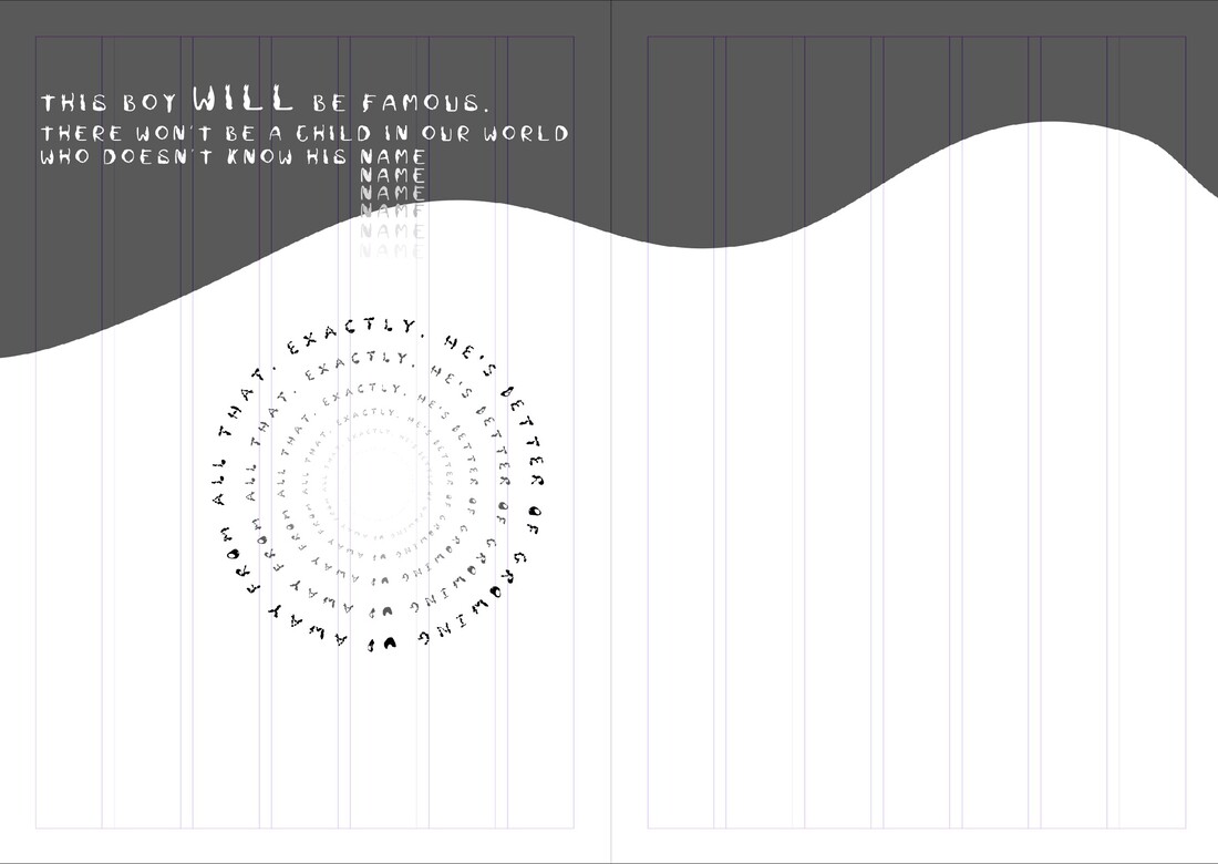
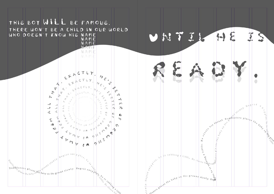
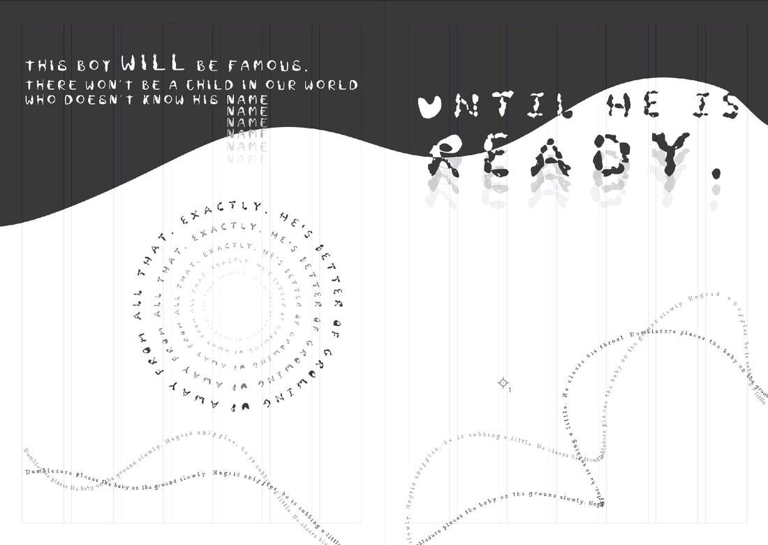
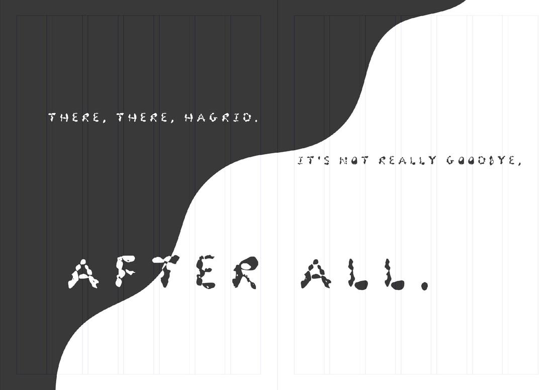
For my final I realised how much better it really looks being only type although trying not to add much visual elements was really hard for me as I wasn't really expecting this to turn out that great without it.

​I think I enjoy having this be mainly black and white as the style really makes it look like it belongs to one script/book. I only ended up using 3 Typefaces and re used Merula for both Hagrid and the stage directions as my own font didn't really appeal to me that well when using it.

​I have added a slideshow to show all my finals as well as adding a link to the final publication on ISSUU.

After the feedback I went back in to add some colour to emphasise on some words as well as adding colour to stage directions. I have also made sure my pages are divisible by 4 by getting rid of the last page and adding it into the previous so  I wouldn't need to work too much into re making this as there was still enough space left to add it in. 
Site powered by Weebly. Managed by 34SP.com
  • Home
  • Univerisity
    • Year 1 >
      • Workshop
      • History & Practice
      • Introducing Visual Communication >
        • Telling Stories
        • Nursery Rhyme
        • Old School
        • Master Forger
        • Perspective
        • The Tree
        • Thumbnail Visuals
        • Colour Theory
      • Muli-Dimensional Illustration >
        • end of year submission
      • Visual Problem Solving >
        • Type Selfie + Quiz
        • DIY Alphabet
        • Ampersands
        • Handlettering
        • 2 Become 1
        • Helvetica
        • Type Talk
    • Year 2 >
      • the critical illustrator
      • ILLUSTRATOR'S TOOLKIT
    • Year 3 >
      • ARTD6000
      • Advanced Illustration Projects
      • FMP
      • Twitch Assests
  • Submission Page
  • About
  • Instagram