MANISHA SAMRA
  • Home
  • Univerisity
    • Year 1 >
      • Workshop
      • History & Practice
      • Introducing Visual Communication >
        • Telling Stories
        • Nursery Rhyme
        • Old School
        • Master Forger
        • Perspective
        • The Tree
        • Thumbnail Visuals
        • Colour Theory
      • Muli-Dimensional Illustration >
        • end of year submission
      • Visual Problem Solving >
        • Type Selfie + Quiz
        • DIY Alphabet
        • Ampersands
        • Handlettering
        • 2 Become 1
        • Helvetica
        • Type Talk
    • Year 2 >
      • the critical illustrator
      • ILLUSTRATOR'S TOOLKIT
    • Year 3 >
      • ARTD6000
      • Advanced Illustration Projects
      • FMP
      • Twitch Assests
  • Submission Page
  • About
  • Instagram

Module Intro and Brief Delivery


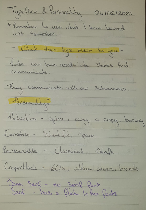
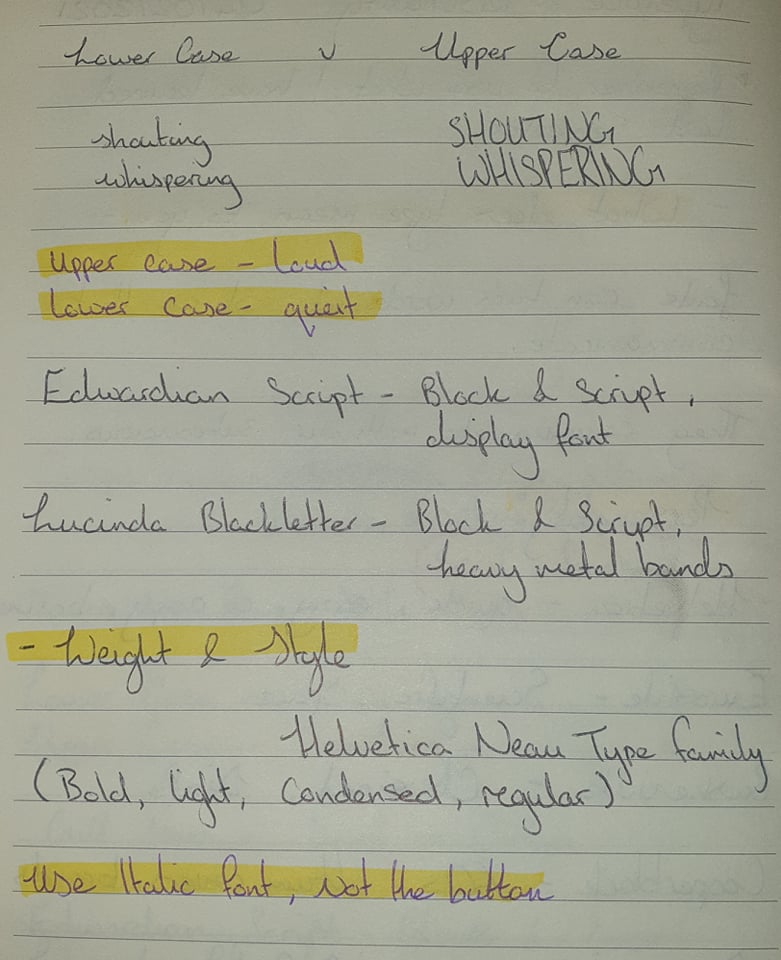
Session Notes
Videos from the session
A Visual Guide to the Anatomy of Typography [Infographic]
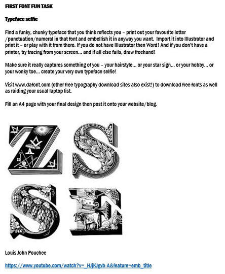
Font Selfie Brief
Picture
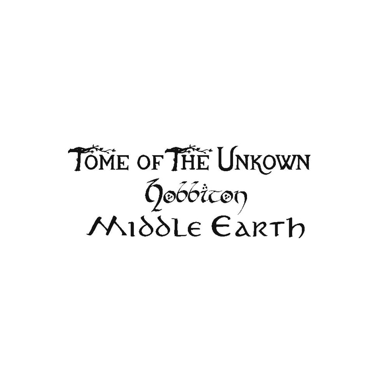
TomeOfTheUnknown
Picture
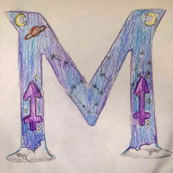
Using TomeofTheUnkown I did a quick rushed design for the lecture revolving around space and my star sign.
I don't like how messy it was so I decided to create two more larger versions. ​I was also really stuck on ideas especially as it was a sudden task. 

Uechi Gothic
Picture
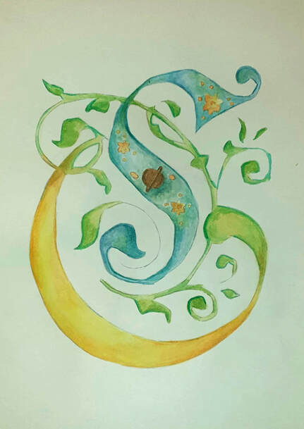
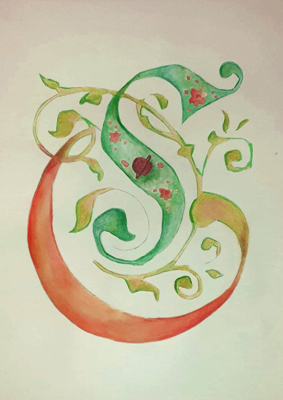
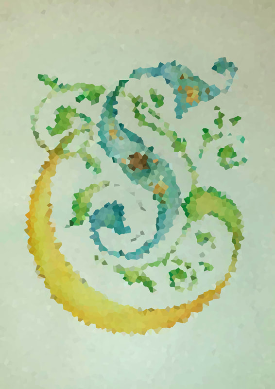
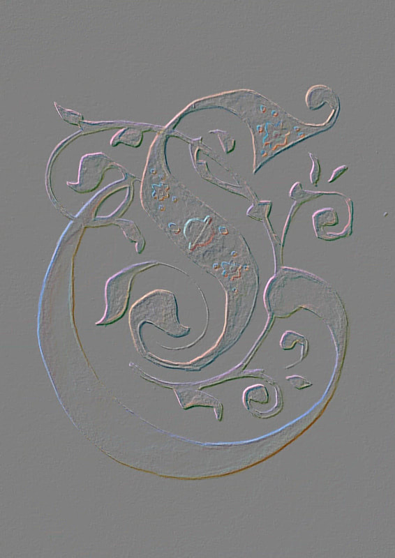
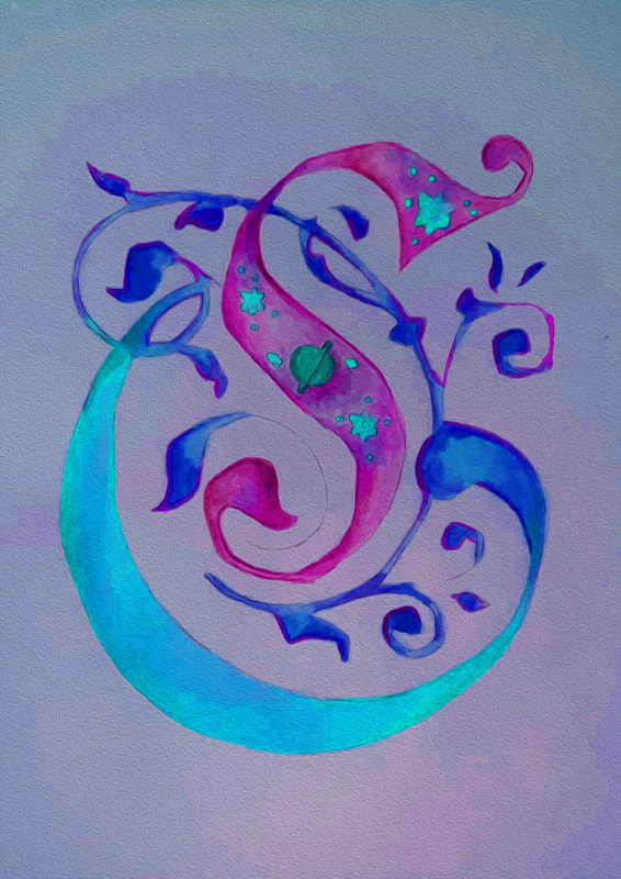
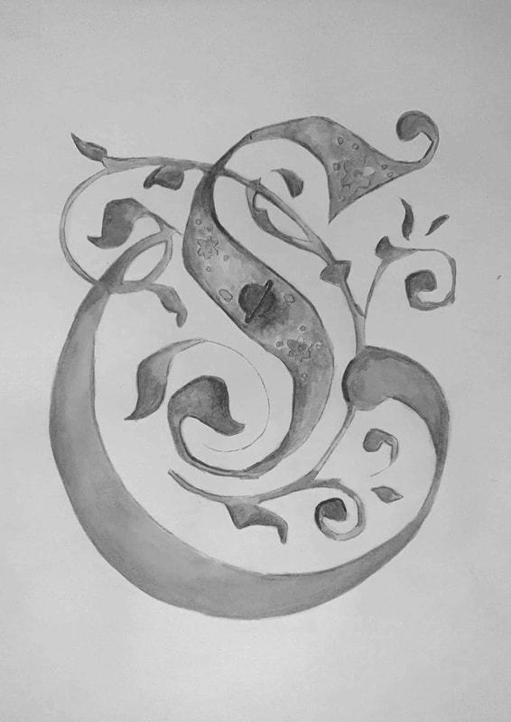
C: For this letter I wanted to make sure the typeface was more decorative where I would only need to add in a few details, I wasn't exactly sure how I was going to create something that represented me but I went with space and stars, the overall image reminded me of Sailor Moon especially with the colours and how the font flows. I used Watercolours for this type. 

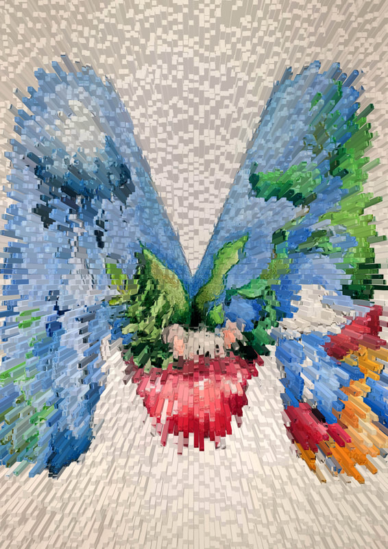
The photoshop tests however I really enjoy the way the last image looks as it is vibrant and looks like northern lights.
Crewniverse
Picture
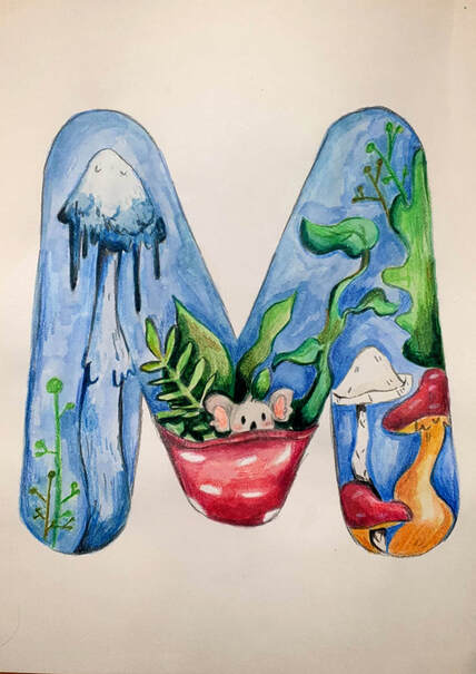
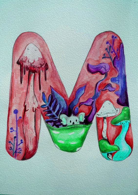
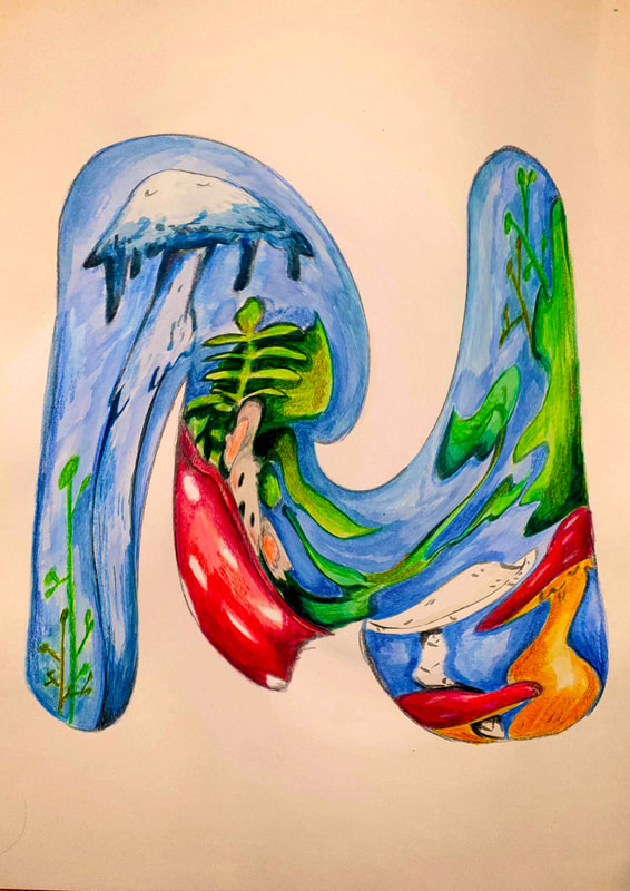
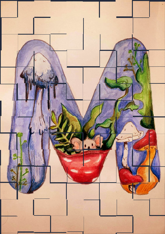
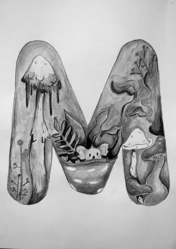
M: The Crewniverse font is from a series I enjoy (steven universe) and the bubble like font makes it look fun so I decided to do a bit more for this by adding in some mushrooms, plants and a baby koala bear hiding in and upside-down mushroom. I worked more into this one with the colouring than I did with my other one. I used both watercolour and pencil for this type. 
Black & White Ver

Quiz activities


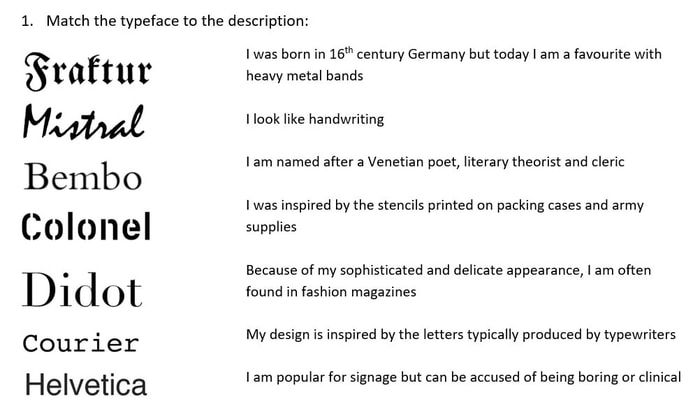
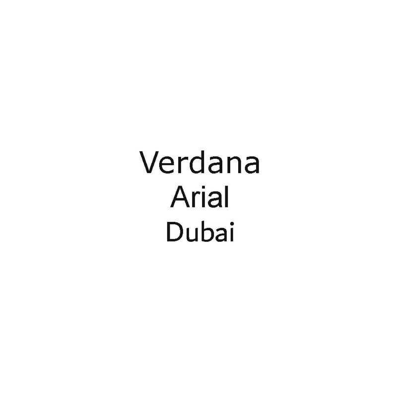
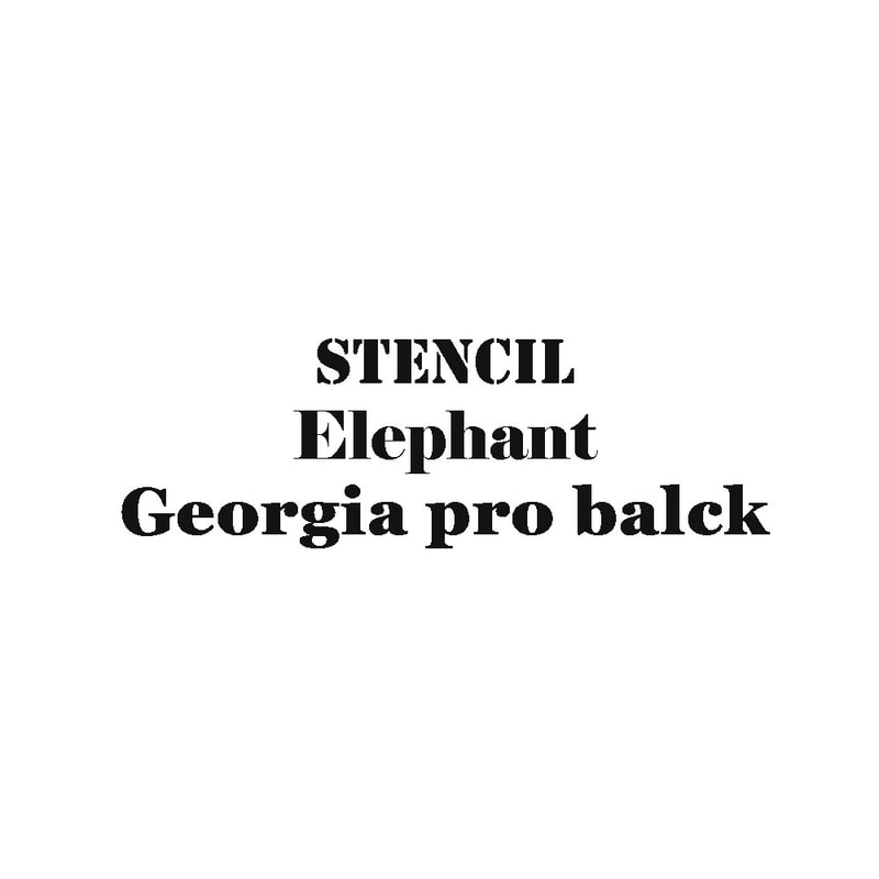
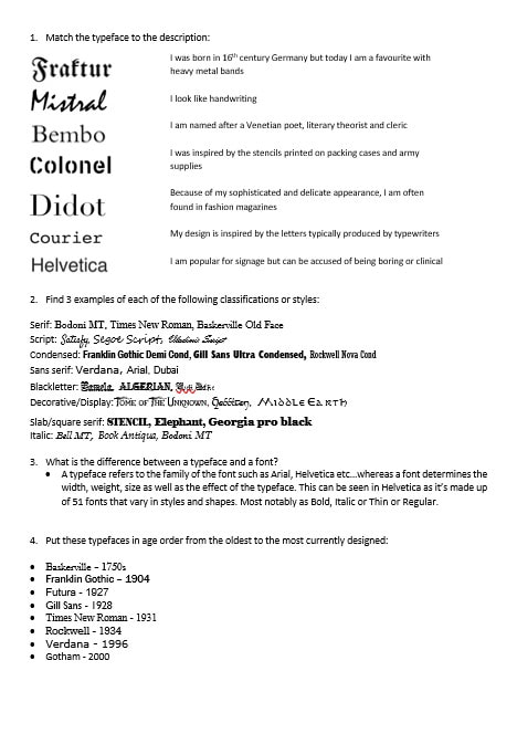
1. Match the typeface to the description:
Picture
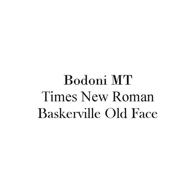
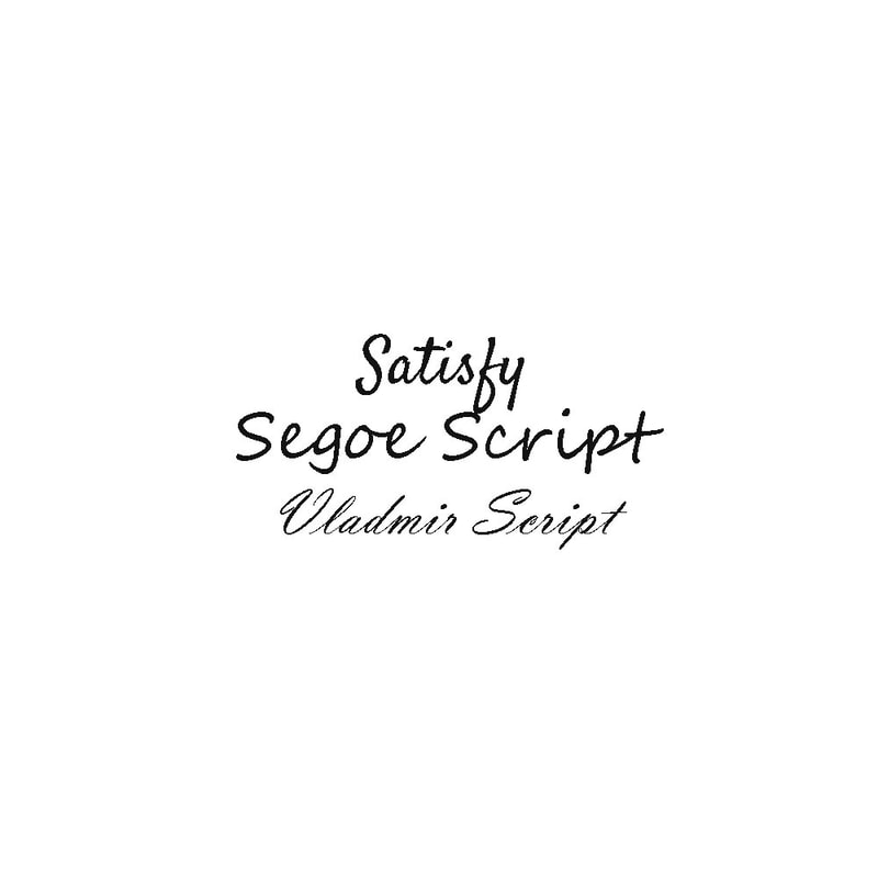
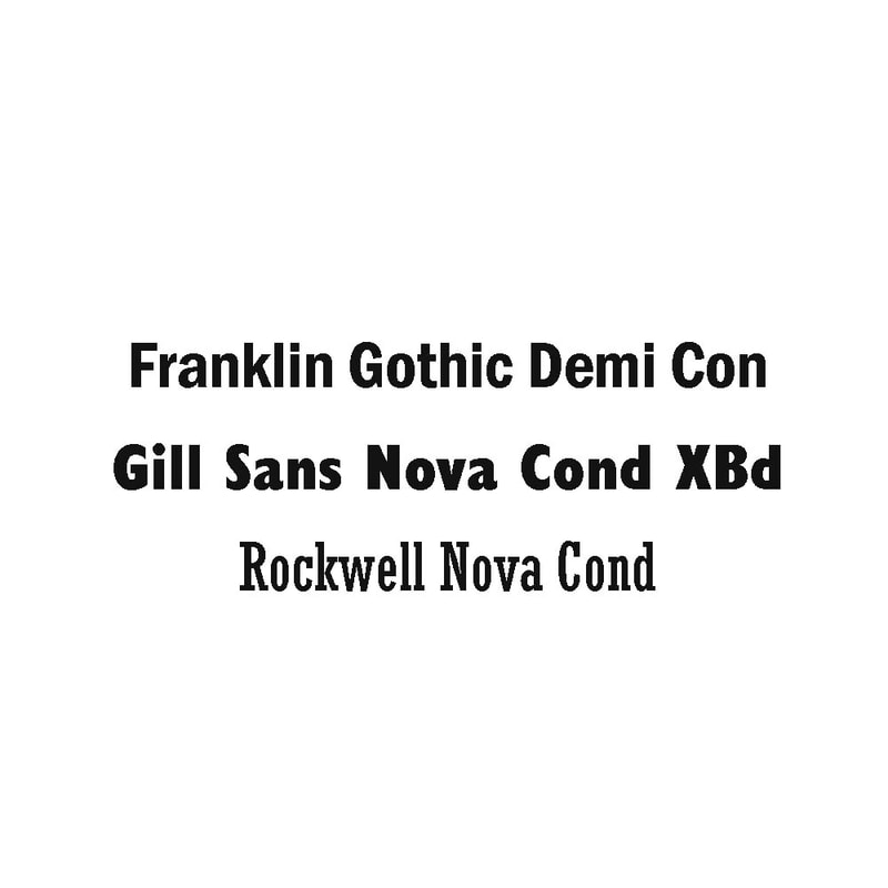
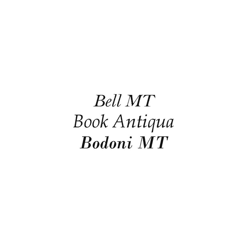
2. Find 3 examples of each of the following classifications or styles:
Serif
Script
Condenced
Sans Serif
Blackletter
Decorative/Display
Slab/Square Serif
Italic
3. What is the difference between typeface and a font? 

A typeface refers to the family of the font such as Arial, Helvetica etc…whereas a font determines the width, weight, size as well as the effect of the typeface. This can be seen in Helvetica as it’s made up of 51 fonts that vary in styles and shapes. Most notably as Bold, Italic, Thin or Regular. 
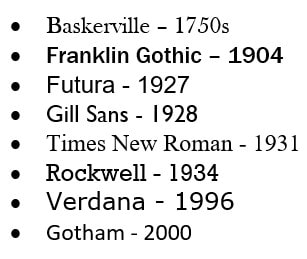
.4. Put these typefaces in age order from the oldest to the most currently designed:
Picture
  • Baskerville – 1750s
  • Franklin Gothic – 1904
  • Futura - 1927
  • Gill Sans - 1928
  • Times New Roman - 1931
  • Rockwell - 1934
  • Verdana - 1996
  • Gotham - 2000

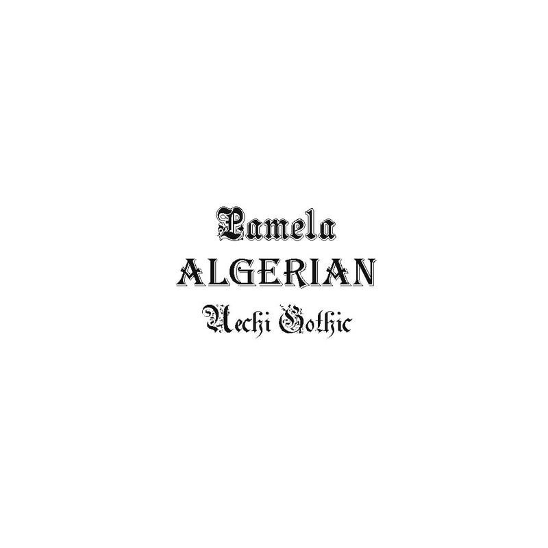
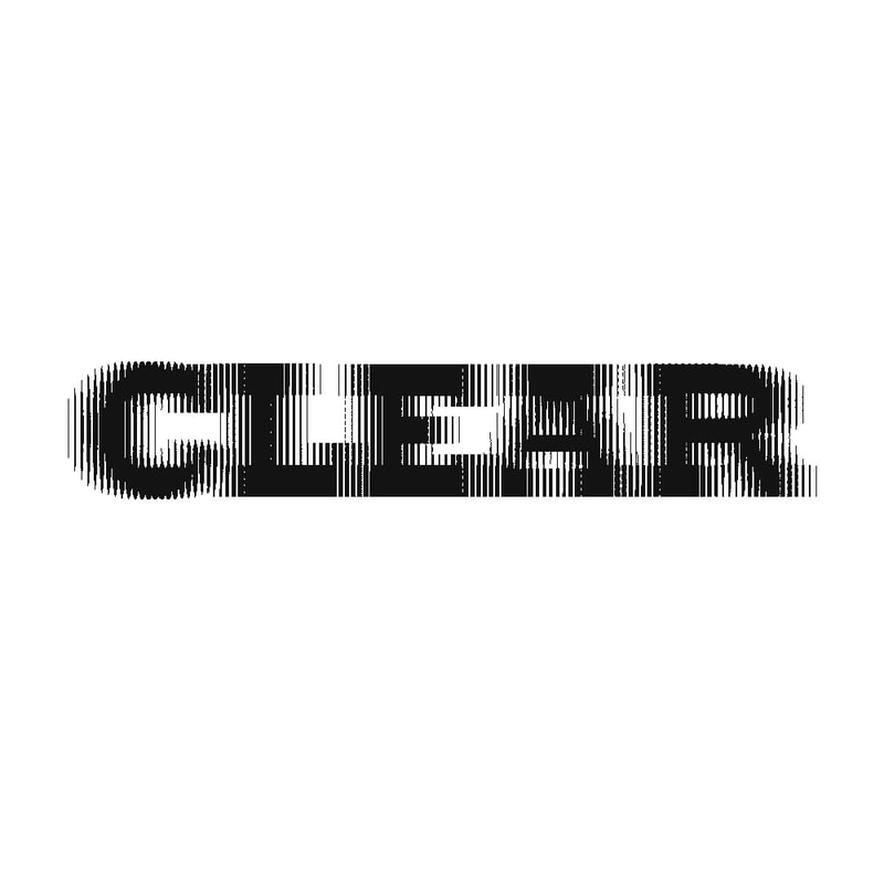
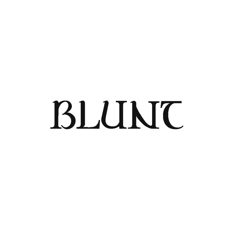
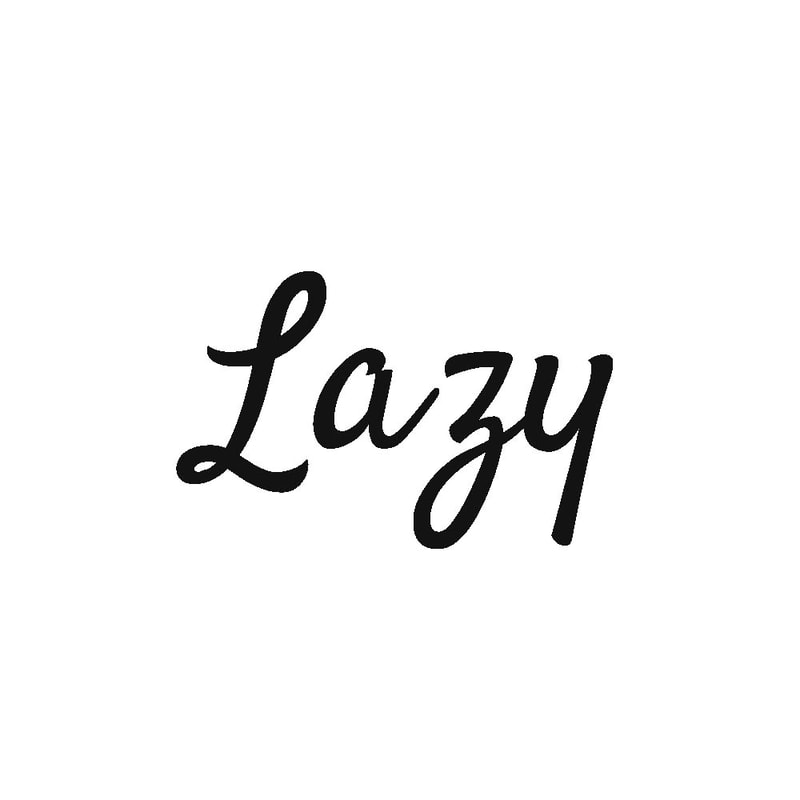
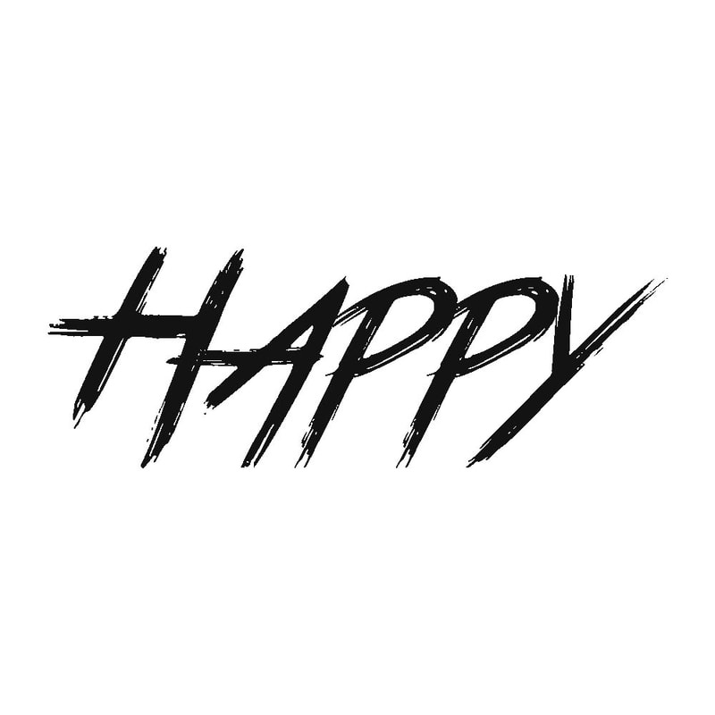
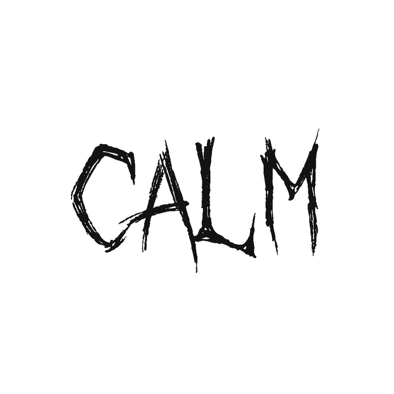
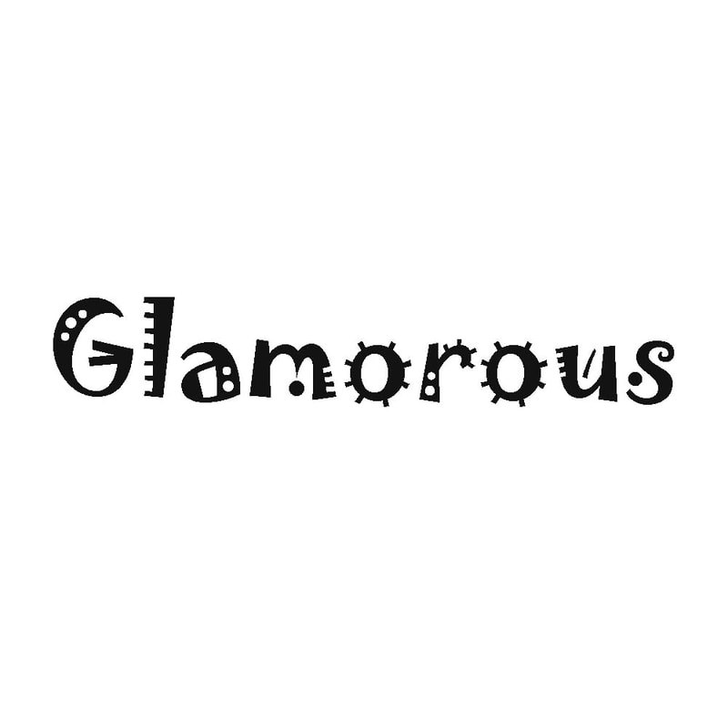
5. Find a typeface that has the OPPOSITE personality (antonym) to the following words and display the word in its opposite typeface:
ExtraBlur
Dungeon
Satisfy
True Lies
Pamela
October Crow
Jokerman
BlackWidow
6. Read this article and summarise in a few sentences ​
The 10 commandments of typography
After going through the 10 commandments of typography I have learnt a few rules:

Do not trust the software’s judgement on kerning and take your time finding the right amount of space that is needed as you have the full control of tracking and kerning. When working with a client/job you should avoid the overuse of script fonts as they are unnecessary and no one will read them. Another thing I have learnt it so not add a busy background as the focus of the typeface, to help with this you should make sure to set the types in blocks of solid colour or crop it. Using a range of different fonts can seem confusing and disorganised, you should use no more than three types of fonts. When it comes to small caps you should never try to fake it, always use a font that works well – The same can be said when it comes to Italics, do not tempt to skew the font to become italic. Do not only use capitals, this makes the writing a challenge to read.
You should avoid using white text on a dark background when it comes to paragraphs as this could strain a reader’s eye. Make sure not combine serifs or any fonts that look overly similar – use sans for the body when using a serif as the title. Long measures can be distracting when either too long or too short. The eleventh commandment is to not use comic sans.
Type Quiz
File Size: 608 kb
File Type: docx
Download File

In case the word doc doesn't work I have screenshotted the pages below;
Picture
Picture
Site powered by Weebly. Managed by 34SP.com
  • Home
  • Univerisity
    • Year 1 >
      • Workshop
      • History & Practice
      • Introducing Visual Communication >
        • Telling Stories
        • Nursery Rhyme
        • Old School
        • Master Forger
        • Perspective
        • The Tree
        • Thumbnail Visuals
        • Colour Theory
      • Muli-Dimensional Illustration >
        • end of year submission
      • Visual Problem Solving >
        • Type Selfie + Quiz
        • DIY Alphabet
        • Ampersands
        • Handlettering
        • 2 Become 1
        • Helvetica
        • Type Talk
    • Year 2 >
      • the critical illustrator
      • ILLUSTRATOR'S TOOLKIT
    • Year 3 >
      • ARTD6000
      • Advanced Illustration Projects
      • FMP
      • Twitch Assests
  • Submission Page
  • About
  • Instagram