Artist Research

The Wild Swans (Princess Sleeps)
|
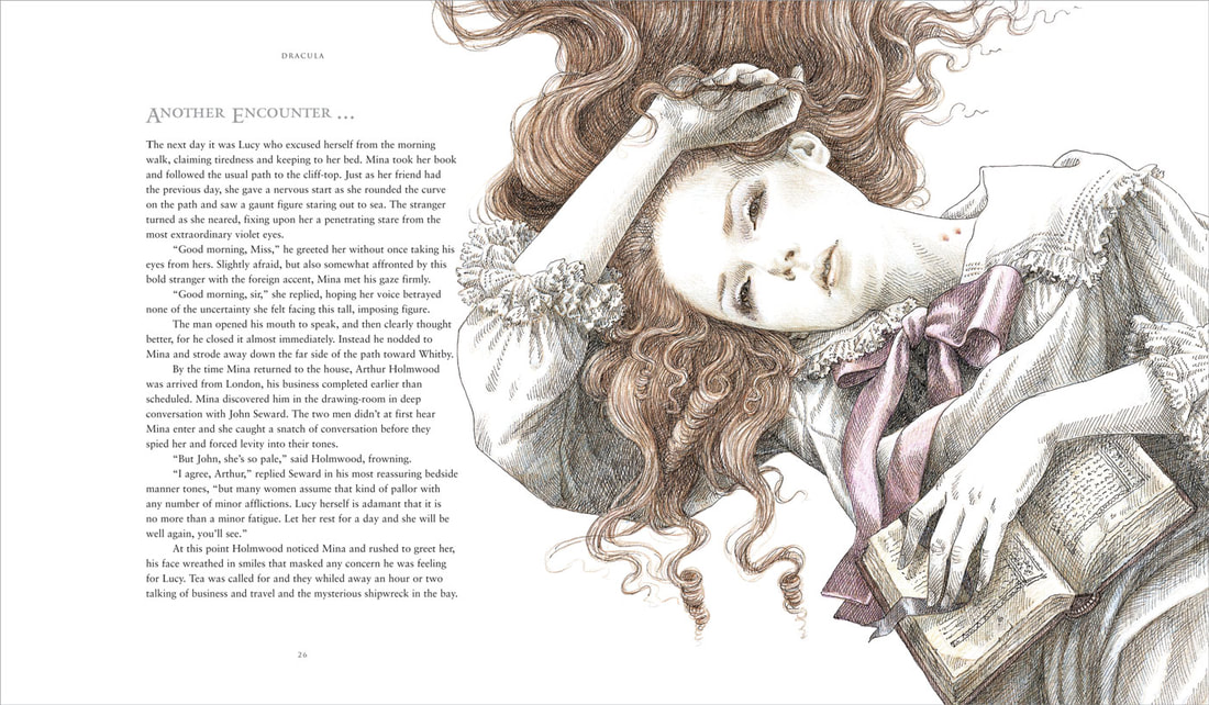
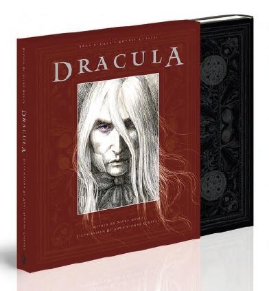
anne yvonne gilbertAnne Yvonne is a British Illustrator born 1951, Wallsend, North Tyneside, Tyne and Wear, United Kingdom. She primarily works in pencil crayons to design children's books and postage Stamps and record sleeves. She has this richness within her imagination which reflects into her research on quality of materials and surfaces.
She has a love for fairy tales combined with history which have resulted in the illustrations of many books worldwide. Arnold Swartzenneger and the late H.R.H. Princess Margaret have originals of her illustration held in private collections. Yvonne's use of colours are different as most will be bright or dark depending on the overall mood of the paintings. The compositions of the illustrations are all carefully thought of from where the humans and animals are placed and how they would lead your eye to the main focus including space for the text. |


City Tiered Stables
1965
|
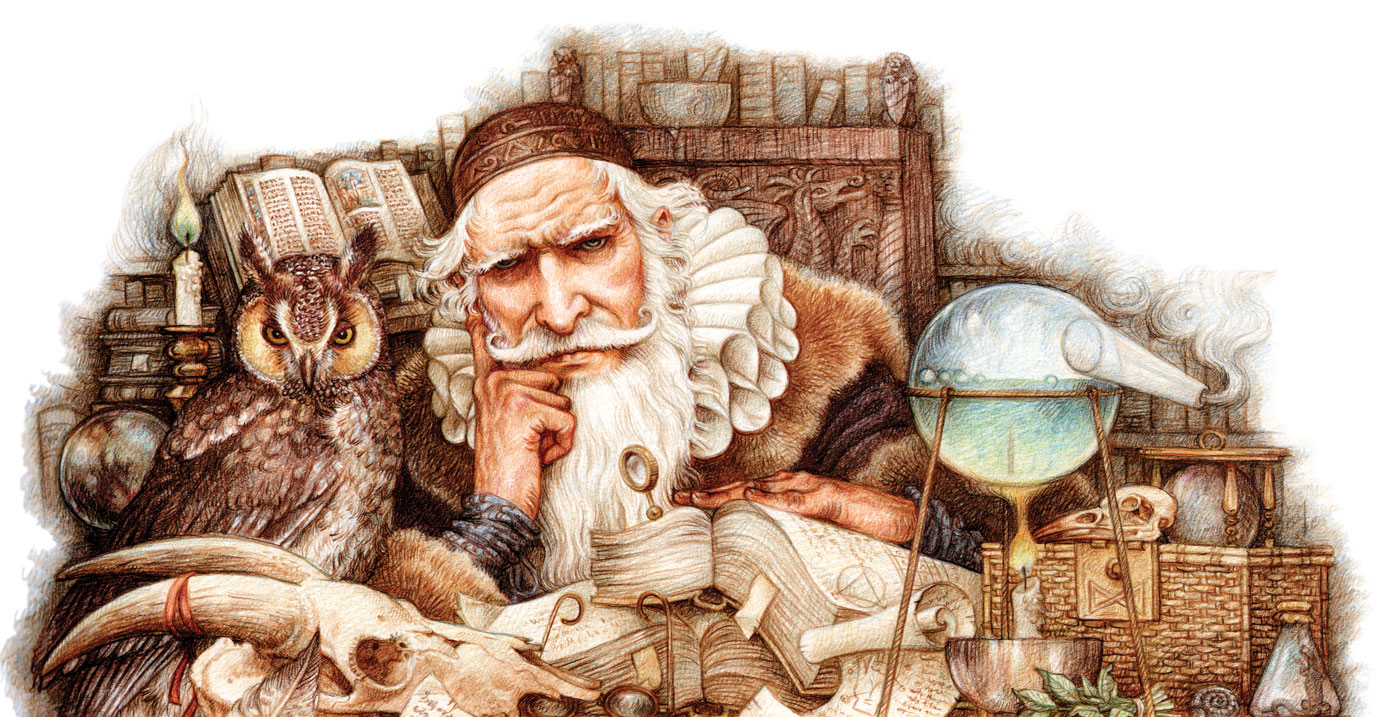
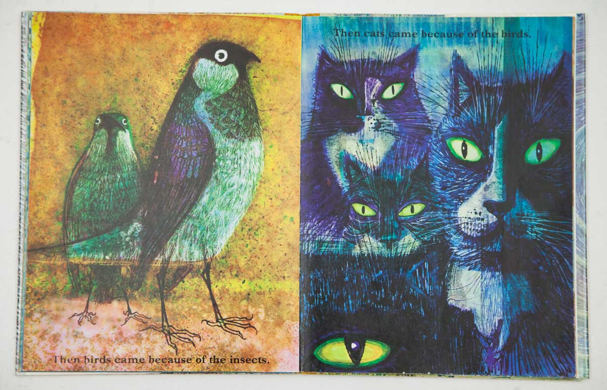
Charles KeepingCharles Keeping, 22nd September 1924 - 16th May 1988 was an English Illustrator for children's books and lithographer. He came to prominence with his illustrations for his historical novels for children. He created several picture books as well as completing works for Charles Dickens for the Folio Society.
He won two Kate Greenaway Medals at the Library Association for the year's best children's book illustration. Keeping's lithographs are exhibited in London, Italy, Austria and the U.S and many other prints are displayed at the Victoria and Albert Museum. Keeping's ink colours are vibrant when he uses colours, some having detailed lines to a few where the lines are much thicker. Keeping also works in a lot of black and white's with hints of colour. His use of composition varies with what the subject of his art is but with the black and white inks the focal point is centred. |
Illustrations from ‘The Statement of Randolph Carter’ by H.P.Lovecraft, ‘Lot No. 249’ by Arthur Conan Doyle, and ‘The Fall of the House of Usher’ by Edgar Allan Poe, all found in The Macabre
|
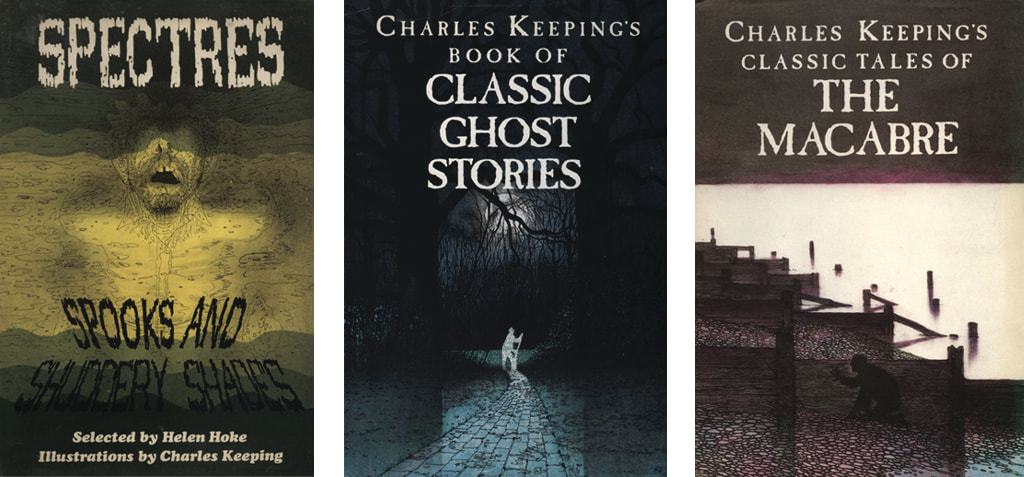
Charles Keeping book covers: Spectres, Spooks and Shuddery Shades (Franklin Watts Ltd., 1977), Classic Ghost Stories (Blackie and Son Ltd., 1986) and The Macabre (Blackie and Son Ltd., 1987)
|
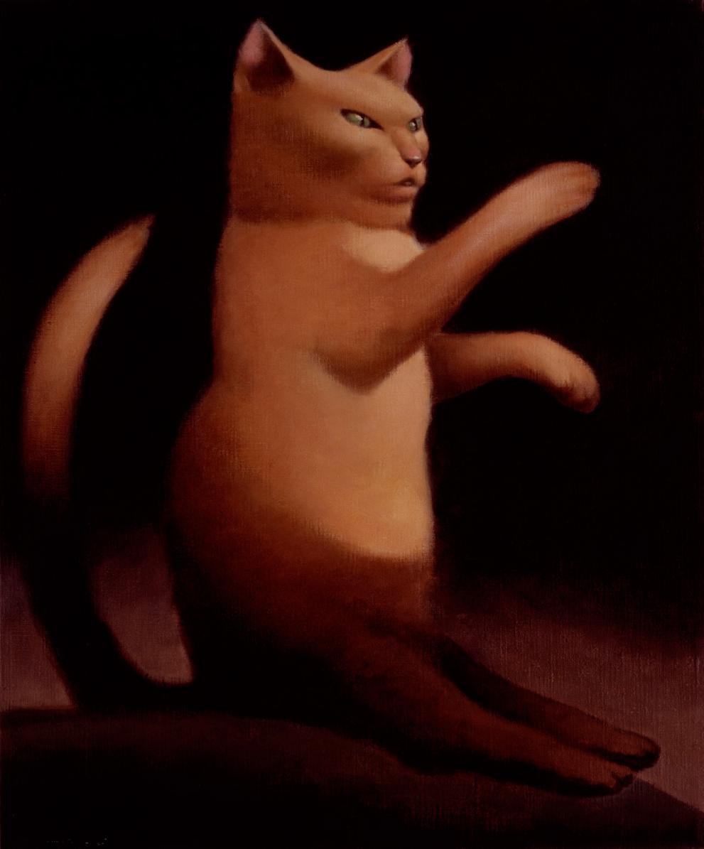
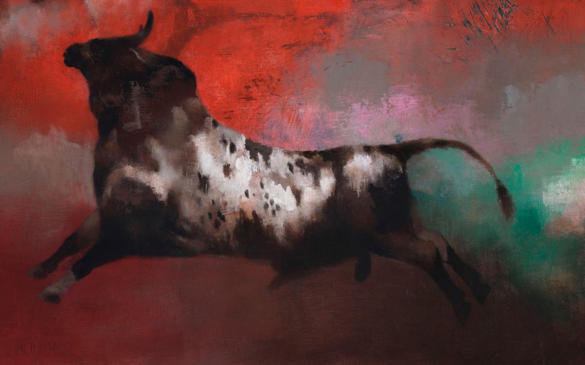
Yellow Cat
|
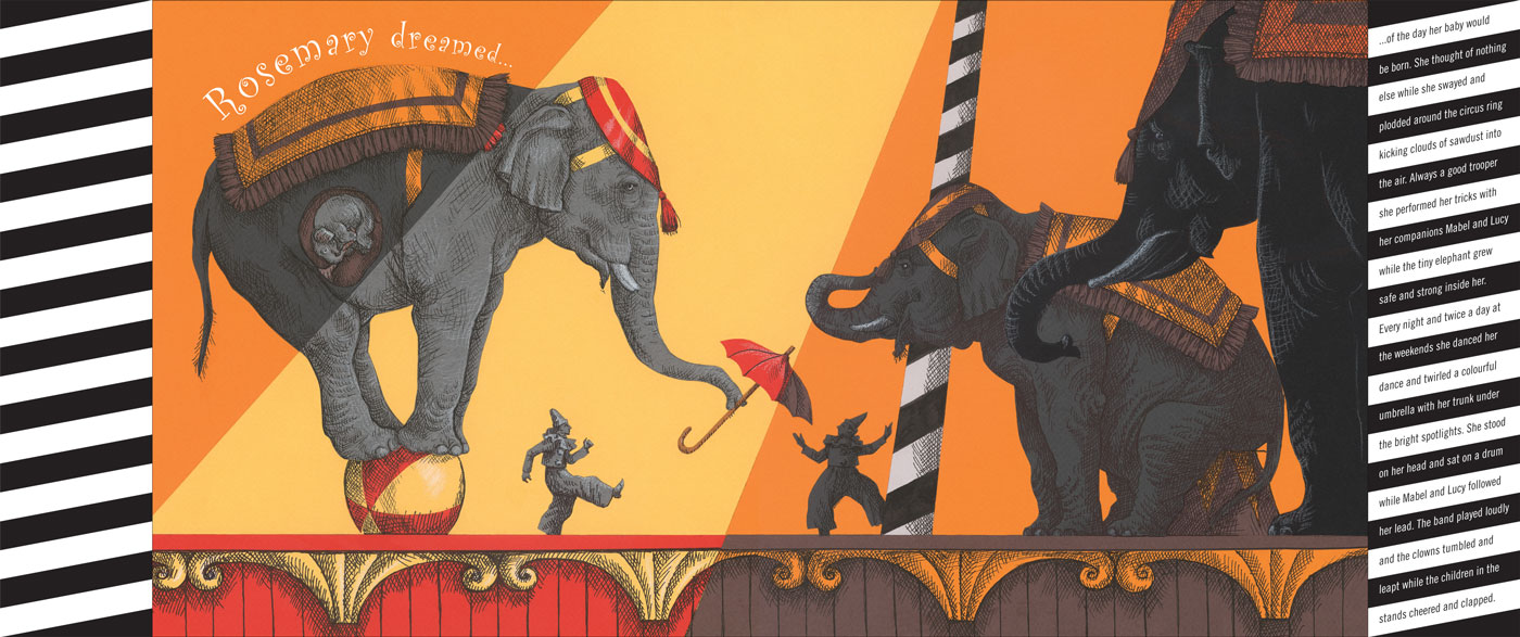
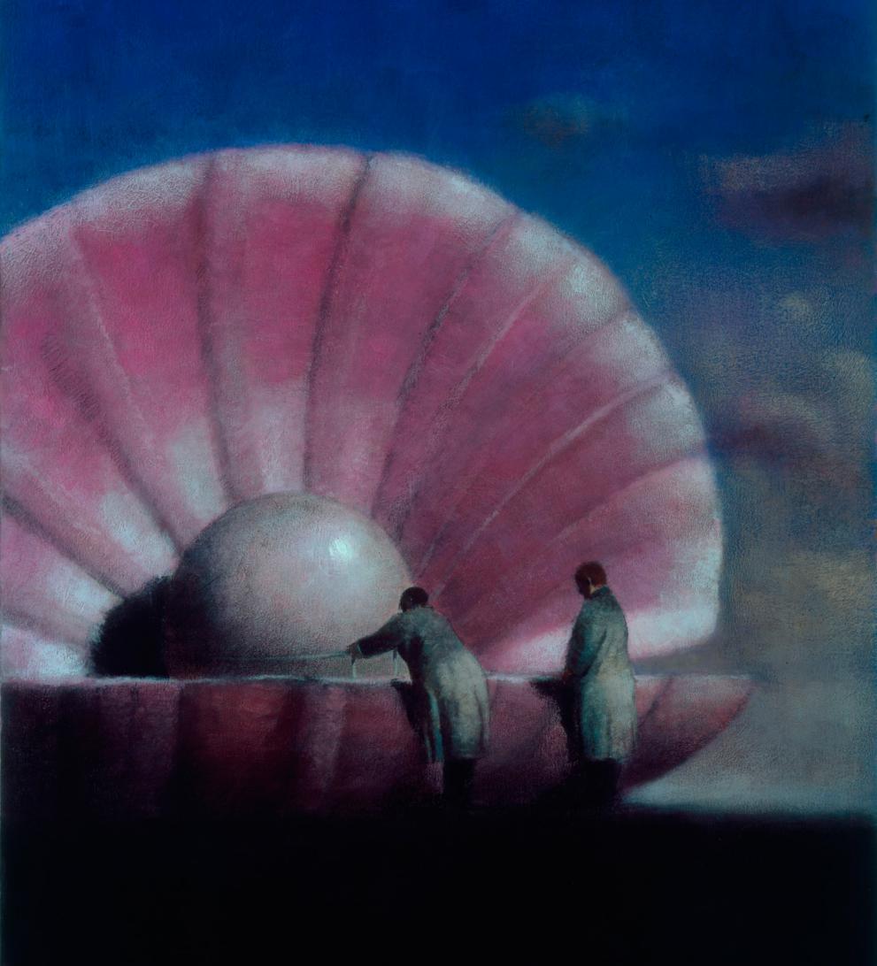
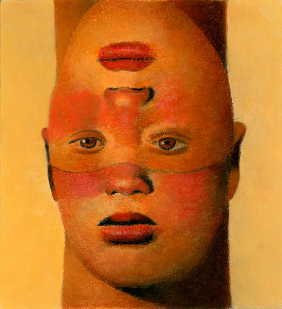
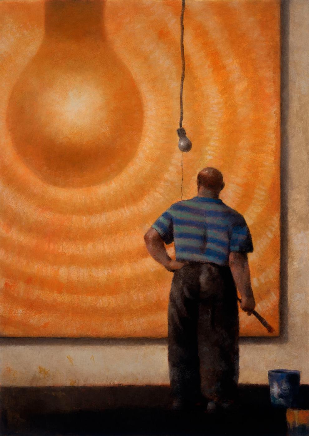
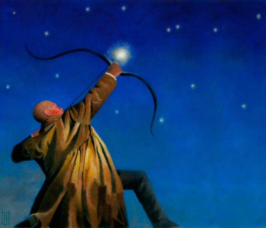
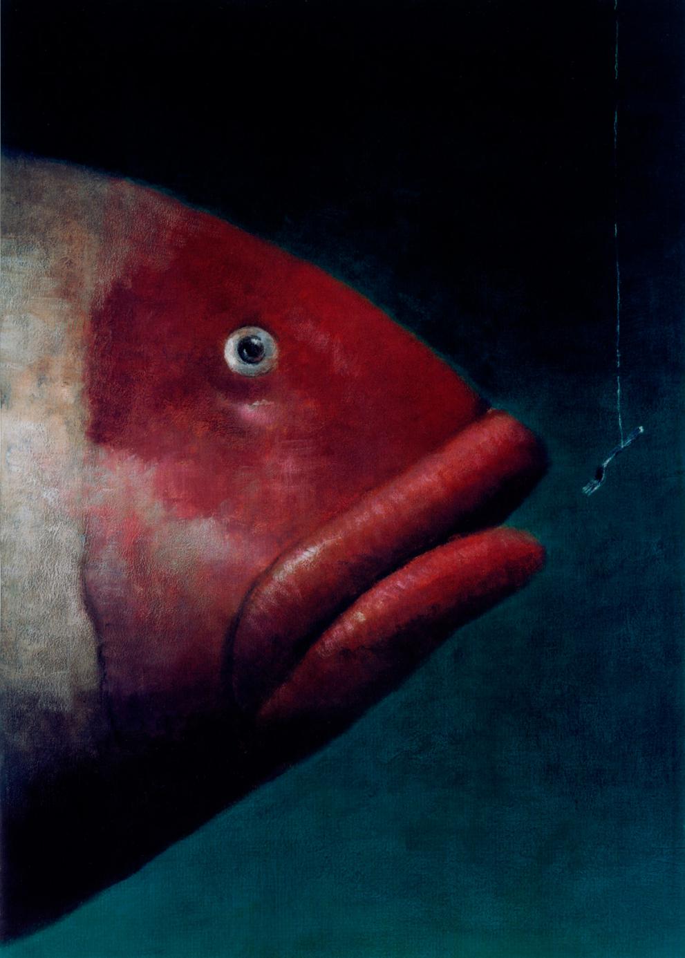
Brad HollandBrad Holland is an American artist and one of the most influential of our time. His illustrations have been printed on magazine covers around the world and his unique style has influenced a worldwide range of artists.
He has been recognised with major design journals internationally and has received awards in many countries from graphic arts organizations. The Musee des Beaux Arts exhibition shows his paintings at Clermont-Ferrand, France in 1999. Holland is also a member for the Alliance Graphique International (AGI). Holland uses bright vibrant colours for most of his paintings which are eye catching as the colours make you wonder what the painting is as it stands out, his use of using humans and objects really draw your eyes around the canvas. |

As I was researching I had decided which genre and which artist medium I thought would be best:
- Children's Book - Anne Yvonne Gilbert
- Science-Fiction - Brad Holland
- Psychological Horror - Charles Keeping
Artist Techniques
Watercolour paper - Rough (pencils)
|
Watercolour paper - Smooth (pencils)
|
Watercolour paper - Smooth (watercolour and ink)
|

Card - Smooth (watercolour and ink)
|
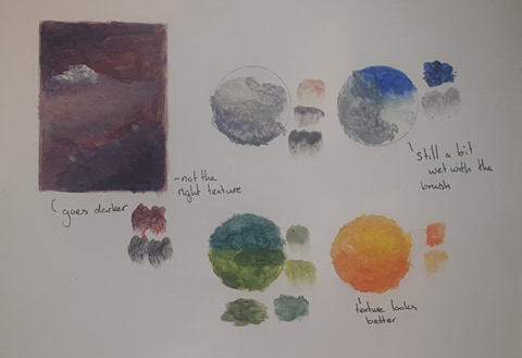
Card - Smooth (acrylic)
|
I then moved on to testing some mediums on different types of paper - this helped me figure out what paper really works well as the card was a bit harder to work with inking.
I enjoyed working with pencil and ink the most but I wasn't really happy with the acrylics and how they turned out although I do like the messy style I managed to achieve.
I enjoyed working with pencil and ink the most but I wasn't really happy with the acrylics and how they turned out although I do like the messy style I managed to achieve.
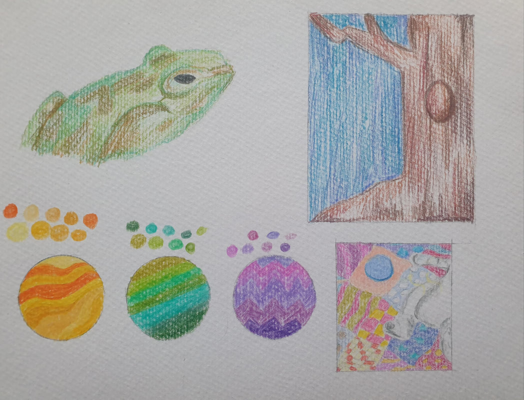
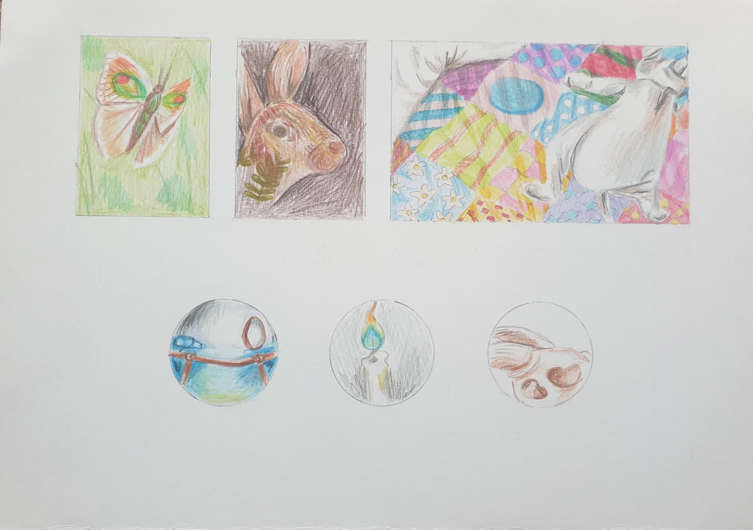
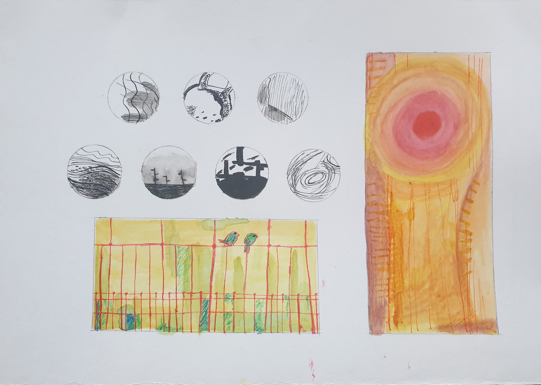
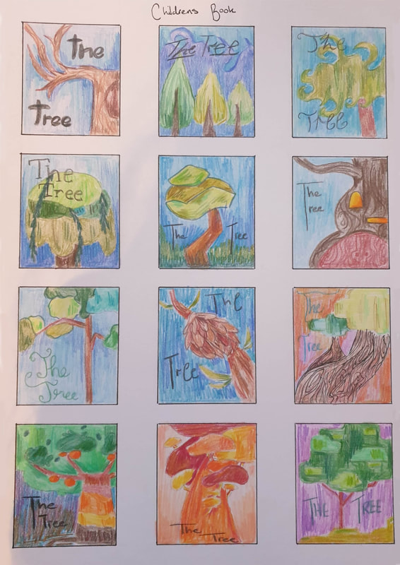
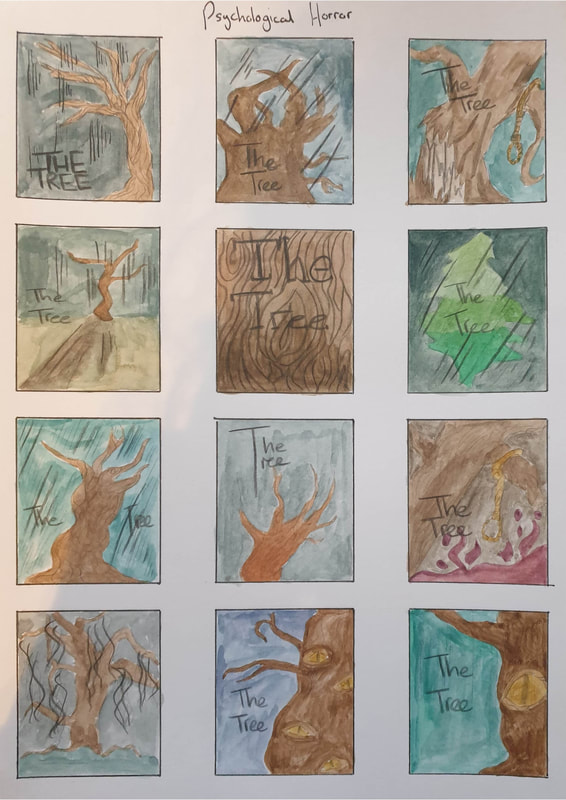
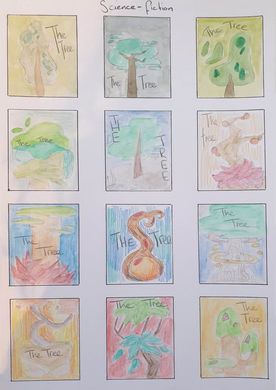
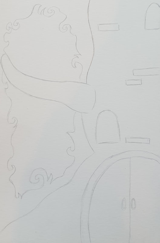
Thumbnails
|
|
|
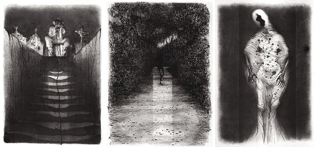
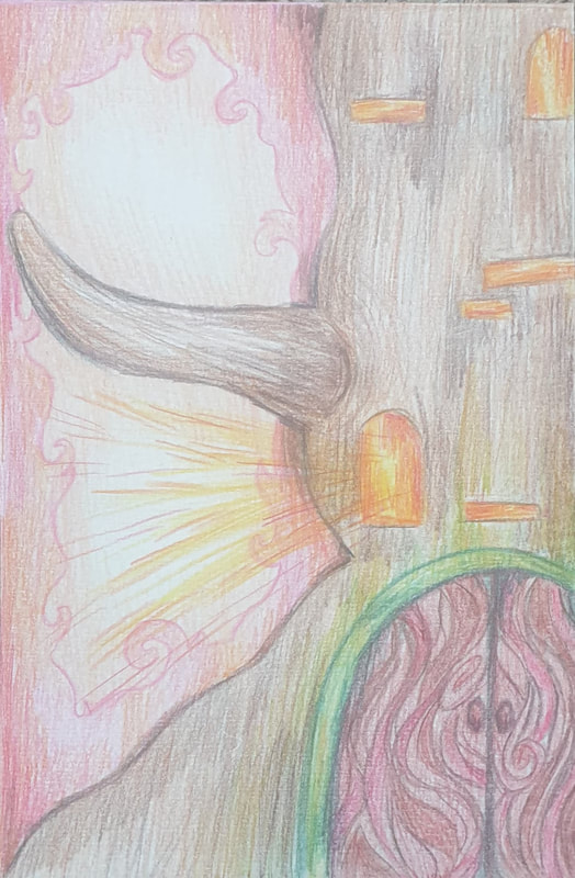
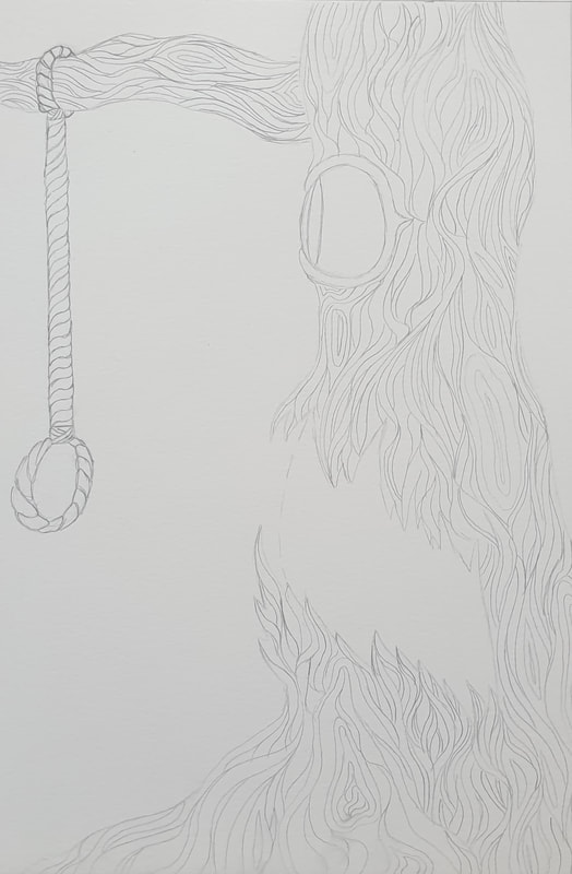
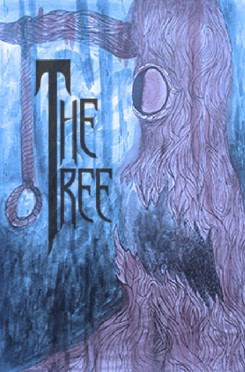
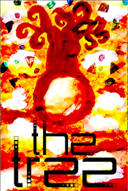
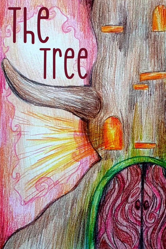
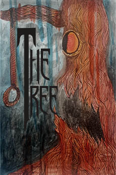
I had a lot of ideas for the horror illustrations although I wasn't too sure on the psychological part, I decided to think of some creepy eyes that would be watching you in a forest and decided to choose one of those decides overall. The children's book is what I worked on next though I wasn't too sure how I was going to do this other than knowing I would be using a lot of brighter colours. Lastly I worked on sci-fi and this wasn't necessary my favourite one to work on and I feel like I just couldn't think of anything for the genre making some designs just look plain.
Development
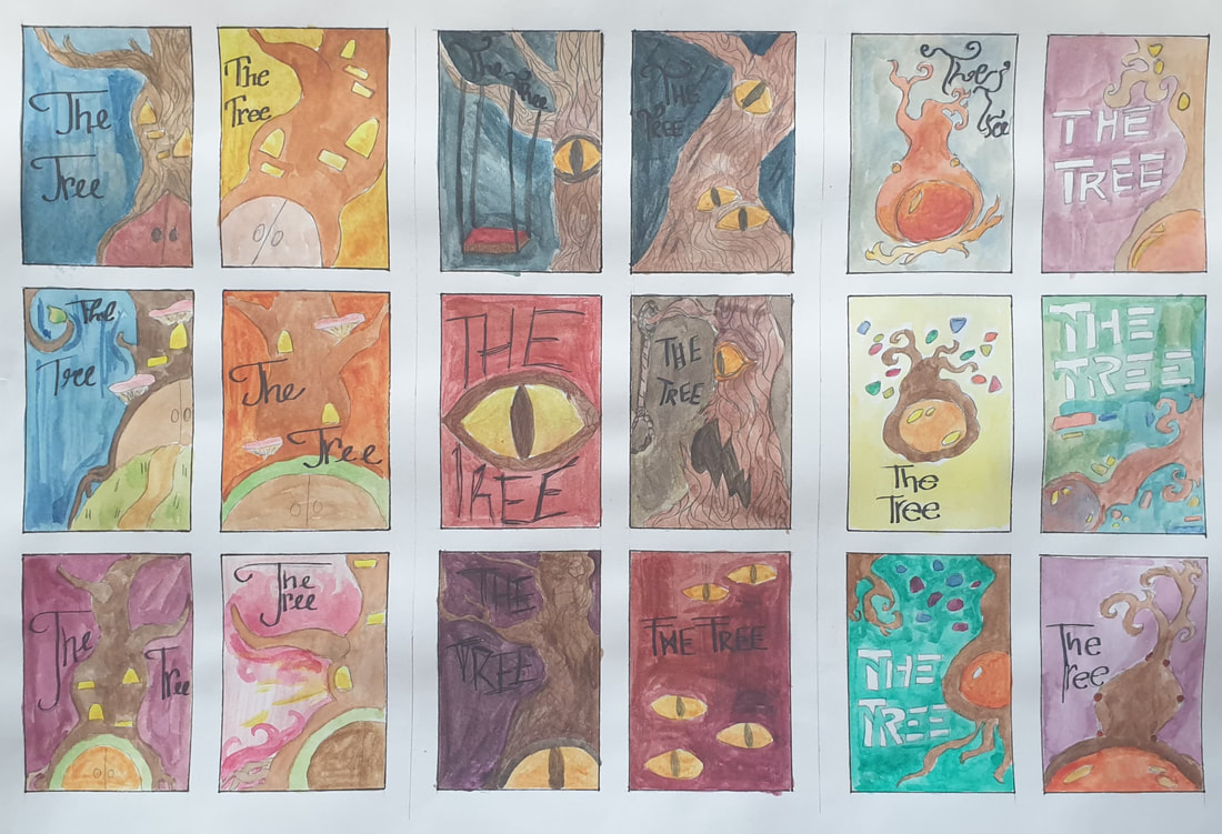
After choosing which designs to work on more I came up with different compositions , layouts and colour as well as adding the text just to see where I would be placing it digitally for the final.
Process
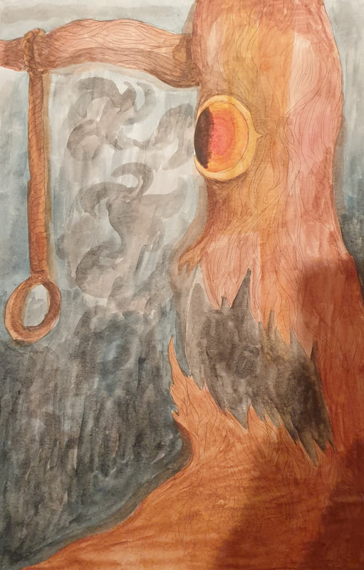
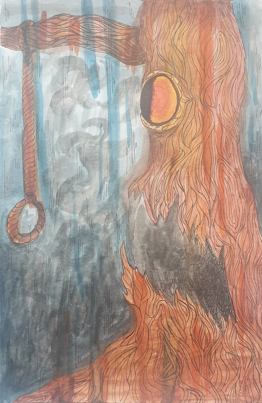

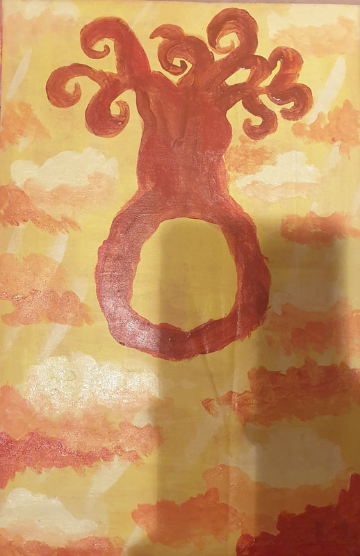

For my pencil and ink I used smooth watercolour paper as this worked best with the mediums, I had a lot of fun working on these and trying to make sure the artists' style and methods still came through. The acrylic painting I used fabric over some cardboard, I had to tone the pink down with white and then go over, this one was the hardest to work with as the fabric didn't seem to work well with acrylic nor was it easy to drybrush.
Font Tests

I did a lot of font tests to see which one would work best with the genre
Photoshop Tests
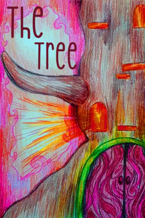
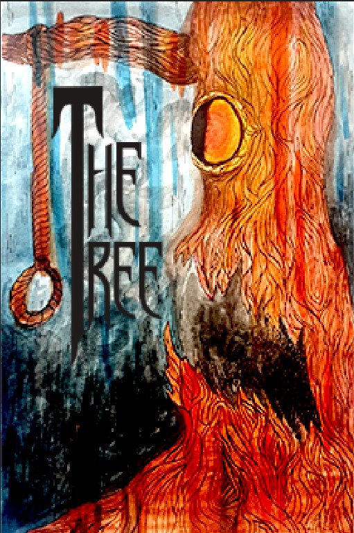


I decided to play around in Photoshop and see If changing the levels and colours would create a different feeling to the designs
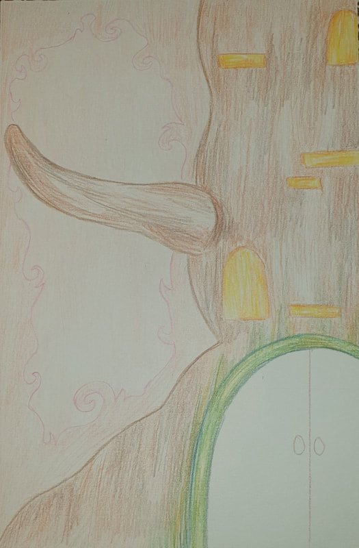
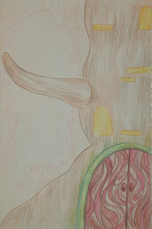
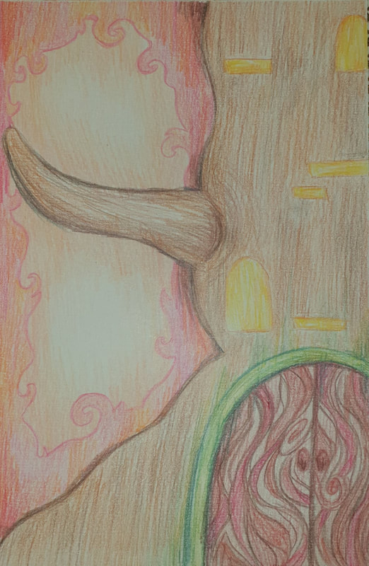
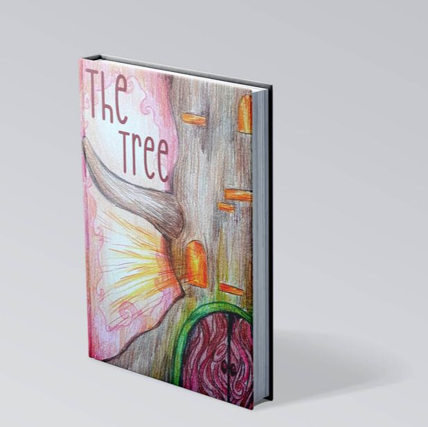
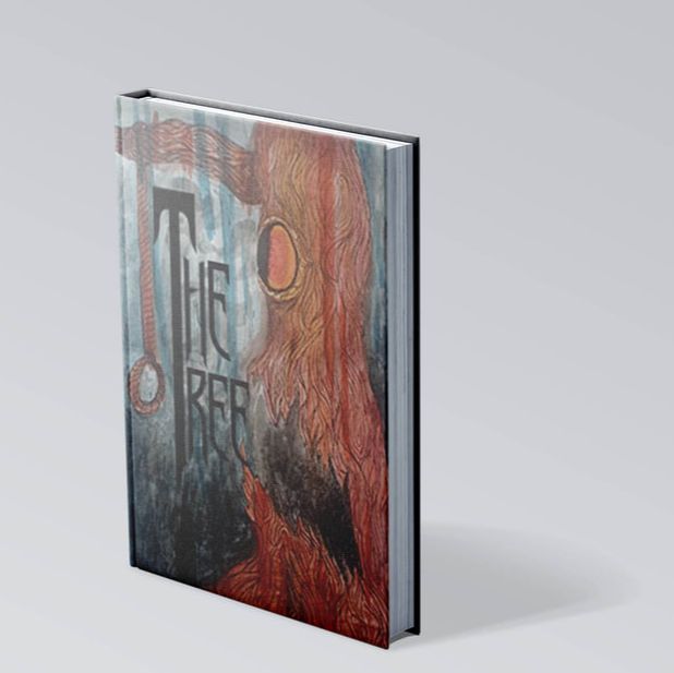
Finals
|
|
|
|
|
|
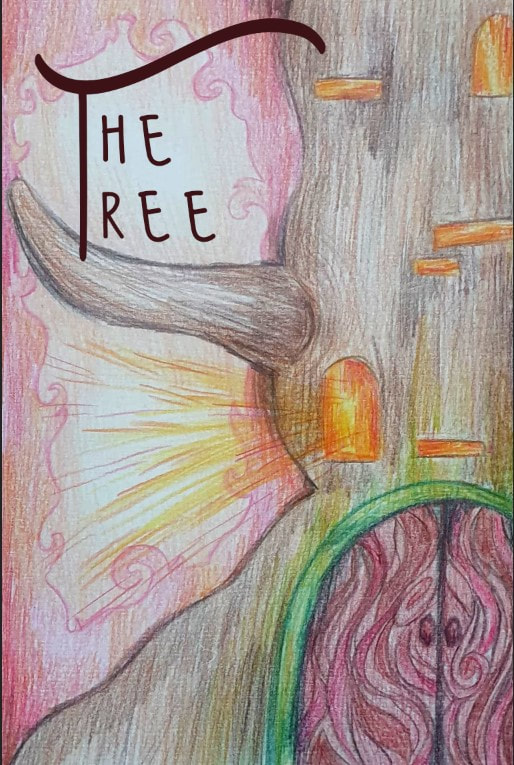
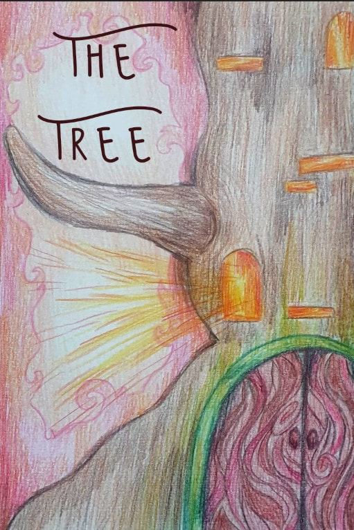
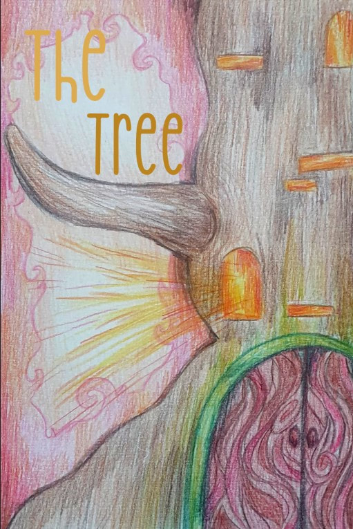
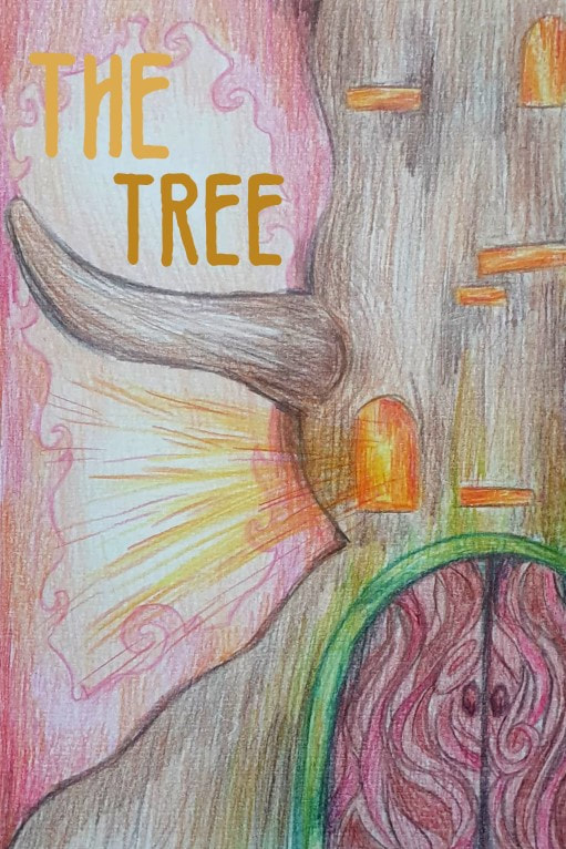
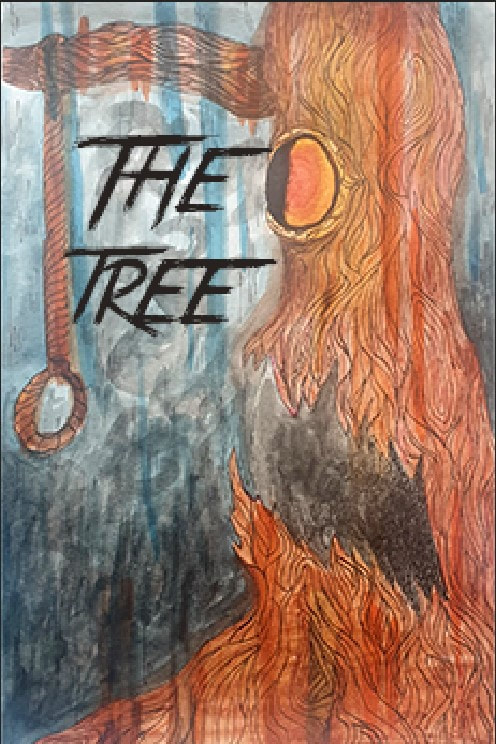
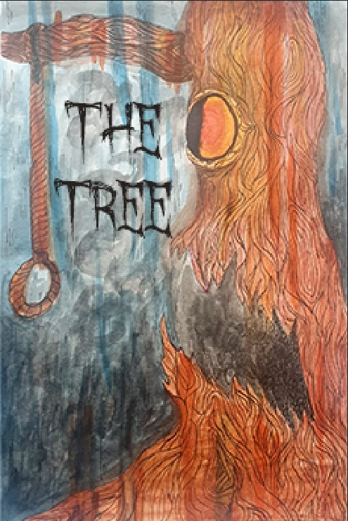
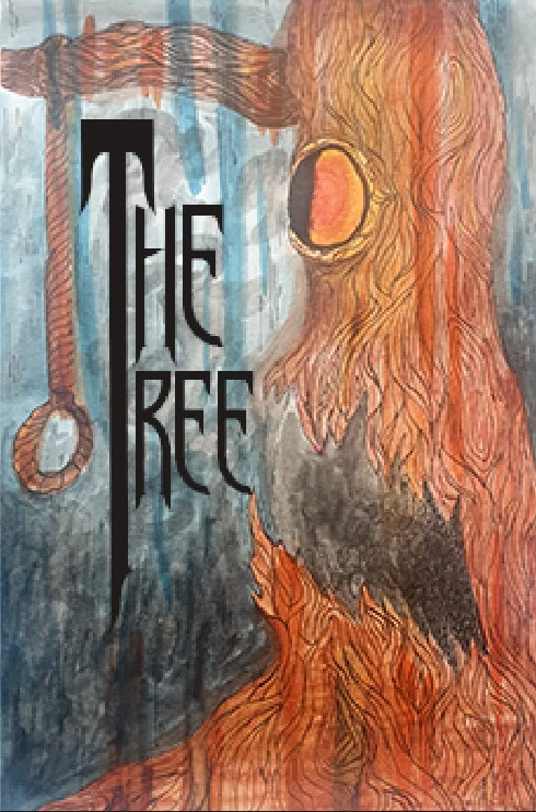
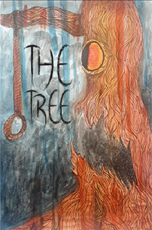
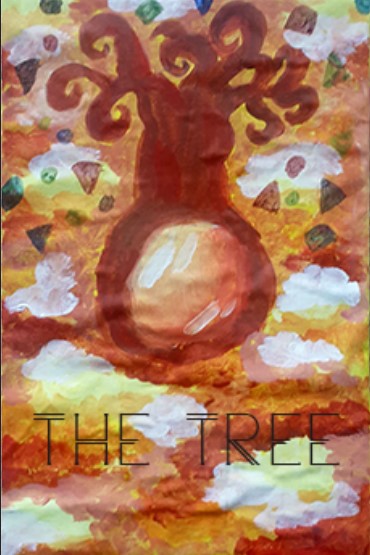
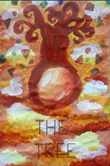
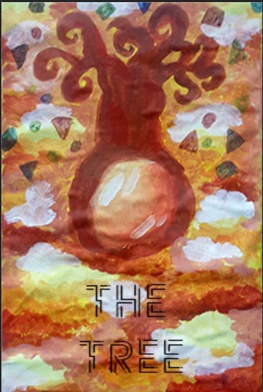
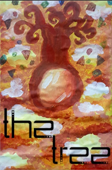
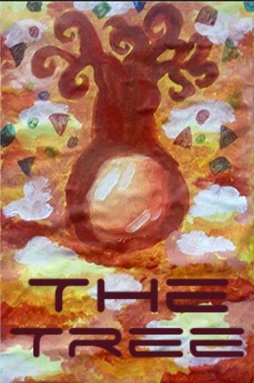
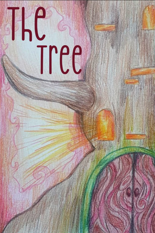
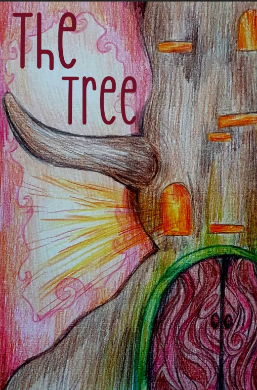
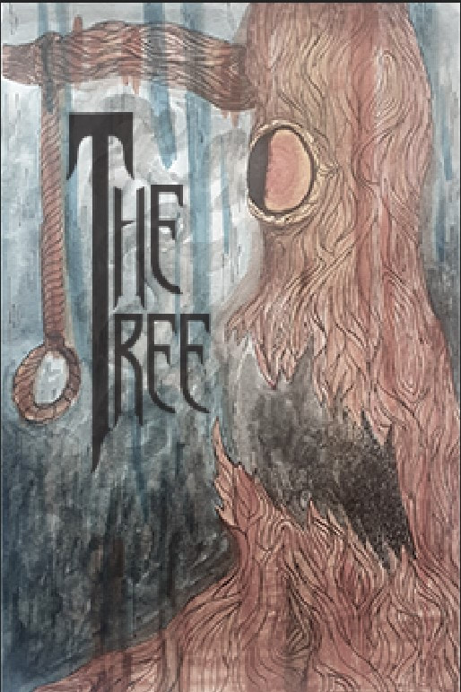
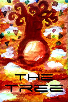
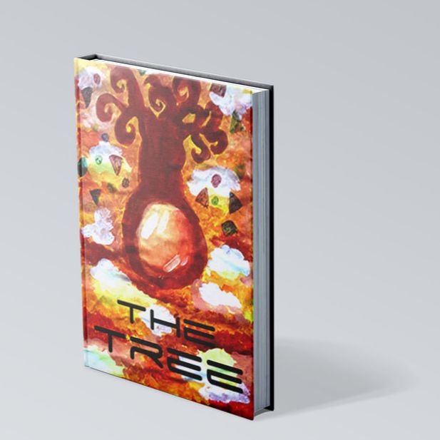
I noticed a bit later that my original font for the Sci-Fi tree looked as though the "e" where 2's so I decided to chose another font which I thought still looked as good for the piece. Overall for this project I had a fun time trying to replicate the artists images into my own especially with the Psychological Horror which I am not really that into, but trying to create an earie atmosphere was fun to play around with. Trying to work with fabric on cardboard was slightly challenging especially with mixing acrylics to get the right colours. The Pencil design was fin to explore and try to think of what type of a tree would best suit a children's book, at first my idea was to have an owl nest which evolved into windows to a whole house that is made of a tree.