Ampersands
|
Session Notes
|
Videos from the session
|
|
|
|
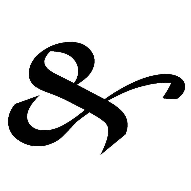
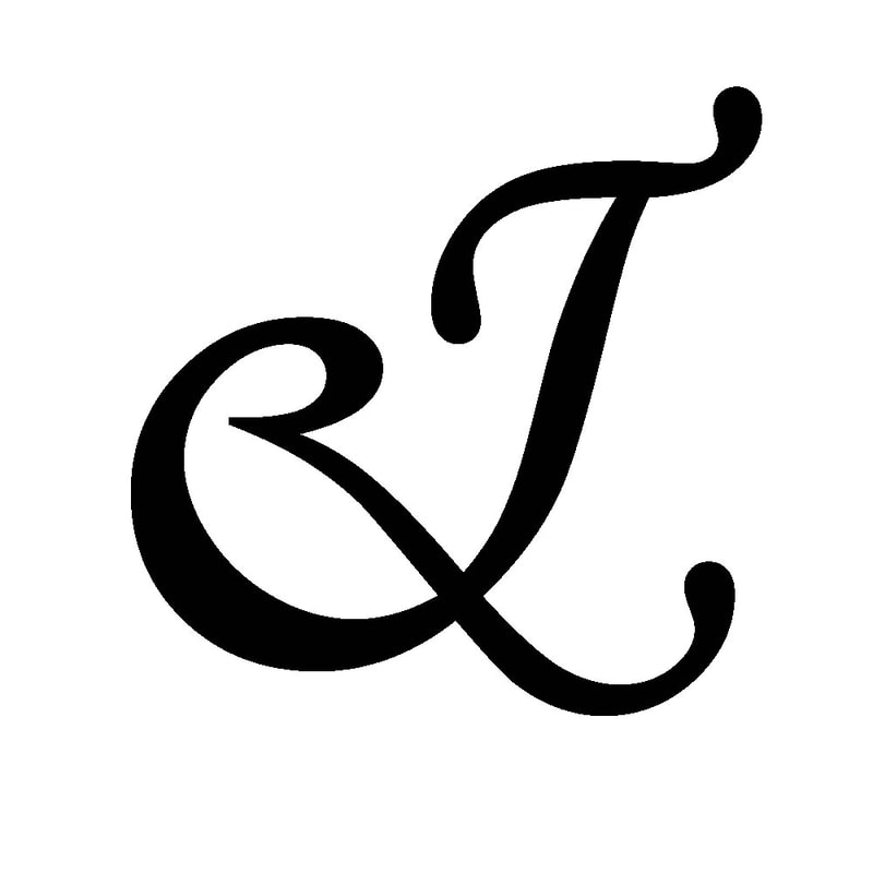
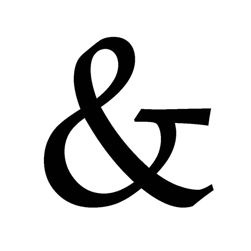
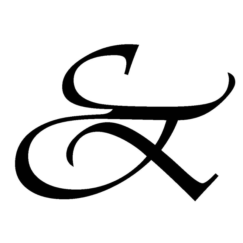
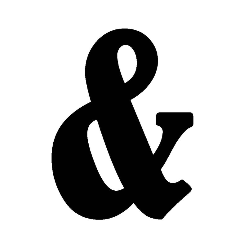
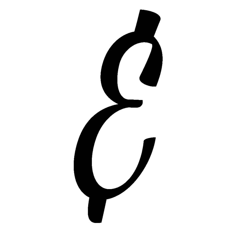
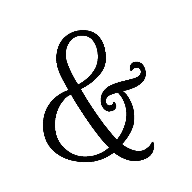
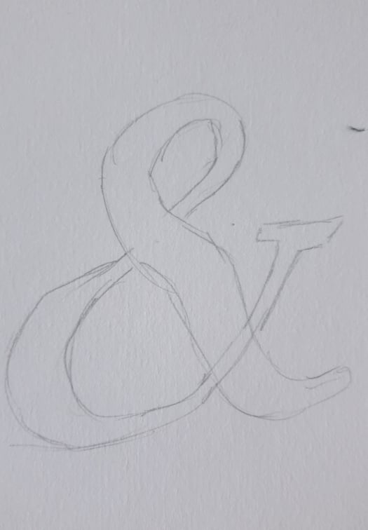
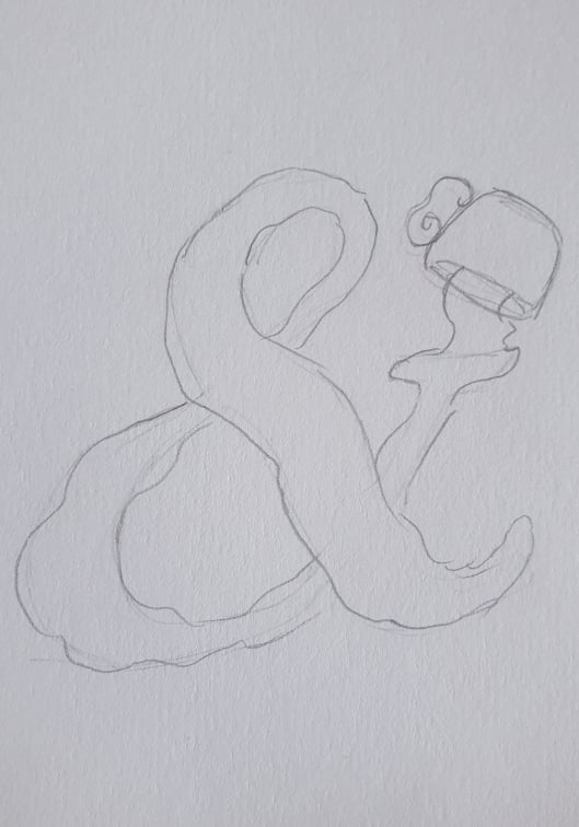
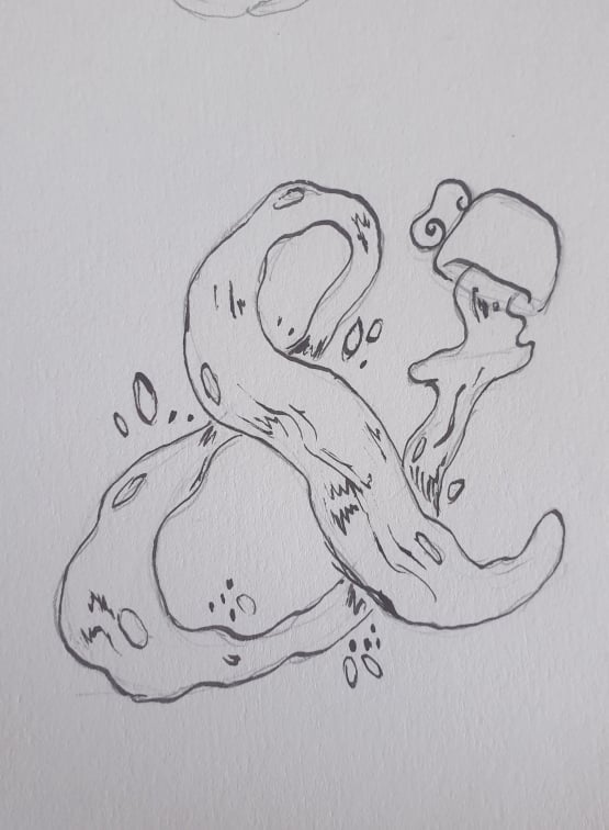
1. collate eight different ampersands. Choose them because they are different from each other. Display them on your blog/website with a small write-up or commentary to accompany each different one that must include the typeface name and what attracted you to it. You might even want to find out a bit about its usage or history and add that to your commentary.
Matura MT Script Capitals - I chose this font as the curves caught my attention
Monotype Corsiva - This font has a unique style to it with the way it shapes the lines
Bell MT - This one is pretty simple but I liked the way the middle section swerved
Book Antiqua - I liked the way this has a swoosh affect with the lines
Vivaldi - I chose this as it was really decorative and reminded me of Arabic writing
Bernard MT Condensed - This is the thickest one I liked as it is condensed and not too bold and wide
Bonbon Light - I like this one as it's the only one that has a different style and almost looks like an E but fancy
Harrington - I like the tails at the end of the ampersand
