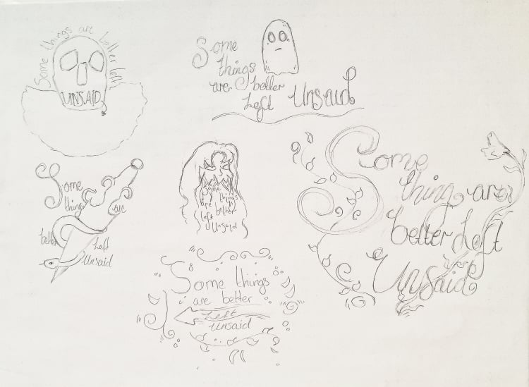
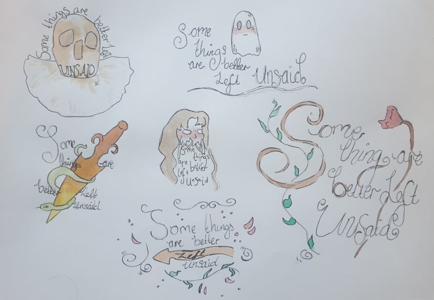
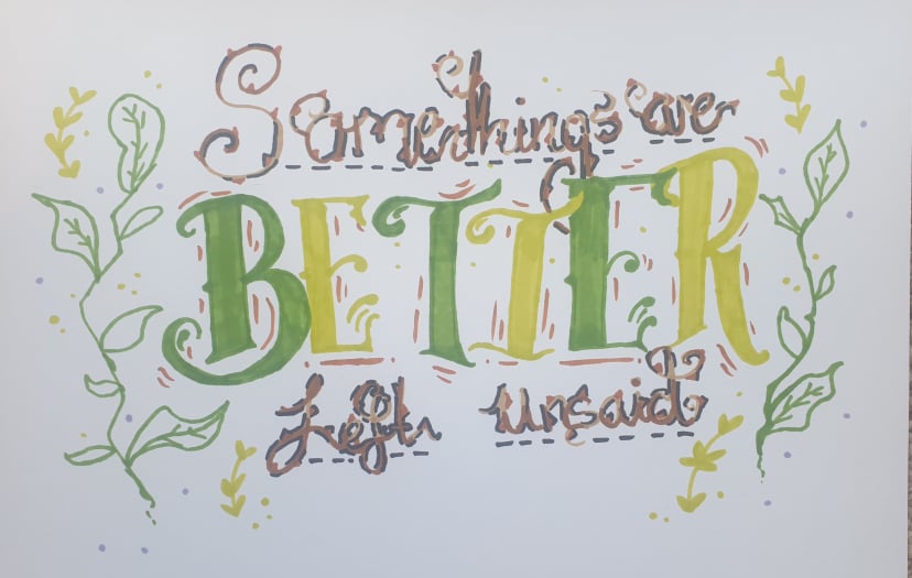
I first began to sketch out some ideas on layout paper but had to copy it over onto cartridge paper as I was going to add watercolour to them, I left it pretty much a base colour for each idea.
|
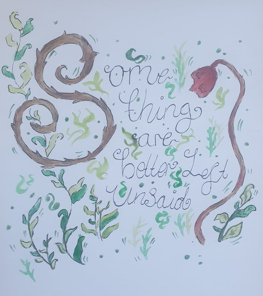
Once I chose which one to go for I had a little play around with how I wanted it to look, I like this design but I feel as though I could have done more to it.
|
After the small presentation of our work i was told to emphasise on one word so I went with Zoe's suggestion on the word "better" but /I feel as though now my other text is a bit too thick and unreadable. I do not plan on re doing this as my main pint was just to make the word "better" stand out, which it does.
|
Site powered by Weebly. Managed by 34SP.com

