ConstructivismBlog task 4:
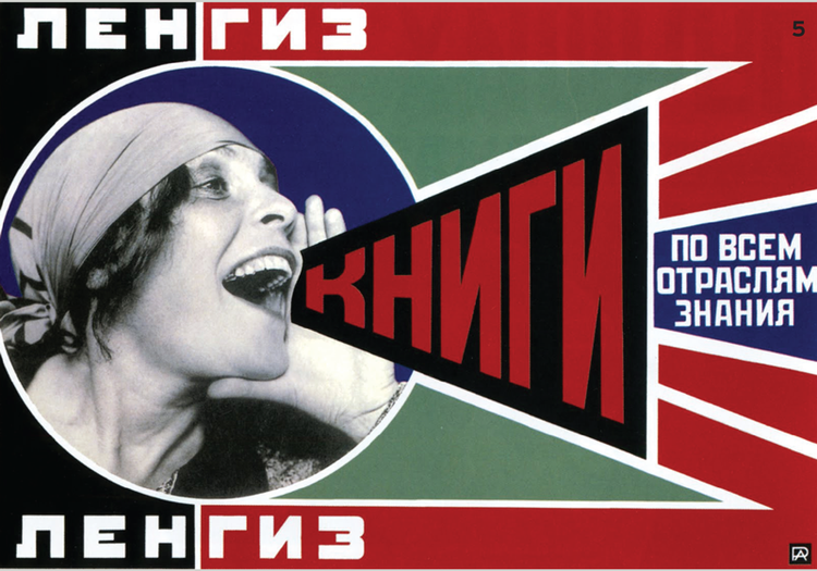
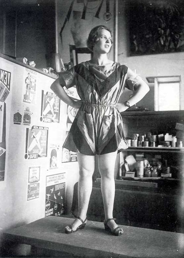
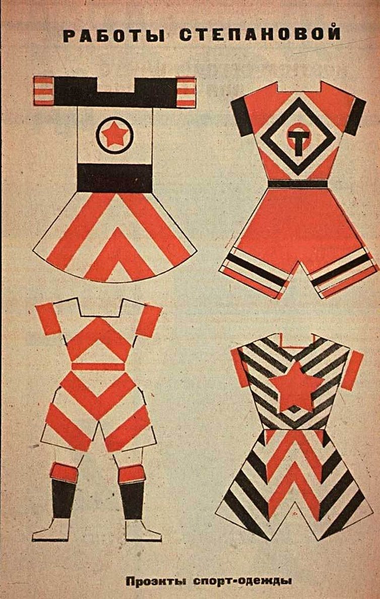
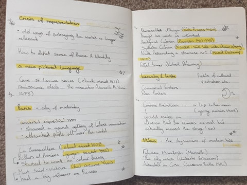
The constructivism movement was founded by Vladimir Tatlin and Alexander Rodchenko and began to bloom around the early 20th century. This was mainly a group of young artists that wanted to show a more revolutionary purpose to their art as they adapted avant-garde forms of cubism and futurism. This movement was more so for the beliefs rather than the artists' personal expression The first poster, 'Sportswear' designed by Varvava Stepanova is a unisex sports wear. This links in with the use of orange as the primary colour she uses as, although colours do not have gender roles, they have been classed to be specific with blues and pinks especially during these time periods. The initial geometric clothing could not be made from materials but was only to be shown as a display. The composition of this image is direct and focuses the eye directly to the model, what makes her stand out is the superhero esc type pose she is making as she is looking off to the side and is in a firm stance. The geometric compositions where not explored through material but rather became a model for more new industrial designs. The use of photography has been done in greyscale where the lighting is hitting her face making the outfit appear more visible. The text image is easy to read and placed carefully at the top in centre as the font also matches the way she uses the geometric lines. The audience is for everyone as these suits come in different styles and would most likely be chosen by preference. Whereas the second poster, 'books in all fields of knowledge' designed by Alexander Rodchenko is an advertisement meant to encourage reading for everyone. The use of colours is much more bold compared to the 'Sportswear' design as this uses a lot of black and reds with a small amount of blues, this makes it pop out as these colours compliment each other nicely. The composition is laid out towards the left as the image text is shouting out at us towards the right. The use of photography was, much like the 'Sportswear' has also been done in greyscale, this diverts the attention from the woman and more on towards the text. The audience for this poster design is for those who are wanting to read no matter who you are. Overall both these posters have slight similarities within the small amount of colours as well as the black and white photos and how the messages for booth of these are mainly diverted to everyone no matter who you are. SESSION NOTES
0 Comments
Leave a Reply. |
AuthorManisha Kaur Samra Archives
December 2020
Categories |


 RSS Feed