ART NOUVEAU - THE MAJOR DIFFERENCESBlog task 3: Document, describe and explain the major differences of ‘Art Nouveau’ as it was interpreted by artists and designers in Glasgow, Vienna, Madrid and Nancy.
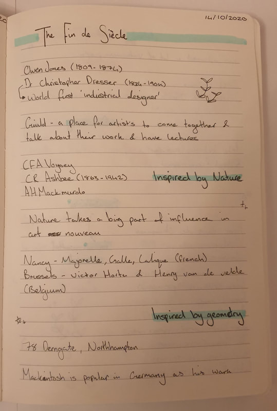
Art Nouveau is a style that was introduced between 1890 and 1910 that spread over Europe and the United States. The movement was influenced by either Nature or Geometry and is widespread from jewellery, architecture and interior design as this was how they wanted to create a new sense of style that broke free of the style of the 19th century. Art nouveau was heavily influenced by expressive lines as well as Japanese prints (ukiyo-e). There were many prominent artists though the one who stood out was the Scottish architect and designer Charles Rennie Mackintosh who specialised in geometric lines which had influenced Austrian Sezessionstil; the Belgian architects Henry van de Velde and Victor Horta who later on influenced French architect Hector Guimard, the Spanish architect Antonio Gaudi who was the most original as he went beyond what others did. Art Nouveau in Glasgow had influenced the Arts and Crafts Movement that consisted of a group of four designers: Charles Rennie Mackintosh, Margaret and Frances Macdonald and Herbert MacNair. The group had been known as Glasgow boys/girls who were highly interested in the architecture of the city even prior to not knowing much of the culture and traditions of Glasgow. Those who wanted to finance the artist’s work where usually local entrepreneurs. This led to the commission of Mackintosh who ended up designing The Hill House. The Glasgow style was well known for their stained glass, ceramics, textiles and illustration as well as the exterior and interior building designs, Glasgow's architecture uses strong lines that are bold and use black outline but contain subtle colours such as how the red's look desaturated making them appear more darker than they should.
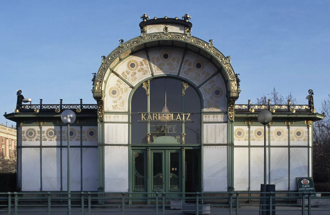
The Vienna secession in 1897 was the beginning for modern art in Australia – a nation that was highly attached to their traditions. This was the beginning for artists and designers to embrace new genres and fields in which they worked with. This heavily helped contemporary artists a first dedicated venue to showcase their works. Josef Maria Auchentaller had designed a poster which can be found in the secession building – this poster resembled how art can all be linked to one another as art influenced many places. The Vienna style is more decorative as it uses gold and vibrant colours making it appear modern and rich compared to the Glasgow style. The style has more details where each part of the architecture the details can be seen individually, the colours also compliment the use of gold as it the Majolika Haus shows pinks which later contrast next to the golden architecture. The shapes have been structured to be more stable and practical but also focuses on the inspiration from nature and geometry giving the buildings their own unique style that is eye catching and makes you want to know more about the thought process on the designs.
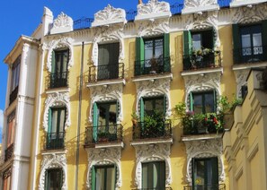
The Spanish Society of Authors and Publishers is well known to be one of the few buildings in Madrid that is styled by art nouveau. The palace was built by Javier Gonzalez Longoria – the building is noted to be impressive due to the ornamental externa appearance. The treatment of the building was made from artificial stone that had smooth vegetable and organic forms which was used with decorative pieces that covered them. Inside the building there is a main staircase which has striking features as it was inspired by the French art nouveau architecture just as much as the rest of the décor inside the building. Overall, the building was very much in line with the style of art nouveau. The style for Madrid's buildings has a bigger amount of colour pallet with the glass stains, the overall colour pallet is lighter compared to Nancy but much more brighter compared to Glasgow. The colour that stands out a lot is yellow within the glass stain and the building making them noticeable and quite interesting to look at. The style has the appearance of being symmetrical with the architecture and furniture alongside the exterior design. Like Vienna the buildings have decorative balconies although they appear darker within the appearance.
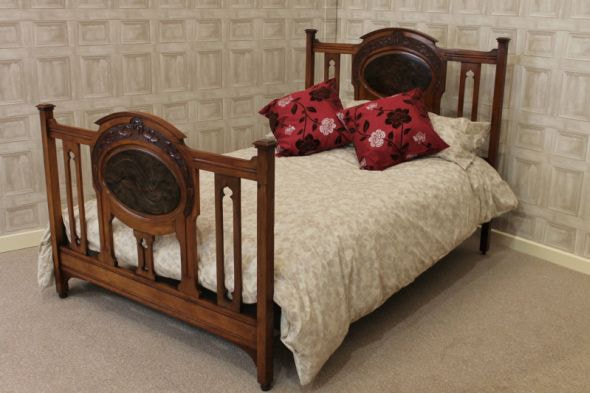
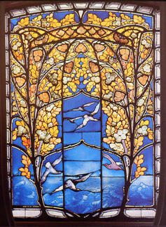
Nancy in 1900 became famous for its art nouveau movement – this was founded by a group of outstanding artists known as the Ecole de Nancy who were very influential within the arts and industrial production. Emile Gallé, an artist who would end up breaking barriers of fine art. Gallé would go onto working with ceramics, furniture, bookbinding, sculpture and much more hands on work – this led to Gallé working on architectures of houses, banks and shops which was a huge success. The style and colour pallet are neutral which include yellows and blues. The designs are detailed yet have a soft touch, all the pieces within the "Nancy School" have soft natural lines that make the architecture stand out weather it is the building. exterior design, stained glass or the furniture. The overall shapes put these styles together. The style focuses on a lot of floral designs and use little to none blacks or whites for the outlines. There seems to be more of a mixture of colours than having them separated which you can see with the stained glass as it shows more depth creating a gradient to the details. The stained glass and door show tree branches which suit the Art Nouveau style. SESSION NOTES
0 Comments
Leave a Reply. |
AuthorManisha Kaur Samra Archives
December 2020
Categories |








 RSS Feed