MANISHA SAMRA
  • Home
  • Univerisity
    • Year 1 >
      • Workshop
      • History & Practice
      • Introducing Visual Communication >
        • Telling Stories
        • Nursery Rhyme
        • Old School
        • Master Forger
        • Perspective
        • The Tree
        • Thumbnail Visuals
        • Colour Theory
      • Muli-Dimensional Illustration >
        • end of year submission
      • Visual Problem Solving >
        • Type Selfie + Quiz
        • DIY Alphabet
        • Ampersands
        • Handlettering
        • 2 Become 1
        • Helvetica
        • Type Talk
    • Year 2 >
      • the critical illustrator
      • ILLUSTRATOR'S TOOLKIT
    • Year 3 >
      • ARTD6000
      • Advanced Illustration Projects
      • FMP
      • Twitch Assests
  • Submission Page
  • About
  • Instagram

Action

Picture
Quick Task:

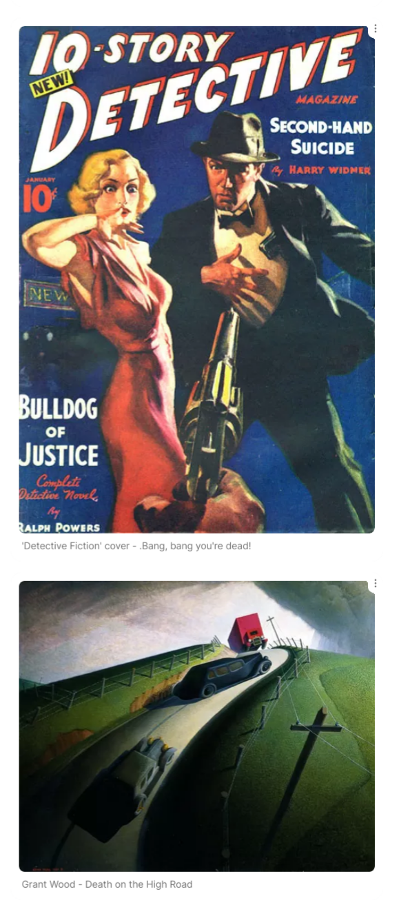
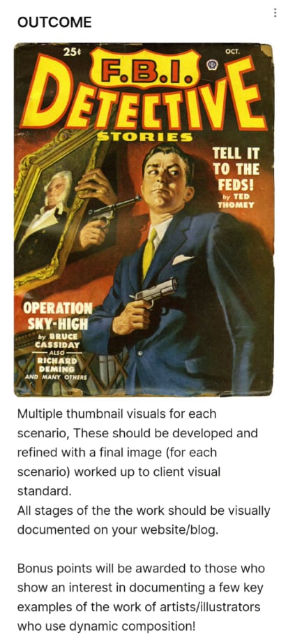
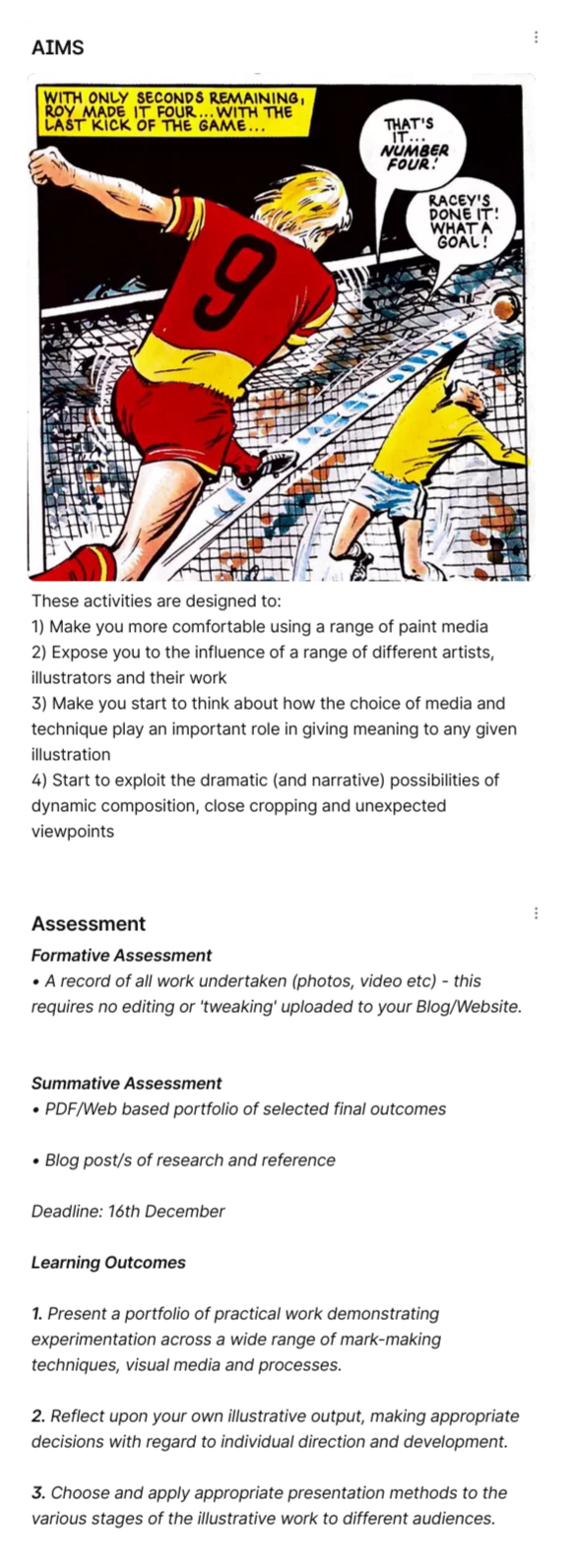
Before begining the next project we had to come up with quick thubmnails that showed a scene of a washing line and winter sports, I wasn't sure what excatly to do but after some feedback i understood the project more. I was told to keep my drawings diagonal to break free from the front view we usually tend to draw in so I have took that into consideration for the rest of the project.
Thumbnails:

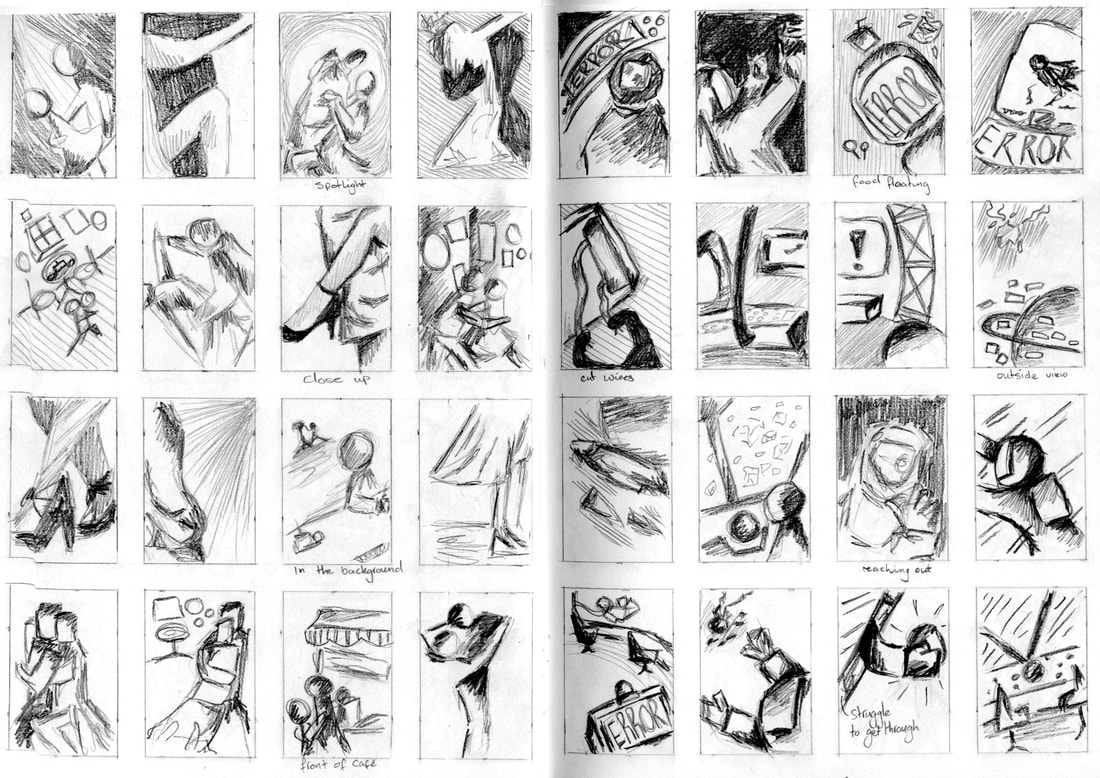
I have kept my thumbnails without any colour as I wanted to focus on the tones and using more diagonals into my work. I plan to move onto skethcing my chosen thumbnail digitally and adding in the colour to figure out how everything will be done and which Images I want the figure to have a more realistic person or if I choose one where the person would be further away would remain a shadow like figure.
Picture
Picture
Picture
Ambushed:
​two figures - a city's back streets - night
Picture
Picture
Vertigo:
 a steeplejack - daytime - windy day
Picture
Picture
Tango:
two figures, movement, sexy, close, exotic, café
Picture
Picture
Systems Failure: 
one figure, spaceship, physical struggle
Picture
Picture
A Giant Leap: 
rooftop chase, three figures, peril, bravery
Picture
Picture
January Sales:
 claustrophobia, queuing, doors opening, multiple figures
Picture
Picture
During this project I did find it pretty difficult to understand how we would create these scenes as accurate to the words we where given, but after a while I started to figure out what I wanted to do although i did have to change certain movements and expressions etc. I added lineart of what i had to show the original idea and if i had changed it during the coloured mock ups. I mostly tried to show off body language in this but for certain drawings i kept to the silhouette images for anything that involved having the people be far away such as 'a giant leap' and 'vertigo'. 

Body Language

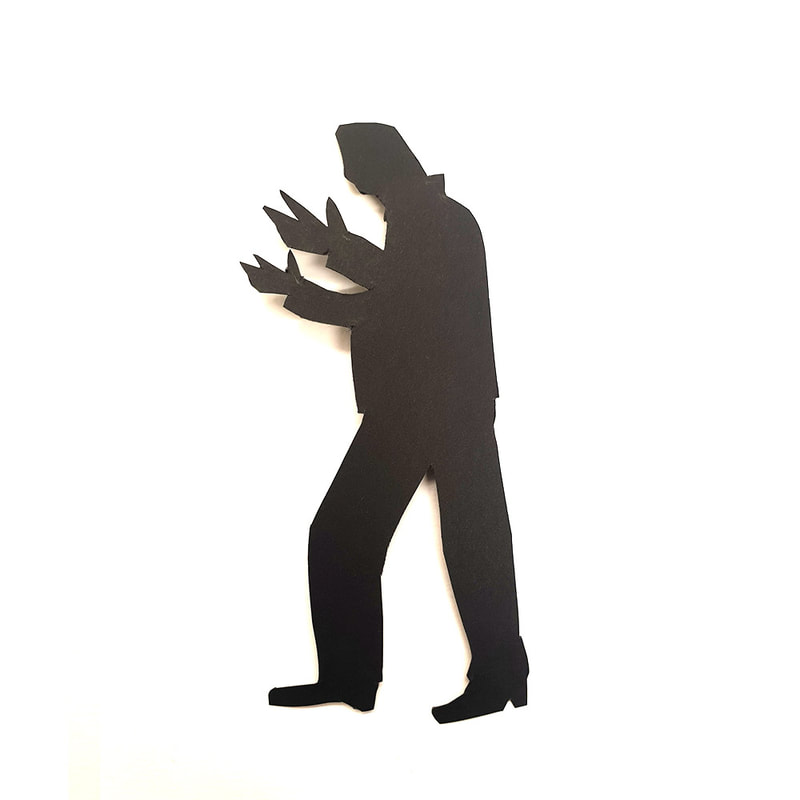
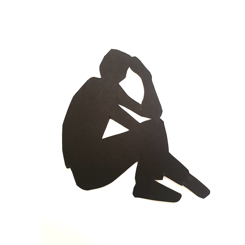
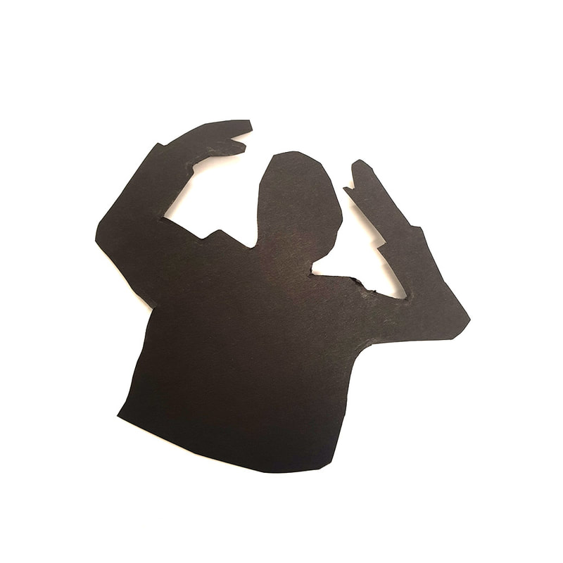
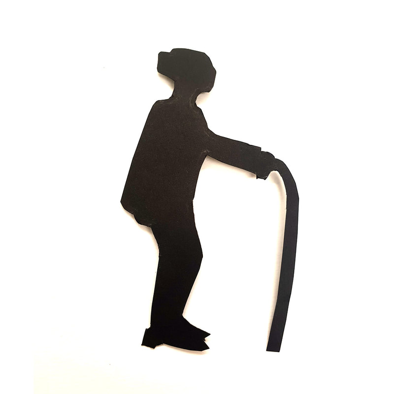
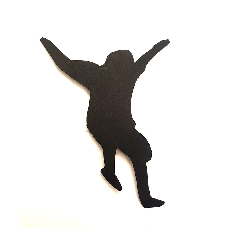
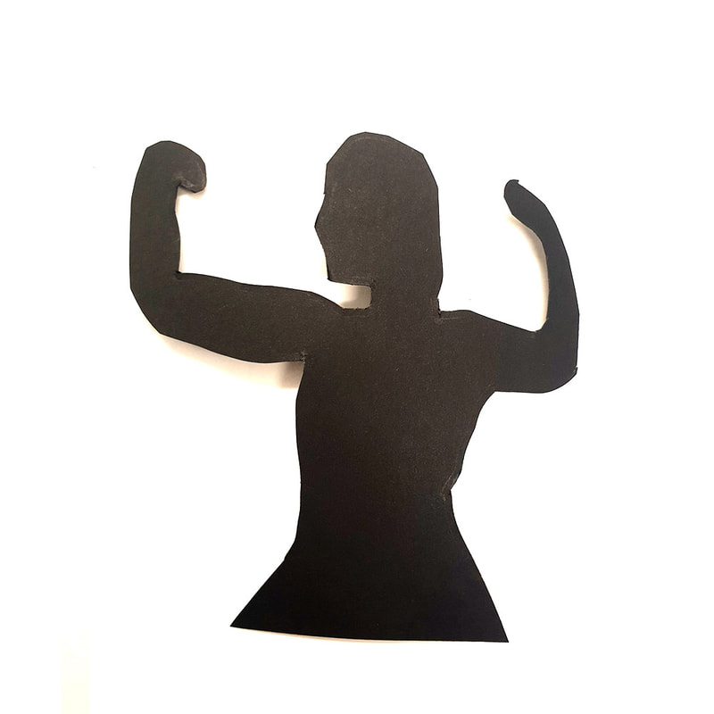
Sillhouete Excersise:
Thumbnails: 

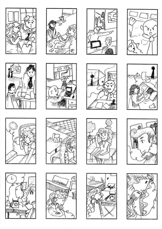
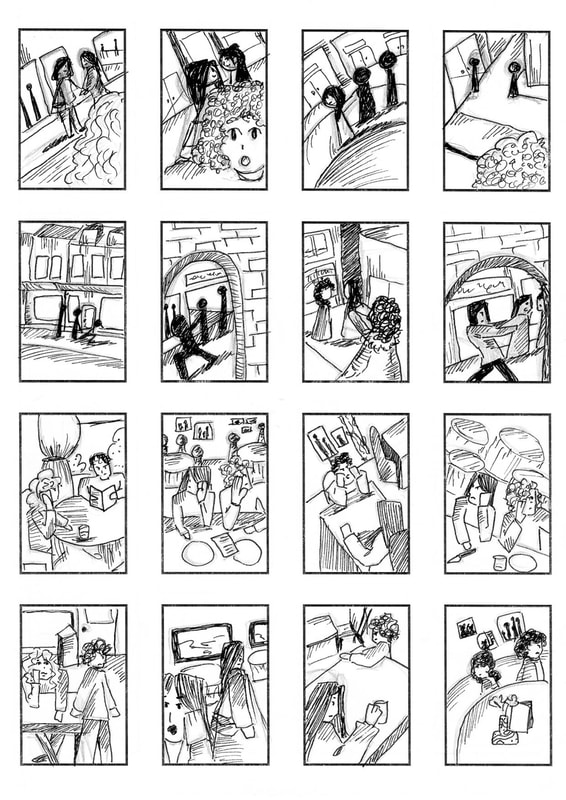
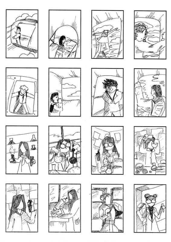
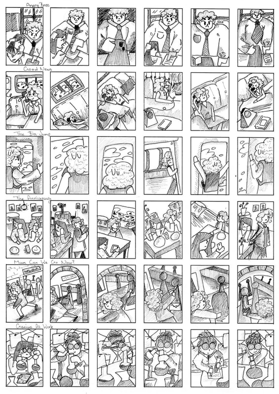
I changed how my thumbnails looked from the project before so it would focus more on the body language and how I was going to end up ceating my mock ups. After getting down eight ideas I then took one of those thumbnails and re created them in different ways. I struggled with some of the words as I wasn't sure what to do or how I could show it all but I managed to fix this and create images I think work well. 
Picture
Picture
Picture
Picture
Angry Boss:
two figures - an office setting
Picture
Picture
Good News:
a single figure holding a phone - 1950s
Picture
Picture
Mum can we go now?:
two old friends meet on the street, the teenage daughter of one doesn't want them to talk for long
Picture
Picture
The Anniversary:
a couple celebrating an anniversary in a restaurant. They hate one another... 
Picture
Picture
The Big Jump:
a figure in an aircraft just before having their first parachute jump
Picture
Picture
Genius At Work:
serious concentration in an academic or scientific setting
Picture
Picture
In a way i found this much more complicated than the first project, I knew what to do for some words and had an overall idea, but for most I just couldn't understand how I would make certain things work out. After a small feedback i was aware of what i needed to get done and what i could do to improve my mock ups. Overall I am pretty plased with what i have gotten done.

Communicative Colour
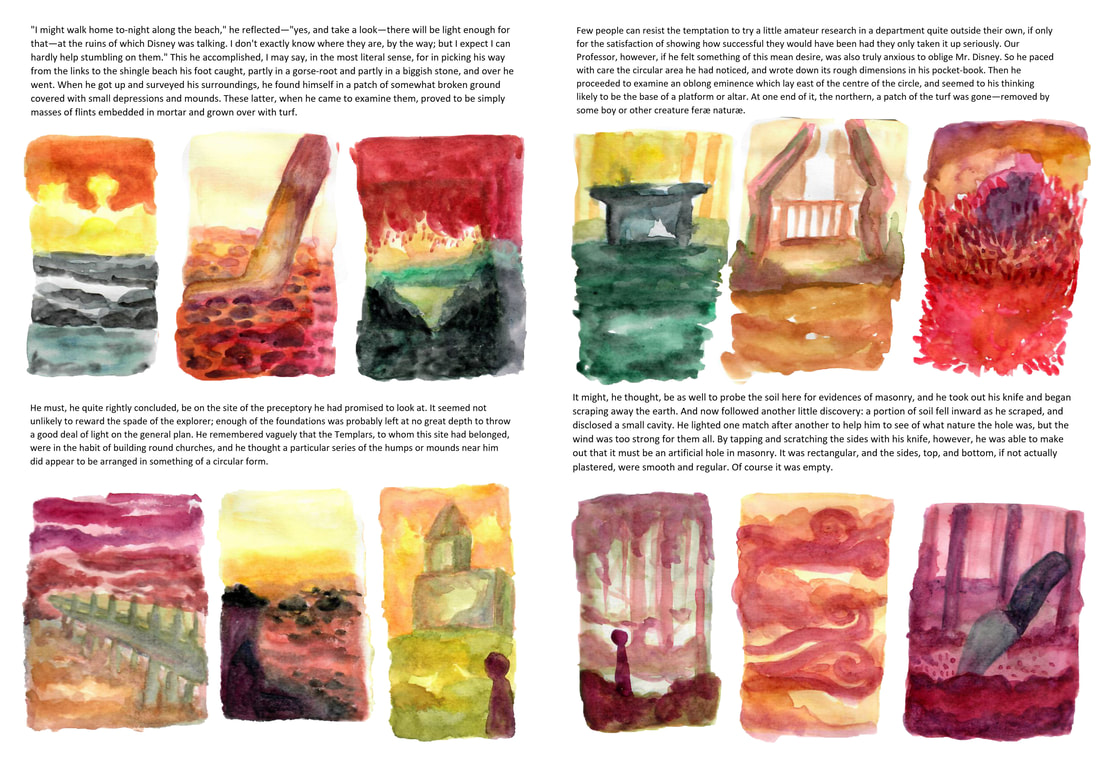
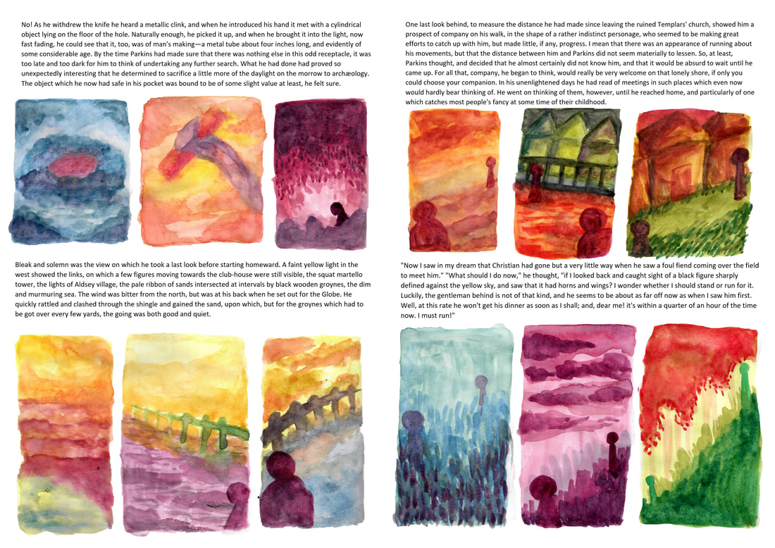
​M. R. JAMES

Art Direction: supernatural, unease, a discovery followed by the realisation that it will soon be dark. A low, windswept English coastline, the sense of being followed and/or watched. 
Artist Research:

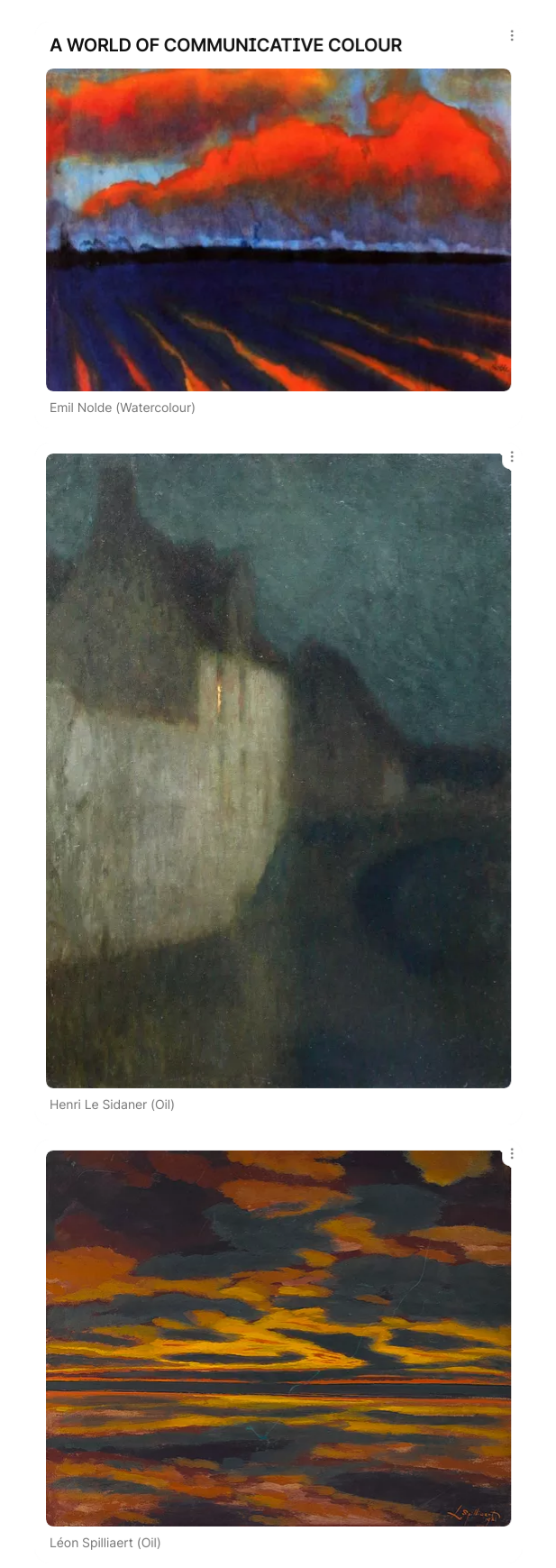
To get an idea of beach/ocean scenery I wanted to try and find some artist inspiration to get the idea of how things could go and how they work with paints. I listed 3 artists that i found helped me with this project the most in terms of compositions and colour. 
View this post on Instagram

A post shared by Gizem Bozkurt (@gizembozkurt_art)

View this post on Instagram

A post shared by Kelley | Gouache & Acrylic Art (@kelleyvivianart)

View this post on Instagram

A post shared by Jennifer Wang (@jenniferwang.arts)

Text Allocation:

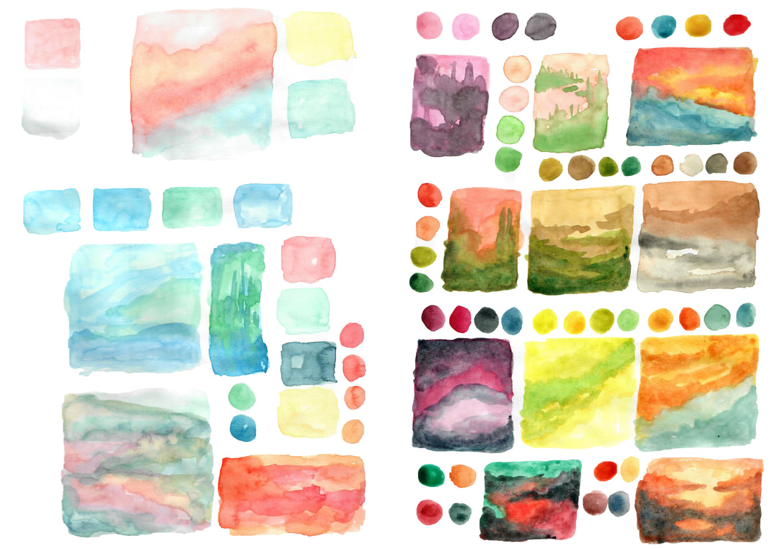
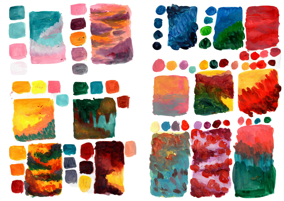
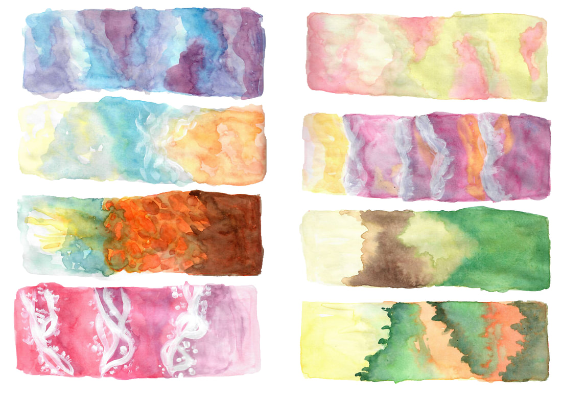
Before I began this project I took out the script and painted what I could see in the text and what colours I thought would work well, however my colours all tended to look similar and there was not much variety anymore so to change this I moved onto using a colour pallete site that would help stick to their chosen colours and not what I wanted to use.
Picture
Picture
Sketchbook Scans: 

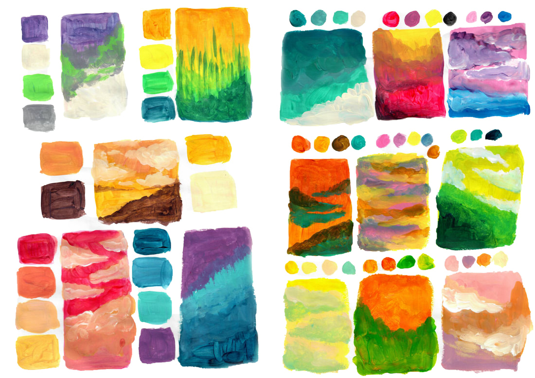
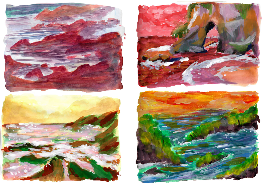
The colours pallete I used are all on coolors.co - this really helped me just shove down paint and not worry about what I was showing, I mostly made gradients but I also did try to add some landscaping into the paints. Once i got the hang of painting with the colour palletes I decided to make 4 larger ones in which I really liked my second one which I would try and re do in the correct sizing.
I used Acrylic for most of these paints which i was never used to, but i felt now i had a better understanding of using acrylic with landscape paintings in my own way.
Picture
Picture
Picture
Picture
Picture
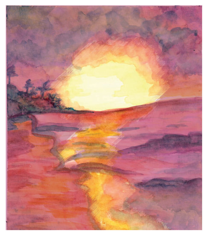
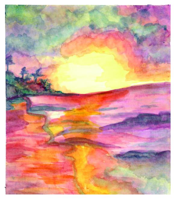
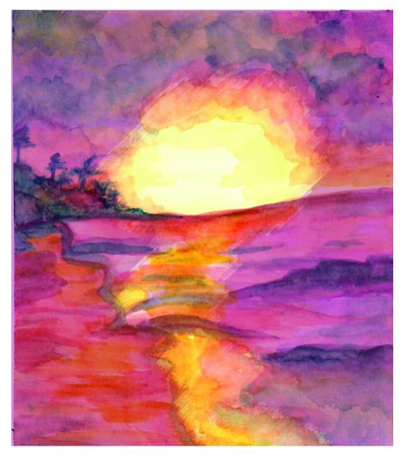
Watercolour:

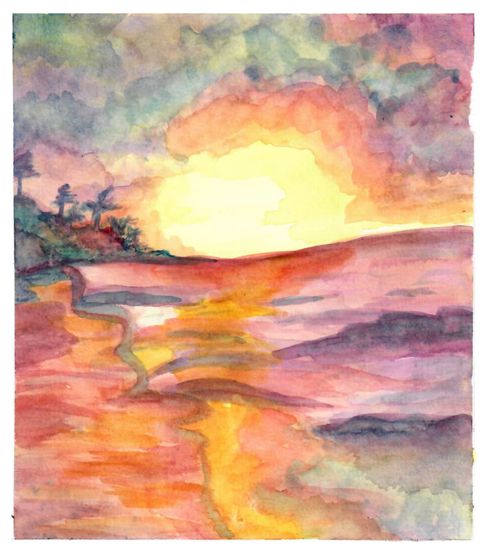
This was my third painting, I had some watercolour paper spared so i wanted to keep creating these beach like paintaings which I have been finding very fun, as the brief mentions we needed a cmyk save file of the painting i thought this would have ruined the original colours but I think it makes it pop out more and has more vibrancy to them. 
Picture
Original
Picture
Original Edited
Picture
CMYK File
Picture
CMYK Edited
Acrylic:

Taking my idea from my sketchbook, I wanted to re create it for one of my finals, I much prefer my sketchbook page though as I think i added more detail and tried more harder than before which ultimetly made this painging have a different feeling to the one before, However i don't hate it and quit liked how I added more colours into the painting as the original was pink/purple heavy. I decided for this to add M.R.JAMES looking frightened as he runs off of screen as there's a hidden person behind the alcove. 
Picture
Original
Picture
Original Edited
Picture
CMYK File
Picture
CMYK Edited
Gouache:

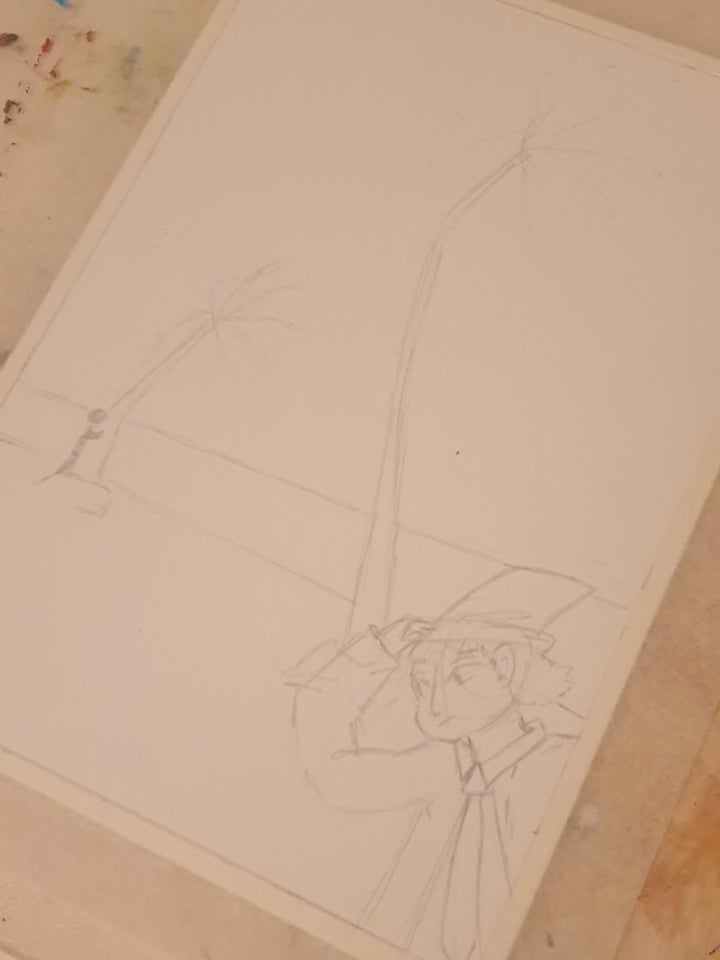
​This is my favourite painting from the three, I still kept creating as I felt my others didn't show what my text direction wanted so i changed the atmosphere to be more windy and created casting shadows to show the sun setting as the night takes over. I still kept to the idea before of having someone hide so i used the tree as one of them as M.R.JAMES is more focused on keeping his hat still as he walks straight past.I really liked how the cmyk file also tured out as it added more depth to my paitning.
Picture
Original
Picture
Original Edited
Picture
CMYK File
Picture
CMYK Edited
Process:
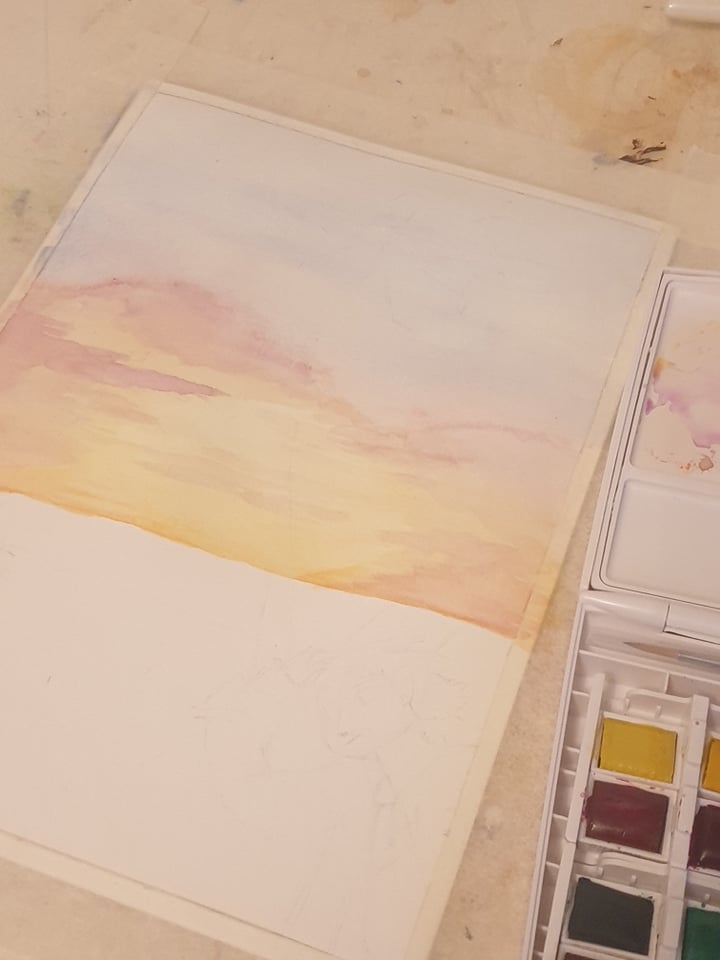
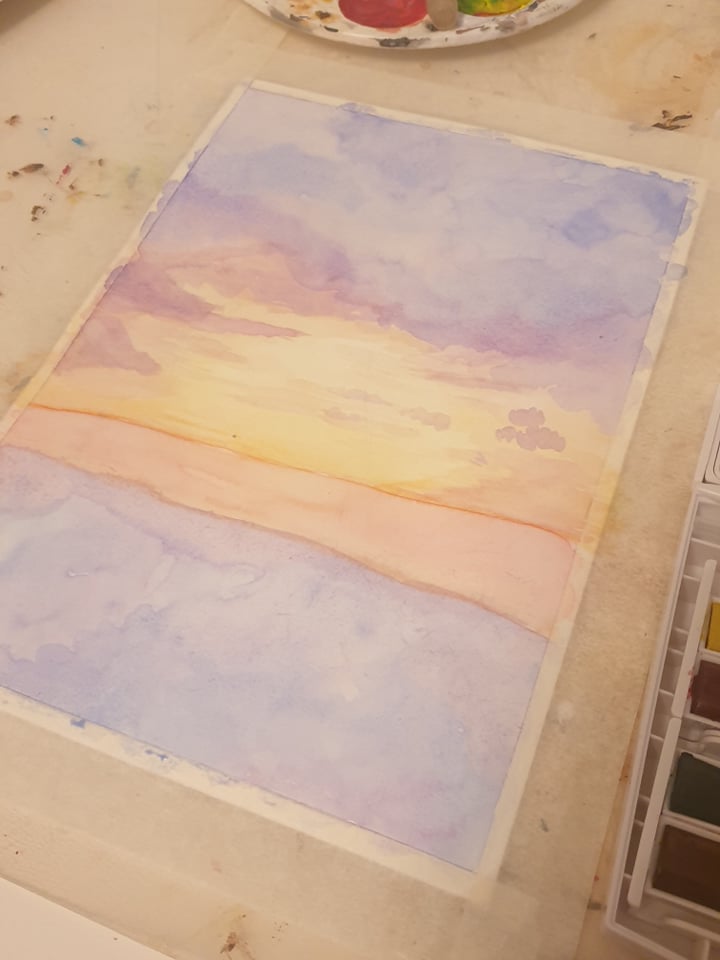
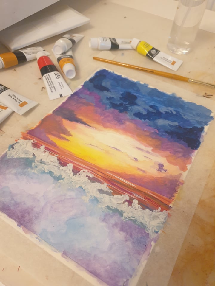
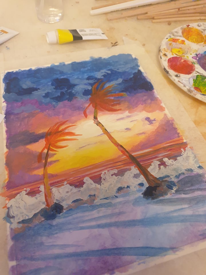
I was too engaged into this project that I forgot to really take much process photos for most of my work but I did manage to remember for my last painting which I started with wtaercolour and then onto gouache.

Picture

Final

I chose the cmyk file i liked best and thought fit my theme the best. however my original files never seemed to show off the colours so i did have to screenshot what i saw as my blog would only show what it looked like originally instead. I still have my original cmyk files saved - i am just unsure how to solve this problem if it's a blog thing and not a file thing. I think if i had to go back on this project I would try and work on the human figure more with the paints and maybe create my other shadow figure to be larger and more noticable. I had fun doing this project and it helped me open up to acrylic paints more. There was a small accident with my painting which I tried to fix digitally. ​
Back to Submission
Site powered by Weebly. Managed by 34SP.com
  • Home
  • Univerisity
    • Year 1 >
      • Workshop
      • History & Practice
      • Introducing Visual Communication >
        • Telling Stories
        • Nursery Rhyme
        • Old School
        • Master Forger
        • Perspective
        • The Tree
        • Thumbnail Visuals
        • Colour Theory
      • Muli-Dimensional Illustration >
        • end of year submission
      • Visual Problem Solving >
        • Type Selfie + Quiz
        • DIY Alphabet
        • Ampersands
        • Handlettering
        • 2 Become 1
        • Helvetica
        • Type Talk
    • Year 2 >
      • the critical illustrator
      • ILLUSTRATOR'S TOOLKIT
    • Year 3 >
      • ARTD6000
      • Advanced Illustration Projects
      • FMP
      • Twitch Assests
  • Submission Page
  • About
  • Instagram