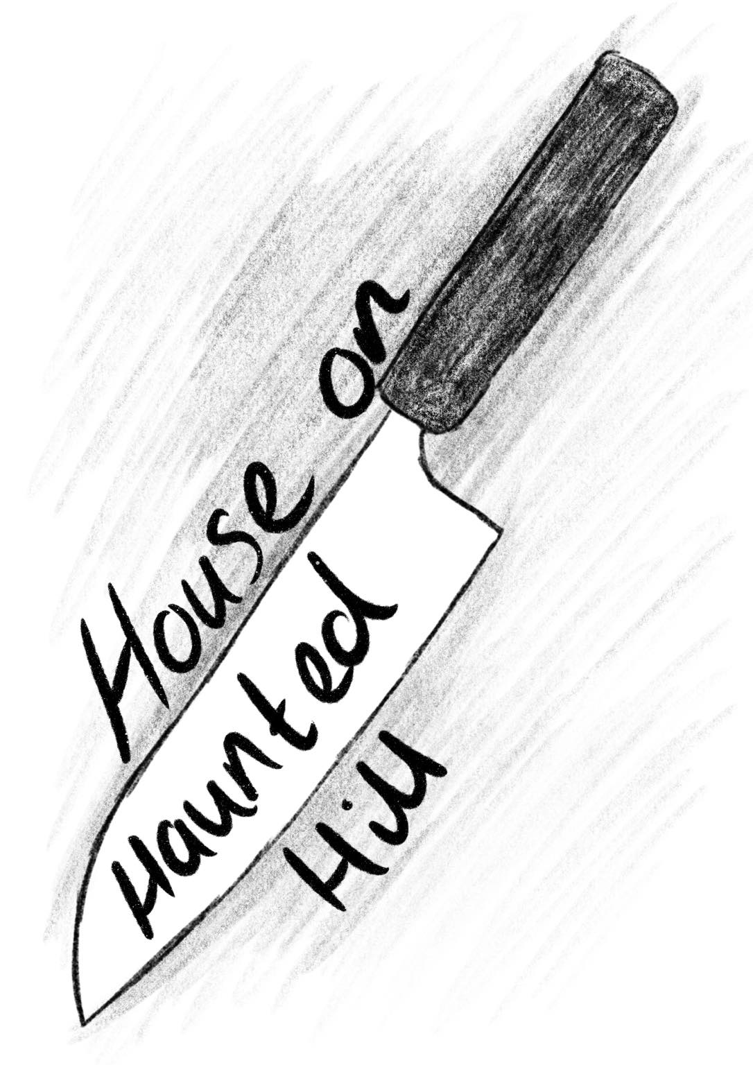
Brief
Our task is to create a 3D film poster based on our given film, when I first heard we have to work 3D I wasn't confident at all but hopefully through a lot of research and tests I will manage to get by and produce a poster based on my film. We have to use key themes based on our films such as the mood, location, the people and their personalities. I was given the film "House on Haunted Hill", I have worked with a project based on phycological horror and enjoyed it so I'm hoping this slight 'horror' film will also be enjoyable. I can work with mediums such as clay, card, paper, plasticine, found objects, knitting etc - I will be going through some ideas and research before I decide which media I will be working with. The final outcome will be presented as a photograph.
Stage 1: Research
The first step is to watch your film.
Record your thoughts.
Look into the history of the film, when it was made, what sort of film it is, any social or political significance etc.
The first step is to watch your film.
Record your thoughts.
Look into the history of the film, when it was made, what sort of film it is, any social or political significance etc.
|
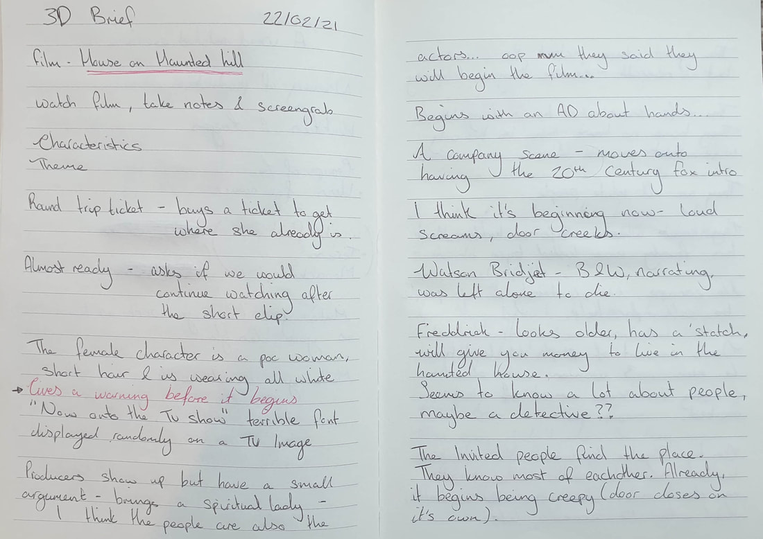
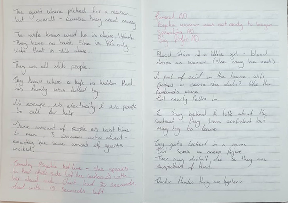
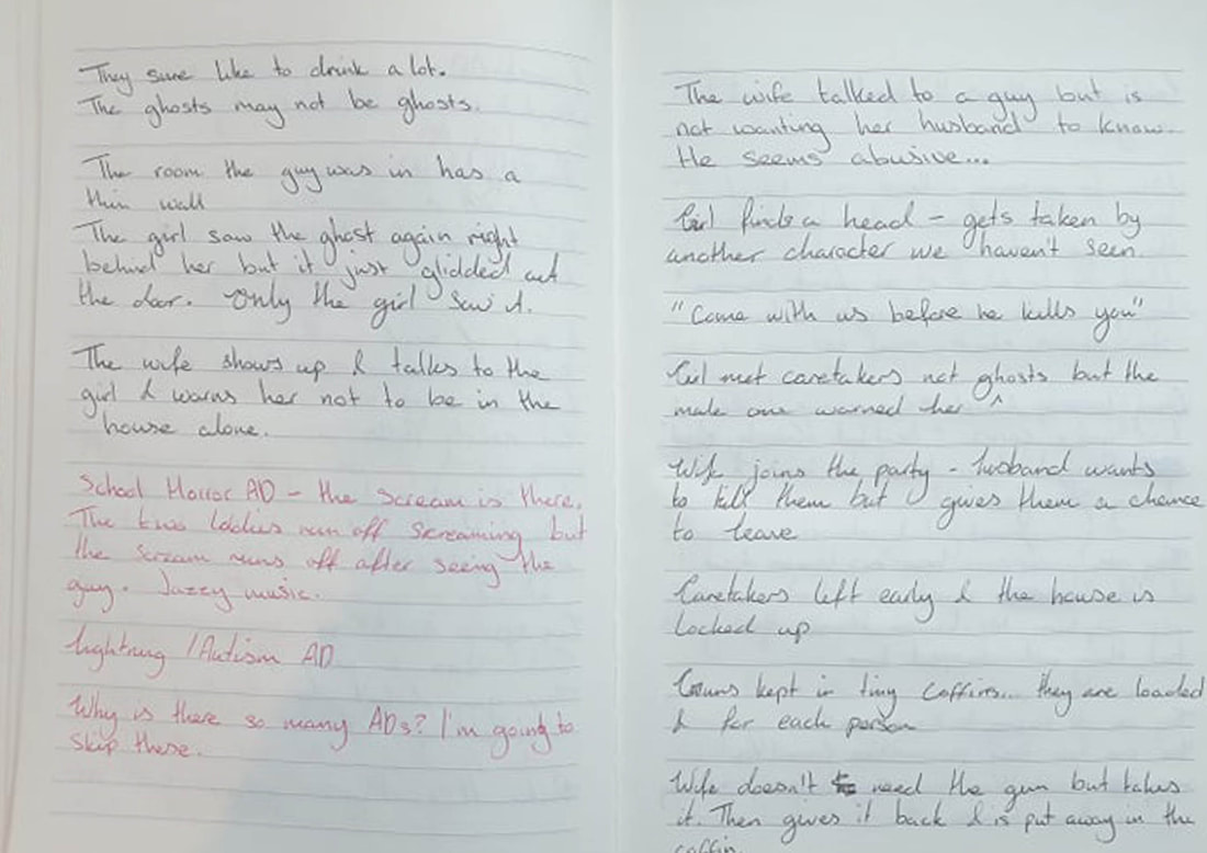
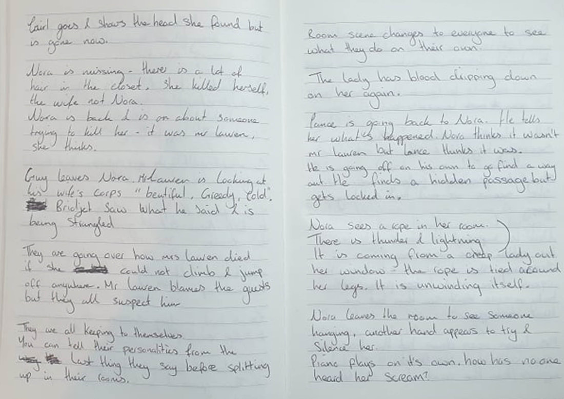
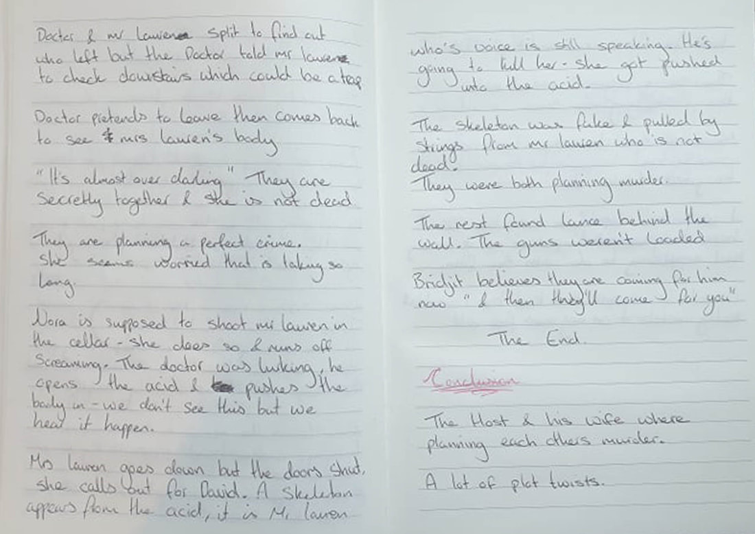
As I watched the film I wasn't so sure what notes I was supposed to take so I may have went a bit overboard and wrote out what happened in most of the scenes, now I didn't exactly hate the film but the most annoying bits would have to be for the ads that came in as it took up most of the film's time. I had started to write down notes as soon as it played and didn't realise I wasn't really watching the film till later on so some of my notes will be me talking about the ads. Most of my notes are messy and have most of the character names completely wrong...The screengrabs I have put up mostly have the timed mark on them to show I did fully go through the film and to see what I was watching while I took my notes.
|
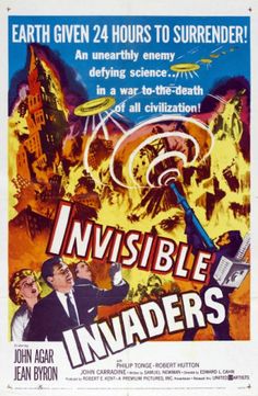
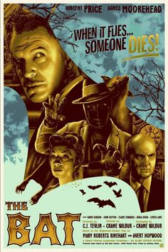
Movie Posters

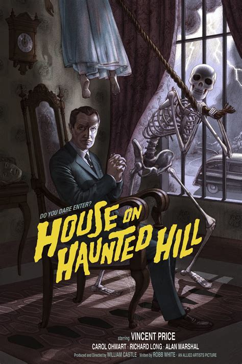
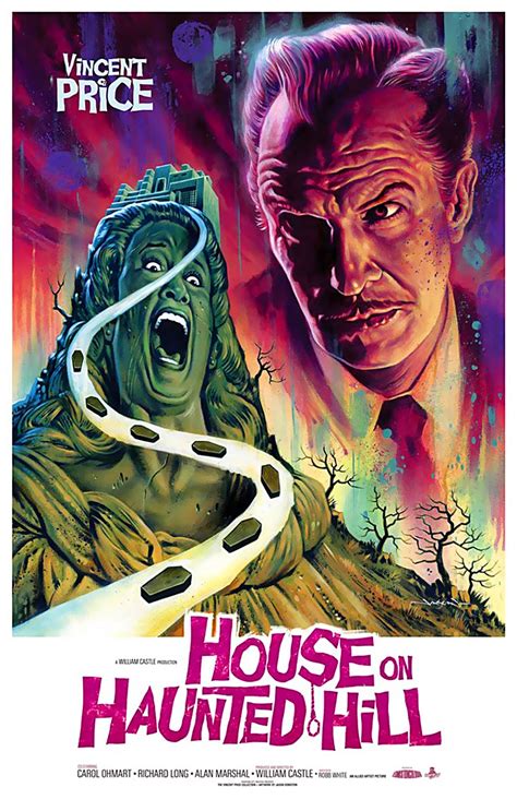
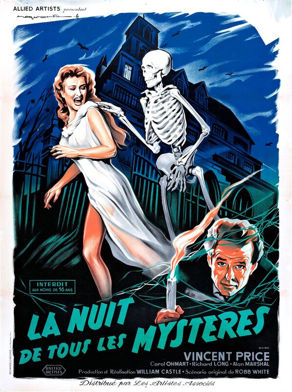
Plot
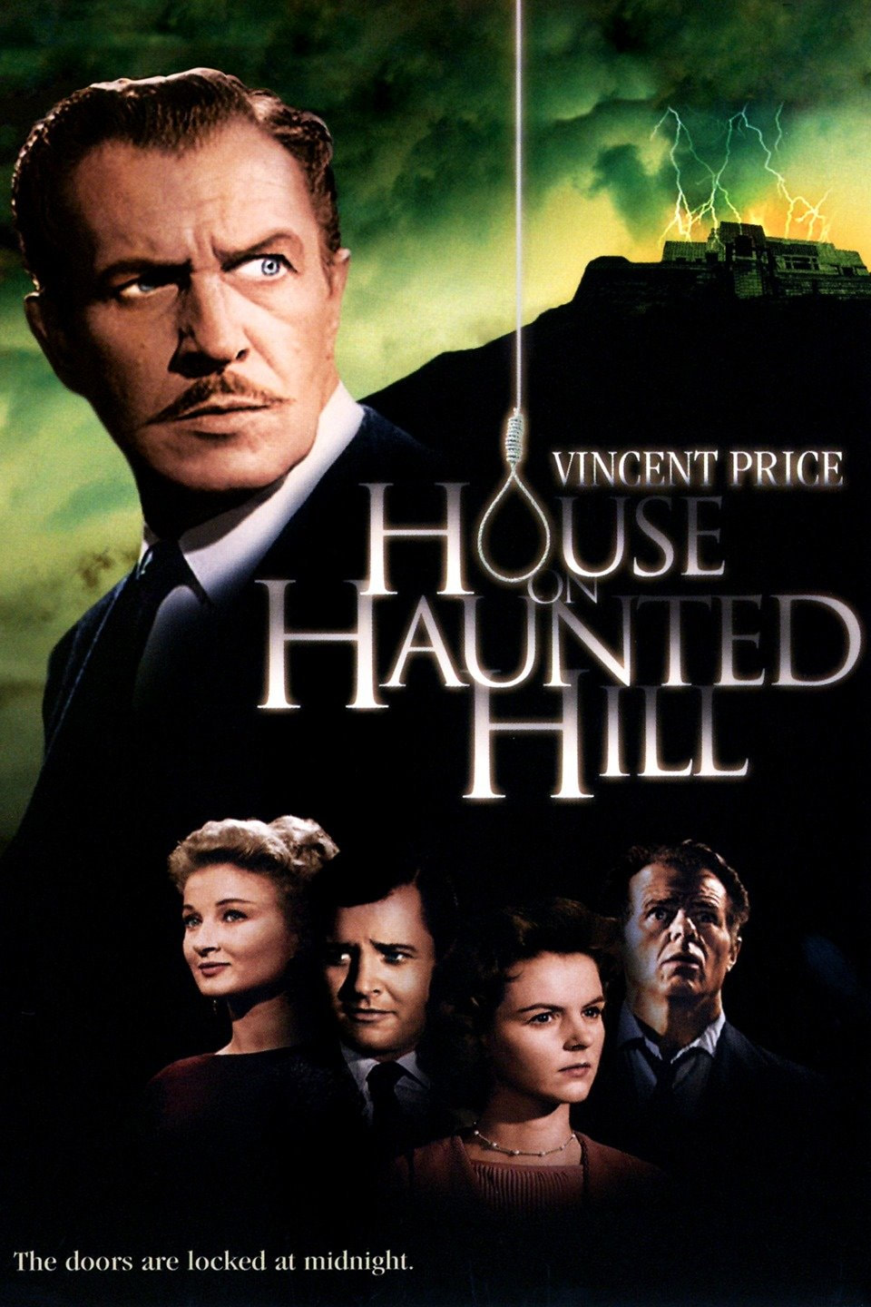
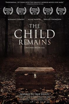
House on Haunted Hill, an American campy supernatural horror film made in 1959 and is directed by William Castle, written by Robb White and stars Vincent Price and Carol Ohmart.
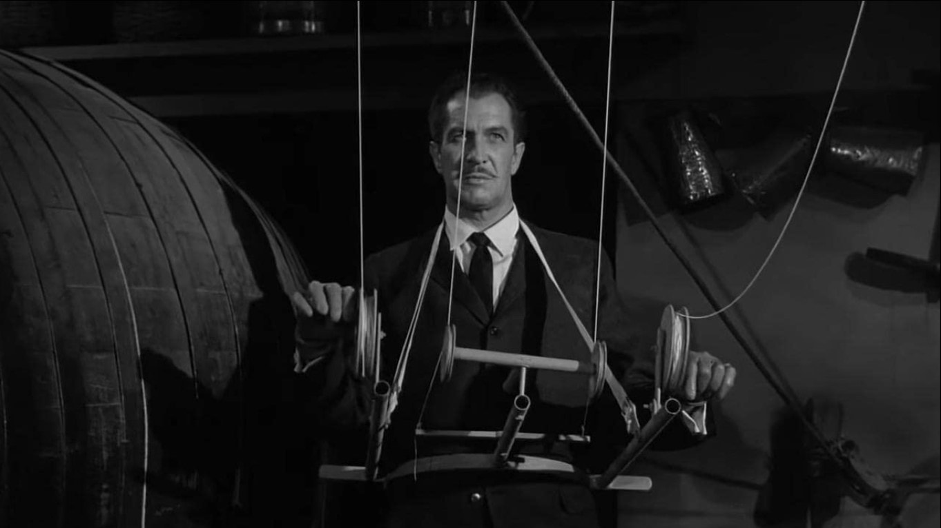
Price, who plays Frederick Loren, an eccentric millionaire alongside his wife have invited five people to the haunted house for a party, they play a game where whoever stays inside the house for one night will earn $10.000. As the night goes by the guests are trapped inside the house with an assortment of horrors.
History
Came out in 1959.
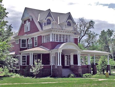
The house exterior shots were filmed at a historic Ennis House in Loz feliz California, designed by Frank Lloyd Write in 1924. The house has a 1890s Victorian style based on the interior design. The film poster includes an illustration of a house in a third style such of a Romanesque Structure.
The theatrical trailer promotes the film with the title as "The House on Haunted Hill" but for advertising they kept it simple and titled it "House on Haunted Hill"
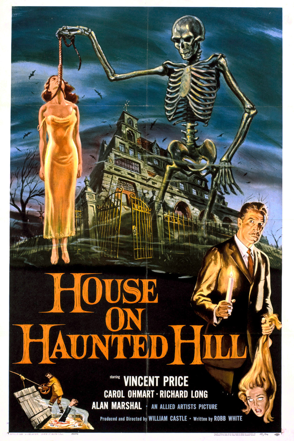
Best known to be a promotional gimmick using the film's original theatrical release called "Emergo" - In some theatres they would get a plastic skeleton to fly across the audience during any corresponding scenes later in the film.
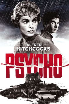
Alfred Hitchcock took notice of the low budget film's performance and made his own low budget horror film (Psycho). Castle was a fan of Hitchcock and then would later imitate his work such as Homicidal.
House on Haunted Hill, an American campy supernatural horror film made in 1959 and is directed by William Castle, written by Robb White and stars Vincent Price and Carol Ohmart.
Price, who plays Frederick Loren, an eccentric millionaire alongside his wife have invited five people to the haunted house for a party, they play a game where whoever stays inside the house for one night will earn $10.000. As the night goes by the guests are trapped inside the house with an assortment of horrors.
History
Came out in 1959.
The house exterior shots were filmed at a historic Ennis House in Loz feliz California, designed by Frank Lloyd Write in 1924. The house has a 1890s Victorian style based on the interior design. The film poster includes an illustration of a house in a third style such of a Romanesque Structure.
The theatrical trailer promotes the film with the title as "The House on Haunted Hill" but for advertising they kept it simple and titled it "House on Haunted Hill"
Best known to be a promotional gimmick using the film's original theatrical release called "Emergo" - In some theatres they would get a plastic skeleton to fly across the audience during any corresponding scenes later in the film.
Alfred Hitchcock took notice of the low budget film's performance and made his own low budget horror film (Psycho). Castle was a fan of Hitchcock and then would later imitate his work such as Homicidal.
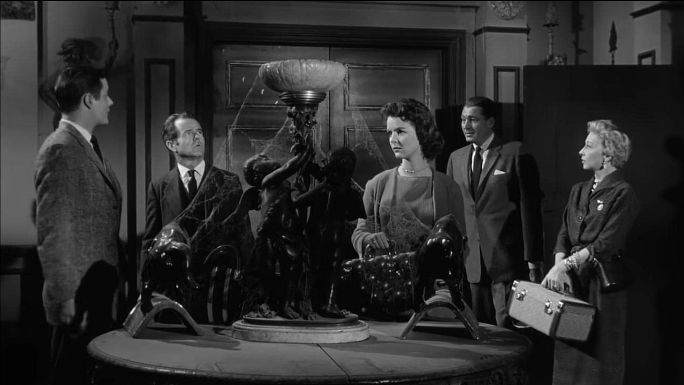
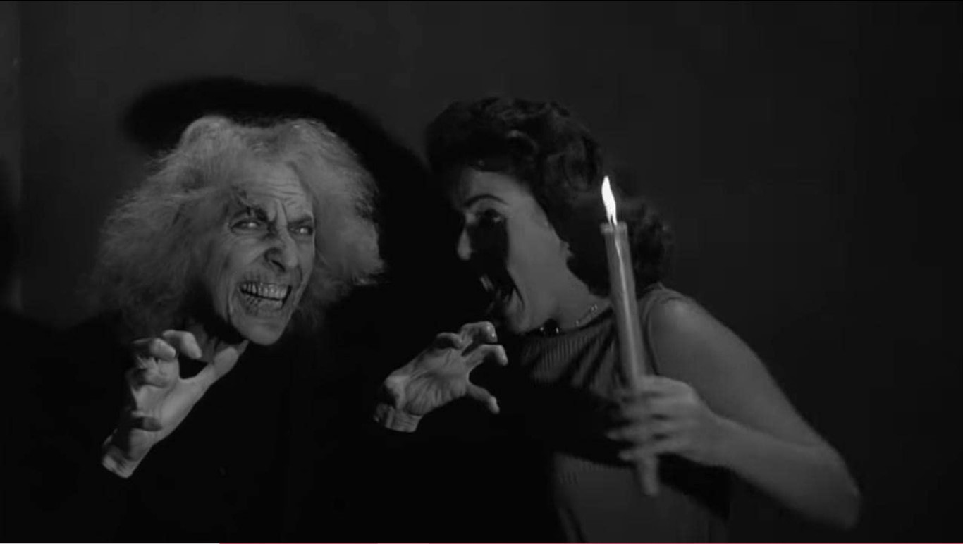
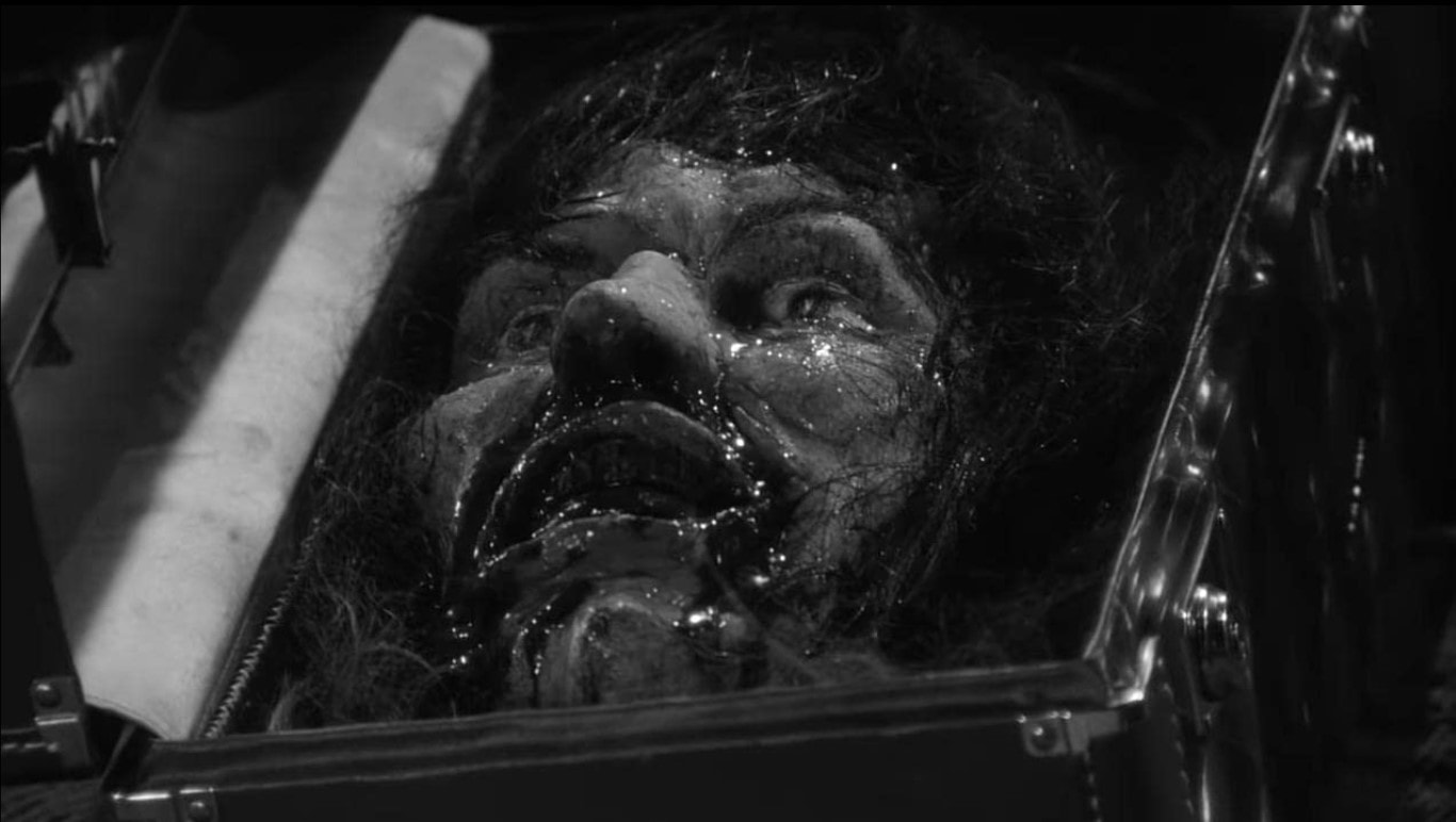
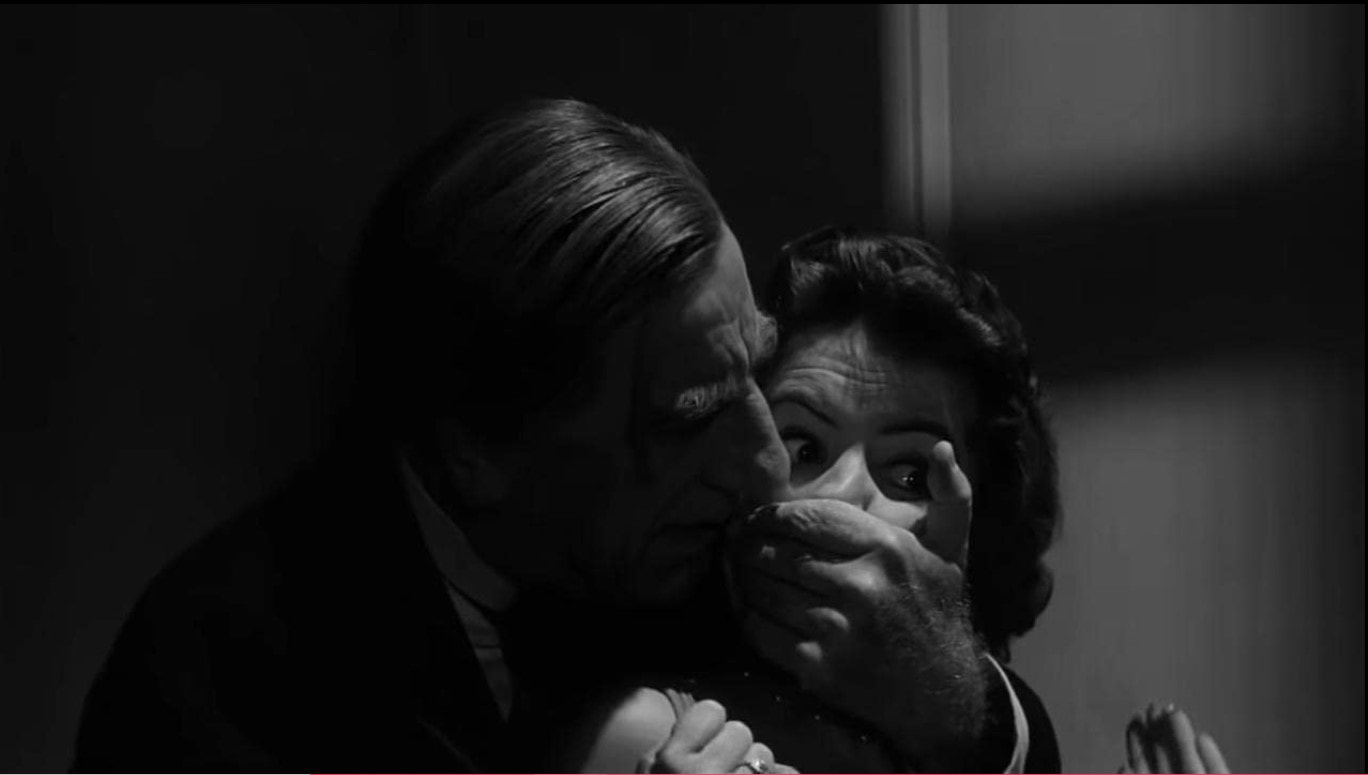
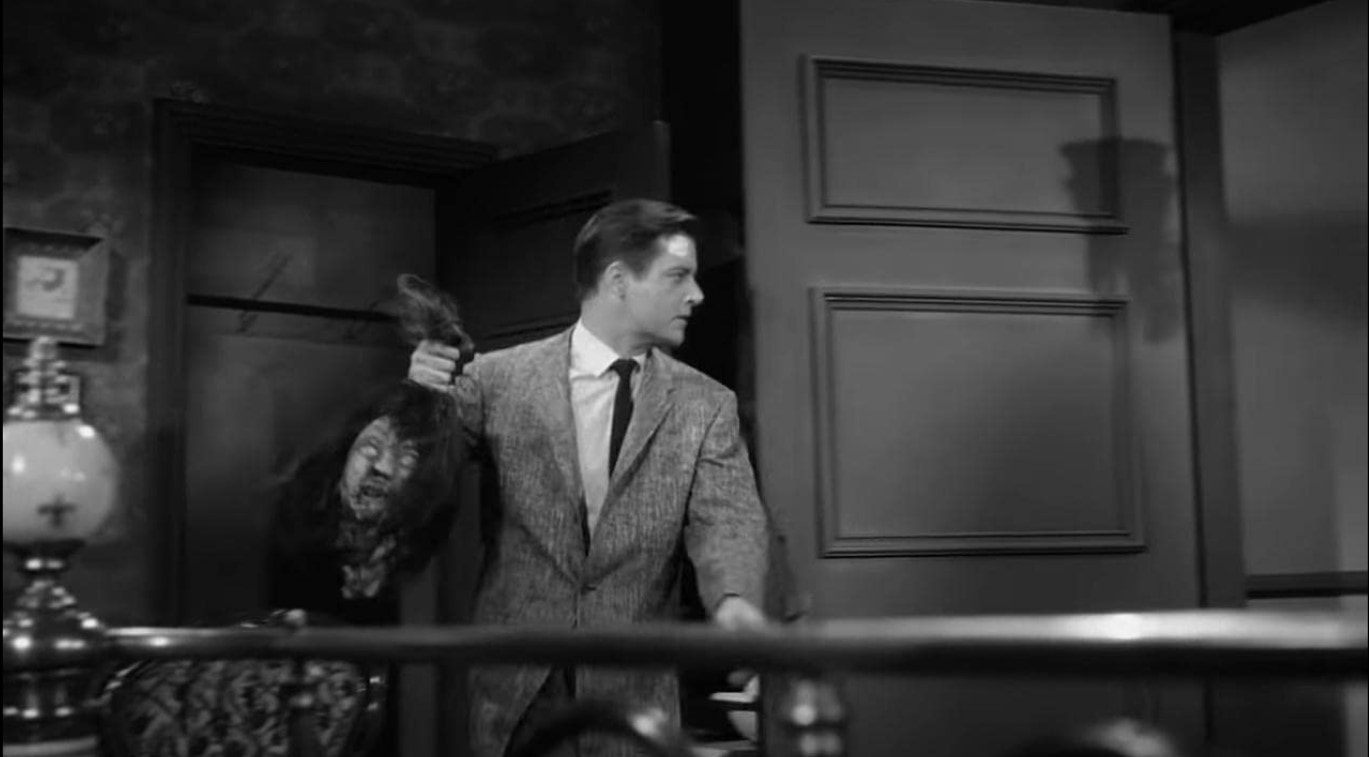
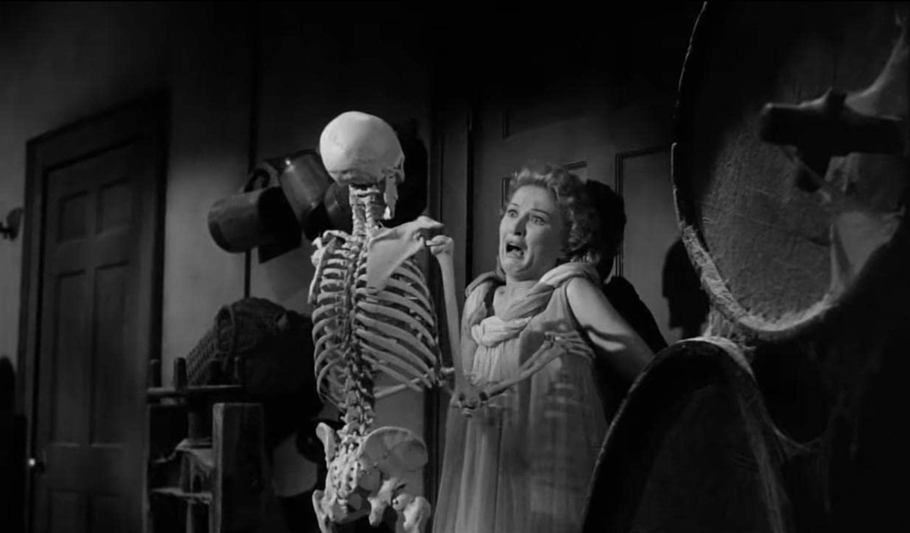
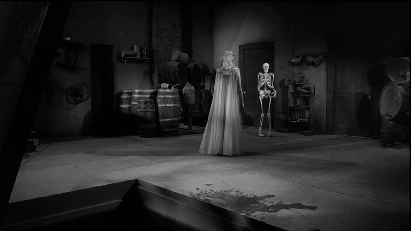
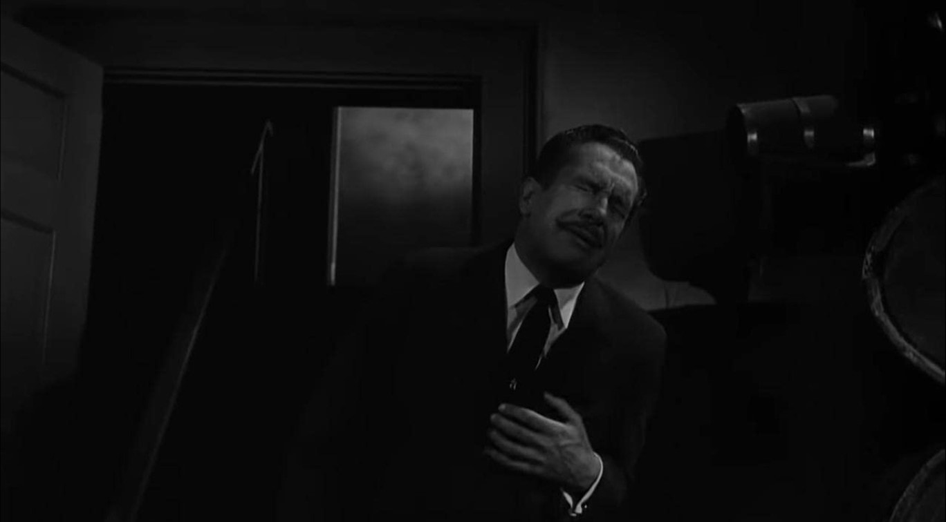
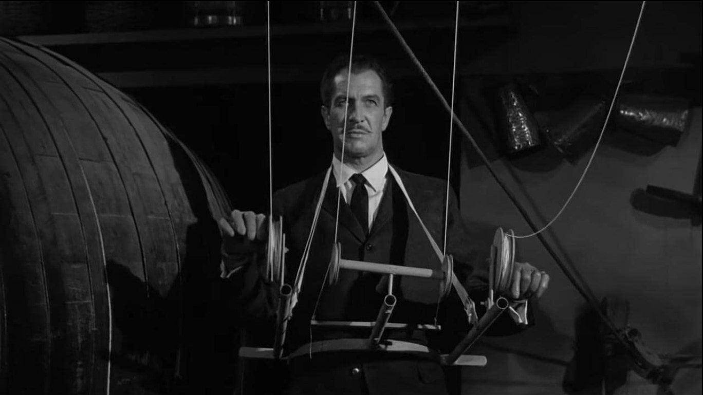
Going through these clearer images I picked out the best ones to showcase as these really bring out the horror in the movie - some of these being subtle like the falling chandelier. I didn't have any idea how this film would go but I felt like the title was familiar (as I had heard the title for the adaption that came on Netflix). The whole film was set in black and white but at some point I had totally forgotten and quiet enjoyed watching, The film however felt so much darker to watch so these images really help me figure out what was happening and what some objects were such as the head as it wasn't this clear in the movie.
|
Book
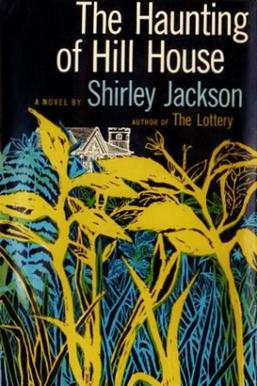
The Haunting of Hill House (1959) is a gothic horror novel by Shirley Jackson. The novel is a finalist for the National Book Award and considered as one of the best ghost stories that published in the 20th century. Later on made into two feature films and a play and is one of the basis for the Netflix series. The novel is more terror than horror which is made to elicit emotion into the reader as it uses complex relations between mysterious events in the house.
|
Other Adaptions:
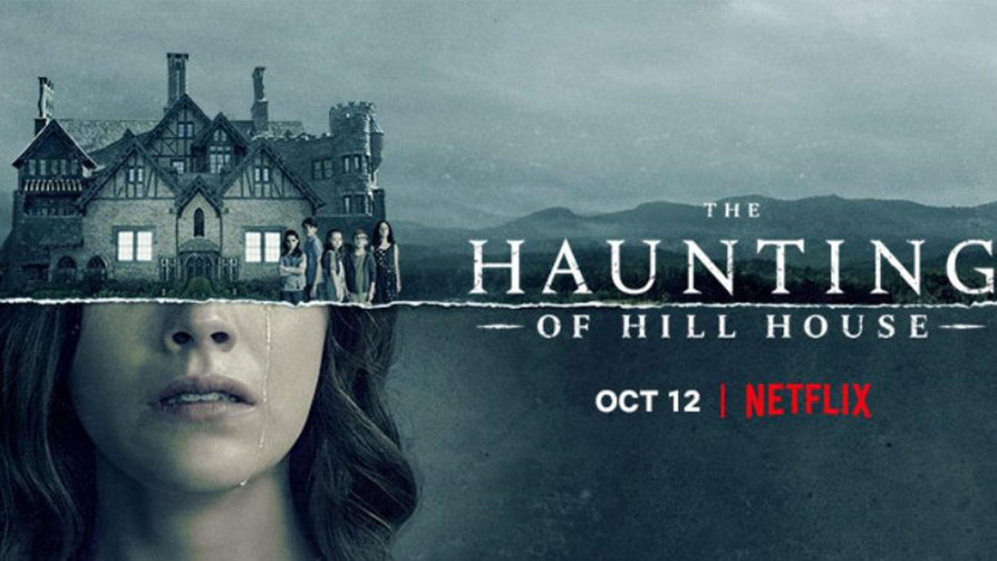
The Netflix adaption (2018) follows the same storyline of the original film but has been changed, for instance the guests are now all siblings but they must manage to stay overnight while they experience paranormal activity. The show is created and directed by Mike Flanagan.
The 1999 adaption follows the original storyline where five random guests have been invited but instead of a house they have been invited to an abandoned insane asylum, they have been offered $1 million to stay overnight if they are able to survive. Produced by Robert Zemeckis and Joel Silver. There is also a 2007 sequel titles "Return To Haunted House" |
|
Stage 2: Exploration
Explore alternative strategies and visual treatments that respond to some aspect of the films narrative or general tone. We're looking for a wide range of initial considerations here so be creative. Whilst your poster will be constructed in 3D your visuals can be 2D thumbnails and sketches.
You will also need to explore the potential means of construction in order to inform your ideas.
This means that we should see both 2D thumbnail roughs and 3D construction experiments.
Artist Research
|
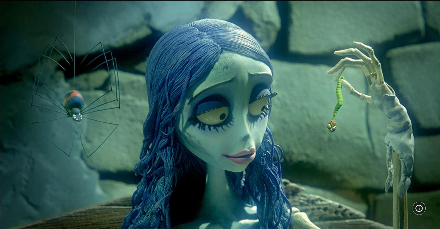
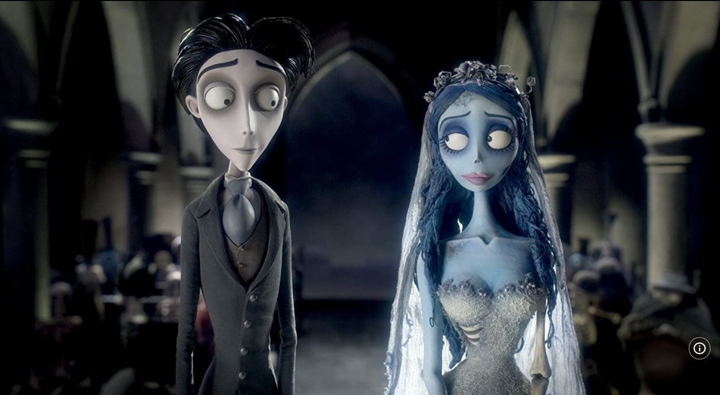
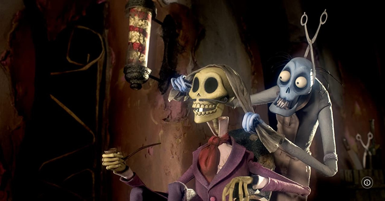
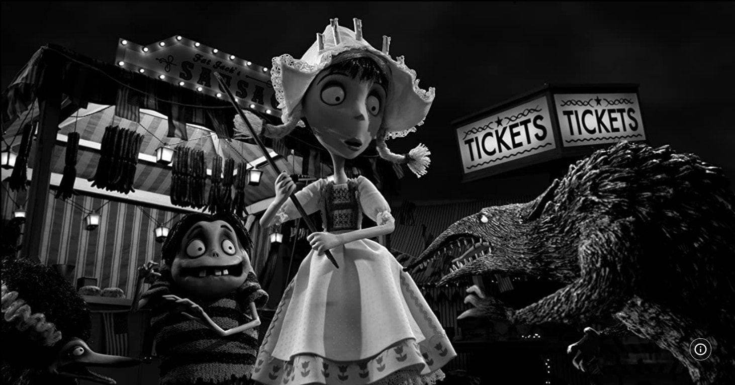
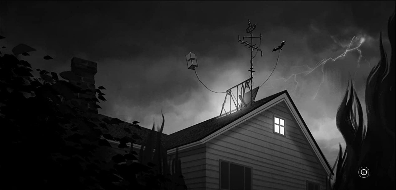
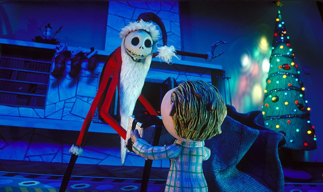
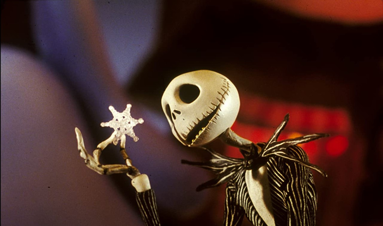
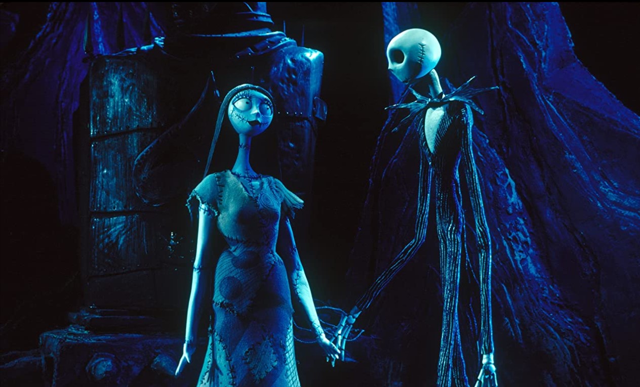
When I first think of Horror and 3D I immediately think of Tim Burton's stop motion films, although not necessarily horror, but his concepts have that horror-fantasy vibe to them especially with the way he uses colour and lighting. I took took so photos from Corpse Bride, Frankenweenie and The nightmare before Christmas. If I create a character I hope to show off the Burton style within the 3D work.
|
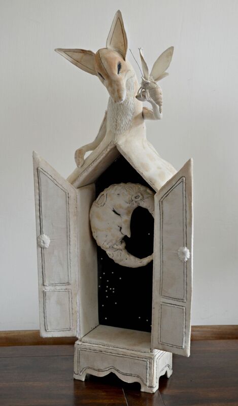
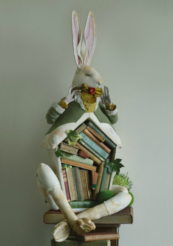
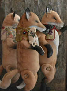
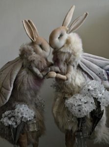
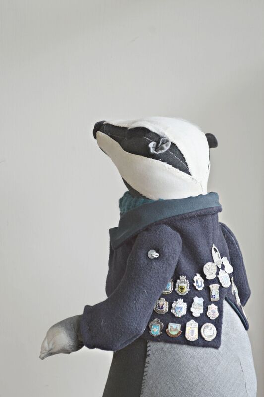
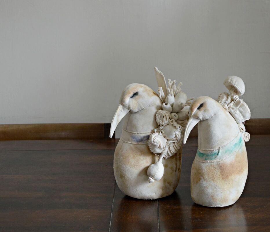
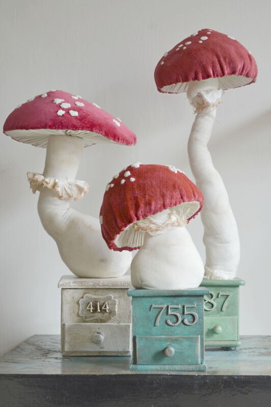
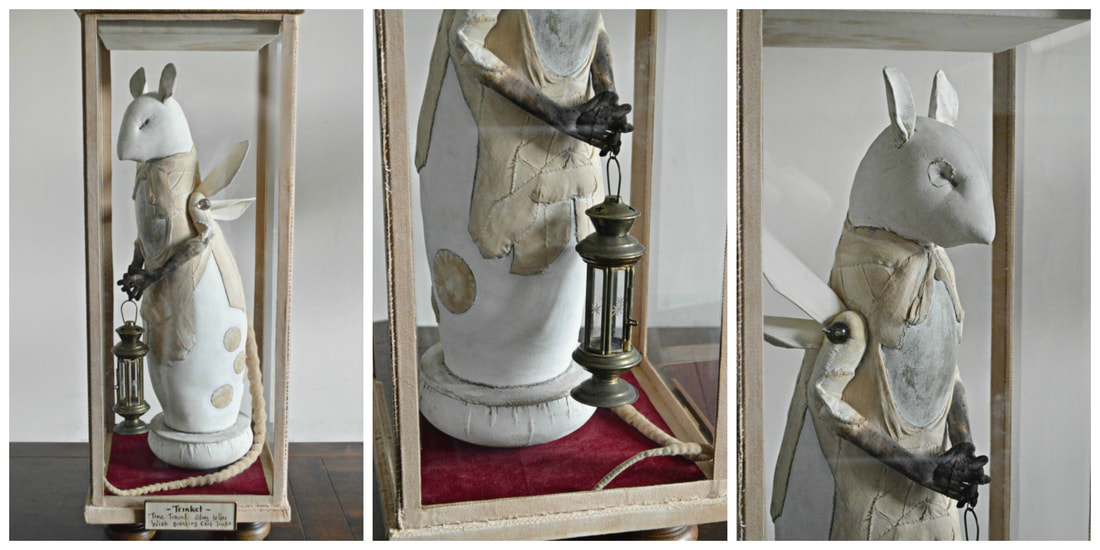
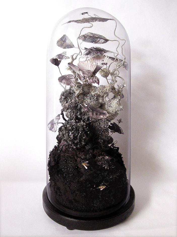
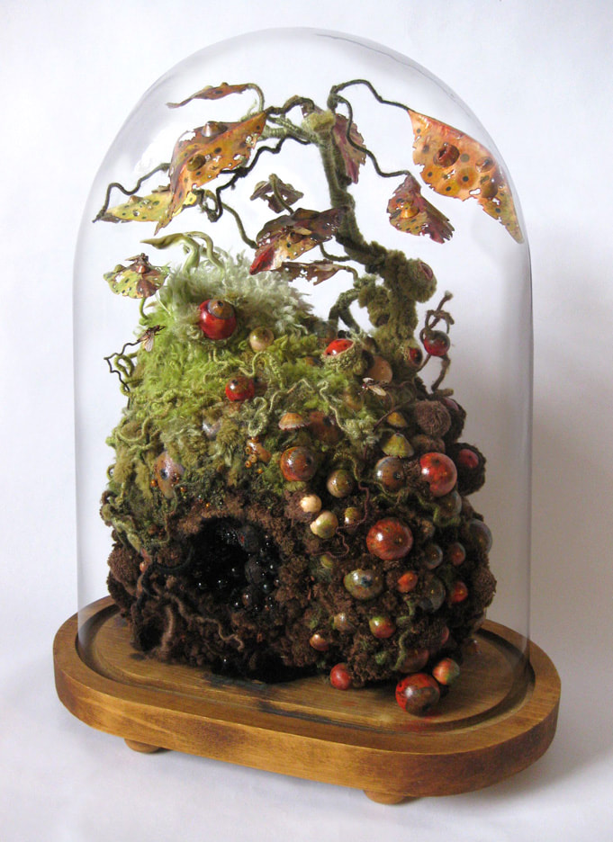
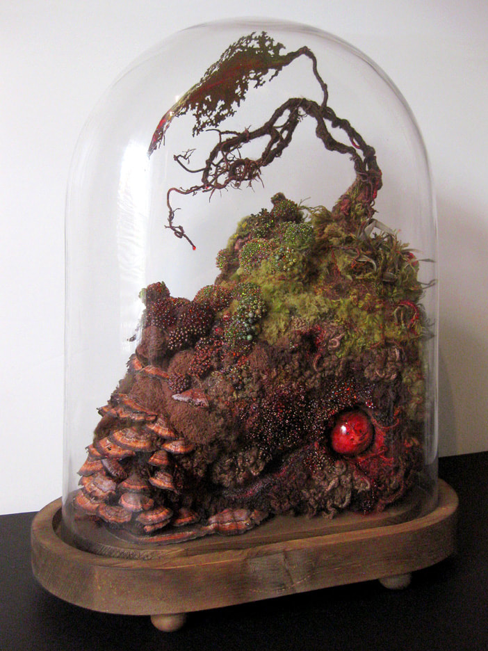
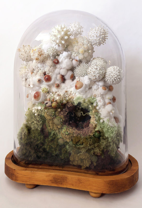
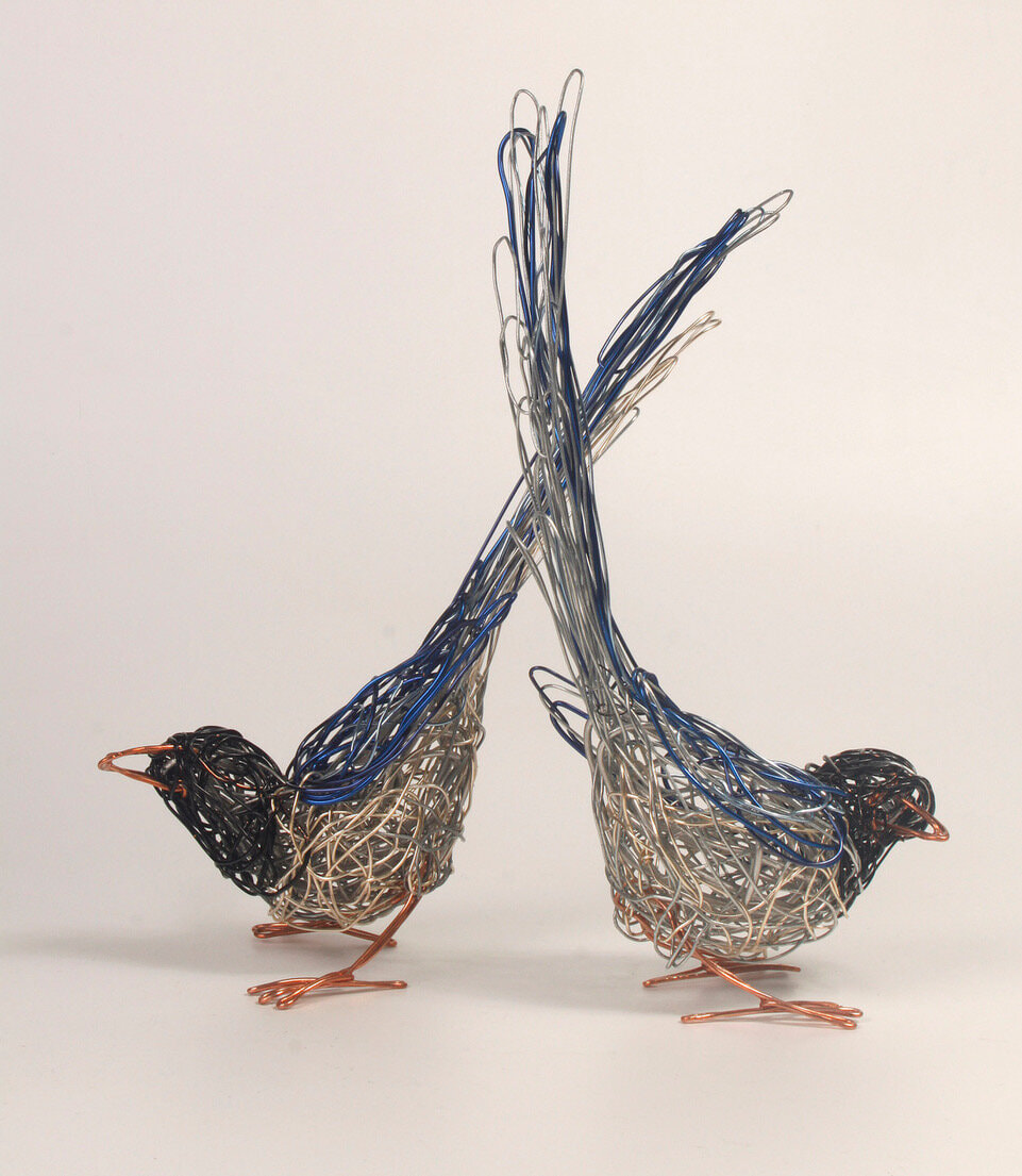
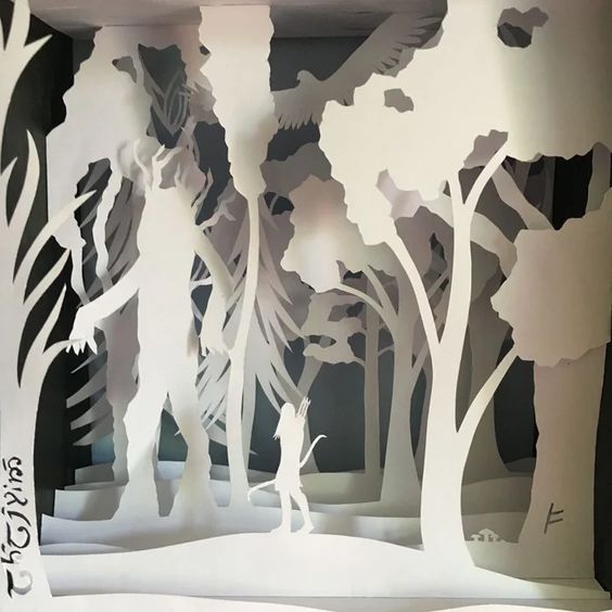
I came across Mister Finch's work on Pinterest and found his blog, He hand sews his work with up-cycled and new materials, from discarded wire, steel and wood, to vintage tapestries, cross stitch samplers, tablecloths, antique silverware and rescued cloth. He draws Inspirations from folklore and Yorkshire wildlife.
|


|
Vivariums have a nice look to them as they are mainly caged, although it is mostly plants I am unsure how I would add in a glass case to fit with my storyline but I do like the thought of these.
|
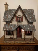
I've had a look at some dollhouses which look like they would be fun but I think the amount of little objects and details would pull me away from it all. I was thinking of creating a dollhouse out of cardboard and to have each little room for each character but thinking back I think this would take a lot of time.
|
|
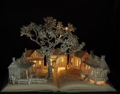
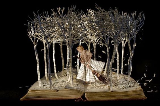
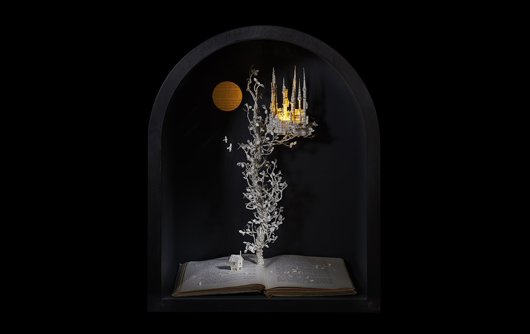
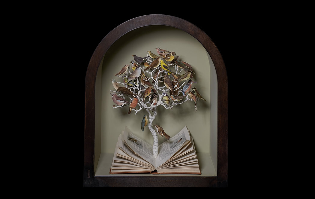
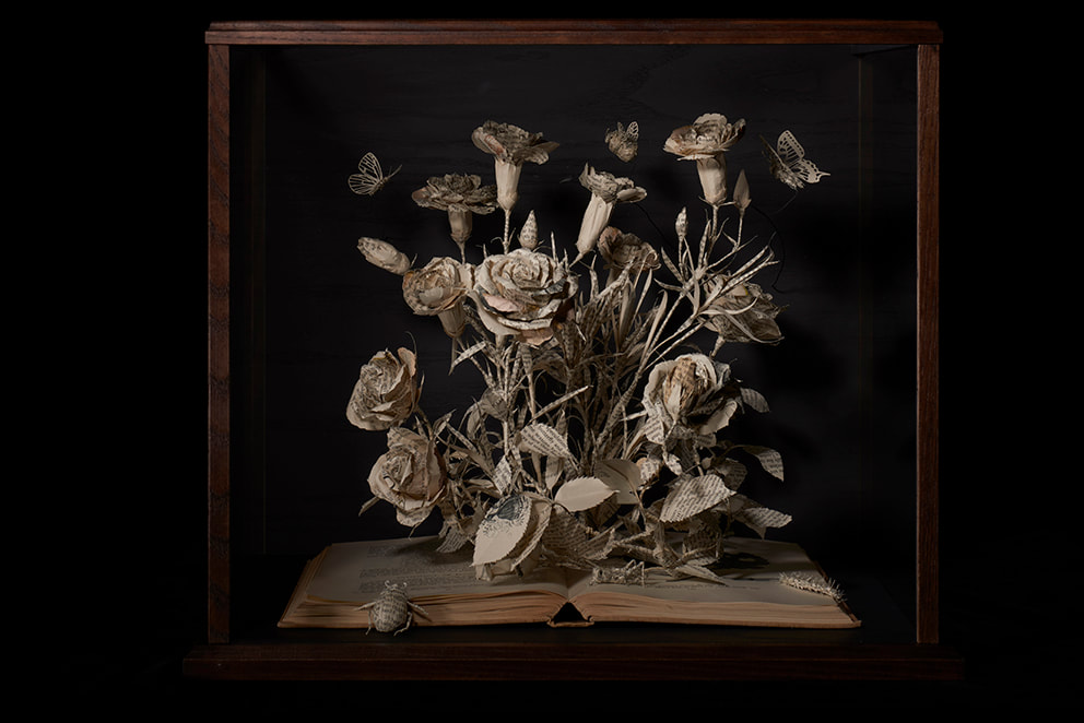
During Tony's session I looked further into Blackwell's work as she uses books for her work, the film I was given is based on a novel and I thought that using book spreads could also be a subtle way to feature that.
|
I noticed that I haven't done much research for type but my mind went straight to wire as this could easily be turned into a horror theme. I will however look up other types of fonts and see what works best for the film and my design.
|

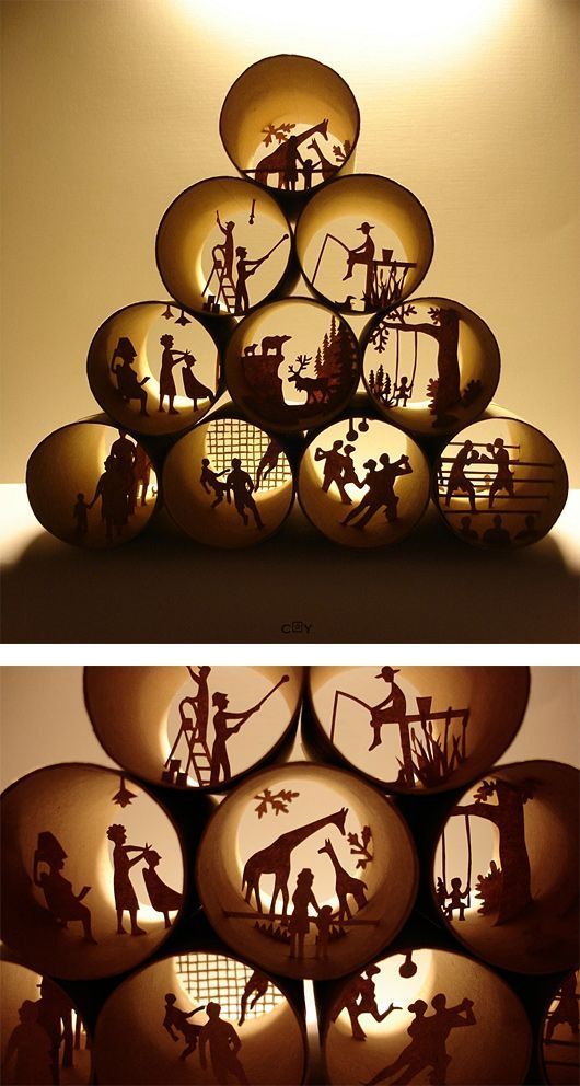
Material Research

After seeing that Mister Finch uses upcycling for his work I went ahead and looked for another artists who uses more objects and came across Stephanie, I watched her video on upcycling as she gives a more insight on her process and some tips and advice when starting.
|
|
|
|
I stumbled across these videos when I thought about using cardboard for most of my work and I love how the Alice In Wonderland design came out, It was mounted flat but still had a 3D look and process to it.
|
|
|
|
Looking more into cardboard I thought to check how would I make this into a building as it may be obvious that I want to create the House of my film but I also came across using plastic bottles.
|
|
|
|
I was looking up some doll making videos and came across a few that were inspired by the Coraline film - the process looks like it would take a few days but overall I think this may be a fun way to create one of the characters in the film I was given.
|
|
|
|
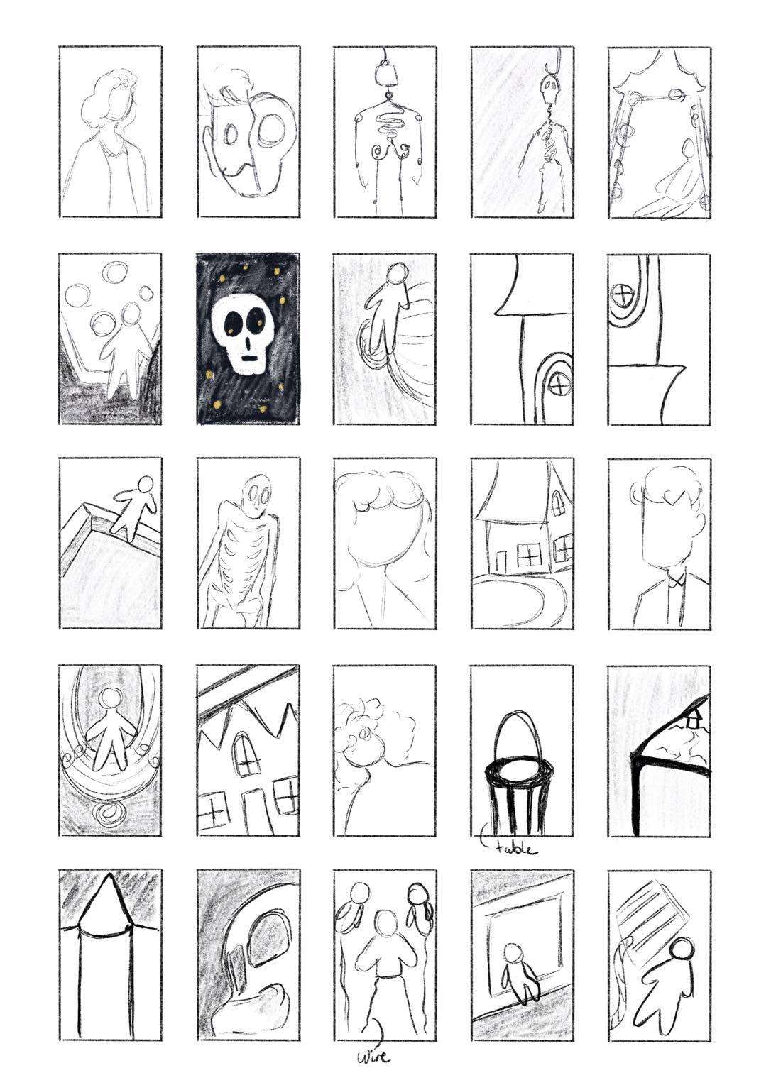
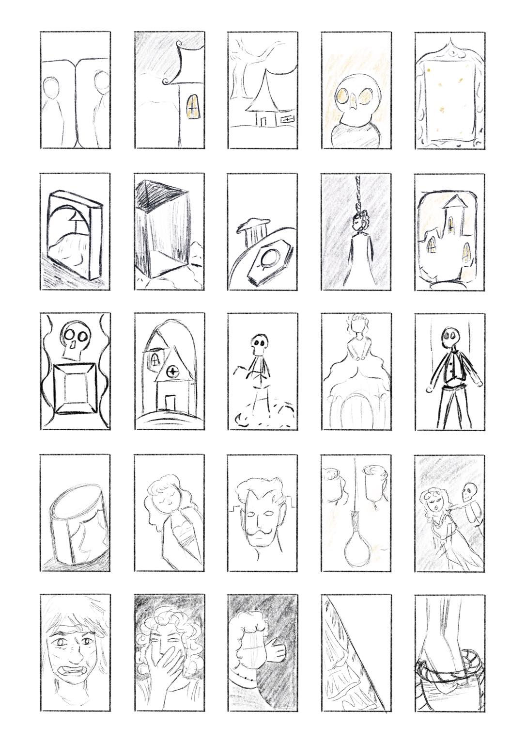
during my thumbnails process I mainly took what I could remember from the film and see if I could recreate some scenes as well as adding in any props - however I don't feel like these thumbnails are staying true to the film so for my development I will be re doing some ideas but changing them to fit into the theme and genre of my film and staying more true to how it's created.
I was mainly looking at some material inspiration for the thumbnails which is were I think it went a bit wrong, so to continue forward I will be focusing more on research based on the film itself although as my film does include a skeleton I feel like the thumbnails might be brought forward in a "terrible" horror sense. |
|
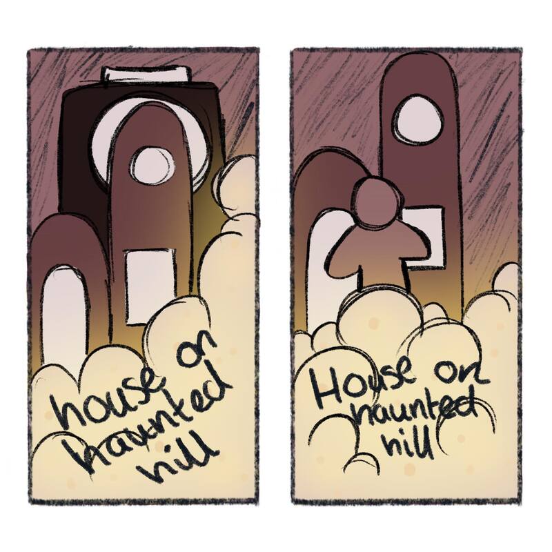
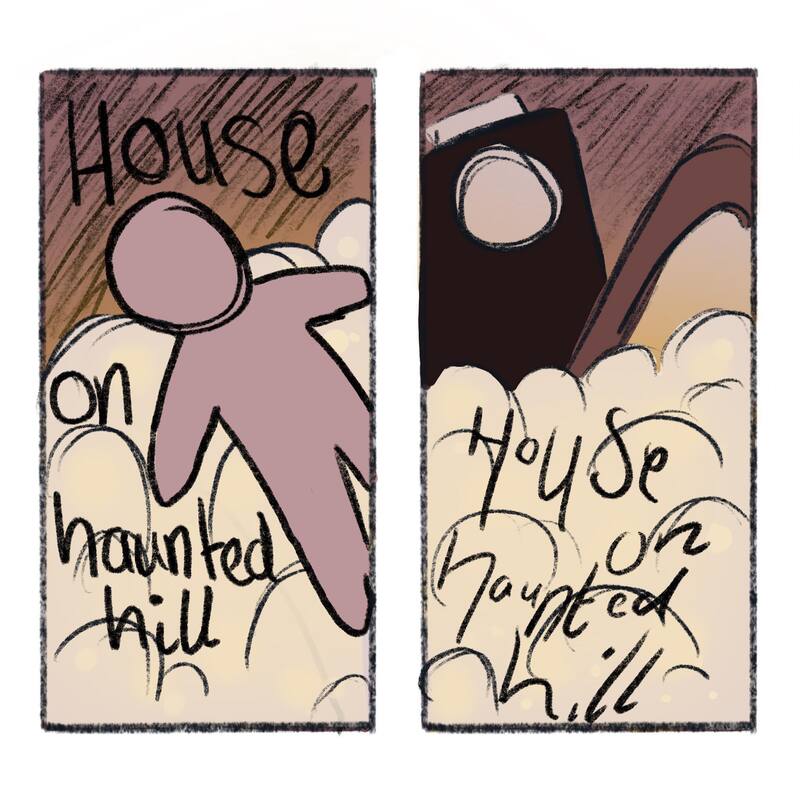
For more research about the genre of my film I looked into some old and new horror posters and how they show off their movie. Now with the film I have been given looks like the poster is pretty old and not that terrifying - I will try my best to keep to that theme. I also need to have a look at the typeface and how I'm going to add the title.
|
|
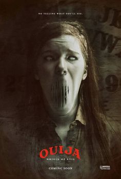
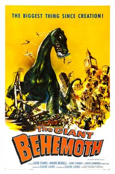
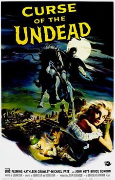
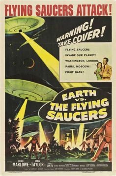
1959 Movie Posters
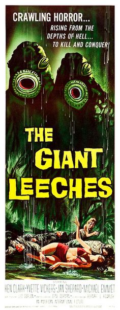
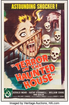
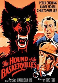
I looked into other movie posters (mainly horror) during the time my film was set to get a better understanding on how they used to look. These posters show really bright images that remind me of old comic books, I am not going to be making my poster be as bright, if I am to use colour it would be less saturated like the poster for "terror in the haunted house" which is pretty similar to my film.
1890s Victorian Houses

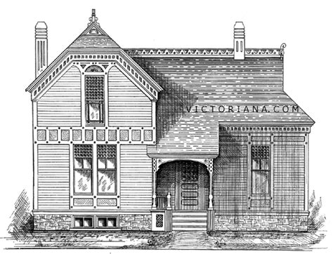
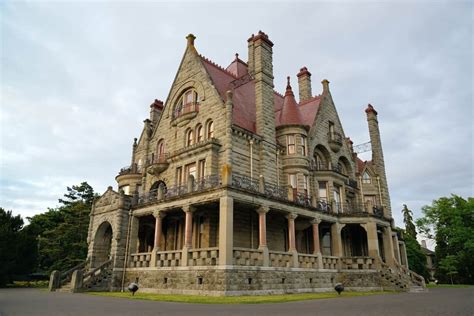
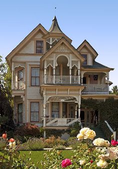
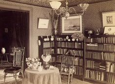
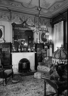
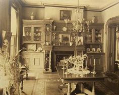
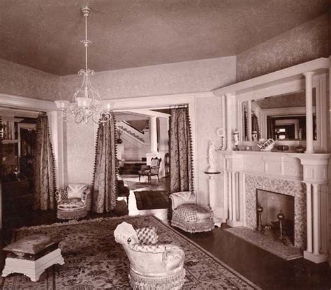
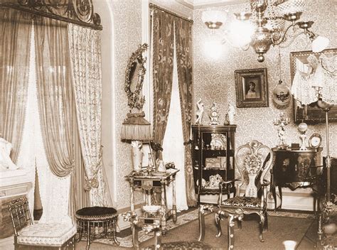
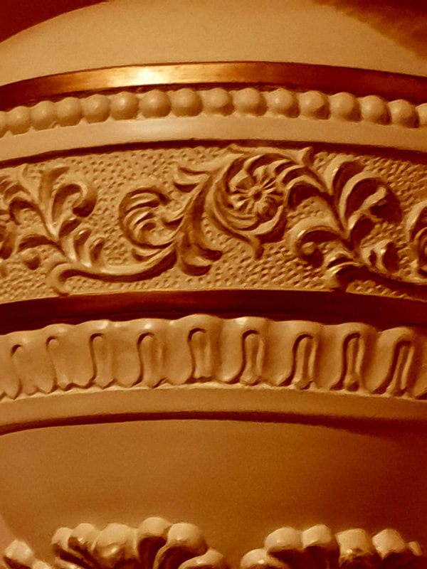
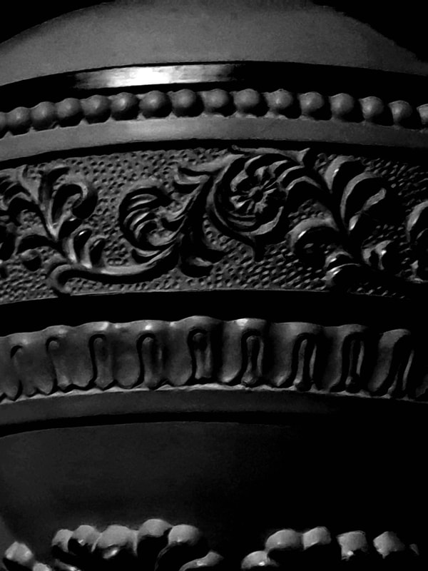
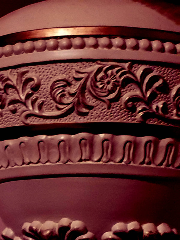
To help figure out some ideas I went back to the history of the house and looked up some exterior and interior designs of the 1890s Victorian homes. I also like how some of the images have a vintage like colouring to them and may use this as a lighting affect. I feel the best idea to come to this would be to create a doll house unless I only focused on the entrance of the Haunted House which is more practical as the original poster looks as though it is badly placed together. I also think that these Victorian Houses do give a horror or terror vibe to them as they are old and most likely have had paranormal activities within them at some point.
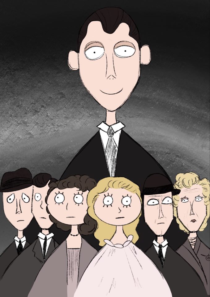
Vincent Price
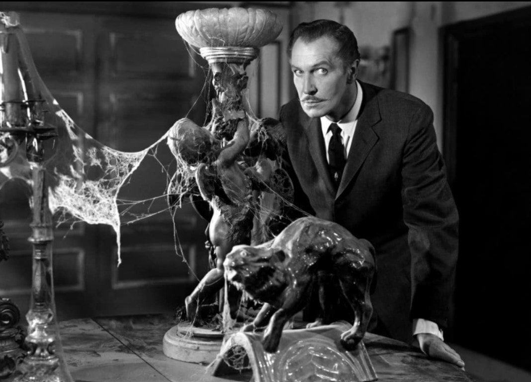
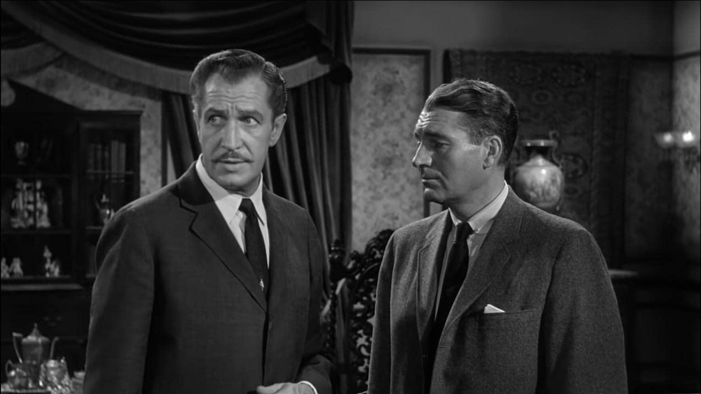
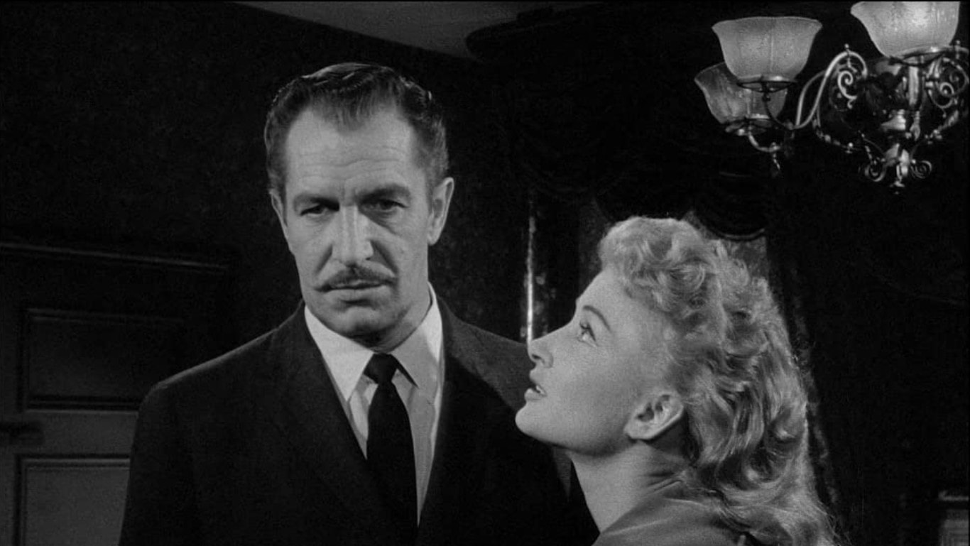
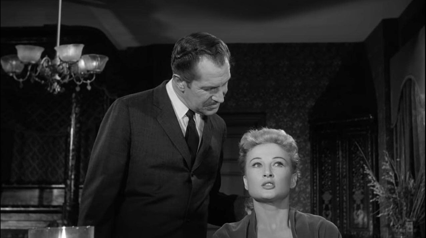
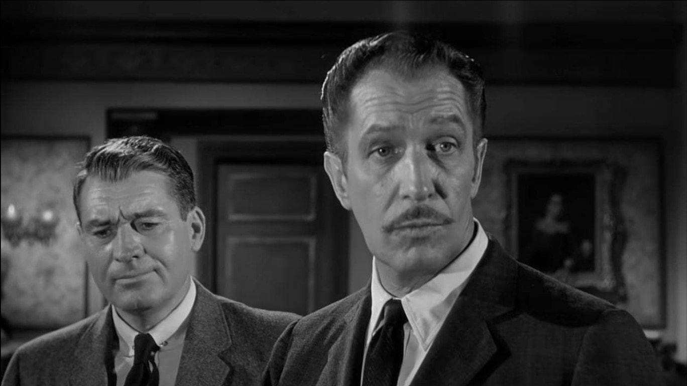
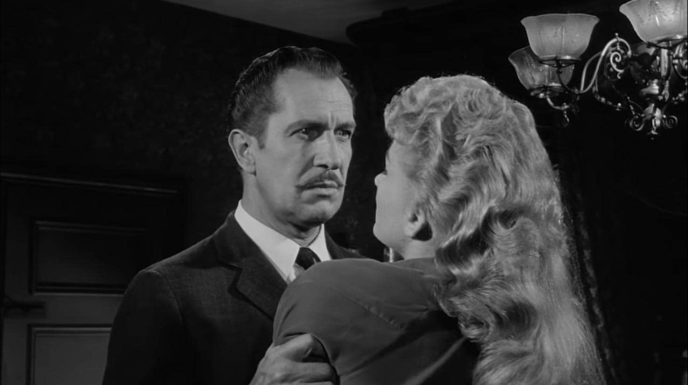
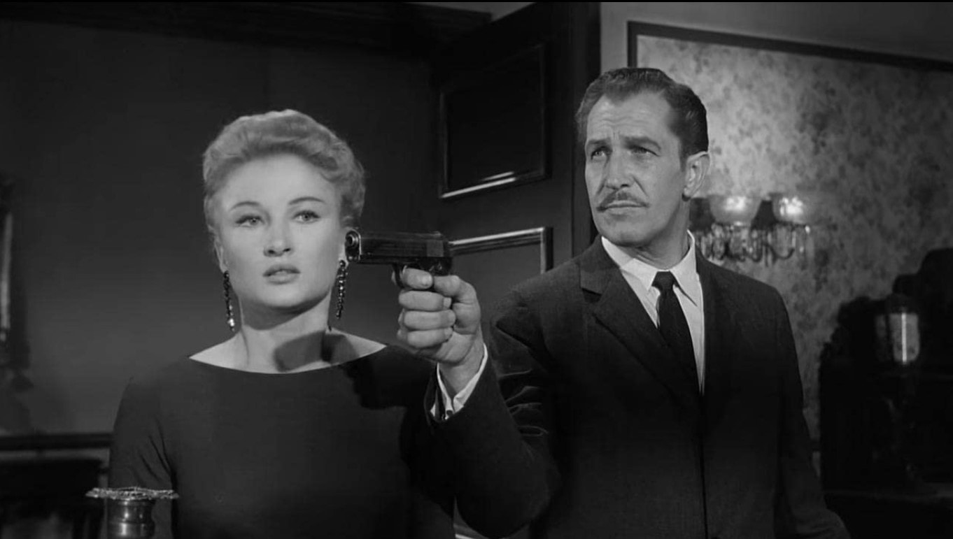
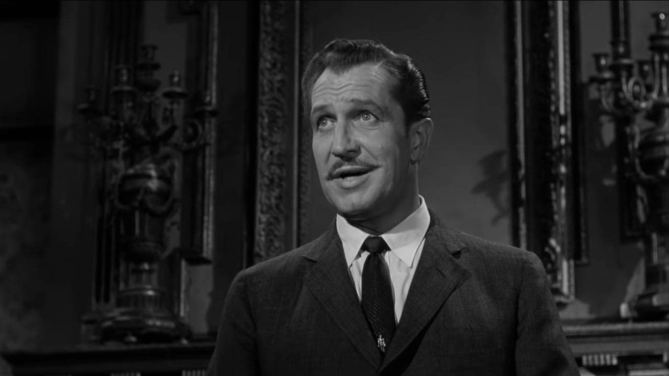
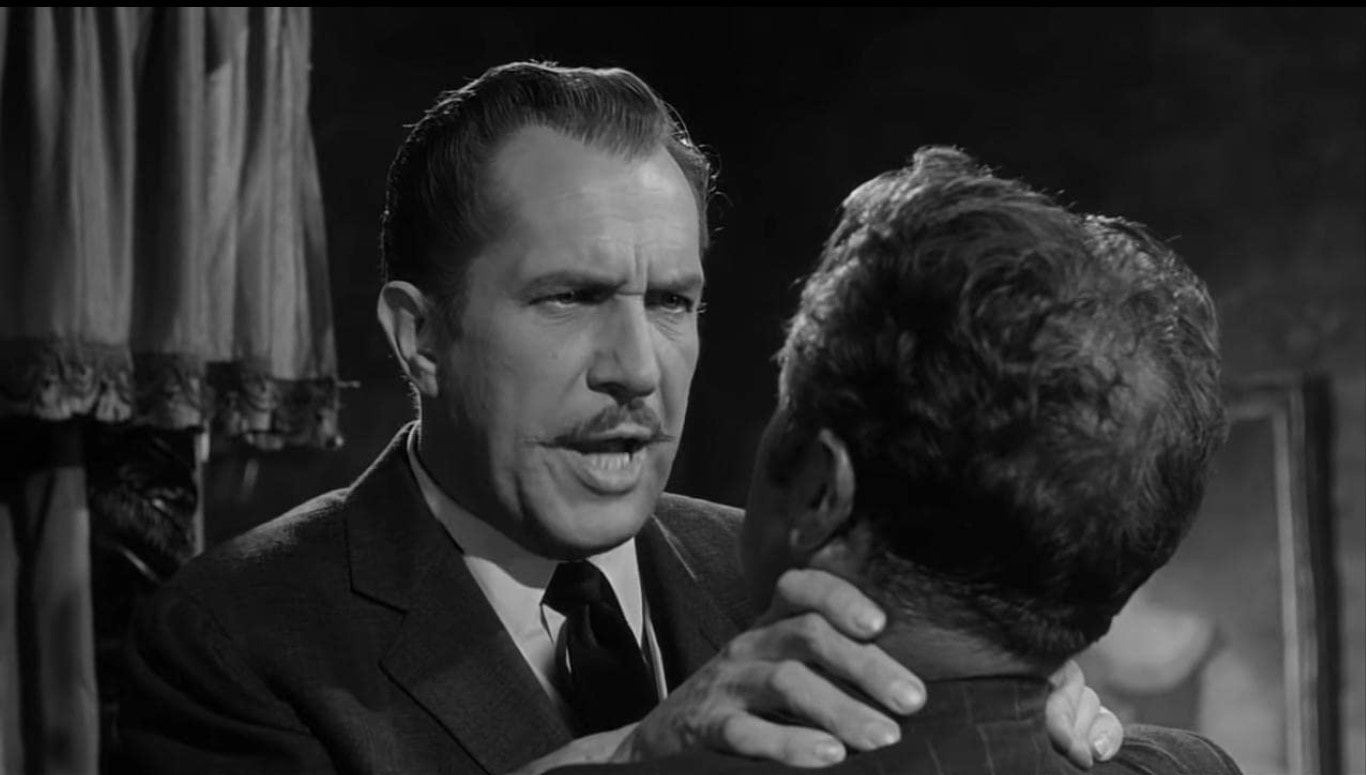
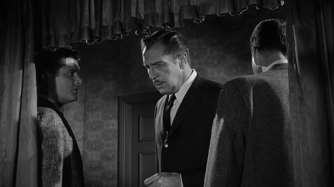
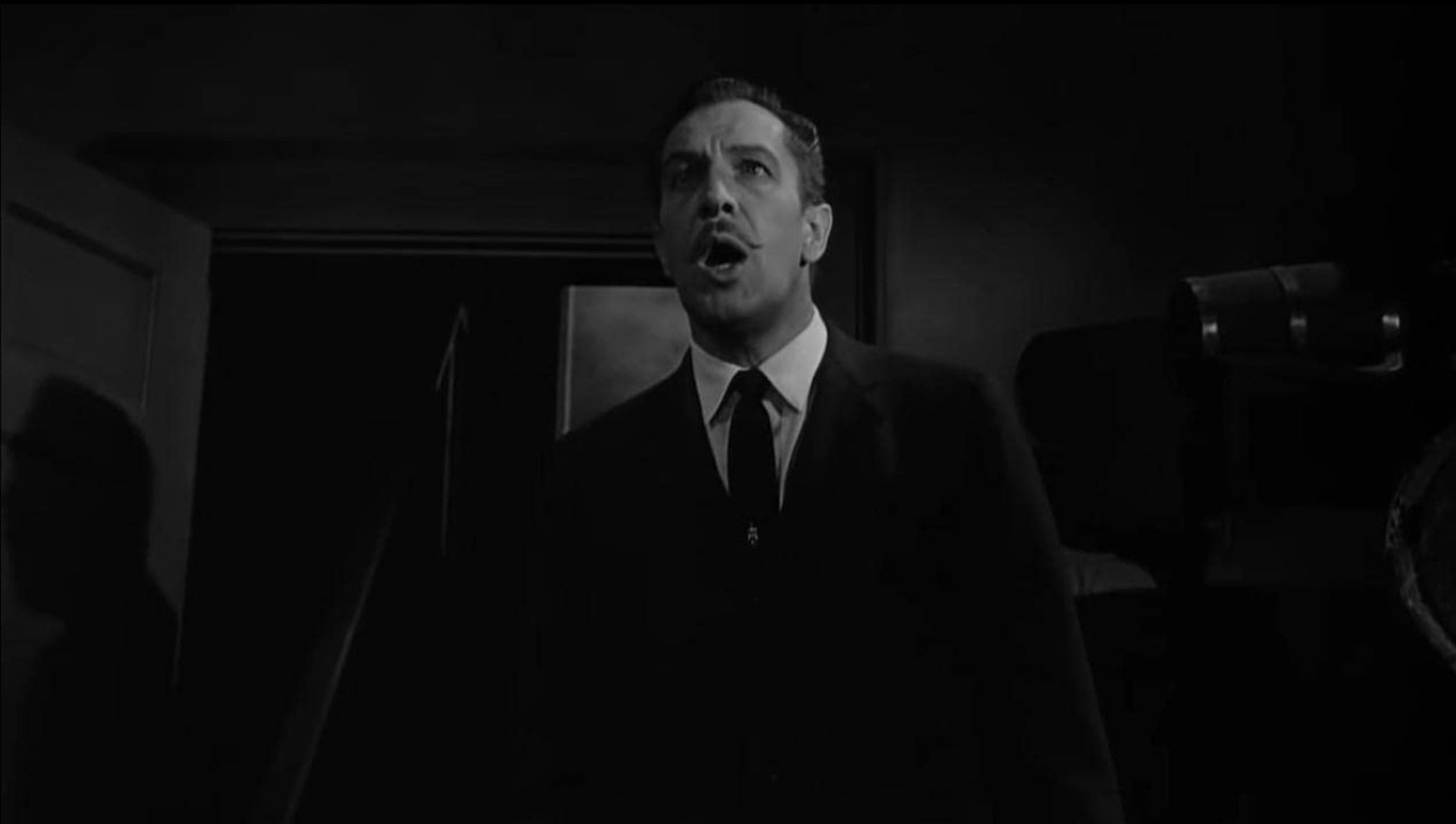
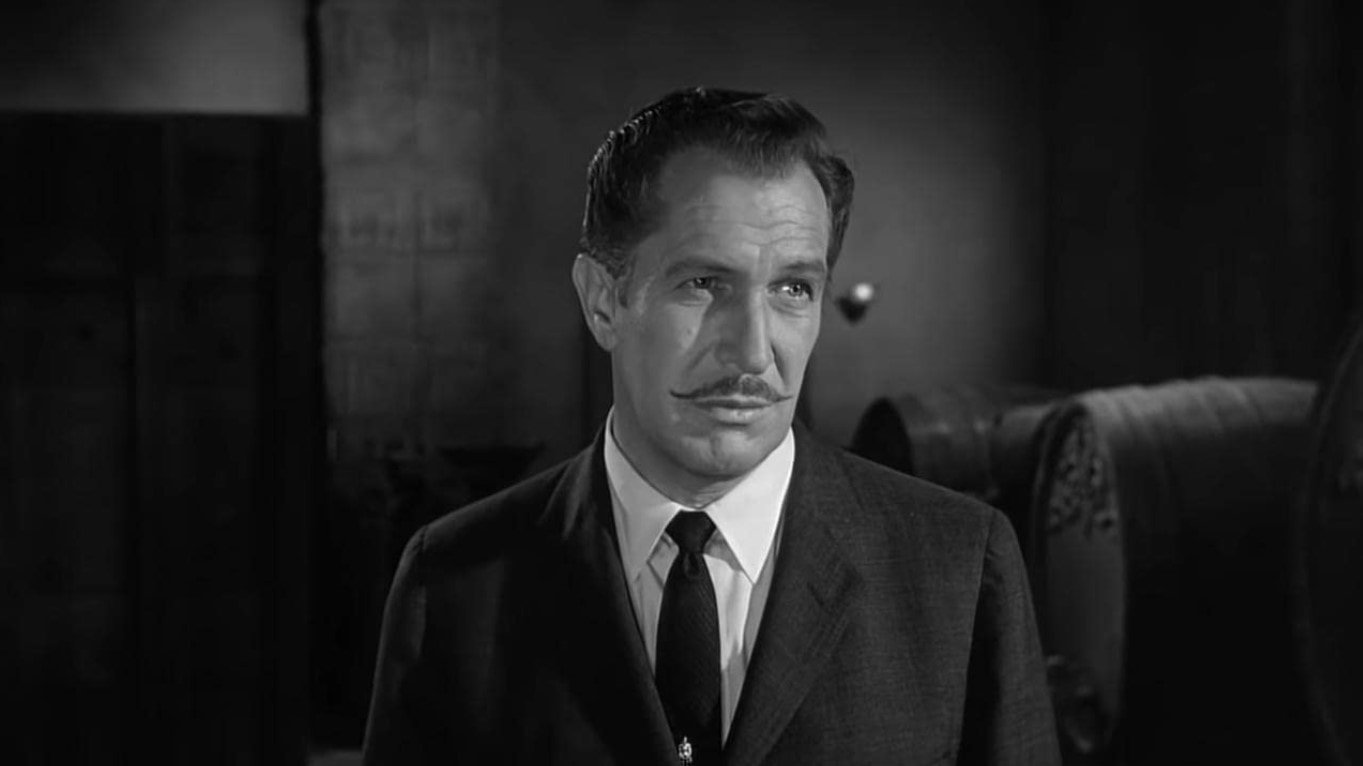
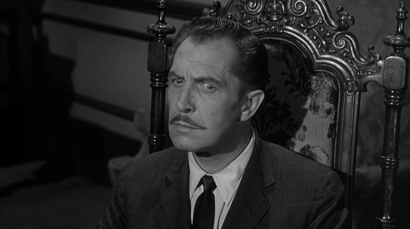
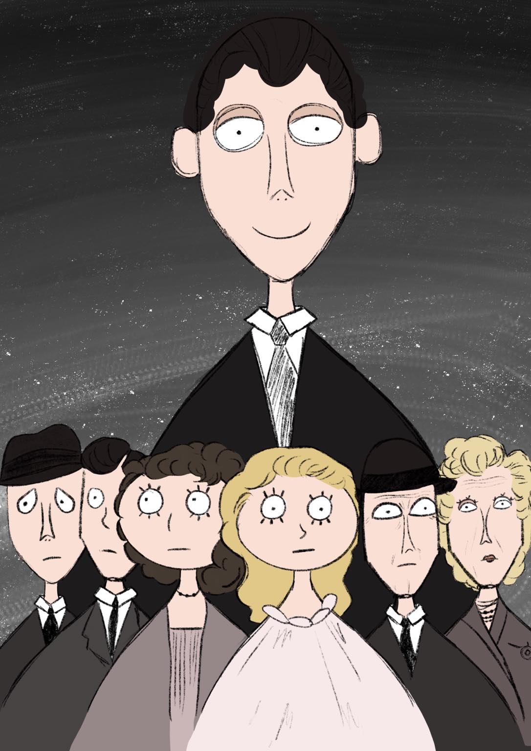
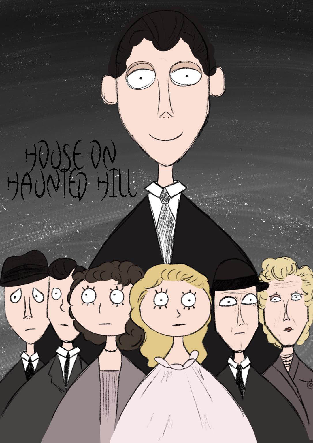
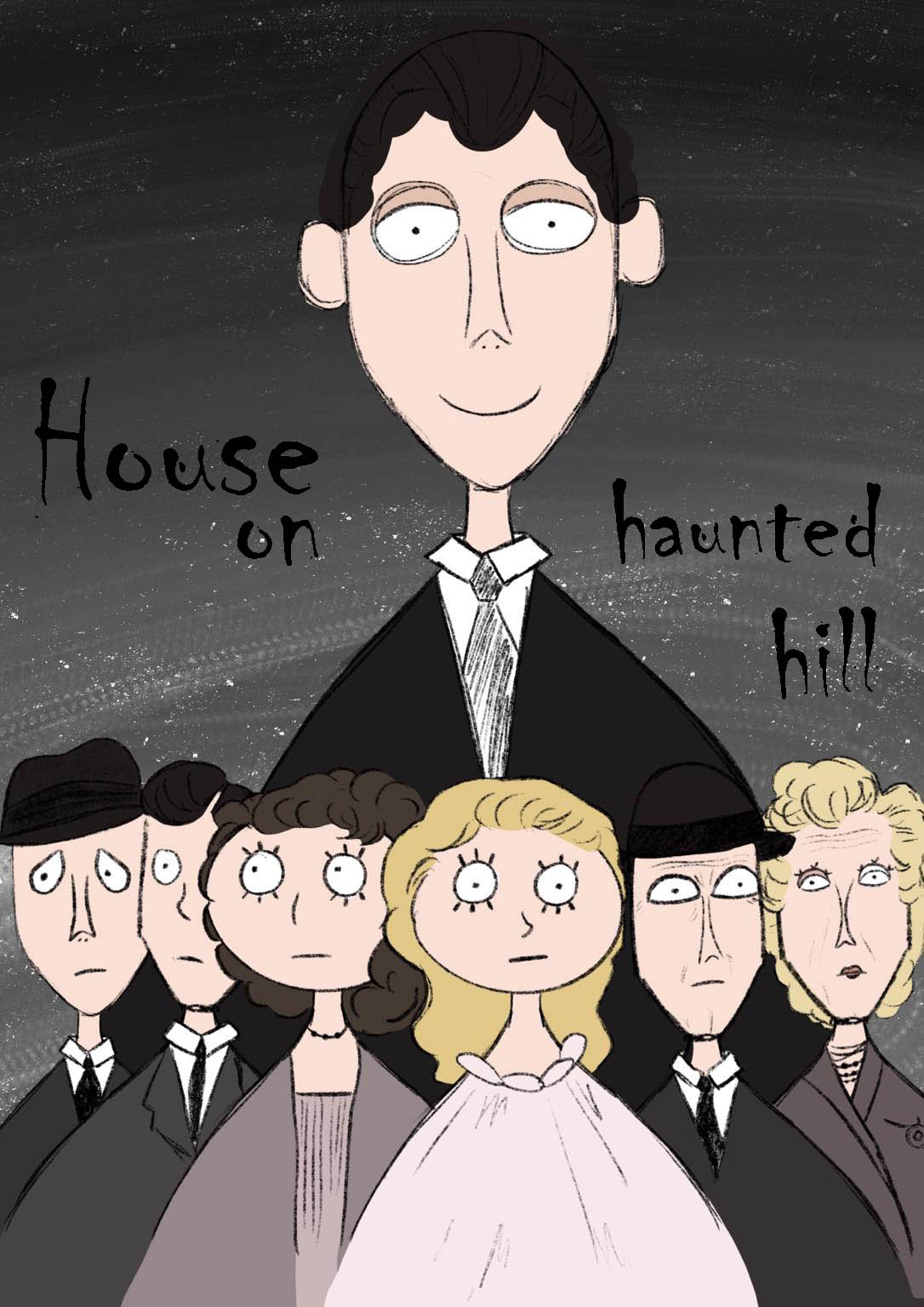
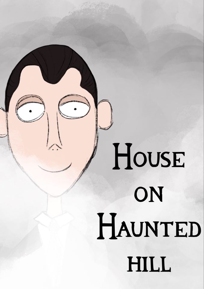
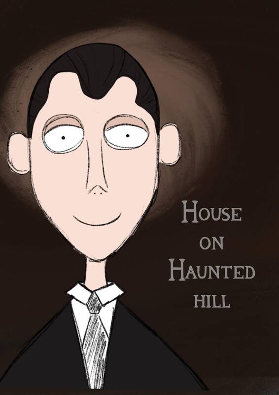
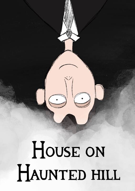
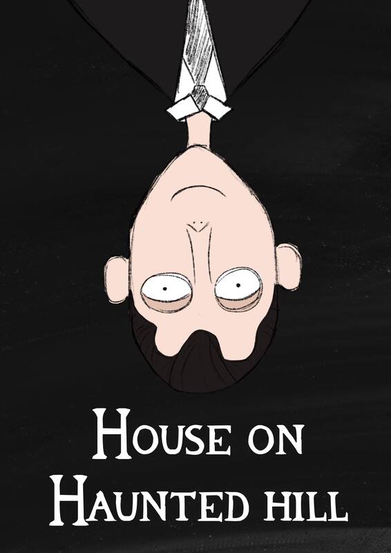
Another idea I thought was to focus on the character Frederick Loren as he's one of the most important characters. He is also placed right at the front of the film's posters as well as other posters that are similar or edited. Frederick Loren is also played by Vincent Price which would grab attention. The images I have gathered are all from the scenes he is in, I was mainly looking into the facial expressions he made. I am unsure if I would want to create most of him or just go back to the beginning of the film were he is just a floating head that starts to narrate.
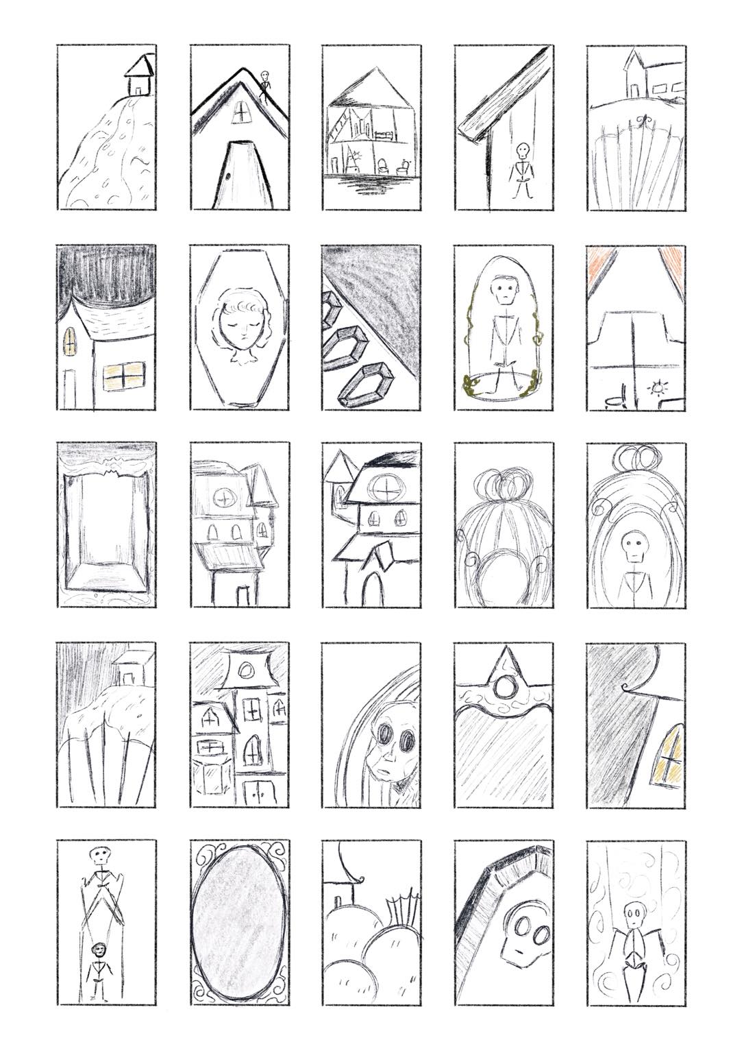
Thumbnail Visuals
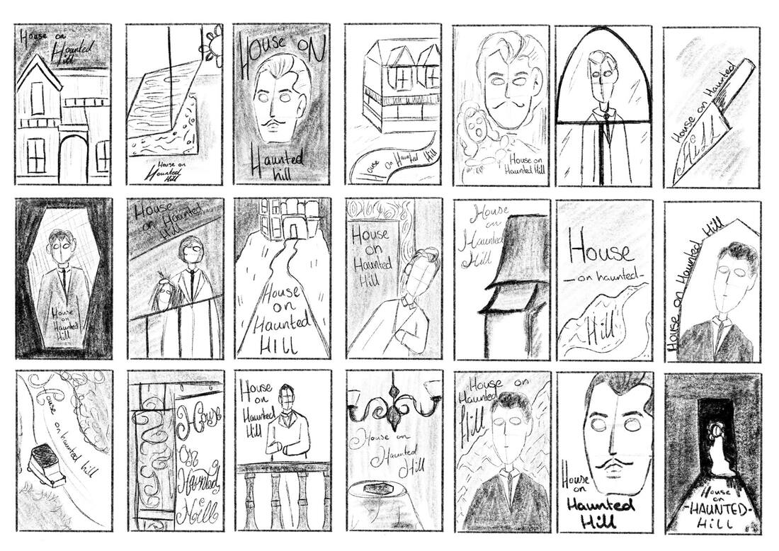
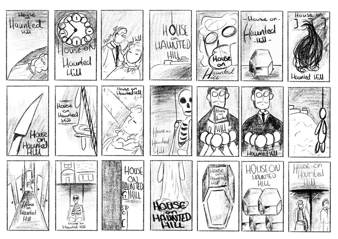
With these thumbnails I have went back and starting getting ideas down while watching the film again as well as trying to see were the title would be fitted. I have taken my research of the Victorian Houses but while re watching I noticed that the house doesn't look Victorian at all, luckily the film's poster does have a Victorian house shown which is what I will be basing my thumbnails towards. I have also kept some skeleton ideas in as well as some interior designs to figure out if I could use furniture or windows as backgrounds for my work. The overall Tone of my poster is going to be horror, something that would frighten someone during the year it was made.
Material Testing
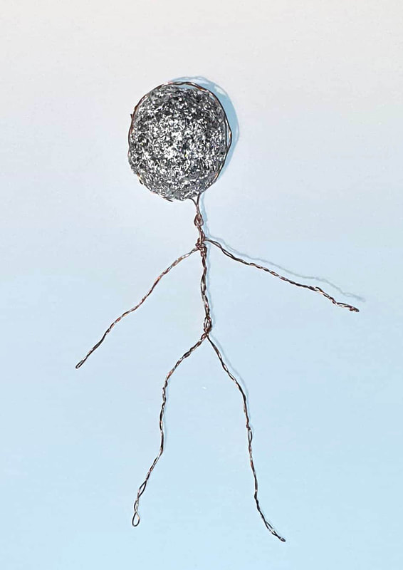
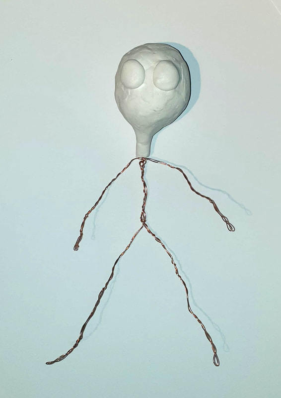
Doll Making
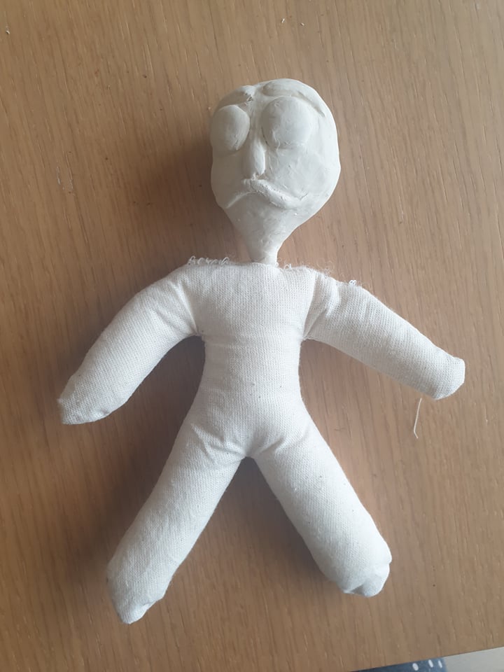
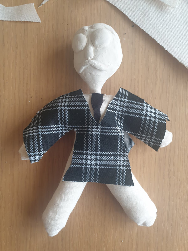
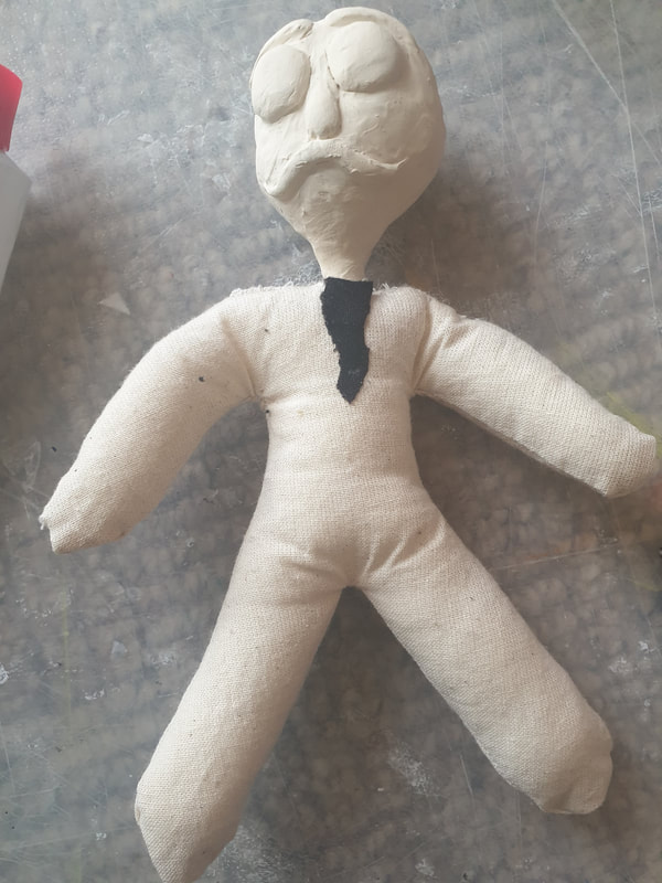
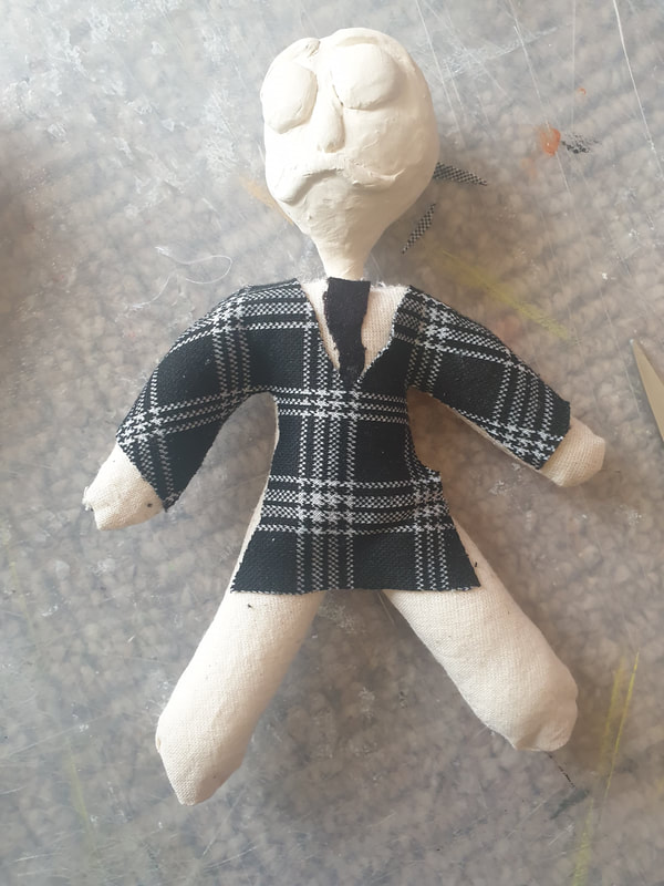
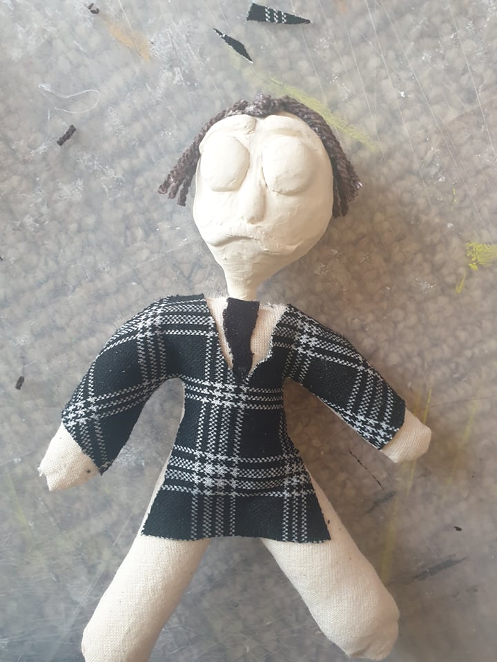
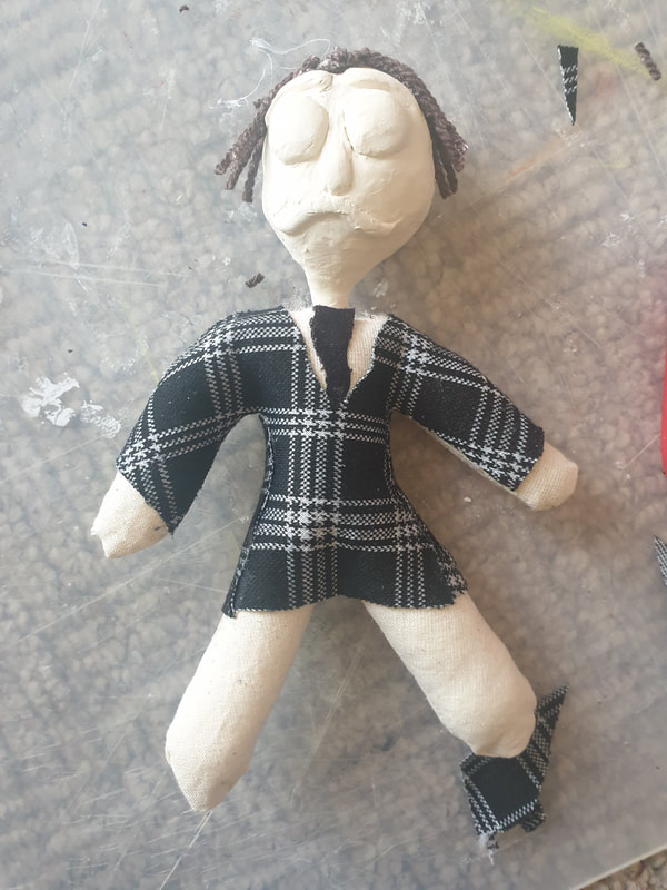
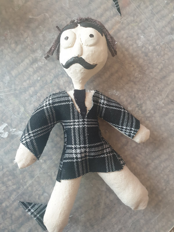
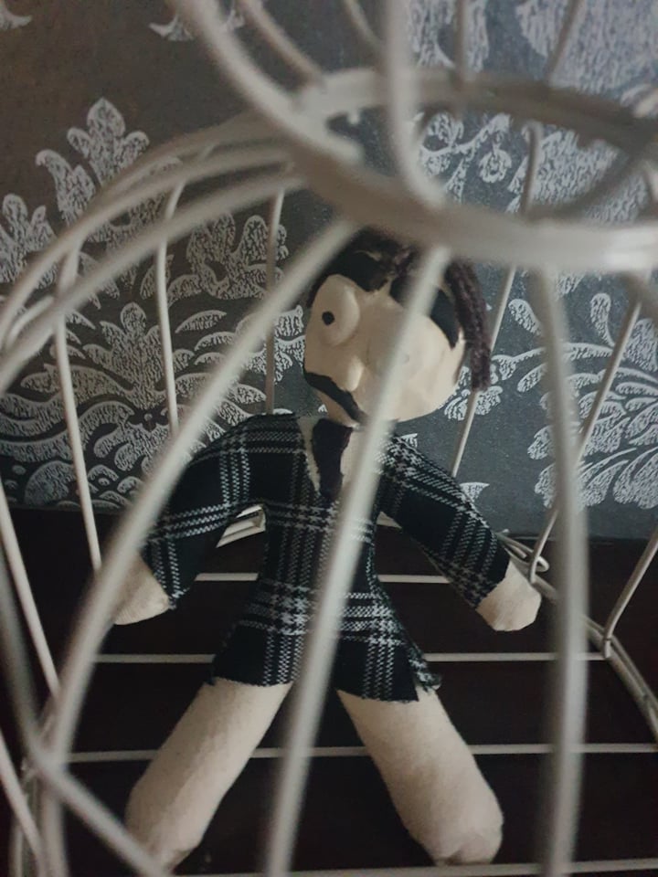
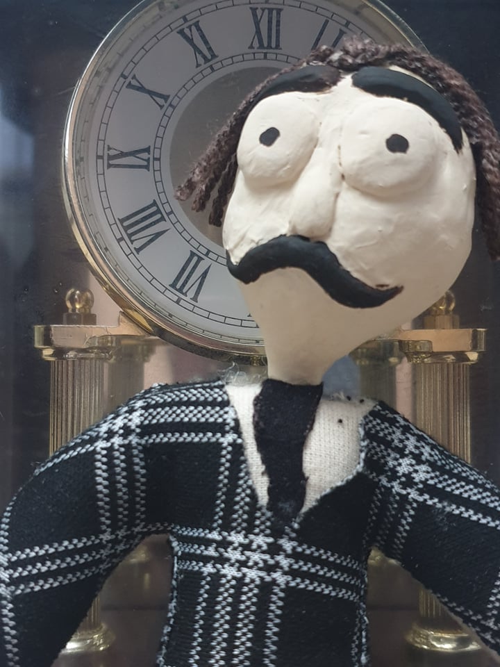
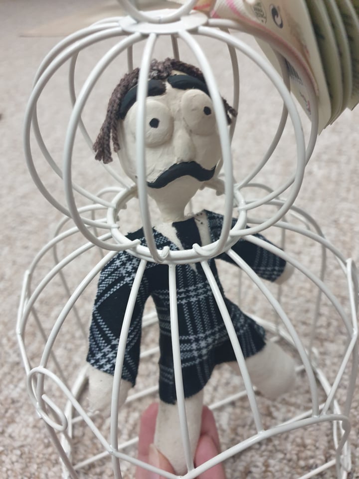
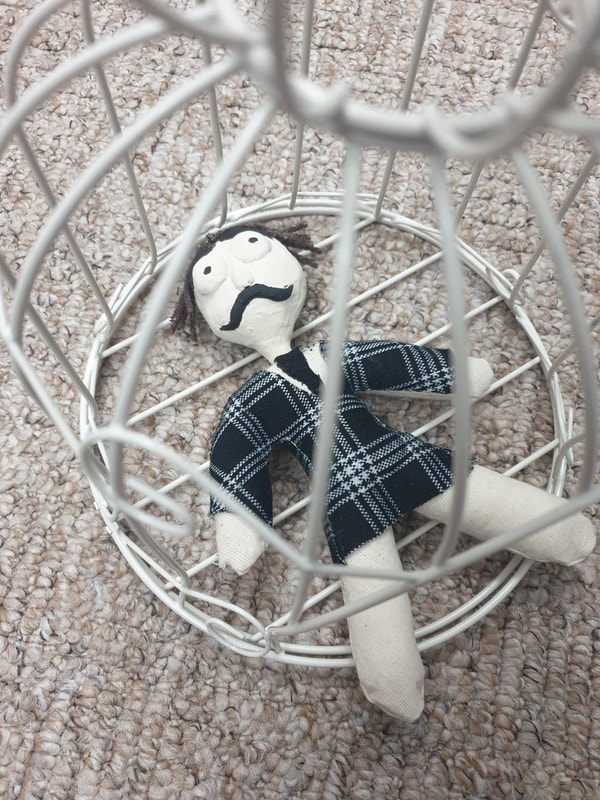
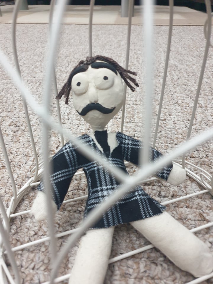
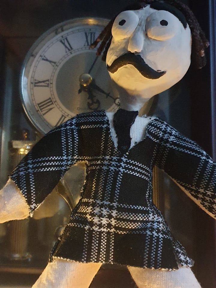
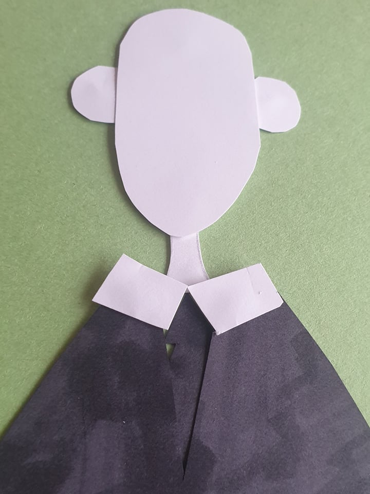
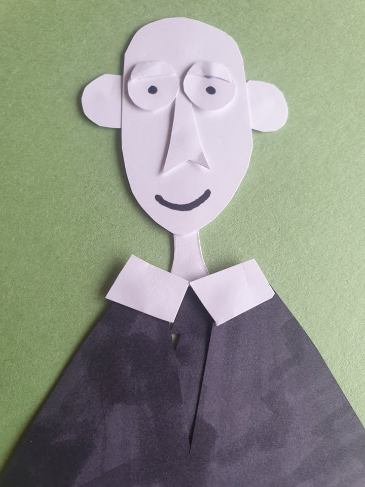
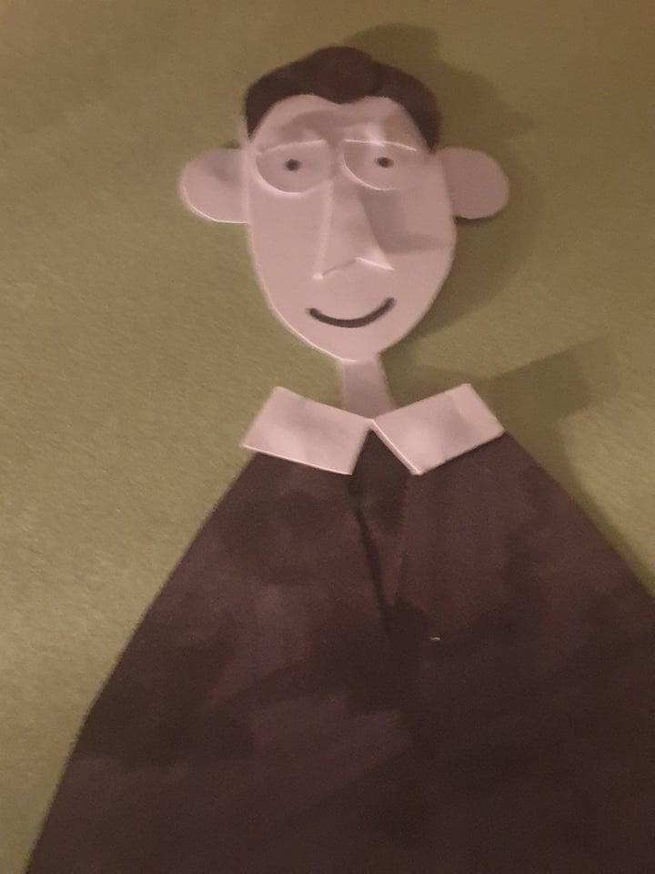
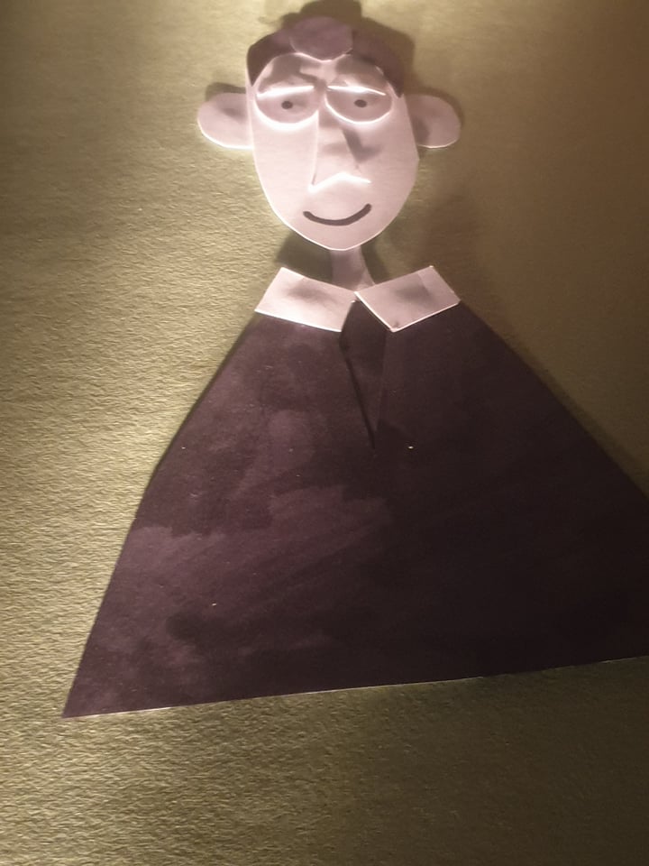
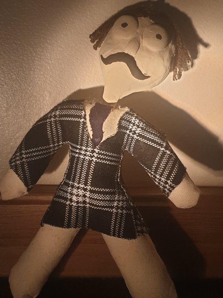
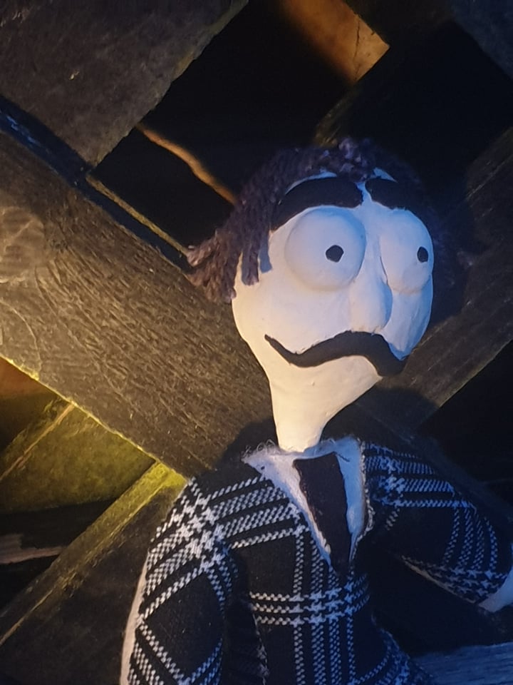
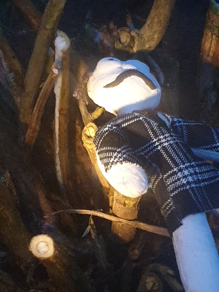
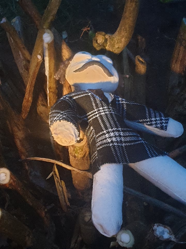
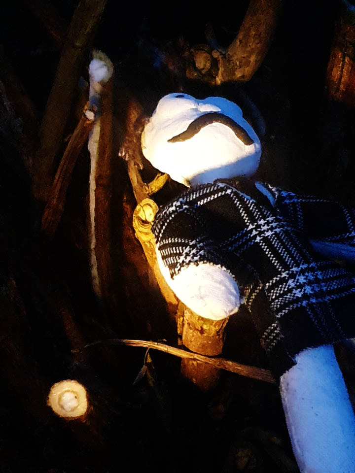
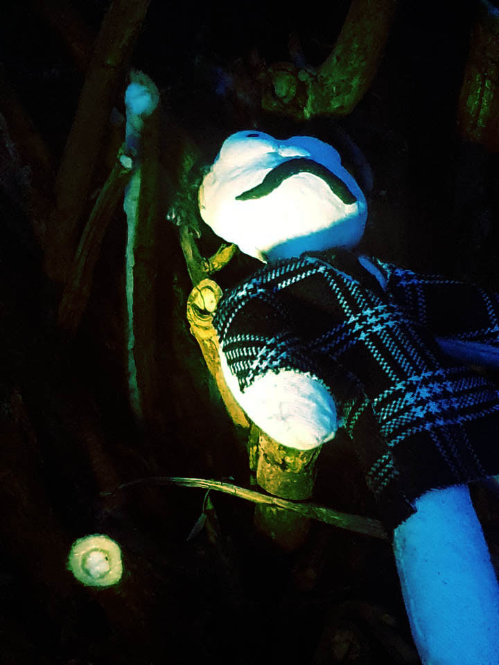
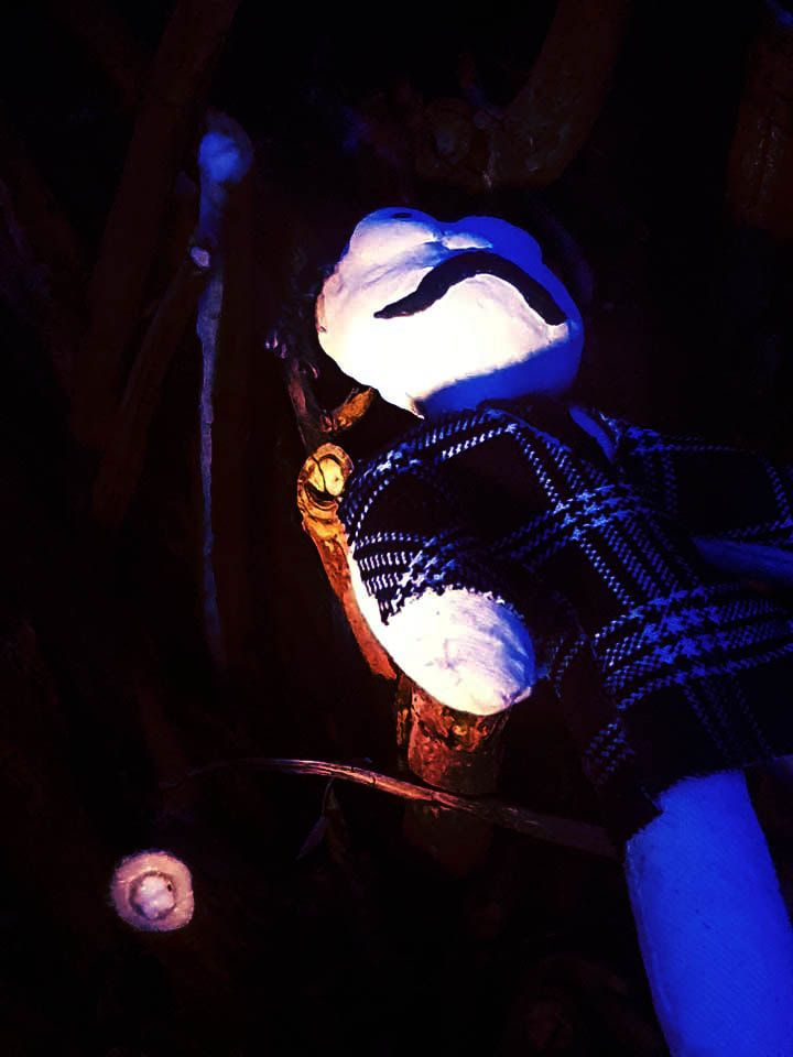
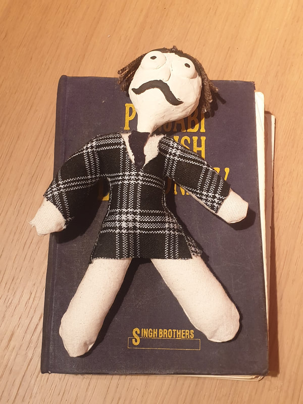
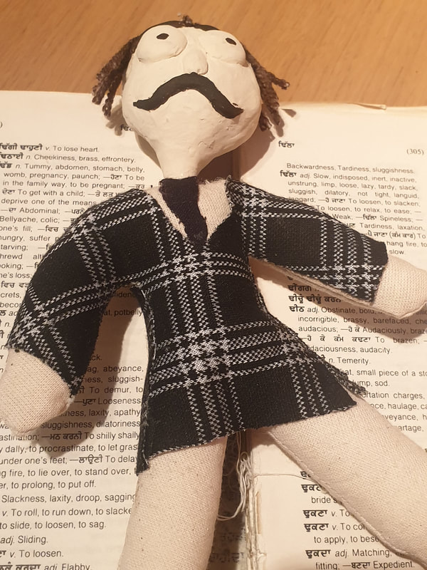
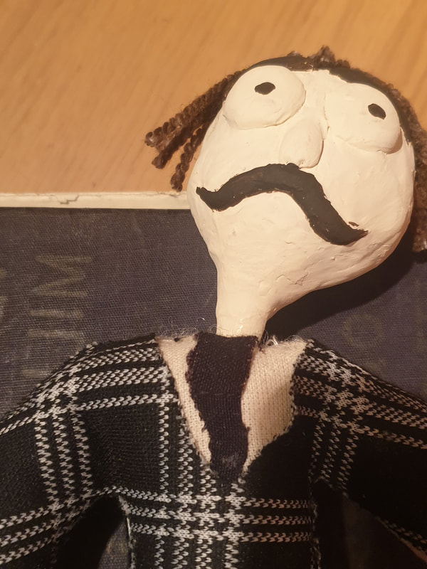
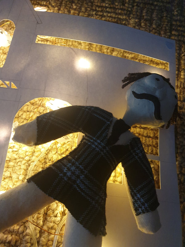
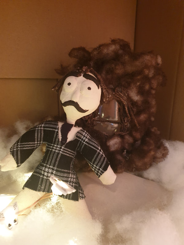
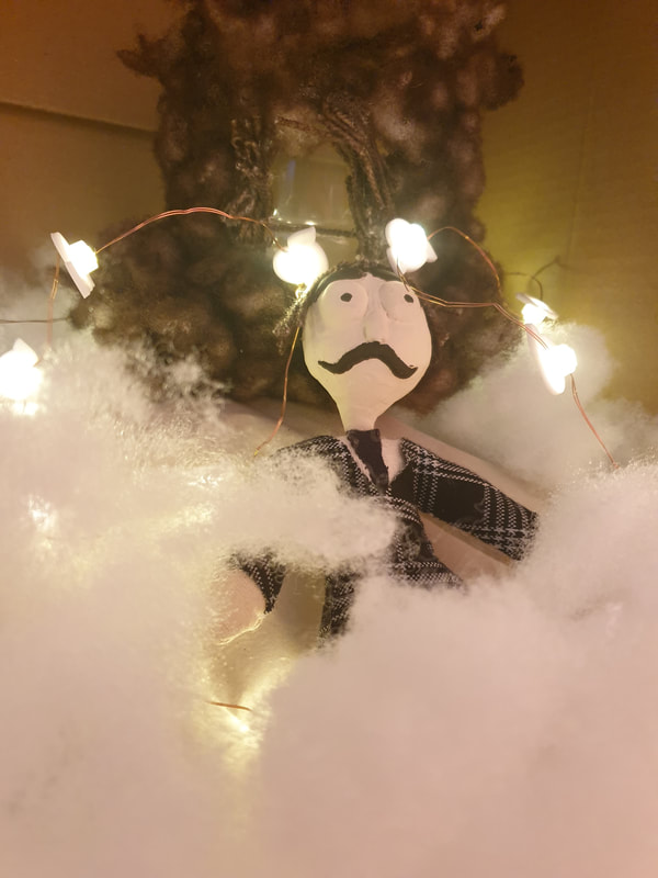
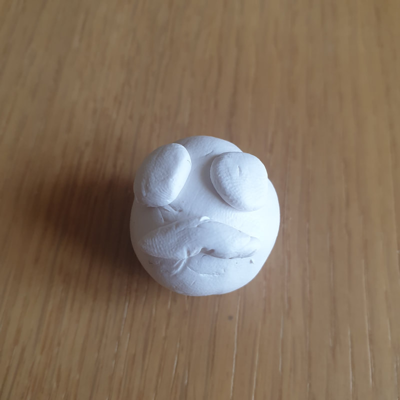
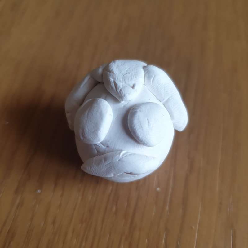
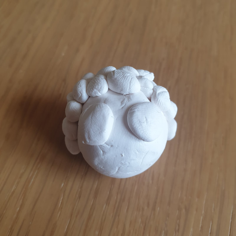
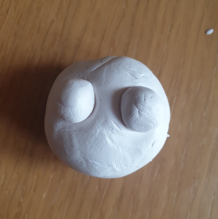
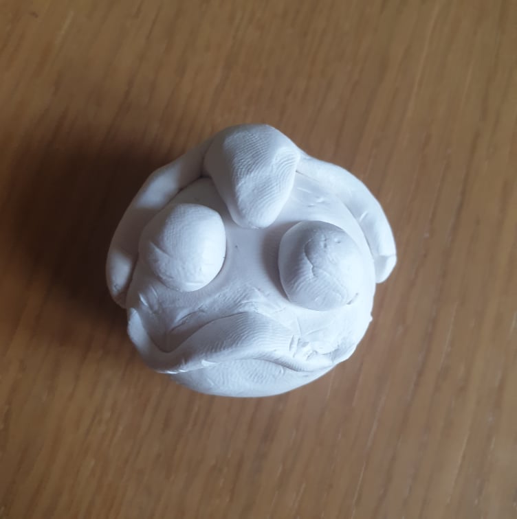
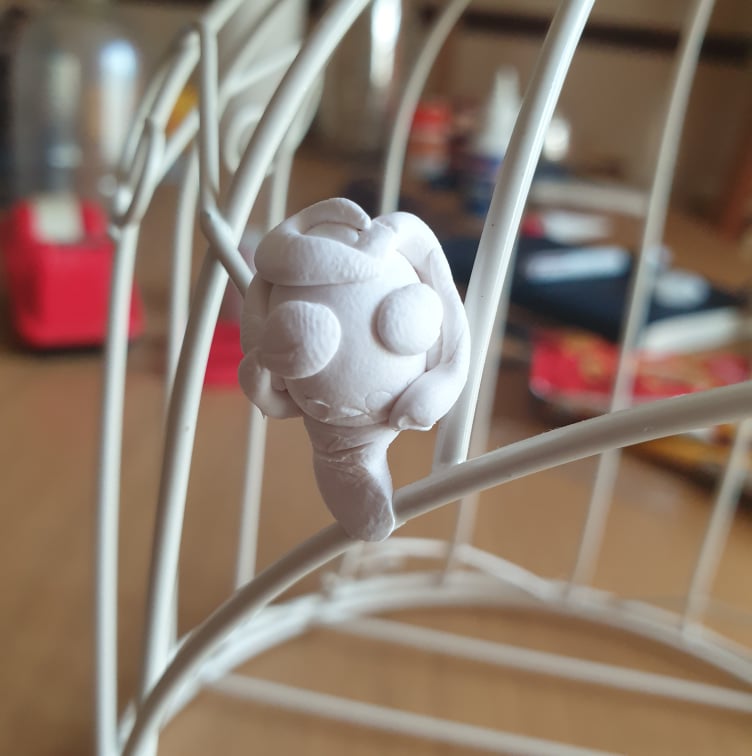
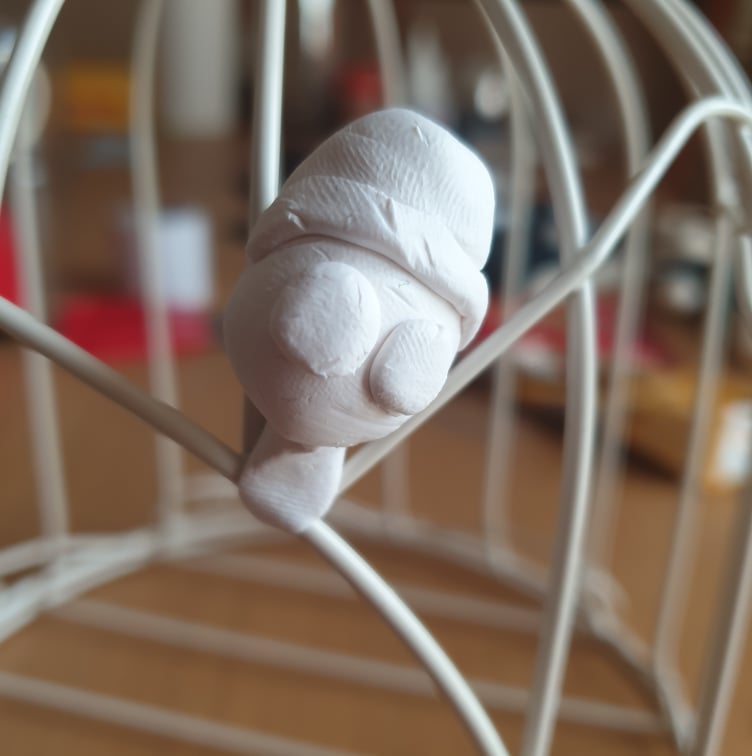
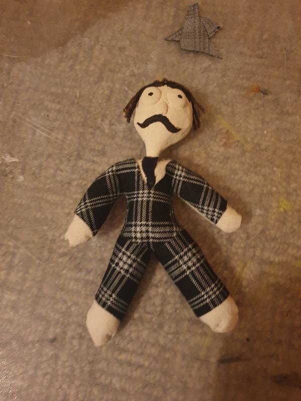
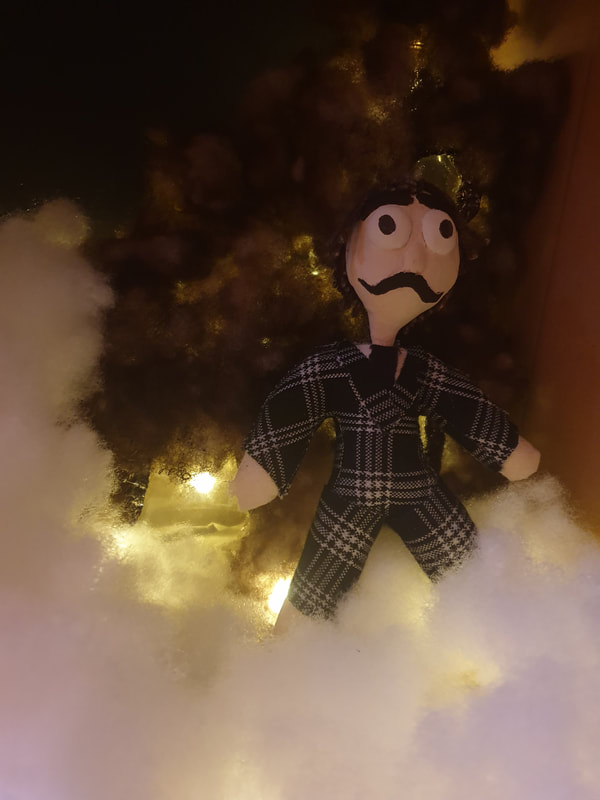
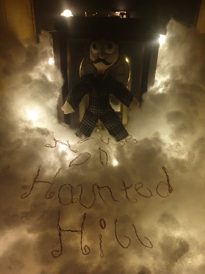
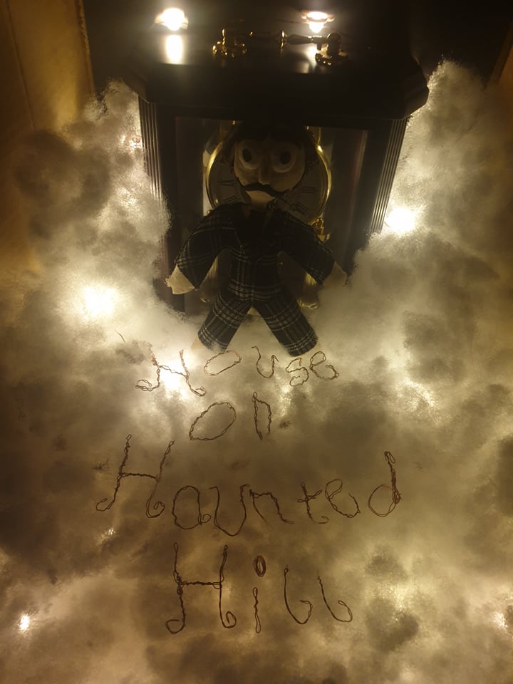
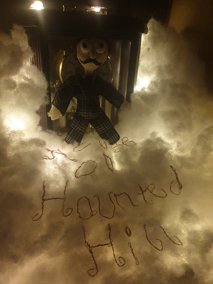
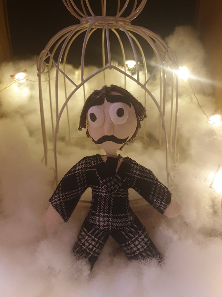
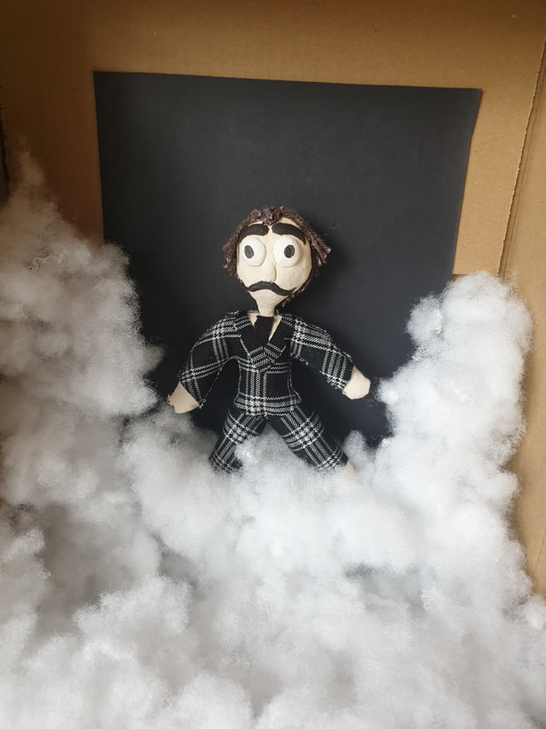
My Idea was to try and create a small doll version of Frederick Loren but I may have baked him for a bit longer than needed. My Overall Idea is to place him as the main focus of the poster or have the most relevance such as the original ones did. The suit I mad him out of some unused clothes kind of resemble a dress, I actually like the way he turned out but for the final I will most likely give him some pants... On the other hand I tried to make sure the he had a Tim Burton style with the tiny pupils and long face.


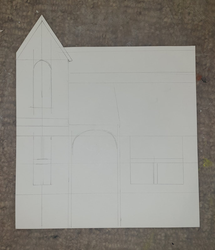
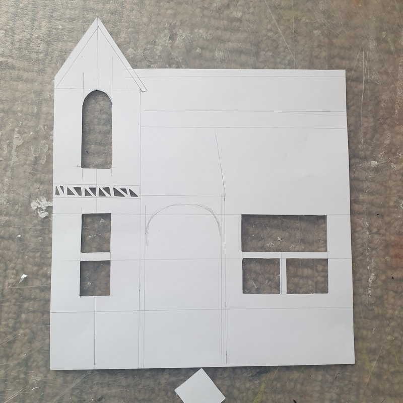
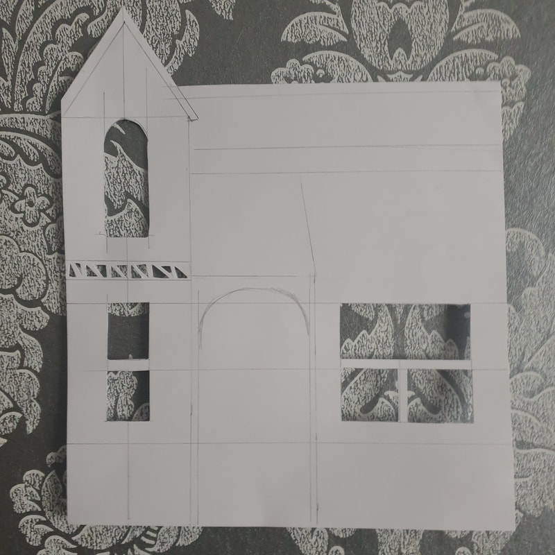
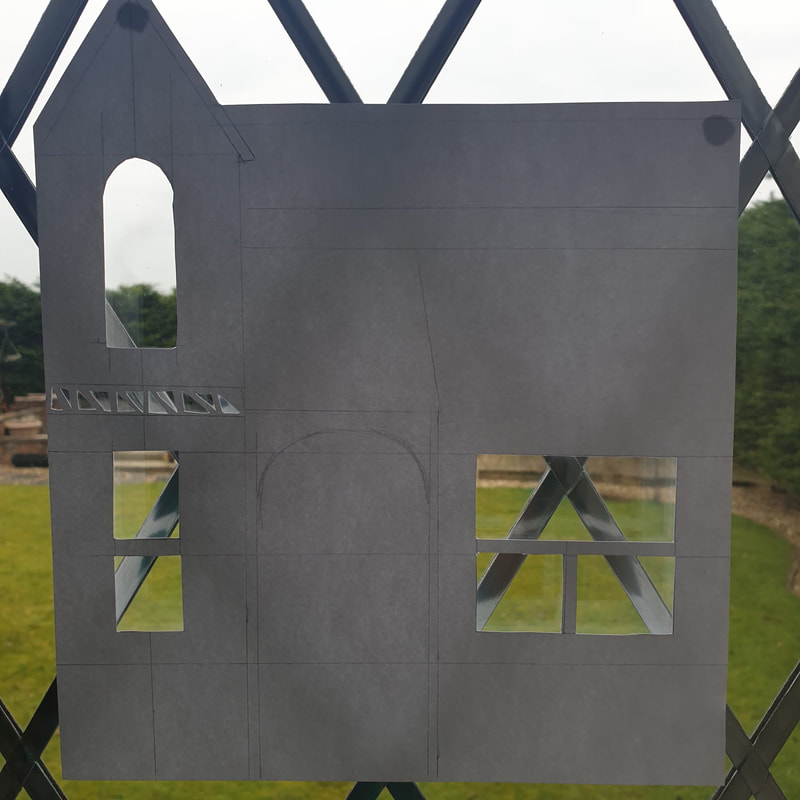
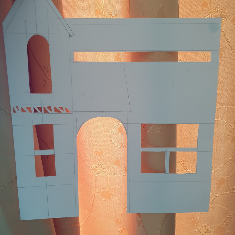
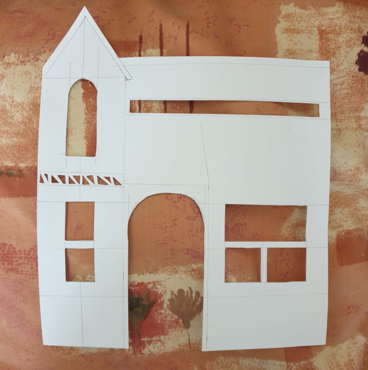
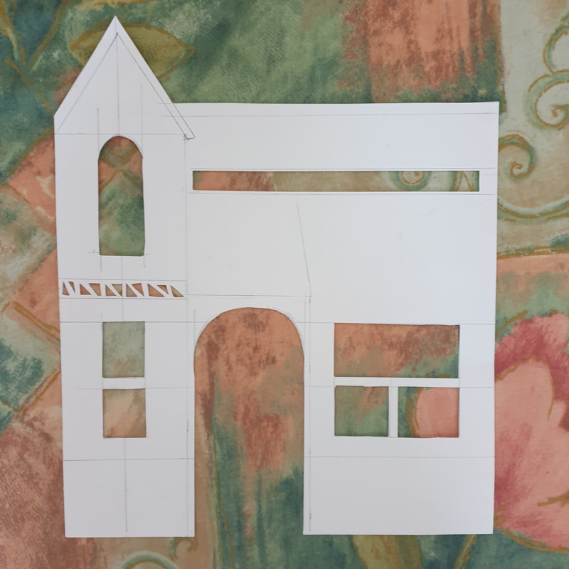
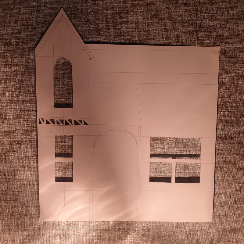
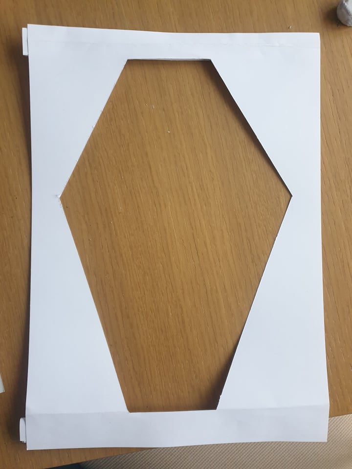
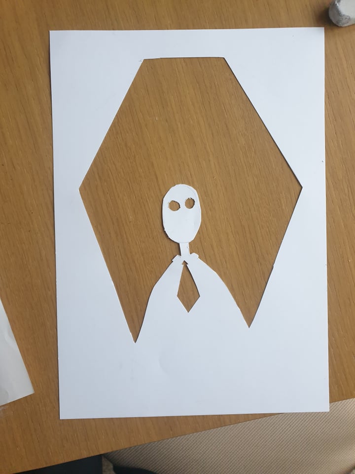
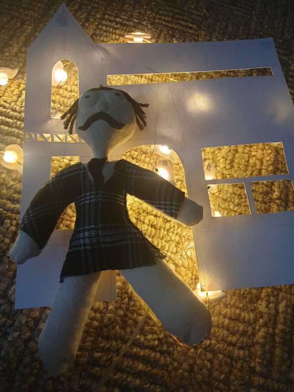
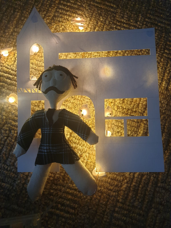
Paper House
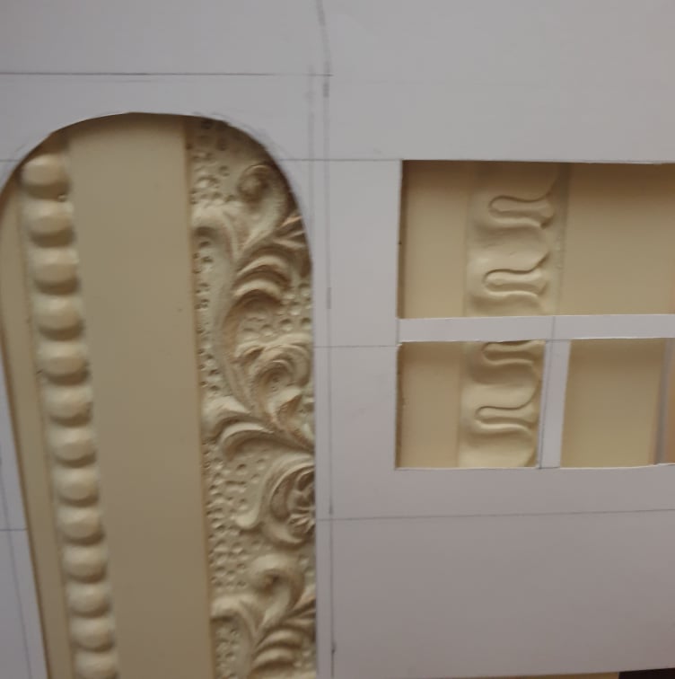
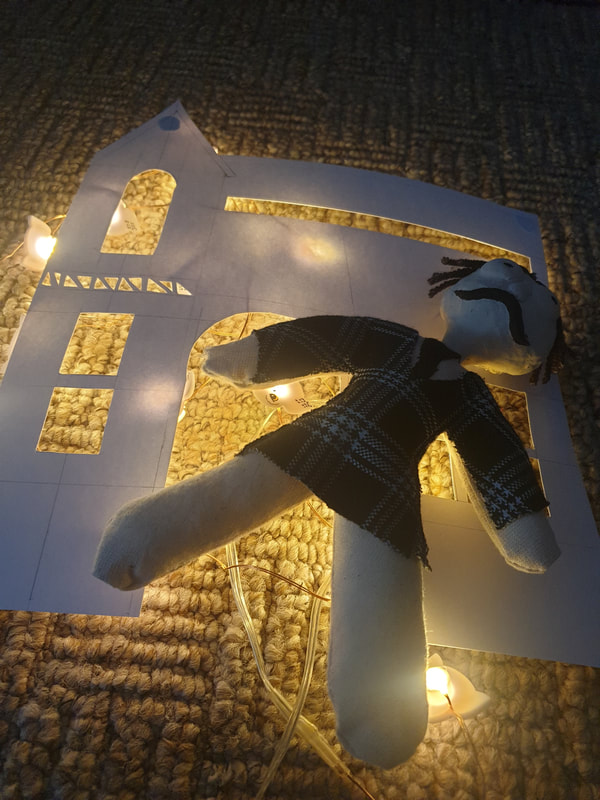
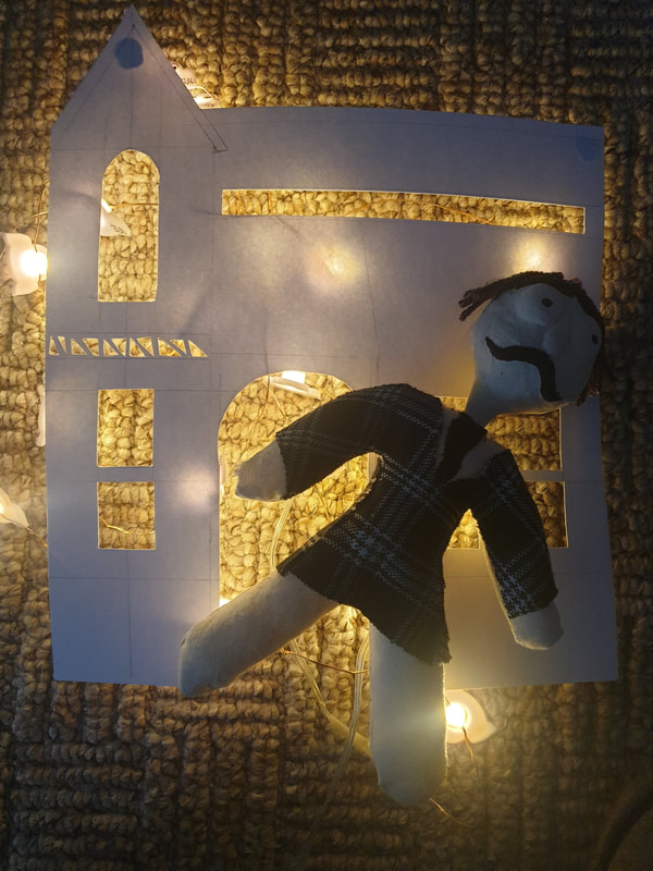
When I began working with the Victorian House style I was a bit lost on how I would this, I cut out the windows and door and experimented with different backdrops I could use. I like the curtain one most as some areas are dark but there is also some sunshine coming through.
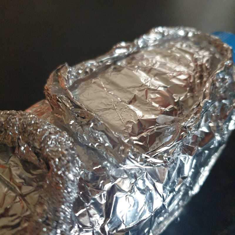
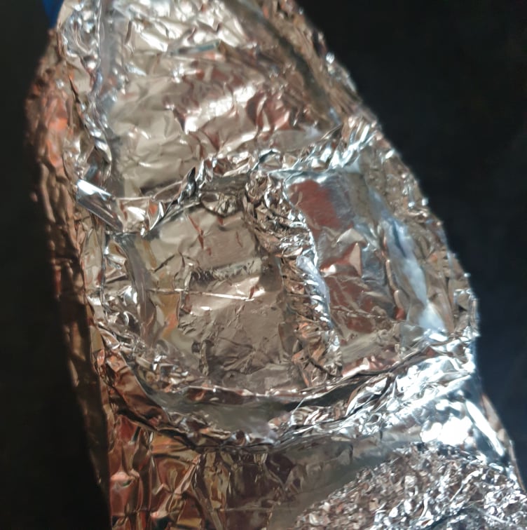
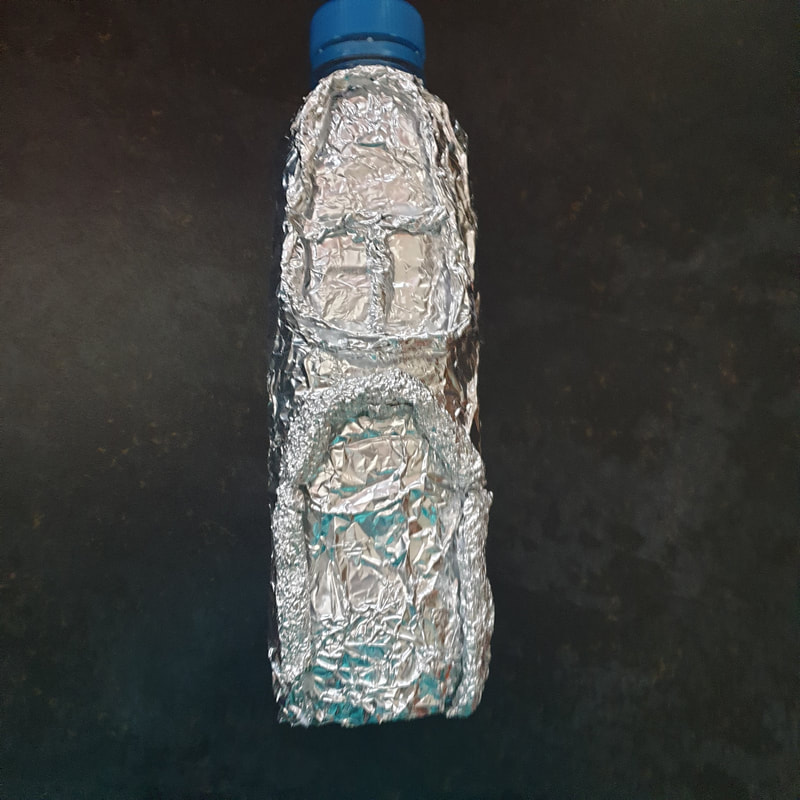
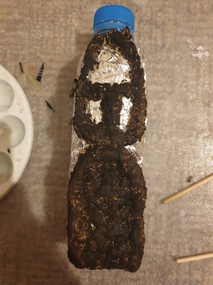
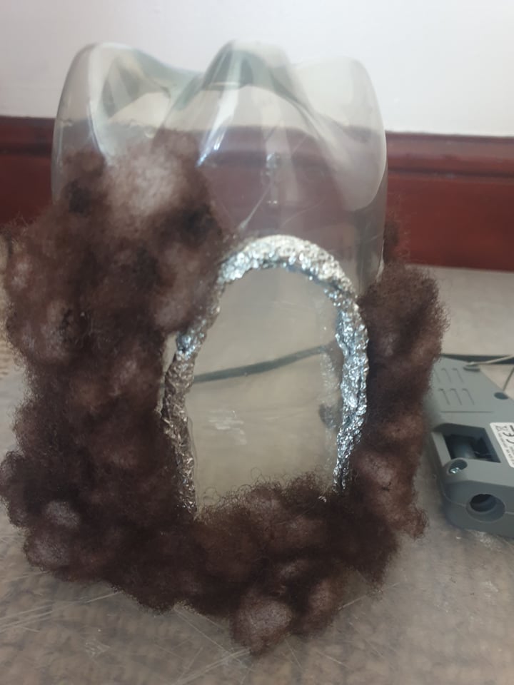
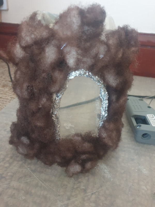
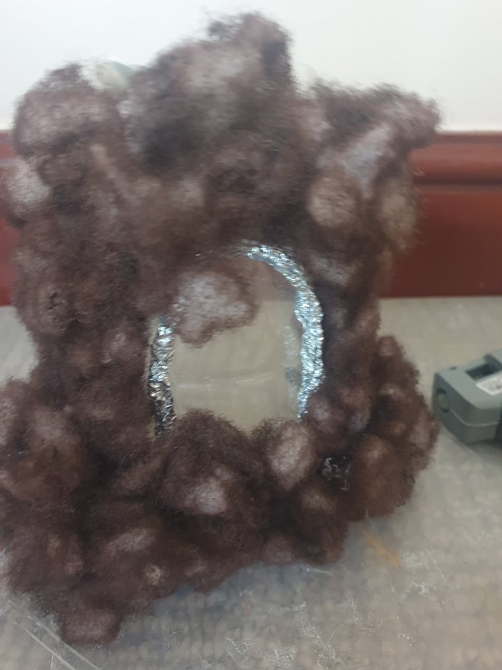
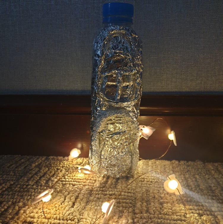
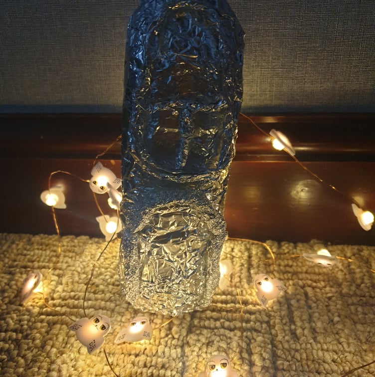
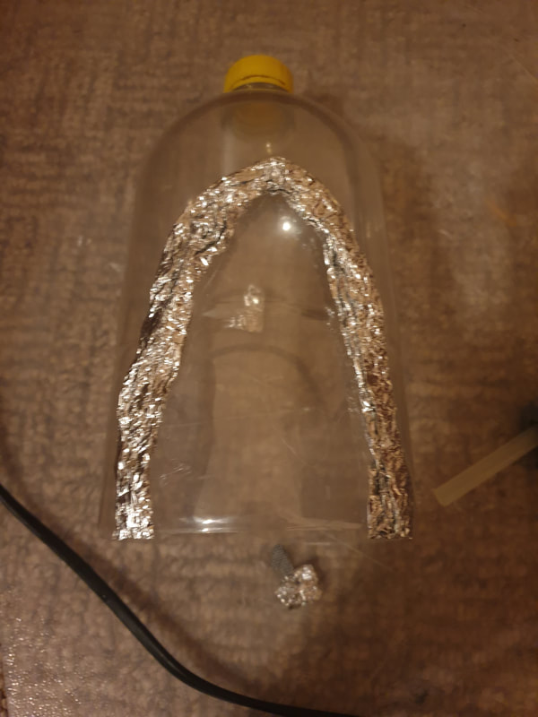
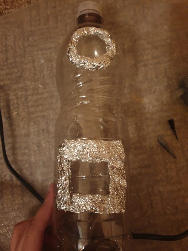
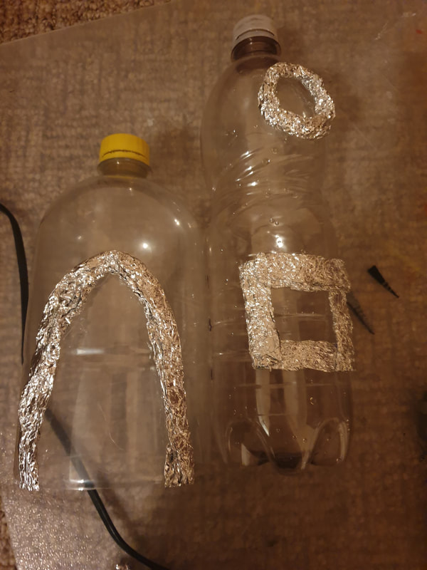
Plastic House
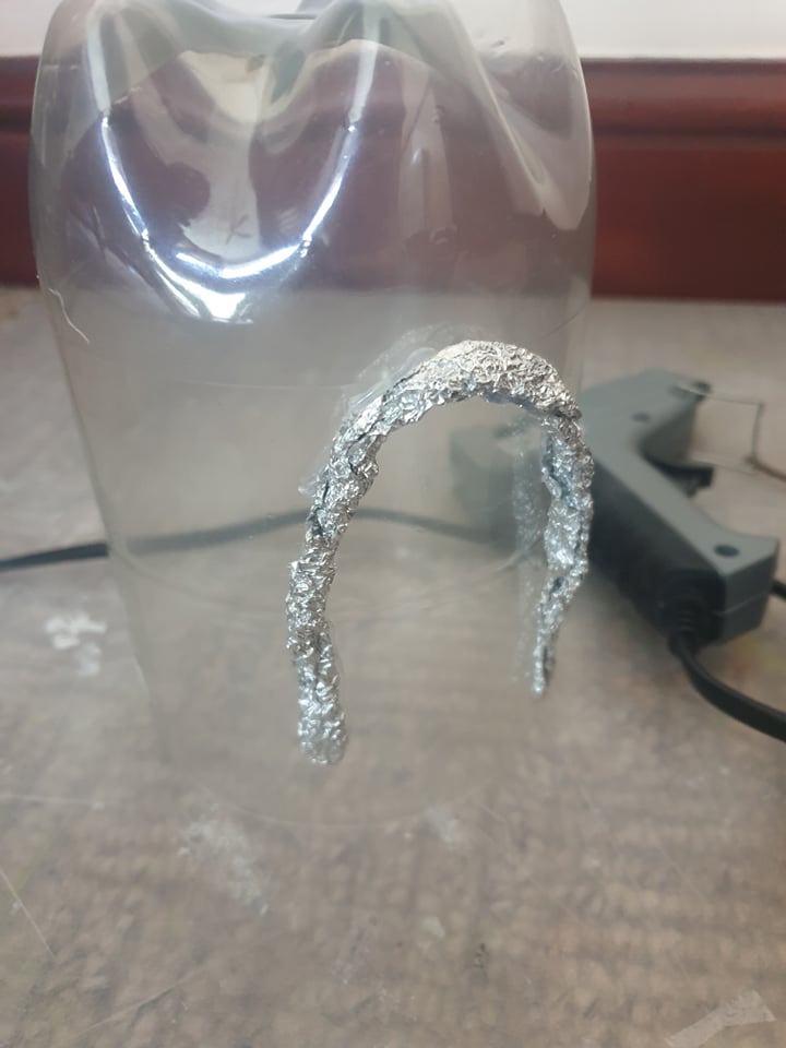
Using a plastic bottle I wrapped aluminium foil to get the basic structure of a small house, focusing only on the front, I am unsure how to make this look Victorian but It could play as a small background detail. I feel like adding the brown pain onto the carboard areas made it too dark.


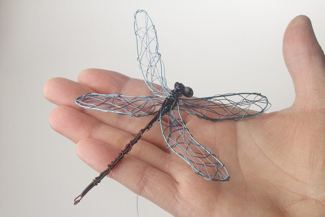
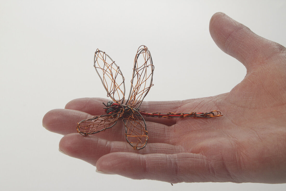
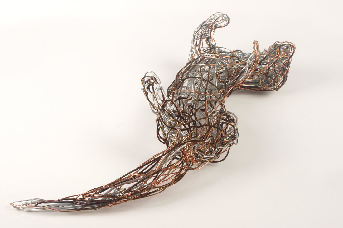
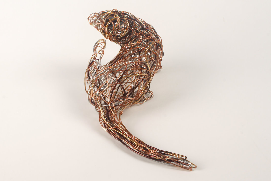
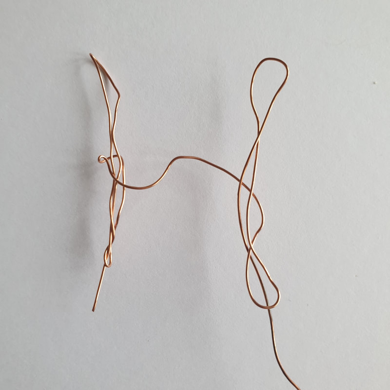
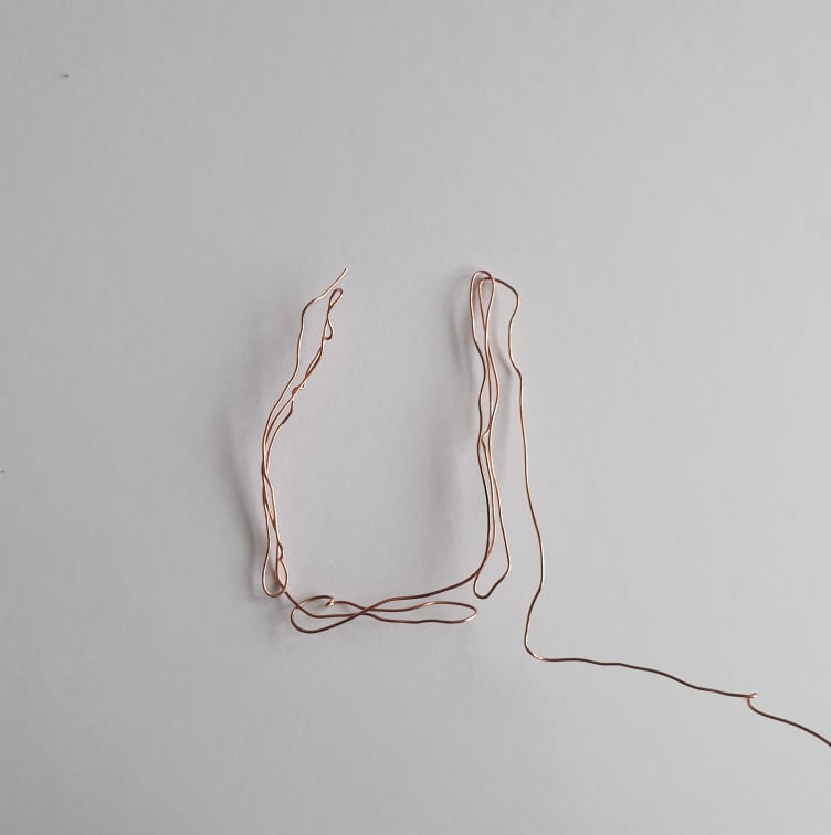
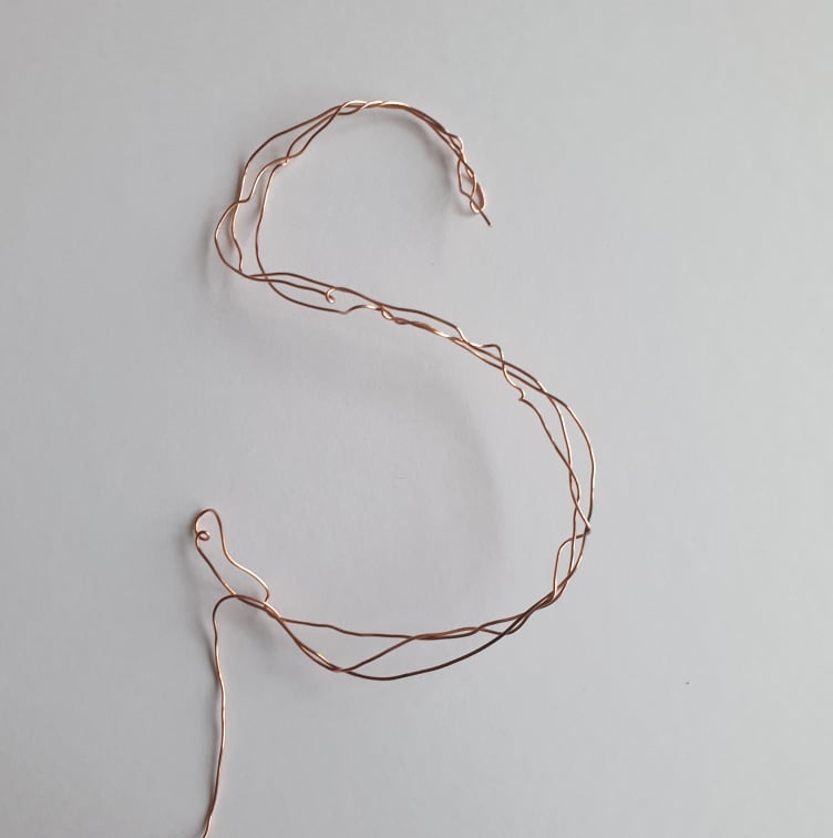
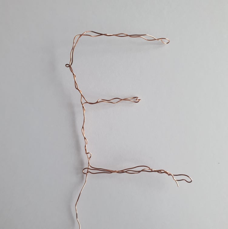
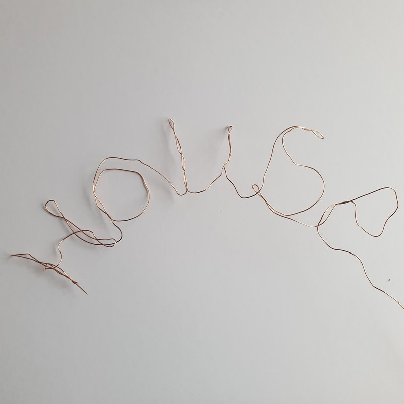
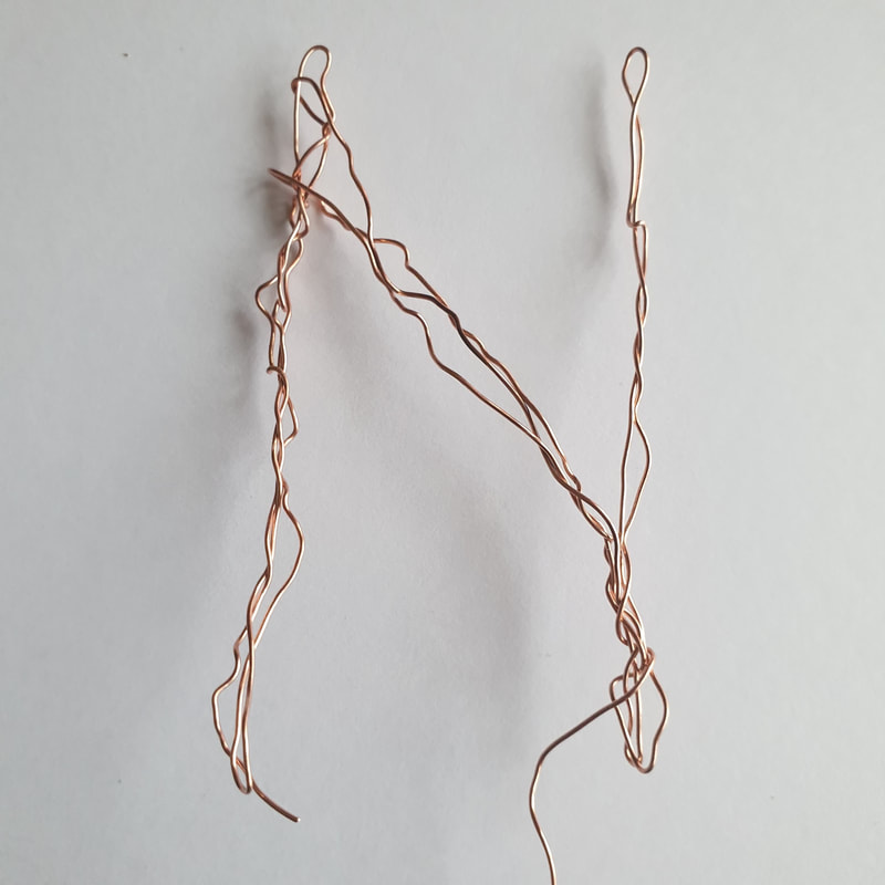
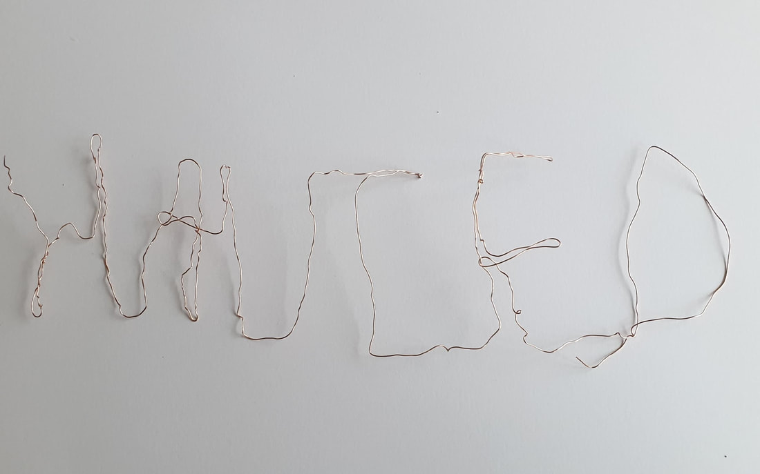
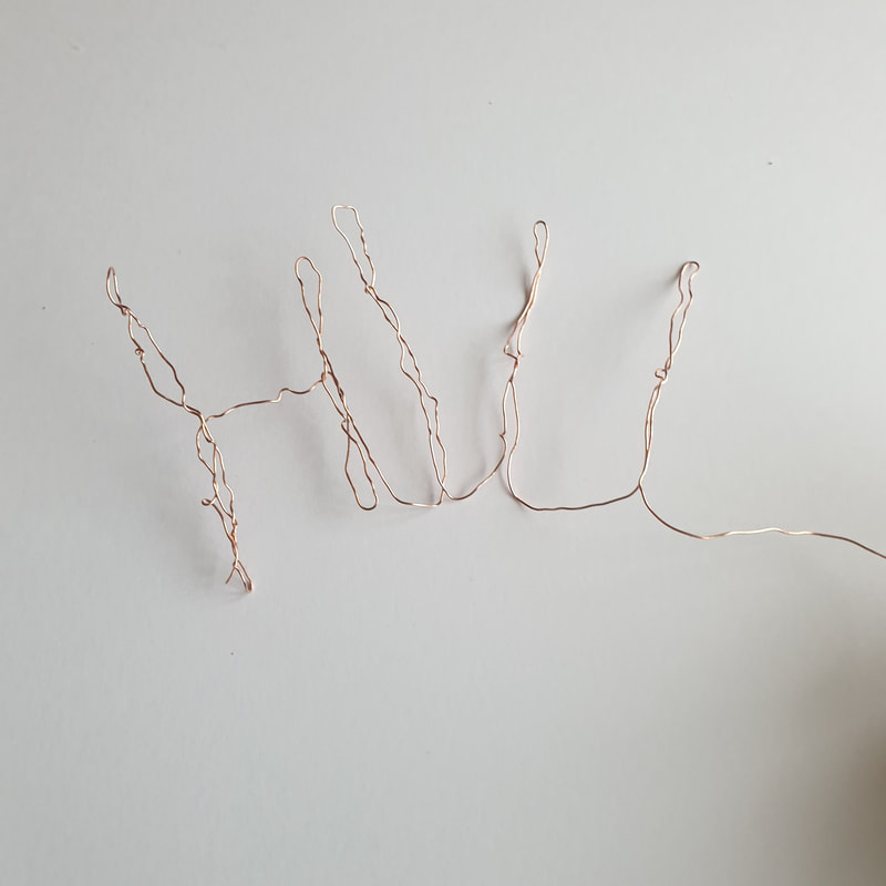
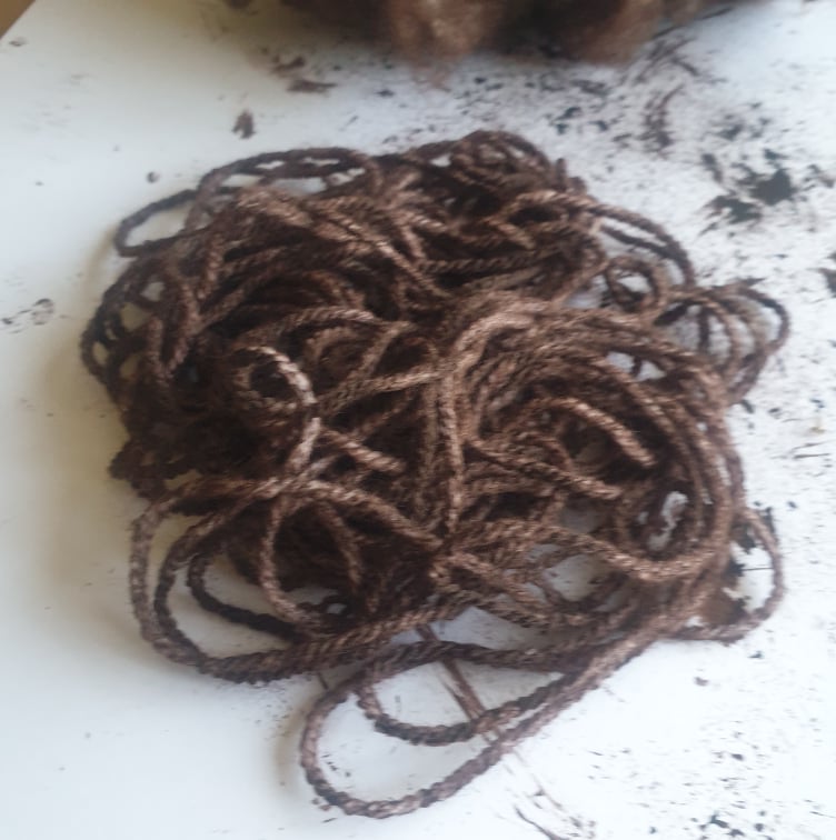
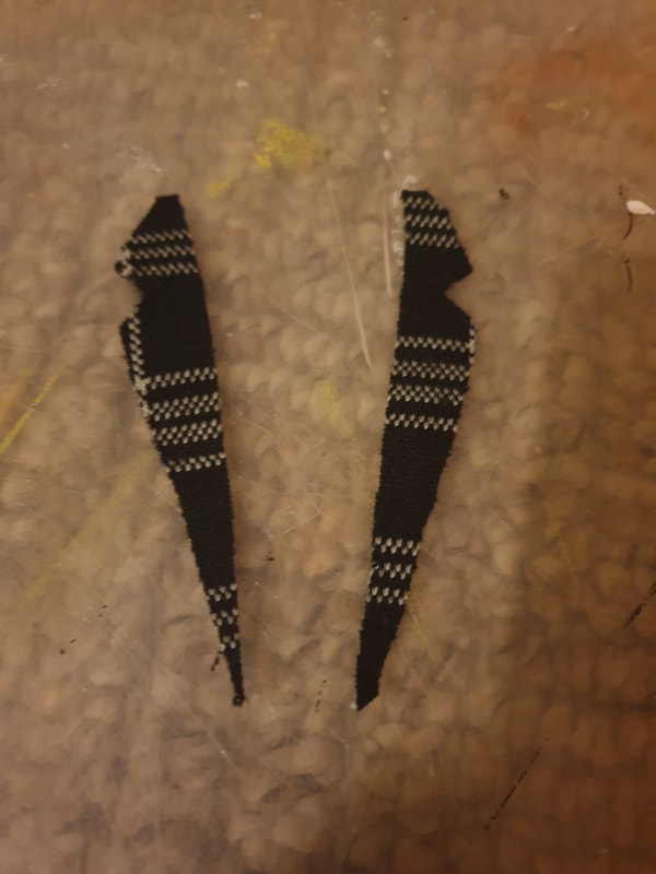
Wire Type
I haven't experimented much with the title but with the wire I like how flexible it can be as well as sharp and not so neat, I prefer the letters to be individual rather than connected and will be experimenting more ways to use type into my work. I feel wire would be the best option for a horror theme.
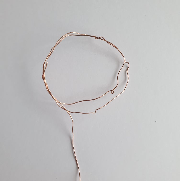

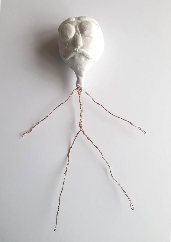
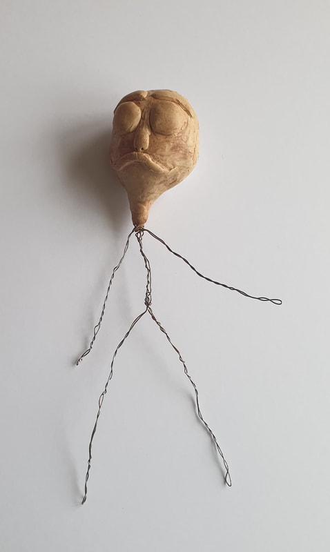
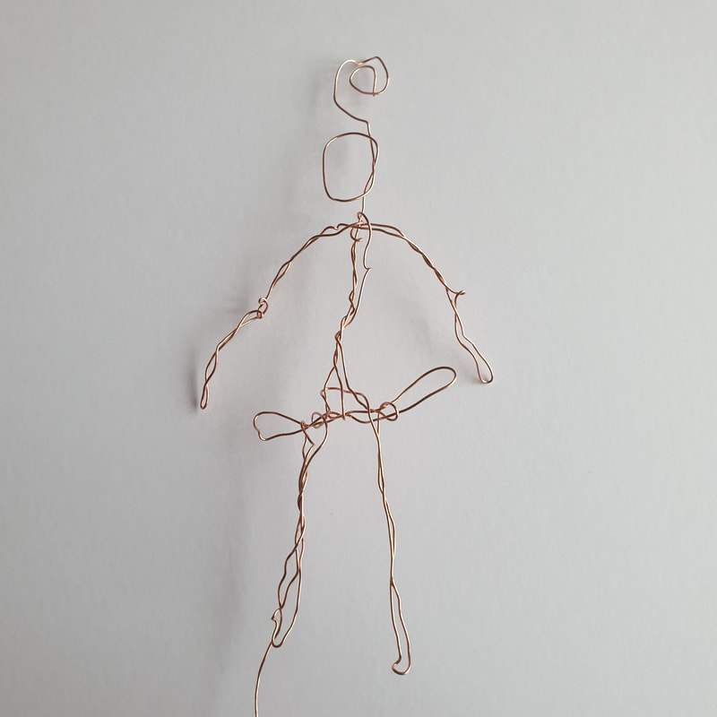
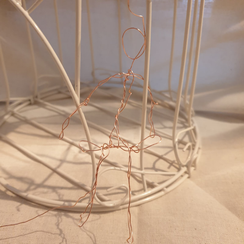
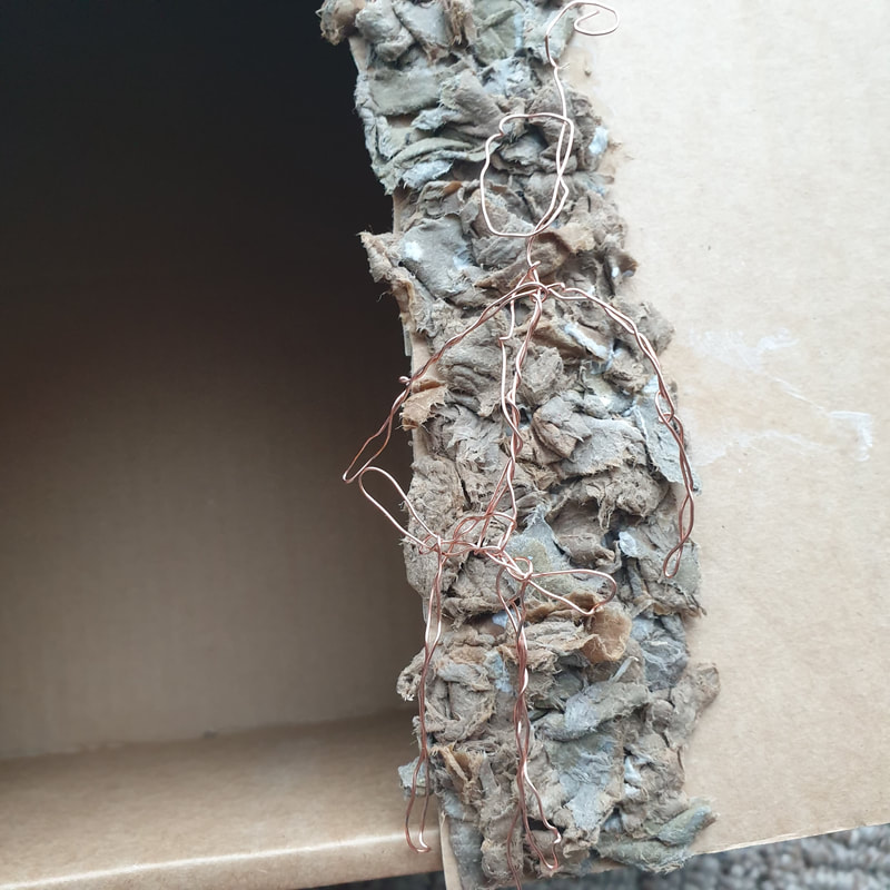
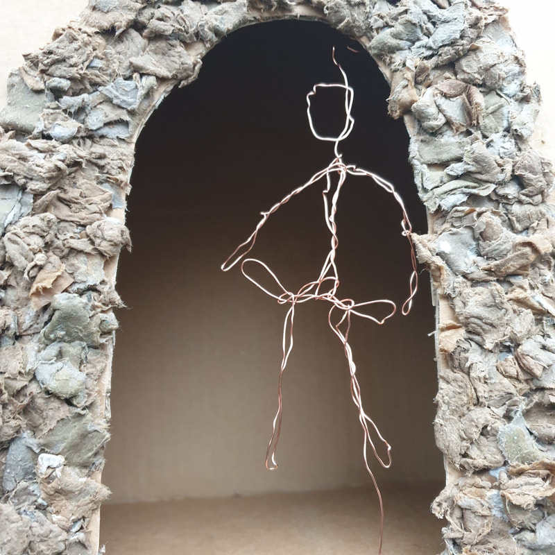
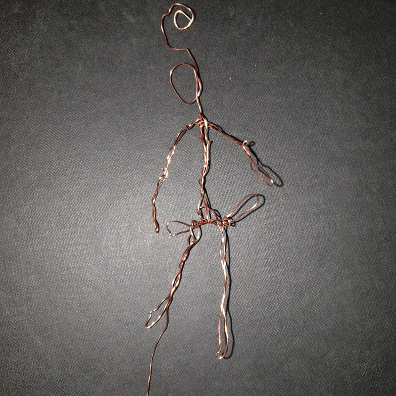
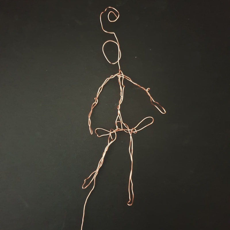
Wire Skeleton
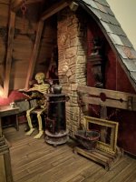
Taking my skeleton idea, I used wire to create a small skeleton although It doesn't really look like one. I believer if I was to use a wire skeleton for my poster I would need to remember to use a dark background so It doesn't get lost.
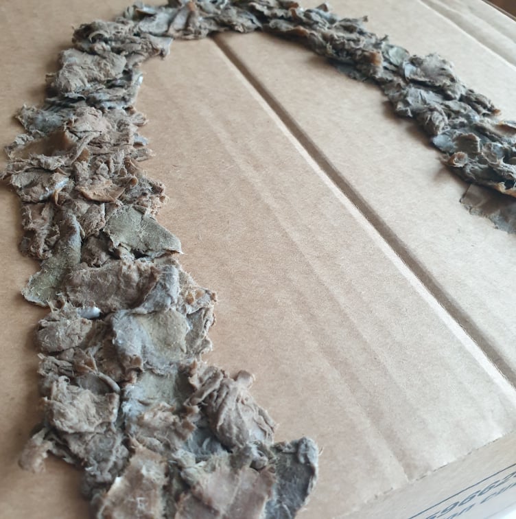
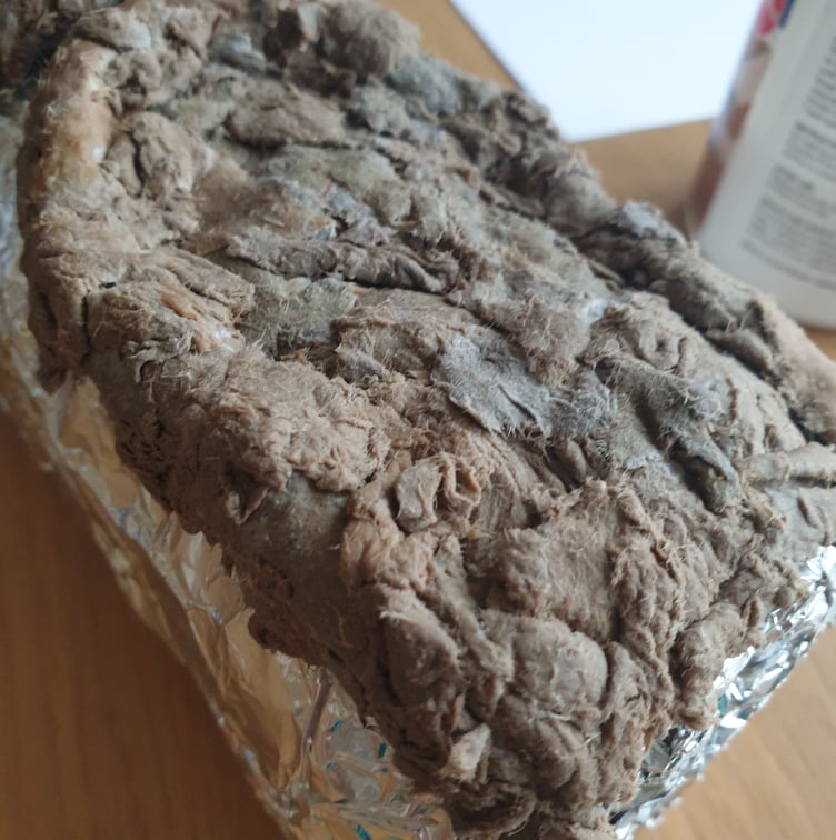
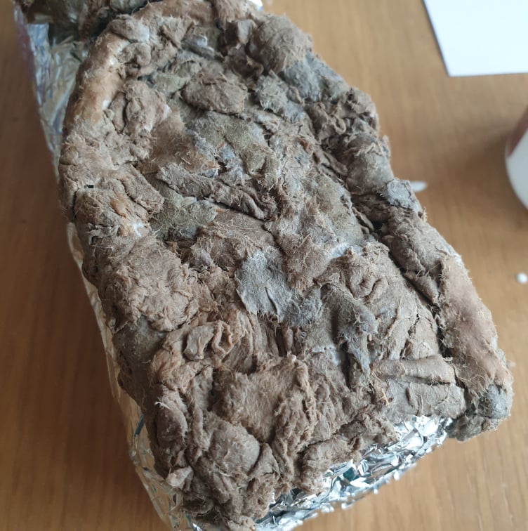
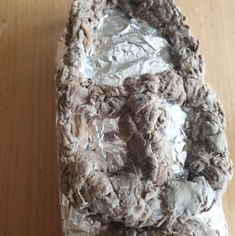
Cardboard
From the video I researched I tried wetting down some cardboard and gluing them onto some more cardboard and the bottle house I made earlier. This was a long and smelly process, not sure If I will continue to work onto this.

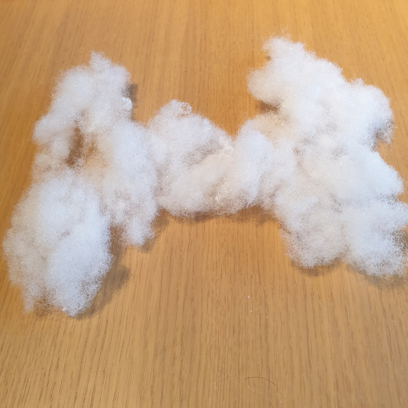
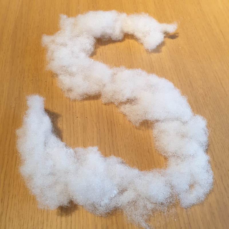
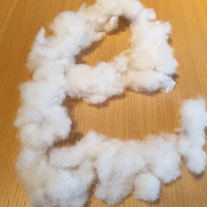
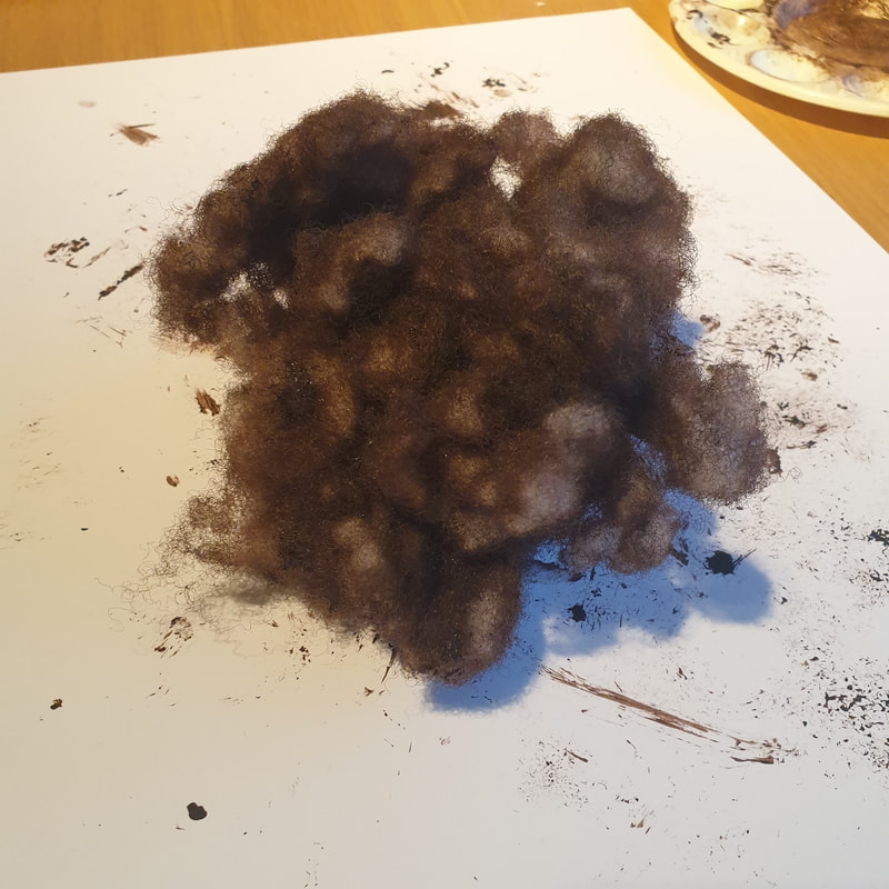
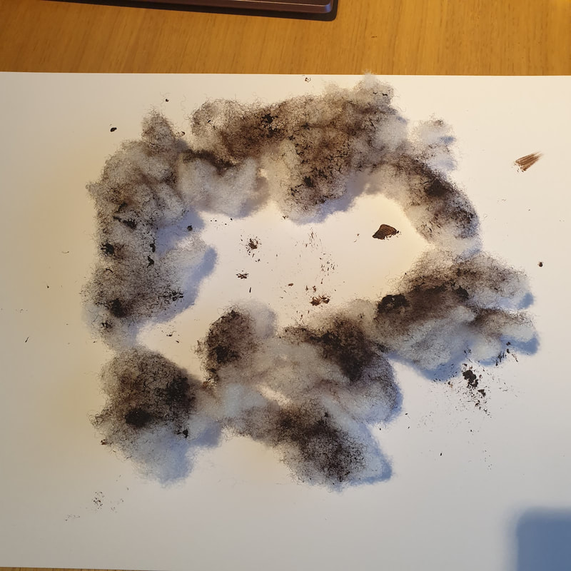
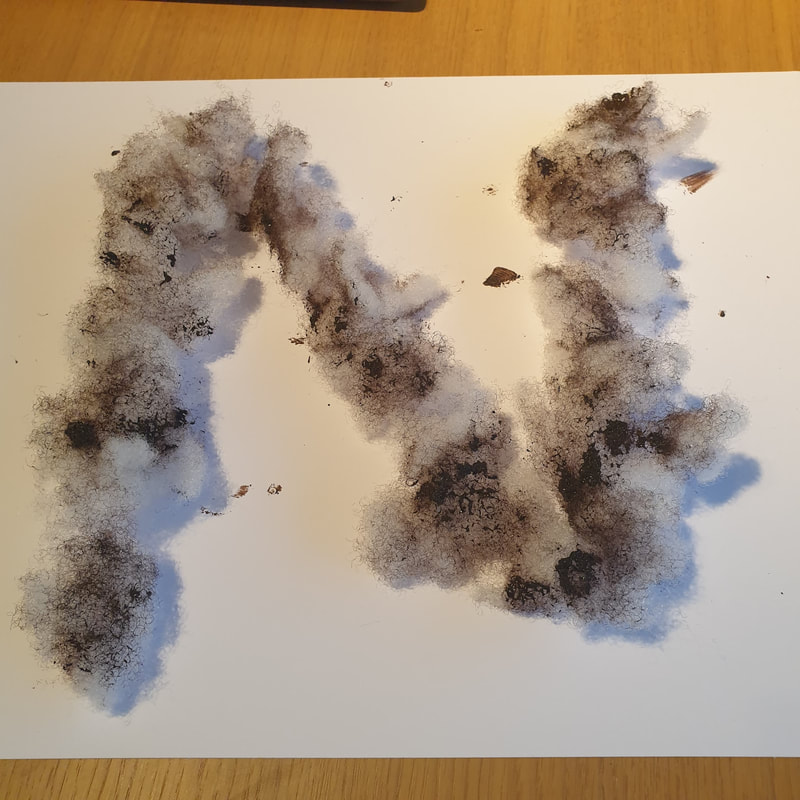
Stuffing Type
Trying out more type materials I went with some stuffing which I later on dyed brown, I think these letters are pretty large to be able to fit the poster but it did give me the idea to use it for anything I may want to appear as hazy.
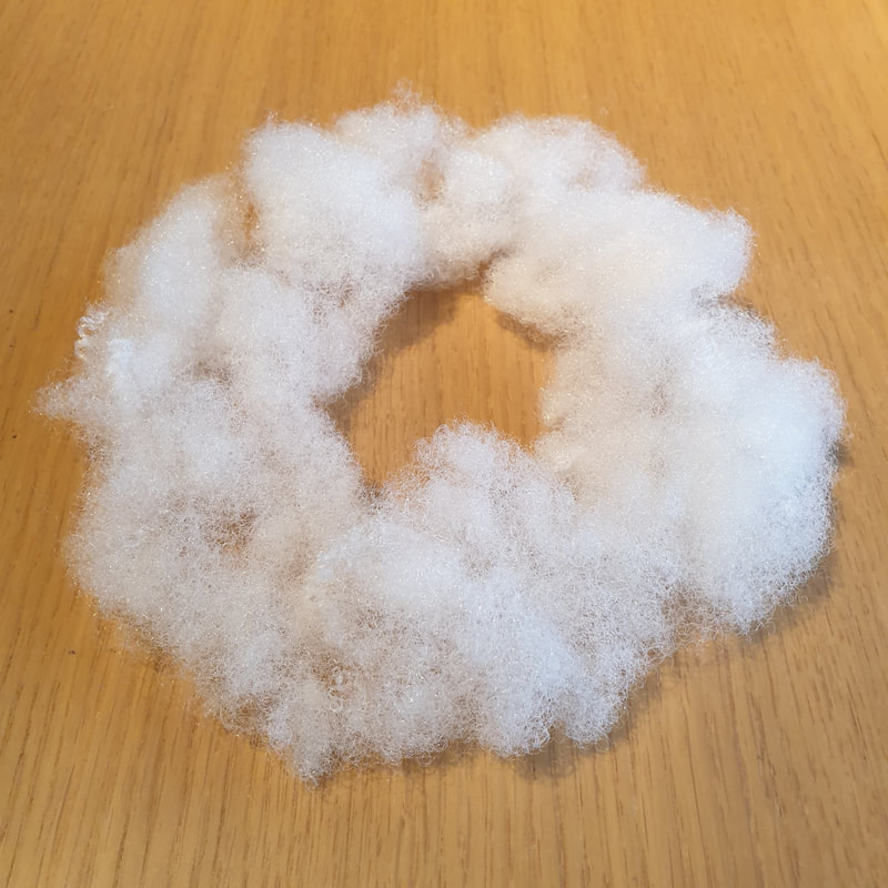
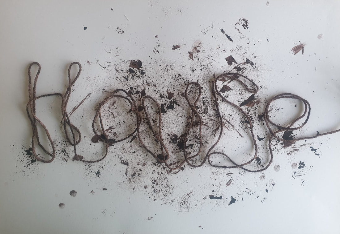
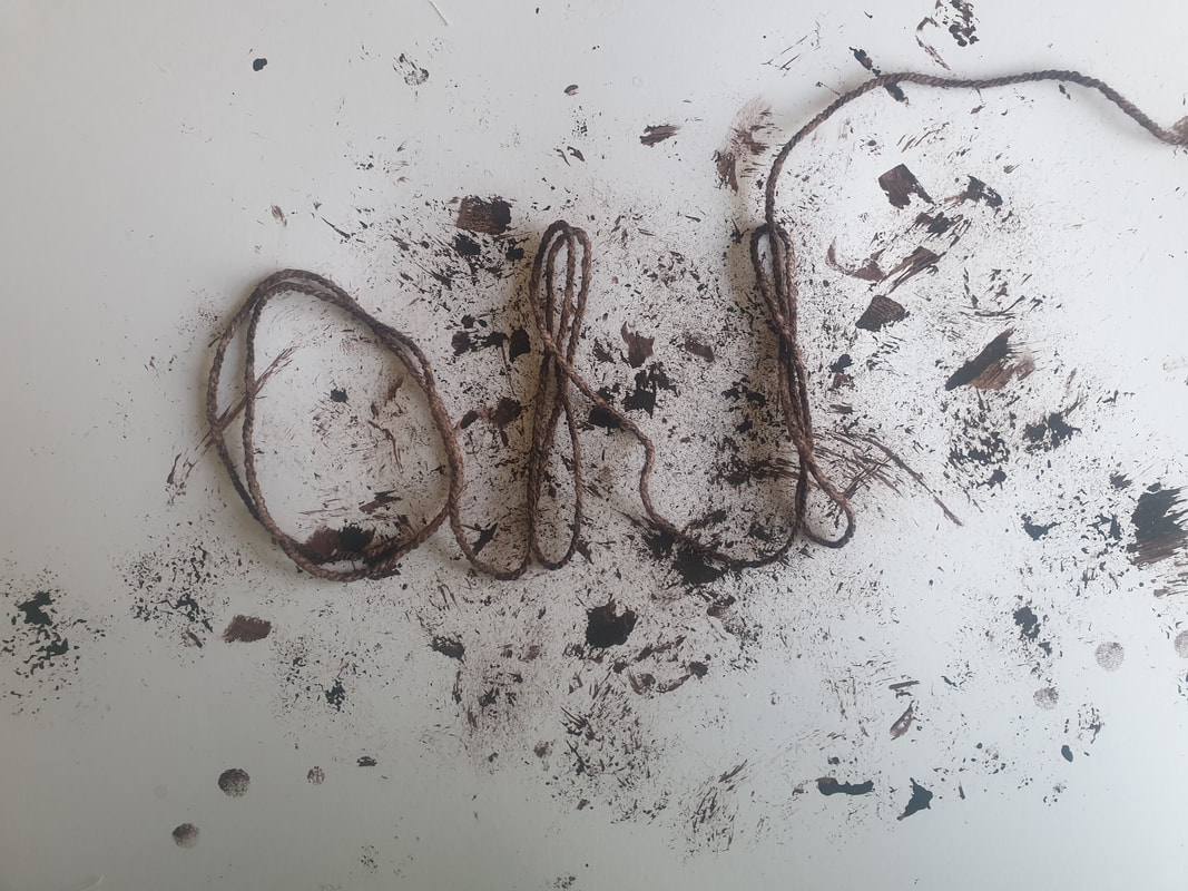
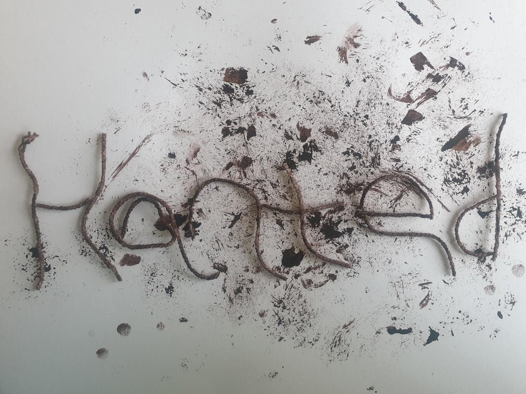
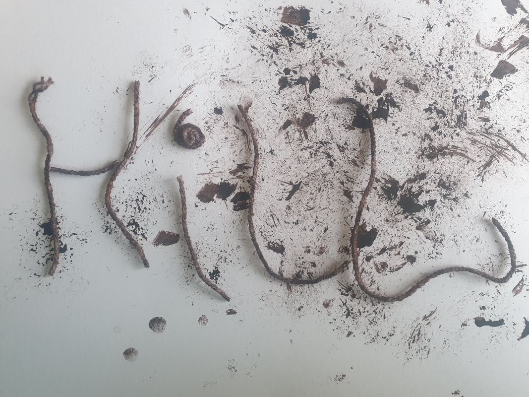
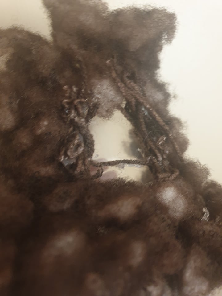
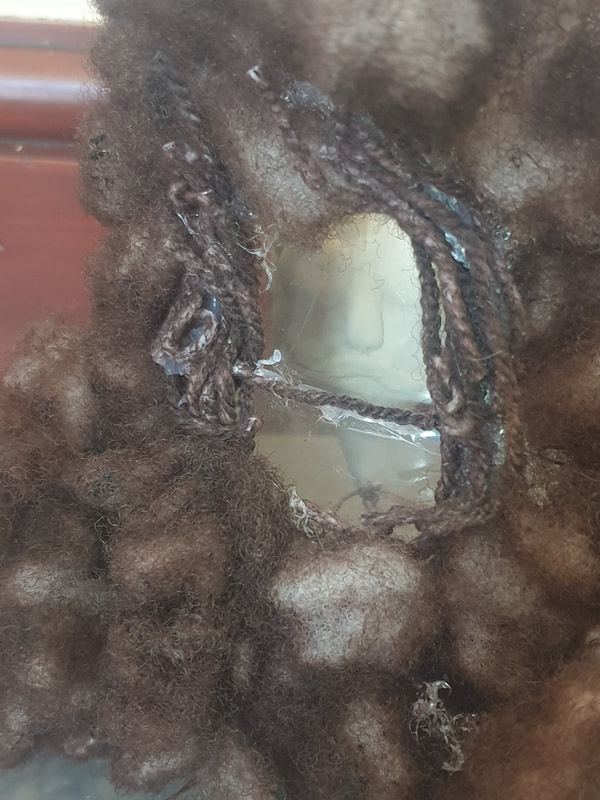
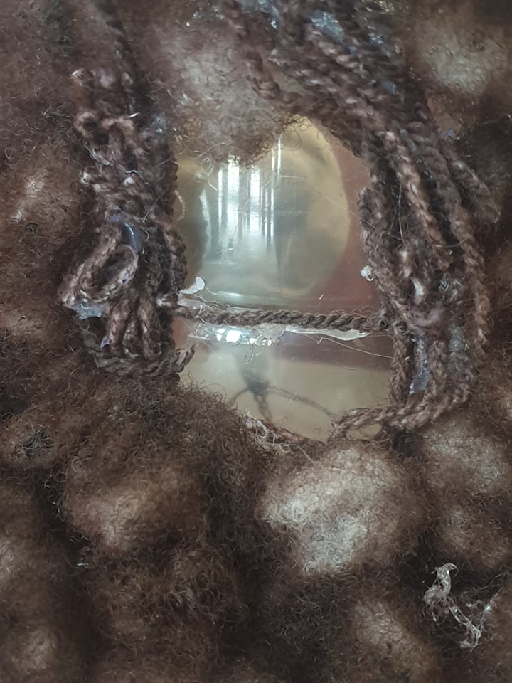
Yarn Type
I quite like how messy this turned out but I think I need to research more into what my background should look and how I will place my text before I move on.
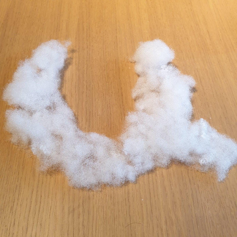
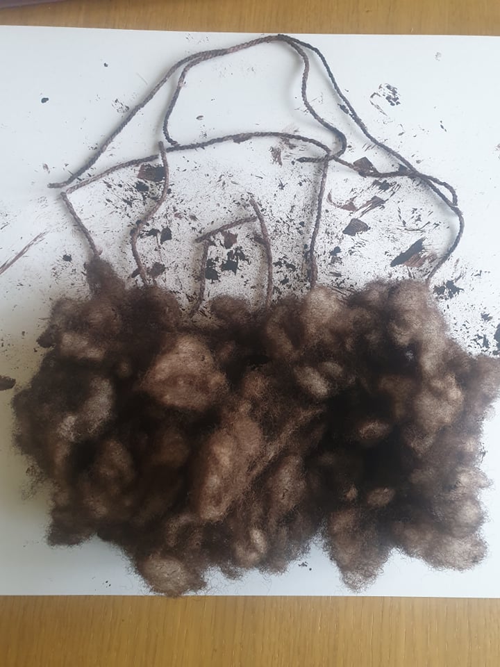
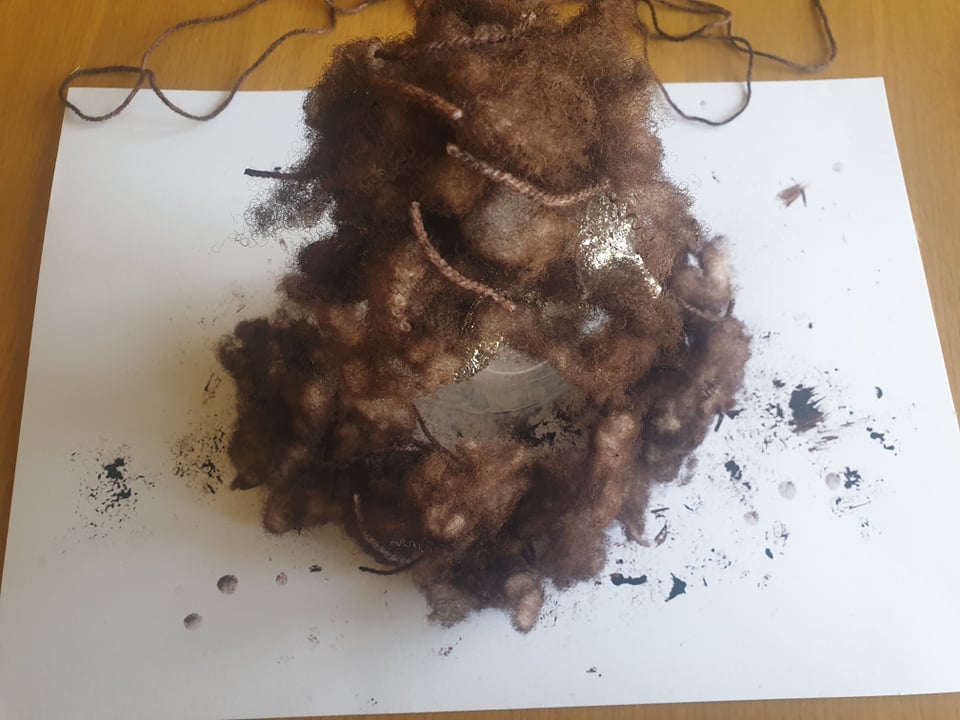
Yarn & Stuffing
At first I wasn't sure what to do with these materials until I started to slice a bottle in half and randomly place things onto it, I actually really like this and it does have a horror vibe to it being dark and murky.


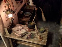
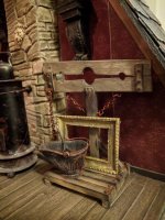
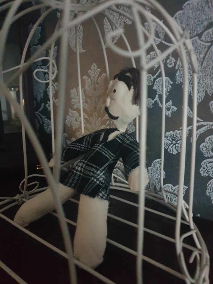
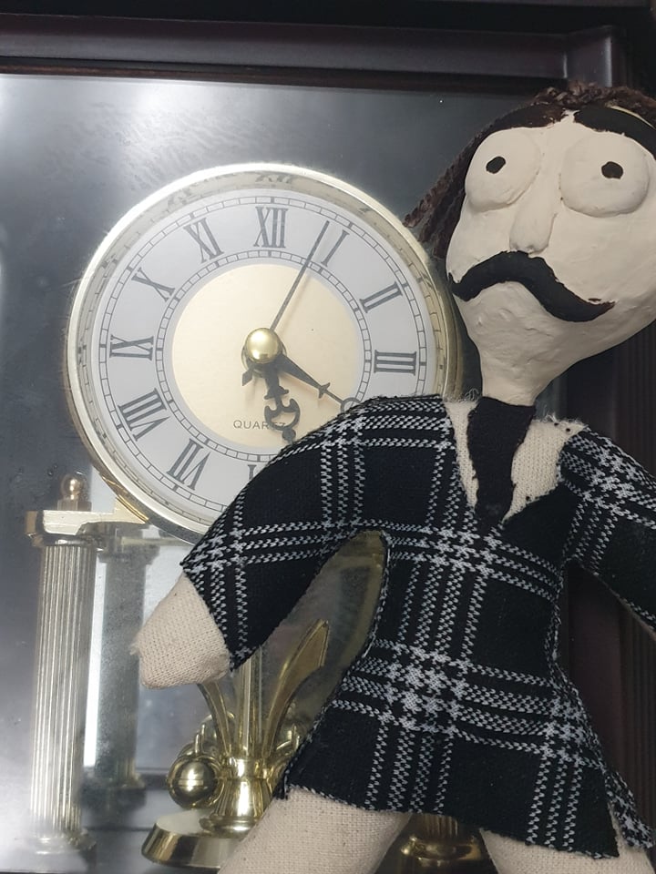
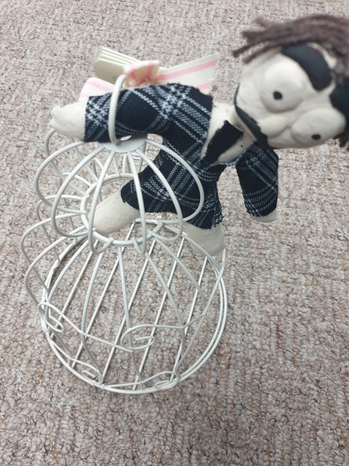
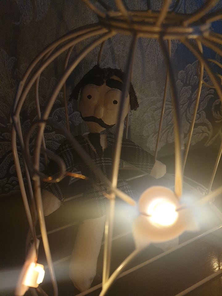
Found Objects
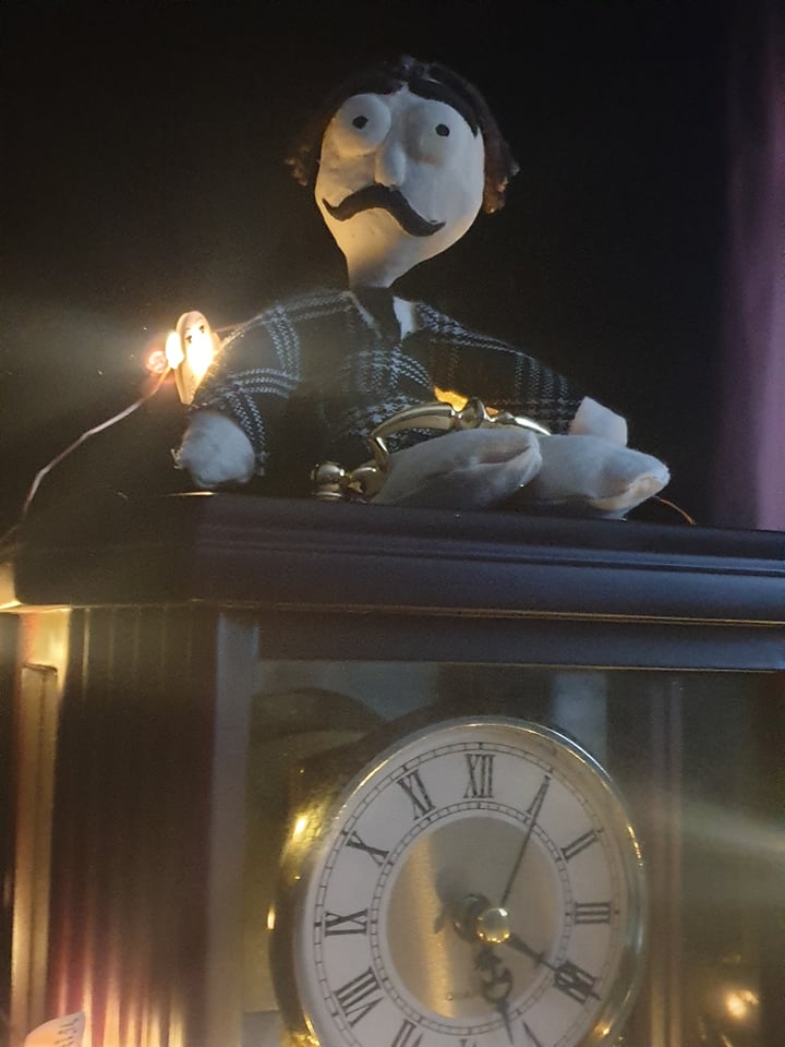
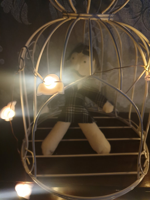
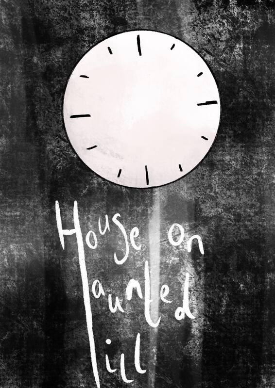
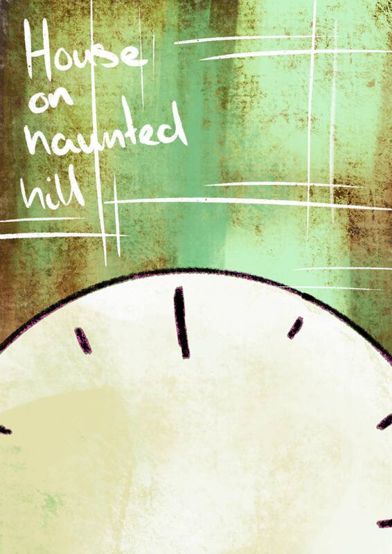
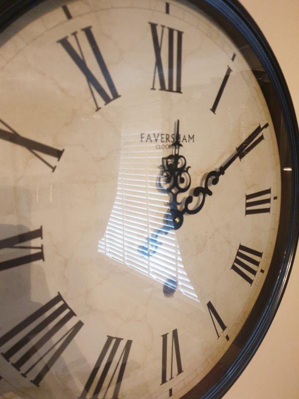
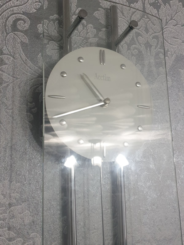
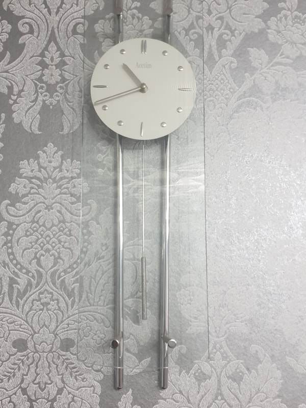
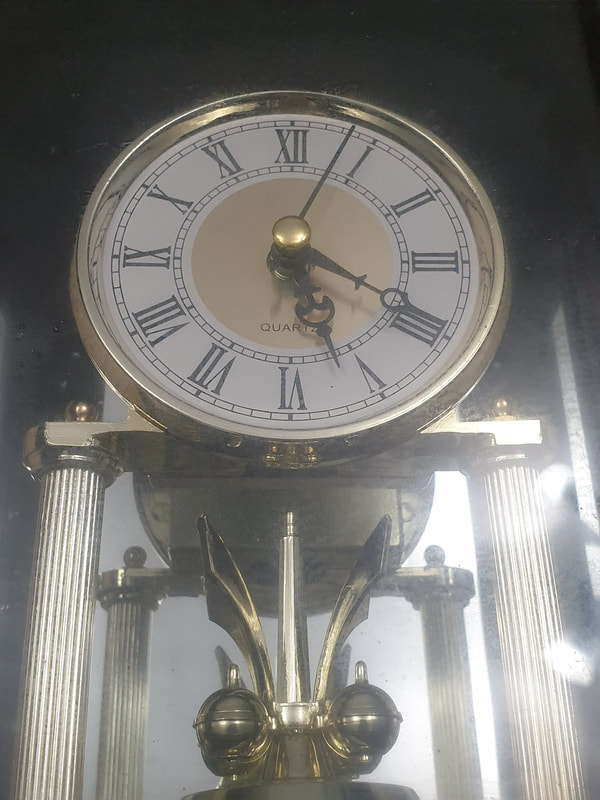
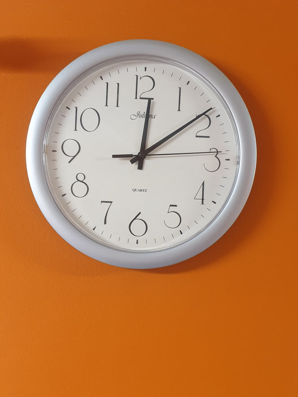
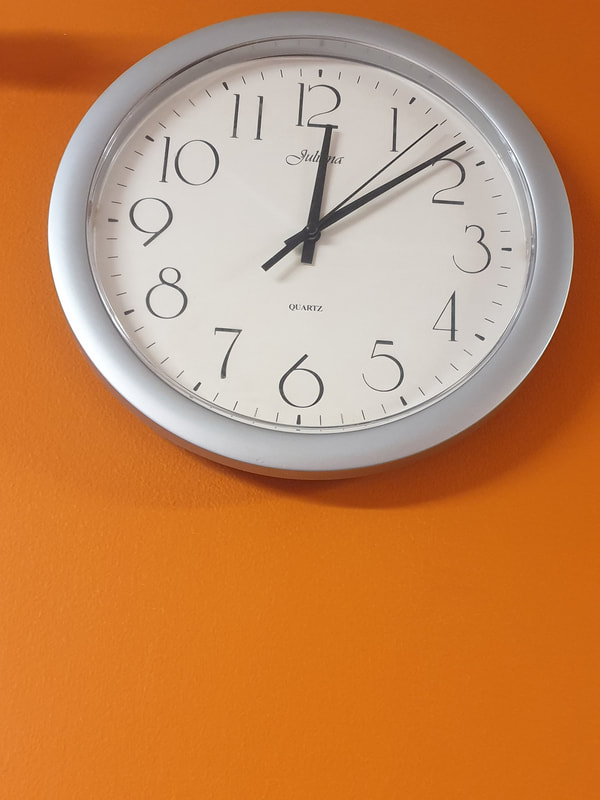
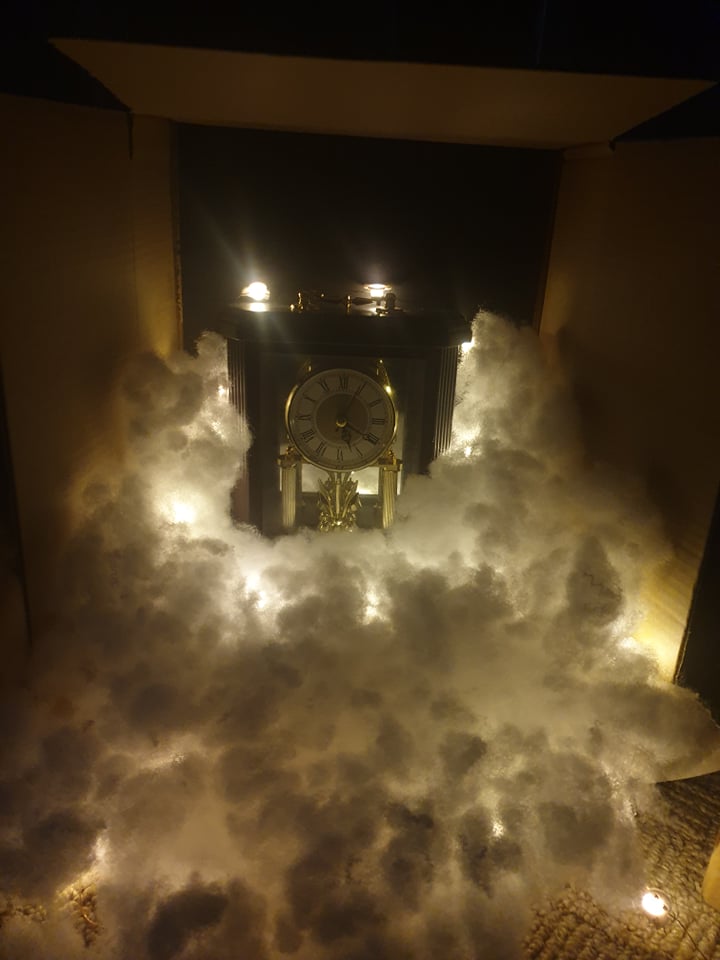
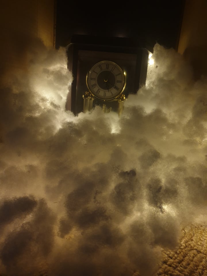
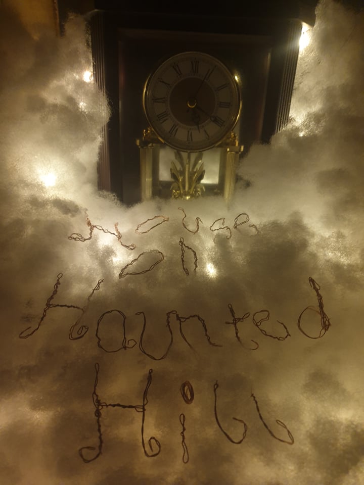
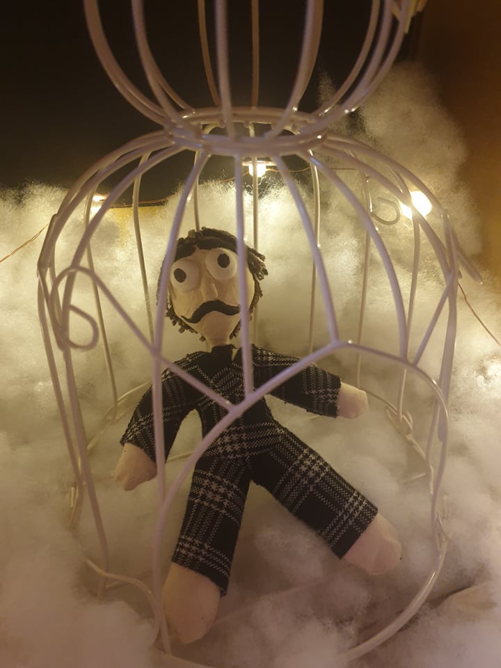
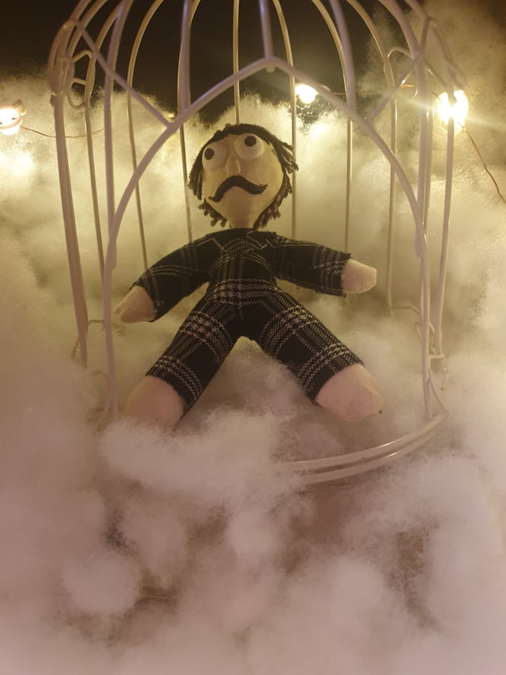
From my thumbnails and the film the two things I found was a clock and...a cage? the clock reminded me of when the main character was talking about the rules and how they had until midnight to decide if they wanted to truly stay (although they had no choice later on). The cage however reminded me more of the wife where her "ghost" was pulling rope to the feet of another character, not sure if I will continue to use the cage.


Lighting
Now my film was pretty much neutral in lighting were some areas where dark and others bright, however I do like the idea of having the windows being lit up. I feel like with the horror theme the lighting really makes up most of it and creates an overall dramatic mood.


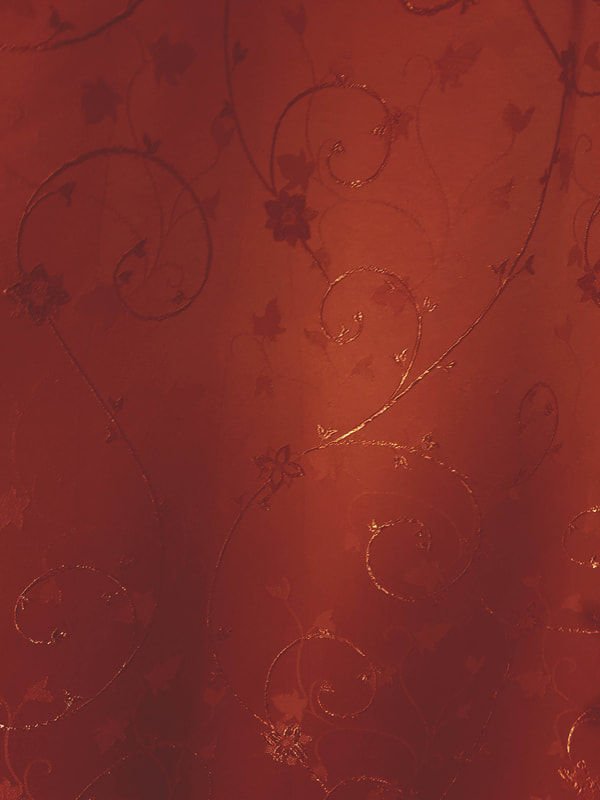
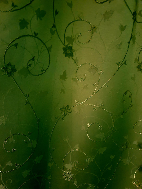
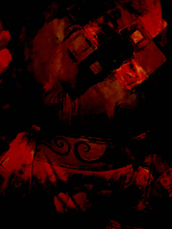
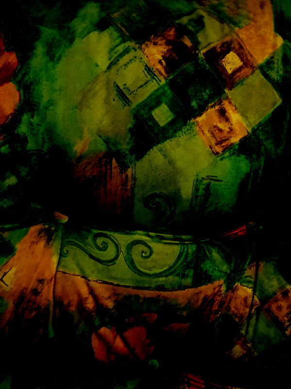
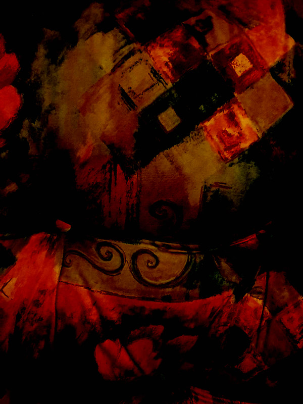
Colour & Background
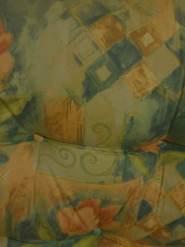
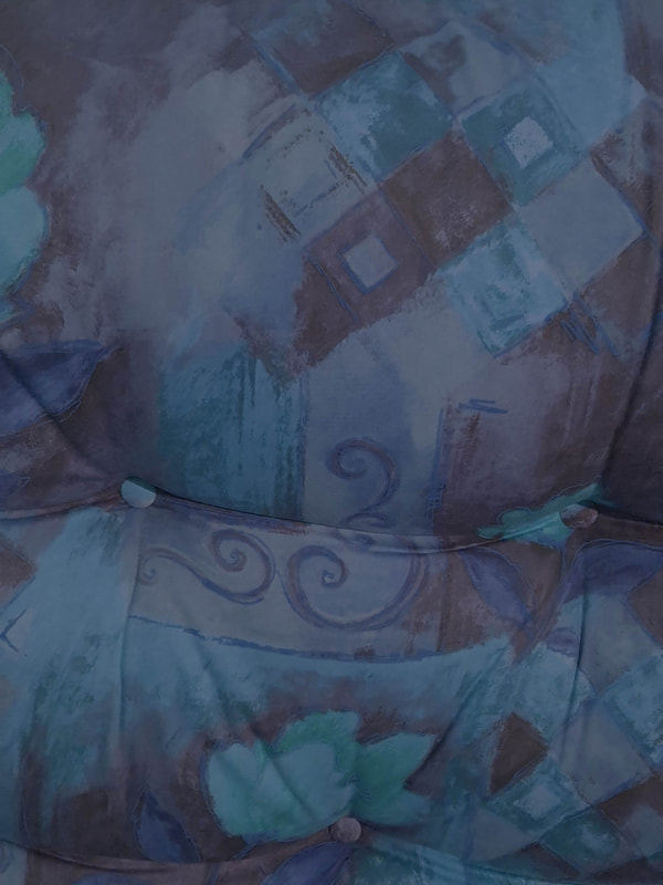
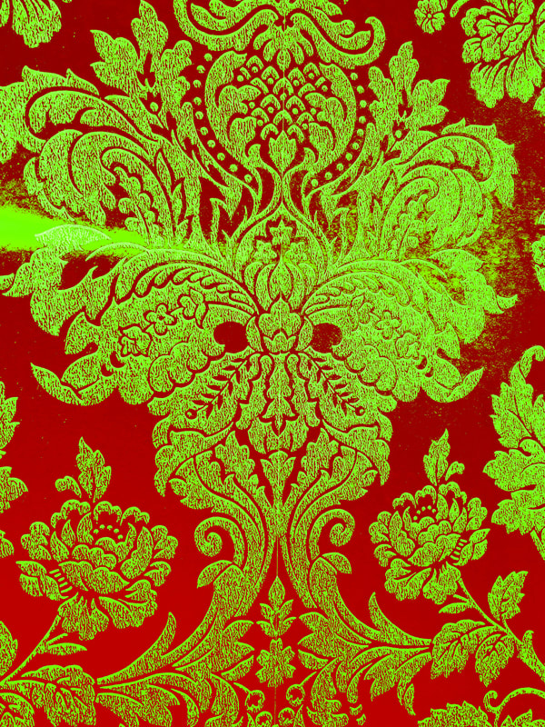
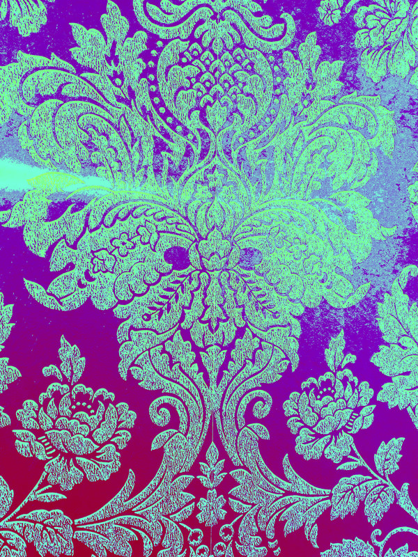
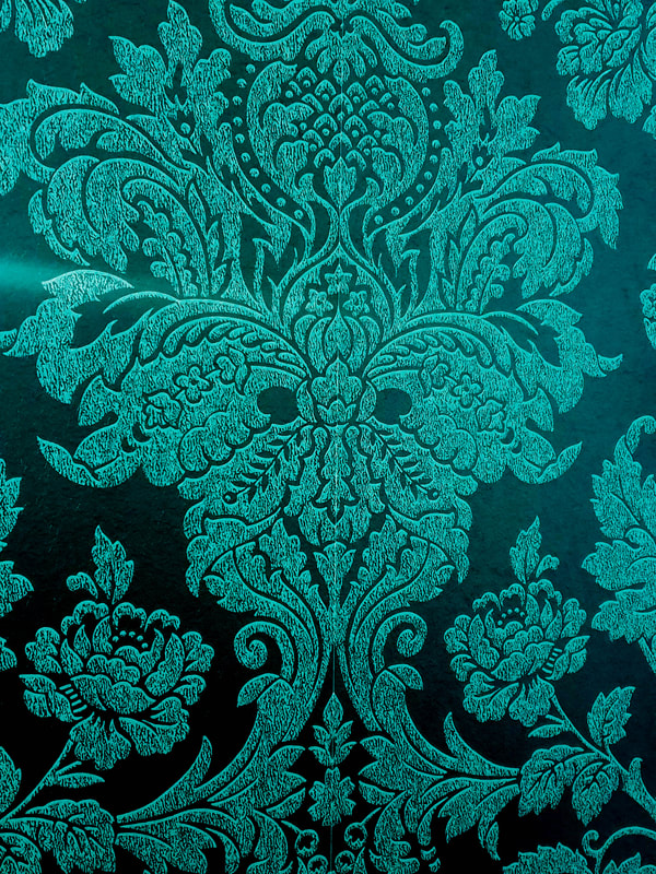
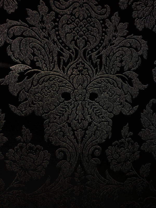
Looking back at my tests I noticed that I was forgetting about the background and what types of colours my posters needed. To continue forward I took some photos of some places from my house that I thought would also fit the interior of the haunted house and edited them to also fit the vibe of 1959's horror posters. I am still a bit unsure if I want these colours to be bright and overly saturated like how it was back then, but I will continue to research more into this to figure out what works best for the horror theme and my design.
|
|
|
I'm not too keen on having these for my background as the pillar I used is pretty thin and I would have to edit it to be larger which makes the images come off a bit hazy.

|
I quite like this one the most out of the backgrounds I could choose from especially when I can manipulate were the light and dark can go as well as making it flat or curved. Out of the edits I really like the darker ones were there is a soft area of light.
|


|
Not too sure if I would use this as the background but some of the colour edits do stand out. I tried to mimic the 1959's style with these but for most of it I don't think it shows that clearly.
|
|
|
|
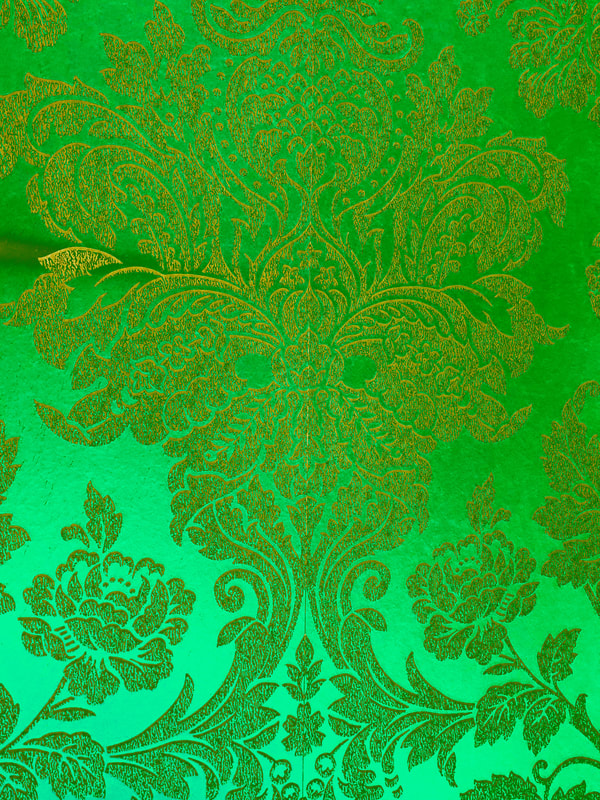
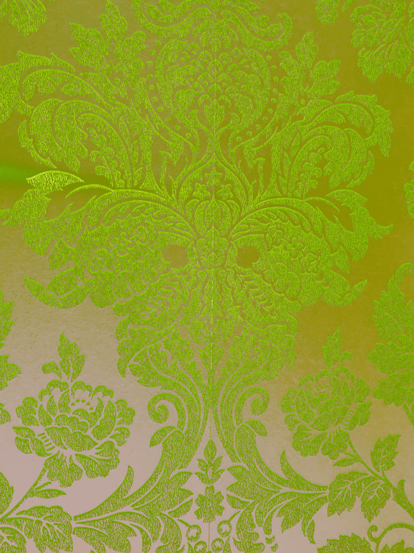
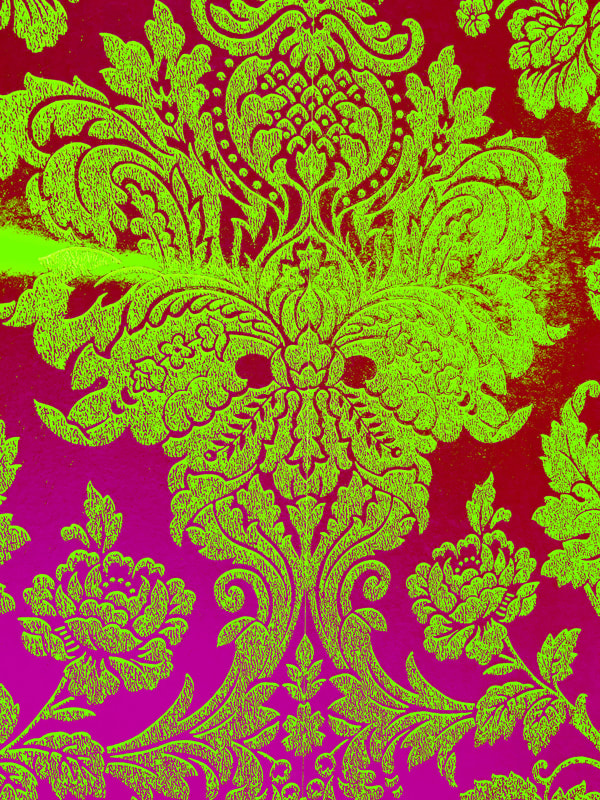
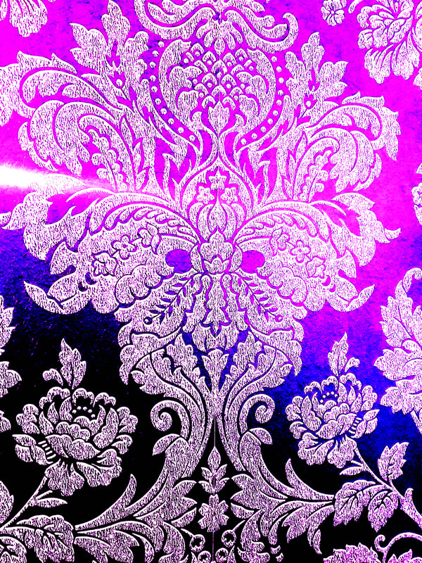

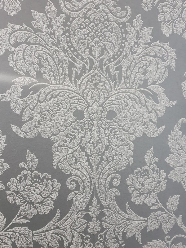
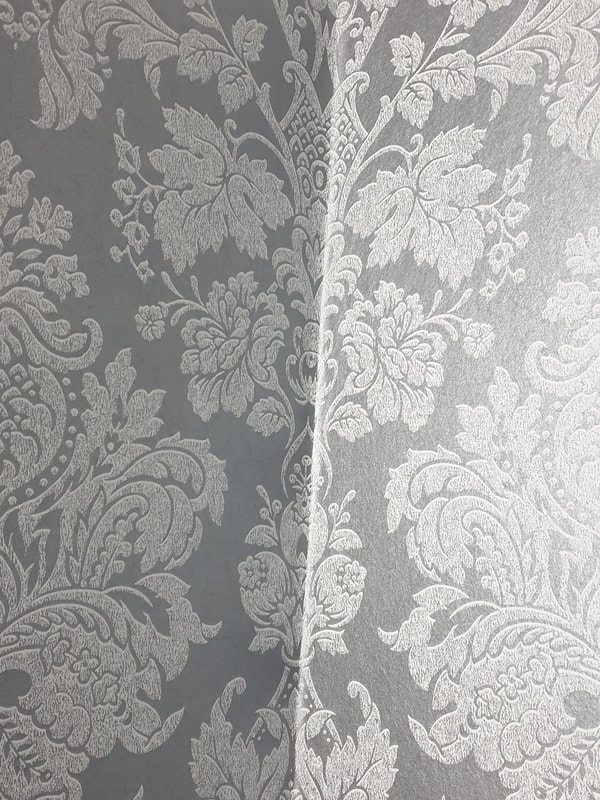
I quite like the wallpaper as the background as It also looks like it has a creepy face on it as well as the corner giving two sides different contrasts.
Development
|
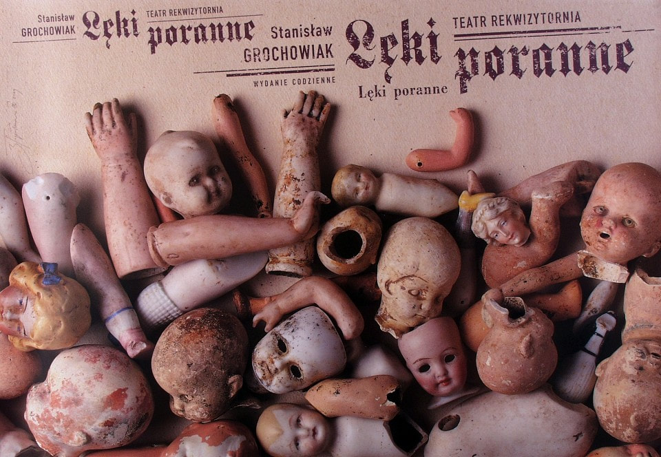
During the small Monday briefing as well as a small feedback later on I was told to look up Tomaz and just take the time to look into the simplicity of the work and materials compared to the artists I have chosen who have more refined detailed work.
Looking through his work I really like the creepy broken dolls, It gives a horror vibe without it being dark - I will try and experiment with this as well |

   |
Tests
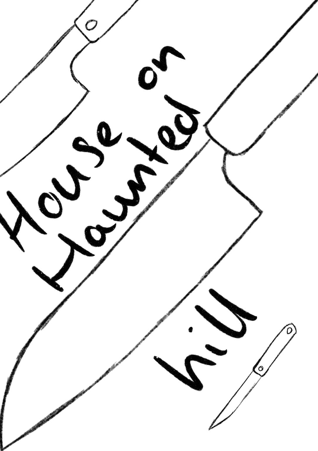
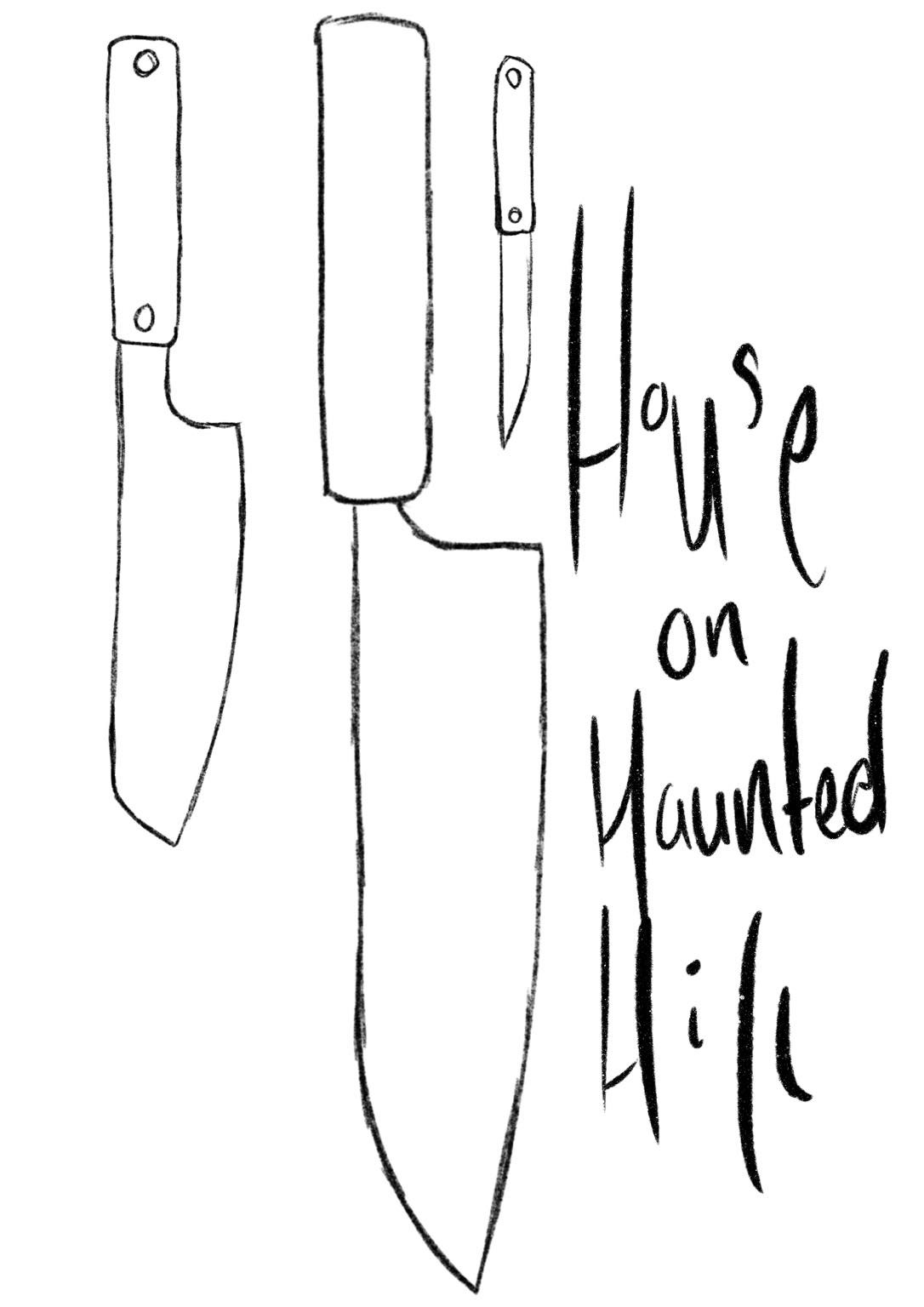
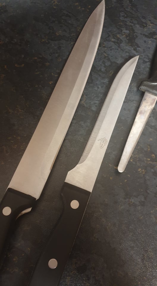
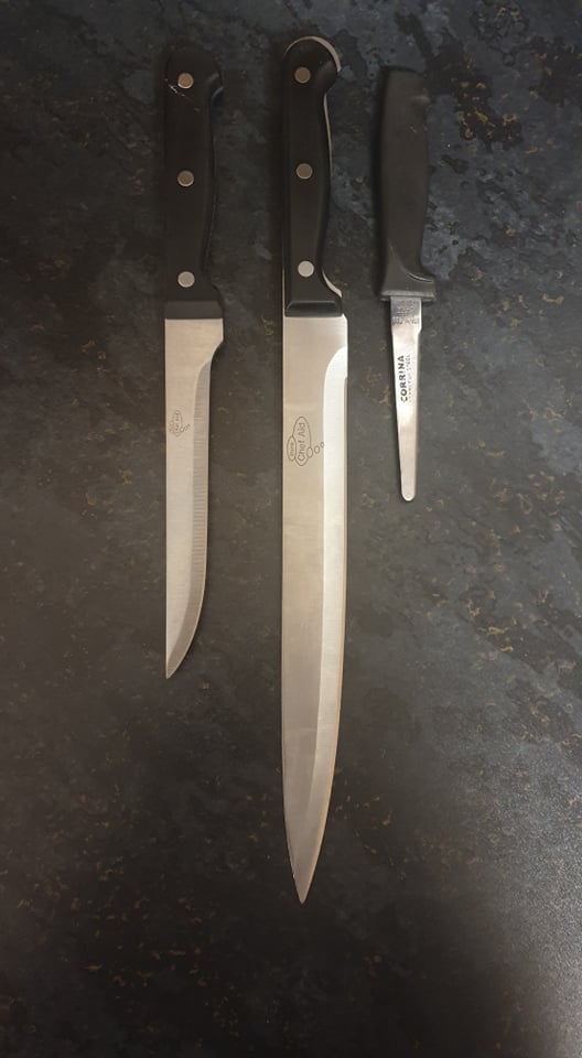
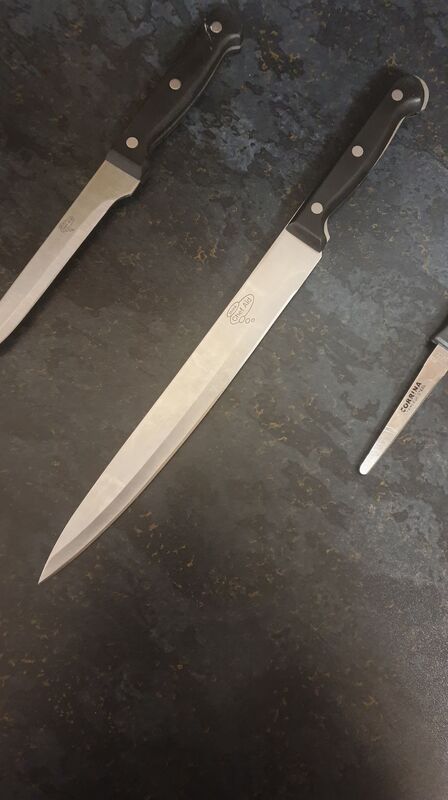
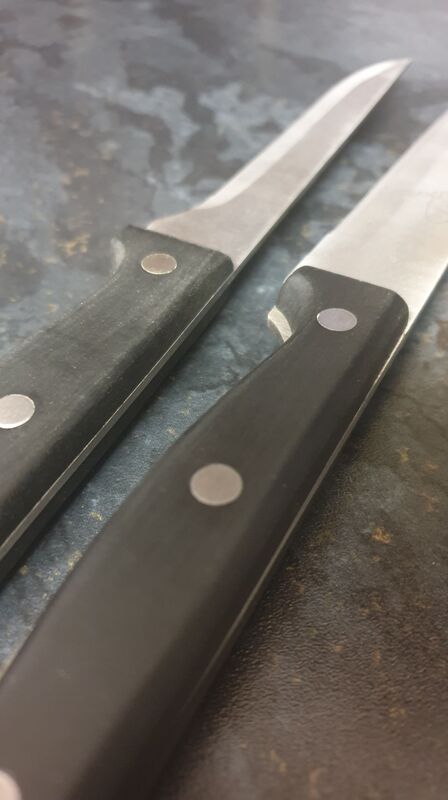
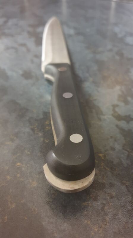
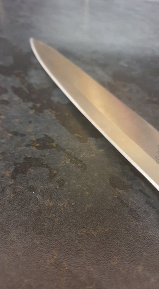
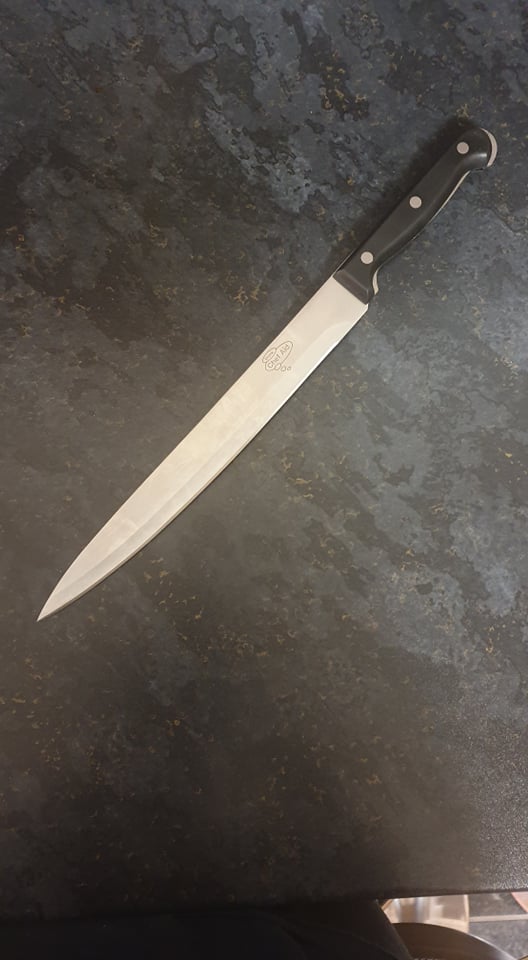
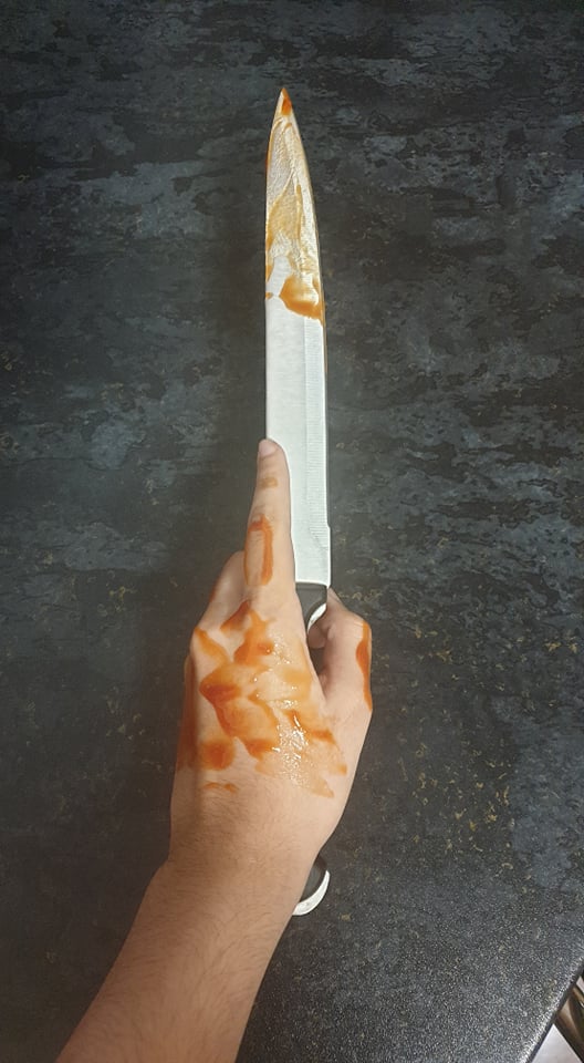
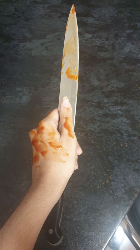
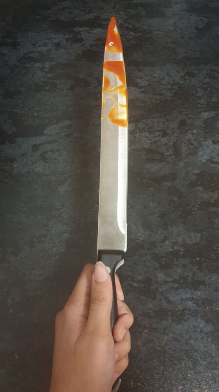
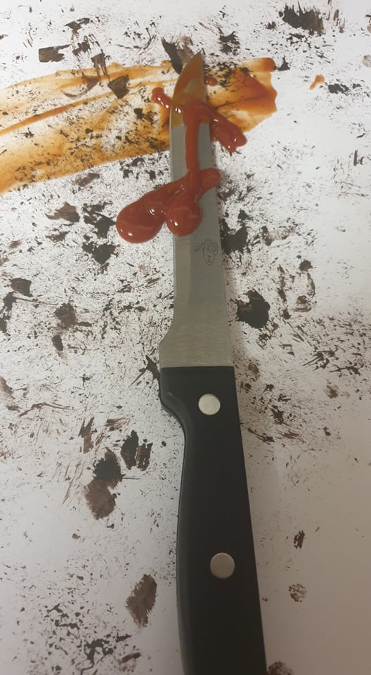
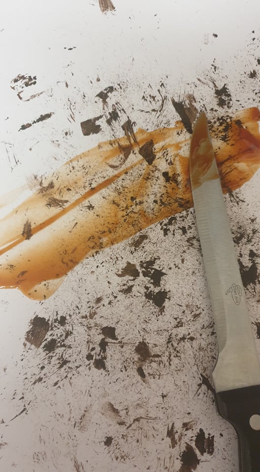
Keeping it simple I took my knife thumbnail and developed into it further with a kitchen knife and some ketchup for blood. This was really messy afterwards but I do like how simple and quick this process was.
|


   |
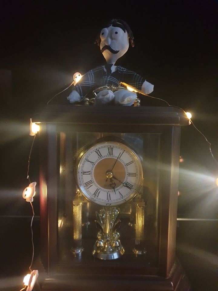
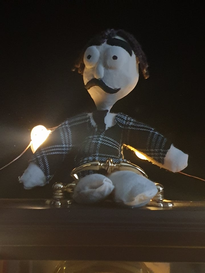
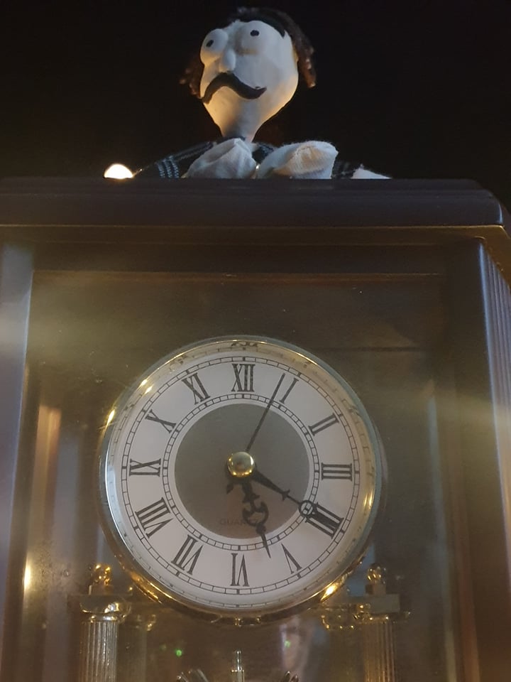
Tests
I decided to go further into my clock thumbnail as I was trying to find 1 object that could be the main centre piece for this test. I'm not sure if I will continue to use this but I will try and test more with different objects and see what I can create and come up with.
|

|
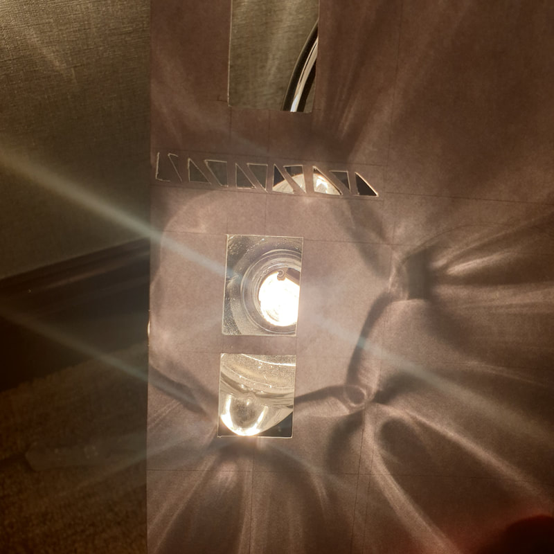
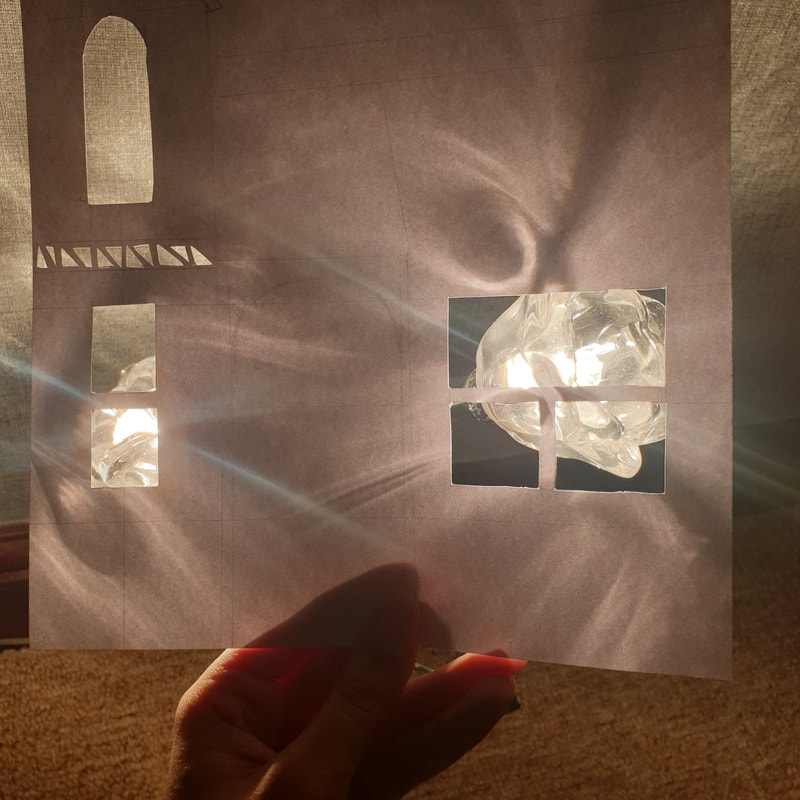
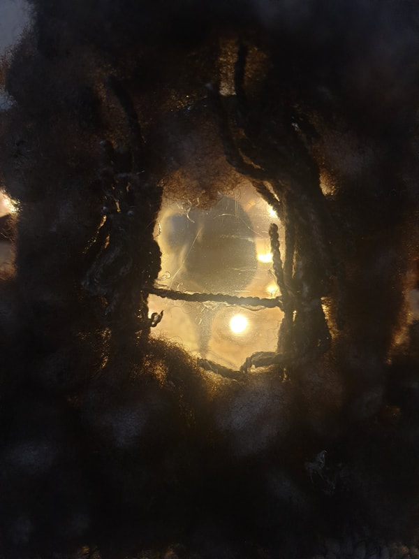
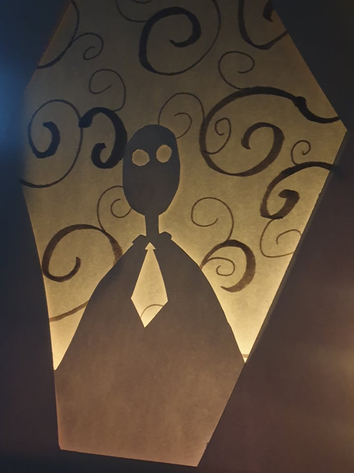
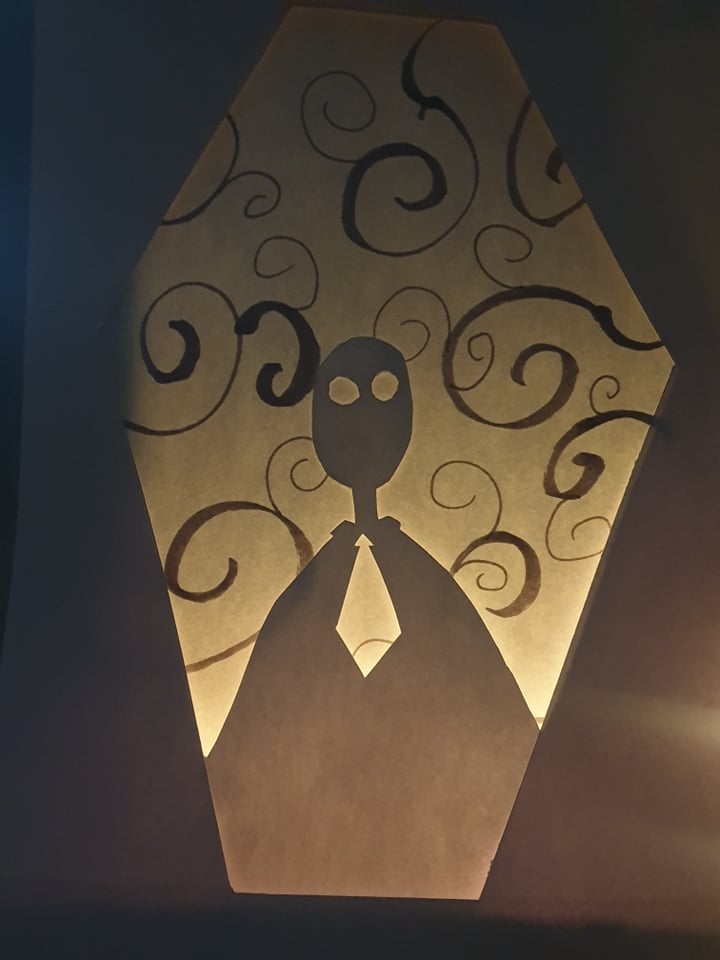
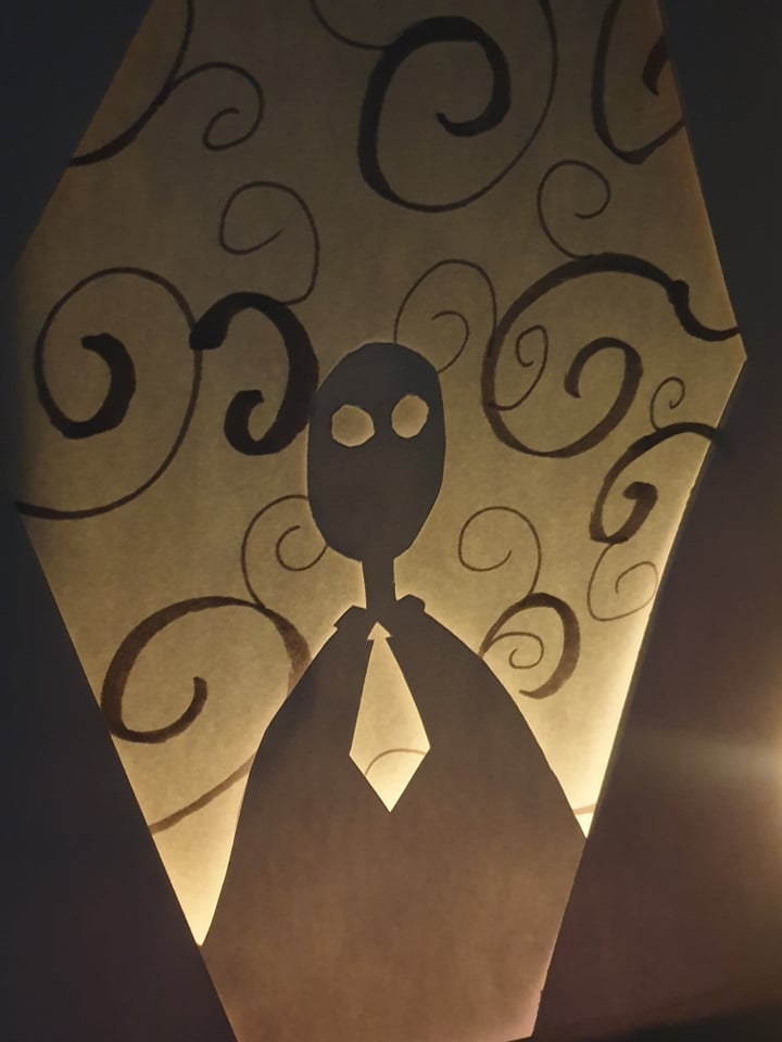
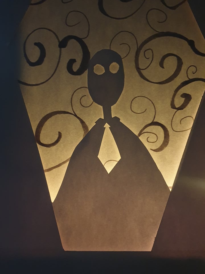
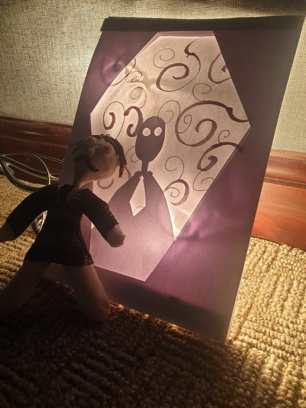
Lightbox
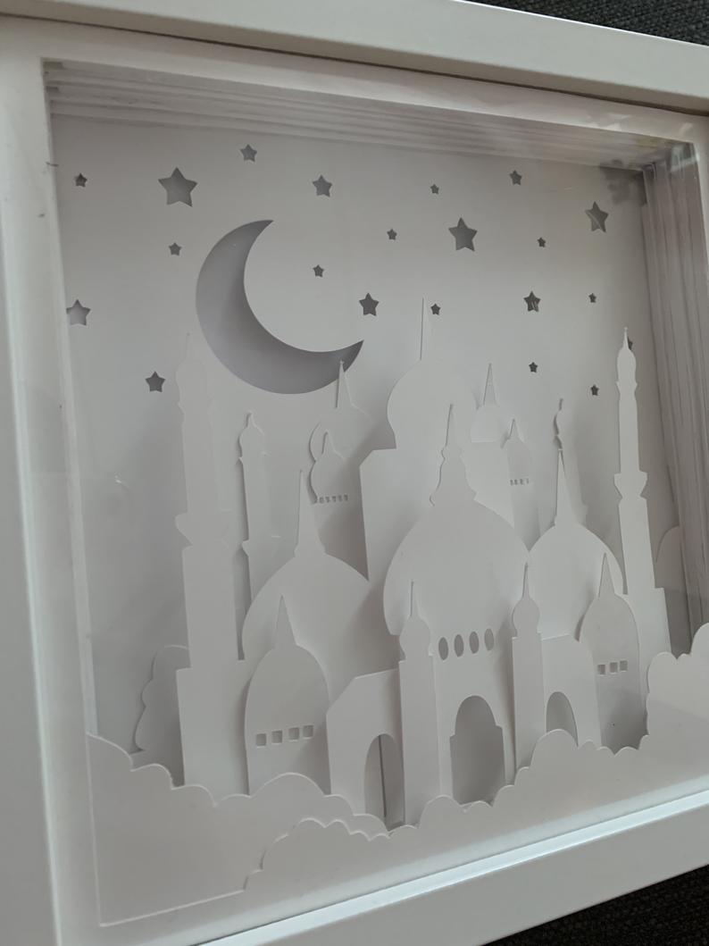
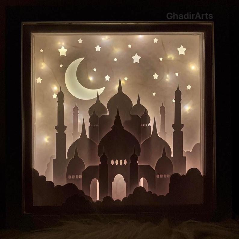
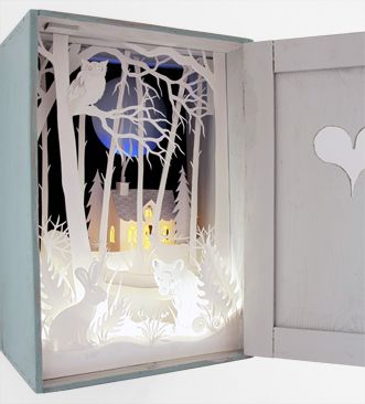
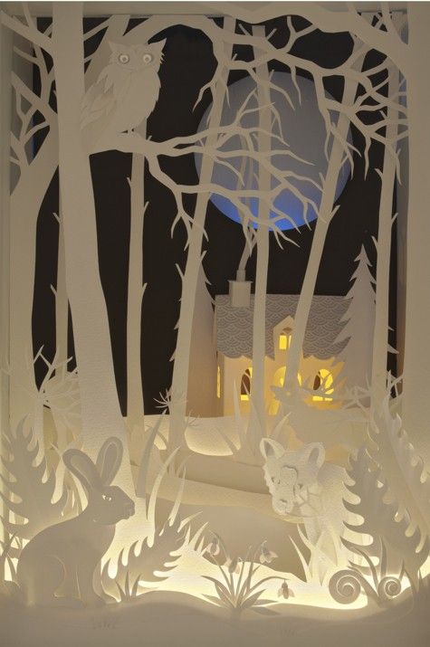
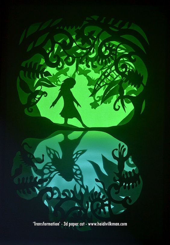
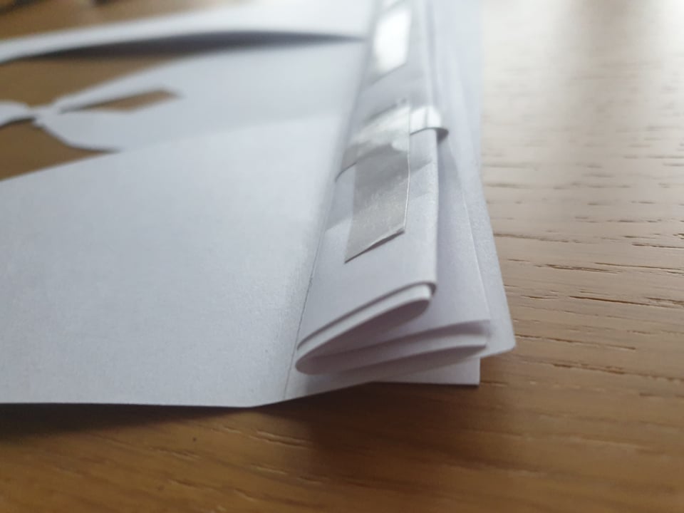
For background inspiration I though paper would be an efficient material to play around and looked more into lightboxes.
I like how the different layers of the paper can give off different contrasts. |


Testing
I had fun creating this lightbox made with only paper, I went simple with it just to see if this would work out. If I continue to go use this I will try and use foamboard for the corners to keep the paper more steady. Not entirely sure how the title would fit in but I will try and play around with that.


|
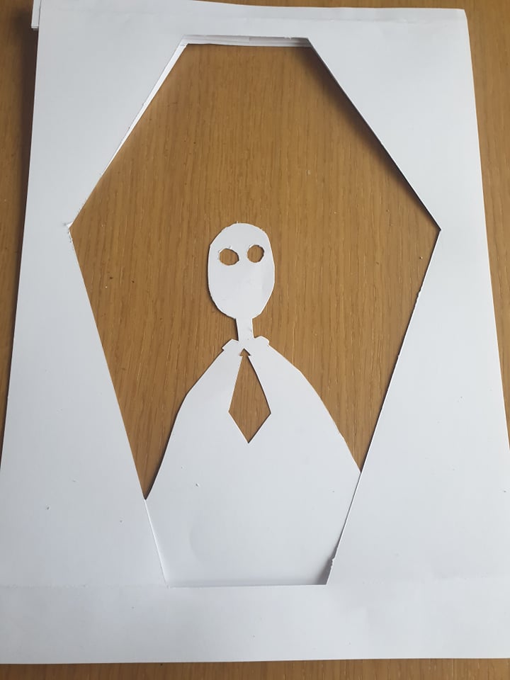
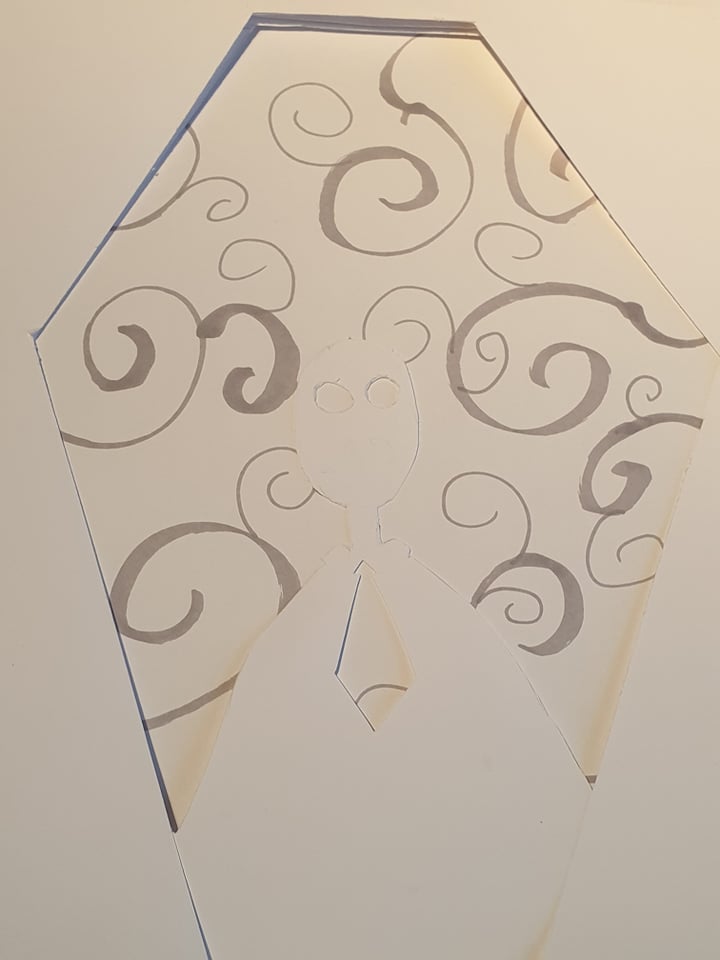
3D Paper
Using paper would be one way to not focus too much on detail (although the images I found are very detailed), I would mainly try and focus on stacking using black and white mainly with a simple thumbnail.
|


      |
      |
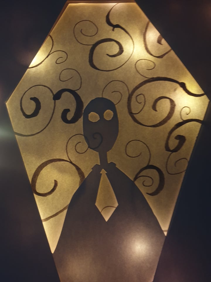
Testing
I'm not sure if I really enjoyed doing this as it was just quick and a bit messy. I then lit up the piece of paper with a flashlight to cast some shadows to make it appear more scary.
Backgrounds & Lighting
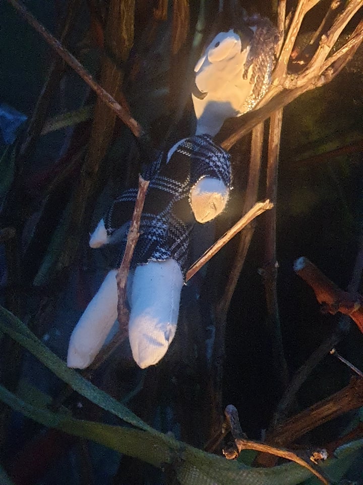
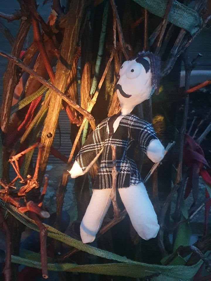
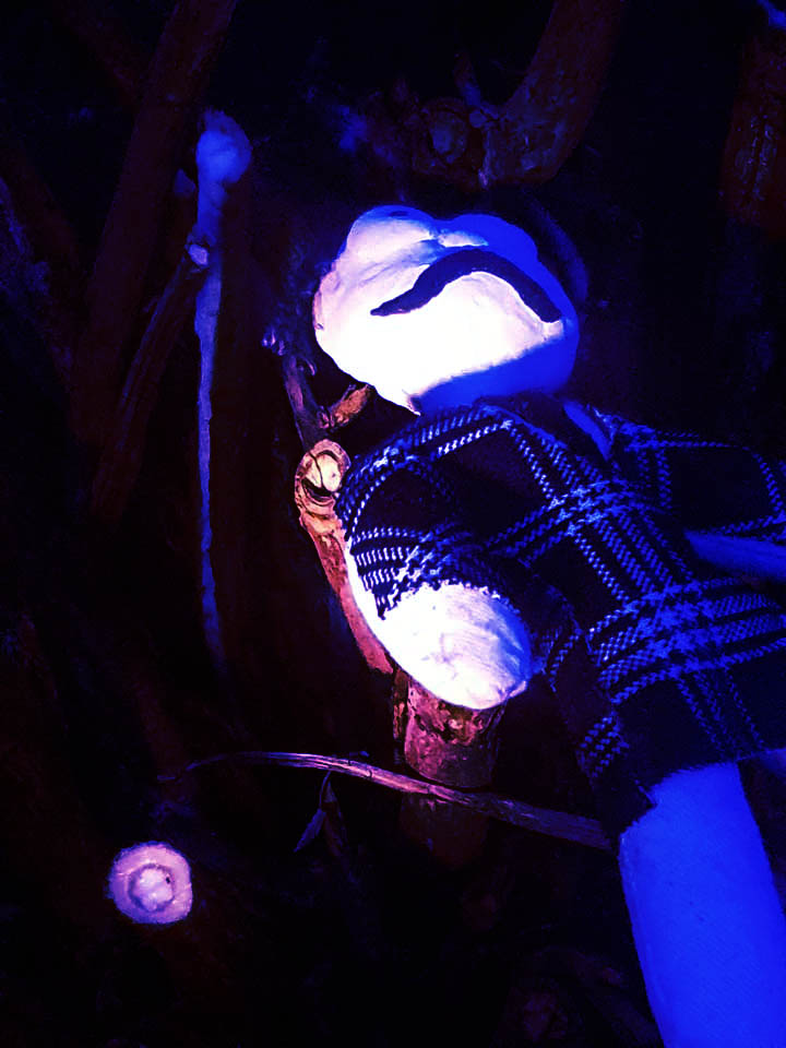
I later on used the flashlight to try and get different effects in my images by going outside and placing the doll in some creepy areas that involved wood the most as well as just finding a dark corner and working with some shadows. I then edited one of my images to see if different coloured light would create a different atmosphere and I really like the purple one the most.

Books
Using an old book that was breaking apart I tried to think of different way to use the doll with it but I had to keep holding onto the book as it wouldn't stay still. I do like the idea of using books but I don't think this was as affective as it could have been.

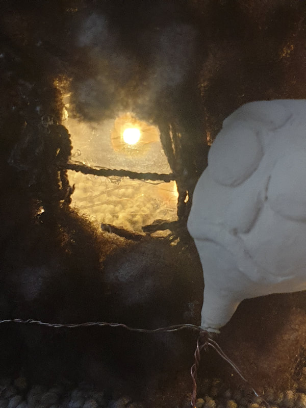
Mixing Materials
Doll + Paper Lightbox
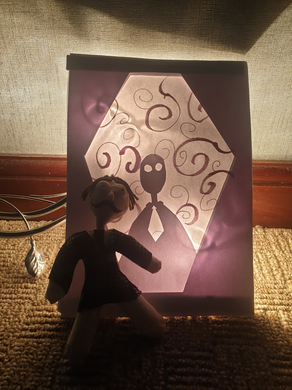
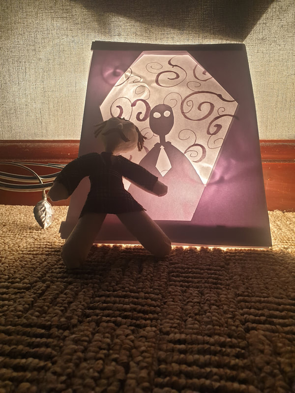
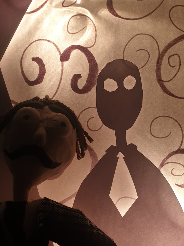
To add more to the lightbox I put the doll next to it - I like this and I might do something similar with my thumbnails for the 3D Paper but make the group of friends into a small lightbox or perhaps make it a house on a hill and use it as a background.

Paper house + Doll
Asking a classmate what materials they liked most ended up being the Doll and the paper house - now, I do believe I would 99% end up using the doll but If i was to make a paper house I would need to make it on a bigger scale.
Cardboard Background
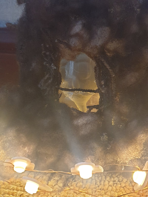
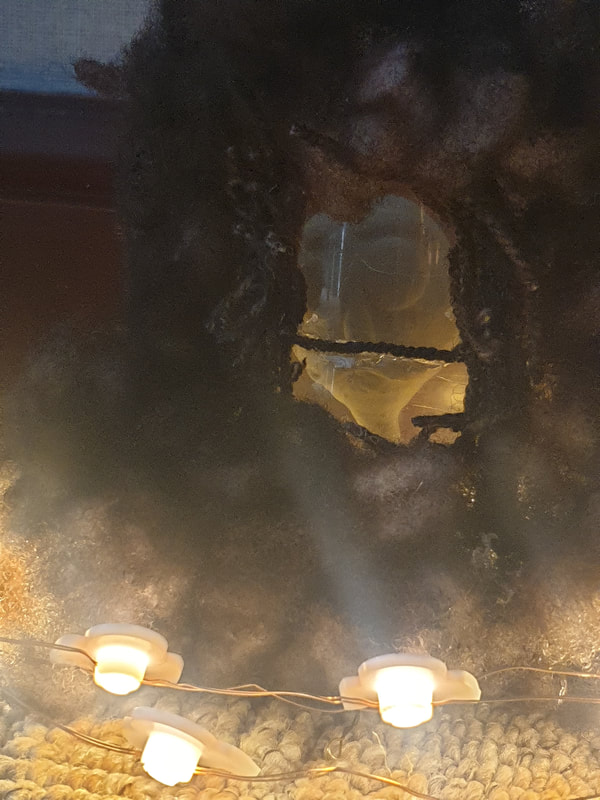
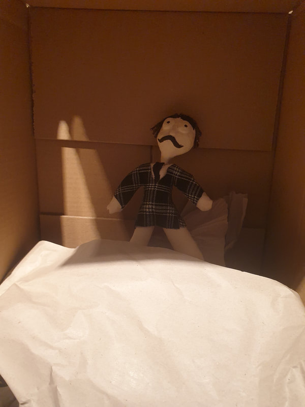
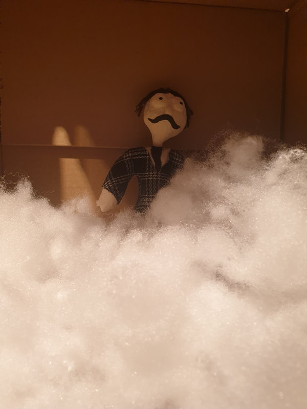
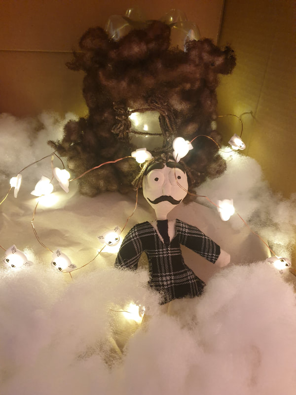
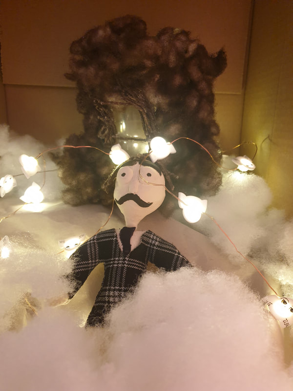
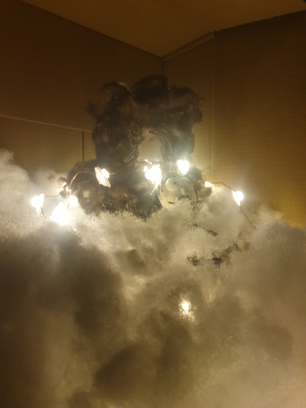
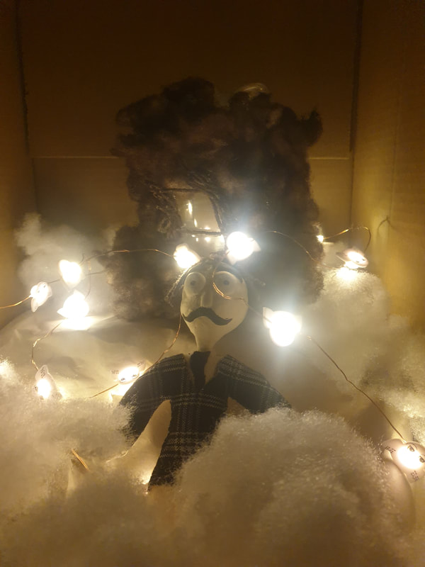
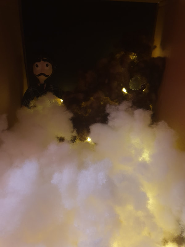
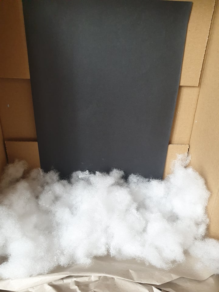
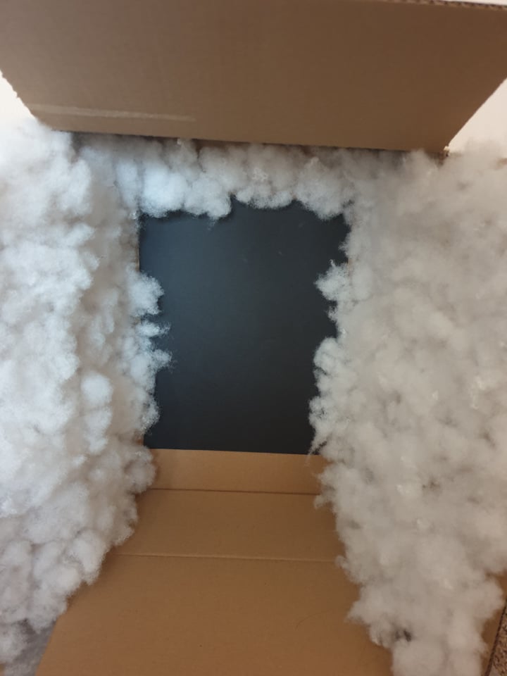
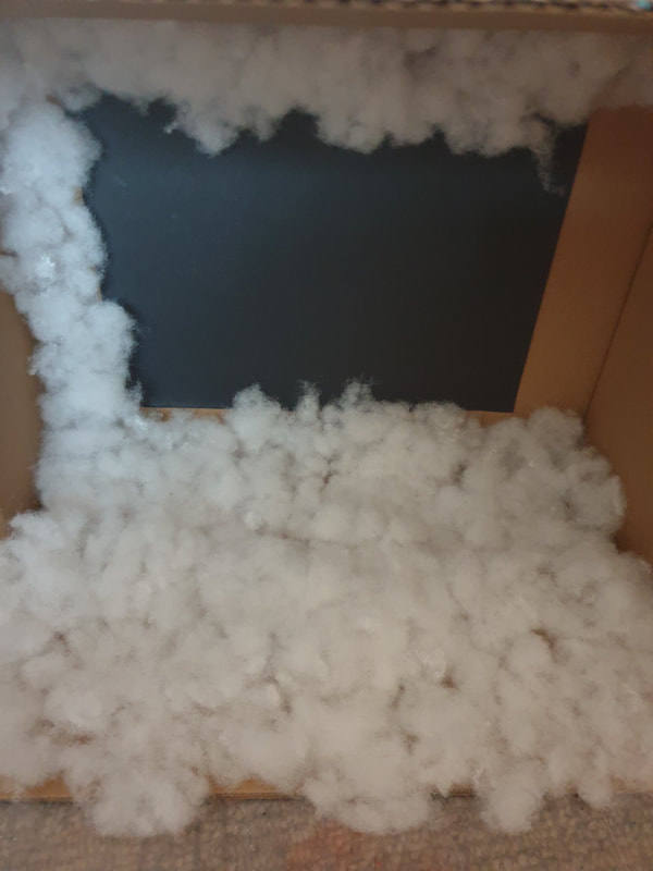
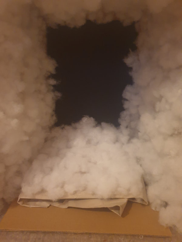
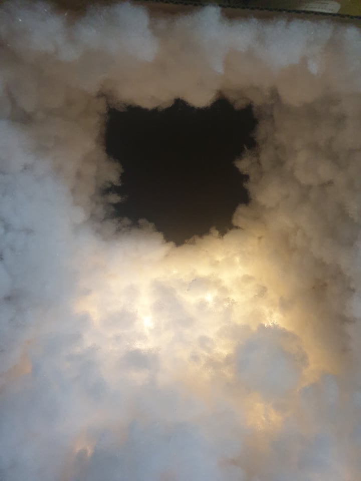
Using a cardboard box I placed in some materials I have been using and just messing around with some composition and angles, I think my favourite photos are the ones were I have managed to hide the lights underneath all the stuffing.

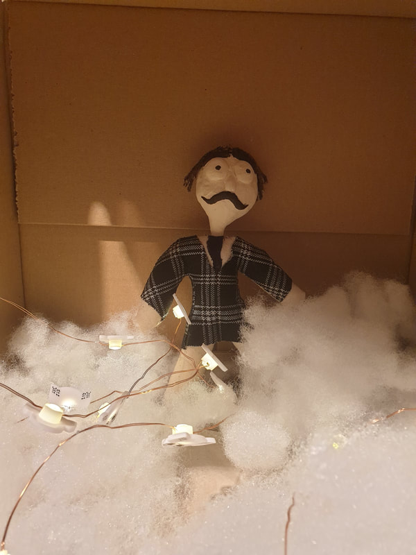
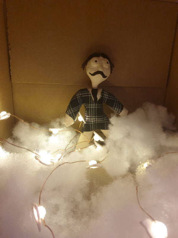
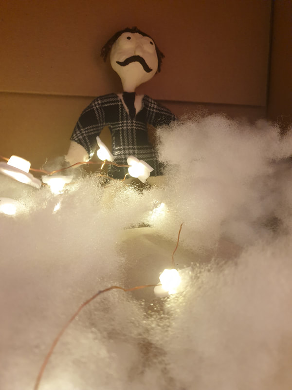
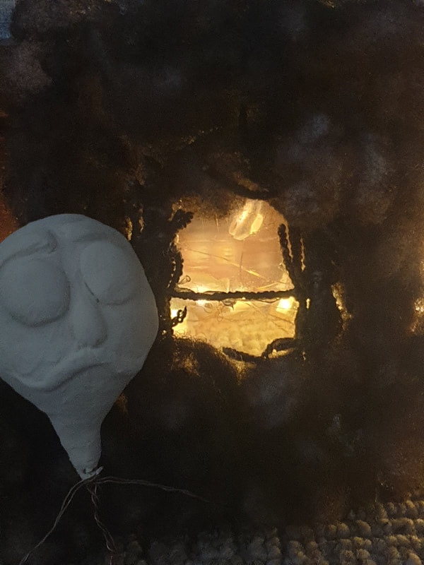
Further Development
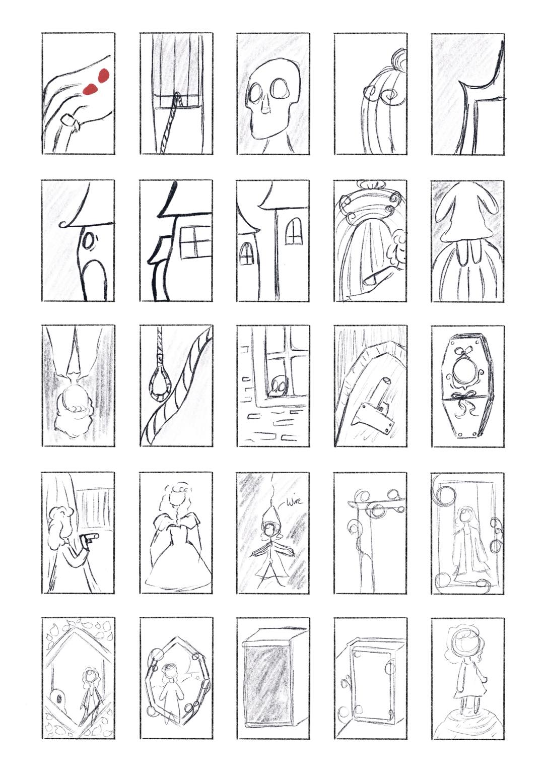
After doing lots of testing with materials and mixing them around I decided to go further into my thumbnails are just mess around with some compositions and text so I can visually see how I can plan things out when I begin my final. I may also switch out the doll to create only the face of my character and have him appear to be floating like the beginning of the scenes as I think that it would look cool with the stuffing and darkness surrounding it. I tested out focusing on only one character as I'm not to sure how I would create the others.
|
        |
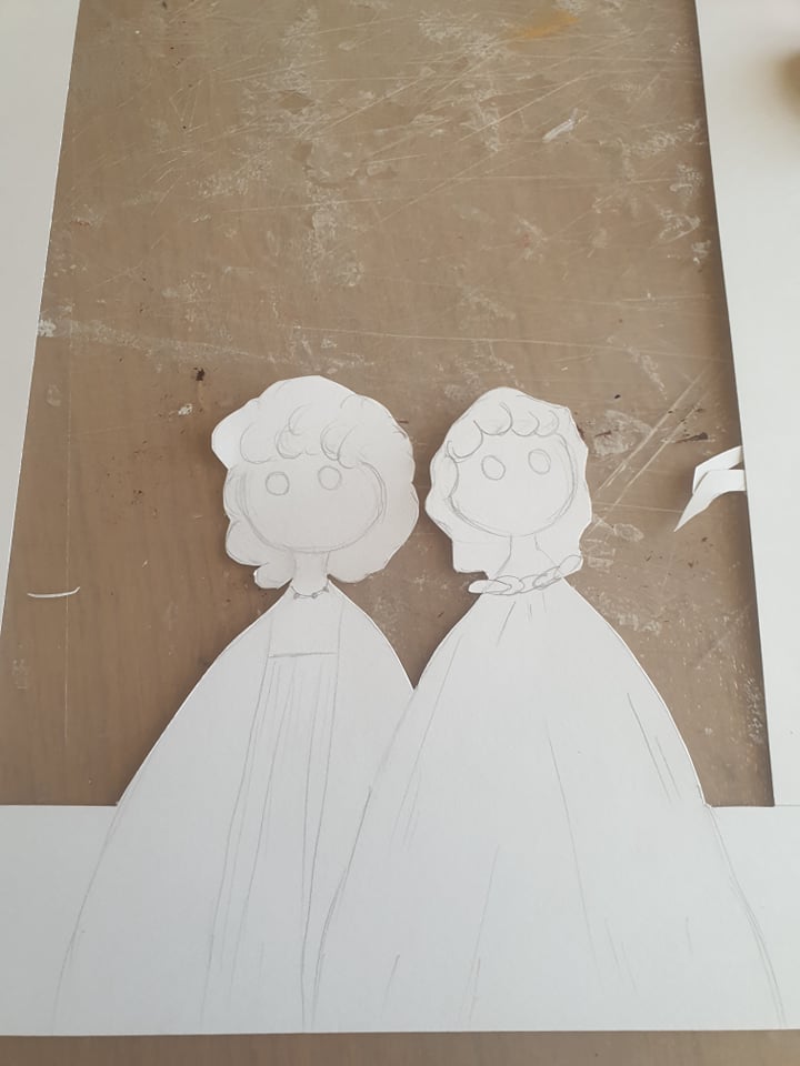
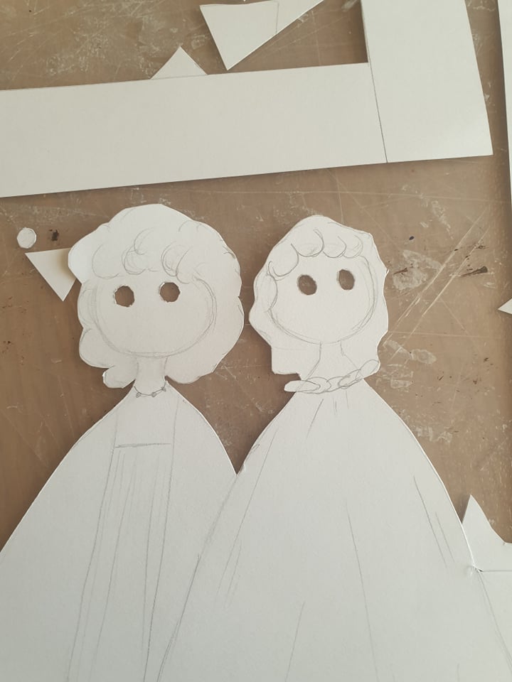
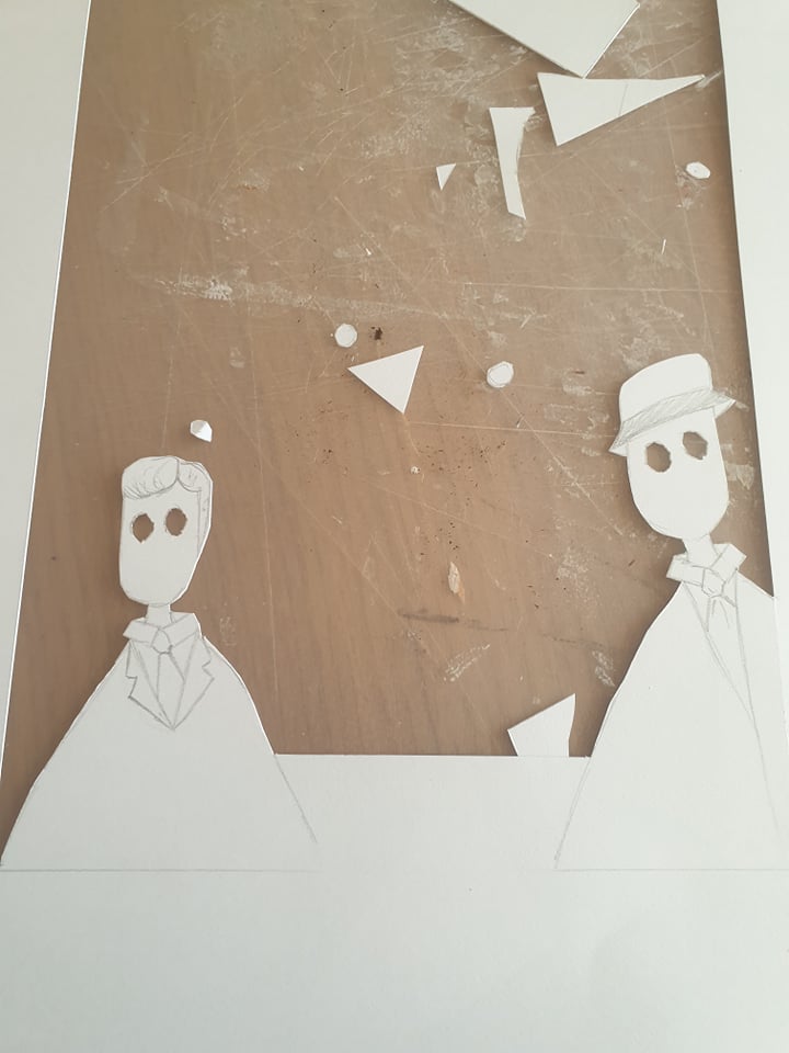
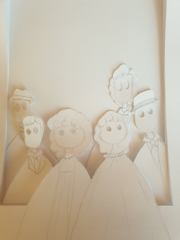
To create the other characters I am thinking of making small clay heads but I feel this may be a bit tedious and if I do incorporate the other characters I would most likely make them into paper standees or do not use them at all.

To further explore I will be creating more quick thumbnails for backgrounds and lighting, I feel as though having a character with just the title seems as though I am not putting in the effort I have with my material tests. To further my designs I made pretty rough sketch ideas that could incorporate the house or the clock within the background, I think I will overall keep trying to use the materials I have and mess around. Now I do like my previous thumbnails with the doll alone so I will most likely try out both and see what I prefer more.
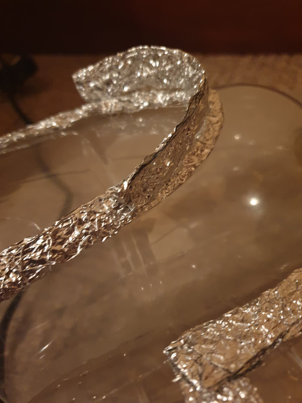
I wanted the house to look like it had a bit more to it, so I added a side as well as trying to get some depth into the foil.
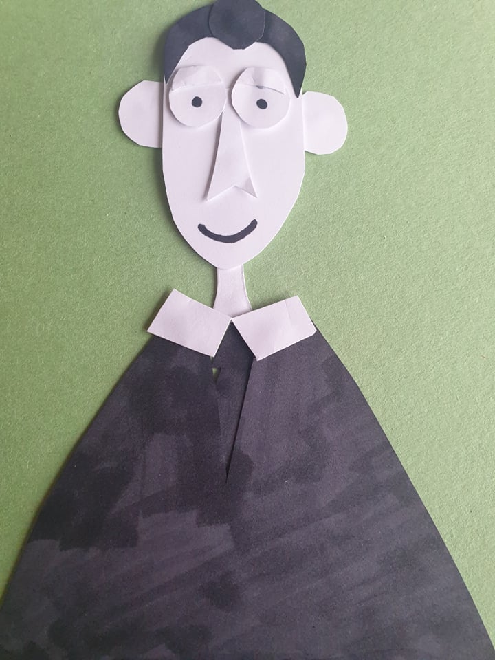
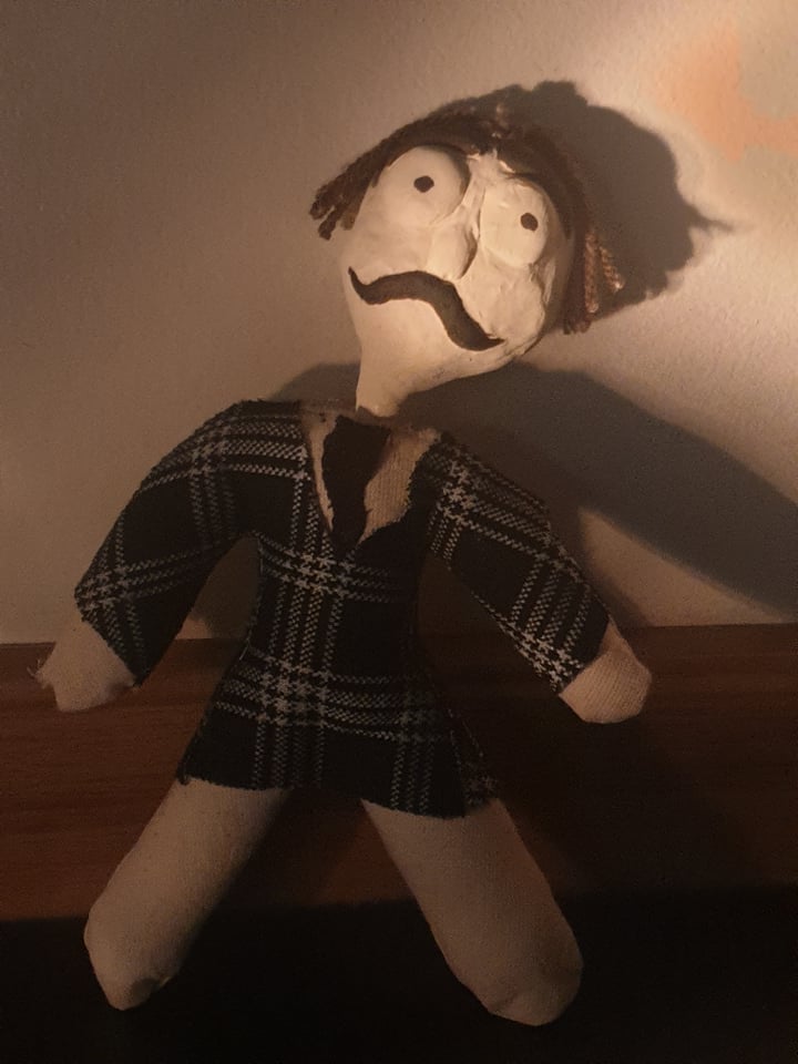
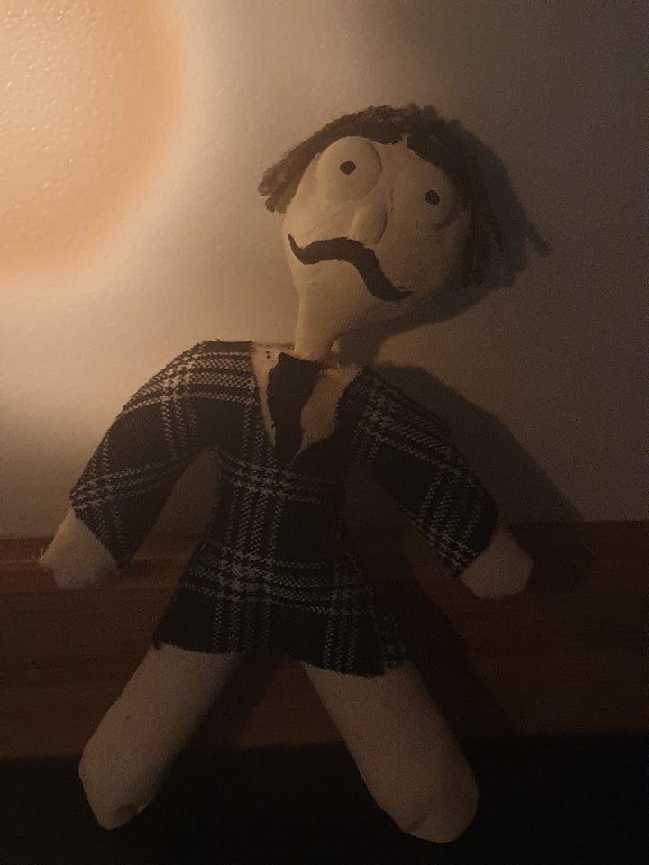
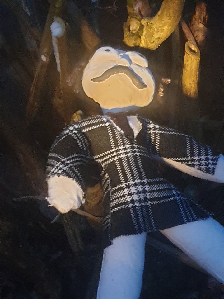
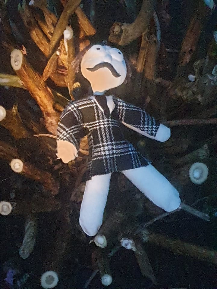
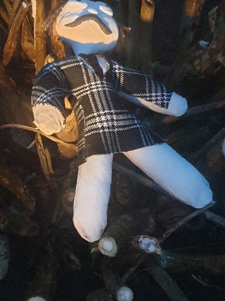
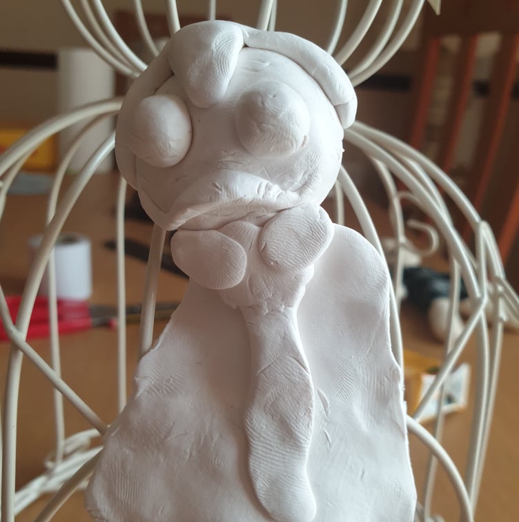
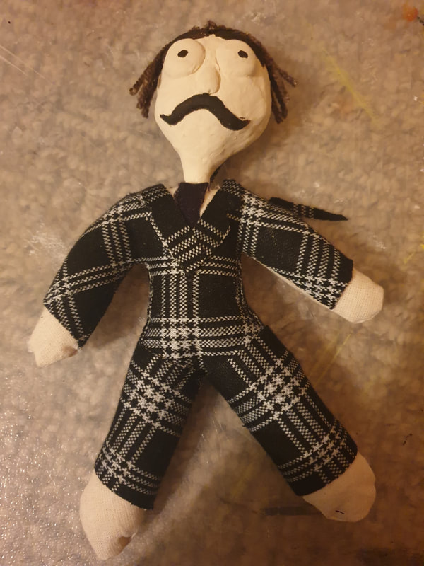
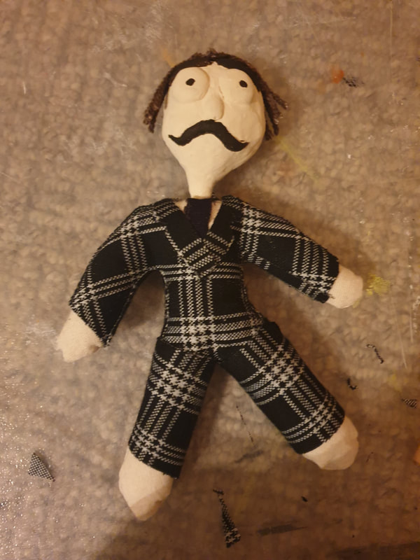
As I'm wanting to work with the doll I created I finally gave him some pants as well as make his outfit look more like a suit.
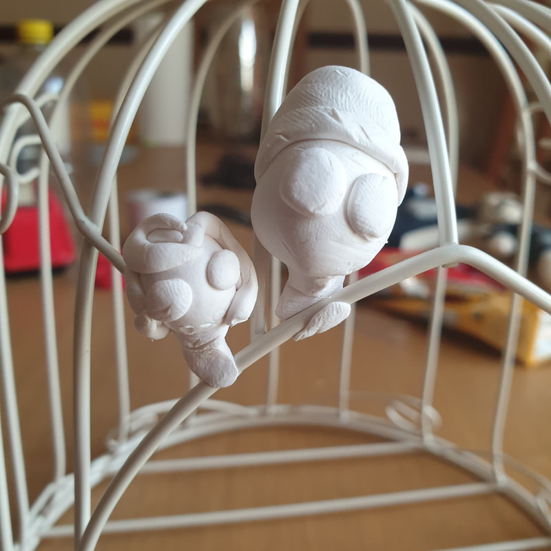
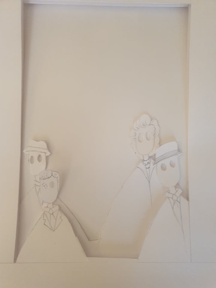
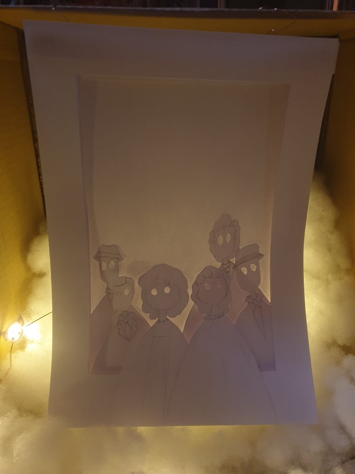
I was thinking of a way to include the other characters and decided to go with the lightbox to create them.
3D Thumbnails
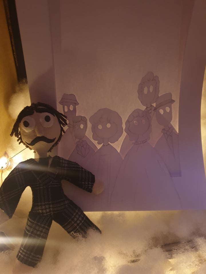
During the feedback we were told most of our 3D work was also a part of thumbnailing which I never really thought about as I thought they needed to just be 2D quick sketches. To incorporate this I took different pictures with different objects and I'm leaning towards my lightbox idea mostly, what I need to work on is making the text stand out and also perhaps removing the back to incorporate the Vincent Price doll that looks over everyone like the thumbnail I had originally chose.
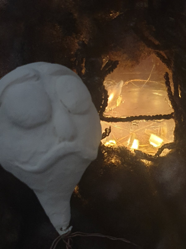
Chosen Thumbnail
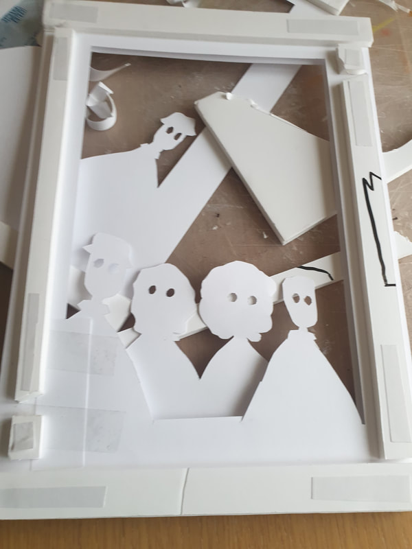
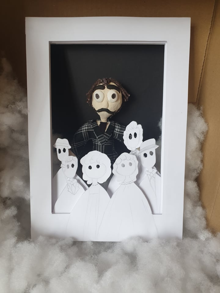
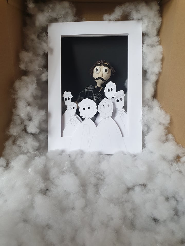
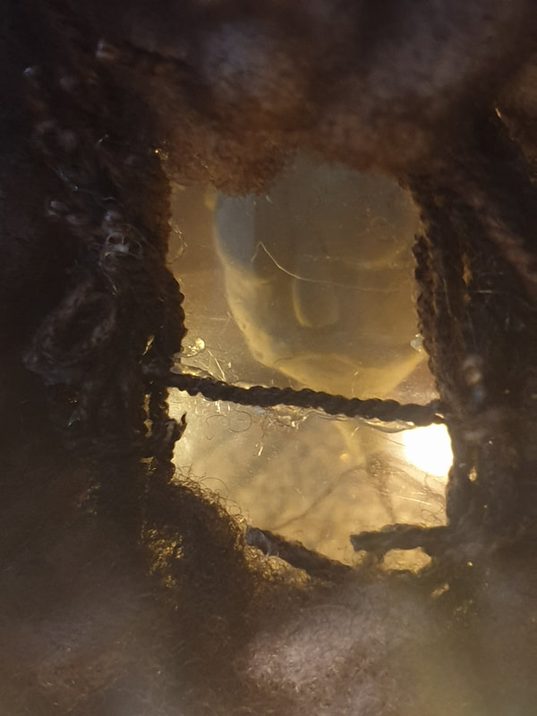
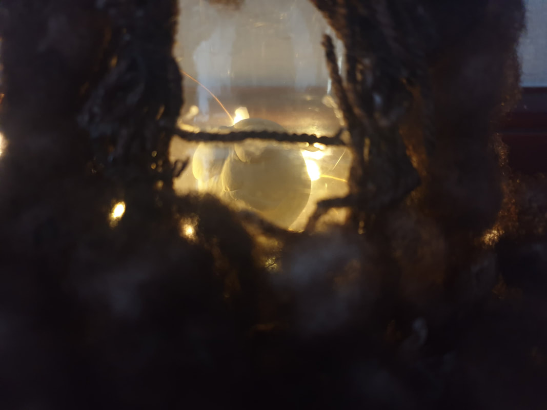
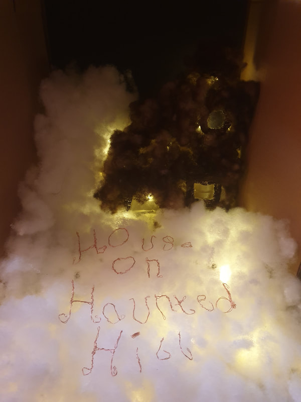
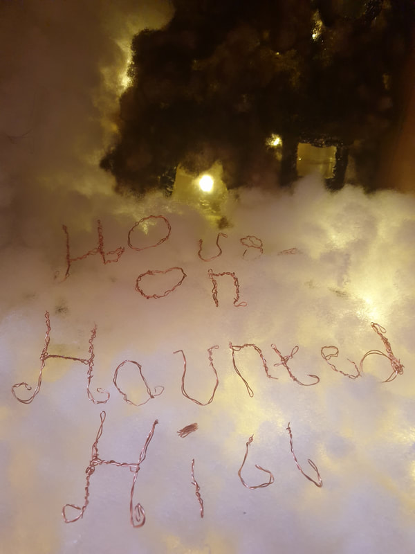
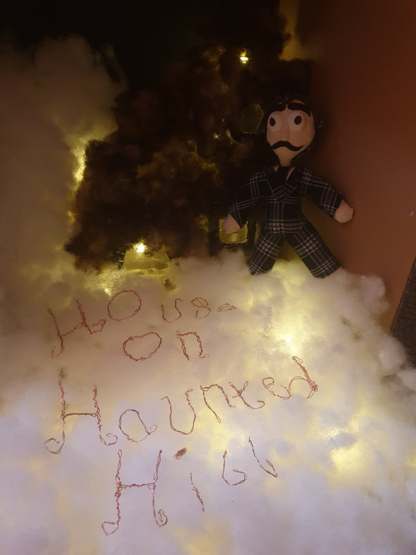
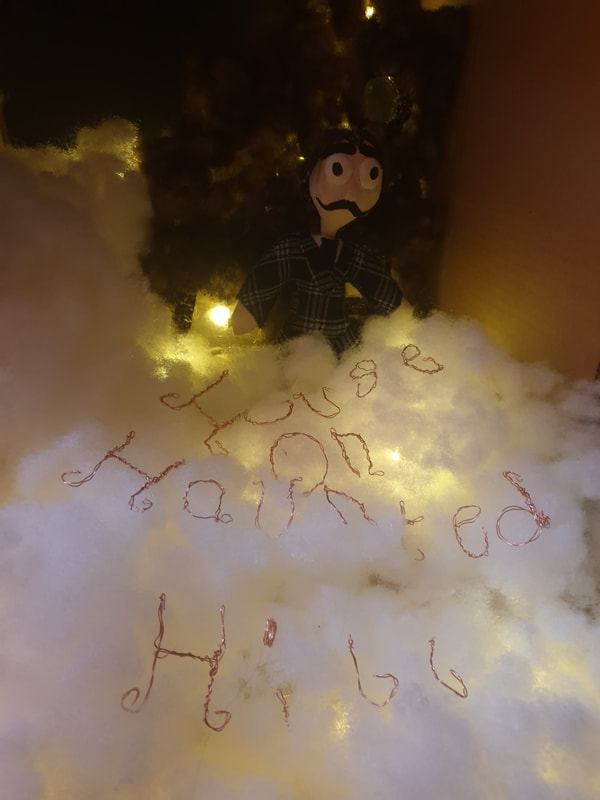
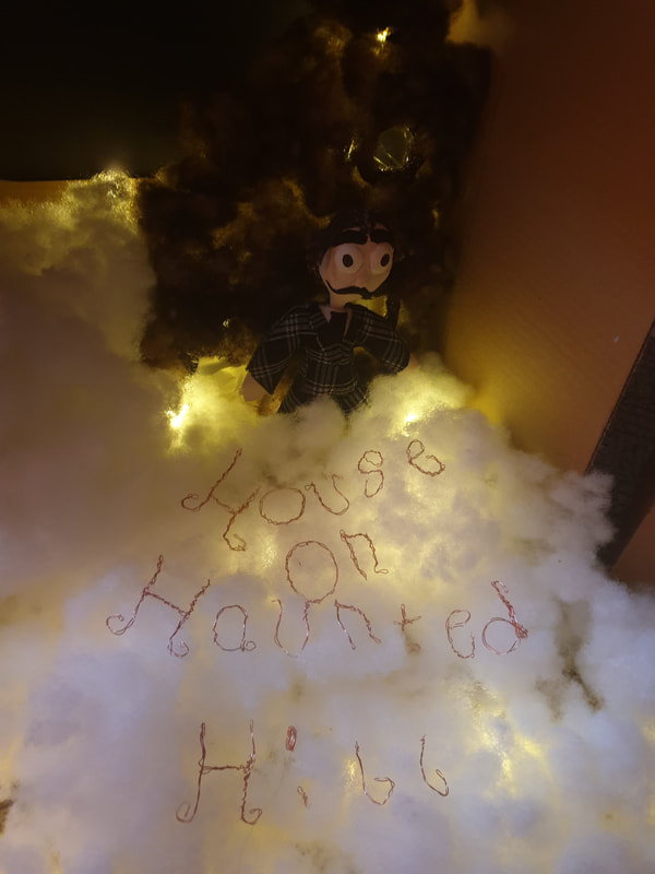
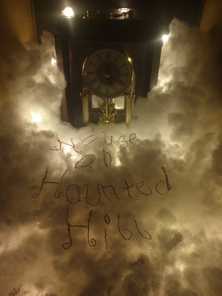
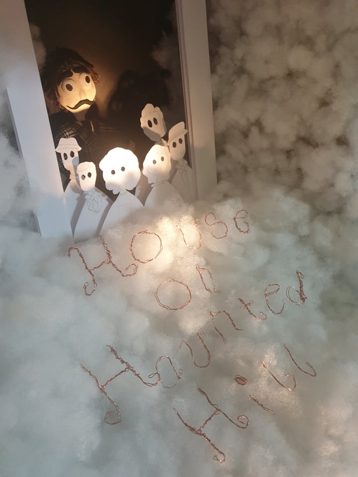
For my final I have been working on the materials I wanted to use, I added a more thicker layer around the paper for the lightbox to show a bit more depth as well as leaving out the background to add the doll behind. I used black paper to make sure the work would stand out. I then hot glued the stuffing to the sides of the cardboard so they wouldn't show but kept it thin as I am wanting to add lights underneath it all.
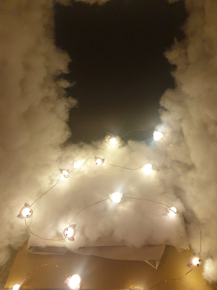
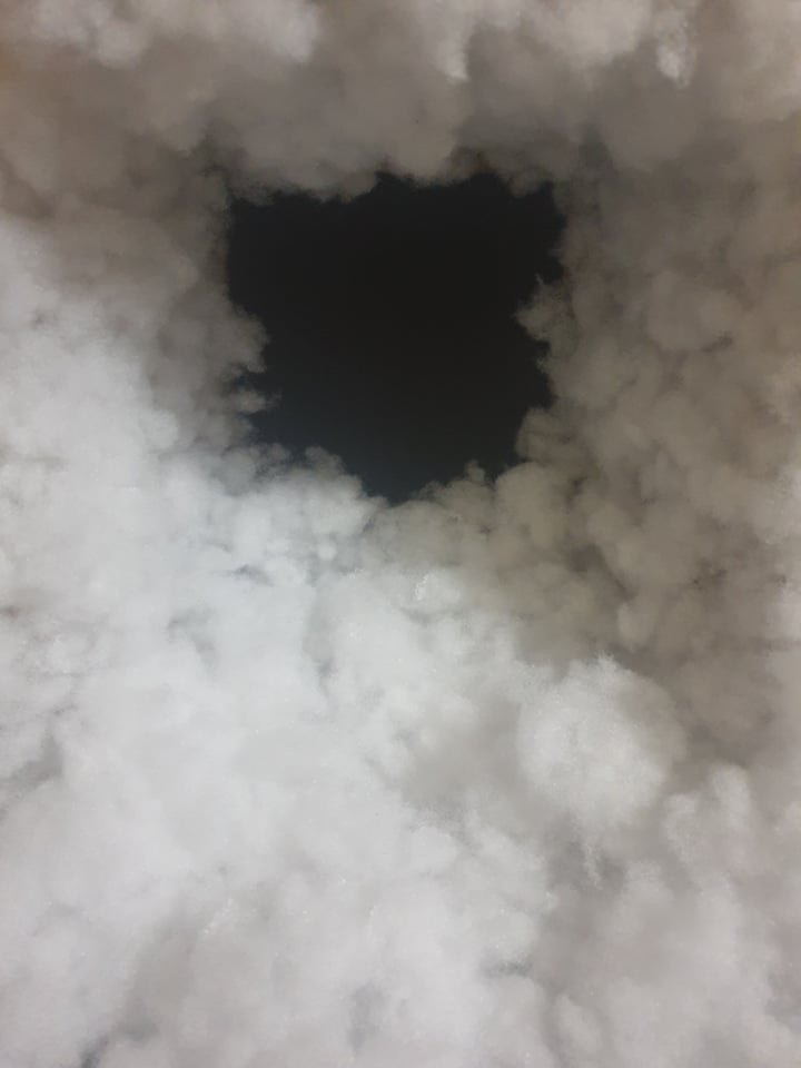
Lighting Tests
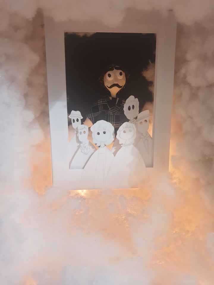

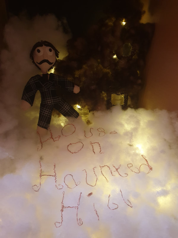
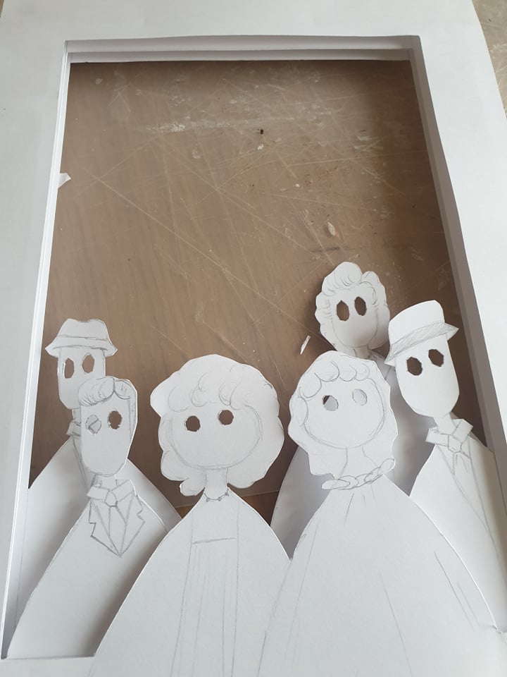
During my lighting tests I was trying to figure out how to make the text be seen, but I noticed that my paper people can't be that well seen either so I am going to go in with line art for their clothing just to add a bit more to them. My Vincent Price doll also needs to be the main focus so I hit the flashlight to make sure it was directed towards him or shining on his face. After a while I thought the image looked a bit too white and boring so I added pinecones and other small plants that looked slightly dead. I also feel as though the title is large and scattered, I will need to work on how to show the title better.
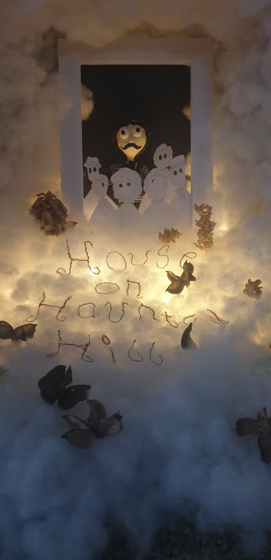

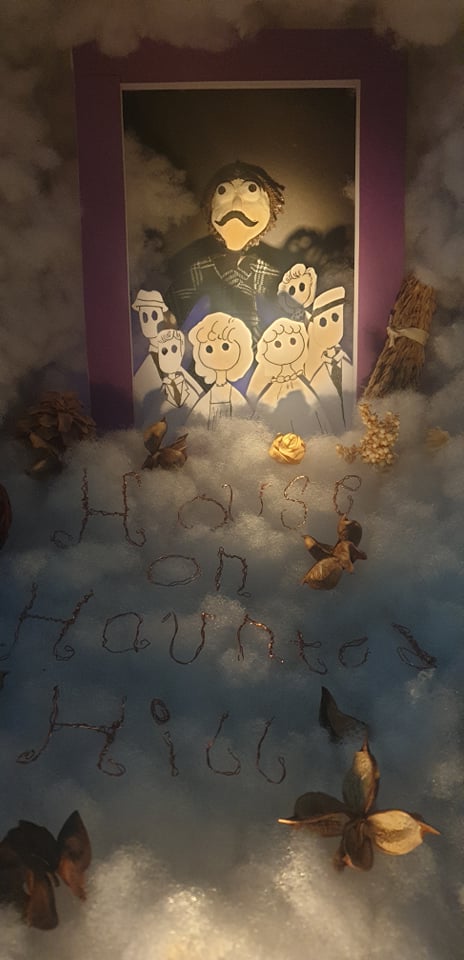

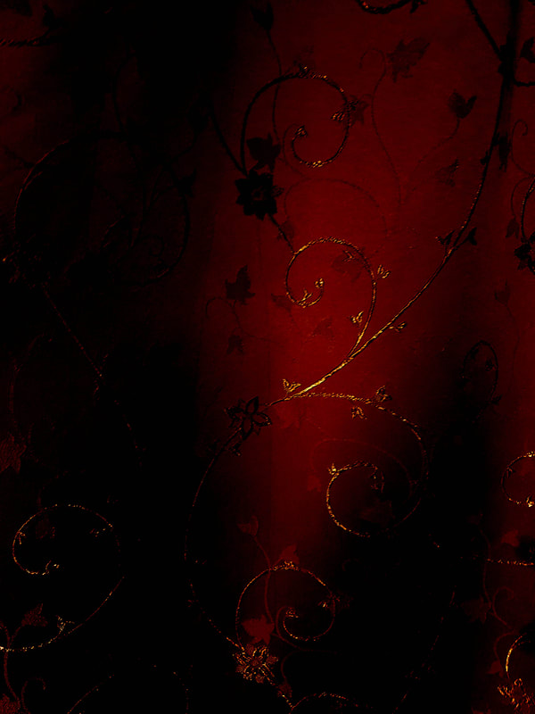
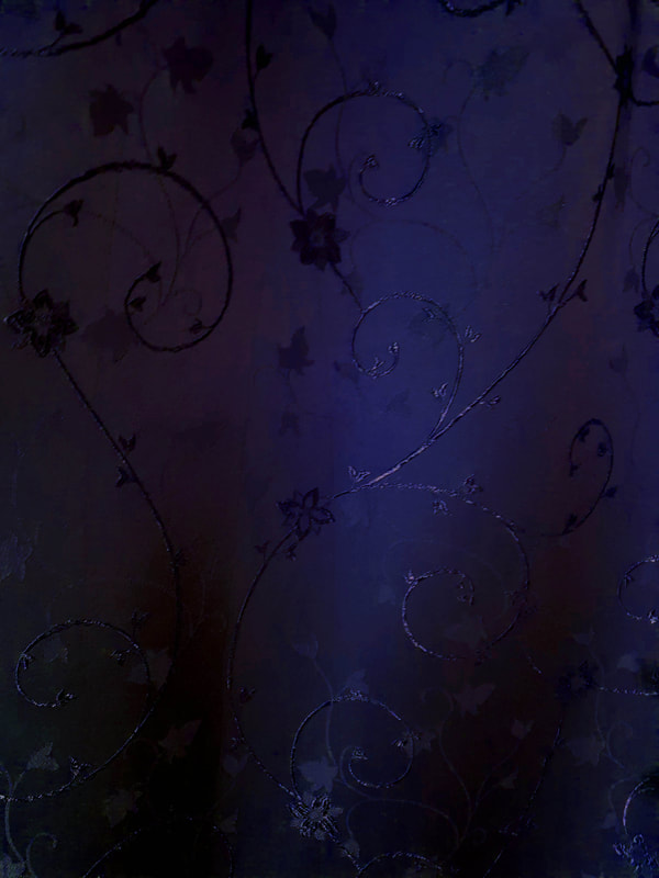
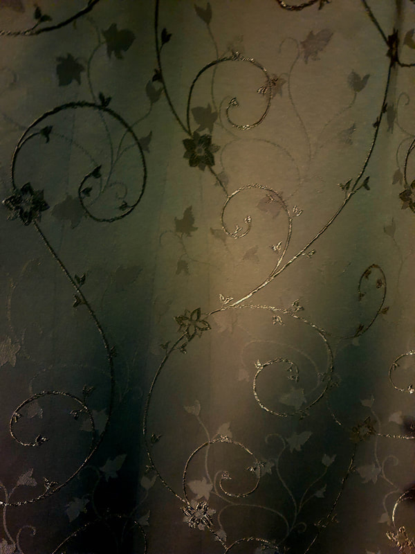
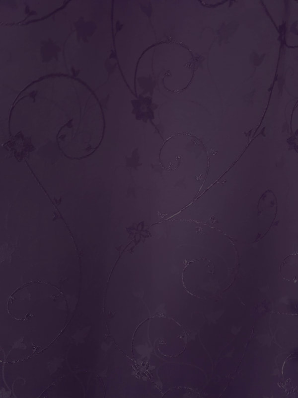
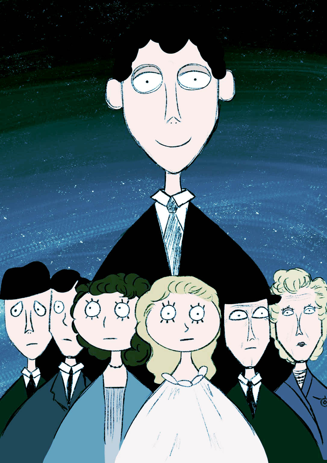
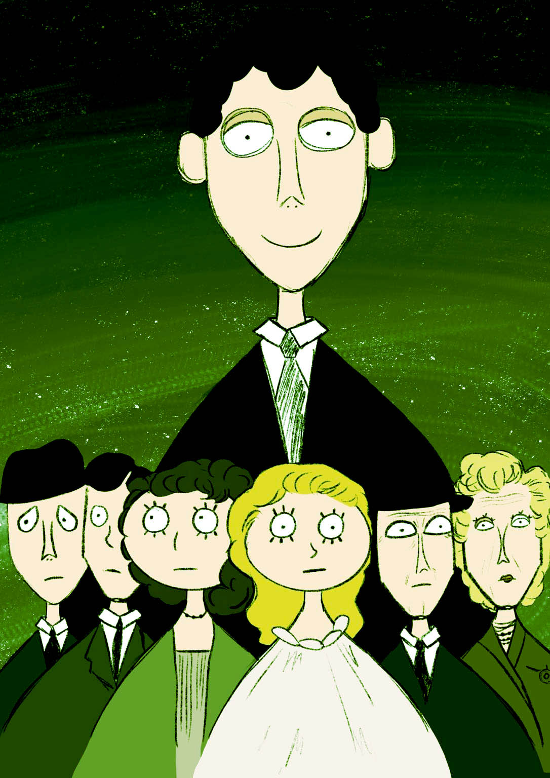
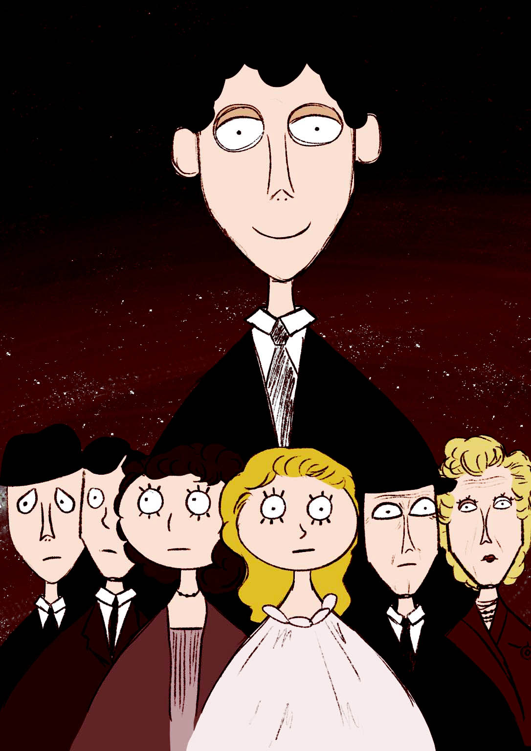
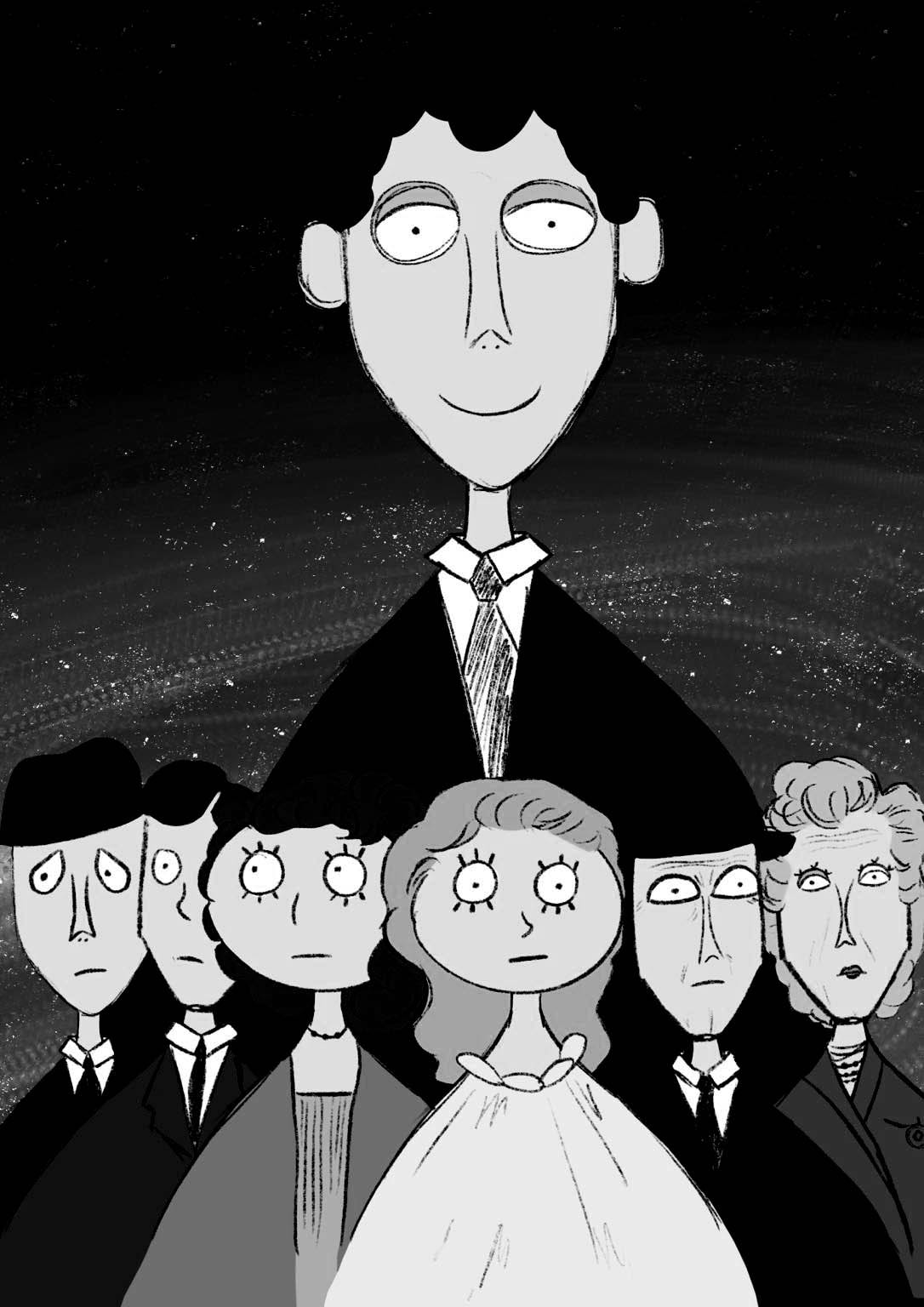
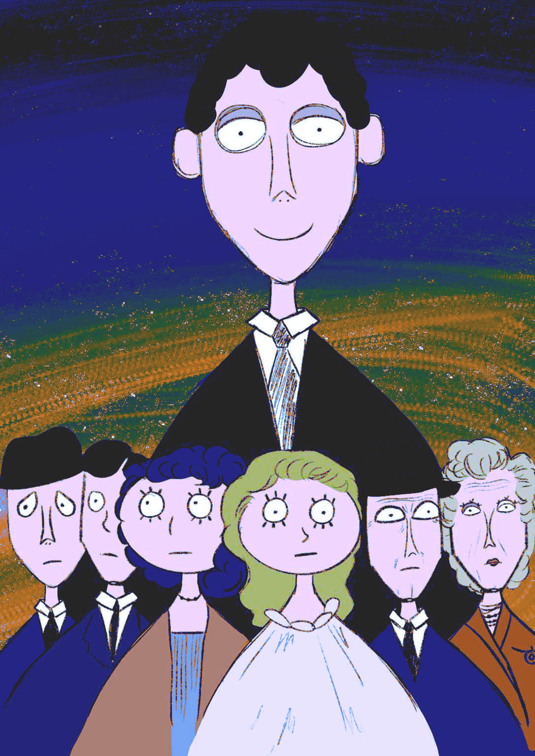
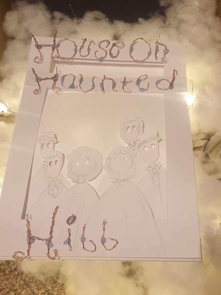
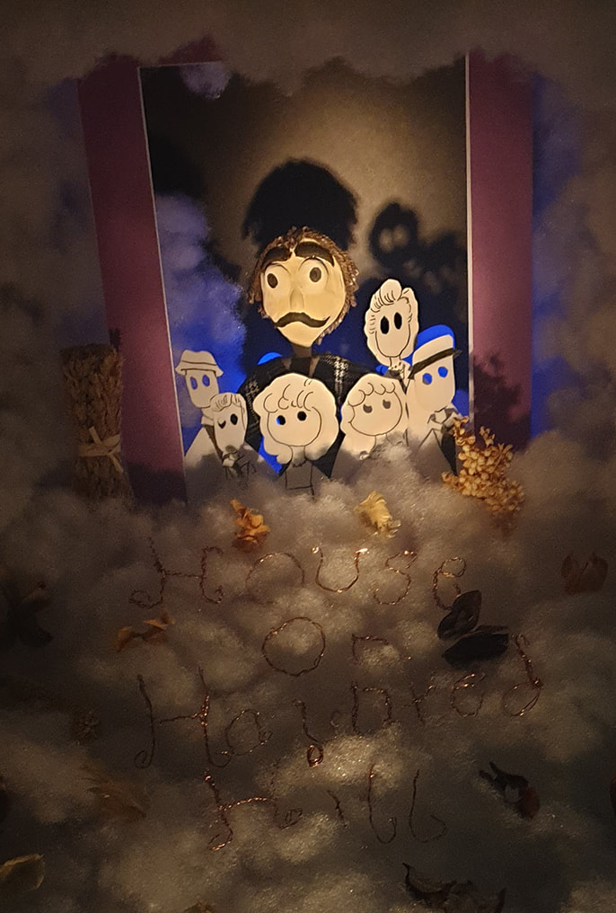
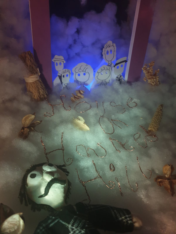
From my lighting tests I added line art to my characters and they now stand out more. To add more colour I added purple paper around the lightbox. To make sure this stays within the correct size I need to back up from where I take the photos and enlarged them later to fit 686×1016 mm. I added colour changing lights to the back and think the blue and green ones stand out most.
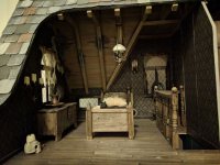
Mock Ups

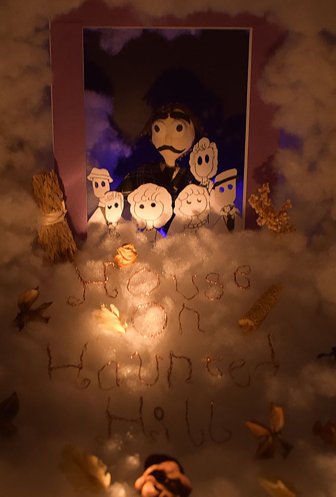
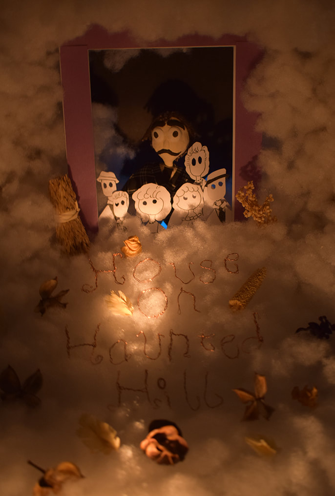

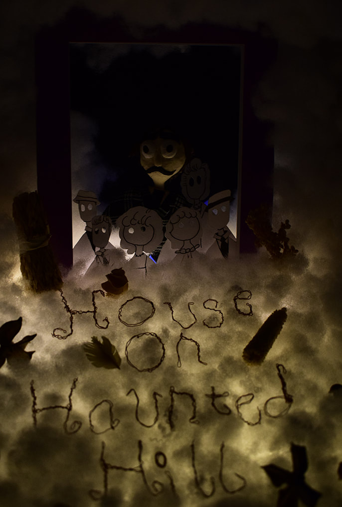

I ended up playing around with photography a lot for the mock ups, I like the blue colours mostly and will be using that colour for my final. I like how some are really dark and creepy but they also don't have my work appear that great so I will be trying to get a good lighting for both text and design and have them be clear but also have the theme of being spooky/scary.
Final Choices
|
|
|
|
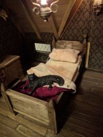
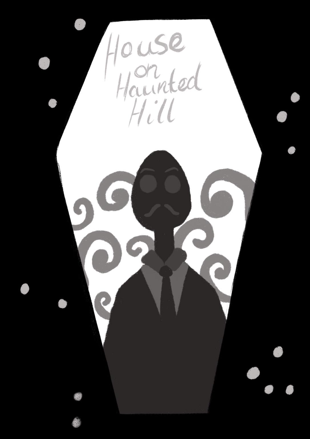
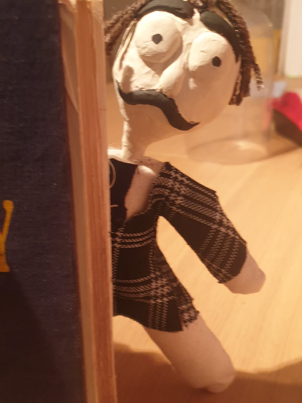
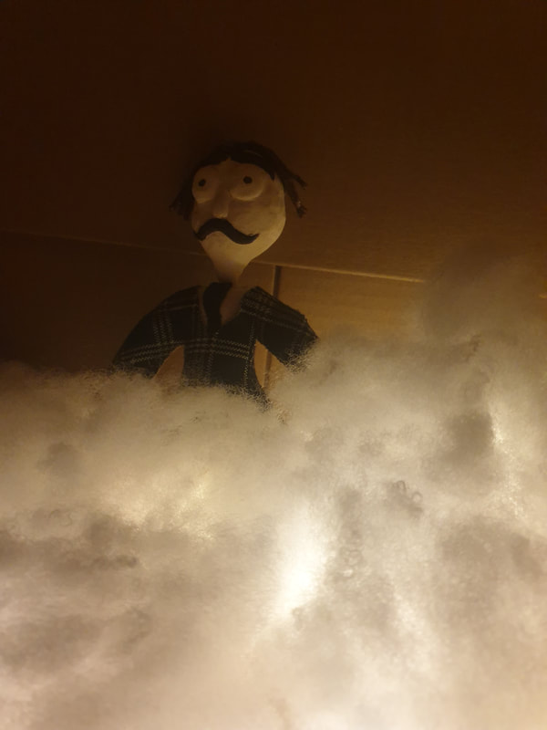
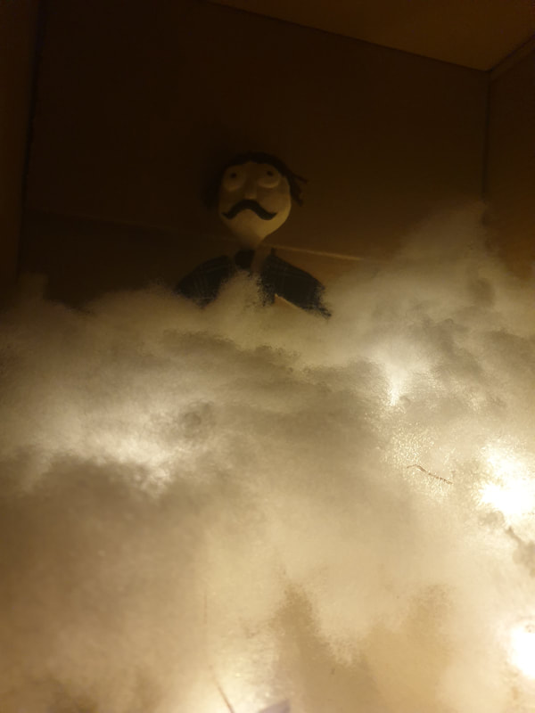
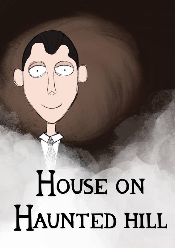
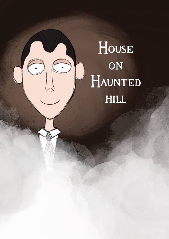
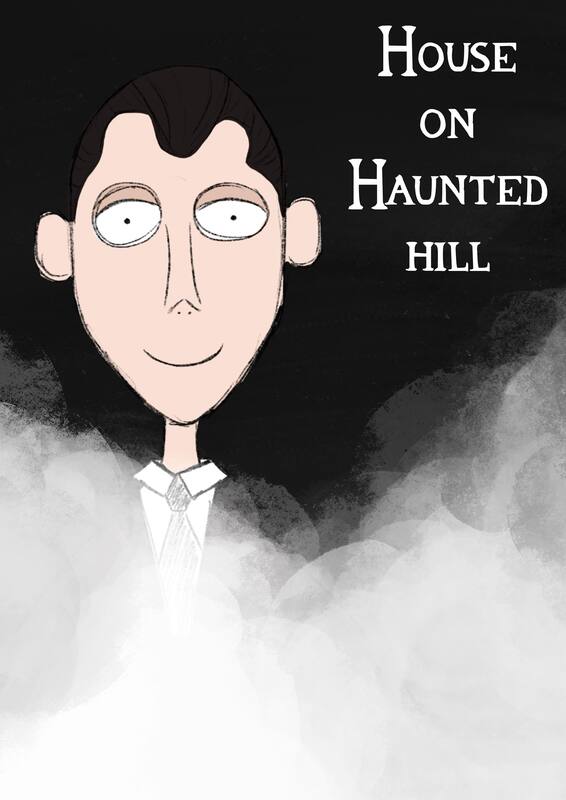
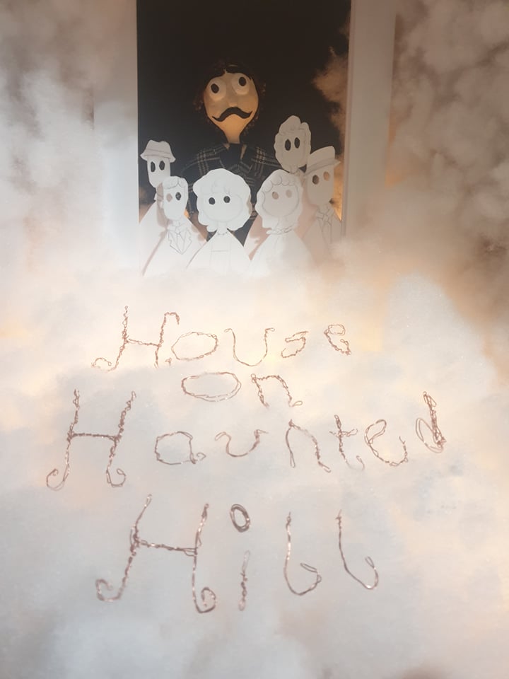
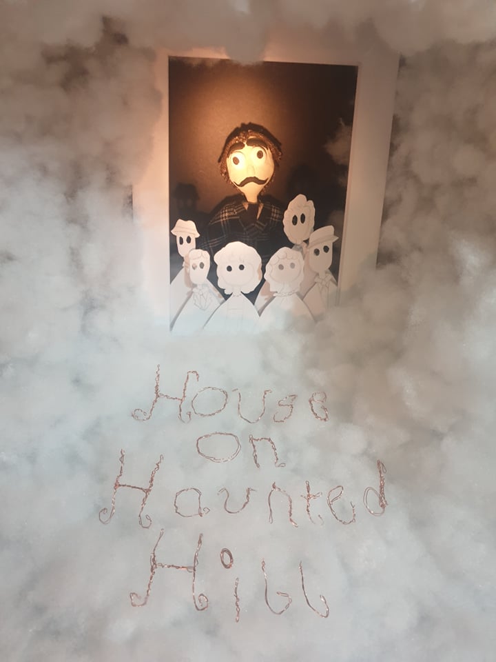
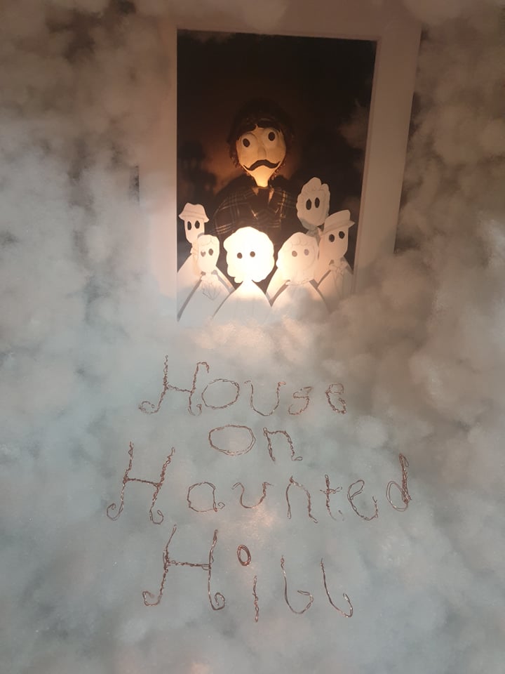
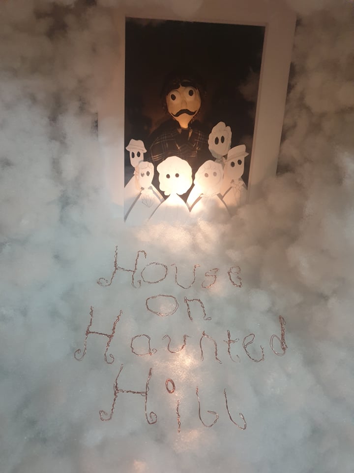
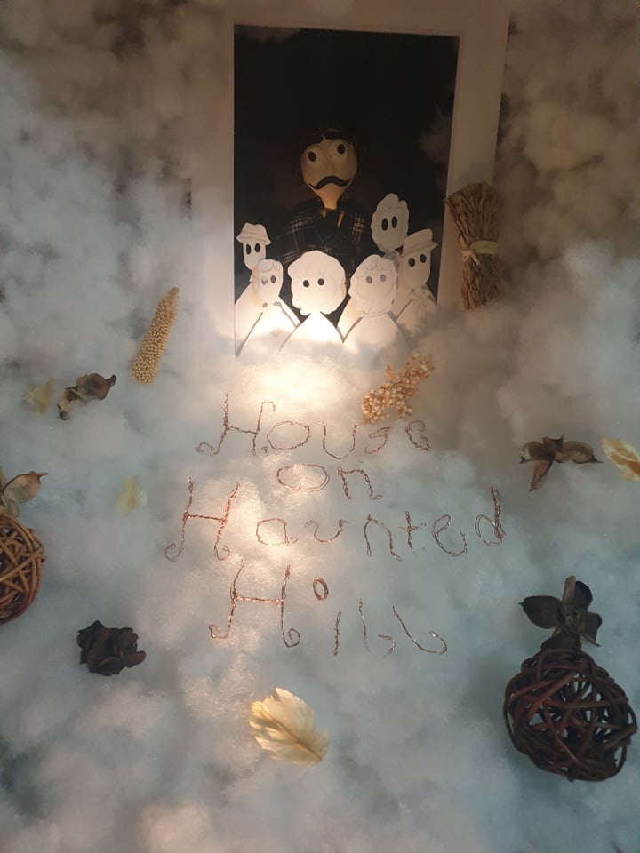
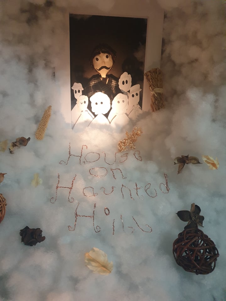
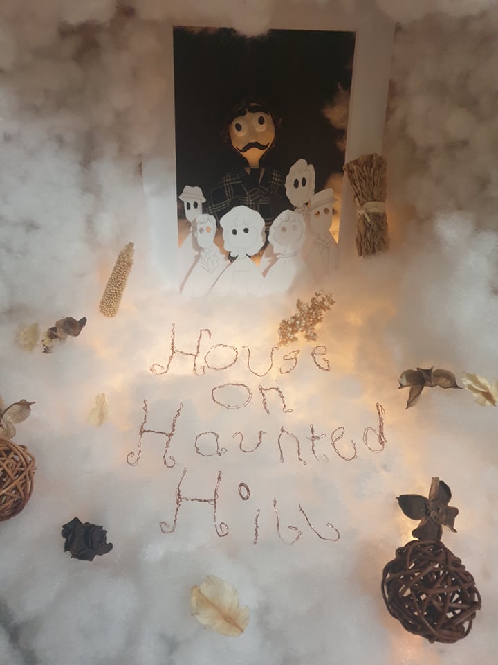
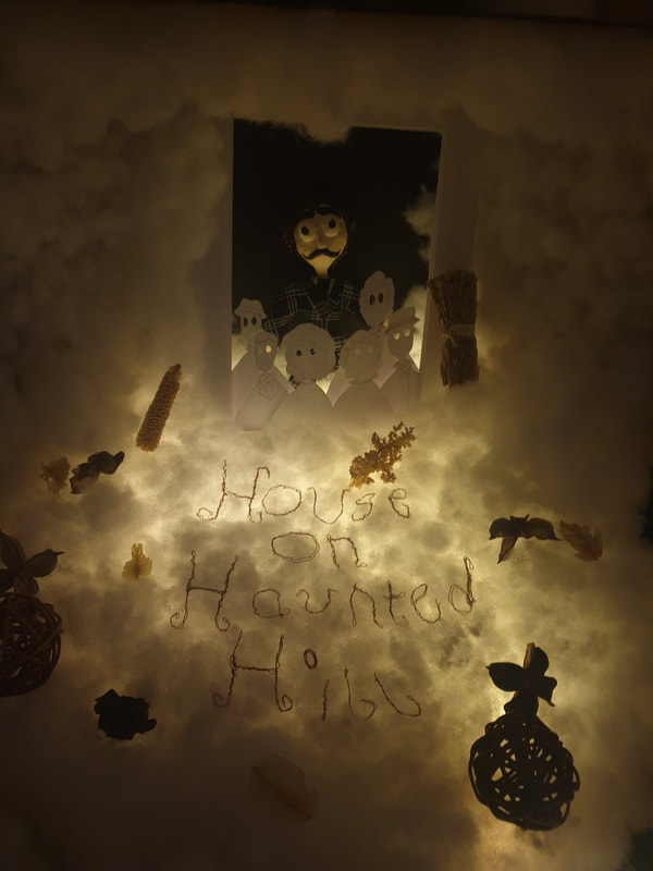
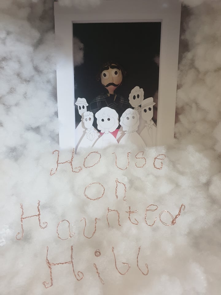
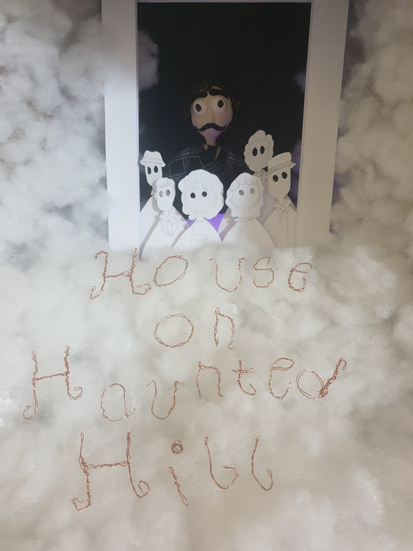
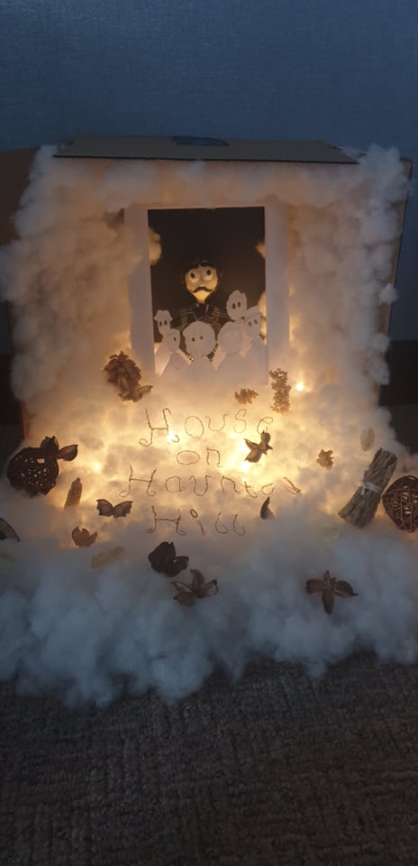
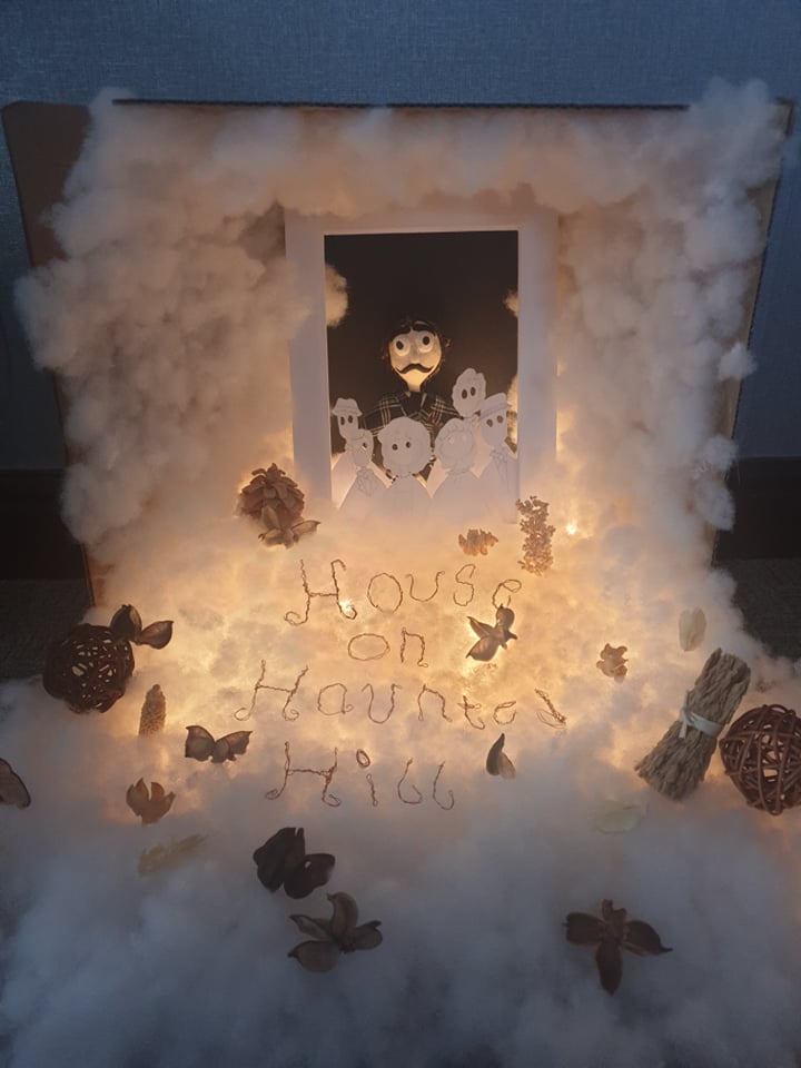
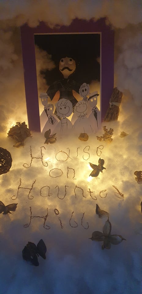
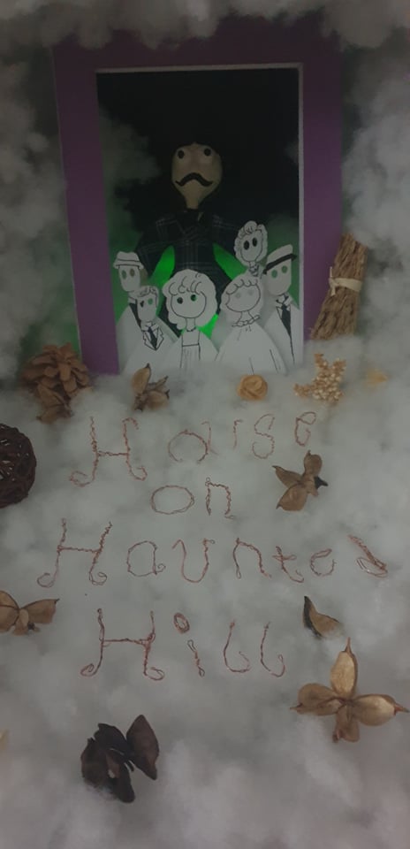
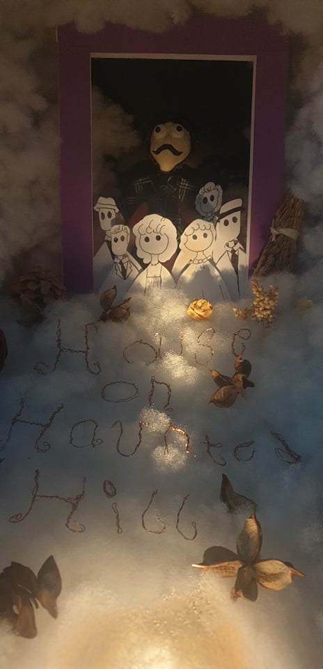
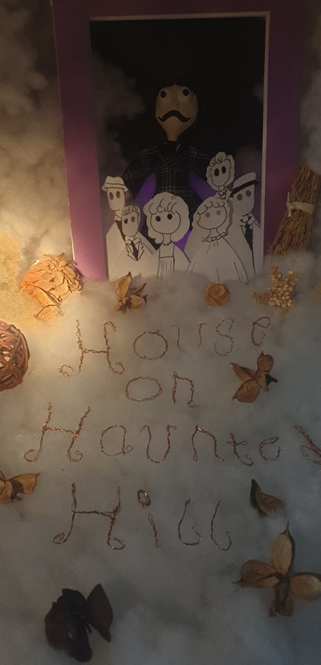
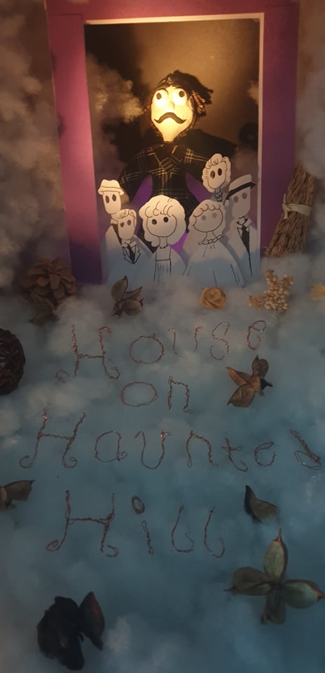
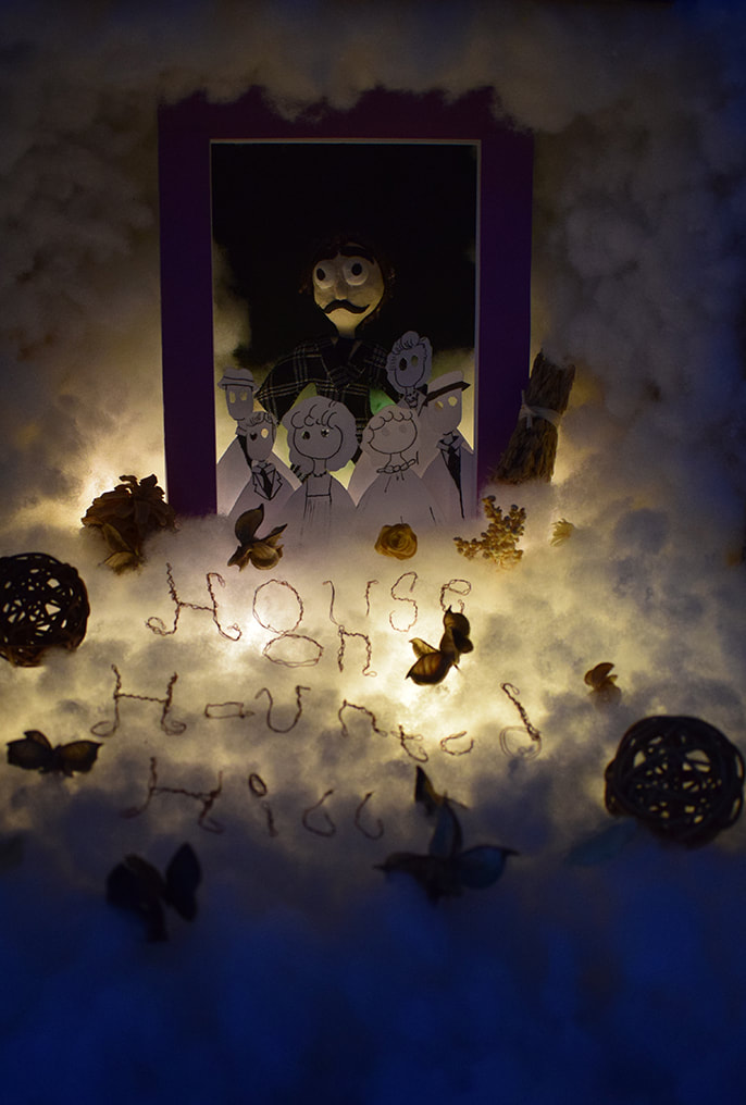
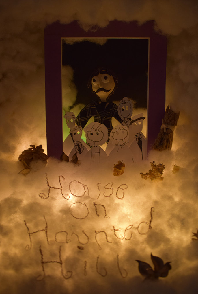
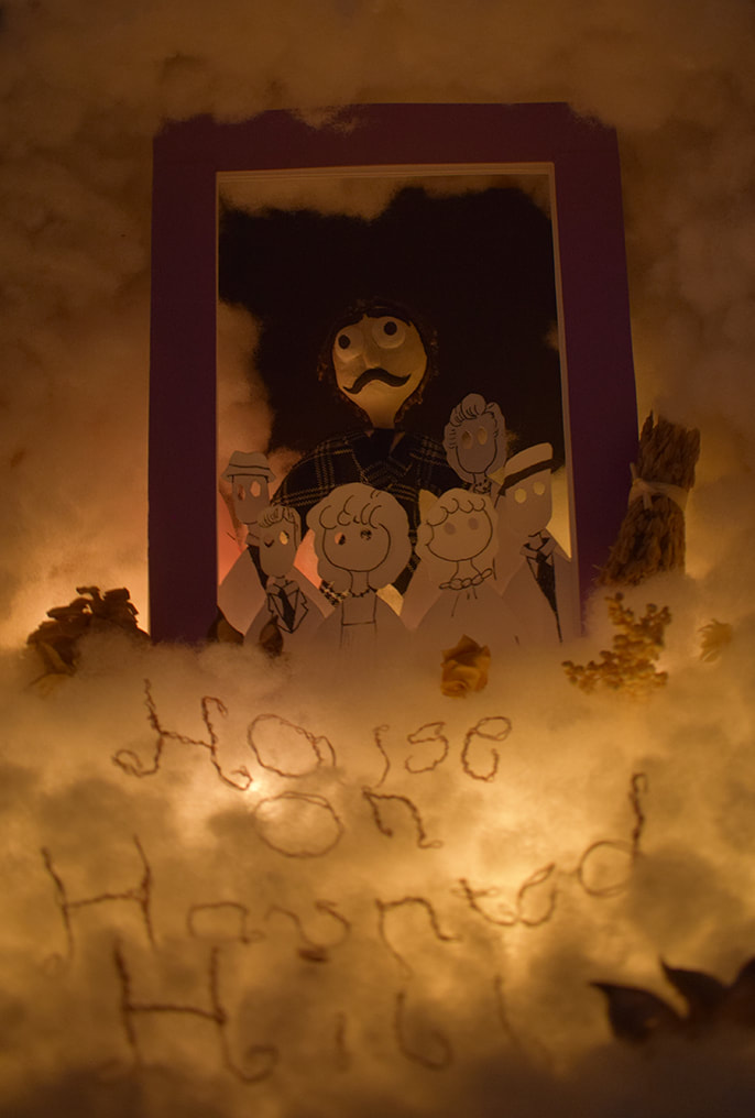
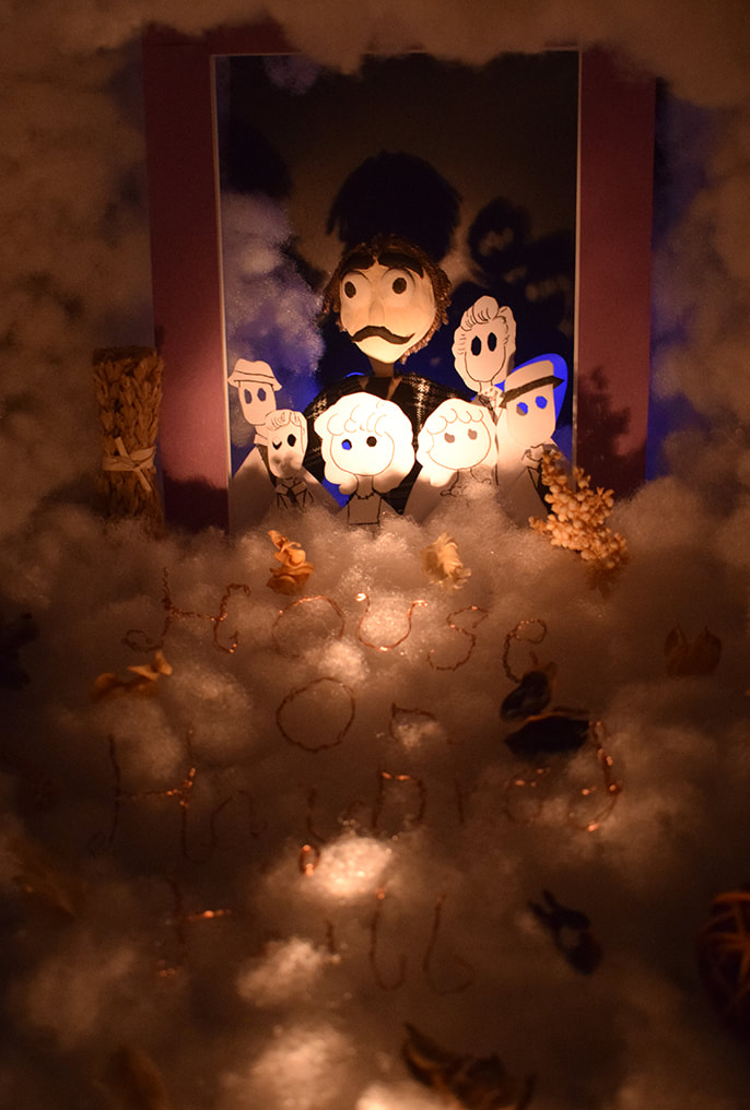
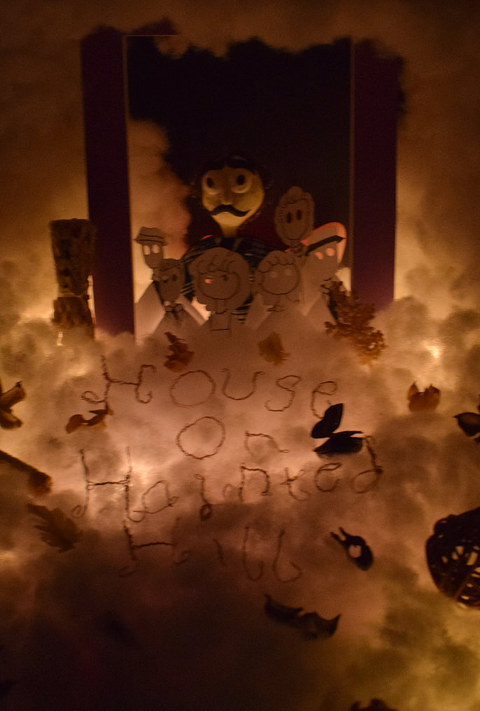
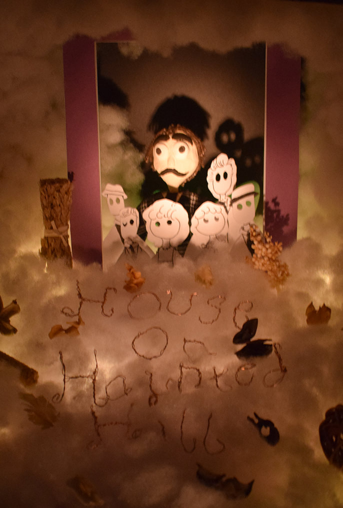
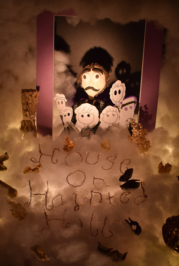
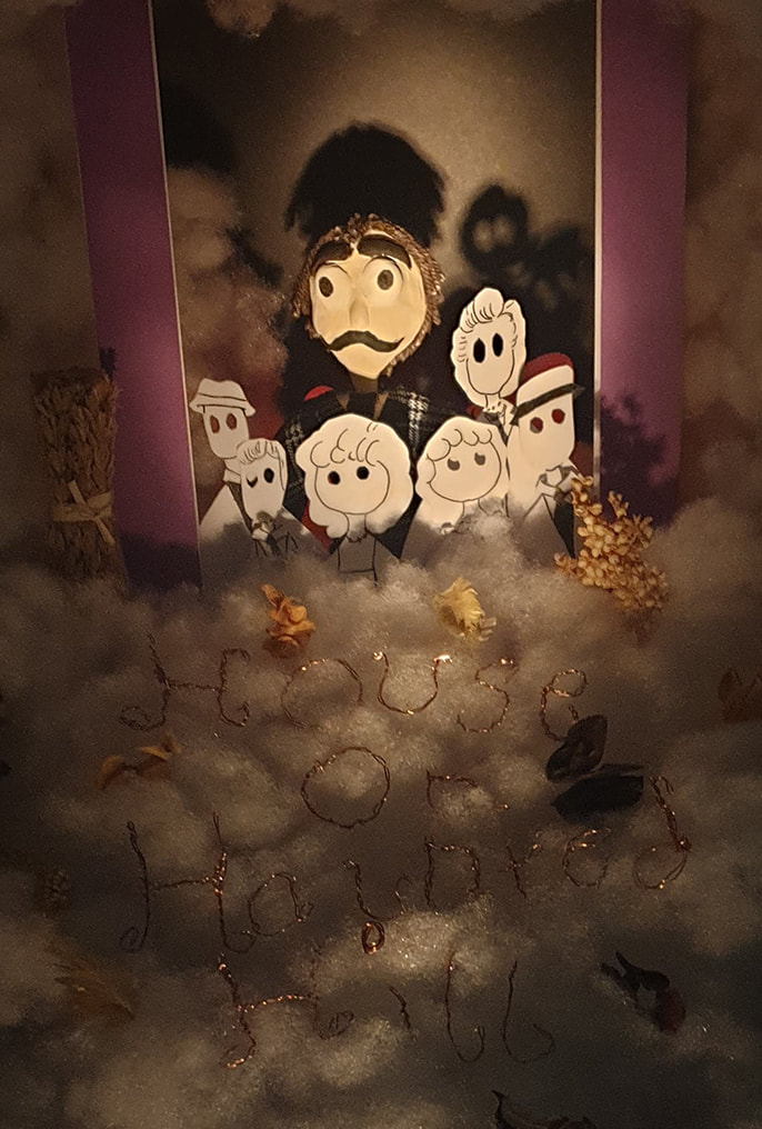
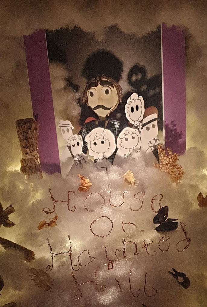
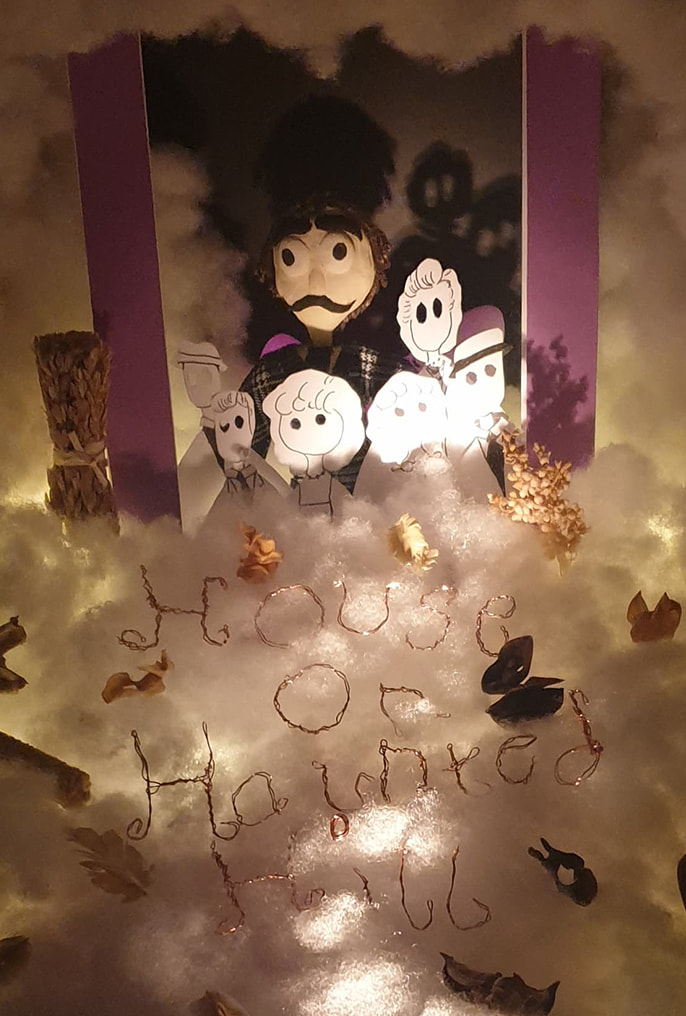
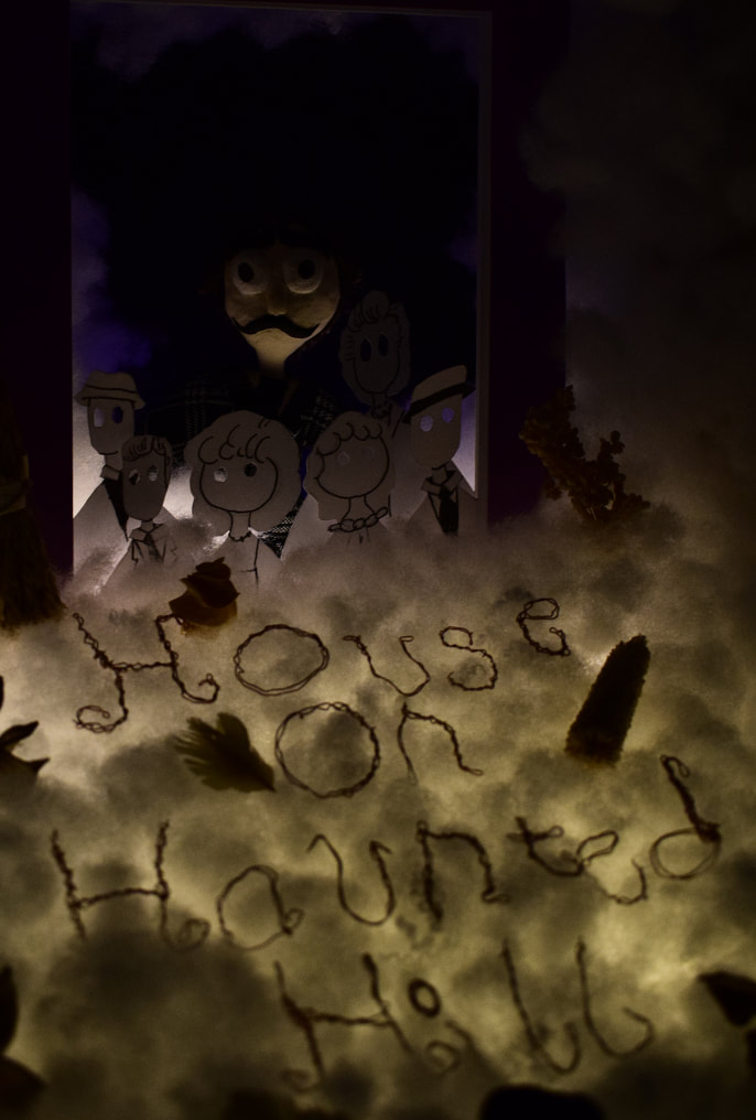
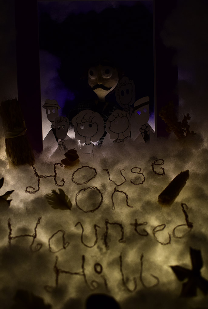
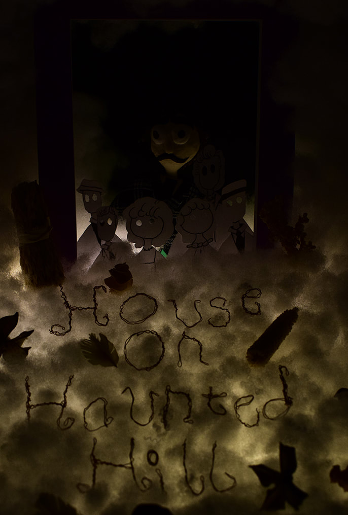
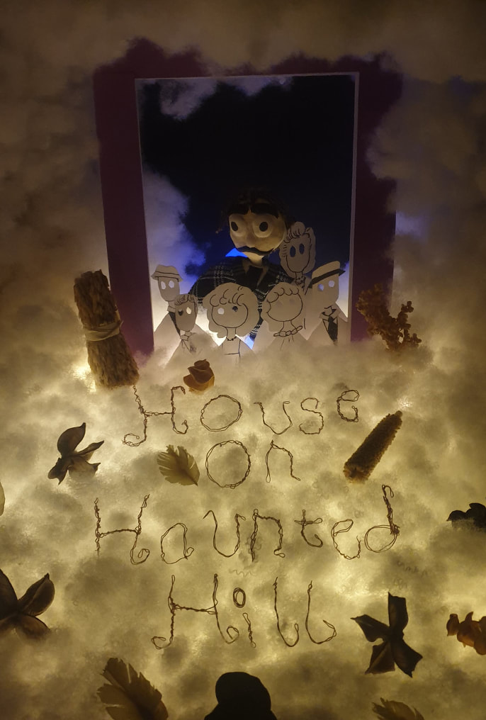
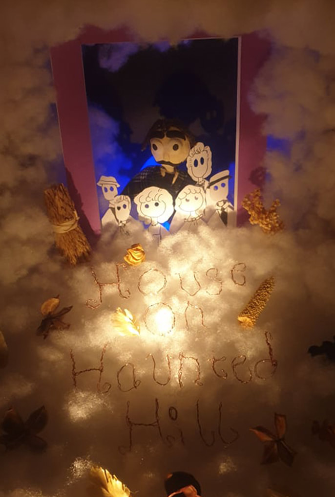
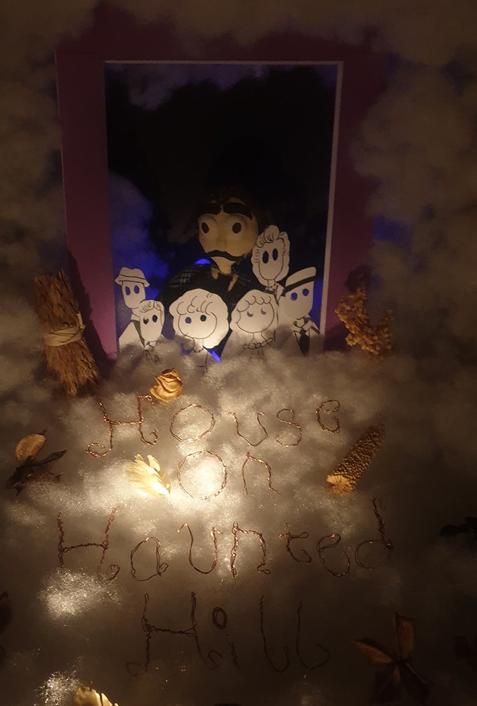
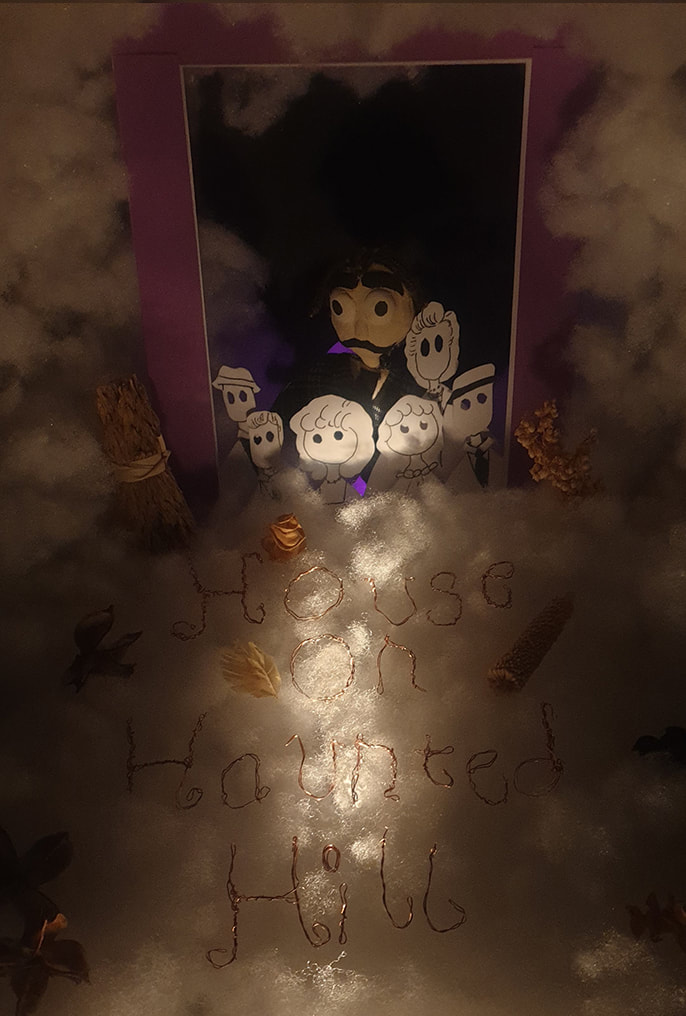
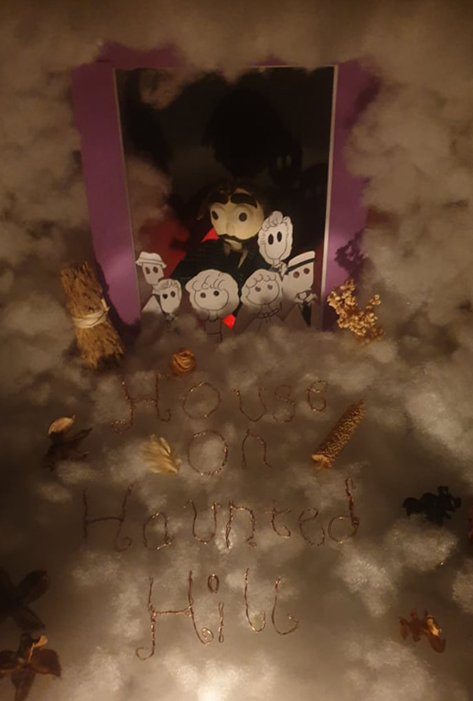
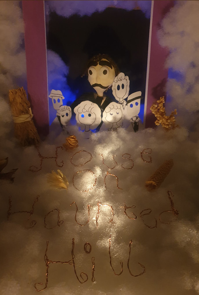
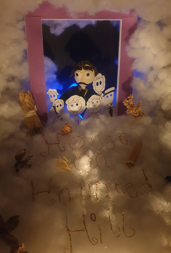
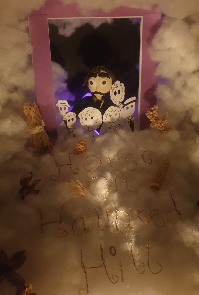
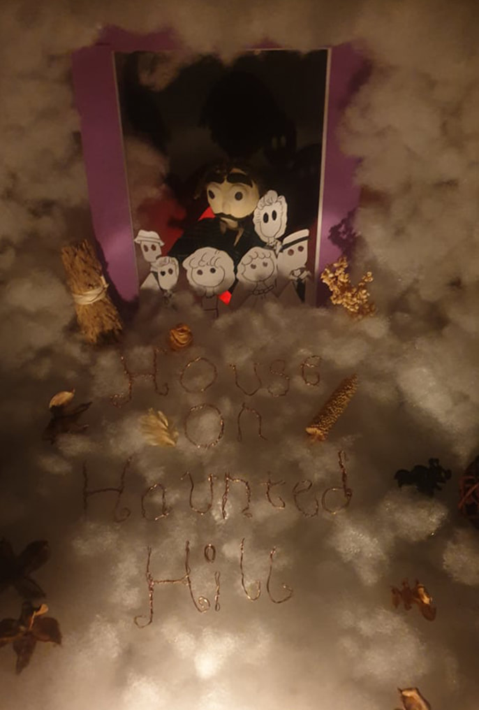
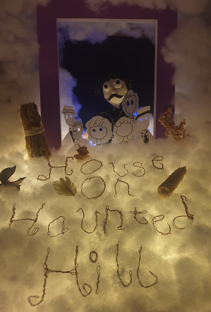
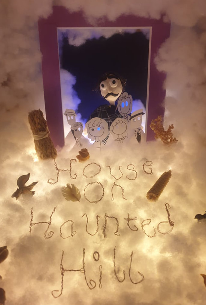
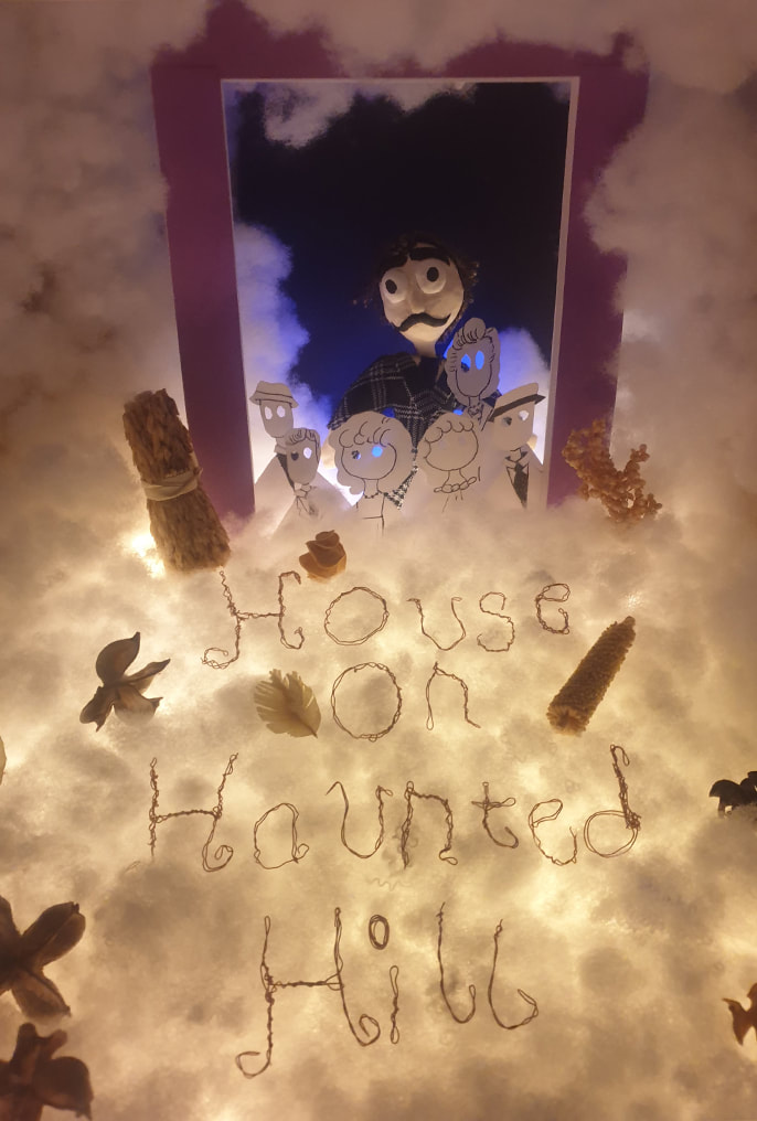
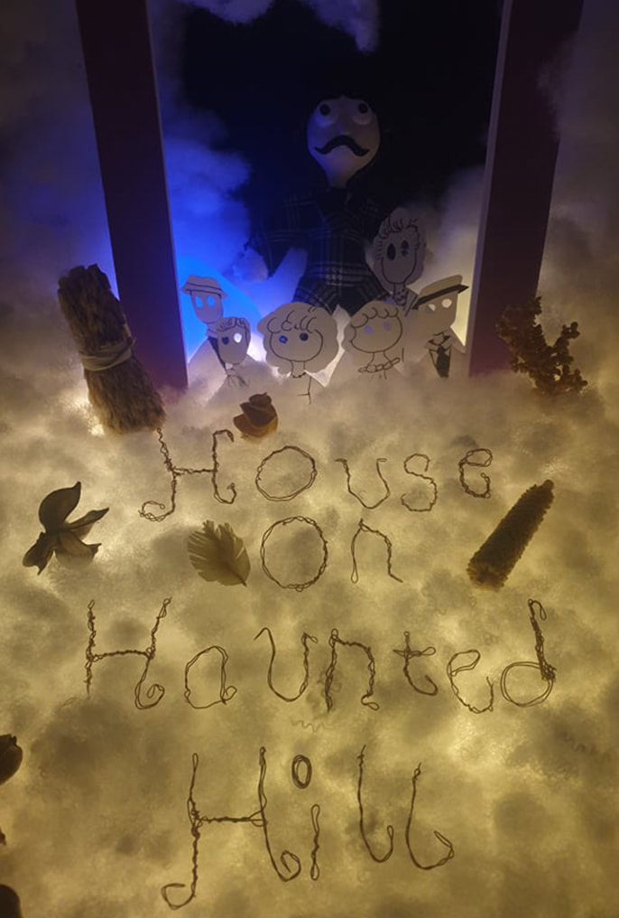
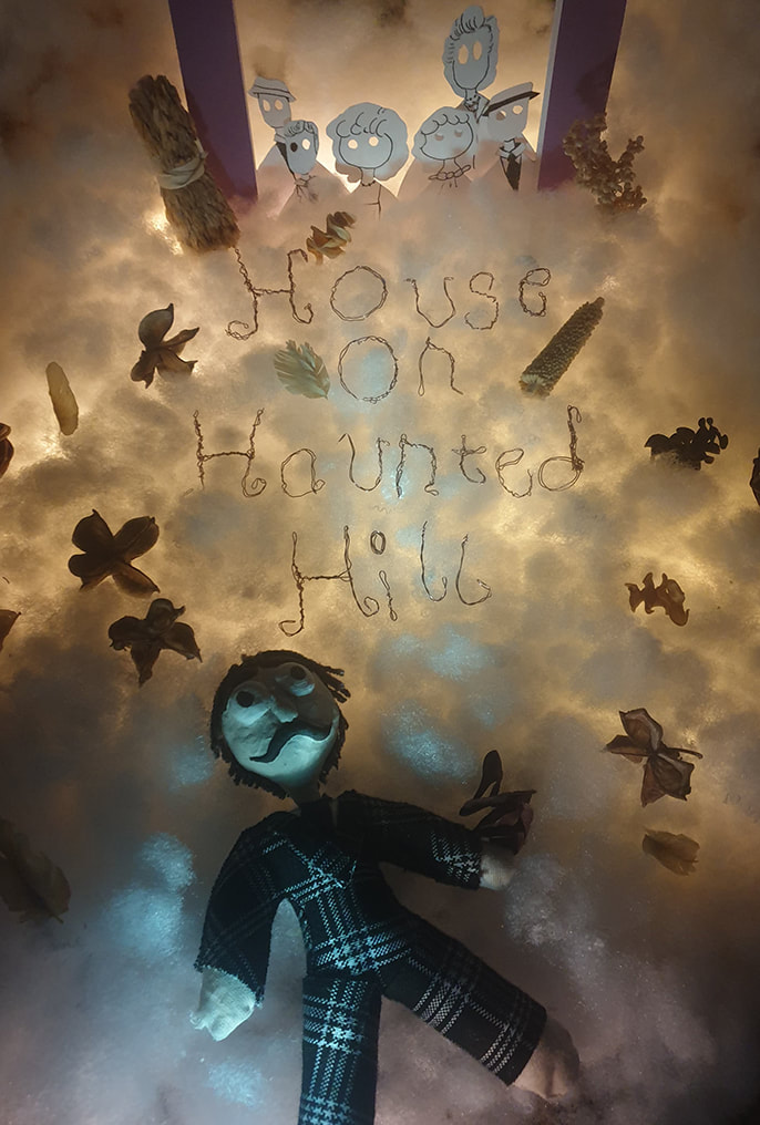
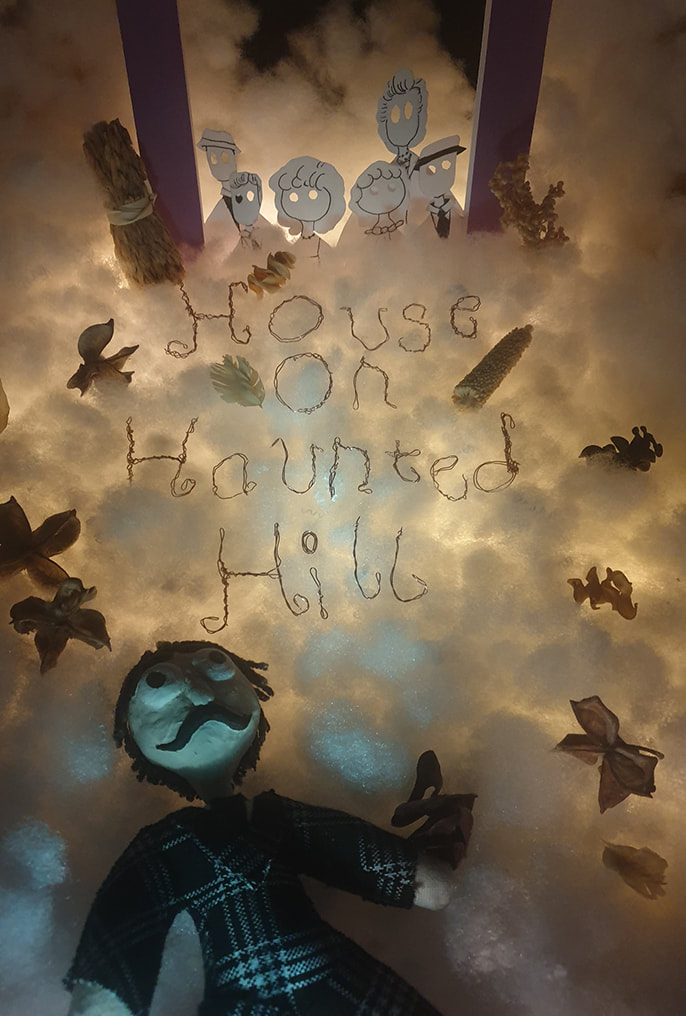
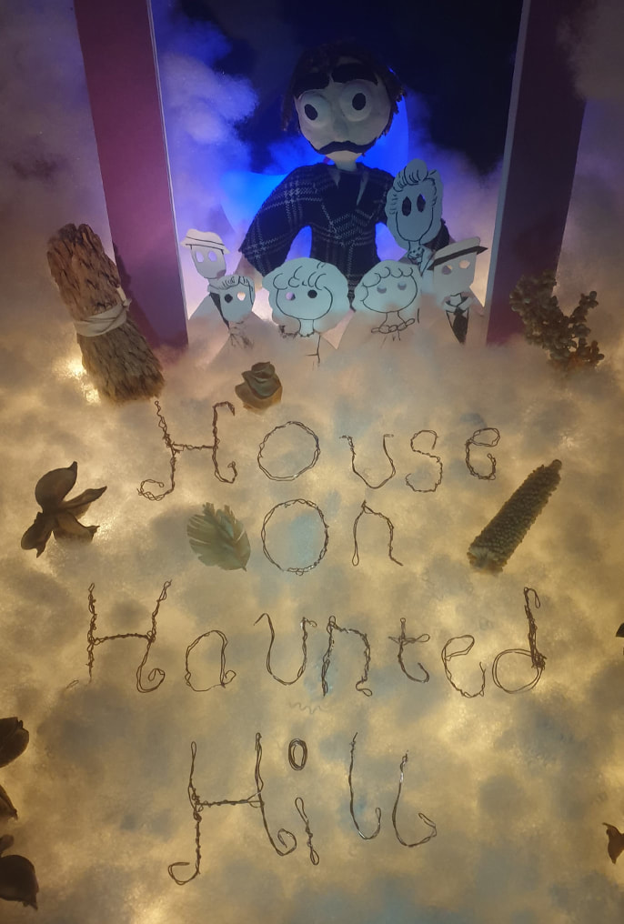
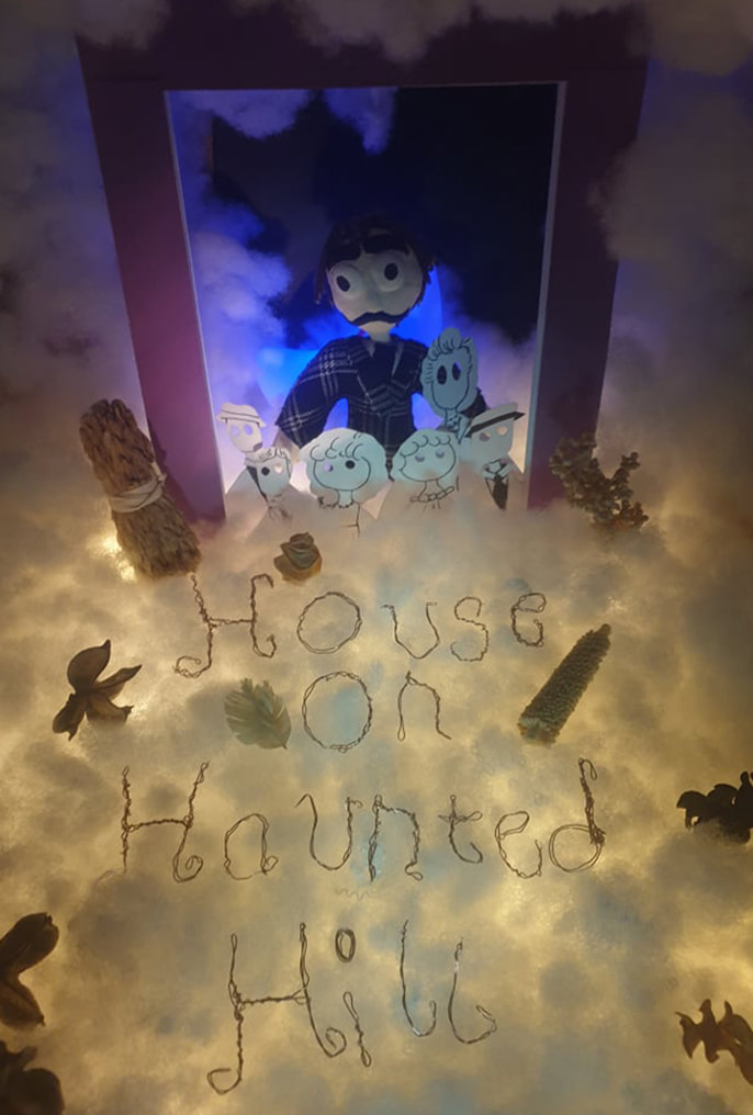
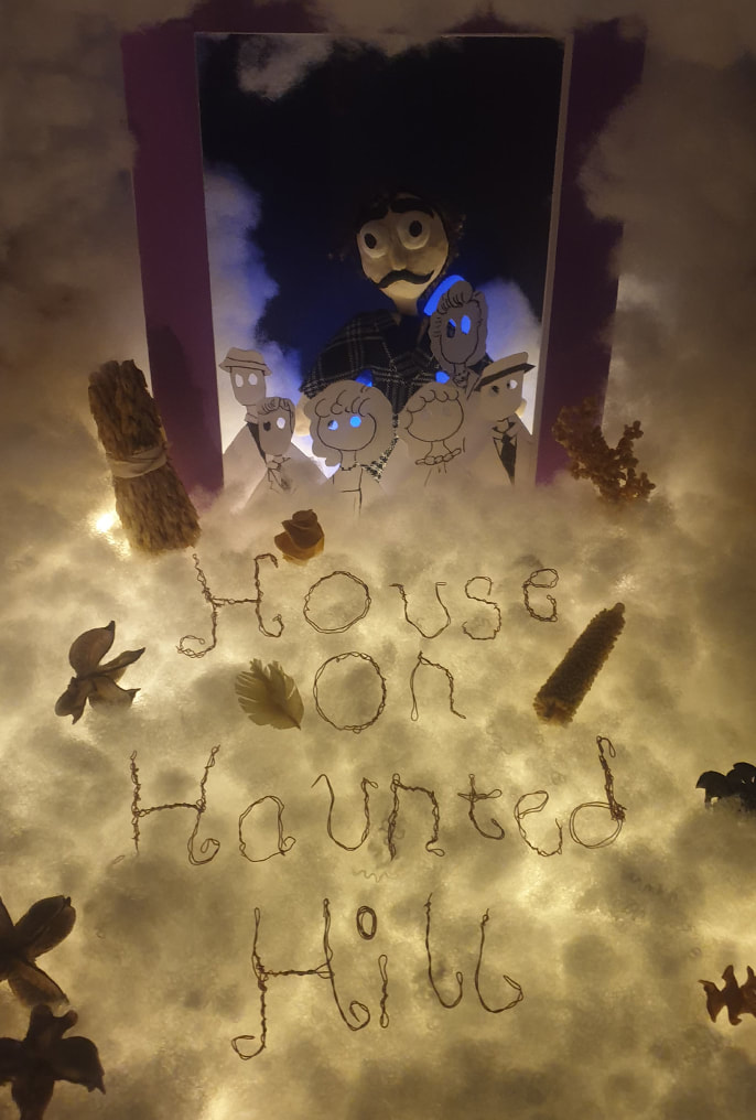
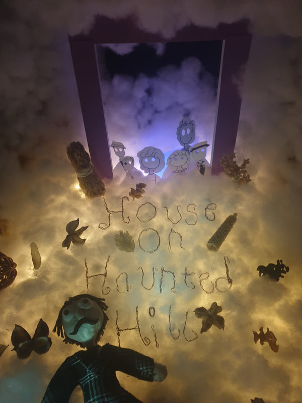
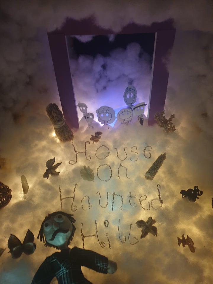
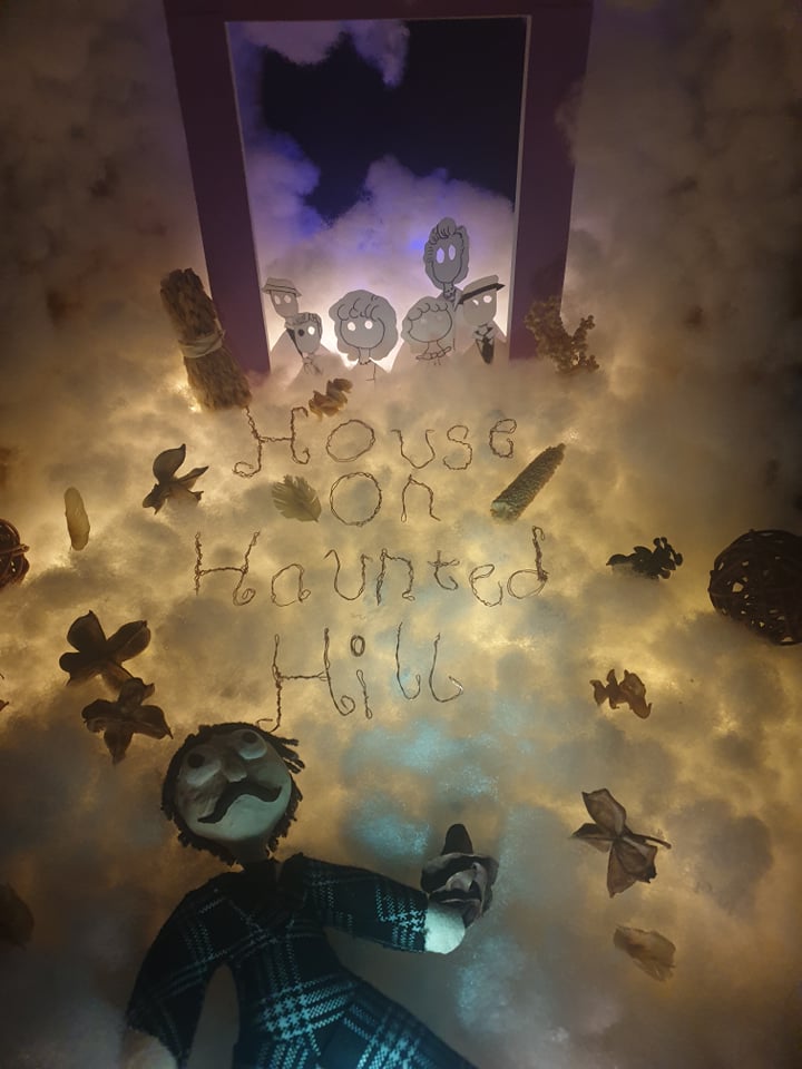
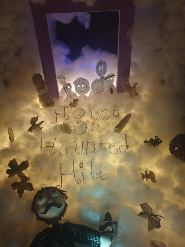
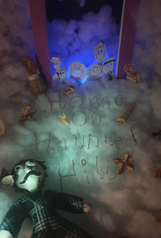
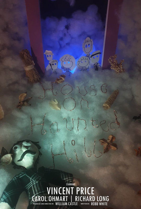
I took more photographs of the designs that worked well, what I need to do for the final Is make sure the doll is standing more straight which has been hard as he is constantly falling onto the lightbox design. I also tried something different and have had him lay down at the bottom of the text where I shone a light through a cup that leads up to the other characters. I asked 3 classmates on their opinions and the only one not chosen was 3 while 1 being the most favourable as it wasn't text heavy and also doesn't look like I have a lot of space that needed covering.
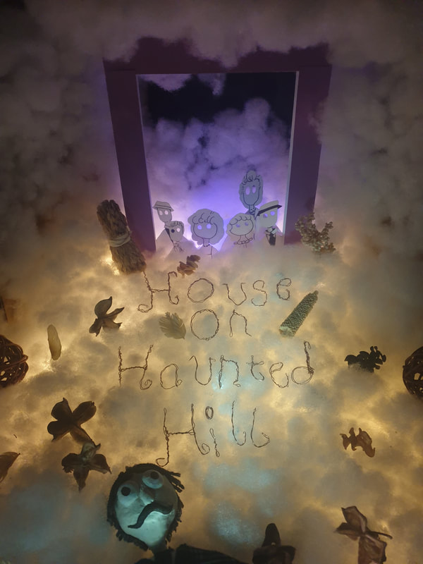
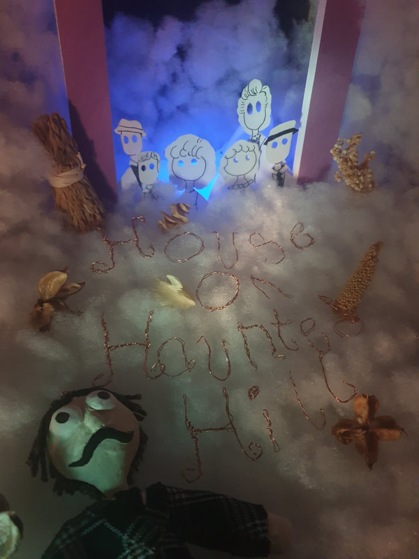
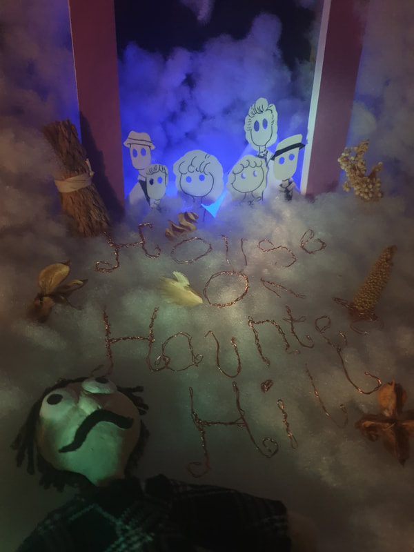
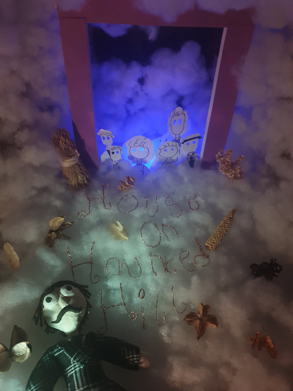
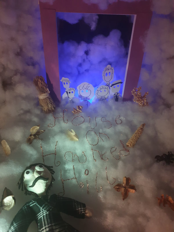
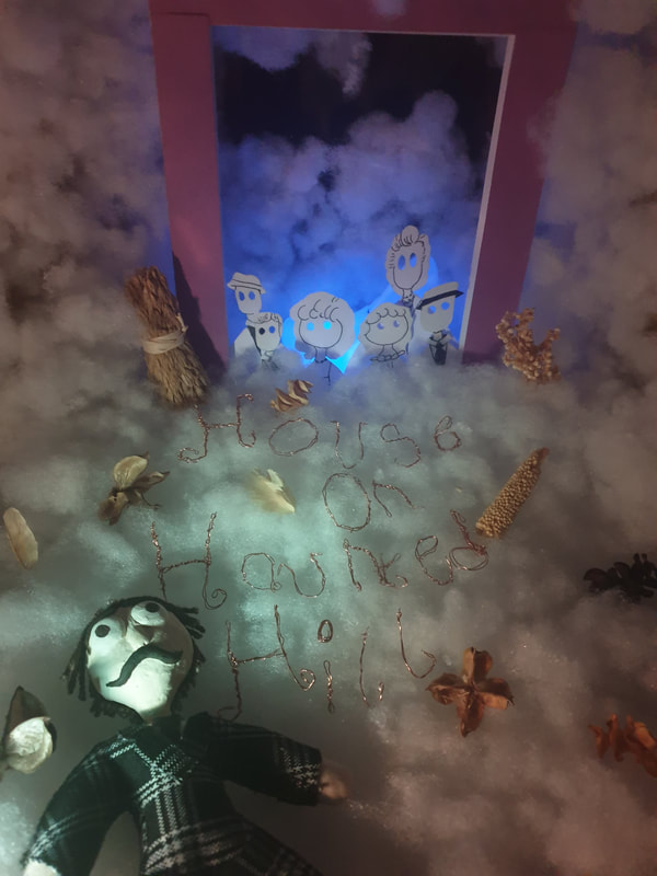
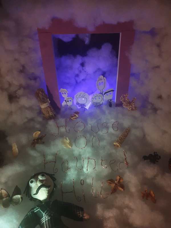
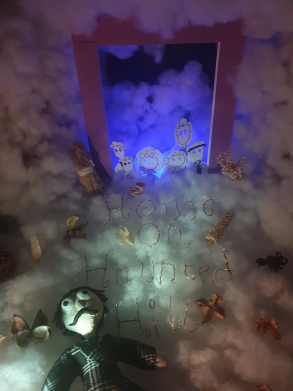
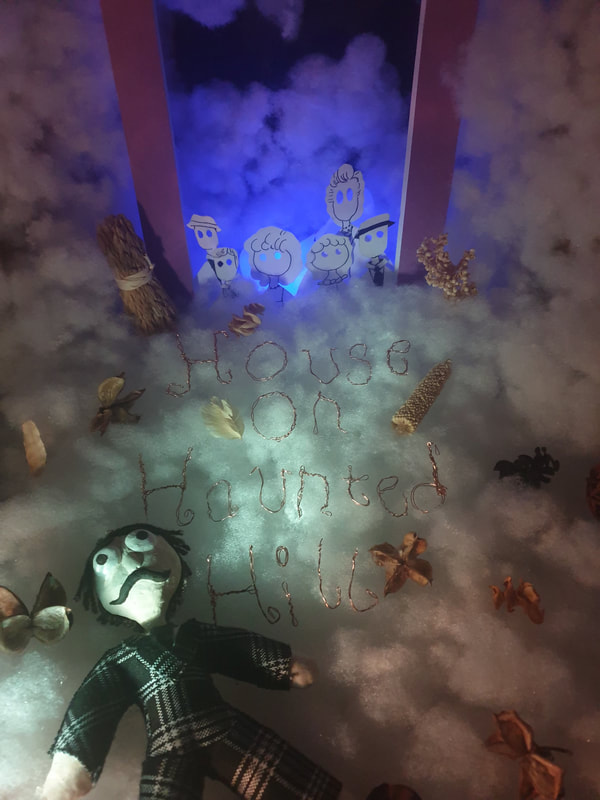
I tried to combine 1 with the lights that the other ones gave off but with the the fluff the colours look de-saturated so I made the light a bit more visible as it lays right behind the characters.
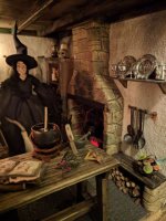
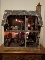
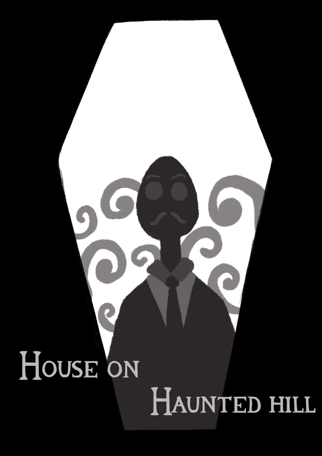
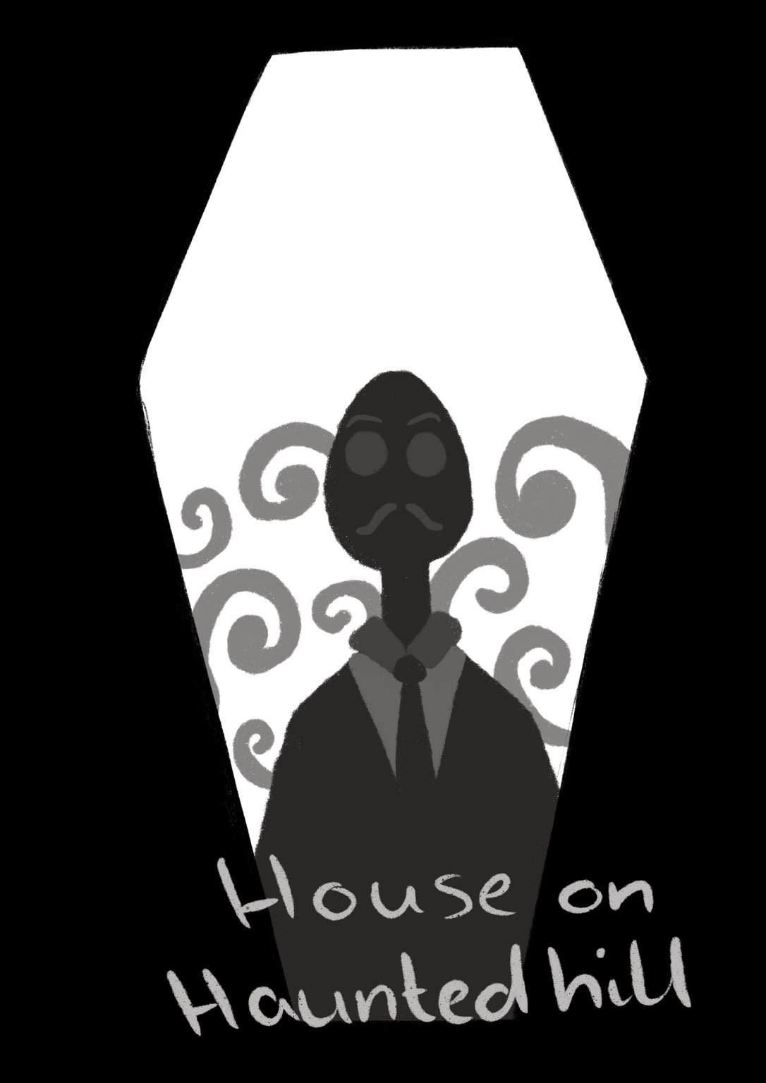
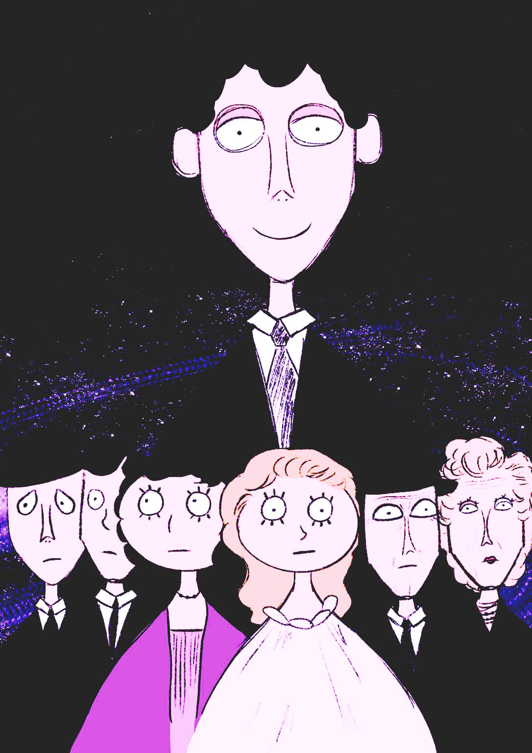
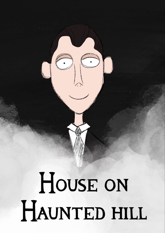
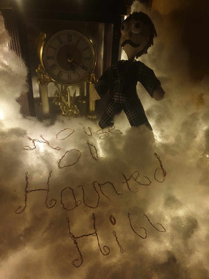
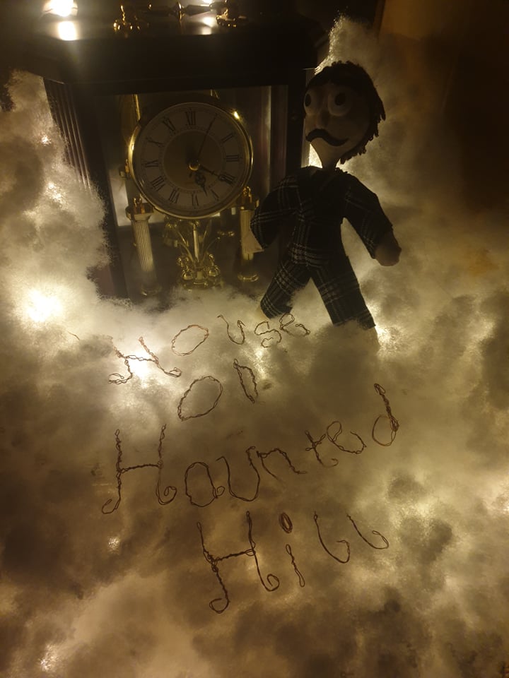
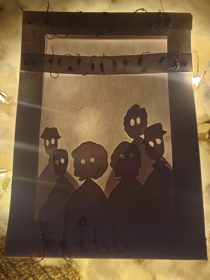
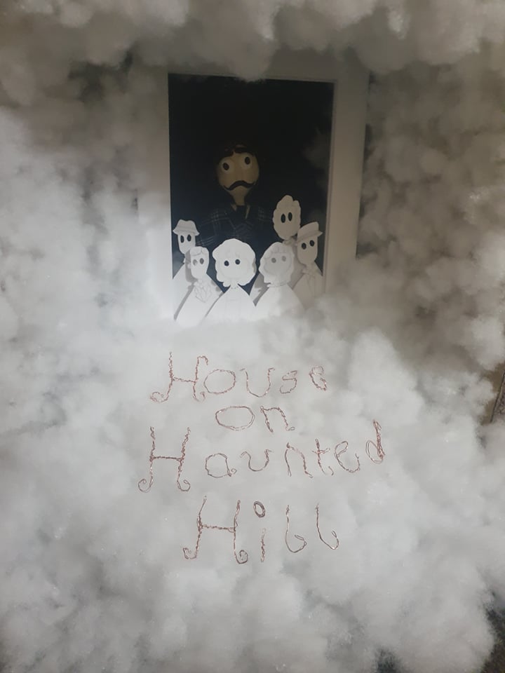
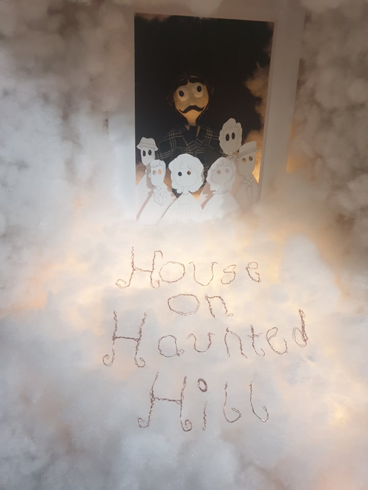
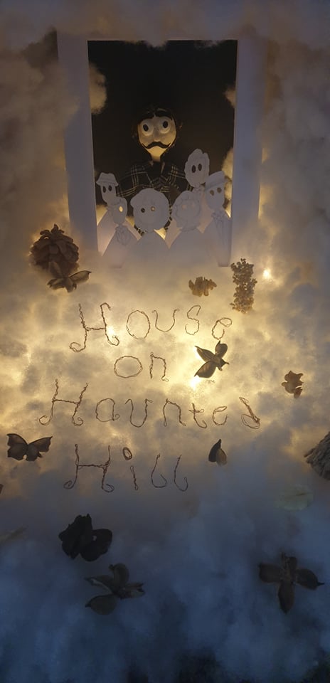
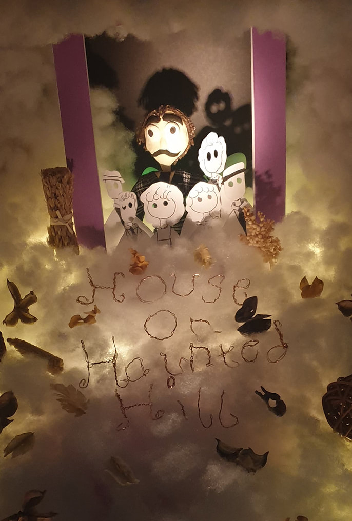
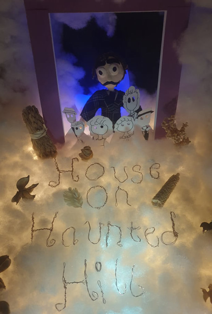
F I N a l
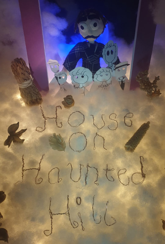
|
HOUSE ON HAUNTed HILL (1959)My final poster was created using a variety of materials such as Clay, paper, stuffing, wire and random objects. Inspired by the 1959 movie 'House on Haunted Hill' starring Vincent Price.
For my final It is definitely not what I had imagined as I was going for a scary horror theme but ended up looking spooky but not entirely scary. I don't think 3D is something I have really been confident in but taking on the challenge I much preferred this project compared to the 3D work I did in the first semester. My favourite part of this design is the blue lighting as such a small detail can really change the design so much. |