Stage 1: Research
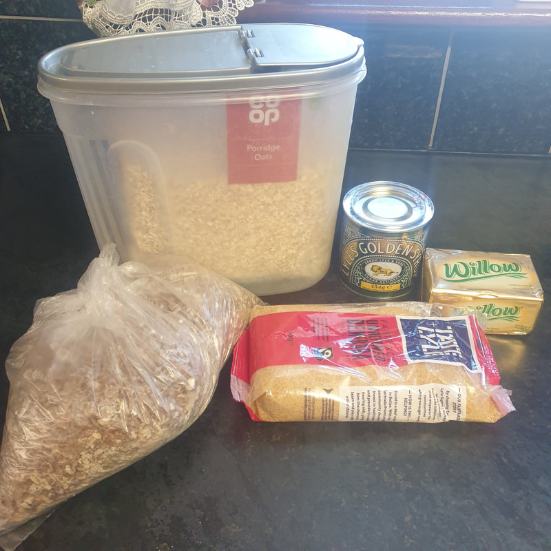
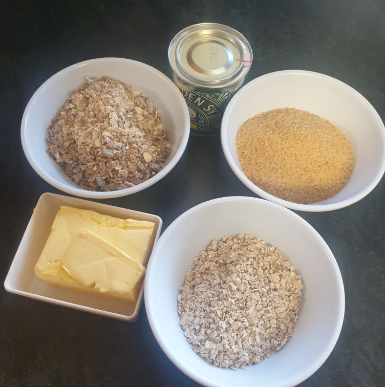
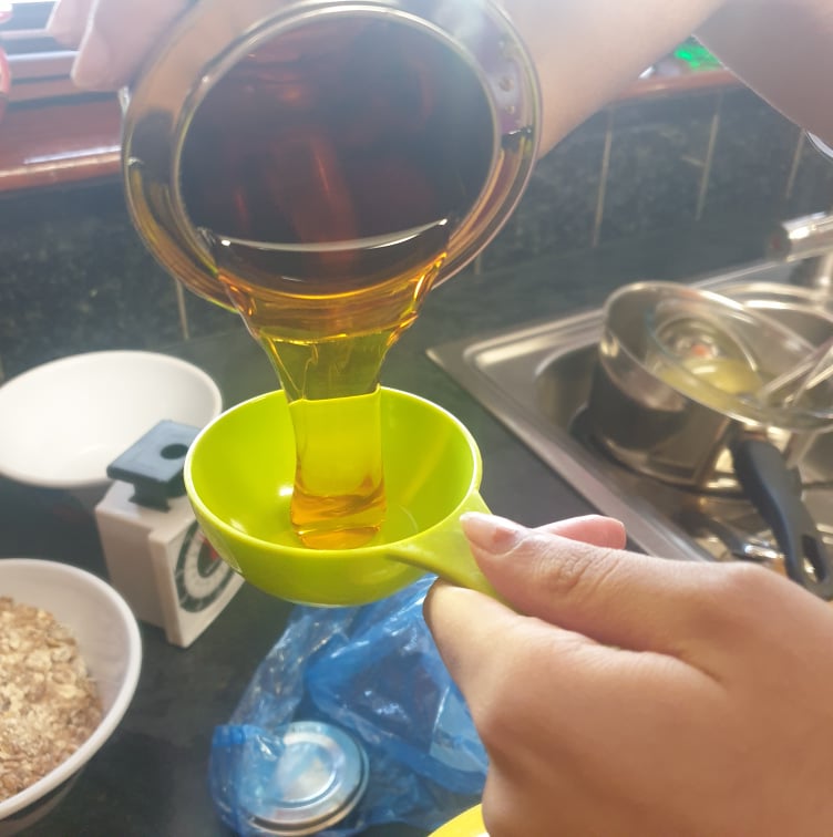
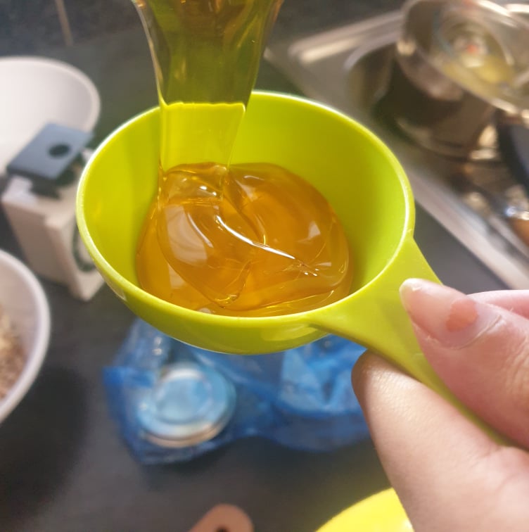
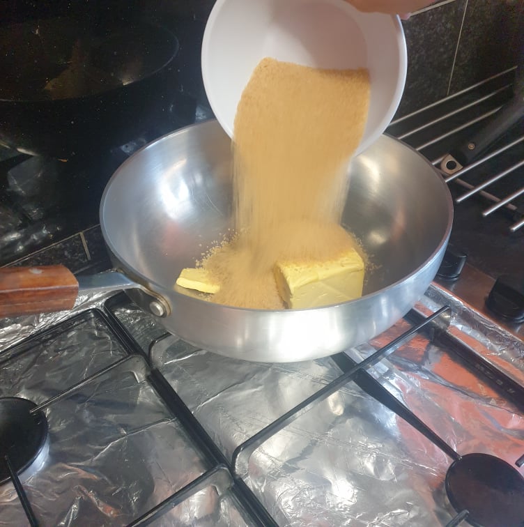
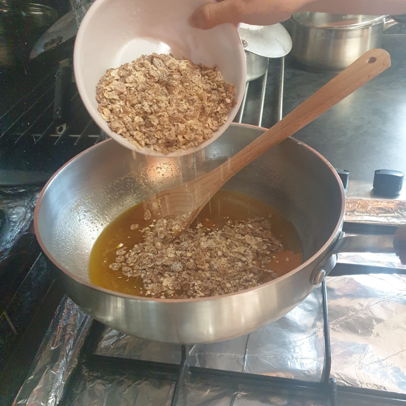
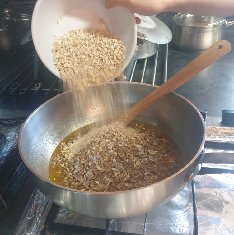
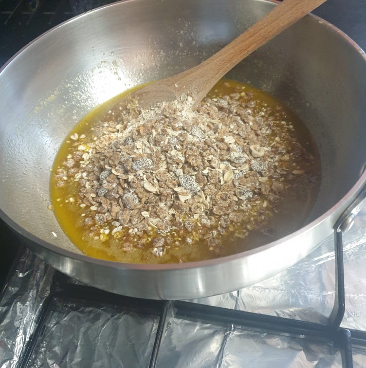
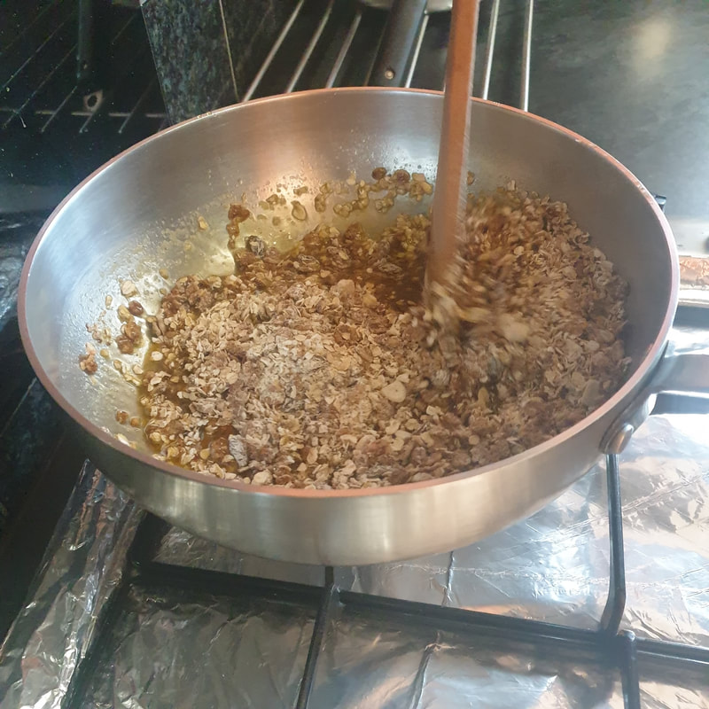
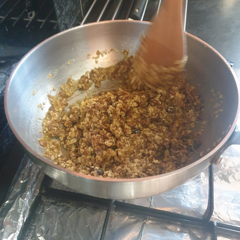
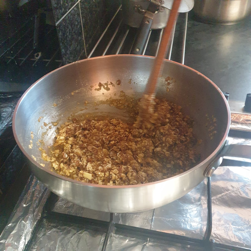
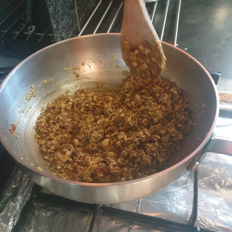
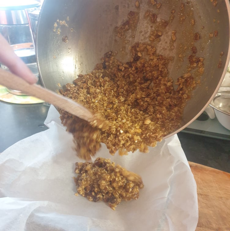
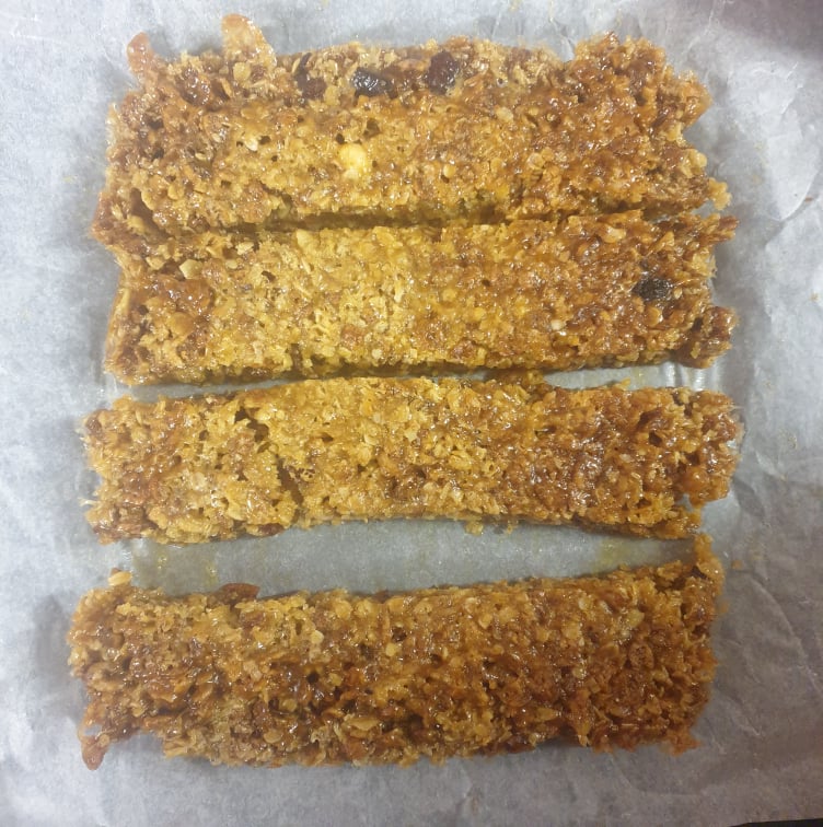
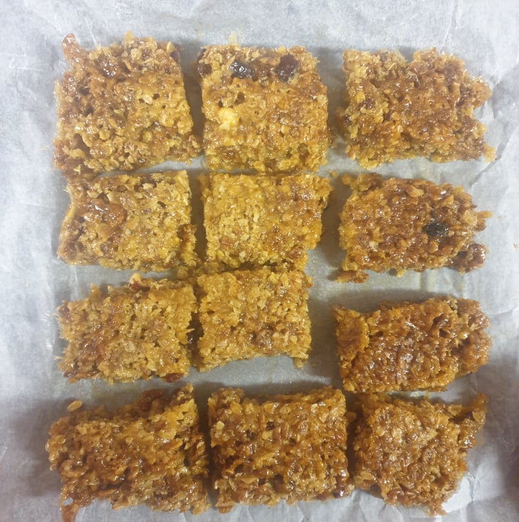
The first step is to make the one of the recipe options.
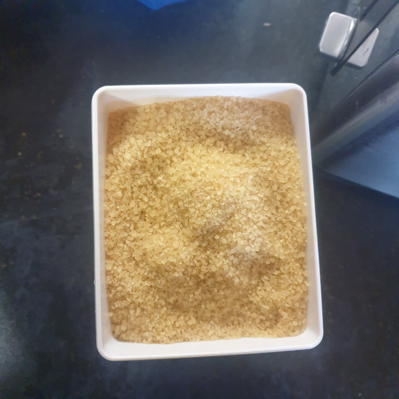
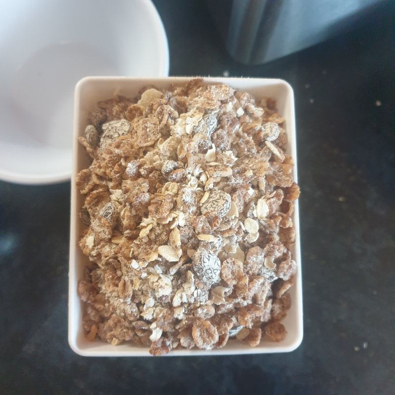
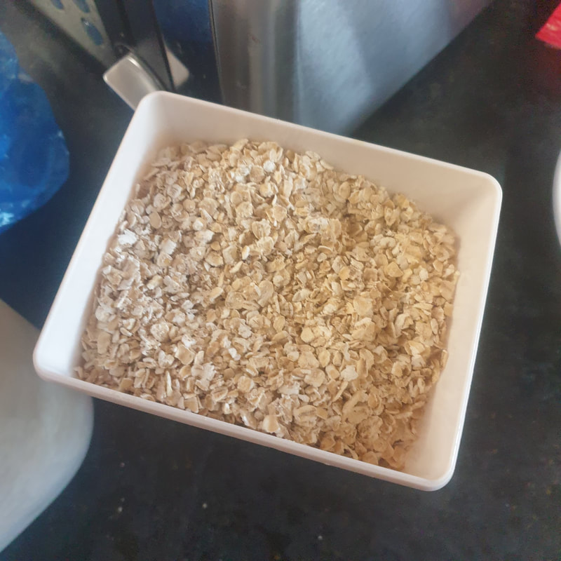
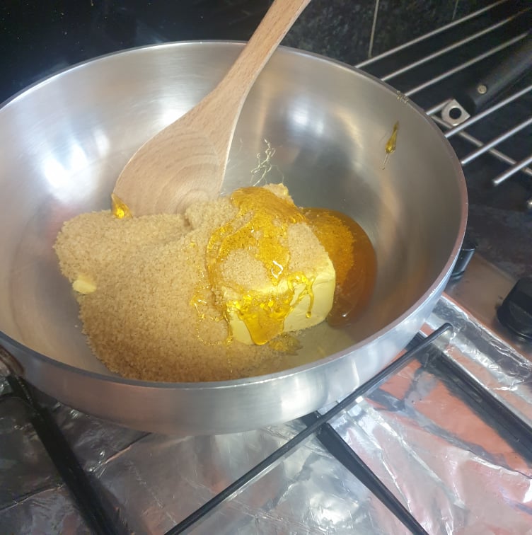
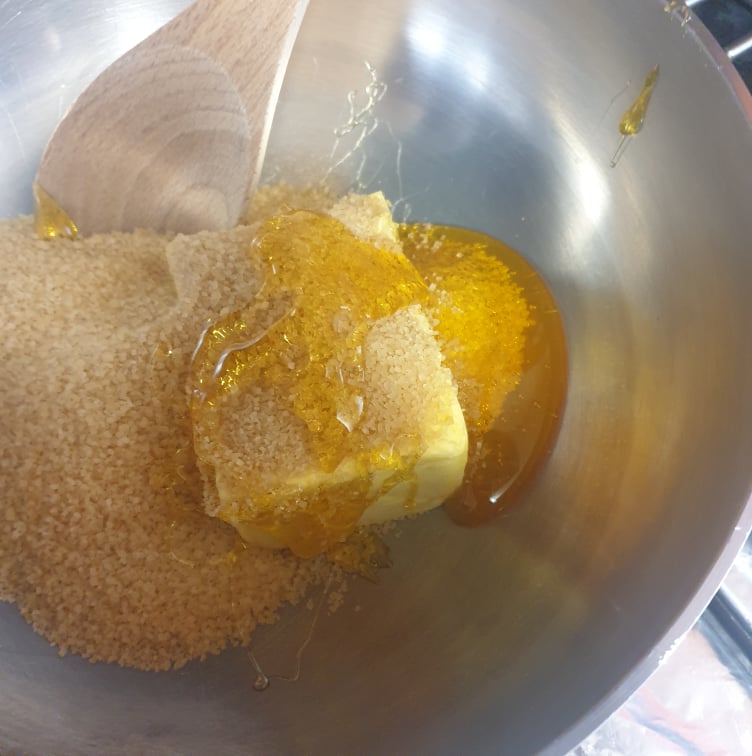
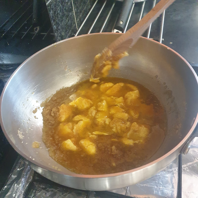
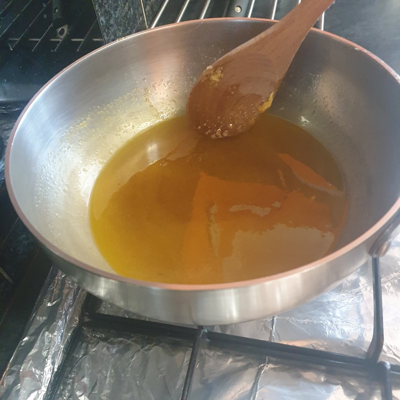
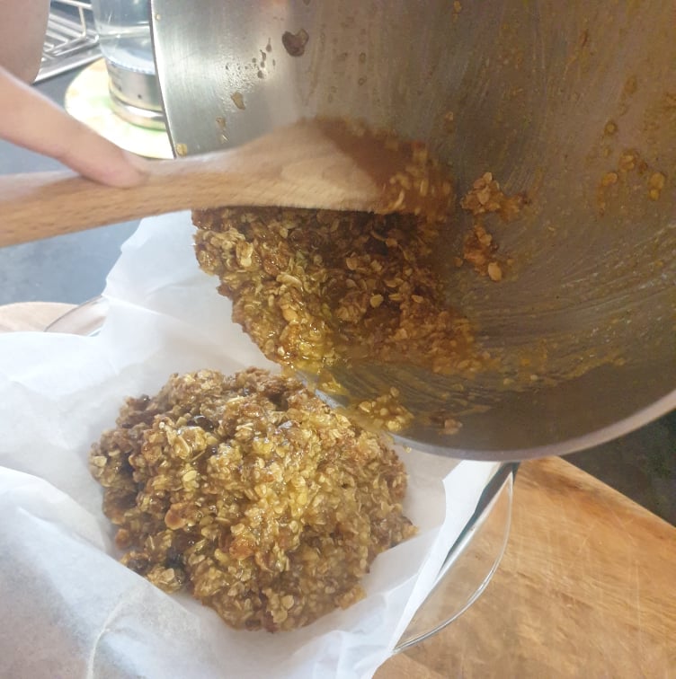
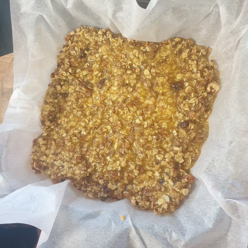
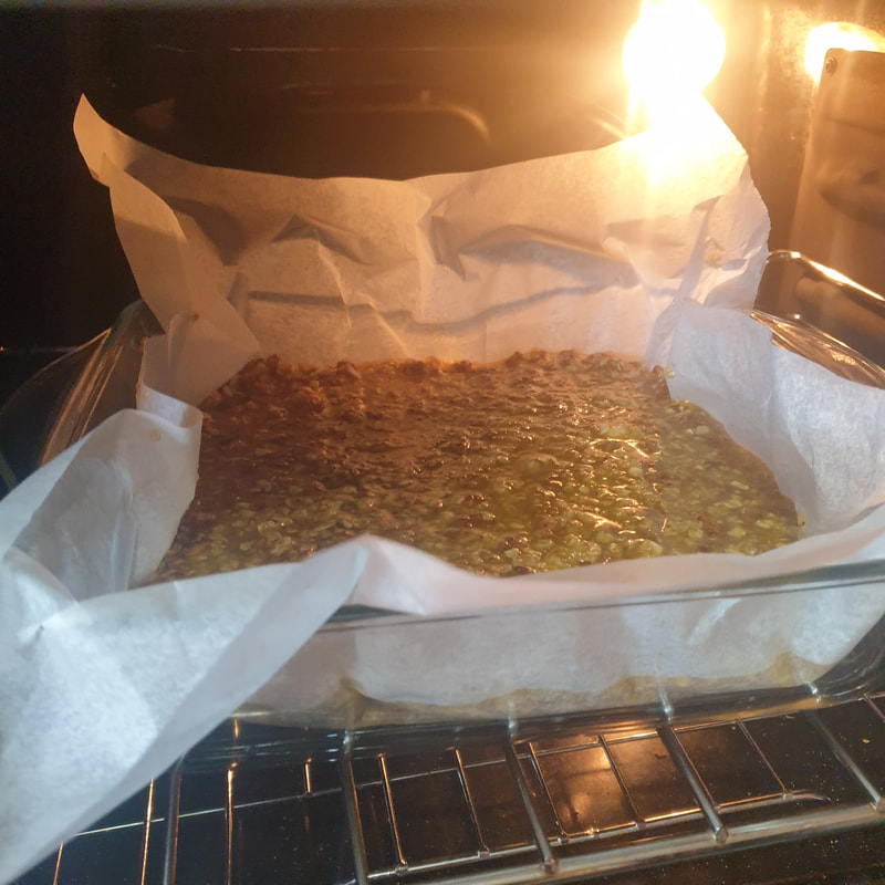
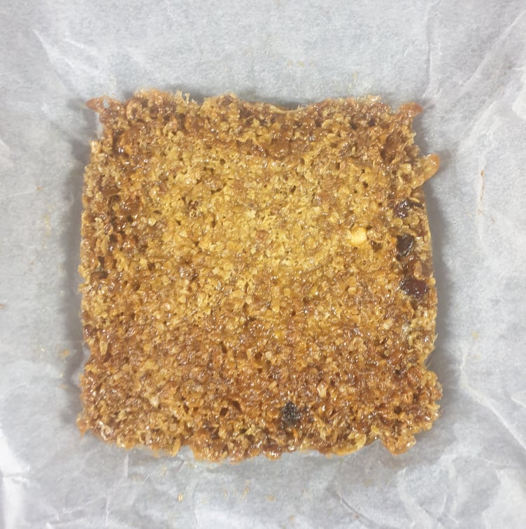
It's really important to record exactly what you do - ingredients, tools, quantities, preparation, mixing, cooking, etc. Use multiple methods to record the process - diagrams, drawing, photography, etc. Even though we're not using words, writing can be helpful too. You want as much primary source material to work with as possible from this stage.
Stage 2: Test
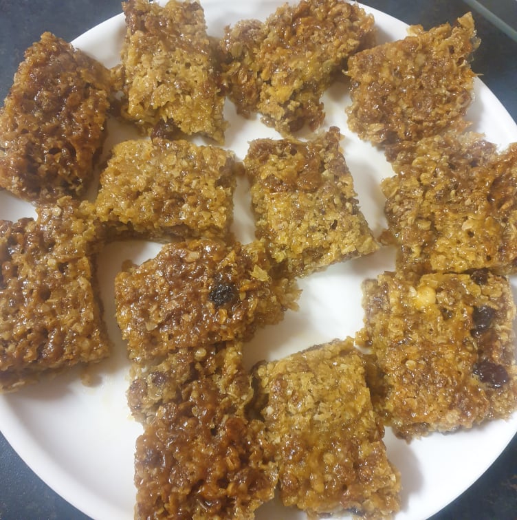
Consume your creation in the convivial company of like-minded but socially distanced colleagues!
Consume your creation in the convivial company of like-minded but socially distanced colleagues!
Stage 3: Exploration
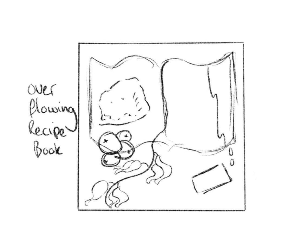
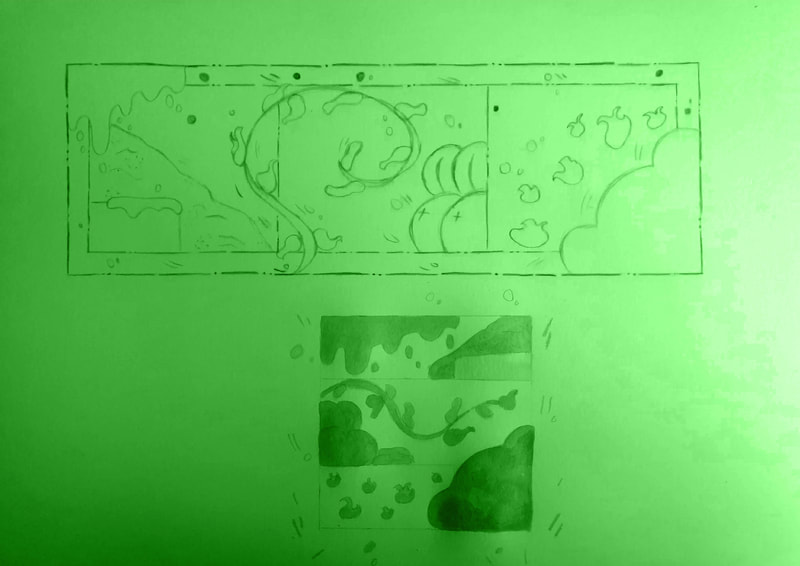
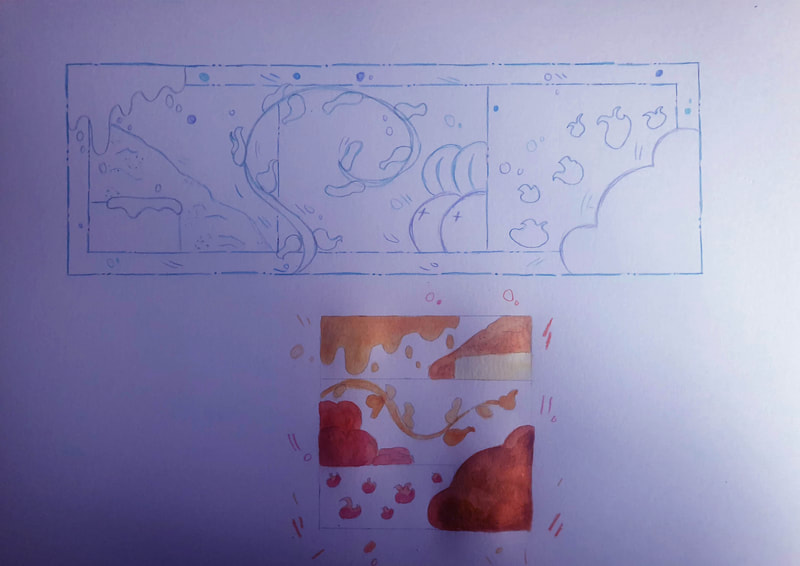
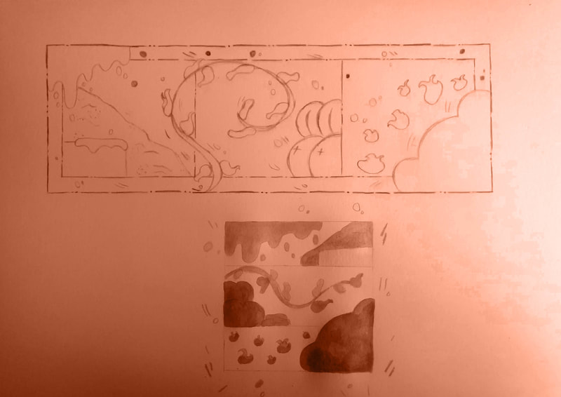
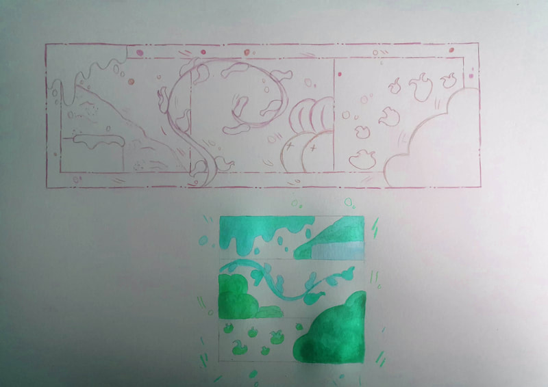
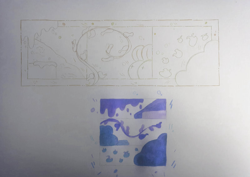
Explore alternative strategies and visual treatments that show how to follow the recipe. We're looking for a wide range of initial considerations here so be creative in your image-making - drawing, painting, collage, diagrams, digital or analogue, etc. Remember that you're experimenting with techniques at this stage, you should be opening up new lines of visual enquiry, not just sticking to what you already know.
Also, explore the different formats. Does the format dictate, influence or change how you arrange the components of your recipe?
Artist Research
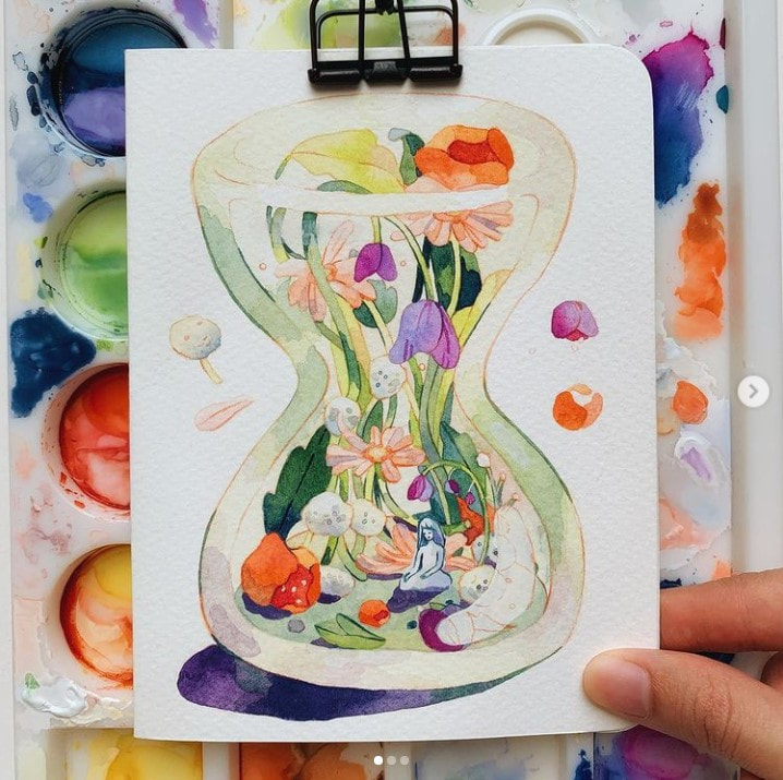
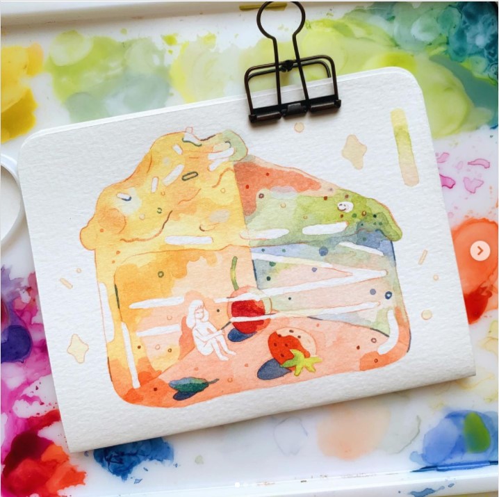
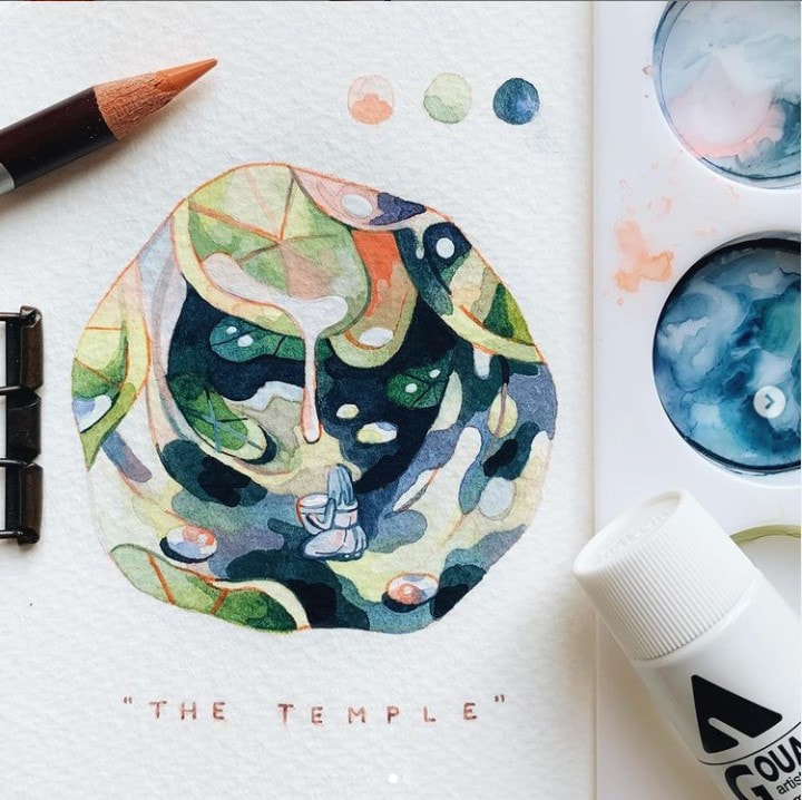
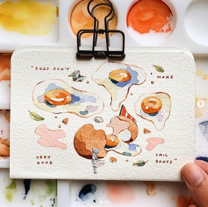
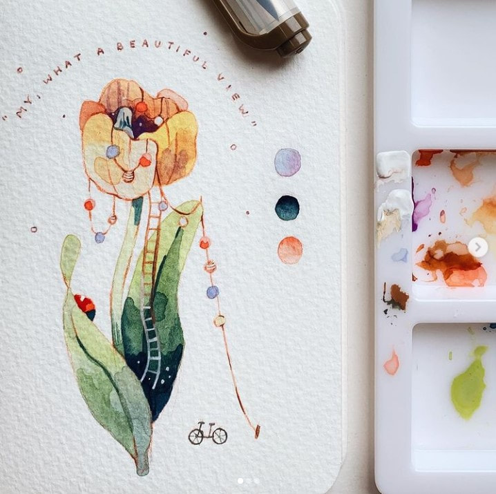
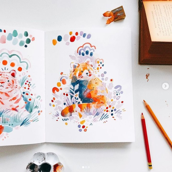
I have been interested in the way Angelyn uses her pains and the way she colours as the designs look soft yet vibrant
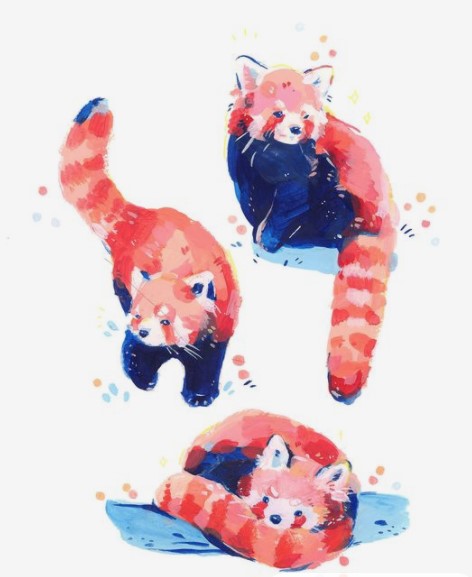
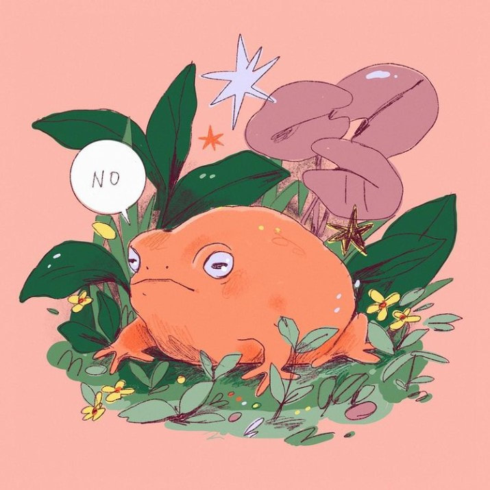
I like the way Leigh doesn't haven't a particular style but also how she uses shapes and line marks to add a subtle bit more into her drawings
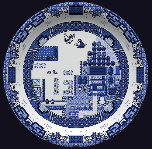
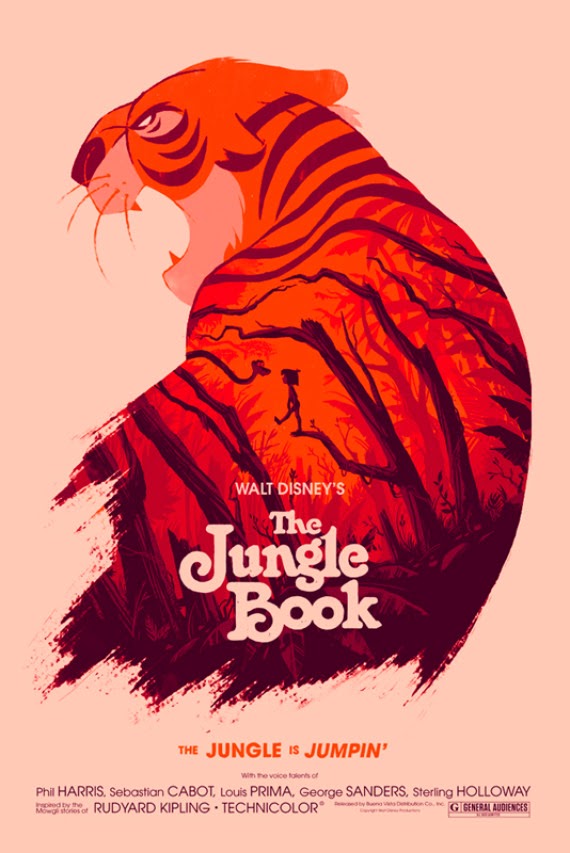
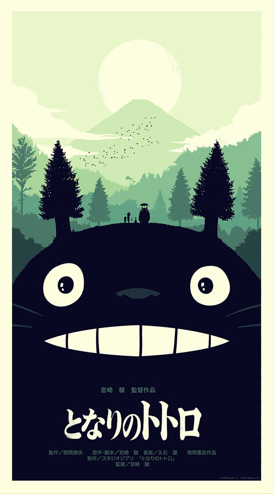
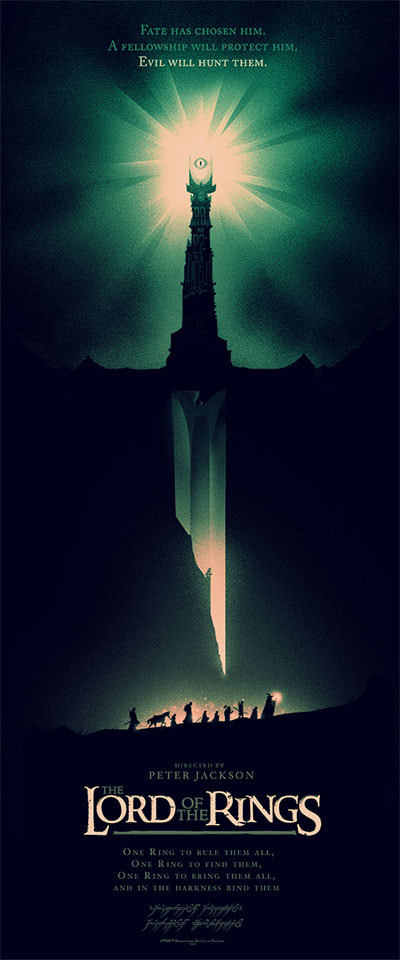
I was intrigued by how Olly moss captured his colours but also came across a bowl design he had made which I later on decided how I could also do something similar
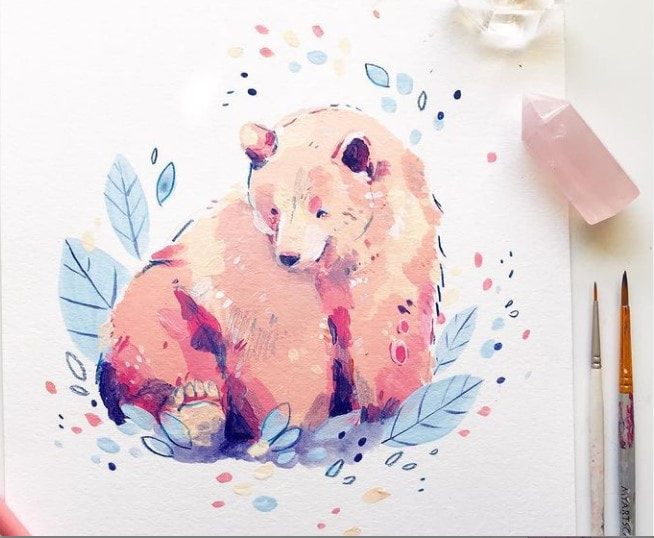
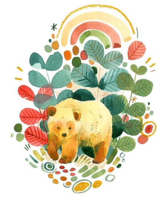
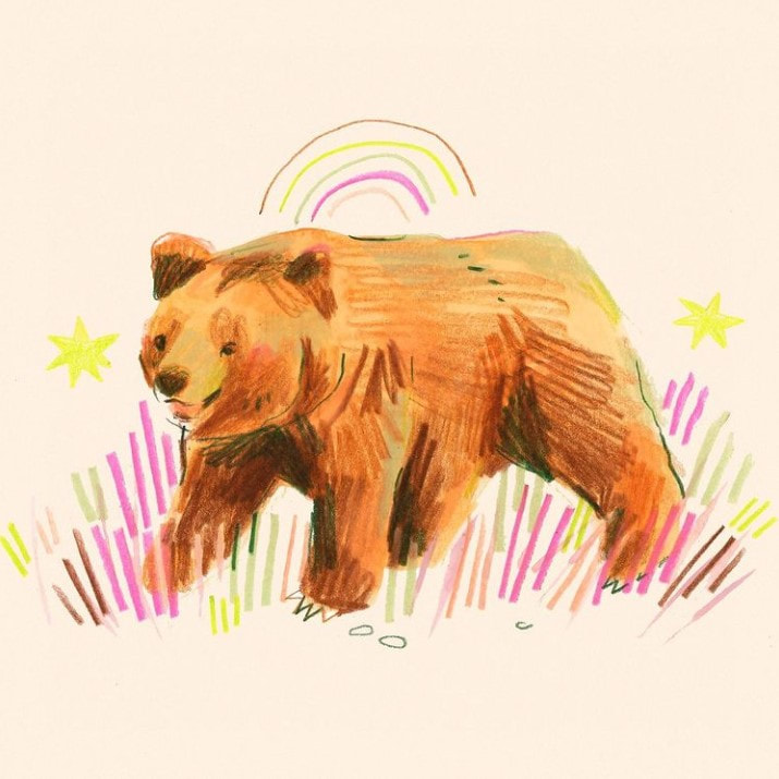
I was suggested to look into art that may perhaps not relate to the project theme overall and found myself looking into bear illustrations as they have been catching my attention lately and I perhaps would like to incorporate a bear into one of my ideas as well. I have also had a look at witchy illustrations with potions, brewing and gem.
Visual Process
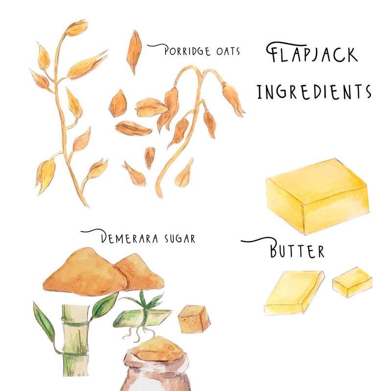
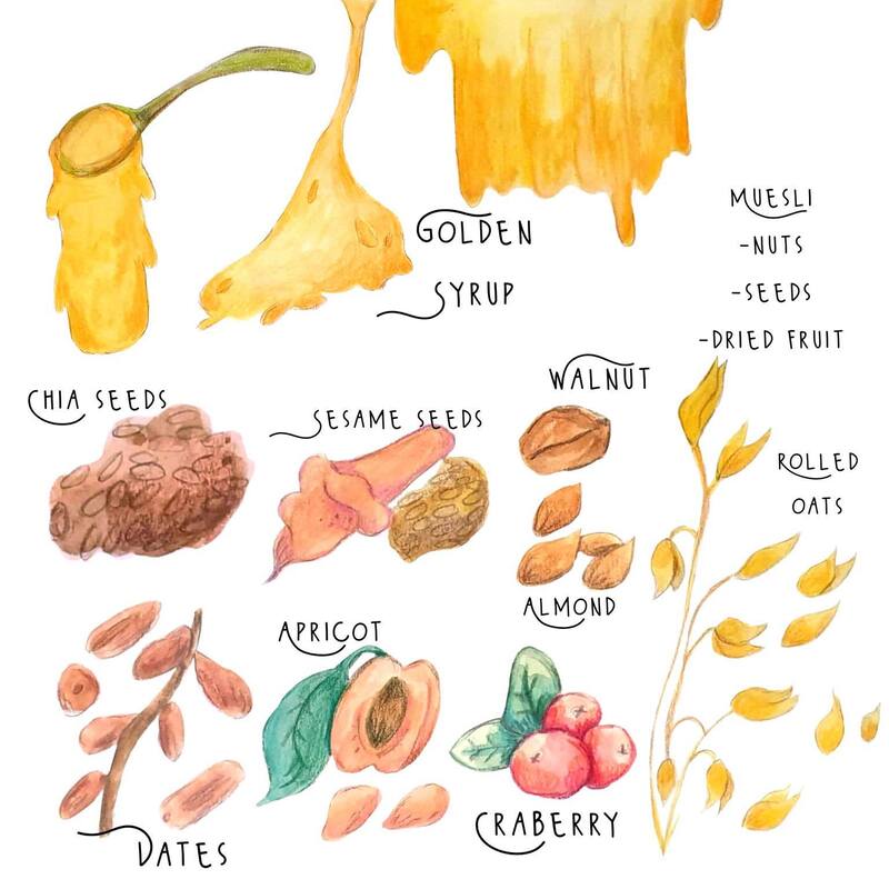
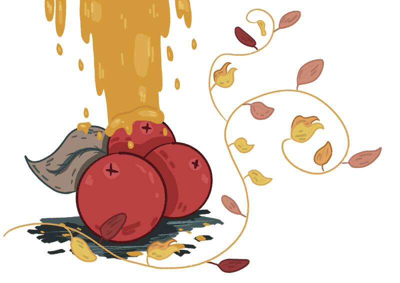
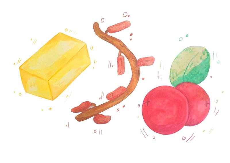
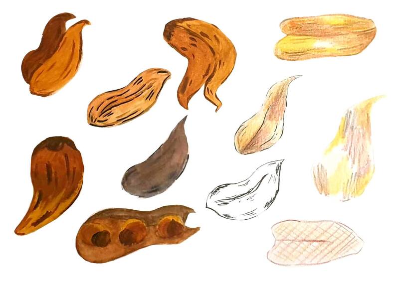
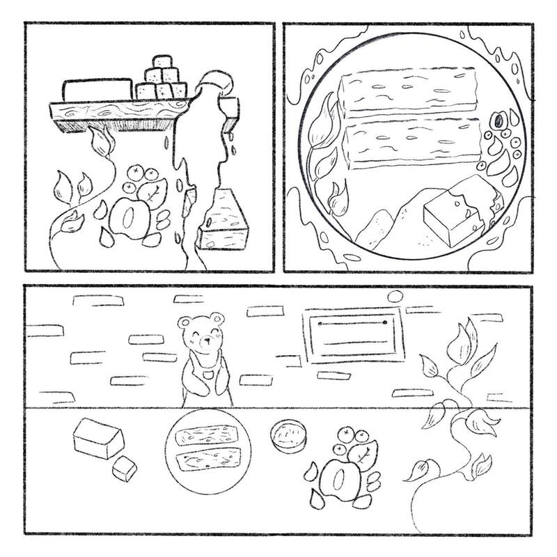
To start of I decided to draw out the ingredients I used and how I could make them look more obvious as to what they are - the oat and muesli look familiar so instead I may use the dried fruits and rolled oat to make the muesli stand out more.
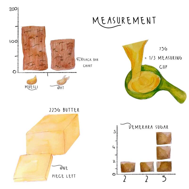
Measurement
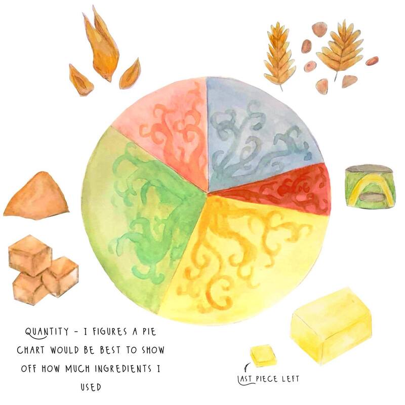
I thought a pie chart would be the best way to show the amount of ingredients I used but i had a look at different ways of also showing this with graphs or a measuring cup.
Media Tests + Style
For my media tests I decided to use watercolour, gouache, ink and pencils. I also tried a digital version to see if I want to work on digital or analogue. I am leaning mainly towards using watercolours and pencils. I used hot pressed watercolour paper for the tests and like the quality it gives off.
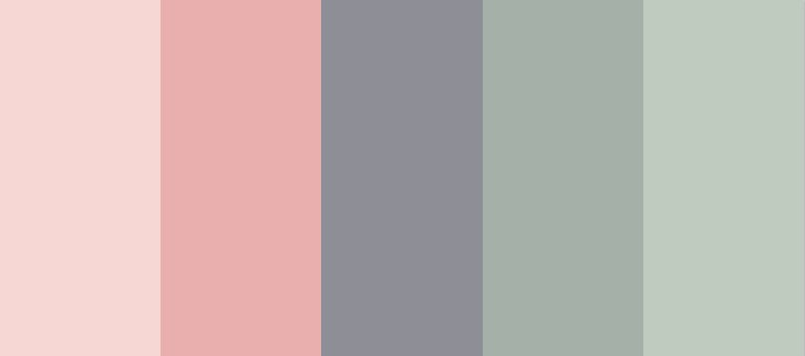
Colour Pallet
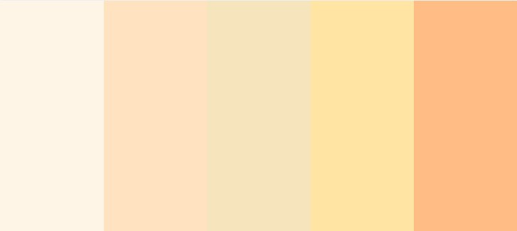
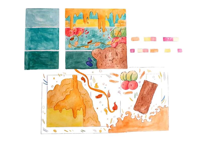
I looked at the colour pallet for most of the ingredients as well as the bear character that I may use. I am overall not deciding on the colour just yet and will experiment more so I see how the overall image will look with these basic pallets. The colours shown are mainly beige and golden colours which makes them seem a bit boring which I will focus mainly towards showing more colour within the backgrounds or any characters I want to focus on.
Thumbnails
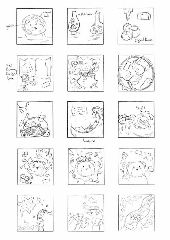
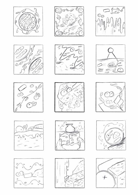
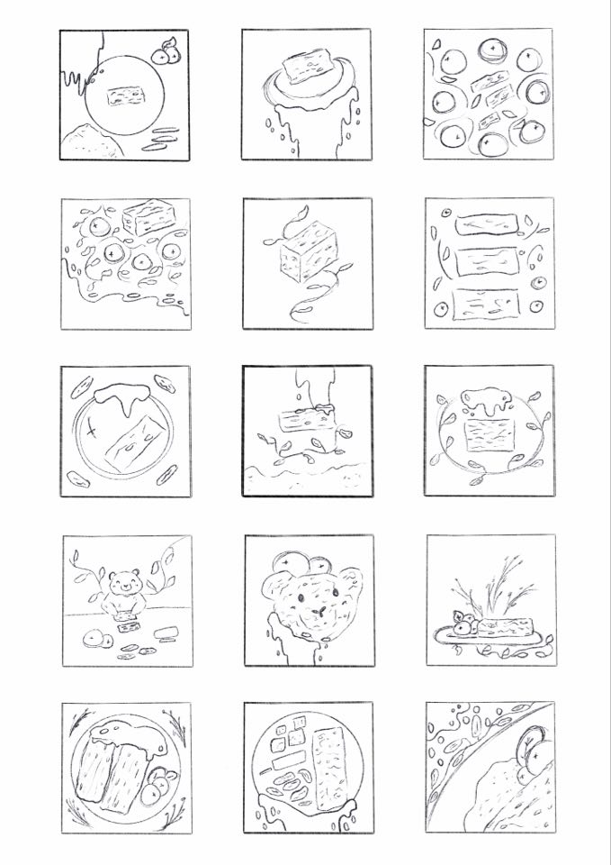
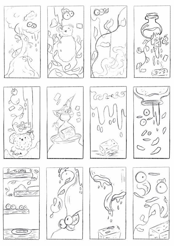
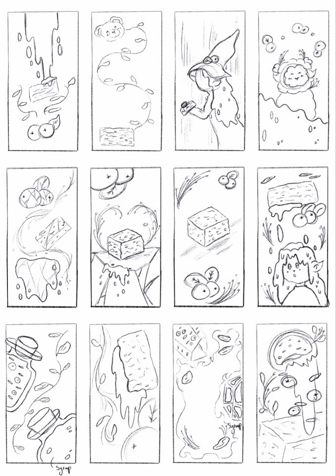
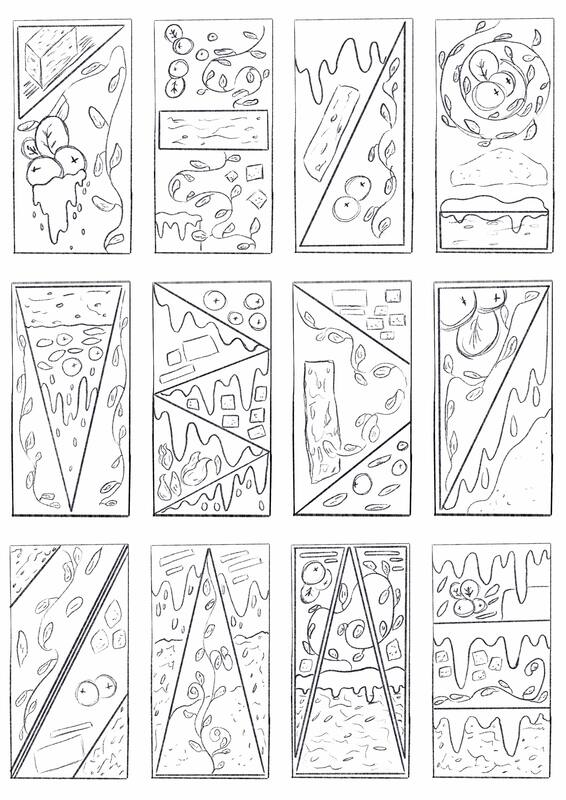
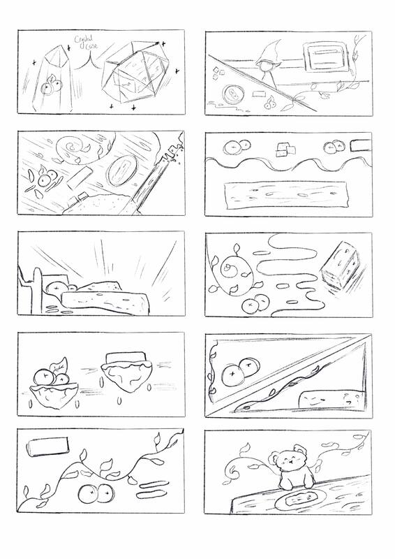
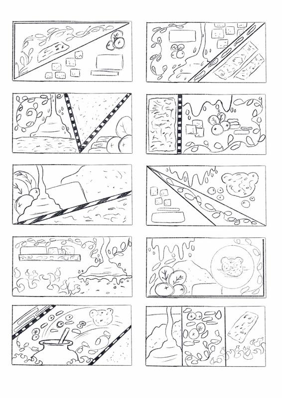
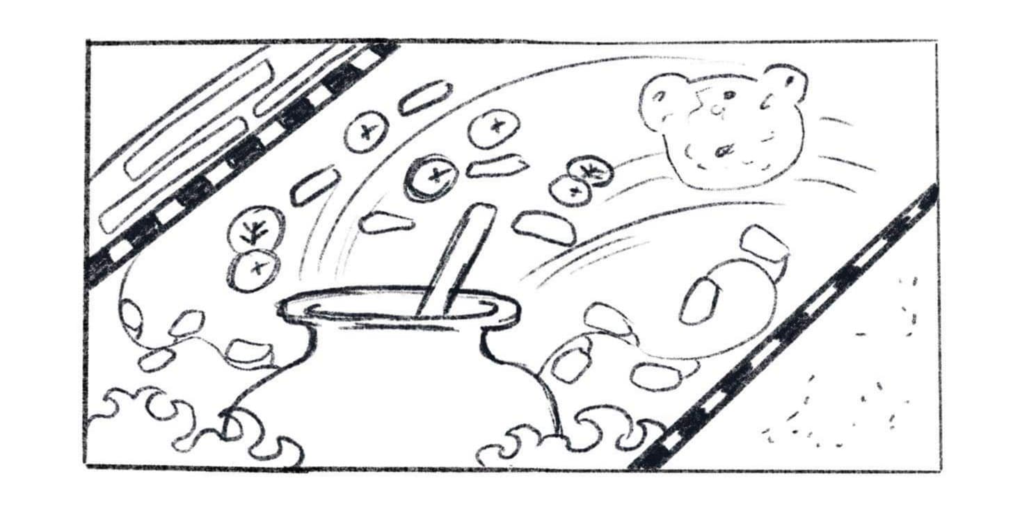
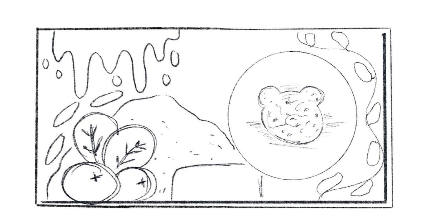
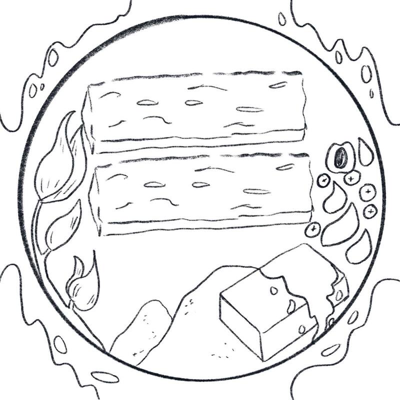
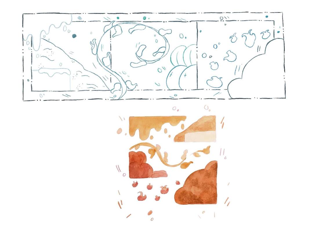
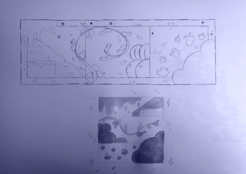
I was told to try and attempt making 100 thumbnails and to not use colour if it only slows down my process, which It usually does as my ideas are a bit slow so It would take me a few minutes to do each box. I quite like these much better than my initial 8 ideas and gives me more of a variety to choose from. I decided to do these digital as drawing out the boxes individually would have taken up more of my time.
D E V E L O P M E N T
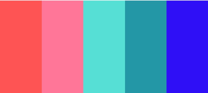
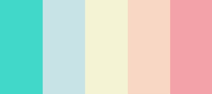
Colour Scheme
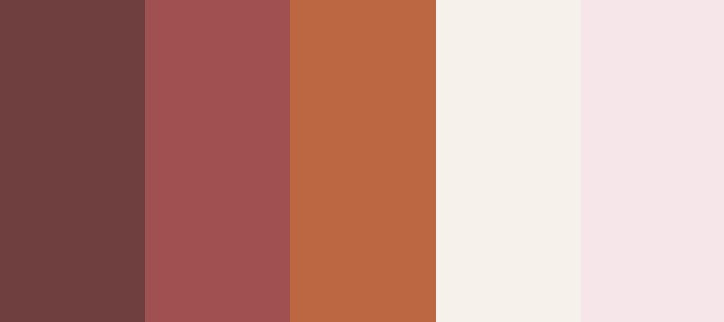
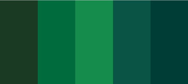
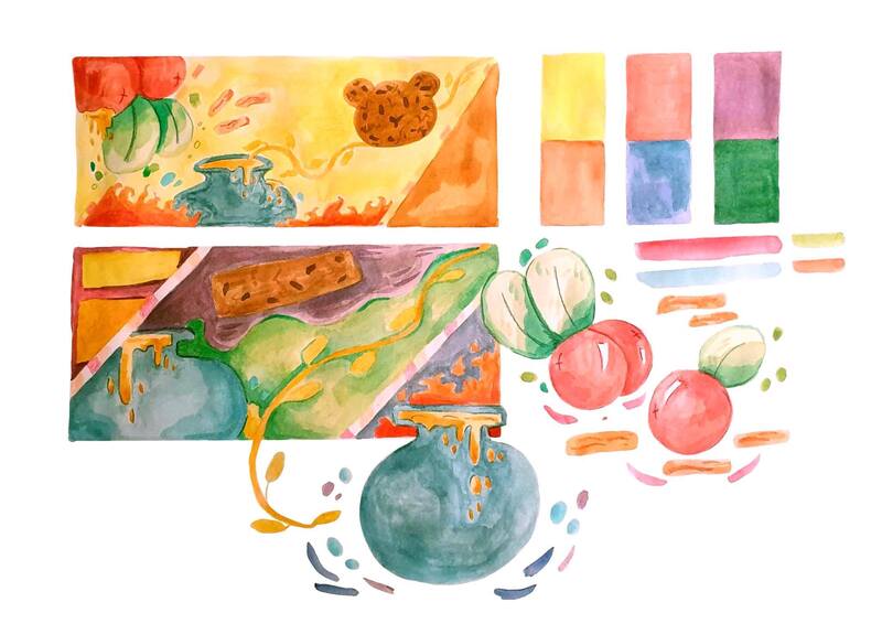
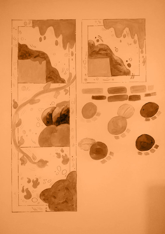
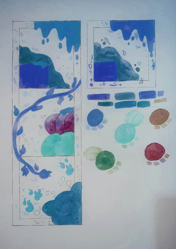
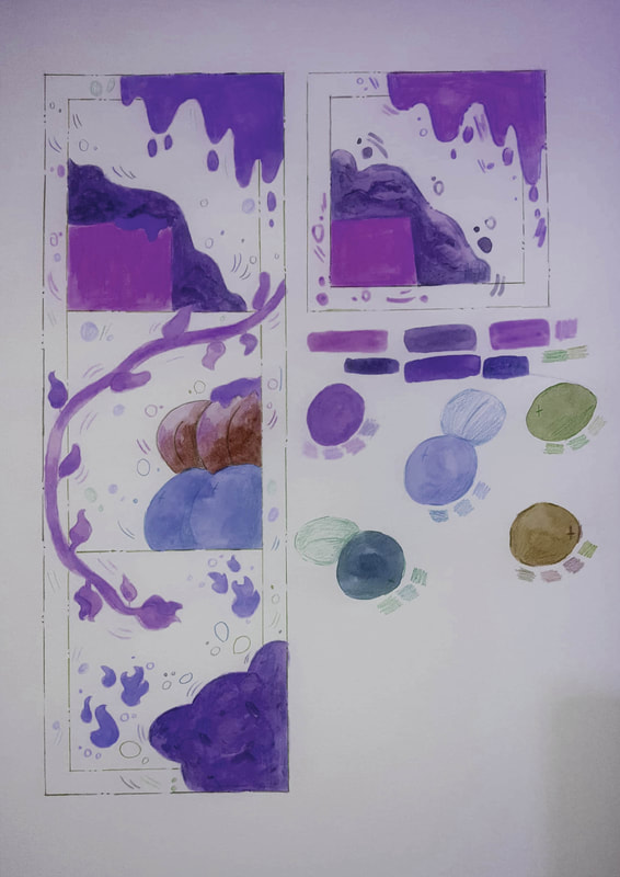
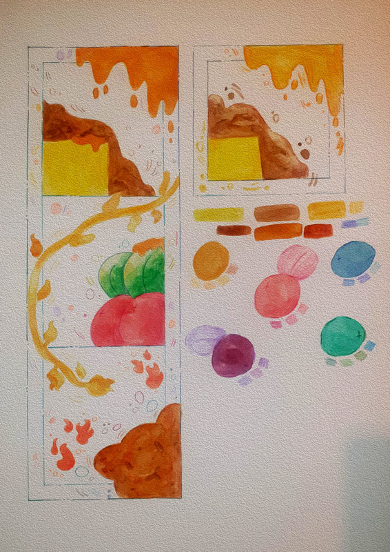
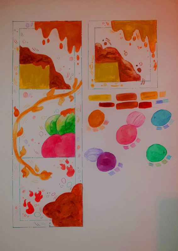
Looking through some more colour pallet's I decided to go for something a bit different were the colours are random but also catch my attention. I am going to use this and explore how I could incorporate these into my designs and how would my illustrations look when I am not focusing on the same scheme.
Selections
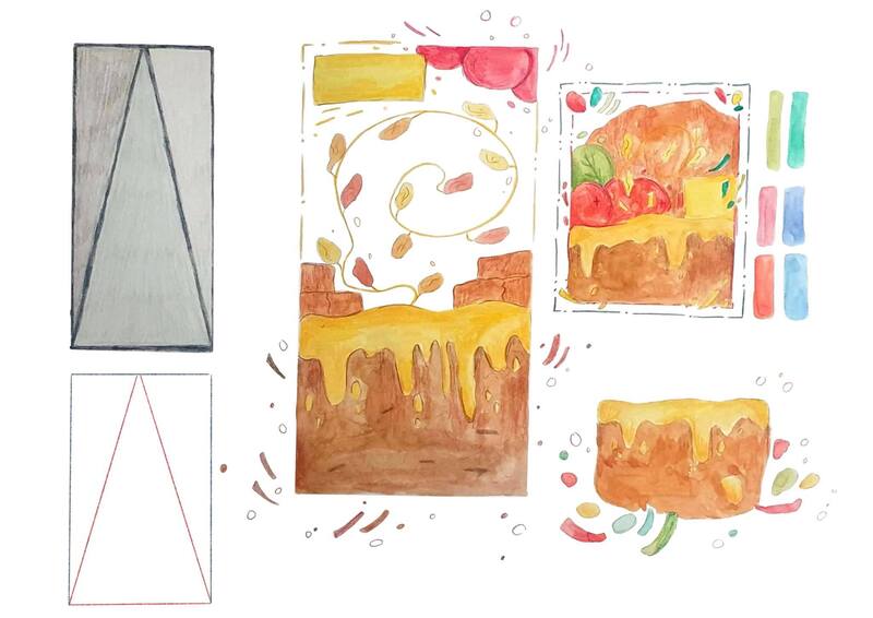
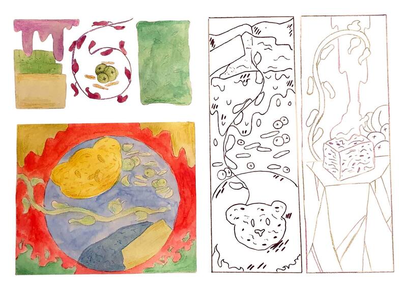
Most of my selections are what I will be developing further into and testing the different outcomes I could receive. I chose a variety of different sizes and will be working into them or combining a few of the ideas as well.
Tests
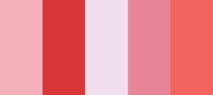
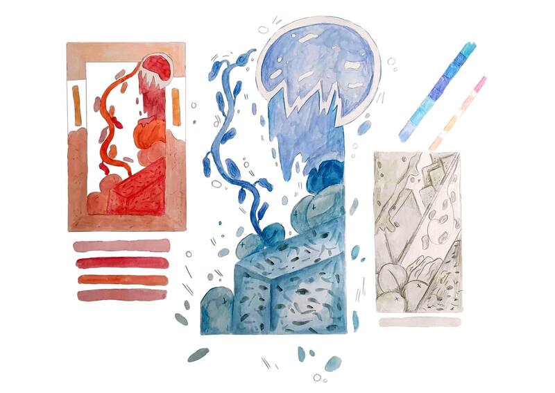
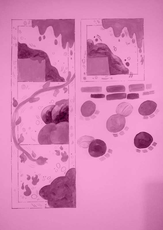
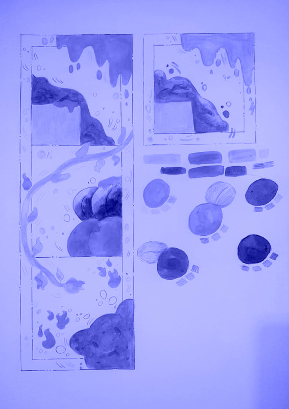
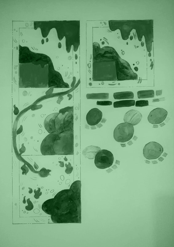
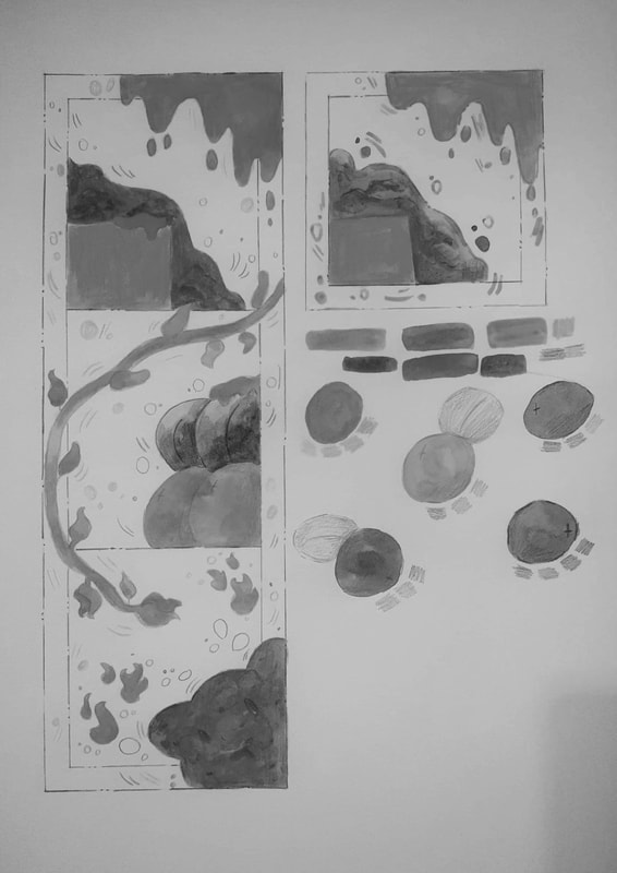
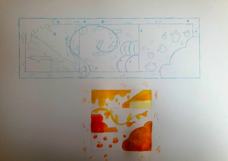
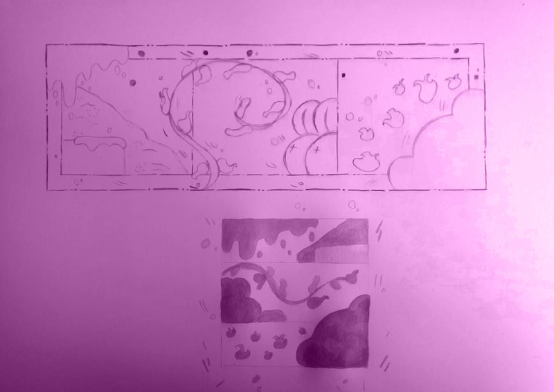
For my development tests I started off with large scales and testing the colour pallets I chose but then I decided to take a different approach and see how It would look using monochrome colours: for this I used pinks, blues and greys and I am liking the way the blue one has came out as, although It does give off a cold vibe with the colour scheme. Next I decided to experiment with two shades of colours with ink and line art but when I tried to mix a few more colours is when it decided to go horribly wrong - but this has at least made me realise that I will either be working in the same colours that the ingredients are or I will try and approach it using one shade of colours with a bit of mixing.
Mock Ups
Photoshop Tests
F I N A L
|
First Attempt
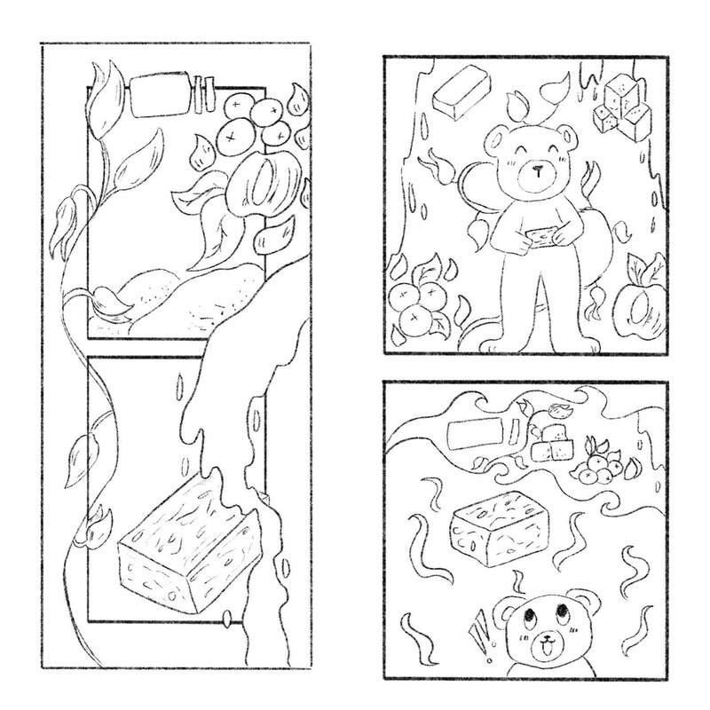
After deciding on the overall layout I decided to go landscape for my final as It shows the process much nicer, for some reason I still feel as though I am missing something but I am uncertain as to what that is but I am pretty happy with how my final turned out. Although I was going to try a different colour pallet I prefer the ingredients to look accurate as I could make them. I decided to keep to the bear theme for the final overall.
Cook Book Mock-up
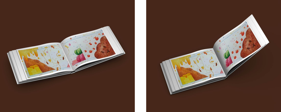
I then went into photoshop and used the photo album mock-up to make sure my design would cover landscape - I enjoy creating mock-ups on photoshop as they then look more polished and well made. However I couldn't get the middle section's to connect but that doesn't entirely annoy me.
|
|
Final
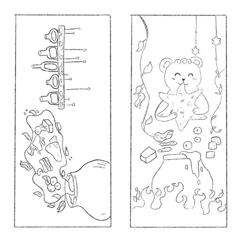
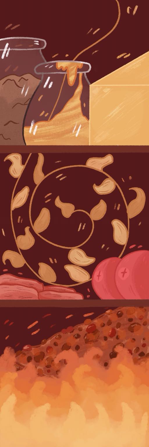
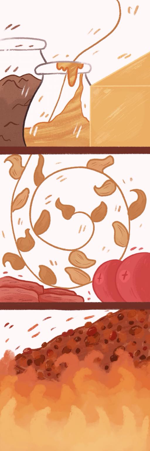
While I was going back on my feedback I thought to re attempt this digitally - I was still struggling with how I was supposed to make my ingredients look like what they were without words so for my butter I decided to change it to be more 3D than flat, I put the Sugar and Syrup In glass bottles. I left the dry fruit as it is as I wasn't sure how else to tackle it as well as my oats. My bottom design shows the Flapjack being cooked as it's surrounded by fire. With the background I have left one completely blank and one that has a dark burgundy colour as it matches well with my warm tones of colours. |
Site powered by Weebly. Managed by 34SP.com
